Click to enlarge — it’s worth it
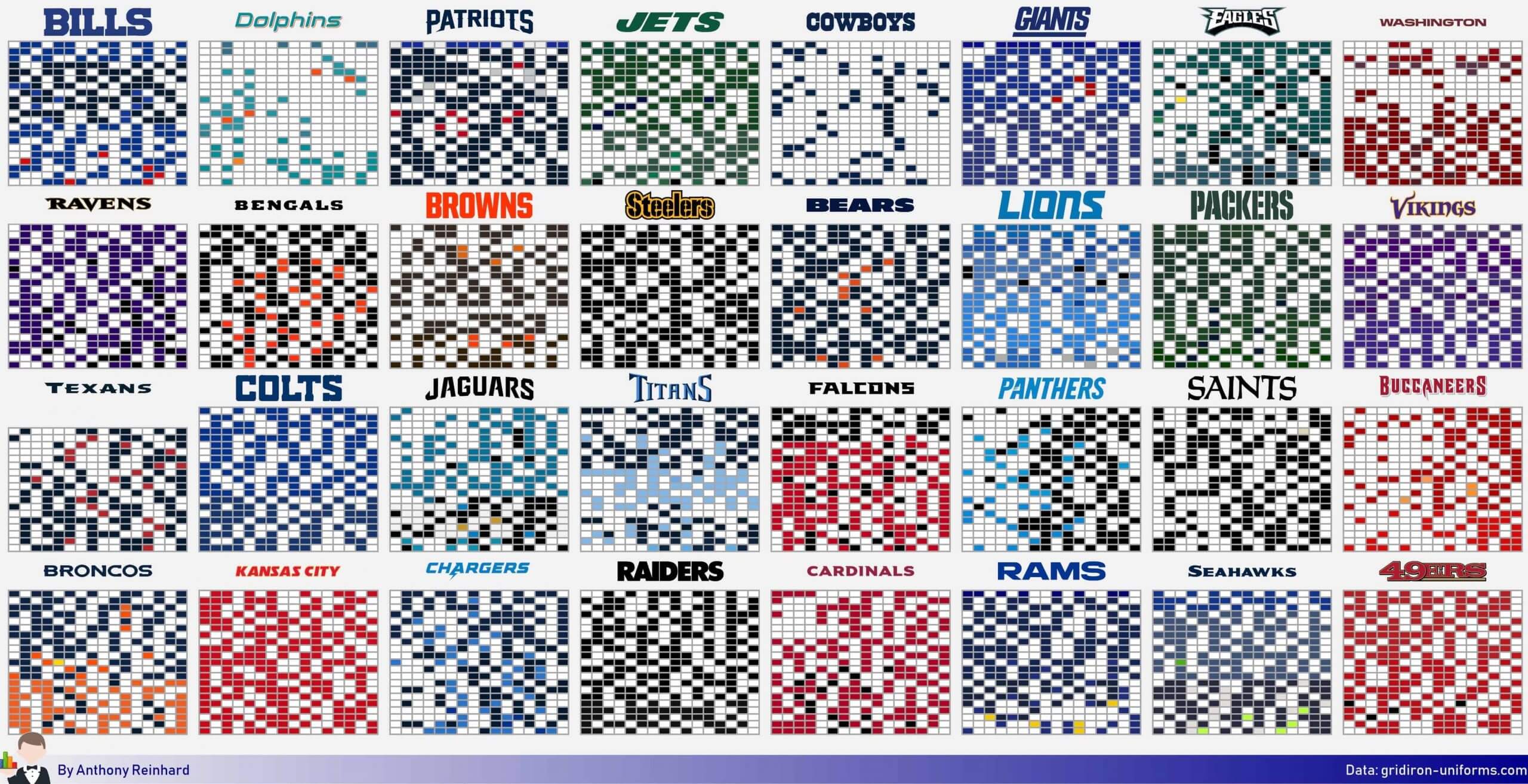
The remarkable chart shown above tracks each NFL team’s jersey color over every game for the past 21 seasons. For each team shown, each horizontal row has 16 cells, representing that team’s 16 games in a given season, and each vertical column has 21 cells, representing every season from 1999 through 2019. So the top-left cell is the team’s first game in 1999, and the bottom-right cell is the team’s final game of last season.
It’s an engrossing and very satisfying example of data visualization. As you can see at the bottom, it was designed by a guy named Anthony Reinhard, who created it by using game-by-game jersey info from the mighty Gridiron Uniform Database. I’ll have more to say about Reinhard in a bit, but first let’s explore this wonderful graphic he’s created. Here are a bunch of things that jumped out at me:
1. If you had asked me which team had the fewest colored-jersey games over the past 21 seasons, I would have said, “Duh, the Cowboys.” But the correct answer, according to the data, is the Dolphins, who played 63 colored-jersey games over the past 21 seasons, compared to the Cowboys’ 67:
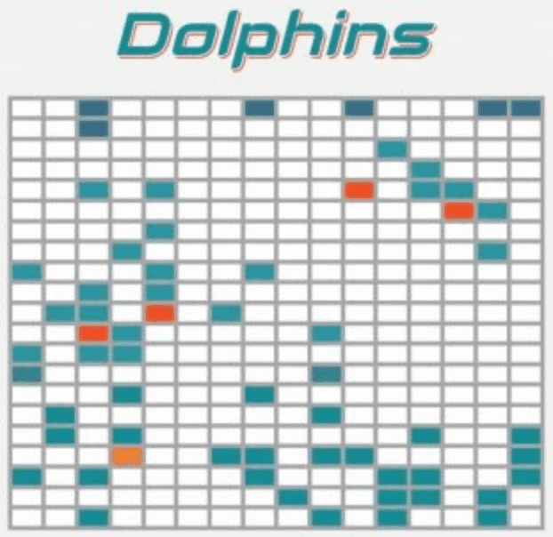
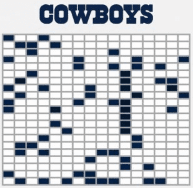
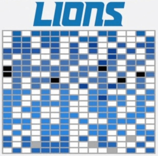
2. As you can see in the Dolphins’ chart, the team’s different shades of aqua over the years were taken into account — a nice detail. This makes it easy to see how certain teams have changed their primary team colors over the years. Many fans, for example, probably think that the Lions just wear Honolulu blue, period. But the chart indicates that their shade of blue changed quite a bit over the past 21 seasons:
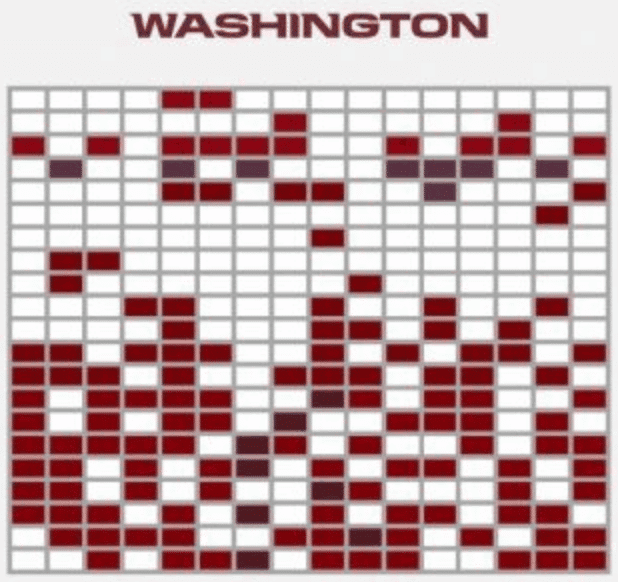
3. You can see certain historical protocols and events play out in the color distribution. For example, remember how Washington used to routinely wear white at home, just like the Cowboys? Their chart makes it easy to see when they did that, and when they stopped:
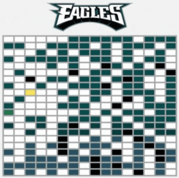
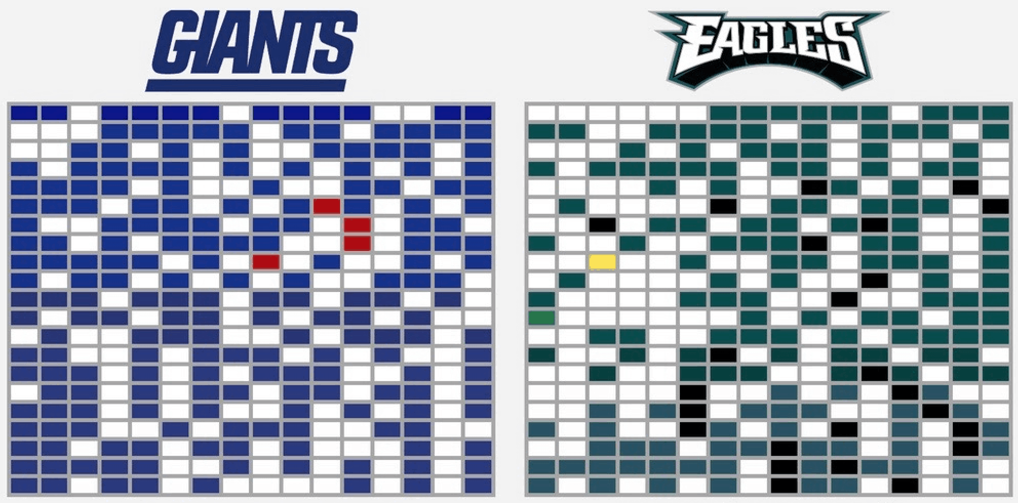
4. Similarly, what’s that one yellow cell in the Eagles’ chart? It’s from that one time they wore the 1934 throwbacks:
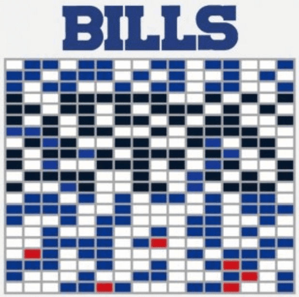
5. And you can also see how the Bills abandoned their classic royal blue for navy for nine years, and then switched back to royal:
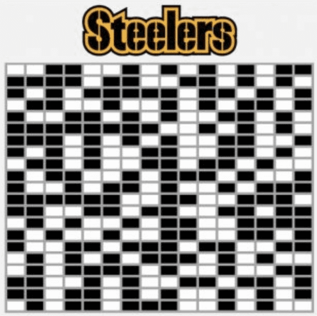
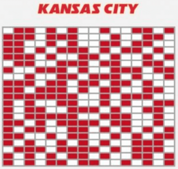
6. While most teams have at least two different non-white jerseys represented (the Broncos have four: orange, navy, yellow, and brown), the charts for some teams, like the Steelers and Kansas City, feature nothing but the team’s primary color and white:
———
I could go on, but you get the idea. I’m sure you can find your own examples of interesting things lurking in the chart. It’s all very satisfying to pore over!
The chart does have its limitations. Some teams have two different white jerseys, for example, or two different blue jerseys, or whatever, and the chart doesn’t distinguish between them. Similarly, there’s no information on what the opposing team was wearing, who won the game, or any number of other things that might be fun to explore. But within the limited framework of what the chart sets out to do, it succeeds spectacularly.
Reinhard posted the chart on his Twitter feed two Saturdays ago, which is how I became aware of it. He describes himself on his Twitter profile as a “visualizer of football data,” which sounded intriguing, so I began scrolling through his feed, where I found all sorts of fun graphics (mostly created by him, but also some retweets of other people’s work). None of them were about uniforms, but many of them used team logos, team colors, and so on, so it all felt connected to athletics aesthetics — maybe not uni-related, but uni-adjacent. Here are some of the ones I particularly enjoyed:
Even with the game clock stopped, Aaron Rodgers and Carson Wentz liked to used up the full play clock last season! Data from @nflfastR pic.twitter.com/DoMN5pPe2a
— Anthony Reinhard (@reinhurdler) September 2, 2020
I thought this would be a fun one for a Saturday: Which quarterbacks most often make the tackle after they throw an interception?
Patiently waiting for Andrew Luck to return next season as an inside linebacker.
Data is from @nflfastR pic.twitter.com/t96Xc7Xz4Y
— Anthony Reinhard (@reinhurdler) August 15, 2020
I plotted WR heights by team! Rodgers has the tallest WRs to work with while Josh Allen has the shortest. Sorted by median. These are pretty interesting to look at and think about. pic.twitter.com/kMP5a3pOiR
— PykingsAnalytics (@mnpykings) August 16, 2020
Which NFL teams are willing to be social on twitter?
– 23 teams follow every other team
– 3 teams (PHI, BAL, IND) do not follow ANY other teams
– @AtlantaFalcons are following every team that follows them back and none that don't! pic.twitter.com/3CGuiepqVa— Anthony Reinhard (@reinhurdler) August 30, 2020
After exploring Reinhard’s feed, I wanted to learn more, so I contacted him and asked if he’d be willing to do a phone interview. He readily agreed, and we recently had a really good talk. Here’s a transcript of that conversation, edited and abridged for clarity:
Uni Watch: Let’s start with some basic information about you. How old are you, where do you live, and what do you do for a living?

Anthony Reinhard [shown at right with his wife, Gina, on the day of their engagement two years ago; click to enlarge]: I am 27 years old. I live in Columbus, Ohio. And for a living, I am a data analyst at a midsize insurance company.
UW: What does a person study to get into data analysis? Like what what was your major in college?
AR: I have a Bachelor of Science in actuarial science, which is basically just statistics and math that has to do with insurance.
UW: How and when did you start doing football data visualizations?
AR: I probably started doing this a little more seriously about eight months ago, close to the end of last football season. I’ve followed a few people on Twitter who talk a lot about advanced football metrics and stuff that is, you know, newer over the last six years or so. And one of the best ways to share information about these advanced metrics, which can be kind of complicated, is to make graphs about some of the information. I’ve worked with data a lot and in my professional life, so it seemed like an easy segue. And I’ve always loved football.
UW: Looking through your Twitter feed, it appears that you focus almost exclusively on the NFL — no college football, no other sports. Is that right?
AR: I wouldn’t preclude myself from getting into any other sport in the future, but right now the data for the NFL is so accessible, and the community seems to be right there for me. So it’s definitely the thing I’m focused on most right now.
UW: It’s so interesting that you use that word community, because that was my next question: I get the impression from your feed that there is a community of data visualizers out there. How big would you say that community is? And where do you all congregate online? Are there particular message boards or websites?
AR: I would say it’s small enough so that any person with an interest in visualization or football, I think there’s a place for them if they’re willing to chip in their own stuff. This is going to be a little bit in the weeds, but most of the stuff that I do is in a statistical package called R, or a statistical program called R…
UW: Just the letter R?
AR: Yeah. It’s been around for a while, and it’s open-source. So it’s not something that’s owned, and it’s not for sale. You can download it on your own computer and do your own analysis. A lot of companies use it just because it’s so accessible, and a lot of academics use it because it’s available and you can use it across different universities or whatever. But within R you can download other programs that people have built inside this statistical program. So one of the ones that has been built kind of recently is called nflfastR. Basically, it’s a pipeline to get NFL play-by-play data very easily. So you can download a big table of data from every play, all the way back to 1999. And I would say that the folks who use that data and talk about it a lot are really at the nexus of the community.
Of course, there are people who work for ESPN or Pro Football Focus, who have access to other data. But the online Twitter community is mostly people who work with that nflfastR data.
UW: Are we talking dozens of people in this community? Hundreds of people? Thousands?
AR: Closer to hundreds, I would say.
UW: One thing I noticed while looking through your feed is that you often refer to data being “scraped.” Can you tell me more about that?
AR: I’m not an expert at web scraping, but basically it means going to a website, downloading parts of the web page, and then storing them in a secondary file so you can access them later.
For the graphic about the jersey colors, for example, I visited every web page on the Gridiron Uniform Database and downloaded the image of the uniform for each team in each game. And then once I downloaded the image, I could look at individual pixels in that image, and then those were the ones that gave me the ideas for the the colors of the uniform. Once I had all that information, I could make it into a graph.
UW: When you say you visited every page and downloaded the uniform images, did you do that, like, physically, one at a time? Or was there a global command?
AR: Yeah, that’s the magic of web scraping. I can write some code in R that will visit every web page for me — and quickly, too.
UW: I never really thought about this before, but now that we’re talking, it occurs to me that in order to create effective data-driven graphics, you need several distinct skills. First, you need to know what data is available and how to access it. Then you need to have ideas about how to harness or leverage that data in order to provide meaningful information — in other words, you have to know which questions to ask and how you can use data to answer them. And then you need good design skills in order to present that information in visually accessible and engaging ways. Which of those would you say is most important, and which one do you think is your biggest strength?
AR: I think you put it perfectly right there. I would say that to make something like what I made, in this case, you would need all three, probably in pretty equal doses. I think that probably the second one is ultimately the most important — knowing which questions to ask and then being able to, you know, answer those questions in interesting ways.
The third step — how you’re going to show it — is, I think, probably the most underrated of the three. I like to say that the information that you have is only as valuable as you can present it. If you have a really interesting finding but you can’t communicate it, whether that’s in a graph or even in words, then it isn’t worth much.
UW: In the data visualization community, are there people who are known as better number-crunchers, and other people who are known as better designers?
AR: Definitely. In my case, I’m probably a better designer than somebody who is a great analyst, and I think some of that comes with time. I’ve only been really looking at a lot of this data for eight months or so, while other folks have been doing this for a couple of years. For someone like me, I think a lot of people are interested in my designs, sometimes more than the information, which I’m okay with. Other folks might say they’d rather have a really interesting concept than an interesting design. So I think it depends. I think that there’s kind of a spectrum that folks land on in the football data community.
UW: You mentioned that you’ve only been doing this since the end of last football season. Now that the 2020 season is about to start, do you think watching a game will be a different experience for you? Will you be sort of processing what you see in a different way?
AR: Absolutely. One of the things that you quickly realize about the basic beliefs of the community is that a lot of folks think that teams run the ball too much, which is something I really hadn’t thought about too much in the past. And a lot of teams punt too often — probably they can be more aggressive on fourth down, and also go for it on two-point conversions a little more often. So I think those are things I’ll be looking out for. It’s very different once you’ve thought critically about some of the stuff that teams are doing in games.
I’ve always been a Cleveland Browns fan, so I think I’m very lucky that the Browns are, at this moment, one of the more analytically driven teams in the league. So I think I’ll be more comfortable watching Browns games than I would be if I were maybe a fan of the Seattle Seahawks, who are kind of working against some of the larger trends in the league — which I’m sure is very frustrating for a lot of the data-driven Seahawks fans that I know.
UW: You’re still new at this, but would you be interested in doing this type of thing for a living, like if a team wanted to hire you?
AR: That’s a tough question. I’m really happy with my current job, so it would be tough for me to imagine, you know, a whole different world like that. This is a hobby, I think — it’s a great getaway from what I normally do and also allows me to leverage skills that I can still use in my day job. If the right opportunity came along, I guess I would consider it, but I definitely see it as a hobby for now.
UW: OK, now let’s talk about the graphic you made about NFL regular season jersey colors. Is this the first uniform-related graphic you’ve created?
AR: Yes, I would say this first one that deals explicitly with uniforms.
UW: Why did you choose to document 21 seasons, instead of a round number like 20? Is it because of that data package you mentioned earlier, which goes back to 1999?
AR: Yeah, it is. We have really good data for those last 21 seasons. The Gridiron Uniforms site goes back to, I think, like the 1920s, so I certainly could have gotten more data, but most of the data that’s available for other metrics is from 1999 on, so I thought that would be a good year to stop.
UW: You mentioned before how you scraped the data — see, I can say it too! — and then got pixel values from the Gridiron Uniforms images. So is that how you were able to include all the slight color variations from year to year?
AR: Yeah.
UW: So, basically, you didn’t track the color changes — the Gridiron Uniforms site did.
AR: Yeah, they did all the hard work.
UW: Were there any patterns or revelations that surprised you? For example, I would have assumed that the Cowboys wore white more often than any other team during this period. But that honor actually goes to the Dolphins!
AR: Yeah, I guess I never really thought about that either, because I think of the Dolphins having that iconic aqua or teal color — that’s kind of how I think of them — but I guess they wear white a lot more often than I imagined.
UW: Did you happen to tabulate which teams wore white least frequently?
AR: No, I didn’t. That’s an interesting thought, though. I would have to think it would be a team in the NFC East, because of the Cowboys.
UW: But not Washington because there was a period where they also wore white at home!
AR: Oh, yeah. So then I’d have to think it would definitely be the Eagles or the Giants.
UW: From a visual perspective, do you find it more satisfying to see the charts for teams that just have white plus one color, like the Steelers and Chiefs? Or do you like the ones that have additional jersey colors scattered into the mix? I use the word satisfying because that’s the feeling I get from organizing information this way.
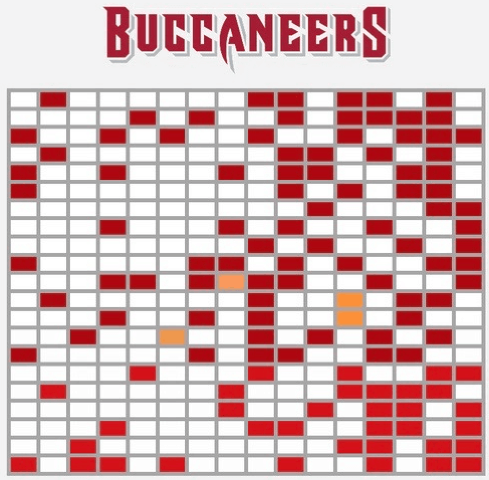
AR: I would say that the most aesthetically pleasing one for me was Tampa Bay, where they’re all almost the same shade of red and then their whites and then they have like four of the Creamsicle ones, which is a great color.
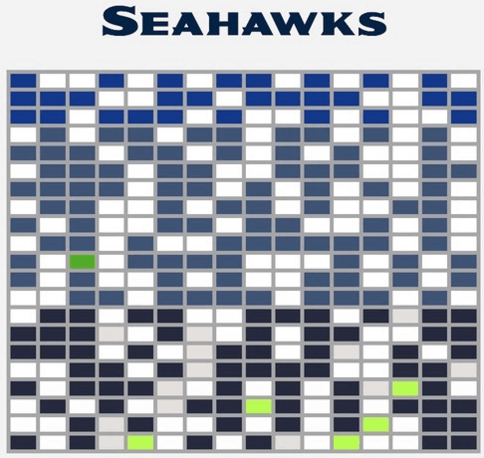
I also like the Seahawks, how they’ve kind of gone through waves with their three different uniform colors and then they have — I mean, I don’t like the green ones that they wear, but I think it looks good when there’s just like four specks of the tennis ball color.
UW: Do you think you might be doing any other uniform-related graphics now that you’ve done this one? And for that matter, are you, like, a uniform guy to begin with? Were you aware of my work, or aware of Uni Watch, before I got in touch with you?
AR: I had heard of Uni Watch before, but I wouldn’t say I have a super-big interest in uniforms. I definitely have an interest in design and color, so that relates to being interested in uniforms. Now that I have the data [from Gridiron Uniforms], I could definitely see myself doing a few more things with this in the future.
———
And there we are. I should add that Anthony was an absolute pleasure to talk to — really nice guy, and obviously really smart as well. Big thanks to him for sharing his time and expertise.
(Special thanks to Greg Boone, who was the first to bring Anthony’s jersey chart to my attention.)
Click to enlarge
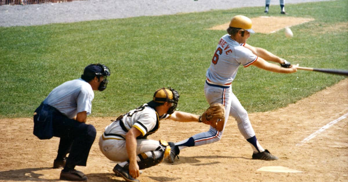
Too good for the Ticker: Hmmm, what’s going on in the photo shown above? That’s a shot from 1973 edition of the Baseball Hall of Fame Game, an annual exhibition game that took place in Cooperstown from 1940 through 2008. The ’73 game featured the Pirates vs. the Rangers (a routine interleague matchup nowadays, but a major novelty back in the day), and at least one Rangers player — outfielder Tom Grieve, who would later become the team’s GM — wore a Pirates batting helmet! It’s not clear, at least to me, if Grieve’s misplaced his regular helmet or if the teams were just having a bit of fun.
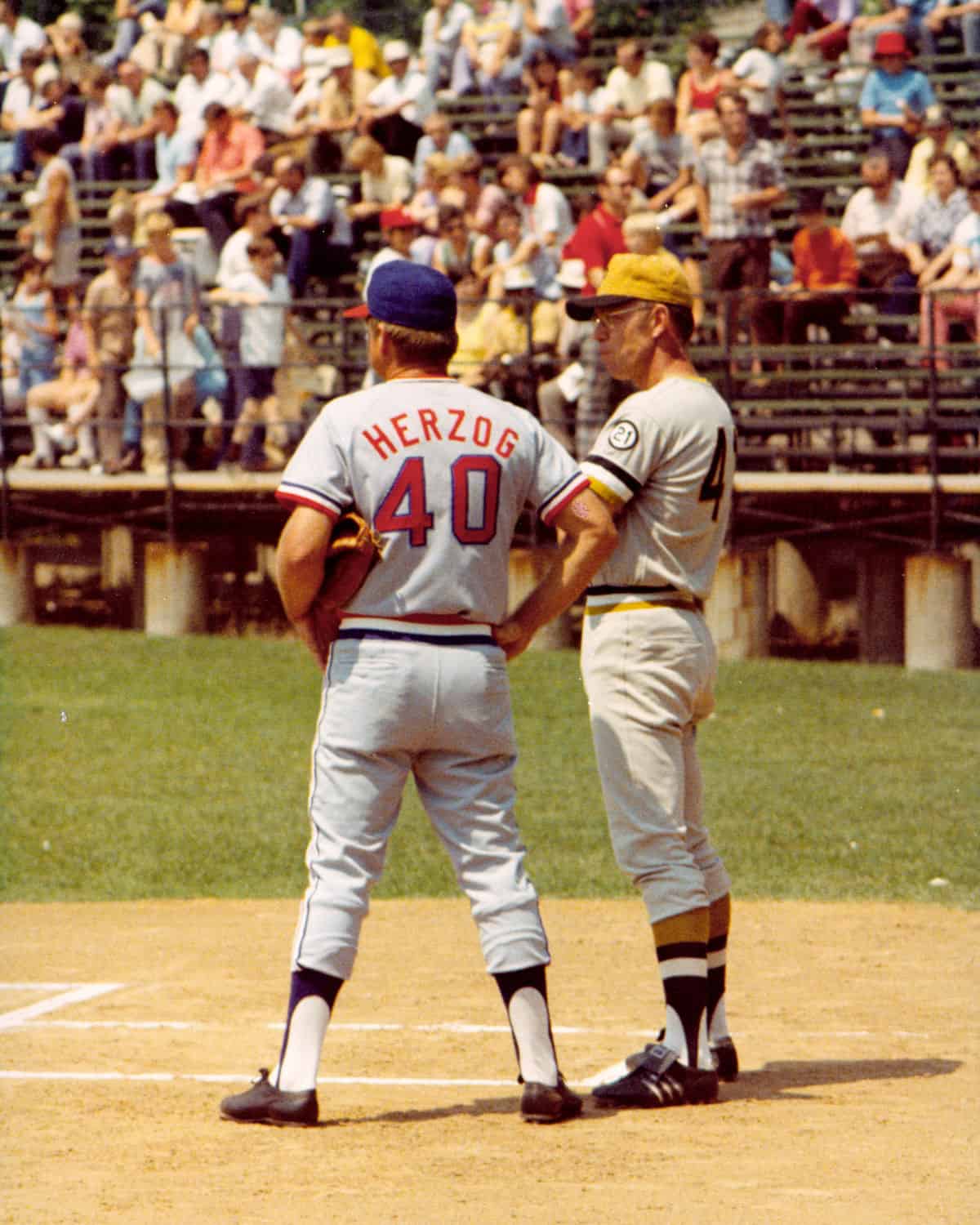
Moreover, although it’s a little hard to tell in that photo, both teams wore their road greys, because they were both in the middle of road trips when they detoured to Cooperstown for the game. Here’s a photo of the two managers — Texas’s Whitey Herzog and Pittsburgh’s Bill Virdon — where the grey tones are a bit more apparent:
(My thanks to @indywestie and @PolyesterUnis for this one.)
Having been a teacher for 11 years, I have used a wide variety of sports to create connections and build relationships with my students. This video explains what I'm doing this year. @UniWatch @sportslogosnet @Extratime @MiamiDolphins @TimbersFC pic.twitter.com/BSbShZslYh
— Trevor Williams (@TrevorTeaches) September 15, 2020
A teacher who deserves an A+: Longtime Uni Watch reader Trevor Williams is a third grade match/science teacher in Texas. He also has what has to be one of America’s most uni-themed classrooms. To get a sense of how he incorporates sports into his teaching style watch the video shown above — it’s two minutes very well spent, I promise.
ITEM! Color Remix cap launch: I’m happy to announce that the first monthly round of Uni Watch Color Remix caps is now ready to go. The four designs, which I teased a few weeks ago, are as follows (click to enlarge):
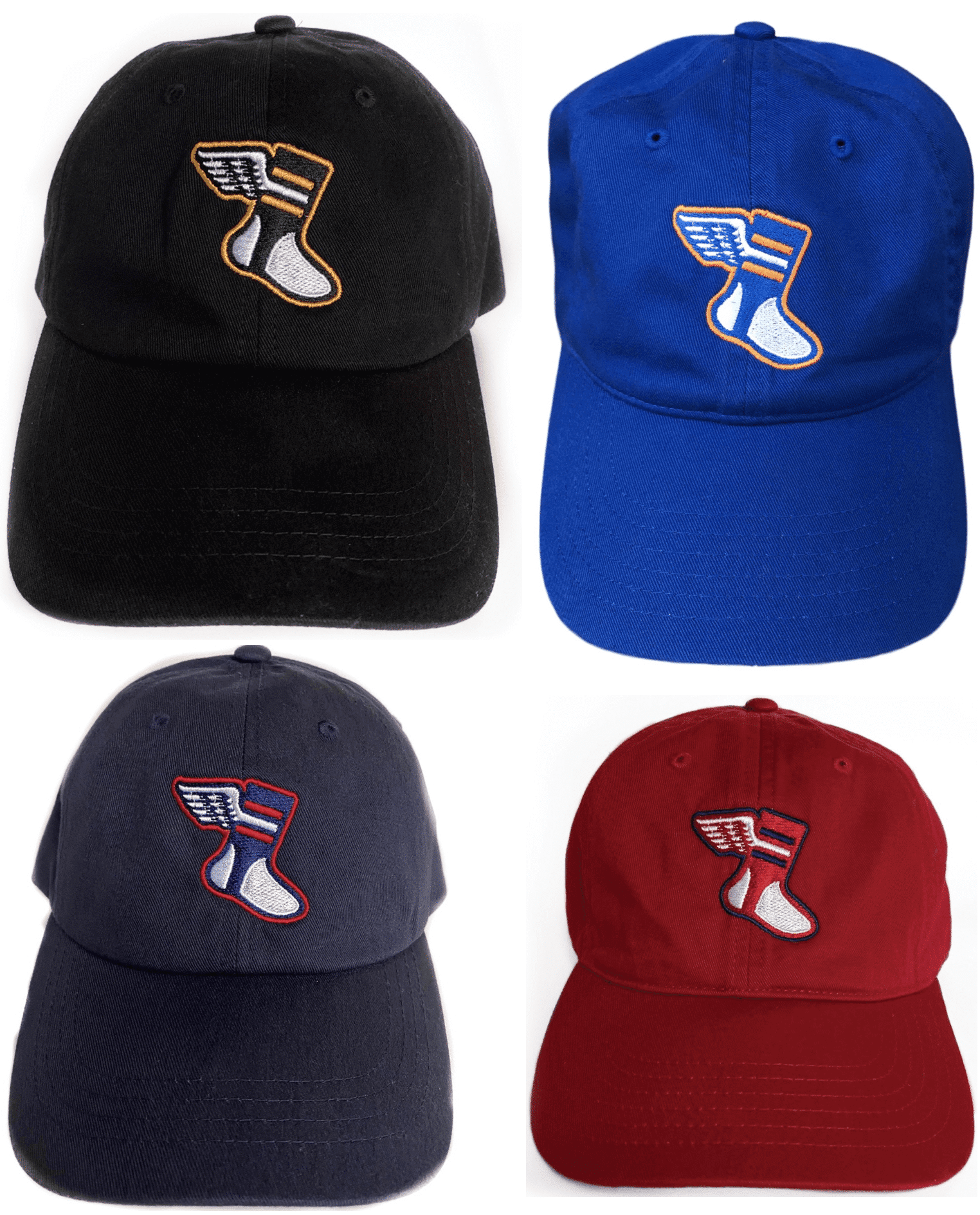
Nice, right? All four are 100%-cotton strapbacks. They’re available here and will remain available through mid-October, when we’ll launch a new batch of color combos.
Meanwhile, in case you missed it last week, we also have corresponding T-shirts in the same four color combos:
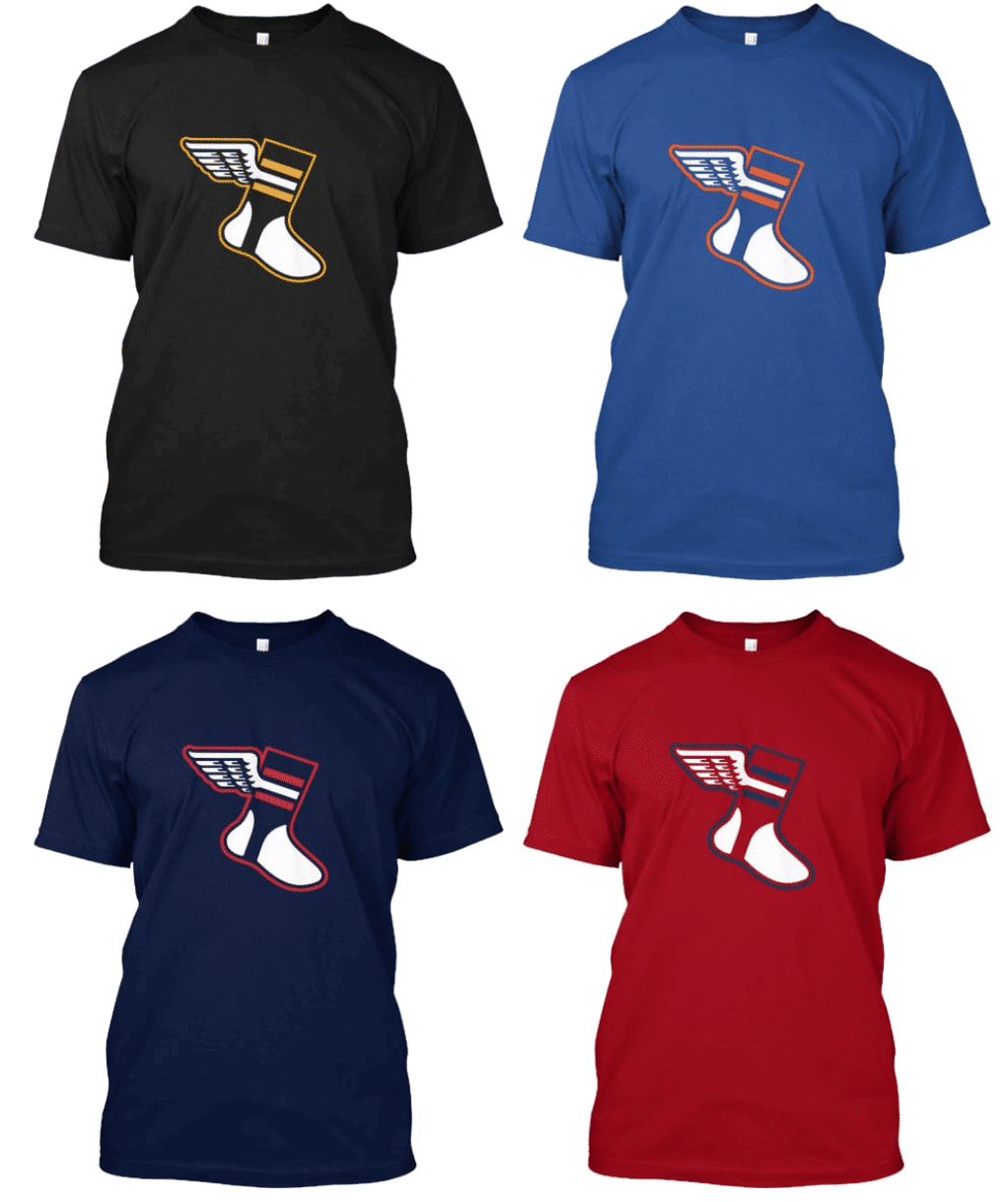
Here’s where you can get the Black/Yellow, Royal/Orange, Navy/Red, and Red/Navy versions. (The T-shirts will remain available in the Uni Watch Shop indefinitely, and we’ll launch new shirts next month to match up with the October cap designs.)
My thanks, as always, for your consideration of our products.

Seam ripper update: I am once again restocked on all five colors of Uni Watch Seam Rippers. They’re available here.
The Ticker
By Lloyd Alaban

Baseball News: The Black Lives Matter stencil on the mound was obscured by the score bug in last night’s Cleveland/Cubs game, at least for the Cubs’ TV feed. Cleveland’s feed had a smaller bug, which meant the stencil was unobscured (from Phillip Santos and @CLETribe). … Padres P Zach Davies was still wearing the team’s Roberto Clemente sleeve patch on his cap last night, despite the fact that Roberto Clemente Day was last week (from Jakob Fox). … The Orix Buffaloes of NPB (which merged with the old Orix Blue Wave) wore Ichiro Suzuki-era Blue Wave unis yesterday. The Blue Wave was Ichiro’s former team before he joined the Mariners (from Dustin L. Meador). … The West Coast Baseball League has established a new team in Edmonton (from Wade Heidt). … Also from Phillip: The Paper Stadiums Twitter account made a 1968 replica of Wrigley Field entirely out of paper.

Football News: A vintage 1960 Raiders sideline cape is on display at the Raiders Image store at Allegiant Stadium. Amazing script! (From @khaled74.) … New uniforms for Bemidji State (from @doubleasterisk).

Hockey News: Here’s a video showing the Stars’ equipment staff adding the Stanley Cup Final patch the team’s jerseys (from Bill Larkin).
.

Basketball News: Here’s a look at some of the uniforms the Spain national team has worn throughout the years (from Jeremy Brahm). … High school player Nathan Bittle’s dad announced his commitment to the Oregon Ducks with a graphic showing Nathan Photoshopped into an Oregon women’s jersey and men’s shorts (from Derek Buchheit). … Louisville’s arena, which had arguably the most embarrassing corporate name of any sports facility in the country, will be getting a new name, because the current naming rights holder has opted not to renew its deal (from Timmy Donahue).

Soccer News: Two items from our own Jamie Rathjen: England’s Women’s FA Cup now has its own advertiser and a new logo, and new shirts for Australia’s Adelaide United.

Grab Bag: The U.S. Space Force will soon let some members test out dress and physical training uniforms (from Timmy Donahue). … Also from Timmy: Apparently President Trump wanted First Lady Melania Trump to have a hand in designing some of the Space Force’s uniforms. … Tokyo’s Ohta City Gymnasium has created a completely socially distanced seat map for the entire arena. Here’s the layout for basketball (from Jeremy Brahm).

Looks like the Browns have new end zone designs. It’s been a very long time since they’ve had the AFC logo in the end zone.
link
Zach Davies pitches for the Padres not the Pirates.
Fixed.
He also had the patch on his sleeve, not his cap.
Ugh. Fixed.
Sports data viz featured on Uni Watch!? *Costanza voice* “Worlds are colliding!” (But in a good way). Fun read!
JohnMark, I know you’re a data guy as well. If you have any uni- or sports-related data visualizations you’d like to share, please feel free!
I had the same thought! As a data analyst/data viz person, I thought the questions were very astute. Particularly noticing how data analysis requires these different distinct skills, and that some people are more analytically inclined, and some are more visually inclined.
You also did a good job of demonstrating how much you can learn from a visualization that isn’t necessarily apparent just from looking at raw data. The visualizations are great in that they make the data fairly obvious. Some visualizations are so complex you don’t actually see any information in them. These are simple but rich.
When I read that the charts go back the past 21 seasons, I thought, “Oh cool! A look back all the way to the 70s.” Time has no meaning.
The visualizations are very cool!
Great video from Mr. Williams. Kudos on the video production and overall presentation as well!
The space force stuff has me shaking my head though.
Thanks for the kind words.
What a great project! I never noticed the shift in color for the Eagles until I saw their chart. I also would have guessed the Dolphins have worn Orange at least ten times, but it’s half that!
The new winged stirrup hats look great! Gonna have to figure out which one to get.
I’m not sure the Eagles will agree there was a shift in their color since 1999. There are four colors in their chart: yellow for one game throwing back to 1933, an attempt at kelly green for their one season opening home game throwback against Green Bay, their midnight green, and black. They’ve not changed the pixel color on their green jerseys since they switched from kelly to midnight earlier in the ‘90s, though Nike had some funkiness with the way it looked on the field for a bit.
Possible error in the 1. graph: “is the Dolphins, who played 63 colored-jersey games over the past 21 seasons, compared to the Cowboys’ 67:”
Those Thanksgiving games and last year brought Dallas’ total down.
I’m not sure how that’s an error. Yes, the Cowboys had an unusually large number of blue-jersey games last season, but they still count! Am I missing something..?
Nope, I read it wrong. Initially thought the counts were for white jersey games, and the counts were reversed.
I am having a rough morning for reading comprehension. Apologies.
I’ve adjusted the wording. SHould be clearer now.
For what it’s worth, when I read that passage, I processed it wrong in my head. I was thinking that the numbers being given were the number of WHITE jersey games, since the passage led with a question of who had played the most white jersey games. So I was trying to figure out “how is 63 more than 67?” But after reading this comment, and re-reading the passage, I realize that this is a matter of comparing the inverse (less dark jersey games = more white jersey games.)
Technically there is nothing incorrect about the statement, but somehow I feel like a little bit of a mental bait & switch was done, which in turn caused me to process the numbers incorrectly.
Gotcha. I’ve adjusted the wording to make it more intuitive.
Some of these charts, especially the Steelers and Raiders, remind me of that white dot optical illusion.
link
Those road grays (plural) in the Cooperstown exhibition. I thought the Rangers wore powder blue in the sansabelt days, but you learn something new everyday! I cross-referenced with the Okkonen gallery, and it looks like the powder blue really came in 1976. Funny how those grays look kind of blue to me! Some shades of gray really truly have a blue tint, or else my eyes are tricking me into seeing what I think I should be seeing. COOL!
For reasons I can’t explain, gray seems to illusively take on a hint of whatever color it’s adjacent to. When I look at that pic, I very clearly see a blue tint in the Rangers’ gray and a yellow tint in the Pirates’ gray.
Cool charts! I especially loved the visualization of things I’ve only sort of noticed over the years, like warm weather teams like Tampa and Carolina wearing mostly white at the beginning of the season before switching to their colored jerseys
Clearly, the next step for big fans of these teams is to re-tile their bathrooms using the appropriate pattern from Anthony’s graphs.
Ha — that is BRILLIANT!
Tile-y
Do not try this at home, unless you enjoy the single life.
File this under – never buy clothes for your significant other or friends of your significant other as hilarty and heartbreak ensue.
Best off giving gift cards or good ol’ cash.
I wonder how accurate the colors of GUD are for the pixel scraping that was done for this: for example, it surprised me that the Colts’ royal is markedly darker in the Nike era compared to the Reebok days according to this, and the Chargers’ shade of powder used from 07-19 was identical to the throwbacks they wore a few times prior to 07. I had always figured the Colts’ shade would’ve been identical, whereas there would’ve been some differences in the Chargers’ powder.
To be clear, this is not a knock on Anthony’s methods, because if I had the skills to datascrape like this with an R script, I would’ve done it the exact same way haha. And the results certainly speak for themselves, particularly with teams where the jersey color clearly HAS changed, like the Dolphins’ shade of orange or teal, which is just oh-so-satisfying to see presented this way. Just was an interesting observation with those couple teams that made me pause about the potential accuracy of the rest of GUD’s data set.
Space Force needs uni design assistance!
Surely someone in the UniVerse can chip in here. Help out so the First Lady doesn’t have to create (steal, I mean intellectually appropriated) from someone else.
Dress Blues: face it. It’s gonna be blue of some sort or shade.
Jackets: A whole new universe of options here.
Boots: Wow.
Love the jersey visualizations. However, the Steelers chart confounds me. What breaks the tie between yellow and black in the Steelers bumblebee throwbacks? Couldn’t they equally be considered yellow? Just something I can’t get out of my brain.
Excellent point!
Side panels for the win.
Can’t the boxes for those just show the pattern from the jersey? That’s what people who uni-track soccer leagues sometimes do to show hoops or stripes. The boxes don’t have to be solid-colored.
Nor does the Steelers 1994 nfl 75th anniversary throwback really scan “black”
The charts only go back to 1999.
As a data guy myself i found these charts fascinating. What immediately jumped out at me was Carolina and Tampa Bay wearing almost exclusively white in the front half of each season, presumably to to force opponents to wear dark colors in the late summer heat. I thought Miami did the same, but apparently not to the same extent
Great insight. Again, this shows the value of data visualizations… without seeing it, you might not even *think* of asking that question, but when you see the viz, there it is.
I’m getting old….just realized 1994 was before the chart!
Why would Space Force unis need to be camouflage? I mean… space… right?
Re the UW hats, someone asked before: what company makes the hats? He was asking because the manufacturer of the “gold circle” hat made a lid a little too small for his noggin. I may be missing it, but I don’t see the manufacturer’s info on the site.
Stand by — checking with Bryan.
I should add, though, that I too don’t love the fit of the “gold circle” cap — the crown isn’t as deep as I’d like. But my royal/orange Color Remix cap, which is the same brand (Econscious), fits me perfectly. Maybe a different stock item?
Hmmm. That is interesting. I almost said in my prior comment that the pics of the Remix caps “look” like the crown is a little deeper than the gold circle cap, but of course it’s hard to say from a picture. I had the same reaction: the green cap is a tad shallower than I like, but it’s OK.
Just got the word: The royal/orange and red/navy caps are Econscious, and the black/yellow and navy/red caps are Yupoong.
Bill Virdon is wearing a 21 patch to honor Roberto Clemente
Re: Cooperstown’s ballpark
I wish that the Baseball Hall of Fame and or the rich owners of MLB would make the effort to give Cooperstown a better ballfield. The current park is shoehorned into the neighborhood right next to the HOF building, and nobody plays there anymore (at least, not much).
I think the property is better suited for an expansion of the museum. New Doubleday Field should be on that tract of land where they hold the induction ceremony.
(Hell, my dream is to own and operate two minor league teams in the NY-Penn League, one in the real home of baseball (Hoboken) and the mythical home (Cooperstown). I’d totally partner with the Clark Sports Center for the Cooperstown site, and with Stevens Institute of Technology for the Hoboken site.)
Re: Raiders’ jacket
Weren’t they still called the Senors in 1960? Or is this one of those two-named teams like the WFL team the Memphis Southmen (or Memphis Grizzlies)?
The Raiders didn’t play a down as the Senors…a name they used for about a week. They were renamed well before the start of the 1960 season.
I don’t think the Senors name lasted more than a few days.
link
Here’s what I love about visualizations like this… take the social media followed/following set of charts. The Tampa Bay Bucs are following all but one team: The Pats.
I’m sure it’s meaningless… but you can make up a story in your head about that.
Any chance anyone out there is a crossword puzzle writer? The NFL uniform data charts look like an unsolved crossword puzzle to my eye. I think an extraordinary challenge would be for someone to write a crossword using her or his favorite team’s chart as the skeleton.
Correct me if I’m wrong, but I think the Eagles generally wear white at home earlier in the season as a way to beat the heat still lingering in September and sometimes October.
Their chart definitely shows this trend of white early in the season, green later…
Noticed that as well.
One interesting point I noticed in the color chart, the Giants appear to have way more games with their primary color (as opposed to white), which makes sense since they would be playing the Cowboys and Washington, so they’d wear blue on the road much more than other teams.
Yes, that was mentioned in the interview.
My quick count showed 203 of 336 times, the NYG wore Big Blue.
Speaking of tracking jersey use over seasons, I’m a Seattle Mariners fan (pause for jokes) and I’ve noticed that they’re wearing their navy road alternate a LOT more in 2020 than previous seasons, including going so far as wearing it at home as well. I can’t figure out the reasoning for it, as it’s arguably the “most unique”/oddest-looking jersey the M’s wear, it doesn’t seem to follow any win streaks, and there’s no articles about the unusual occurrence. Can anyone help me out?
No idea why they’re doing it. But you can track its use in this season and previous seasons here:
link
This was one of my favorite features/articles. The interview was great too. Nice job all around!