Good morning! Greetings from Uni Watch HQ, where all three inhabitants continue to be safe and well, and where I’m happy to bring you the first Monday Morning Uni Watch of the 2020 NFL season.
And as MMUWs go, this one is a doozy, because yesterday was an unusually uni-eventful day around the league. That’s in large part because there were no preseason games this year, so a lot of things that we would normally have seen in August ended up staying under wraps until the start of the regular season. Also, some teams inexplicably waited until yesterday to announce and unveil patches, decals, and so on, so things that would normally have been included in my NFL Season Preview column instead ended up being announced just hours before yesterday’s kickoff.
Moreover, the lack of preseason games meant yesterday was our first chance to see all of this season’s new uniform designs on the field. As you can see above, the Chargers looked particularly sharp (although they had the advantage of standing out against the Bengals’ laughably bad mono-black costumes). I’ve been saying for decades that they should bring back the yellow pants, and the results were every bit as excellent as I had hoped for. You can see more photos from that game here and here.
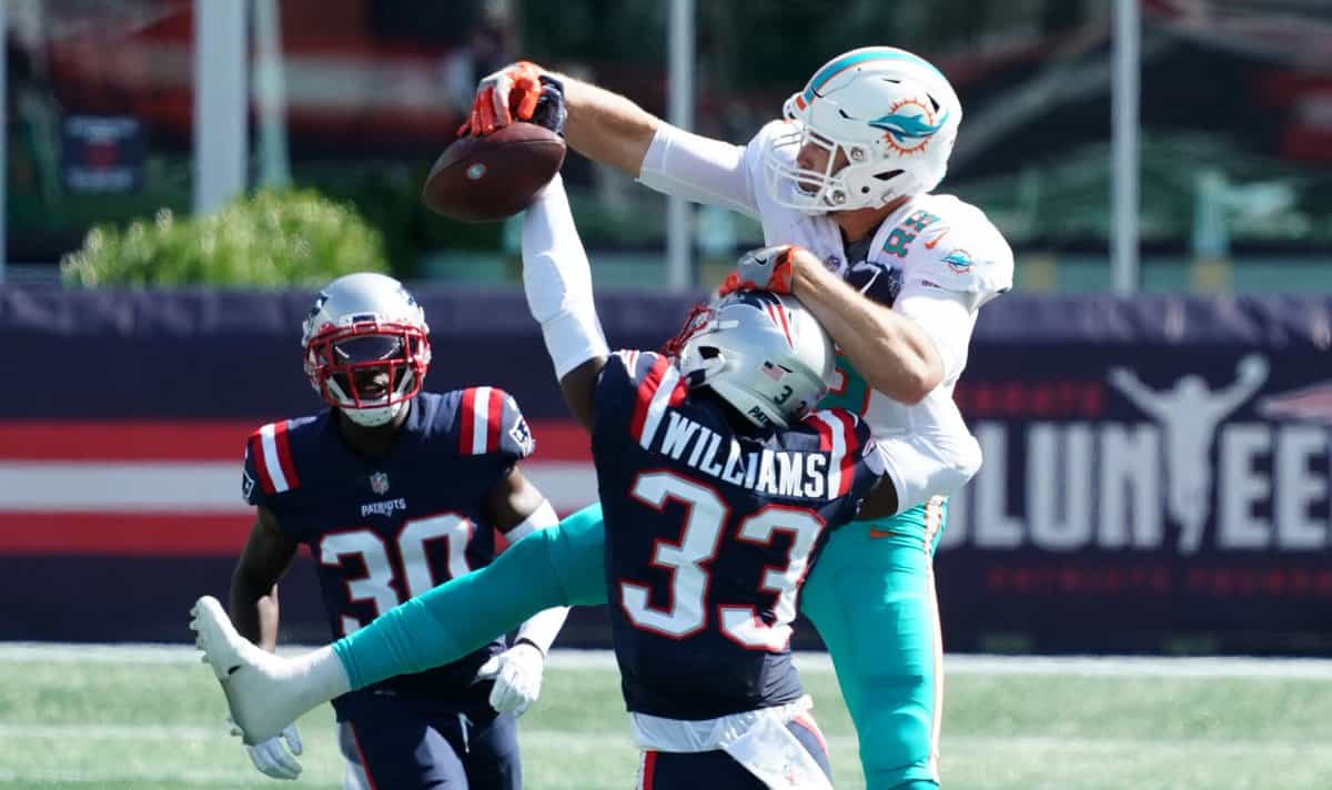
Not every team debuting new uniforms was so lucky. Up in Foxboro, there was some weird shit going on with the Patriots’ new unis. As you know, their new navy jerseys are similar to last year’s Color Rash jerseys, but with a new number font and new NOB font. On the field yesterday, however, some players appeared to be wearing the old Rash jerseys instead of the new primary jerseys. Here, for example, is a shot showing cornerback Jason McCourty (No. 30) in the new jersey and teammate Joejuan Williams (No. 33) in the old Rash jersey (for this and most other photos in this section, you can click to enlarge):
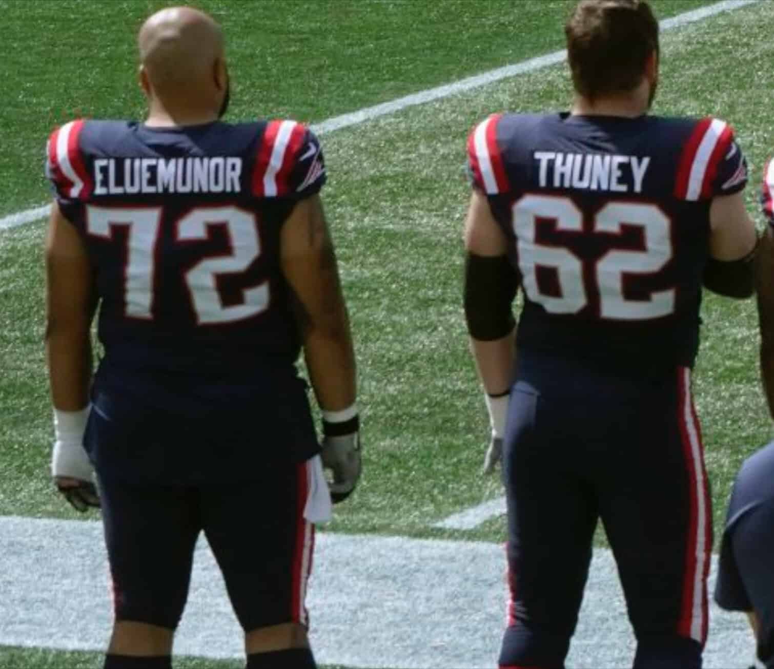
Even stranger, offensive lineman Jermaine Eluemunor had the old Rash number font — but paired with the new NOB font! Dig:
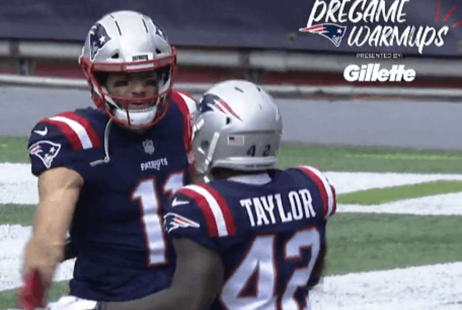
Similarly, running back J.J. Taylor had the correct number font but the old, incorrect NOB font! Check this out:
What a mess! You can see more photos from that game here.
And then there were the Rams, who debuted their bone dishwater uniforms, which were every bit as awful as the unveiling led us to expect:
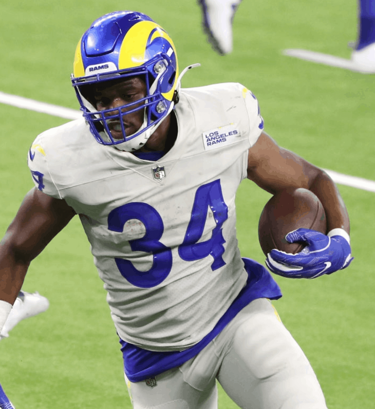
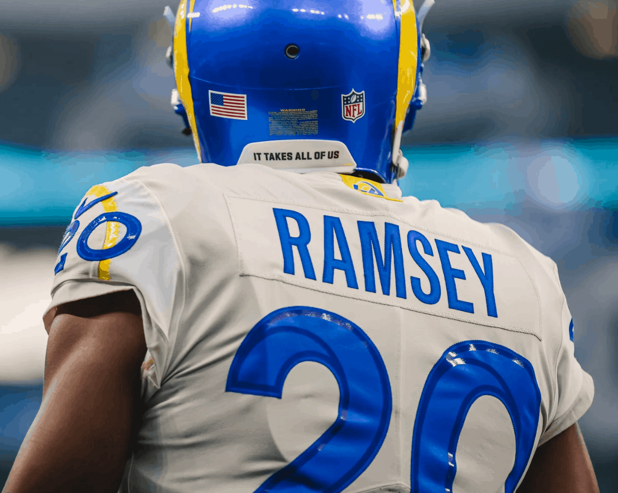
What a mistake. You can see additional pics from that game here, and here are additional photo galleries showing our first on-field looks at the new Browns, Bucs, Colts, Falcons, and Washington uniforms.
In other news from around the league yesterday:
• In my NFL Season Preview column, I reported that the Packers would have a memorial helmet decal for Willie Davis this year but that they wouldn’t announce or unveil it until “shortly before the season opener.” They ended up waiting until yesterday morning, but here it is:
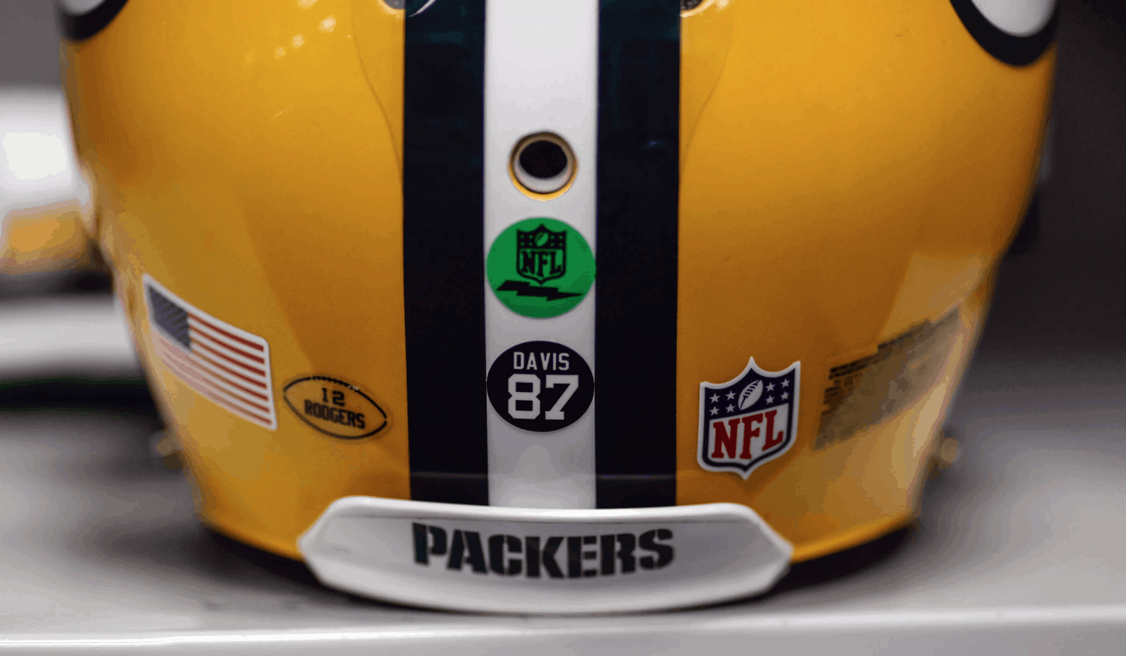
Note that the decal design matches the design of the Bart Starr decal they used last year.
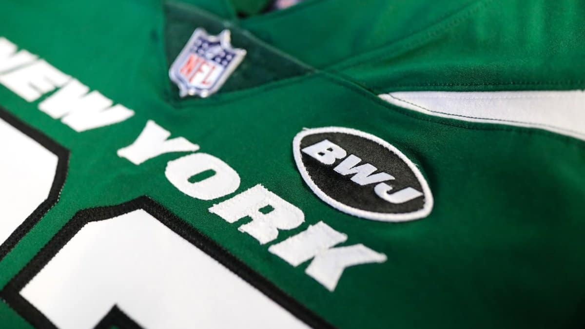
• In another late-breaking uni memorial, but one that I don’t think anyone had any inkling of beforehand, the Jets announced yesterday morning that they’ve added a season-long memorial patch for Betty Wold Johnson, the mother of team owner Woody Johnson and team CEO Christopher Johnson:
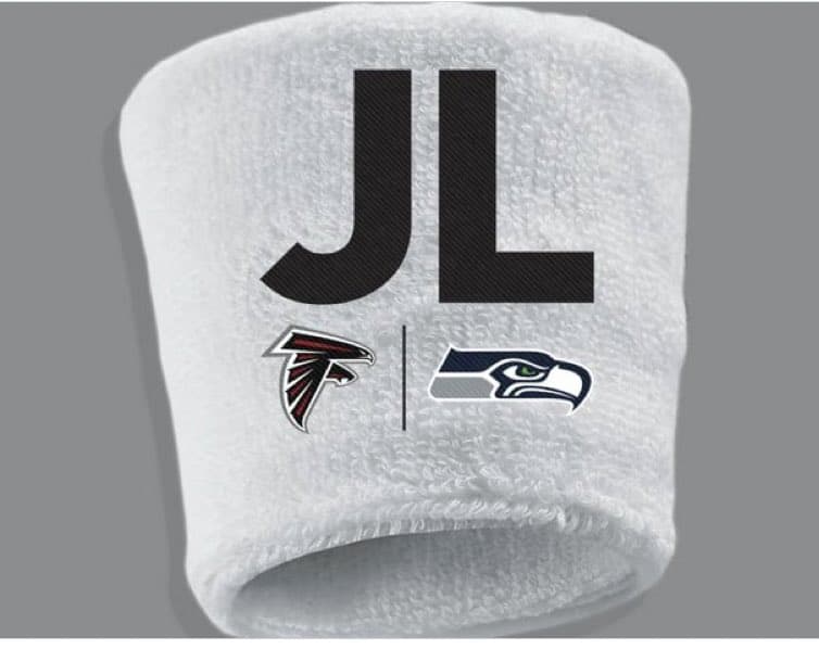
• In yet another late-breaking memorial, the Falcons saluted their hometown Congressman, the late John Lewis, by naming him as an honorary captain and also wearing wristbands with his initials. Their opponents, the Seahawks, also wore the wristbands, which featured the logos of both teams — a nice cross-team gesture for an American hero:
• And in still another new memorial (although this one was announced on Friday, not on Sunday), Washington has added a season-long “49” patch for Bobby Mitchell, whose number is also being retired:
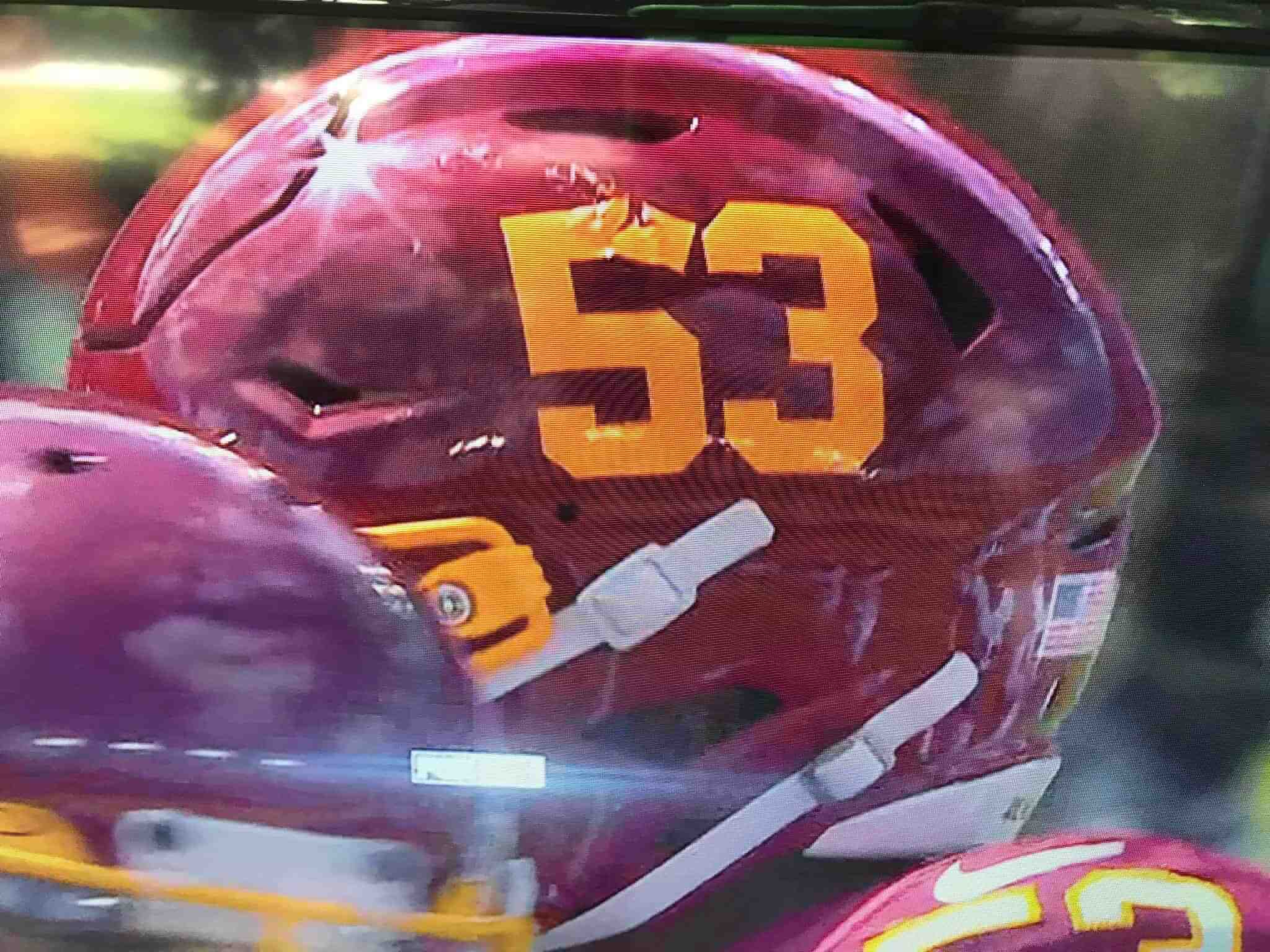
• Speaking of Washington, linebacker Jon Bostic was the first to suffer a malfunction with the team’s new helmet numerals:
• In a terrible season-opening move, the Lions opted to go mono-blue:
• Bengals running back Joe Mixon wore a rear-helmet decal in support of his agent’s cancer-stricken son:
#Bengals RB Joe Mixon is wearing a ribbon on his helmet today in honor of Gavin Schaffer, the son of his his agent Peter. Gavin is battling Hodgkin’s lymphoma and doing well enough to continue playing lacrosse. Hence the sticks in the logo. pic.twitter.com/oR5GOBSalN
— Mike Garafolo (@MikeGarafolo) September 13, 2020
That’s a nice gesture, and I’m plenty familiar with the ravages of Hodgkin’s lymphoma (my brother died of it), but a uniform memorial for your agent’s son? That seems like a bit much.
• New Bucs quarterback Tom Brady and new Colts quarterback Philip Rivers both wore captaincy patches with four gold stars and a gold “C” (that’s the format for players who’ve been captains for their teams for at least five seasons), even though this is their first year with their respective teams (and also, somewhat incredibly, the first time in Brady’s career that he’s ever worn a captaincy patch!):
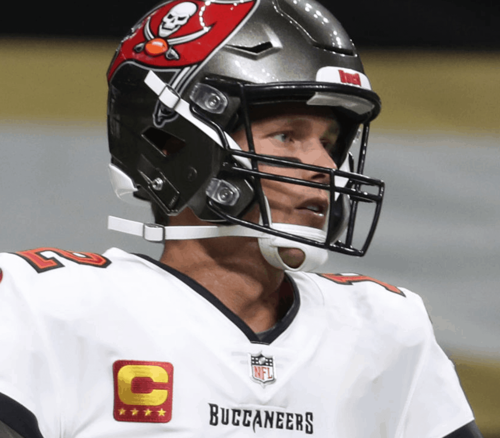
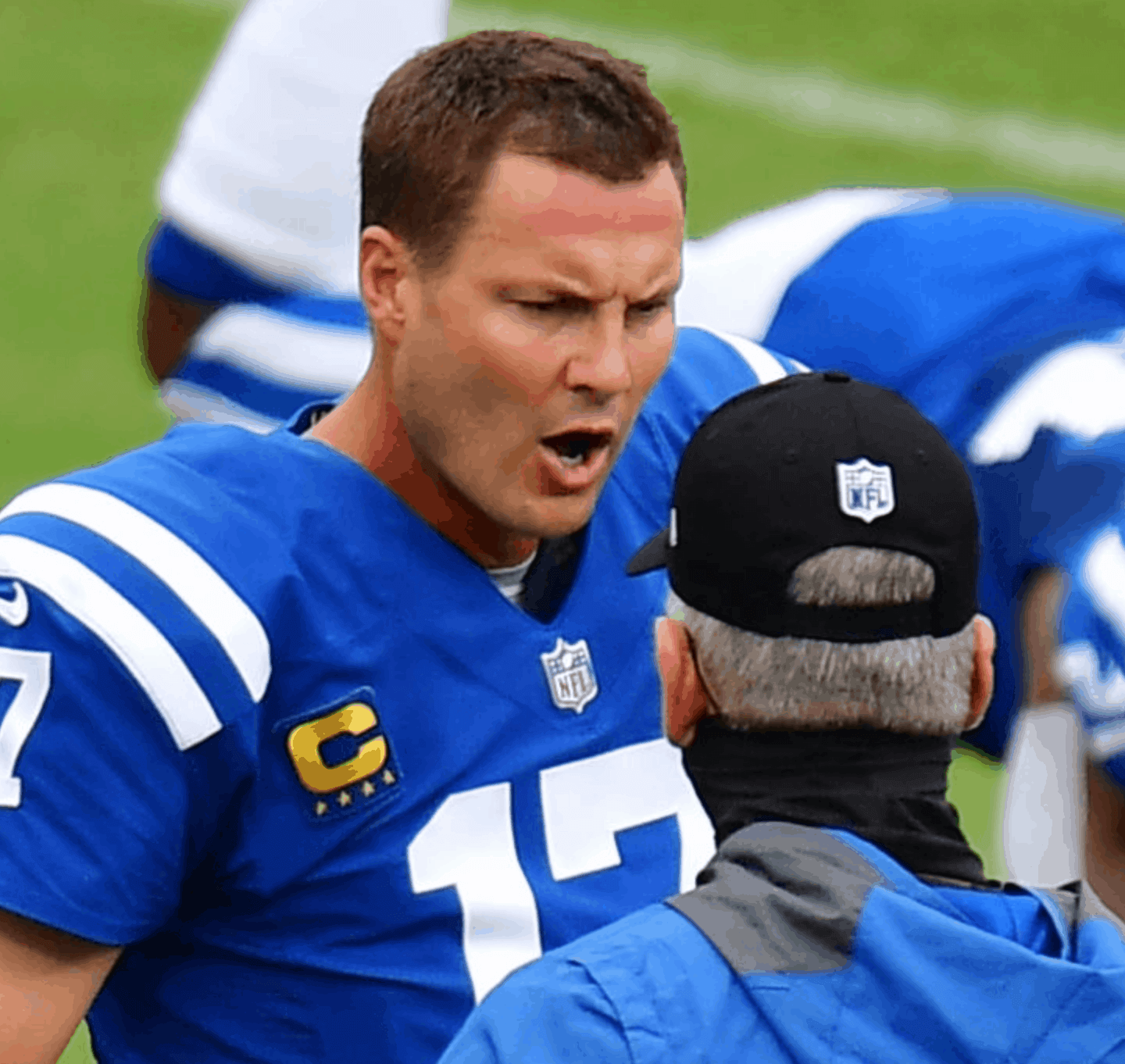
This isn’t the first time we’ve seen teams playing fast and loose with the captaincy stars, of course, but it’s not supposed to work that way. The NFL should really get rid of the stars (or just get rid of the patches altogether).
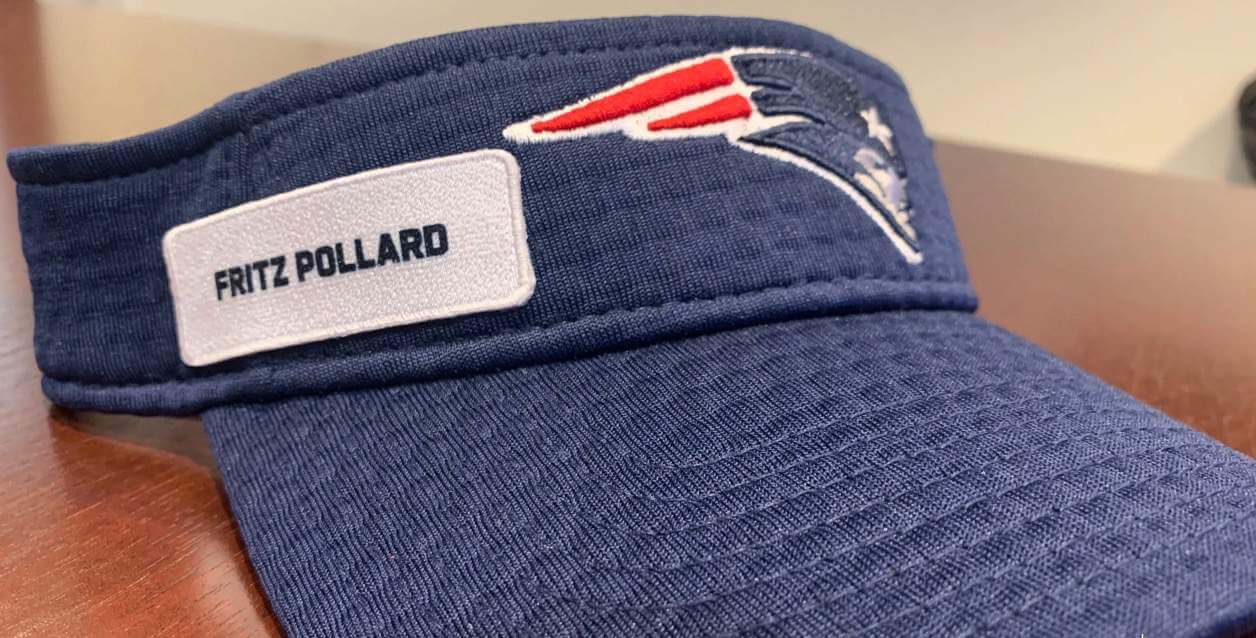
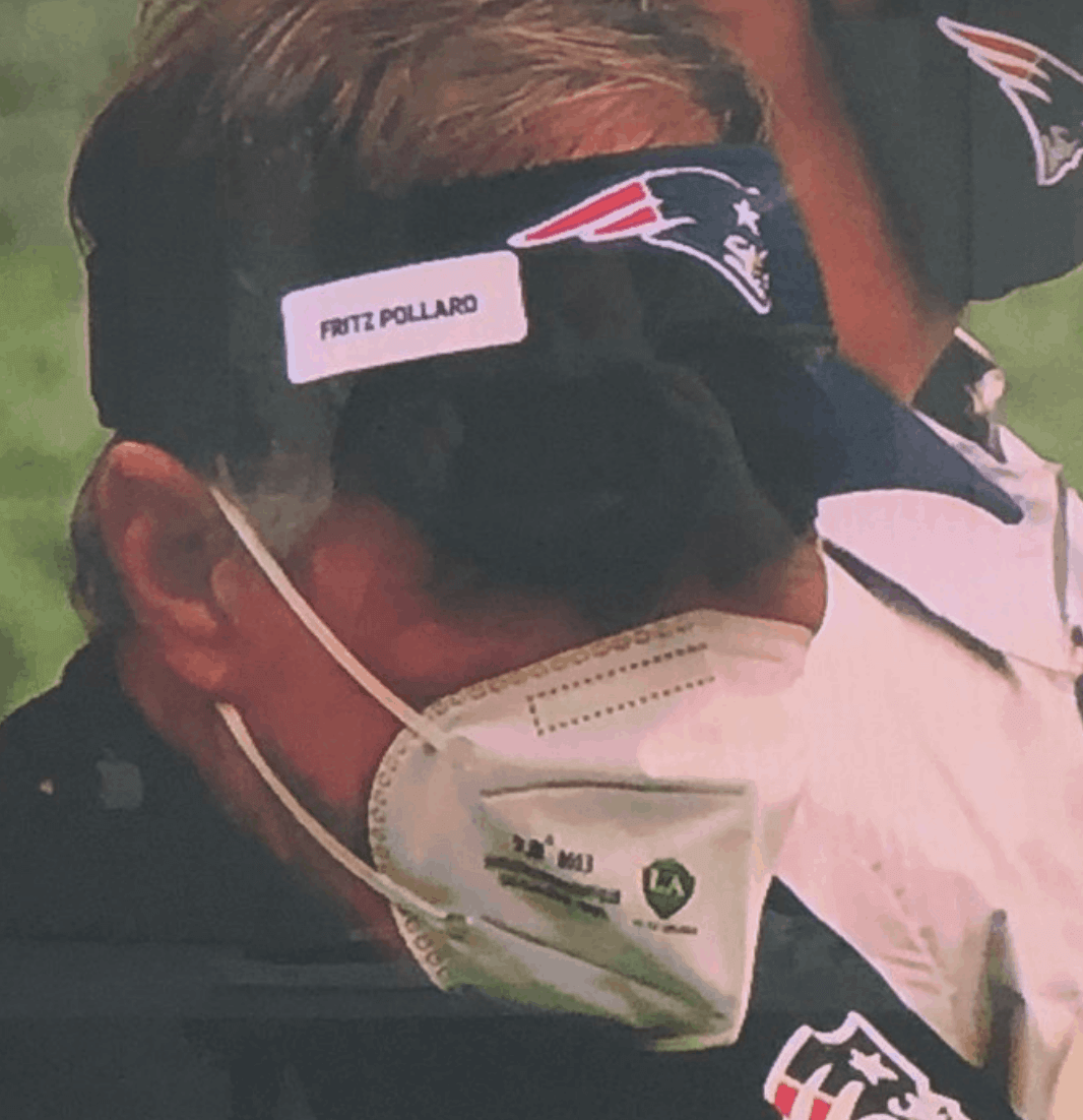
• Circling back to the Patriots, coach Bill Belichick wore the name “Fritz Pollard” on his visor. Pollard was the NFL’s first Black head coach (additional info here):
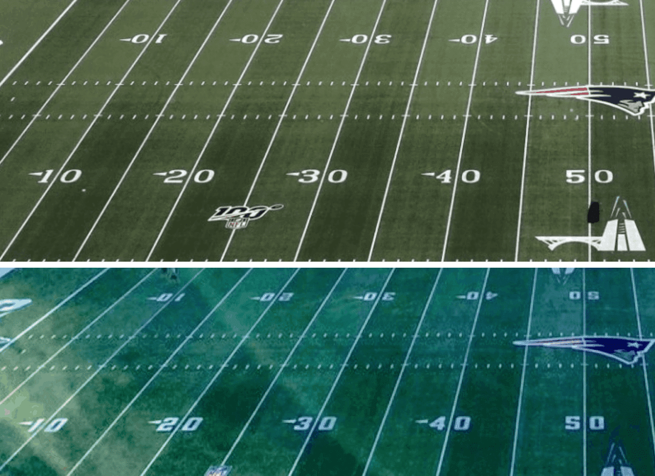
• One more Pats item: They’ve changed the number font for their yard lines. Here’s a comparison — old version on top, new on bottom:
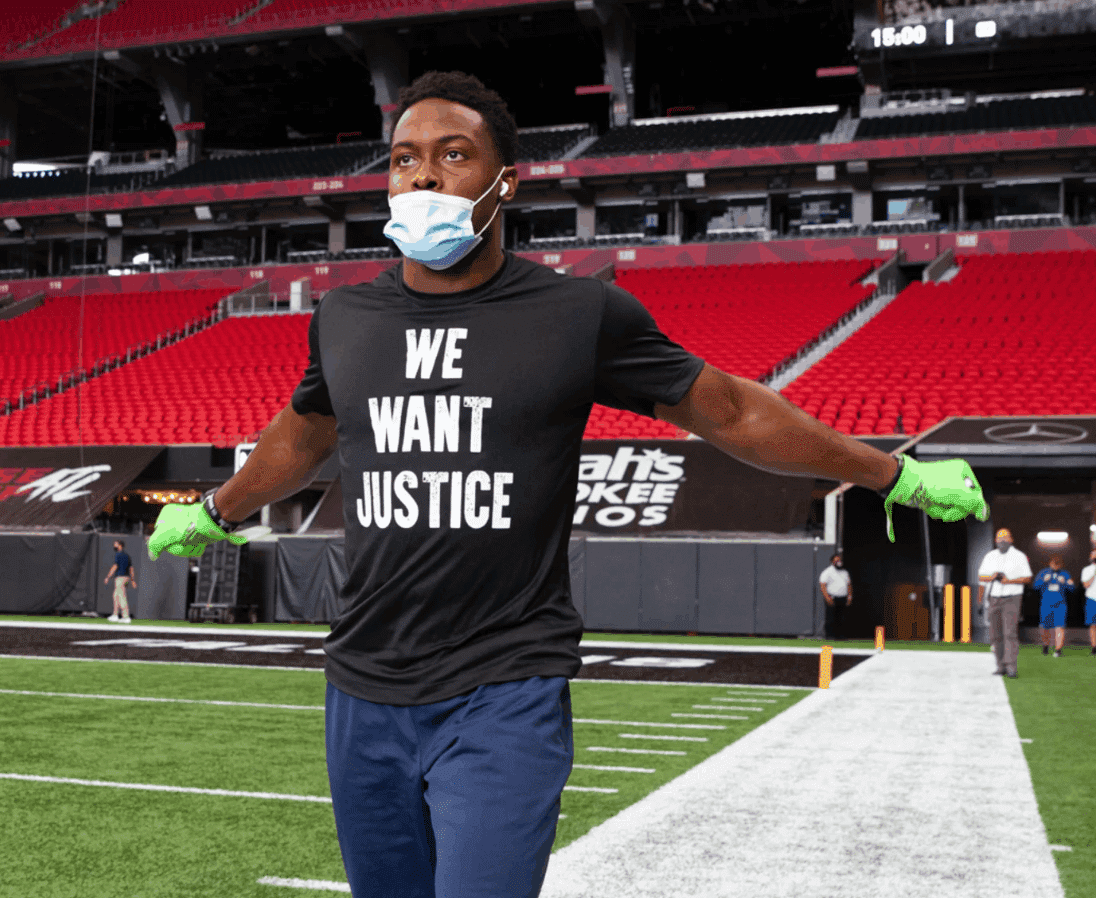
• Players wore a variety of social justice messaging on their pregame gear:
Injustice against one of us is injustice against all of us. pic.twitter.com/KKtXnpRGrm
— New England Patriots (@Patriots) September 13, 2020
— New York Jets (@nyjets) September 13, 2020
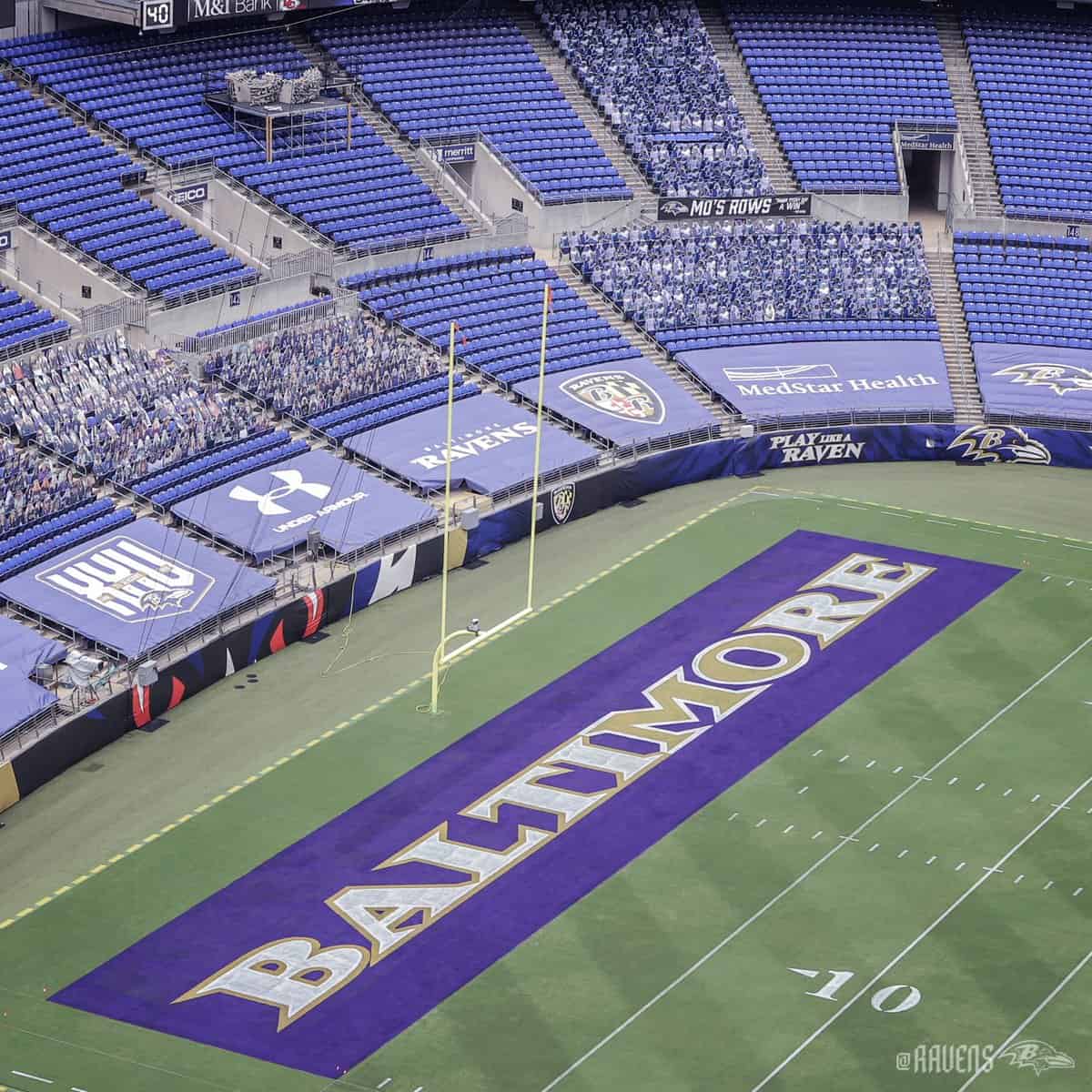
• The Ravens saluted Mo Gaba, a 14-year-old Ravens superfan who died of cancer in July, by adjusting their end zone lettering to highlight the letters “MO,” plus they filled an entire seating section with cutouts of him (additional info here):
Mo's Rows 💜 pic.twitter.com/akpRpo6Gft
— Baltimore Ravens (@Ravens) September 11, 2020
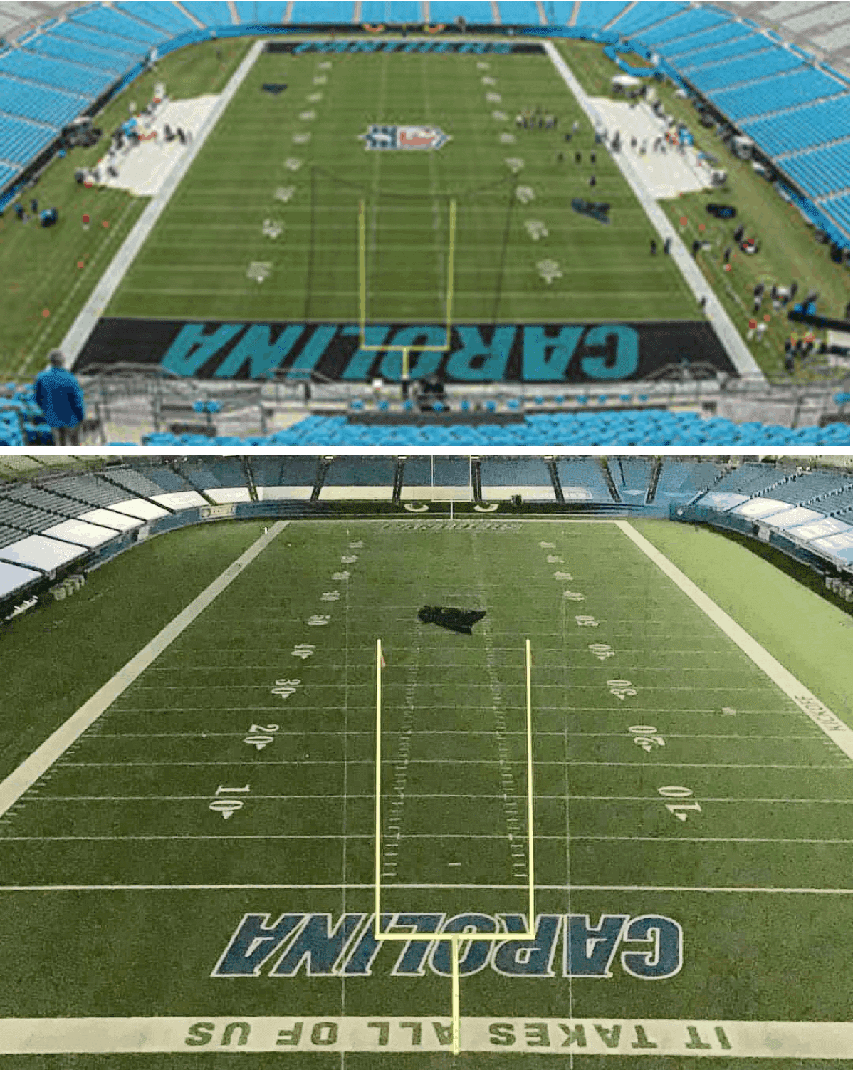
• The Panthers have changed their end zone design. Here’s a comparison — old version on top, new on bottom:
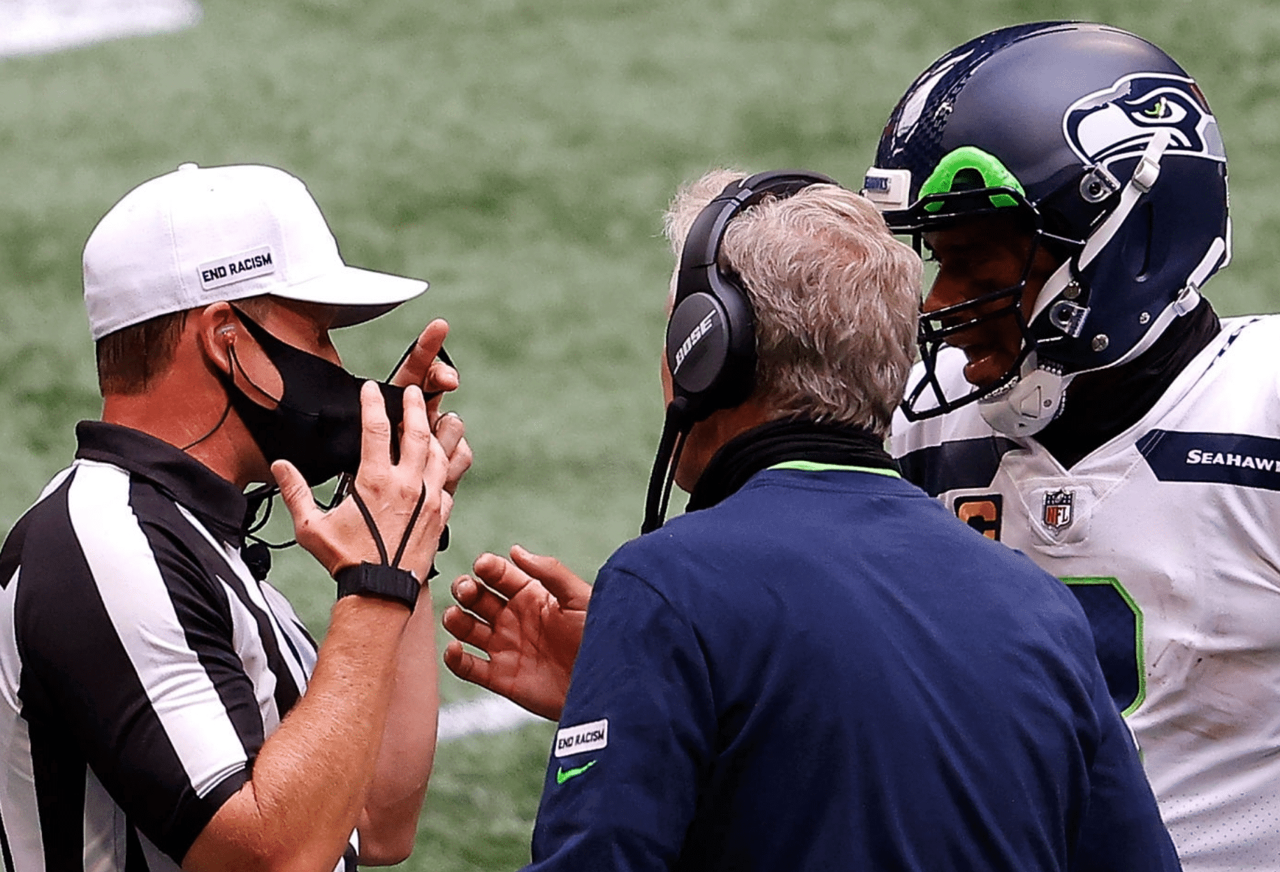
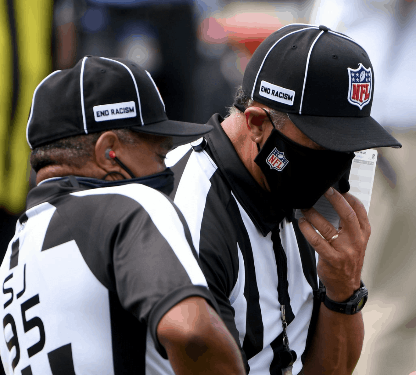
• The officials wore masks, and many of them wore “End Racism” patches on their caps:
• Here’s a good rundown of how various teams handled the national anthem.
• There were apparently some issues with the phony crowd noise.
• Four teams wore white at home: the Bills, Jaguars, Panthers, and Ravens (plus we could sorta-kinda include the Rams).
(My thanks to all contributors, including Jeff Ash, Ryan Bugaj, Gabe Cornwall, our own Anthony Emerson, Marcus Hall, Lance Harris, Will Hughes, Matt Monitto, @skinsunis, Mike Sullivan, and Dan Zappulla.)
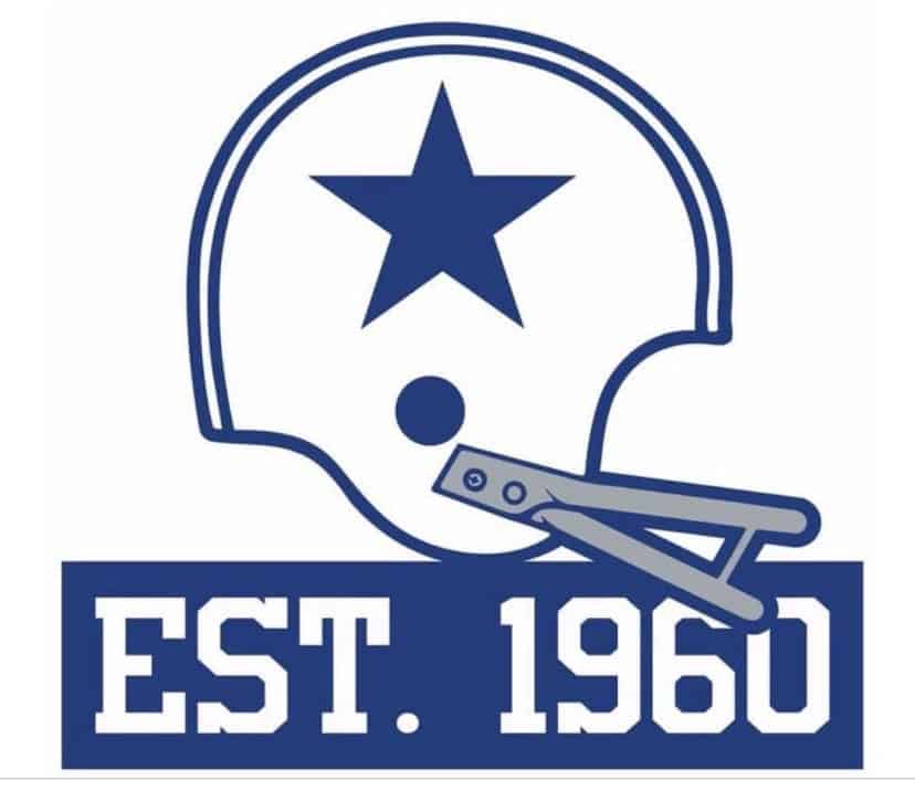
Uni Watch, Est. 1999: I’ve mentioned several times how interesting it is that the Cowboys chose to put “Est. 1960,” rather than “1960-2020,” on their 60th-anniversary logo (which they’re also wearing as a jersey patch). What I didn’t realize until now was that this is part of a larger trend that extends throughout the world of trademarks and logo design.
According to a great new article by James Bowie, “Est.” and its variants are now appearing in trademarks 17 times more frequently than in 1980. Here’s a chart that shows the trend (click to enlarge):
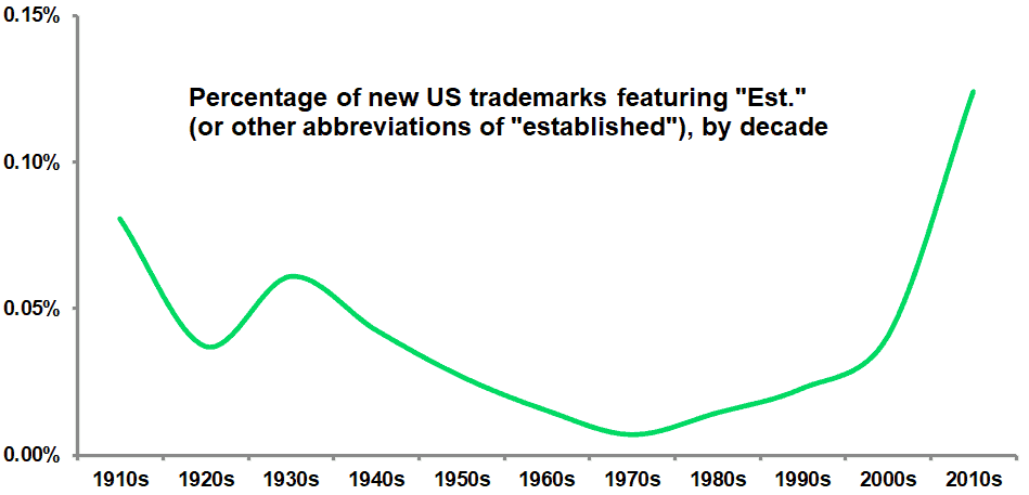
As you can see, the use of “Est.” bottomed out in the 1970s, presumably because being associated with “the establishment” in any manner was considered out of step with the countercultural times. As for “Est.”‘s current resurgence, Bowie provides some good analysis — recommended reading.
Unfortunately, the article doesn’t mention the Cowboys’ anniversary logo. It’ll be interesting to see if any other teams follow Dallas’s lead with their own upcoming anniversary patches.
Update: Reader/commenter LI Matt notes that this trend has also hit the Washington Football Team’s new end zones, which include “Est. 1932”!
(Thanks to my buddy Rob Walker for this one.)
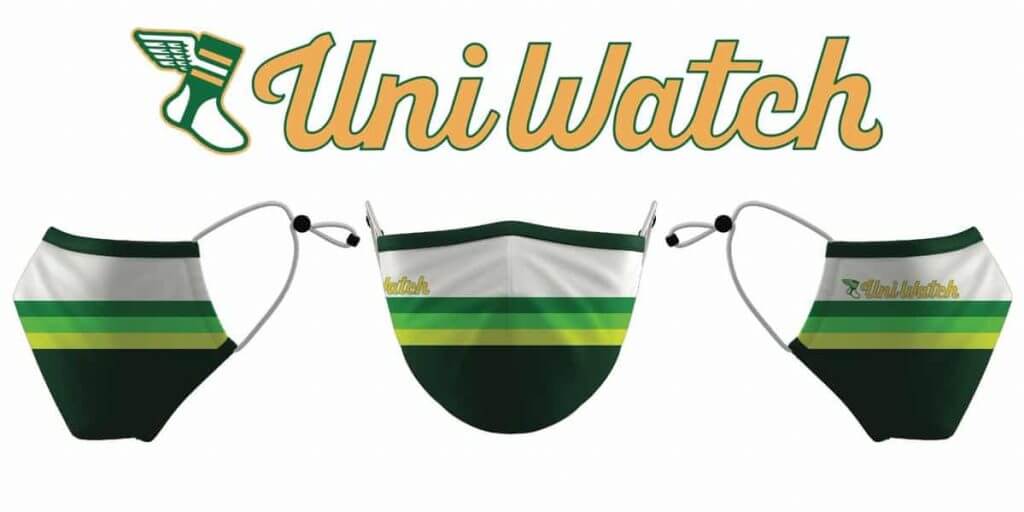
ITEM! Another mask raffle: Although our Uni Watch Tequila Sunrise Masks are sold out, reader Jeff Link has two extras — both in the M/L size — that he’s generously letting me raffle off, so that’s what we’re going to do today.
This will be a one-day raffle. USA addresses only, sorry. To enter, send an email with your mailing address to the raffle address by 8pm Eastern tonight. I’ll announce the two winners tomorrow.
Meanwhile, the winner of last Friday’s raffle is Dan Matkowsky, who’s won himself a Uni Watch membership card. Congrats to him, and thanks to reader Chris Meisse for sponsoring that one.
Click to enlarge
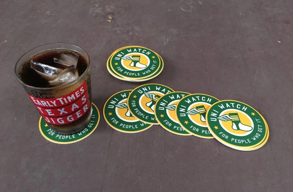
Coasters reminder: In case you missed it on Friday, I once again have a few sets of Uni Watch Coasters available. As of this morning, just six sets left now down to four sets — these won’t last long, so move fast if you want a set. Full details here.
The Ticker
By Jamie Rathjen

Baseball News: Interesting stat from Twitter-er @attorney_troy: The Cubs’ no-hitter yesterday was their fourth in a row for which they wore their blue alternate jerseys.

Football News: Washington owner Dan Snyder said he could possibly keep the “Washington Football Team” name (thanks, Brinke). … Some websites and apps have not yet updated Washington’s logo, including theScore and Twitter (from Scott Gilliland and @KKane_27). … Meanwhile, Fox ads still use pictures of Tom Brady in the Bucs’ old uniform (from Matt Brooks). … A commercial that aired yesterday features a truck with 49ers logos and flags, including the infamous one-day logo (from Mike Fudge). … Clemson RB Travis Etienne is apparently on his 12th helmet model since starting college (from Austin Pendergist).

Hockey News: A longtime AHL linesman has commissioned a very cool-looking Hershey Bears pinball machine (from William Yurasko).

Soccer News: Germany’s VfL Wolfsburg wore a 75th-anniversary shirt and shorts on Saturday — the actual anniversary of the club’s founding — but not matching socks, resulting in two different shades of green. … The Netherlands’ Vitesse replaced their ad with a message thanking healthcare workers. … New kits for English League Two’s Salford City and the Spanish third-tier team FC Andorra. … The USL Championship’s Loudoun United added a patch for the rest of this season thanking healthcare workers (from my brother Nate Rathjen). … NWSL teams playing this weekend wore a variety of messages on their warm-up shirts, either the names of Black victims of police violence or associated phrases of support. … English women’s team Durham moved to their own stadium, Maiden Castle, named after a nearby fort. … Liverpool’s new second kit made its competitive debut in the Women’s Championship with plain cyan shorts, which don’t match the pattern on the shorts and socks.

Grab Bag: The first two items are from the Australian Football League: Melbourne wore a one-off guernsey including the names of fans who donated to a club fundraising campaign to offset the financial impact of the pandemic. The design originates from one worn in preseason, where AFL teams sometimes experiment with their looks, in the late ’90s. … Sydney also wore throwbacks from their time as South Melbourne. … New shirts for the Polish men’s volleyball team MKS Będzin (from Jeremy Brahm). … The Pringles cannister is apparently one of the hardest individual items to recycle, so it’s being redesigned (thanks, Brinke). … Some New Mexico teenagers designed the badge for a NASA mission that’s taking New Mexico chile peppers to space (from Timmy Donahue).

Whoever gave the stamp of approval within the Rams organization for those God-awful uniforms is gonna have an extraordinarily bad Monday.
I’m with you, HATE HATE HATE the new Ram’s unis. Those rags they wore last night look like practice jerseys ans pants that haven’t been laundered in 2 weeks.
The bright white “Hello, my name is:” patch makes the dishwater look worse. New helmet looked great but maybe that is because it is the best of a bad bunch.
Bring on the yellow pants for this combo and tuck in the blue undershirts then uniform could be salvageable until the inevitable redesign.
I like the bone color, though I don’t like the name “bone.” The rest of the uniform is a complete mess… but for some reason that off-white shade resonates with me.
I agree with you, I love the colour. The name “bone” though, ouch!
The bone color is not really the problem with the rams unis, if you ask me. It could look nice, like baseball teams that use “cream” instead of white, or the 76ers off white jerseys. But when that color is paired with so many new-dangled ideas, it just looks out of place. The bright yellow and blue look nice with it, but the “name tag” The glossy rubber accents on the numbers, the color fades. I was also having trouble figuring out if the helmet horns were yellow, white, or a fade. Not sure if the yellow is so bright that when the light reflects on the helmet it makes it look white. I think the set could be quite nice and unique with some serious editing. For now they are just another “every idea gets approved” Nike design.
The Rams uniforms were disgusting. Nothing about them worked. At all. It’s gonna be a long 5 seasons.
I agree. I’m definitely not buying any of that. I’ll stick with my old-school gear, thanks.
The bone look is brutal, but the helmets do look good.
The Rams numbers have that shiny material that makes them look like they are made of the same stuff as cheap drug store Halloween costumes. ugh.
Washington looks like they stole a college teams helmets and are wearing it. I hate the gold numbers and the removal of the strip, looks mismatched with the rest of the uniform. Could’ve just matched the jersey numbers (or put a W in white w/gold outline). Also they remind of the old video games that didn’t have the NFL license. Hope Dan Snyder isn’t actually serious with that quote.
Personally, I think Snyder would be wise to keep the identity as a…well, non-identity.
Being from DC, the new name has been a huge topic of conversation, and I told many friends from the beginning that the team should just not bother even picking a name. No matter what they pick, someone will be upset, either because they like another name better or because they’re offended by it for some reason (reasonable or not).
Not only is “Washington Football Team” a subtle “middle finger” to those who wanted the name change (I’m not passing judgement one way or the other, but Snyder was obviously not in favor of the change until he felt he had no choice), but I believe it’s very forward looking. In our current environment, I predict team identities will become a thing of the past sooner rather than later. Now that activists have driven one team name change, how long will it be before animal activists start protesting the depiction of various creatures as bloodthirsty, violent mascots? We already heard someone push for a change for the Texas Rangers due to their racist past – how long before someone digs up something racist in the past of the Meat Packers that Green Bay honors? Or the Steel industry in Pittsburgh?
It’s just a matter of time before we lose all team identities IMHO, and Snyder’s just leading the pack.
Please note: I’m not saying changing the name was ridiculous. Just that it’s a sign of the times.
The old helmet striping was exactly a great match to the rest of the uniform either. I’m glad they’re gone.
Would matching the helmet numbers to the burgundy jersey numbers improve the look? I say yes, and I’ll also say the most obvious uniform issue with the Redsk…err, Washington Football Team is the abandonment of the yellow pants. Bring ’em back!
I couldn’t disagree more about the gold numbers. I think it looks really slick, and could become something of a visual identity for them. Designs without white or black don’t always work, but when they do they really click for me.
I like the WAS uniforms pretty much as-is. I would restore the helmet stripe and perhaps add a color to help the helmet numbers “pop” a bit more, but I like it. I also think keeping their name as Washington Football Club would be a great move.
I did not mind the color of the Rams jerseys. I think it is unnecessary (white would better) but I did not mind it. What I hated was all of the blue “waist bands” from all the players who had their undershirts out. It looked terrible. Also the yellow “horn?” on the shoulders looks really bad.
I think it’s actually supposed to represent a sunburst, or something in that order, not a horn.
And I think it’s better that way. I always thought having a double pair of horns on the uniform was too much. Actual rams don’t have horns on their shoulders lol.
Also why I like what they tried on the blue uni sleeves, it reminds of a horn but it’s not exactly one.
As a longtime Rams fan, I actually liked them Rams uniforms. A lot.
They’re not perfect, especially for the broken helmet horn and the weird shoulder numerals that look out of place, but I thought the uniform was overall very sweet on the eyes on TV. Those yellow lines were popping nicely.
And the kind of shiny body numbers really popped as well. I wasn’t so sure about that move but it’s actually a great idea. Screams LA without overdoing it.
Also, getting rid of the mandatory white part of the socks is a great idea, at least now the whole team is wearing socks in a consistent manner. Clean look.
Could you elaborate by what you mean by, “Screams LA,” because I think that’s a point a lot of us that have never been there wouldn’t get.
I really liked the helmet, but the name tag and that shade of white were hard to stomach. I’m not a fan of the numeral shape too, but it could grow on me.
As a longtime Rams not-care-about-at-all, I was surprised by how much I didn’t hate the bone uniforms. I thought the idea was interesting but looked poorly executed when they were revealed, but on the field of play it surprises me what a perfectly fine look it was. Not great, but not bad either. I’m honestly not sure now that white would be better. Certainly not worse, but I don’t think it would be better.
Rather than the uniform color, the Rams would be better served by tweaking their shoulders and TV numbers.
Also the new horn decal on the helmet looked much better in play than I expected.
Whereas the Chargers looked decidedly worse than I expected. The Chargers actually looked less balanced and coordinated to me than the Rams yesterday. Exactly the opposite of my reaction when each team’s uniforms were unveiled. Seeing the uniforms in use on the field can be so different than seeing them in promotional photographs.
My thoughts exactly, and I’m a Chargers fan.
Chargers looked extremely balanced. Perfect mix of white/gold/powder. Looked like a well tailored suit. On the other hand, the Rams had a terrible leotard look going on.
At least on TV I found the Rams uniforms to not look horrid like the pictures. The grey looked grey and was a nice change. I didn’t really notice the name tag. I agree I found the yellow pants on the chargers and their helmet numerals looking bleh. They looked kind of clownish. Its like the Brewers ball in glove logo in I can’t get why people like it aside from nostalgia. I’m typically not a huge fan of these newer uniforms either. Browns looked great. Love the Ravens purple pants. Pats looked terrible. Eagles mono white is awful. WFT looked fine though I’d think it’d look better with the numbers white with a gold outline and maybe a thin gold strip on the center. Atlanta looked terrible as well.
Some good, some bad with the uniforms in first week of NFL season.
The new regular practice of mono-colour jersey/pants with a different colour helmet is so college/high school. Wish NFL teams would quit doing it. They never used to. Calling out Lions, Patriots, Saints, Bengals this week. You have better options (as in get silver pants Patriots).
Loved the Browns look this week. Enjoyed the new Chargers look with the yellow pants.
Jags white over white is about as generic as a uni can get. Falcons new uniforms – not on board with all black and number font. It could use a little more striping.
We need NFL uniform police. It’s anything goes with the socks now which I do not like when you get to the pros. I do not like the undershirts bring longer than the jerseys. Saw a lot of blue undershirts hanging below the hemline with the Rams. Does not look good.
Rams look like high schoolers whose parents don’t know how to clean their uniforms after a mud game.
Rams uniforms look sloppy, like they were thrown together at the last minute. Undershirts hanging out. On the sleeve it looks like they forgot to put the swoosh on, then just slapped it over the sleeve graphic.
Washington’s end zones had “Est. 1932” painted in them.
I love how Aussie Rules uses the word “guernsey” for their uniform shirts. (Guernsey and Jersey are neighboring islands in the English Channel.)
Chargers’ light blue socks are a perfect example of the importance of contrast. They completely anchor the uniform and looks best all light blue/zero white like Florian is saying. If the socks were white or yellow, the uni would’ve been missing something. Powder socks pull it all together perfectly.
Former Rams players must be shaking their heads in disgust. They looked bad enough In their new thrift store unis without the blue undershirts hanging out of the jerseys. They looked like a ragtag neighborhood touch football team. Does the NFL still have uniform police?
I really don’t mind them, but I prefer to think of these new Rams uniforms as wildfire smoke stained.
Seeing the generic “Football Team” nickname yesterday reminded me of this recent 99% Invisible podcast episode about the evolution of generic grocery branding. Very interesting episode!
link
LA would look a lot better if they wore blue pants–the bone over bone look is a real issue. Same is true with all non-white monochromatic uniforms.
Is wearing a decal for your agent’s son weirder than wearing a patch for your team’s owner’s mother?
Agreed. Mixon just got an extension. Maybe he is showing appreciation for his agent and family. As long as he is not going around knocking out females again…
I don’t care if his agent gave him a blowjob and a kilo of cocaine — why should any of that be reflected on his uniform?
Either of those would be an outstanding patch/tribute tho.
^^^^ And that’s why Phil is my bench coach!
RE: piped in crowd noise…
I’d prefer to hear the game the way the teams are hearing it. the fake crowd noise is just distracting. i want it to be like i was the only person in the stadium.
Crowd noise maybe to drown out what they don’t want us to hear?? Maybe too many f-bombs would be heard??
Baseball, Soccer, Hockey are all doing the fake crowd noise. I believe NBC has a channel where the soccer fake noise is removed.
I agree. The fake crowd noise needs to be removed, so we can hear what Cowboy Joe West heard that cause him to throw out of the game the Washington Baseball Team’s GM.
I hate the fake fans and the fake crowd noise. Just stop with all the fakery already!
I might be saying this as a petty Boston sports hater (Habs and Yankees), but I love the Patriots’ mismatches. Not only is their new uniform worse (monochrome look, and the jersey number font is decidedly less special…the old numbers were great because they were legible and looked traditional but still distinctive enough that I could ID them out of context as the Pats font), but the mismatch knocks them down a peg or two.
It would have been a little charming (like “Man, remember the 70’s Dolphins? Some striped jerseys, some no stripes?”) if it were just old jerseys next to new jerseys, because I’d write it off as conserving resources in a crazy pandemic world. But with new NOB font over old number font, and vice versa, it makes the Patriots look like they are in over their heads. Tough crap!
So, are porch cocktails a literally every evening thing? There isn’t a time you guys are busy and don’t do it.
We started doing it on March 13 or 14 (not sure), and I started photographing it on March 17. We have not missed a day. The full photo set, as always, is available here: link
Indeed! The Rams unis seems were made for their presentation on tv, they looked incredible! The royal blue popped like IKB, the yellow had a highlighter effect, and the bone off-white was a great cool white contrast to the field and everything else.
Kinda like the original Star Trek unis, what appeared gold on tv was actually green.
The Rams were abysmal looking. When I first saw them I was looking for more gold. The numbering style is trite.
Will someone please explain the fascination NFL players have with wearing a cute little miniskirt every game. It is getting worse, and I though players were fined for untucked shirts. The Rams all doing it yesterday made everything way more cringeworthy.
I think it’s something about sticking it to the man by going untucked, or some nonsense like that.
I think there would certainly be media controversy if players got fined for untucked jerseys, along the lines of what Paul’s saying. I think the actual reason they do it is for comfort. Few people play sports or exercise nowadays with tucked-in shirts.
I didn’t mind the untucked look for the most part, except on the Rams. The bright blue under the dull gray put too much attention on their “torso panties” (my term for visible undershirts).
The Rams uniforms looked WORSE than I even expected. That bone on bone combo is as painful as it sounds. And having your only accent being a thin bright yellow stripe means you’re looking at a set that looks incredibly plain while also looking unwashed. No, this looks like excrement. The only thing I like is the bright blue that’s really only vivid on the helmets. Total missed opportunity with the unis. Which is sad, because they now play in such a beautiful stadium.
The Chargers went back to an early 70’s look, which is okay but not their best look either. Other quick takes from me: the new/old Bucs unis look great; the Lions unis still look amateurish; Jags are boring; Bengals look bad; Browns are improved; didn’t see much of the rest.
I’m a Chargers fan. I received more than one text calling their pants piss-colored. I saw the same quite a bit on Twitter.
I also thought the shoulder bolt would’ve looked a lot better in blue, and that the helmet numbers need to be darker.
I’m willing to give the piss pants time. Maybe they’ll grow on me.
You know that there are other things that are yellow besides piss, right? In fact, if your urine is that color, then something’s probably wrong. Yellow is one of the 3 primary colors, it’s not like some fringe color that should be avoided. The Packers and Steelers have worn yellow pants for forever, and their uniforms are considered classics. No need to hate the pants just because they’re yellow.
EXACTLY.
If your toilet bowl looks like that after you did your Number One, then perhaps you should drink more water.
It’s the specific piss-yellow chosen by the Chargers that’s the issue. The Packers’ yellow, for whatever reason, isn’t piss-evoking.
Speaking of the Patriots. What is the deal with Robert Kraft and his dress shirts? It seems like he just wears powder blue shirts with white collar and cuffs. Why would he not change up his wardrobe a bit? Like wear a different colour dress shirt sometimes. Does he have a massive closet full of a number of the same dress shirts?
Are you actually *disparaging* someone for having a de facto uniform?
;)
That is a nice shirt he wears. I like the style with the white collar and cuffs. Thunbs up to him for stylin’ and profilin’ in the press box. When it comes to wearing suits, de facto uniform not a great fashion choice. He needs to show a bit more variety.
This is clearly an unpopular opinion here but I’m a Rams fan who liked what he saw last night. I prefer what I’ve seen of the blue uniform set (particularly when they match them with the yellow…err…sol pants). Not everything works perfectly but the new helmet really pops and the new horn is growing on me. My wife isn’t as much of a football fan as I am but she pointed out that she liked them as well. I will admit that the primary reason I liked the uniforms was because for the first time the uniform wasn’t a mismatched combination of St. Louis and old LA concepts…the dull gold outlines were gone for good. It felt refreshing to see. I know the hopes for most was that the Rams would go back to just the old school royal blue and yellow, I’ve had that conversation many times with other fans but the it seems the sports business economics these days dictated a new set…fans will still buy the old school merch and they get a boost from the fans they will buy the new school merch. The throwbacks will return soon enough into the rotation (hopefully this time with the old school 1979 white jerseys over yellow pants). They new uniforms are perfect, I would like to seem some tweaks to the bone jerseys with the odd shoulder and other items but I also don’t think these are the worst uniforms ever designed as I sometimes read. I am at least really enjoying the new color scheme, the new stadium, the fact that the last remnants of the awful St. Louis reboot are long gone.
Oops, typo…I said “They new uniforms are perfect“ but I meant the new uniforms aren’t perfect…(my fingers went too fast in typing that comment)
The Patriots jersey’s 30, 33, 62, 72 are the same. I see no difference at all between them. Font and numbers are all the same.
Look harder.
Regarding the end zones in Maryland, line 1 was “WASHINGTON” and line 2 was “FOOTBALL TEAM, EST. 1932”. Obviously there have been periods in end zones before (ex: St. Louis) but has there ever been a comma in an NFL end zone before?
My vote for best looking uniform matchup of the week is Packers-Vikings. Other games that didn’t look bad are Texans-Chiefs and Browns-Ravens. It looks like tonight’s Steelers-Giants should be fine, too.
But so many games have one or more teams going mono with same color shirts and pants (Seahawks, Falcons, Bills, Panthers, Lions, Jaguars, Patriots, Eagles, Bengals, Buccaneers, Saints, and Rams). Three of the games had both teams wearing white pants (Jets-Bills, Colts-Jaguars, Eagles-Football Team), and the Cowboys and Rams had similar pants colors. My wife looked at Cowboys-Rams game and said “the teams are wearing a lot of gray.” I had to point out to her that the Rams were actually wearing “bone”, not gray. But she had a point that there wasn’t a ton of contrast between the two.
There’s the overly busy clownishness of uniforms like the Bengals, Cardinals, and Broncos and the overly simple uniforms of the Jaguars.
Then you’ve got (as many people have pointed out already), the untucked undershirts and different sock styles and shoe colors.
Overall, I find the aesthetic state of the NFL right now to be rather unsatisfying.
We got our first view of Calais Campbell’s Walter Payton Man of the Year patch on a link
That patch tiny on such a large man.
Ah, yes — thanks for posting that. I should have included it in the MMUW roundup!
There was nothing I liked about the Rams’ uniforms, other than they were being worn while the team defeated the Cowboys.
The Rams classic classic look is better — they could have simply updated the 70s-80s look and been fine, and I’m sure they’ll do that in five years to reap the second windfall from the nostalgia market — but I was surprised to find that I didn’t hate the new ones nearly as much on TV as I assumed I would from the studio shots. It isn’t nearly as offensively bright on the football field as it is under studio lighting, and the helmet is growing on me.
It’s not an upper tier uniform, but it feels about as offensive as Seattle’s look. It’s just a thing and we’ll get used to it and if they start pairing the dark tops with the yellow pants it might even look — nice? It’s just not on the same level of awful as the Browns or Bucs last set, or the Bills before they went back to the basics, or whatever mess Atlanta is rolling out this year.
When I see those chargers uniforms, I swear I can hear angels singing.