For all photos, click to enlarge
[Editor’s Note: Today we have a guest entry from our own Jamie Rathjen, who’s going to fill us in on all the new NWSL kits. Enjoy. — PL]
By Jamie Rathjen
The NWSL is the first North American pro team league to take the field since the sports world’s mid-March pandemic shutdown. Instead of having a normal season schedule, the league is holding a month-long tournament, the Challenge Cup, which began last Saturday.
Like MLS, the entire league has one outfitter, Nike. But unlike MLS, teams can receive either one or two new kits for a given season, and every team has received at least one. The league’s designs are improving and I’m a fan of many of them. They’ve come a long way from five years ago, when the first NWSL game I watched was played at a Division III football stadium and almost every team wore templates or solid colors. Many of the new designs use patterns from nature, which I hope to see more of. Unusually for soccer, every team also has a white shirt, whether first or second choice. One league-wide uni-related change for this season is that teams are now allowed to have their own sleeve ads.
So, what are all the teams wearing? Let’s go one team at a time:
Chicago Red Stars
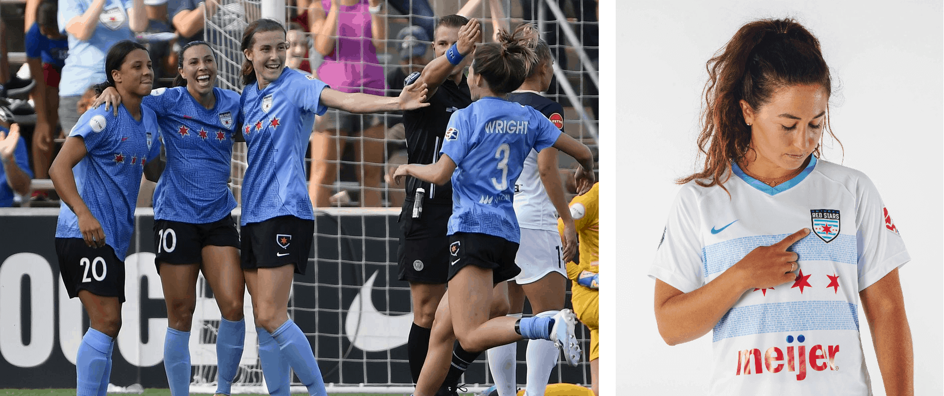
The new white second shirt is based on the flag of Chicago, which is a pattern the team commonly wears, but if you take a closer look you’ll see that the blue stripes and skyline design on the back are comprised of the names of the city’s neighborhoods. The design still would have been great — and the stripes would have been bolder — if the blue parts were solid. A good example of why not every design has to have extra “storytelling” attached to it. This shirt was worn as part of a mono-white combo on Saturday.
The first shirt, released last season, features a labyrinth-like map of the Chicago area, and is worn with black shorts and blue socks.
Houston Dash
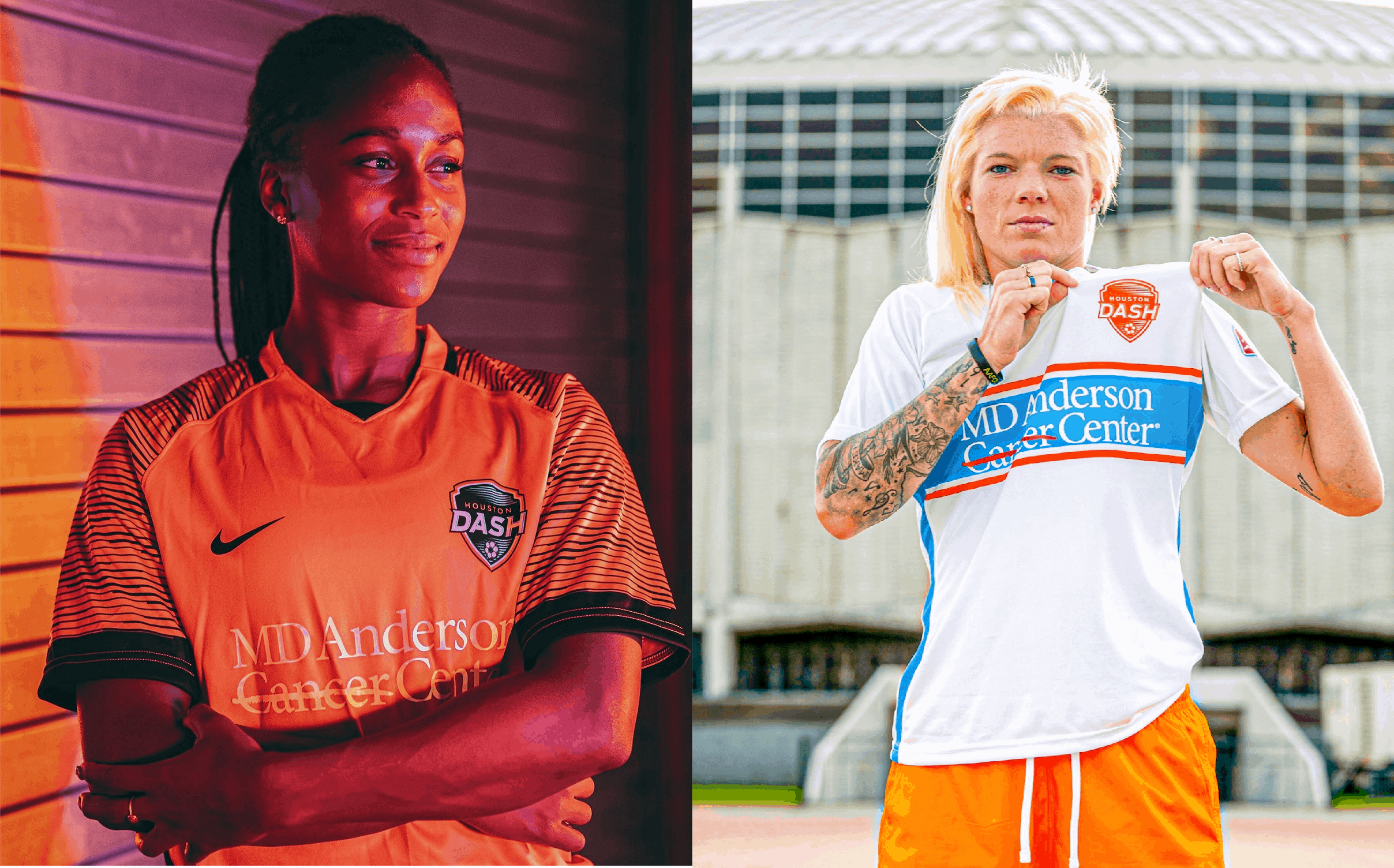
The Dash’s new orange first shirt uses black sleeve striping, which distinguishes it from last year’s solid orange shirt. Additionally, the Dash were the only team not to have an ad for all of last season, but they do now. This shirt is worn with orange shorts and socks.
The white second shirt is much better. Chest bands are an uncommon but good-looking design element, probably most associated with the Italian team Sampdoria. I just wish the bands extended around to the back, which isn’t always possible if space is required around the numbers.
Since no other team’s primary color clashes with orange, the second shirt isn’t needed and is arguably just a merch dump. Or maybe it could be used as a keeper choice, because goalie Jane Campbell was one of the players who modeled it (as shown above).
North Carolina Courage
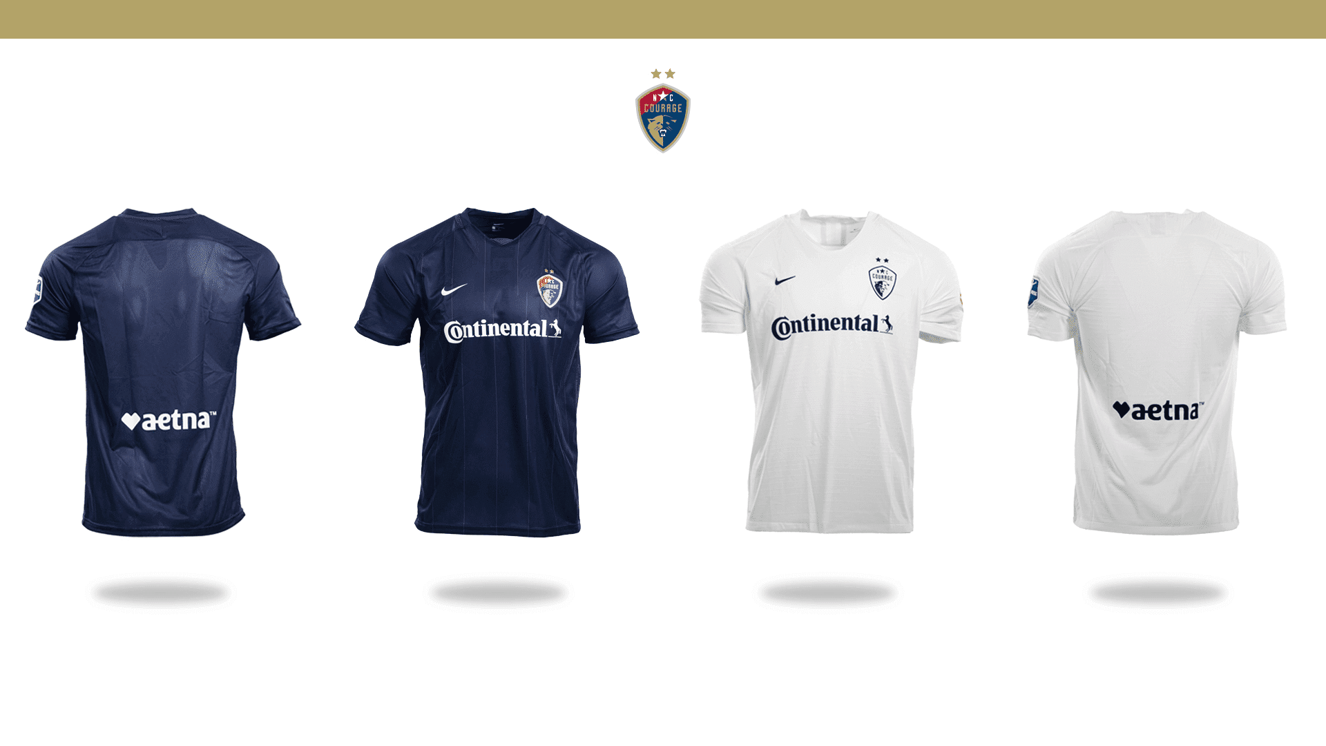
The Courage usually go with minimalist mono-navy first kits and mono-white or -grey second kits, sometimes with gold accents. That didn’t change this year, with the blue shirt featuring only tiny gold pinstripes. That was disappointing to see, especially with some other teams becoming more adventurous than they have been in previous years. It’s also unfortunate to see another “plain white T-shirt” design, a style that has proliferated in the NWSL and MLS in the past few years.
Overall, the Courage’s looks are yawn-inducing, even if the twice-defending champs’ performances aren’t. I’d like to see them come out of their shells a bit more.
OL Reign
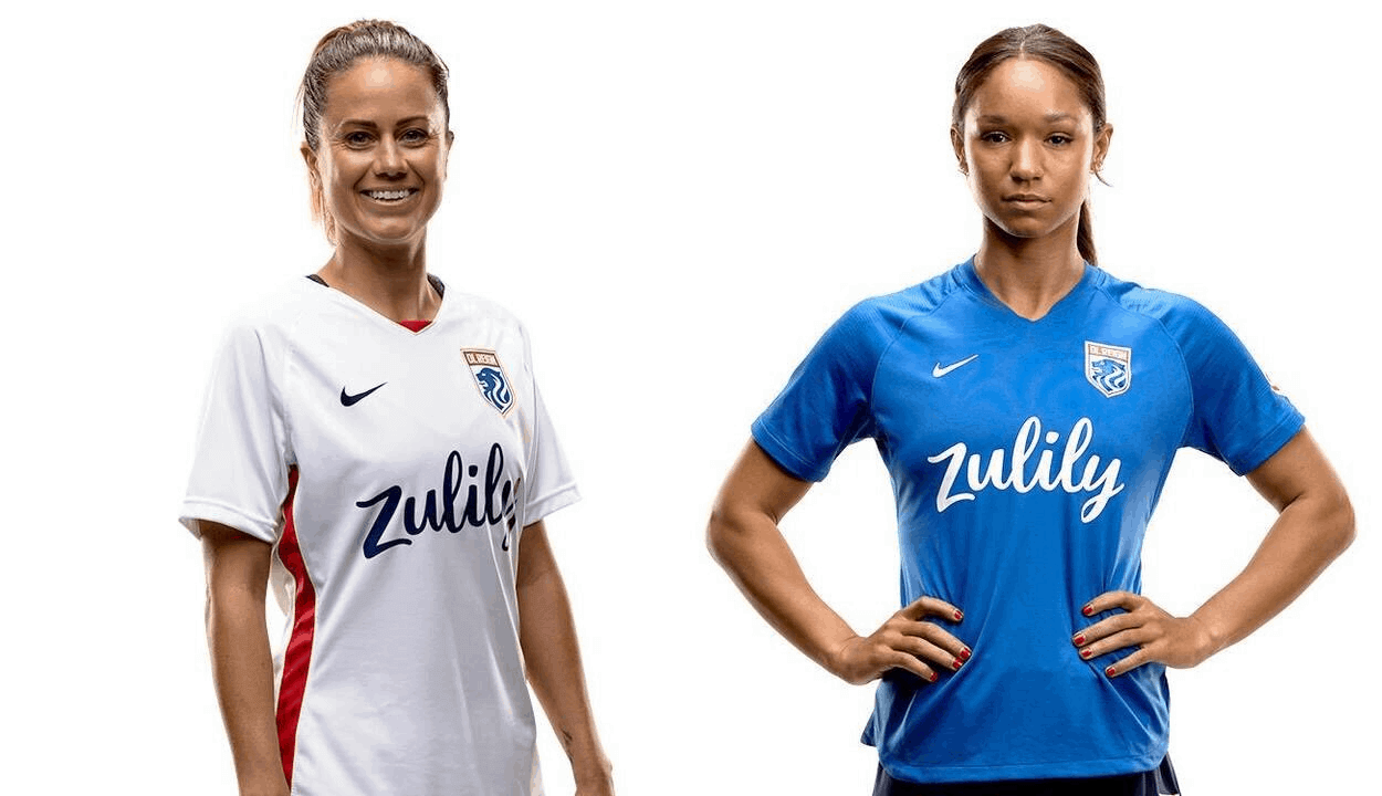
The former Reign FC was bought in January by French club Olympique Lyonnais, who run one of the most successful European women’s teams, and went through a name and crest change for the second year in a row after dropping “Seattle” for a 2019 move to Tacoma, Wash.
As a result, these designs are very basic. Much like MLS’s New York City FC, they remind the viewer of the parent team as much as possible without sharing the same manufacturer. The first shirt is white like OL’s (in previous seasons it was usually dark blue or black) and the second shirt is royal blue (last year’s was white).
As with the Dash, the second shirt won’t be needed because no other team’s first shirt clashes with white. The team appears to plan to wear white shorts with the first shirt and darker blue shorts with the second shirt.
Orlando Pride
The Pride withdrew from the Challenge Cup last week after players and staff members tested positive for Covid-19, only to then test negative. No other teams have reported any positive tests. The team is likely to go a year and a half without a competitive game, one of several long layoffs or cuts that have also affected women’s sports elsewhere in the world, especially as men’s sports receive priority for restarting.
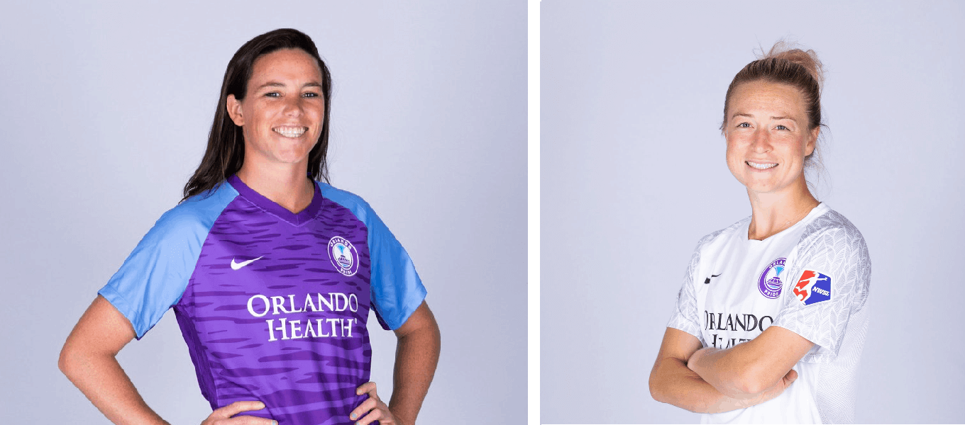
So we won’t see these new designs on the pitch anytime soon, but let’s take a look anyway: The new second shirt is bird-themed. The sleeves have a feather pattern — one of several nature-based NWSL designs. The pattern isn’t particularly visible from distance, but I appreciate the effort to avoid a plain white T-shirt design. This shirt is likely part of a mono-white combo.
The current first shirt was released last season. It’s purple with light blue sleeves and another nature-based pattern, this time depicting water (both of the team’s designs are reminiscent of Lake Eola in Orlando). It’s worn with purple shorts and socks.
Portland Thorns
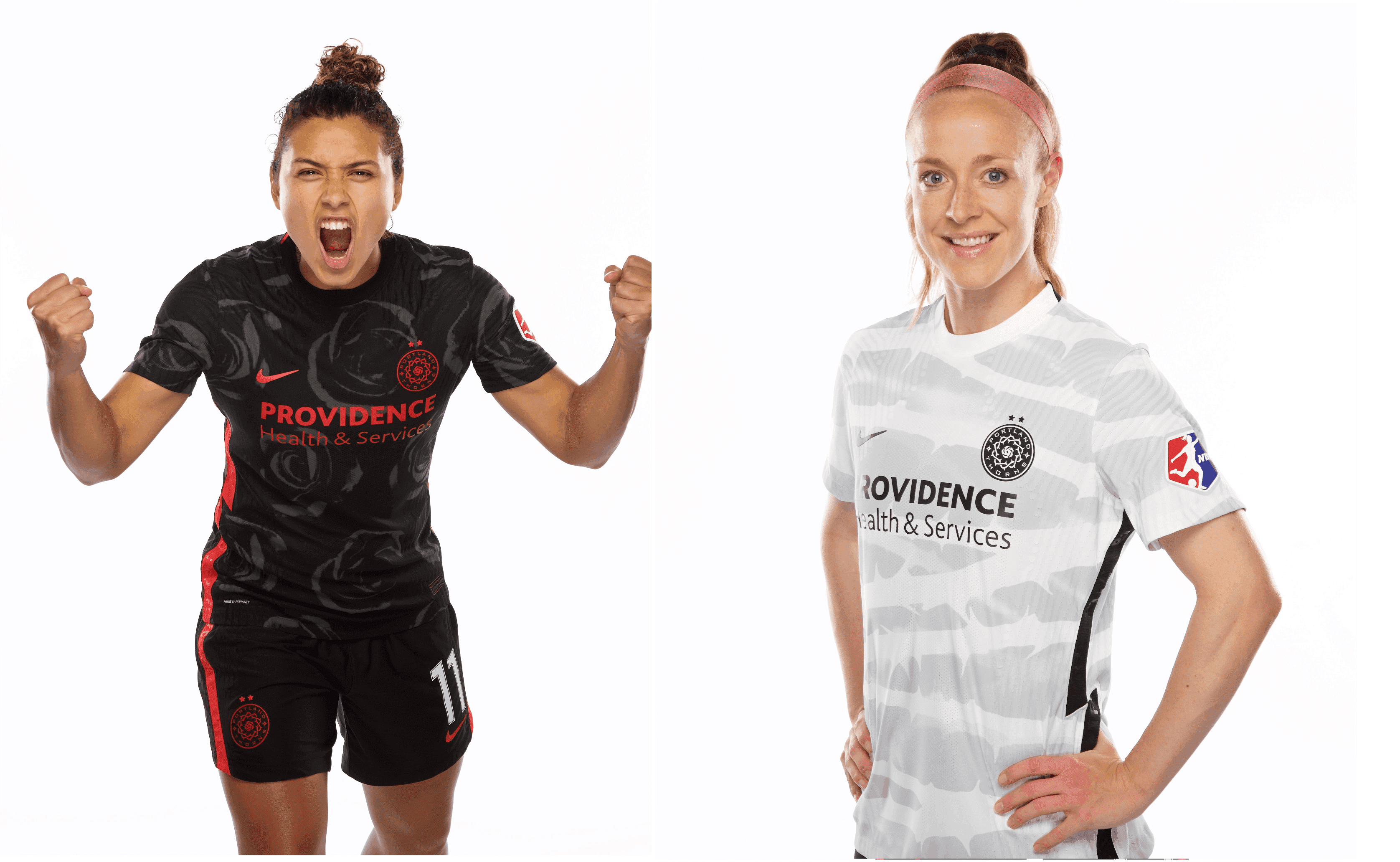
The Thorns’ new black first shirt was widely praised when it was released in May, with the podcast and NBCSN show Men in Blazers placing it among the top designs in American soccer history. It features a pattern of large roses, which is a fantastic, distinctive, and instantly recognizable idea, even if it also seems obvious since a rose is featured in the team crest. (It would be even better if Nike hadn’t just used a similar idea for England, which was one of my favorite shirts at last year’s Women’s World Cup.) It’s worn with black shorts and black socks.
The white second shirt uses stems or vines to create something like hoops (horizontal stripes, if you don’t speak soccer). The grey parts of the shirt could be darker, because they were barely visible in the sunlight during the team’s first game, when this shirt was part of a mono-white combo.
Sky Blue FC
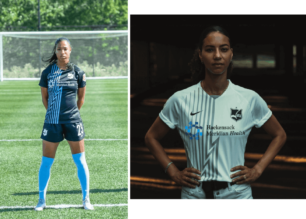
Sky Blue’s current visual identity is puzzling. They don’t wear sky blue as first choice, and the shirt and shorts are now predominantly black, with sky blue featured in a lightning-bolt design and on the socks, one year after the team pulled a surprise switch to wearing mono-navy as first choice. This design is novel and I like that they tried it, but I can’t say it makes sense to me. Aren’t clear skies blue, not stormy ones?
The second shirt is a white version of the first with grey lightning bolts.
Utah Royals
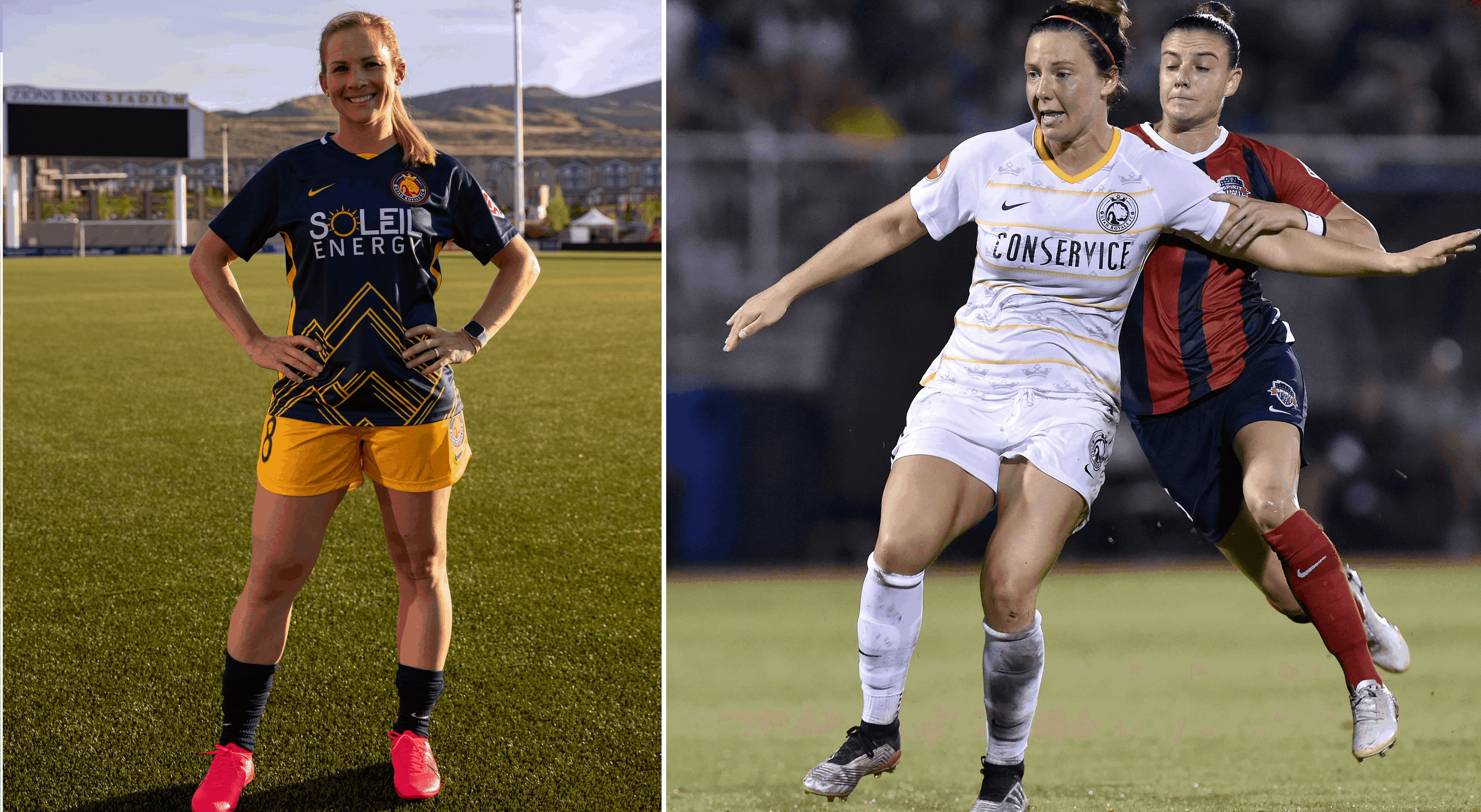
Until now, the Royals were the only NWSL team that had never had a primary color of red, blue, or the color scheme of their parent men’s team. Instead, they primarily wore gold shirts, an accent color of parent team Real Salt Lake.
The new first shirt is dark blue, meaning two-thirds of the league has a shade of blue as a color. It has a mountain-based pattern, but that’s not enough to distinguish yet another blue shirt in a league full of them. On the plus side, this shirt was revealed with gold shorts and blue socks, a fantastic color combo, and I cannot express how much I appreciate that the Royals did not go the monochrome route like so many other American teams. Gold shorts make this design so much better.
The white second shirt was released last season, and includes features that are partially gold and partially a pattern of the crown from the team’s crest. It was part of a mono-white combo last season.
Washington Spirit
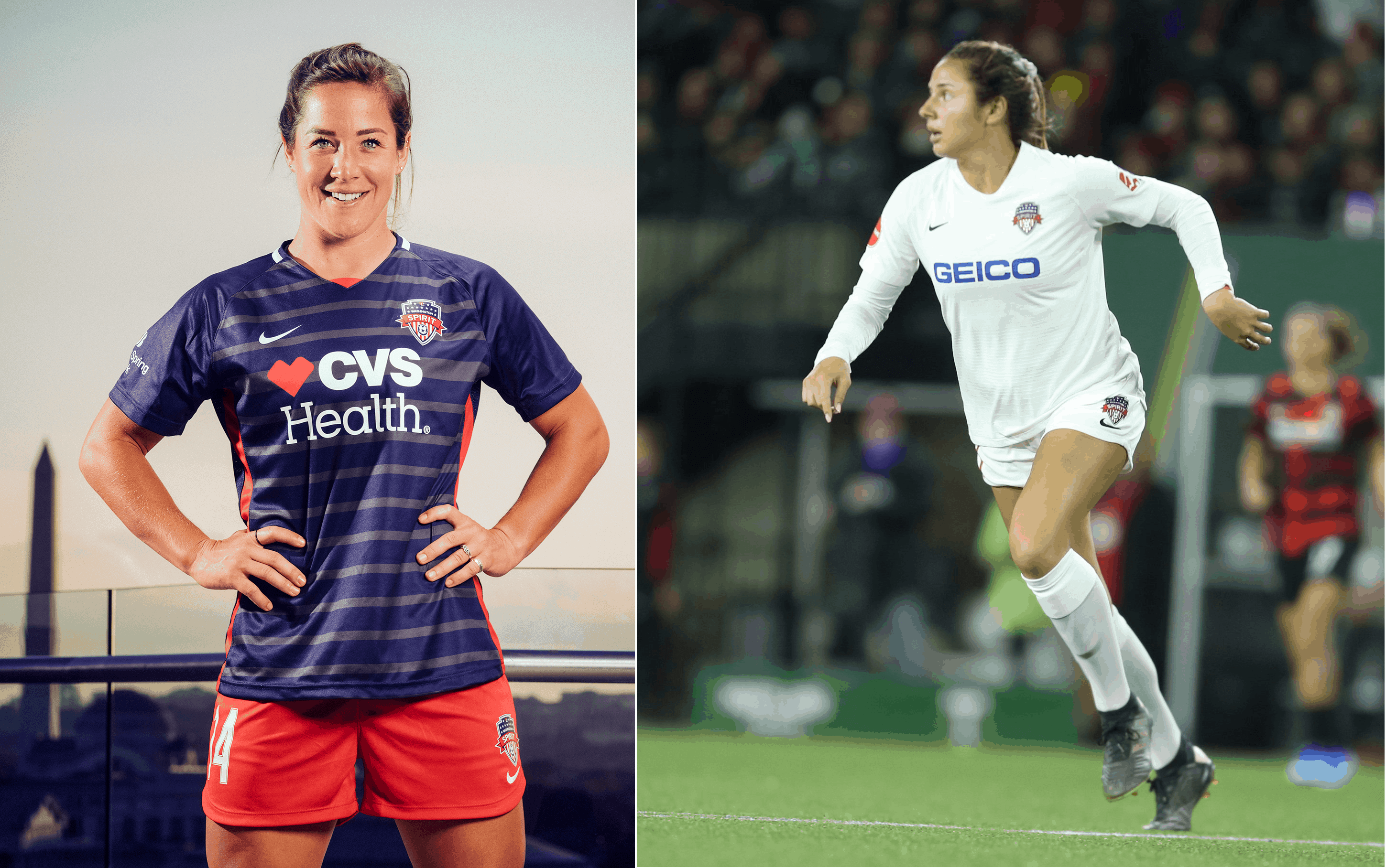
The Spirit have been moving from being a red team to being a blue team throughout their history, and finally did so this season after wearing red and blue stripes.
The red shorts make this kit great. Much like with the Royals, red and even white shorts will provide much more color than a mono-blue combo would have. On the spectrum of navy blue shirts, this represents a middle ground between the Courage and Royals. The shirt’s red accents add a lot of color when paired with the much darker blue.
The second shirt, released last season, is a plain white T-shirt that appeared with both red and white shorts and white socks.
Goalies
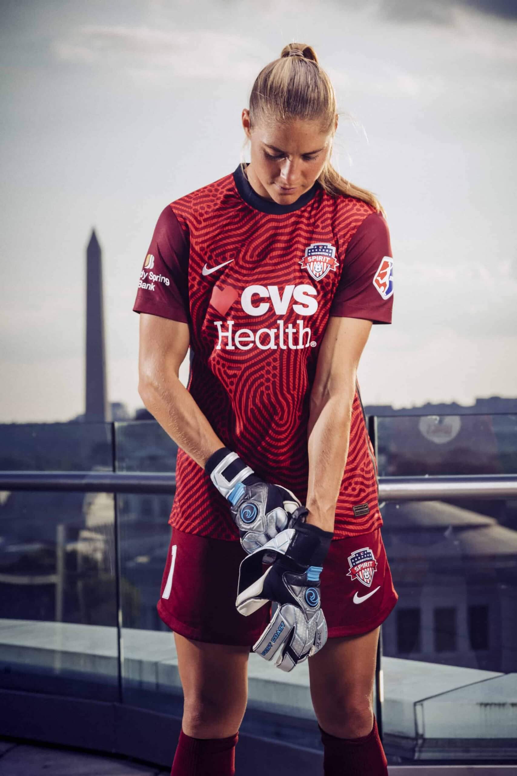
Goalies have all worn one template (shown above) in red, green, or yellow. It’s usually the case that manufacturers give their teams one of a few possible goalie designs, and this appears to be a new Nike template.
Click to enlarge
Collector’s Corner
By Brinke Guthrie
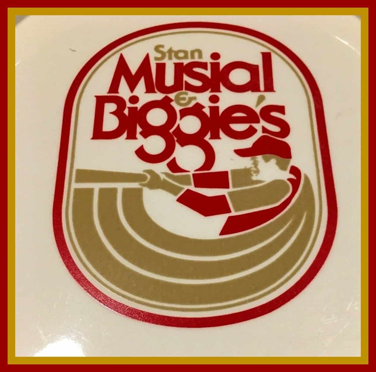
Leading off today with this ashtray from the old Stan Musial & Biggie’s restaurant in, of course, St. Looie. Great graphic, am I right? This type of item has largely gone the way of the dodo, because you can’t smoke indoors in most places. The restaurant closed on New Year’s Eve, 1986. And if you get the ashtray, you’ll want this matchbook, too!
Now for the rest of this week’s picks:
• As long as we’re talking about cigarettes and smoking, how about this sensational Baltimore Orioles cigarette lighter. It bears the inscription. “We’re Going To Win —Birds.”
• I had some Ted Williams soft drink signage here a few weeks back. Now, here’s the actual drink: three bottles of Ted’s Delicious Creamy Root Beer, ready for a frosty glass. Another website says these were from the 1960s, so these might not be fresh for human consumption. Cheers!
• Here’s an early-1960s Minnesota Twins key ring that doubles as a coin holder. The seller says it’s from Metropolitan Stadium, so probably a promo giveaway.
• Even though this was back in 1974, you can still be an official Charter Member of the Magnavox Hank Aaron 715 Club. Your suitable-for-framing certificate states that you agree to live up to the high standards of hard work, good sportsmanship, and fair play at home and in school!
• This is a baseball “perpetual counter” from way back. One site said 1907 for this, but who knows. You’d click the dials to keep track of the game statistics. Sponsored by Coca-Cola, the drink that “Relieves Fatigue.”
• These 1967 Cubs beer coasters were sponsored by Schlitz and WGN-TV.
• I lived in Cincinnati a long time, and I never once saw a Pete Rose chocolate bar as shown on this wrapper. (I did partake of a Pete chocolate drink a time or two, however — an offshoot of the local Choc-ola brand, which I loved.)
• Another wrapper for another athlete: This time it’s Montreal Canadiens hockey legend Maurice “Rocket” Richard on this 1950s bread wrapper.
• Here’s a set of Detroit Red Wings hockey players from 1990, for use with Wayne Gretzky’s Overtime Hockey tabletop hockey game.
• This seat cushion carries the NFL and AFL logos. The seller theorizes it might be from the first Supe. It also comes with a generic rain poncho.
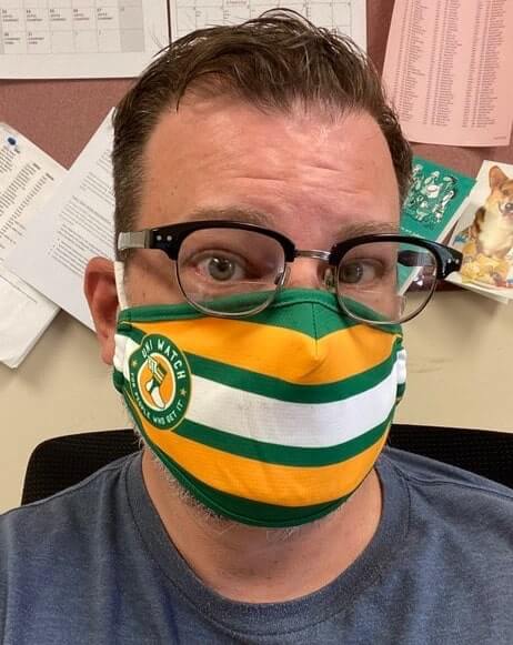
How to Get It™ and not spread it: People are starting to receive their Uni Watch masks (like reader/Twitter-er @PunCMD, shown above), and they look great!
If you missed out on these last week (the initial batch of 85 masks sold out in 40 minutes), don’t worry — I have 300 more masks in the works. I’m hoping they’ll be in the Teespring warehouse and ready to go by the end of next week.
As was the case with the first batch, all Uni Watch profits will be donated to charity. For the first batch, we donated to Doctors Without Borders; this time I’ve decided to go with Feeding America, which has been fighting hunger during the pandemic.
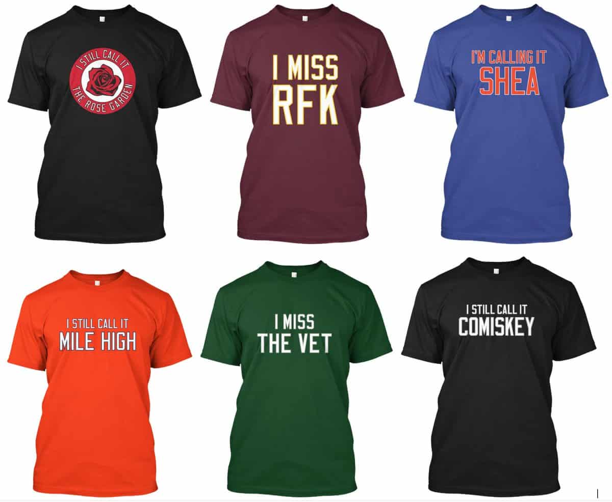

ITEM! Naming Wrongs raffle: Reader Jon Eidukas has generously offered to cover the cost of any T-shirt from the massive Naming Wrongs collection for a lucky Uni Watch reader, so that’s what we’re going to raffle off today.
This will be a one-day raffle, and only U.S. shipping addresses are eligible (sorry). To enter, send an email with your name, mailing address, and preferred Naming Wrongs shirt and size to the raffle address by 8pm Eastern tonight. One entry per person. I’ll announce the winner tomorrow. Big thanks to Jon for sponsoring this one!

Membership update: An interesting Purp Walk order that for various reasons we didn’t get around to designing until now came from Kary Klismet, who asked for a card based on the Springfield Cardinals’ 2018 “Jazz” Solo cup-patterned jerseys — a brilliant request.
Kary’s card is part of a new batch that’s been added to the membership card gallery. We’re about to hit 2,900 designs, so we’ll definitely hit 3,000 soon.
If you’d like to get in on that push toward 3,000, ordering a membership card is a good way to support Uni Watch (which, frankly, could use your support these days). And remember, as a gesture of comm-uni-ty solidarity, the price of a membership has been reduced from $25 to $20 until further notice.
As always, you can sign up for your own custom-designed card here, you can see all the cards we’ve designed so far here (now more than 2,800 of them!), and you can see how we produce the cards here.
The Ticker
By Alex Hider

Baseball News: Gross: MLB turned the name of its Summer Training Camp into an ad (from Mike Chamernik). … Also from Mike: Pirates blog Bucs Dugout ranked their favorite Buccos logos of all time. … Lots of notes from Kary Klismet: MLB.com published a piece over the weekend that takes a look at the weirdest unis in baseball history; they also published a quiz about old team nicknames; the Hall of Fame has a new exhibit with artifacts from each team; finally, amid Black Lives Matter protests, Ballpark Digest has published a piece about stadium names, particularly those named after people with a history of racist comments. … The logo for Belén Medical Center near Miami appears to have poached the Rays’ sunburst graphic (from Willie Vizoso). … @GoatJerseys spotted a car with a Yankees paint job in North Carolina. … Brewers 2B Brock Holt previously hinted at a number change. With the Brewers announcing their summer camp roster, we learned he’ll be wearing No. 11. He’s previously worn No. 12 and No. 26 (from Shane Bua).

NFL News: Designer Luc Samanski is redesigning every NFL team’s look over on his Instagram page. … ESPN’s First Take photoshopped QBs Tom Brady and Cam Newton into old Bucs and Pats unis that they’ll never wear (from @AVKingJames). … In 1977, Eagles C Guy Morriss wore a strange facemask during at least one game — looks like that would be classified as “overbuilt” by today’s standards, huh? (From Bill Kellick).

Hockey News: The NHL will determine playoff seeding with several best-of-five series, which the league will refer to as “Stanley Cup Qualifiers.” Here are the logos for that round (from @OlegKvasha). … Reader @Nas_160 created a series of charts comparing the Sens’ centurion logos through the years. … Here’s why Canucks C Zack MacEwen will never give up wearing No. 71 (from Wade Heidt). … Another Canucks item from Wade: Some fans want the team to wear the flying skate throwbacks, rather than the primary home blues, in the postseason.

Basketball News: In addition to potential social justice messaging NOBs, the NBA plans to paint “Black Lives Matter” on the courts if/when the season resumes (from @HitTheGlass). … Grizzlies G Ja Morant has apologized for posting an image of a jersey with an anti-police slur on his Instagram page (from Mike Chamernik). … The Washington Mystics unveiled their 2019 WNBA championship rings yesterday (from Wade Heidt). … Speaking of the Mystics, G Natasha Cloud says she will sit out the 2020 WNBA season to focus on activism. Converse, who signed her to a shoe deal earlier this month, says it will pay 100% of her salary in the meantime (from Brinke). … Couple of Nets number/name updates from Etienne Catalan: PG Spencer Dinwiddie says he wants to wear “Trillion” on his NOB if the NBA allows it, and G Tyler Johnson will wear No. 8. … A reporter at New York Gov. Andrew Cuomo’s press conference yesterday was wearing a Latrell Sprewell Knicks jersey and matching orange Chucks (from Ryan Walters).

Soccer News: Nike has unveiled the new ball design for the 2020-21 EPL season (from Bridger Deschamps and Chase Reeves). … The NWSL will continue to play the national anthem before games, but players will have the option to remain in the locker room during the song (from Jamie Rathjen). … CSKA Moscow of the Russian Premier League will be outfitted by Joma during the 2021-22 season (from Ed Żelaski). … One of Borussia Dortmund’s 2020-21 jerseys has reportedly leaked (from Jakob Fox). … Staying in Germany, Borussia Mönchengladbach unveiled their 2020-21 home jersey, which includes a new advertiser (from Josh Hinton). … Aston Villa of the Premier League has a new shirt advertiser (also from Josh Hinton). … Falkenbergs MF Lorik Ademi’s shirt apparently had the wrong number yesterday, so they had to create the proper number out of masking tape (from Ed Zelaski). … New home kit for Austrian side Red Bull Salzburg.

Grab Bag: An unintended consequence of sports in a pandemic: Empty stadiums mean refs can hear almost everything coming from the sidelines, leading to more ejections. … Formula One is restarting next weekend and Mercedes will swap its traditional silver livery for black as a commitment to diversifying its team. The cars will also include messages such as “End Racism” on the driver’s protective halo (from our own Jamie Rathjen and @nomuskles). … The West Indies Cricket Team will wear “Black Lives Matter” on their collars in a Test series against England beginning July 8 (from Timmy Donahue and KTParthepan). … Also from Timmy: American soldiers have been cleared to wear combat patches for serving in Saudi Arabia since September’s attack by Yemeni rebels. … One more from Timmy: The North American Association of Uniform Manufacturers and Distributors unveiled the winners of its “Best Dressed” awards for local public safety departments earlier this month. … Chicken chain Bojangles’ will drop its trailing apostrophe and will simply be known as Bojangles (from James Gilbert). … New logo for the European Handball Federation (from Jeremy Brahm).

Click to enlarge
What Paul did last night: A few minutes after I snapped yesterday evening’s photo, we got hit by a thunderstorm. Like, a serious storm, a fucking biblical storm. Serious winds, sideways rain, even some hail.
I know what you are thinking. You are thinking, What about the branch?
That’s what I was thinking, too. So as the porch got soaked and the street flooded and chaos reigned all around us, I pointed my phone at the branch, which was valiantly hanging in there (literally):
Toward the end of that second video, you can hear the Tugboat Captain saying she’s going inside. She was about to walk in front of me, so I stopped video-ing — and just at that moment, the branch came down!
It narrowly missed the car parked beneath it and broke into a few pieces near the car’s right-front wheel:

A few minutes later, when the storm passed (like so many serious thunderstorms, this one was intense but brief), we went out for a closer look:


A lot more came down than just that one branch. Trees were toppled all over our neighborhood (but not on our block, thankfully). Serious stuff.
I’m sad to see the branch go. It had started to feel like a friend, or at least a neighbor. What the hell are we gonna talk about out on the porch now?
And that was just the start of an eventful evening. As you may recall, back at the old Uni Watch HQ I had a nice backyard with a built-in grill. The current Uni Watch HQ doesn’t come with backyard access, so last summer we had cookouts in the park, using the public grills. But we don’t feel good about doing that at the moment (mainly because we’re still antsy about using public restrooms), so we bought one of those cheapo mini-kettle grills and asked our landlords if we could occasionally use it in the backyard during the pandemic. They said sure.
The plan was for the grill to lose its virginity last night. We had marinated some pork kebabs and were going to start cooking after Pandemic Porch Cocktails™. At first it looked like we’d be rained out by the storm, but the skies cleared quickly, so we figured we’d go ahead with it.
The grill is so small, it feels like a toy, but it did the job:
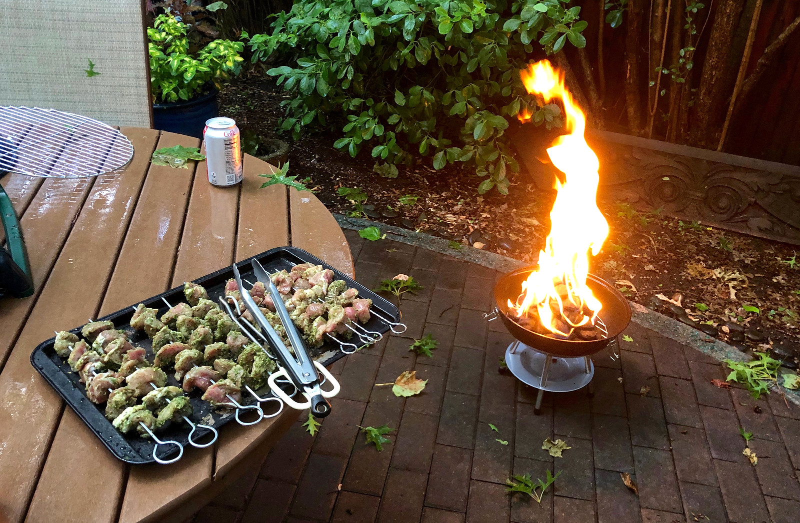

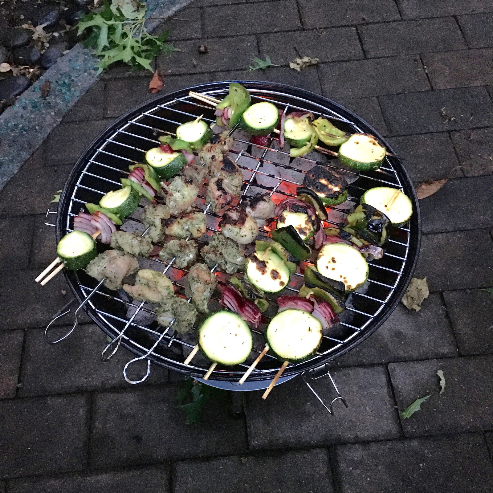
Not bad at all. By the end of the meal, I’d almost stopped feeling bad about the loss of the branch.
The storm videos are labeled as private and won’t play.
Stupid YouTube settings. Now fixed.
About the Aston Villa note, it’s a new shirt sponsor/advertiser, not uniform manufacturer.
Fixed.
For the ticker item about US soldiers in Saudi Arabia, it would be more correct to say “Yemeni rebels” or “Yemeni Houthi rebels.” The lack of an adjective implies that the rebels are Saudi, which they are not. The attacks in question are coming across Saudi Arabia’s borders, not from inside the kingdom.
I’d begun to expect that the branch would be there for years, until someday a city tree crew clears it away and you’d mention it and we’d all have a moment of nostalgic frisson as we thought back to the crazy spring of 2020.
Fixed.
The NWSL kits are nice, but as with these and all other professional soccer leagues, the identity is always overshadowed by the sponsor.
FC CVS vs Zuliliy United
Totally true. Hard to take them seriously. I’d at least rather the team crest be largest and most legible, with the advertiser smaller. It’s so weird reading aesthetic reviews of these things when there’s a turd smear all over it!
I maybe jumping ahead a bit, but the three cars parked on the street in the porch photo would be very appropriate for the July 4th photo.
Thanks for the NWSL preview Jamie. Well done. I think Sky Blue scored big with the sky blue socks but that begs a question. Do soccer players still wear full length socks? Or are those just leg sleeves similar to what WNBA players are wearing?
Thanks! As far as I know, those are real socks. Soccer players sometimes cut off the bottoms and wear their own socks underneath, but I don’t see any examples of that in the pictures here.
It used to be very common to see players with team socks that had obviously been cut at the ankle with very visible dots from their TruSox up the back of their ankle.
Nike and Adidas (not sure about smaller companies) have gotten wise to this and started making sleeves –
My personal theory is that Nike started developing high-ankle soccer shoes to cover the TruSox dots
Seconding Harry’s appreciation. Thanks, Jamie!
I’d also love to see similar coverage of European women’s leagues someday.
Thanks as well! And that’s a good idea…
Soccer jerseys are literally just boring ass t-shirts with ads. Brutal.
Farewell, Branch Rickety. We hardly knew ye. Rest in pieces.
Will there be a branch memorial pin in the Uni Watch Pin Collection?
Probably not a pin. But maybe we can come up with something else — stay tuned.
I’m hoping for a t-shirt saying, “I miss the branch”
Sky Blue’s current visual identity is puzzling. They don’t wear sky blue as first choice
How very Chicago “White Sox” of them. I don’t know anything else about them, but based on this alone they are now my least-favorite NWSL team.
The grill is so small, it feels like a toy, but it did the job
Still bigger than my grill.
And you should’ve cut up the branch and put it in the grill…sort of like a Jedi funeral.
How small is your grill??? (This one is 14″ across.)
I just held my foot up to it…I wear a size 12 shoe and if I had stepped into it I could only have done so diagonally.
Incidentally, the last time I used my little grill was for pork kebabs!
No nasty peppers or onions, though. We went with tomatoes, zucchini and mushrooms.
How do you cope with the uneven cooking time between a tomatoe (nano seconds) and say a mushroom? In terms of a vegetable that upgrades itself based on its good fortune to be cooked on a grill – I go with asparagus.
The mushrooms were cut into smaller pieces, so cooking time wasn’t very long. Same with the pork.
Jamie,
The “ labyrinth-like map of the Chicago area” on Chicago’s blue jersey is a map of the city’s elevated train system. The L is the one of the only ways to get around in the city, and the one used most often by city residents, so it’s a big deal for them. Just thought that that was an interesting little tidbit of information.
Thanks. The name (some of these shirts have marketing names and I wish they didn’t) makes sense now.
In addition to the L map being featured on Chicago’s home (blue) jerseys, the back includes the city’s skyline:
link
As for the on-field jersey, it looks like Chicago is adding a sponsor/ad to both jerseys (not just the white).
link
The ads for the home and away are both lower than you would usually expect so the ad doesn’t cover up the red stars. I really like how they did that. Thoughts?
Obviously, that they can keep the stars is good, but I think the ad makes the front crowded. They’ve usually gone with ads on the back instead (and still have one there).
Re: Orlando Pride “The new second shirt is bird-themed.”
its supposed to be a Swan theme because of the swans that in Lake Eola that located in downtown Orlando
Yes, I know.
I’m sad to not see the branch update each day. It was a nice little constant each day. Just a one line little ray of consistancy. I’ll miss it, thanks for the update and saga of the downfall of the branch.
Goodbye branch.
In late spring I noticed a similar branch outside my bedroom window, I really have no idea how long it was there for because it appeared to be part of the tree until all the leaves came in and it became obviously it was a hanger on. It has survived some extremely windy days this spring. I’m curious to see how long it hangs on.
Anybody else have problems with the embedded pictures displaying on this site? I see the flickr pictures fine, but the .jpg files from bullpen.uni-watch.com all report security issues (unknown certificate). The .png and .gifs used for the ticker headers also come through ok.
I am pretty sure that this is a problem on my end with an company-managed PC, but curious if anyone else sees this problem.
I expect to see a new official Uni Watch Item for sale:
Slivers of Wood, Holy Relics from the Blessed Branch of Brooklyn.
European Handball Federation link broken.
This leads to another article that discusses the new logo:
link
Fixed.
I thought FIFA required solid backs so those iconic front jersey designs no longer wrap around to the back, for clarity on reading numbers.
MLS is sanctioned by USSF which is part of FIFA. Indirectly sanctioned by FIFA and it seems to not matter in MLS. Vancouver Whitecaps have their signature hoop wrap around the back.
link
Jamie would probably know the rules on this.
It’s up to the league or country. FIFA’s equipment rules only apply to competitions that it runs, but they’re intended to be a model for others. So that includes the various World Cups/Women’s World Cups and their qualifying phases, Olympic qualifying, and the Club World Cup, but not any other club competitions (including continental-level) or the final Olympic tournament.
FIFA has relaxed this for their own tournaments too. The challenge is that the number must contrast with both colors. “A Number Zone must be created on the back of the shirt, unless in FIFA’s discretion, the number appearing is clearly legible and distinguishable from a distance.”
As an example, Argentina had black numbers directly on their blue and white stripes in the last 3 World Cups.
You know, I looked every. single. day. To see if the branch was still up.
Did you at least keep a piece as a memento? Heck, I’d make a little trophy out of it.
More on that tomorrow.
I was thinking the same thing. Paul, I hope you fashion the branch into something, ala “Wonderboy” for Roy Hobbs.
Goodbye Branch. :-(
Looking forward to hopefully getting a mask. Hopefully it will make it long enough for us west coast peeps.
So sorry about the branch. I loved seeing the daily update. It’s a loss for all of us.
Pouring one out for the branch! I hope you are doing something fun and special with its remains, Paul.
I Miss The Branch.
Jamie, great write up on the NWSL kits and Paul it’s so great to see women’s sports get the lead on your site!
I may be biased as someone who grew up in the Chicago suburbs but the Red Stars knock every other kit out of the water and have always done so. Their organization just ‘gets it’ for lack of better terms.
Thanks! I think the Red Stars are always one of the best-looking teams, along with the Thorns.
Can one of the weekend uni Tweekers come up with a “Brooklyn Branches” uni concept so those looking for a unique Uni-Watch membership card design can place an order for the same?
The Maurice Richard bread wrapper depicts the Rocket shooting righthanded! That is not accurate.
I know everyone loves rankings, here are 101 soccer kits ranked on espn, disappointed they left one of FC Porto’s kappa alternates off (link)
link
Amazing how attached (no pun intended) many of us became to the branch. I actually said “oh, no” when I read that it fell after watching it battle so valiantly against the storm. I think I’m glad that you didn’t have its’ demise on film.
Thanks for featuring my new membership card today, Paul! It looks great! Scott knocked it out of the park! The Jazz design never looked so good!
I feel a strange sense of loss at the branch’s falling, too. It was fun getting updates as it stubbornly clung to the tree for the past many weeks and months. RIP, branch!
Great job on today’s lede, Jamie! I feel brought up to speed on several sharp-looking uniform designs in the NWSL. Except for the ads, of course, but whaddya gonna do?
The Brooklyn branch office has been closed!
I really liked today’s featured membership card. What a way to remember the 90s.
The new Bojangles logo looks a lot like the Denny’s logo. I wonder if they’re owned by the same company?
No minor league baseball this year.
We will never see the Norwich Sea Unicorns ever take the field. Good bye forever to the Staten Island Yankees and the other NY-Penn teams getting the axe.
Many memorable uniforms and a great time to get some clearance hats coming!