[Editor’s Note: Good morning! Today we have a guest entry from Mat Swatek, who’s created a project regarding team colors that I’m pretty sure everyone here will love. Enjoy! — PL]
By Mat Swatek
Have you ever thought about how teams in a particular city tend to use similar colors for their uniforms and logos? This is something I’ve thought about a lot, and some random conversations with friends over the years finally led me to do an actual analysis of team colors within North American cities.
Before getting to the results, I need to briefly discuss the ground rules I set up and the methodology I used.
The Ground Rules
1. The teams in each city have to play within a reasonable commute from the center of that city, although I made a few exceptions. I grouped the Packers under Milwaukee, since I found it to be a reasonable commute to attend Packers games every other weekend. The Bay Area is another oddity, as Oakland, San Francisco, and San Jose are in close proximity and have a bunch of teams between them. I decided not to group all of these teams because ultimately they identify with different cities. New York, on the other hand, has multiple teams in New Jersey but are grouped together because almost every team shares “New York” in its name.
2. To qualify for this analysis, a city had to have at least two teams. This is obviously a small sample size for comparing colors, but I wanted to include as many cities in this analysis as possible to get a true sense of the color-matching landscape. It also didn’t feel right to exclude smaller sports hubs such as Buffalo, New Orleans, and St. Louis.
3. To compare team colors within cities, I focused on the primary and secondary colors for each team. When those colors were not immediately obvious, I looked first to the team’s uniforms and then to the logo. I also generally avoided any consideration of white or grey, since those colors are present on many uniforms. But again, I made some exceptions to that rule, since some teams are primarily identified with those colors (e.g., the Raiders, Spurs, Yankees, Red Wings, etc.).
4. I aligned team colors within each city by primary and secondary colors. I did a bit of rearranging in some places to maximize the similarity. For example, the Bulls’ primary color is red, but that’s the secondary color for most Chicago teams, so I flipped black and red.
The Methodology
This gets a little wonky: The first step in making the color comparisons was collecting the RGB color mix for each team. The RGB values represent the full spectrum of colors using a combination of levels of red, green, and blue light (each scaled from 0 to 255). Once I gathered all the color data, I converted it to a slightly more accurate model that uses the CIELAB format, which uses color coordinates denoted by the letters L, a, and b. I used a simple distance formula to determine the difference in each team’s colors within each city. To do that, I took the difference in primary colors among all pairs of teams within a city. Then, I did the same for the secondary colors. In the formula below, I’m determining the difference in the primary colors of team1 and team2 [click to enlarge]:

This left me with differences in primary colors among all sets of teams within the city (e.g., the difference between the Cubs’ blue and the Bears’ blue, as well as the difference between the Bulls’ black and the Bears’ blue). The primary color score is the median of the differences of the primary colors. I did the same for the differences among secondary colors. Averaging these two scores gave me the overall two-color score, which identified which cities are the most color-cohesive and which have the most differences among their teams.
Version 1 Feedback and Changes Made
I tweeted an earlier version of this analysis in mid-May and I received a ton of feedback. It turns out that people know a lot more about their teams than I do! It was fun learning about the color history of some teams and how well-liked certain uniforms and color combos are. I corrected the errors that people pointed out and also added in WNBA and NWSL teams where applicable, which several people suggested. In almost every case, adding those teams increased the color similarity within cities.
Results
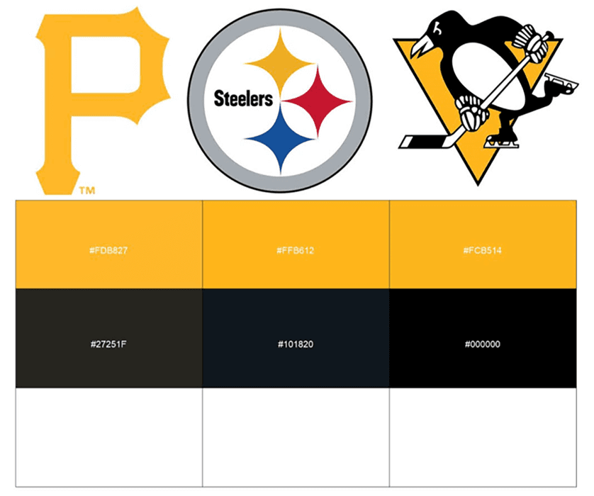
So now you’ve made it (or just skipped ahead) to the part you care about: Which city is the most color-cohesive? The answer, of course, is Pittsburgh. The primary yellow colors are beaten in similarity only by the blues in Indianapolis; the secondary black hues trail only the blues in St. Louis and the blacks in San Jose. The picture below shows the team logos as well as their primary, secondary, and tertiary colors. (The primary and secondary colors are used in the overall scoring, and I added the tertiary color just for fun.)
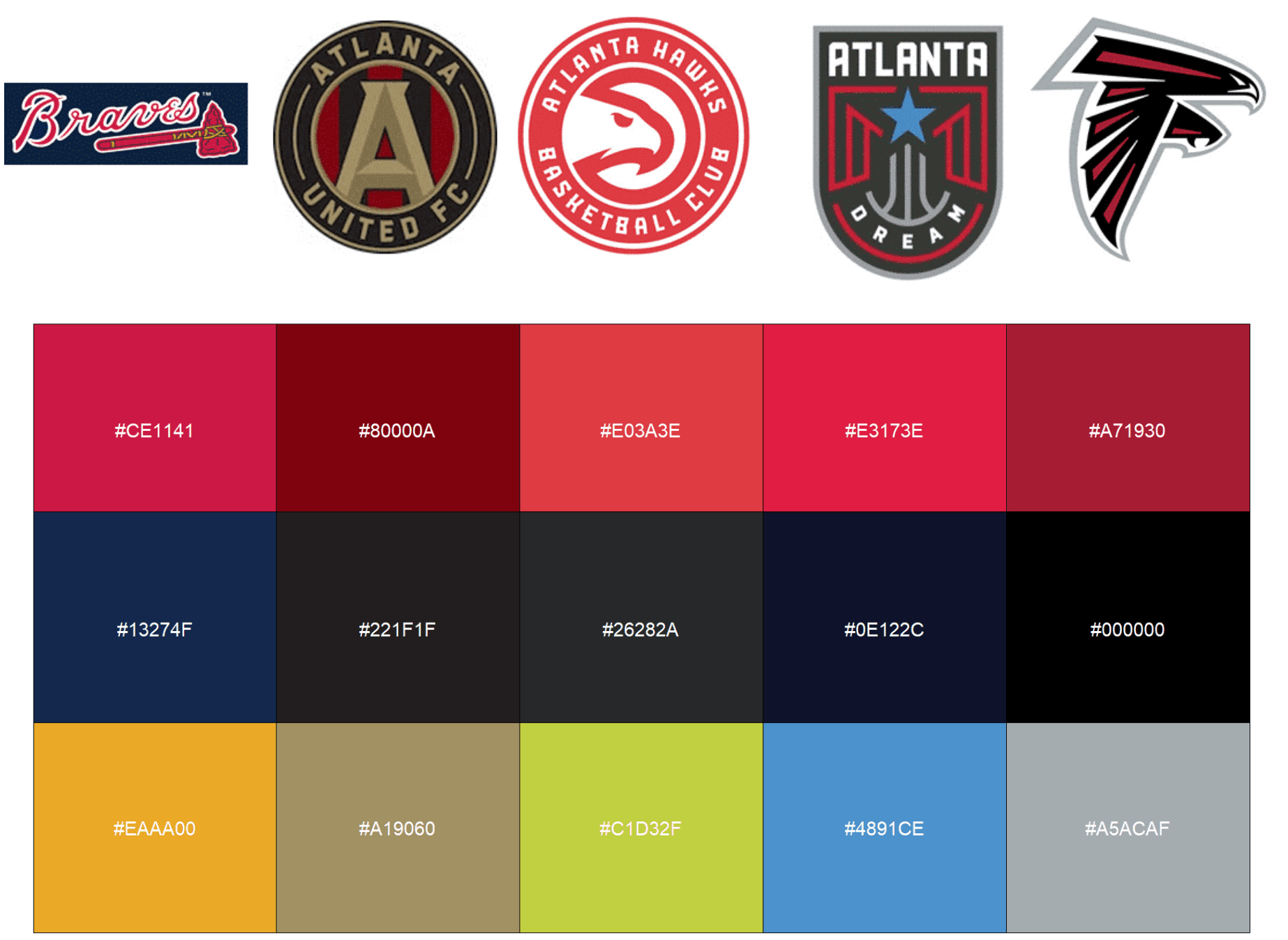
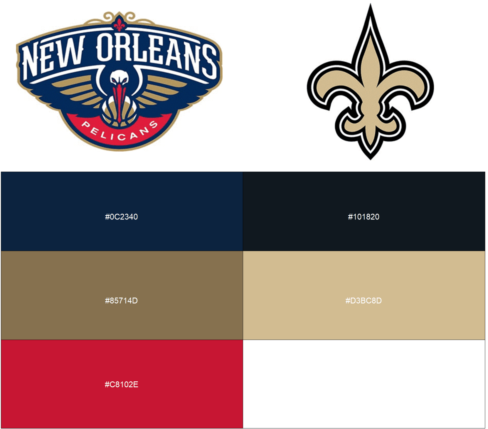
The No. 2 and No. 3 cities in terms of color similarity are Atlanta (with five teams) and New Orleans (two teams):
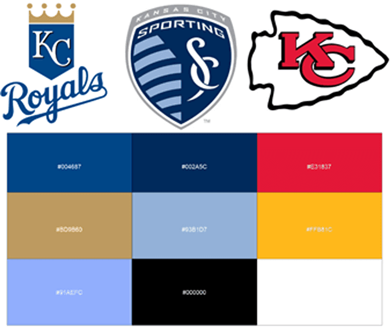
We can just as easily flip things around and look at which cities are the most color-dissimilar across teams. Kansas City has one of the most dissimilar primary color scores, mainly thanks to the red of the Chiefs. KC teams’ secondary colors also clash, ranking in the bottom 10 among all cities. Add these two scores together and you have your least color-cohesive city!
Other cities whose teams have clashing colors are Columbus, San Francisco, Baltimore, and Minneapolis.
To get a snapshot of where each city falls in terms of its two-color score, you can refer to the map below. The size of the dots represent the number of teams in that city while the color represents the overall two-color score. Lighter colors represent cities that are more color-cohesive, like Pittsburgh, while darker colors denote cities that are less so, such as Kansas City:
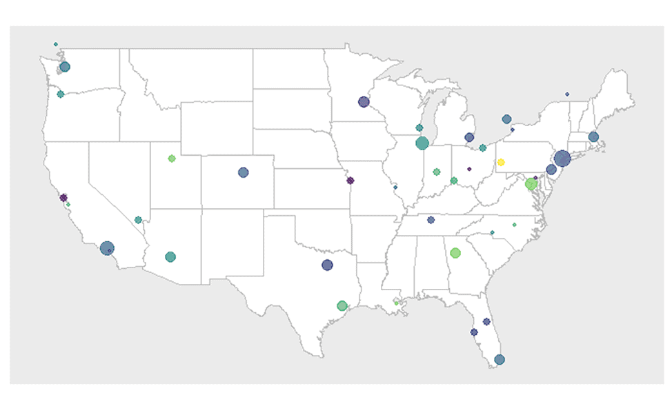
You can see an interactive version of that map, and a whole lot more, on this page, which has the full results of my analysis.
I plan on adding another section for ad-hoc requests. Though I’m no expert on sports fandom in New York, I think its 13 teams could probably be split up several different ways based on natural subsets of fandom or geography. I also mentioned earlier that the Bay Area gave me some trouble, and I am considering grouping all teams in that region and seeing how well they align. If you have a region that you’d like to see expanded or sub-divided, or have any other interesting ideas (e.g., adding college teams to the mix or looking at teams that moved cities or changed colors), then feel free to email me at mbswatek@gmail.com with your suggestions. Thanks!
———
Paul here. What a great project! I definitely recommend spending some time poking around on Mat’s site — lots of food for thought from this project. Thanks for sharing it with Uni Watch, Mat!

Click to enlarge
Flames follow-up: Remember my recent interview with Bill Brownridge, who designed the Calgary Flames’ “diagonal” uniforms? Reader Dave Turigan found an article about that uni set, including lots of quotes from Bill, in a 1995 Flames program. Good stuff!
The first page of the article is shown above. You can see the rest of the pages here.
Contest reminder: In case you missed it last week, my latest Uni Watch design contest for InsideHook is to create a logo for teams or leagues to wear in acknowledgment of the current racial justice protests.
We’re probably going to see a lot of these logos/patches/etc. when American sports leagues resume (well, if they resume). What should they look like?
Full details over at InsideHook.

ITEM! Another membership raffle: Reader David Dahl recently purchased two memberships for me to give away, so that’s what we’re going to do today.
This will be a one-day raffle. No entry restrictions for this one — open to all. To enter, send an email to the raffle address by 8pm Eastern tonight. I’ll announce the two winners tomorrow.
As you know, we’ve had a slew of these donated memberships lately, but this is the last one, at least for now. If you’d like to help support Uni Watch by purchasing a membership for me to raffle off (or by just ordering a membership card for yourself), you can do that here.
The Ticker
By Jamie Rathjen

Baseball News: We’ve featured Paper Stadiums projects several times recently, and it’s now added Shea Stadium to its list (from Mike Chamernik).
.

NFL News: Reader Kurt Rozek asked former Bengals QB Kenny Anderson why he often seemed to have a grey facemask with chipped black paint, rather than just a true black mask, and got a great response from Anderson. … In case you missed it, Washington is retiring No. 49 for RB Bobby Mitchell, the team’s first Black player, and also named the lower level of their stadium after him. That level of the stadium had been named for the team’s racist founder, George Preston Marshall, whose statue outside the team’s former home, RFK Stadium, was removed on Friday.
College Football News: Georgia Tech’s uniform for the 2009 Orange Bowl was an exercise in one-time use: It was never worn again and also featured the Buzz yellow jacket logo together with the helmet logo on the pants, which apparently has also never happened before or since (from Michael Rich).

Hockey News: A Golden Knights website mentioned the team potentially getting a fourth jersey, but it’s not clear if it would be used for warm-ups or games (from Thomas Roddy). … You may have heard that the Sabres fired more than 20 people last week. They have more problems, because they didn’t flood their practice facility properly when they shut it down in March, so the rink’s boards warped and have to be replaced (from Wade Heidt). … Here’s then-Flames C Joe Nieuwendyk wearing an odd facemask in 1992 or 1993, which looks like the full-face masks sometimes seen now in the NHL but not made out of plastic (from Johnny Garfield).

Soccer News: New kits for English League One’s Crewe Alexandra, the German Bundesliga’s RB Leipzig, and the 2. Bundesliga’s Darmstadt 98 (all from Ed Żelaski). … Another from Ed: The Polish third tier’s Widzew Łódź wore their white second kit at home. … France’s Ligue 1 and Ligue 2 have new logos and number/NOB fonts. … German women’s team USV Jena, just relegated from the Frauen-Bundesliga, are to become the women’s team for the local men’s 3. Liga team, Carl Zeiss Jena (from my brother Nate Rathjen). … In Spain, Celta de Vigo’s normal beer advertiser replaced its ad with a charity supporting the hospitality sector. It looks like Deportivo de La Coruña, Real Valladolid, and the Segunda División’s CD Lugo might participate as well (from Germán Cabrejo). … English Championship team Swansea City’s striker Rhian Brewster celebrated a goal on Saturday by holding up a shirt saying “Our colour is not a crime,” while in the same league Wigan Athletic wore Black Lives Matter warm-up shirts. … Liverpool striker Divock Origi’s National Health Service patch still had the paper attached to it yesterday (from multiple readers). … In the NWSL, Washington Spirit players and coaches knelt during training on Friday. … Portland Timbers players formed “BLM” during training on Saturday (thanks, Anthony). … Another from Anthony that we’ve Ticked half of before: in 2006, the players wearing No. 8 for Liverpool and Everton at the time, Steven Gerrard and James Beattie, wore No. 08 because Liverpool had been chosen as one of the EU’s European Capitals of Culture for 2008. … Among the banners Premier League teams are using to cover their seats is a rainbow one from Norwich City in memory of former striker Justin Fashanu, who in 1990 became the first player in the sport to come out as gay.

Grab Bag: NASCAR Cup driver Denny Hamlin planned to run a National Civil Rights Museum-themed car for yesterday’s race at Talladega Superspeedway in Alabama. The event was postponed to today due to rain, and Hamlin’s car will carry added weight given that a noose was discovered in driver Bubba Wallace’s garage stall yesterday. Wallace is the Black driver who successfully urged NASCAR to ban the Confederate battle flag at its events (from @texastrevor). … France will allow 5,000 spectators inside stadiums for events starting July 11, while in Australia Queensland is to allow stadiums to fill to a quarter of capacity, up to a maximum of 10,000. … Rider University has a new surface for its soccer and field hockey teams. … Two more schools will no longer call their teams the Rebels: Fairfax High in Virginia and Quartz Hill High in California (the latter item from Erik Bogh). … Minnesota State Patrol officers have been wearing maroon and gold uniforms since 1934, when the change was made to honor one of Minnesota’s football national championships (from Kary Klismet).

Click to enlarge

What Paul did last night: Around the corner from us is a street with a grassy median, which is technically part of the NYC parks system and thus open to anyone who wants to hang out on it. Nobody ever did that, at least not that I was aware of, until the pandemic hit, when people got sick of being cooped up inside and started using the median for picnics, yoga, sunbathing, or whatever. The median is nicely tree-shaded and traffic is light because the street is a dead end, so the median has become a convenient option for us when we want to have socially distant meet-ups with friends.
That’s what we did yesterday afternoon with our buddy Sujan, who lives a few neighborhoods away. She biked over to our place and then we all walked around the corner, pitched blankets a safe distance apart, and had a nice visit (click to enlarge):

Later on, Mary and I convened on the porch, talked a bit about our fathers (cuz it was Pa’s Day and all), and thought about how the days will now be getting shorter. Happy post-Summer Solstice!
The branch is still there.
As always, you can see the full set of Pandemic Porch Cocktails™ photos here.
So I’ve seen some comments about how more cities/regions should embrace a consistent color scheme for their teams and it made me ask: what if every city/region HAD to rely on one color scheme across all sports? What colors would they go with, and how would those colors look on the teams that would have to change? For example, does Boston decide to go with the red and blue that the Sox, Pats, and Revolution already use since they’d only need to change two teams to match? Plus it would be somewhat problematic for teams called the Red Sox and Patriots to have a green-and-white or black-and-gold color scheme. How would the Celts and Bruins look with red and blue logos/uniforms? And how would a place like Los Angeles handle the changes? Do the iconic Dodgers hold on or is it the iconic Lakers who rule the roost?
The Yankees might have to give up their navy blues! NYC would likely go with a Mets/Islanders/Knicks Blue and Orange, which is is in line with the NYC flag.
link.
Lakers originally were blue, so it makes sense they would go back to blue. And the Dodgers would have to add some yellow, so probably change the red numbers on the front to yellow.
In Phoenix it would be an easy decision, since the Coyotes, Diamondbacks, and Cardinals, all have a darker shade of red. Would be interesting to see the Suns with Red as their primary color.
There’s enough dark blue and “electric” green in Seattle. (Mariners, Seahawks, Seawolves, Sounders)
I don’t know how you get UW to go from Purple and Gold to Blue and Green…
When we are talking about Canada with most colour-consistent cities, we have to think about CFL and major junior hockey as well.
Montreal with red and blue. Ottawa with black and red (includes a university there). Hamilton with black and yellow. Calgary usually red.
You cannot really do an analysis of the Canadian cities and ignore our professional football which has importance in Canada. Montreal and Toronto would have ranked higher for consistency in this study if the Montreal Alouettes and Toronto Argonauts were not completely ignored.
I sent Mat an email this morning outlining this exact point. Especially is you are including MLS and WNBA you need to include the CFL.
Montreal at one time was as consistent as Pittsburgh, in fact in the mid 70’s, were more consistent – as the Penguins wore double blue. The three teams were the Habs, Expos and Als (CFL) – all wore red, white and blue of more or less of the same shade.
Jump to 1981 and you could include NASL’s Montreal Manic in the red, white, and blue with these teams.
KC might be the most color-dissimilar city, but with each team being either the best or one of the best looking in its league, that’s more than OK. I would like to see some other cities follow Pittsburgh’s example, though.
New York, on the other hand, has multiple teams in New Jersey but are grouped together because almost every team shares “New York” in its name.
Split ’em up.
KC might be the most color-dissimilar city, but with each team being either the best or one of the best looking in its league, that’s more than OK.
Agreed, although I don’t think Mat ever said that color-cohesion was a virtue; it’s just a phenomenon.
That’s true. I think it’s really cool when cities match their team colors. But that’s not taking anything away from the great individual color combos of some teams.
How should New York be split up?
I’d say that the Devils and Sky Blue could be “New Jersey.” Those teams identify as being from New Jersey and are both abbreviated as “NJ” on TV/by their leagues. The others can still be New York, even if they play in New Jersey.
If you were to add the NWHL, the Riveters could be New Jersey as well.
Yeah, to clarify, I’m not saying either option is preferable. If you have widely dissimilar colors or all the same…as long as the unis look good.
As for splitting NY… if you go by metro areas I don’t have an issue with leaving it as is. Had you done this by state, I’d have to stand firm that New York only has the Bills.
I’m with Jamie; the Devils and Sky Blue all identify specifically as New Jersey. They don’t market in the city and don’t particularly draw from the city, which separates them from the Jets, Giants, and Red Bulls, who are New York teams that happen to play across a line on a map.
Lolzzzzzzz The Redskins have no credibility at all with these issues. What are they even doing? Fail.
That is some project from Mat. For Toronto I would suggest that you need to add the Argos (double-blue and white). This splits Toronto into 2 distinct color camps: Traditional (Leafs, Argos, Jays) – blue, blue, white and Modern (Raptors, TFC) – Red, White, Black/Grey.
A bit niche but the Toronto Arrows rugby team are also royal blue and white
Sporting KC dubbed as ‘dark indigo’. What that be considered blue or purple?
Great project, Matt.
Makes me think that the Bucs need to make their blue accent color more of a coequal primary alongside green, and they need some gold. Then they’d be effectively a bridge team between the Brewers yellow and navy and the Packers yellow and green.
Bucs?
Tampa Bay or Pittsburgh?
Oh, wait..you meant Bucks. Milwaukee (Wisconsin) teams have some good unis and great uni colors.
I’m definitely NOT one who thinks
Pittsburghteams should all adopt their city (flag) colors, but there are definitely some that would look great if they adopted said colors for their teams. And while I used to feel that teams were individual entities not necessarily beholden to their cities/fans, I’ve changed my tune on that over the past decade or so. City pride (and therefore association with city colors) can sometimes be a good rationale for team color schemes. Should every team always and only sport their city (flag) colors? No, but some cohesion here and there is a good thing.I think the Bucks should instead drop the silly Working Class Wannabe “blue collar” blue. Doesn’t really fit the rest of the color scheme.
In my defense, I wrote “Bucs” after having tea, rather than coffee, with breakfast, due to evil.
Chance is never wrong, but I would counter that the Bucks’ problem is not the blue, which works nicely with their current color scheme, but the silly blue-collar framing of it. Blue is the color of water, and you know what both Milwaukee and Wisconsin have a lot of, as defining geographic features of each? Water. It’s blue for the lakes, not blue for the jobs that disappeared 40 years ago.
Is there any rhyme or reason as to why you sometimes refer to Mary by name or as the Tugboat Captain?
No. Just my mood or whim at the given moment.
The paper Shea is spectacular! Can we see a version before the post-Jets renovation utilizing those wonderful confetti panels? Now that would make it even better!
Technically, the days aren’t getting shorter… the daylight is… lol
I love Mat’s project! Very cool analysis, and very consistent with the Uni Watch ethos. Talk about Getting It(TM)!
Shocked that Denver wasn’t mentioned as one of the most clashing, with the Broncos (blue and orange), Rockies (purple and black), Nuggets (blue, yellow, red), and Avs (red and blue)
That’s because the clash isn’t all that bad, especially compared to lots of other cities out there. If you look at Mat’s work, it looks like Denver ranks somewhere around the middle. The Rockies are a bit of an outlier, but the blues of the other teams match up fairly well, and the burgundy and red shades worn by the Rapids, Avalanche, and Nuggets are also similar.
Rapids (burgundy and light blue).
Yeah, you’re right. I guess I just meant I’m surprised that the clash wasn’t as bad as I thought it’d be. It was the first city I thought of when I read the intro.
It’s largely because he decided to count Blue as the primary color for the Broncos and Avs, when their primary colors are pretty clearly Orange and Burgundy.
Oh, and he has the Rapids’ colors switched as well.
Putting Milwaukee and Green Bay together but not SF and Oakland teams together when they’re one four mile bridge apart is a bizarre choice. Obviously there are people who have allegiance to one team over the other but from living in the Bay Area I can tell you everyone considers teams in SF and Oakland (and San Jose too, especially now that the 49ers basically play there) to be in the same area.
Paul, have you ever written about the use of different blacks on team branding/logos/uniforms? I’ve gotten a little familiar with the world of colors in my work life, but have never understood why there are so many choices for black, and how the people doing the designing really see any difference between them. Looking at the differences in the Pittsburgh teams is what piqued my interest. I’d be curious to hear your thoughts.
Have never written about that. Will consider!
I would love to read that piece. I was also struck by the three shades of black; I always presumed that “black” teams all used #000000.
None more black.
I feel the colors of my sports teams might have unintentionally influenced my college choice. Growing up a Mets/knicks/isles fans, my closet was only orange blue and white and I knew it limited my college choices. I did wind up a Gator so orange blue and white it has stayed. Only outlier for me is the Giants.
You could’ve gone to UVA. Go Hoos!
This is a great project, Mat! Love it.
My only gripe is that teamcolorcodes.com and sportsfancovers.com are not always reliable sources for team colors. I know for a fact that they’ve both got incorrect color codes for NYCFC.
I think they pull a lot of their info from bad Wikipedia graphics.
I find it interesting that Chicago’s two women’s teams use light blue (like the city flag), while the men’s teams use darker blues or black. Also, the Sky use yellow for a secondary color, which none of the other Chicago teams use. Mat referenced the White Sox’ gray as an outlier, but didn’t mention how the Red Stars and Sky also contributed to Chicago’s differences. I wonder if there is anything to women’s teams being more willing to use lighter colors than men’s teams, perhaps because men perceive darker colors to be more macho or aggressive and see lighter colors as soft.
More likely that the men’s teams have been around for so many years!
The women’s teams make good use of the city flag colors, which have been around for a while, but haven’t been utilized in marketing until more recent days.
My kids gifted my with a Purple Amnesty Day ball cap for Father’s Day.
Ok… I bought it for myself, kept it unopened for the last few weeks and they did the wrapping.
Looks great! Worth waiting for!
It’s funny that you linked Green Bay to Milwaukee. Other than GB playing at County Stadium, I’ve never understood this. It’s 121 miles from AmFam Park (where County Stadium used to be) to Lambeau Field. It’s 97 from AmFam to Soldier Field. And don’t say it’s because of the state. The people of Kenosha (70 mi from Soldier) are all about the Bears.
Bonus points if you can draw the “Halas-Lambeau Line”
(My wife is a GB cheesehead, refers to us as flatlanders, and, as you noted, there is a specific locale between fandoms.)
Don’t forget the Yoopers! They’re all, ok mostly, Packers fans.
Thanks for including the WNBA and NSWL in your project Matt!
I’ll have fun poking around your site for awhile.
Looking at so many great logos in Chicago and then you see the Fire and it’s just further confirmation that they really screwed that one up. Hopefully the new owner fixes it in the next year.
@Paul–Is that Ditmas? I love the median!
Yes, we live in Ditmas Park.
Turns out that NO NOOSE IS GOOD NEWS!
link