
Click to enlarge
Reader Will Scheibler recently came across something very interesting on eBay: a listing for the original mock-up artwork for the Calgary Flames’ mid-1990s “diagonal stripe” uniforms — one of the more unusual uni designs in modern NHL history.
Like most uniform designs, this one had never been attributed to a specific designer (at least not to my knowledge). But the listing said the artist for the mock-ups was someone named Bill Brownridge. That led me to Brownridge’s website, where I learned that he’s a lifelong hockey fan, graphic designer, and fine artist. After spending most of his working career at an ad agency, over the past 25 years he’s written and illustrated a series of hockey-themed children’s books.
I wanted to know more, so I contacted Brownridge via his website and asked if we could talk about the Flames design. He readily agreed, and we recently had a FaceTime call as he took a ferry ride back to his home in Victoria, British Columbia. Here’s how it went:
Uni Watch: Before you got the assignment to redesign the Calgary Flames’ uniforms for the 1994-95 season, had you ever created an NHL uniform design before?

Bill Brownridge [shown at right]: Not for the NHL, but my brother owned the junior team in Calgary, the Centennials, and I had designed their crest. I’m not sure I could say I designed their whole uniform.
UW: How did you get the assignment to do the Flames’ uniforms?
BB: I was employed by Francis, Williams & Johnson, an advertising agency in Calgary. We knew Bill Hay [the Flames’ President and CEO at the time], and he gave us the assignment to add black to the uniform.
UW: What else was in the creative brief? Any other guidelines or instructions regarding what the team wanted?
BB: No, they just wanted a good-looking uniform. They didn’t give me any specifics — it was pretty wide open. So we came up with several ideas. There was one that they liked, and then it had to go to the NHL for their approval. And then we actually created a whole uniform [prototype], and we had a player put it on and skate around in it.
UW: The uniform you designed had several significant changes from the Flames’ previous design. For starters, there’s the diagonal stripe on the front of the jersey. What was the thinking behind that design element?
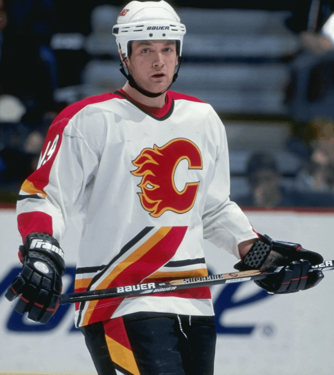
BB: Well, that was my fatal mistake. I really am a great believer in the diagonal in uniforms — you don’t see too many diagonals — and my thought was to put the flaming “C” on a podium, sort of a soaring-up podium. And then of course I used the diagonal slashes on the pants and the sleeves.
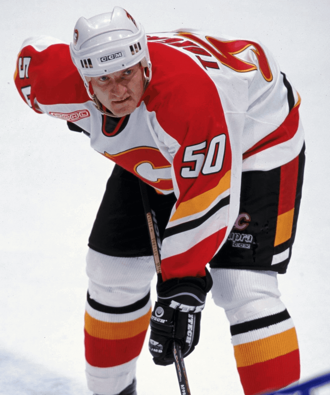
UW: So that was your concept from the start, to have this diagonal theme?
BB: Yeah. But in retrospect, it hasn’t been that popular of a uniform.
UW: The other big change for this uniform set was the introduction of black as a team color, which you said was requested by the team, right?
BB: Yup.
UW: Did they say why?
BB: I think other teams were doing it. So I guess they just wanted to be part of that. And I guess black is viewed, psychologically, as more aggressive.
UW: It appears that the one design element they didn’t use from your mock-ups was the chevron design on the socks. What was your thinking behind that design element, and why did they choose not to use it?
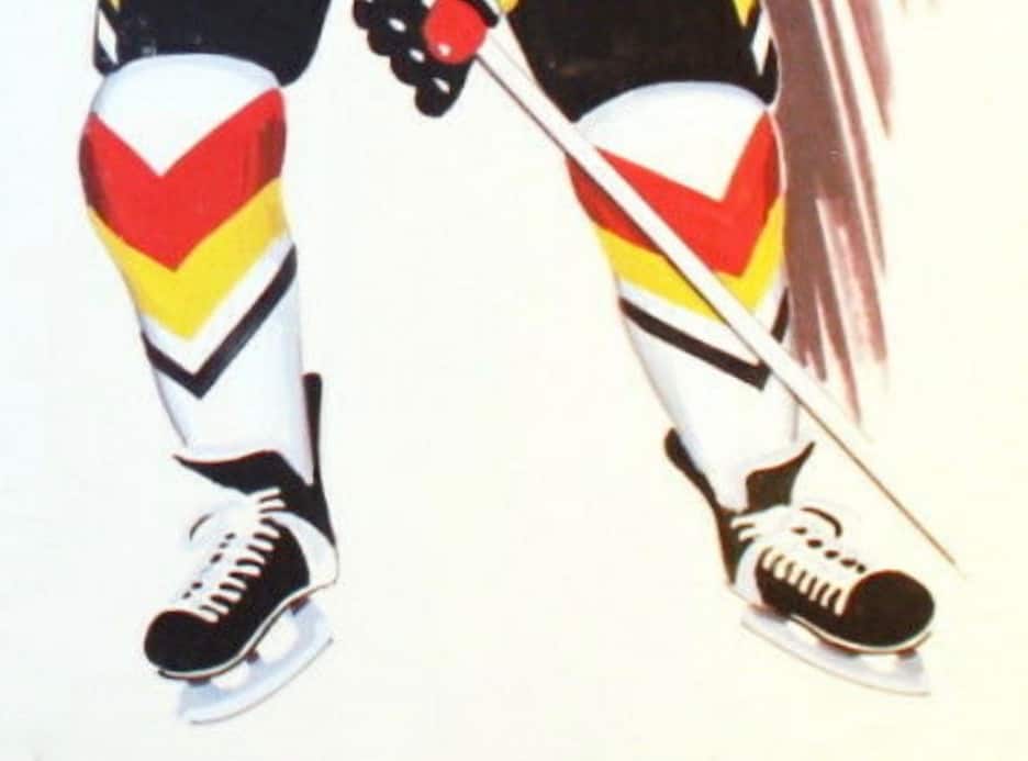
BB: I don’t know why. Sometimes sports executives don’t really explain why they think what they think. I just assume that sitting around the boardroom table, they decided that they liked the old-fashioned horizontal stripes.
UW: And the chevron was meant to stay in keeping with the diagonal theme?
BB: Yes, exactly.
UW: Were you disappointed that they didn’t use that element, which sort of ruined the consistency of the diagonal theme?
BB [chuckling]: You know, executives on hockey teams aren’t always that great on aesthetics.
UW: As you may know, the NHL ended up using something similar to your chevron sock striping for the 2007 All-Star uniforms. That was the first thing I thought of when I saw your mock-ups. Do you remember that, and if so, what did you think of it at the time?
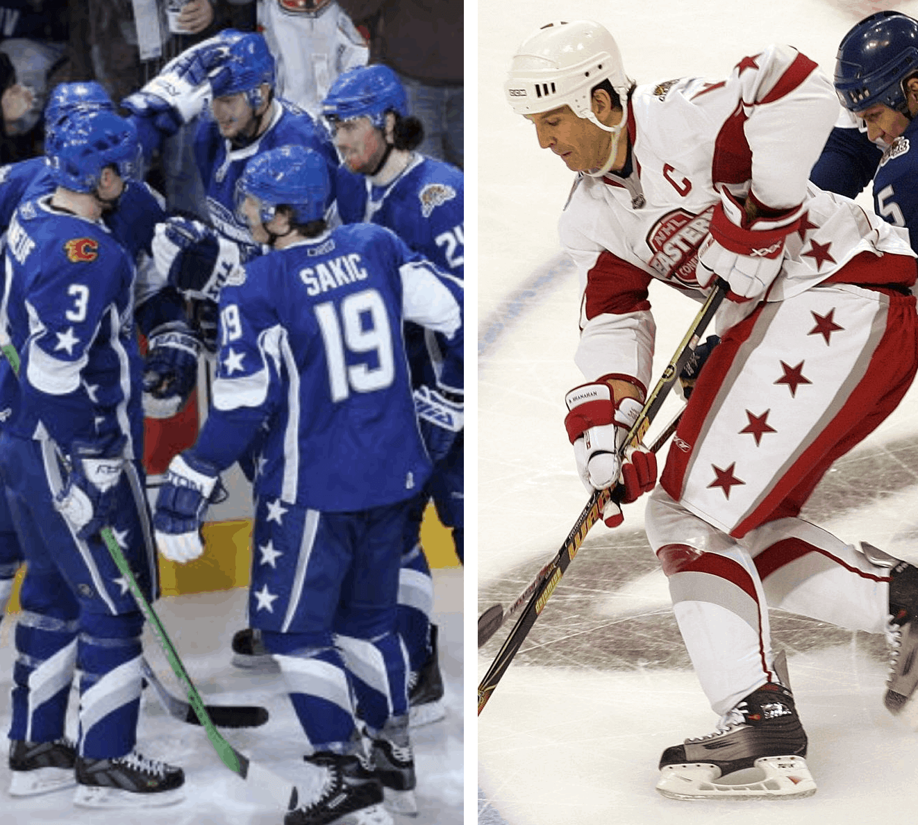
BB: Yeah, I thought the same thing. But you know, I guess you just have to roll with the punches.
UW: One thing you didn’t change was the team’s primary logo, the flaming “C.” Was that the team’s decision, and would you have come up with a new chest logo if you’d been permitted to?
BB: They said that wasn’t going to change.
UW: Let’s talk for a minute about the mock-ups themselves. The eBay listing says they’re acrylic on board. Was that your standard media at the time?
BB: Oh, definitely. It’s quick-drying and there’s no fumes. Definitely.
UW: Did you ever transition to designing on the computer?
BB: No, I never did start designing on computers. I always got as far as doing quick chalk sketches and someone else would put it on the computer.
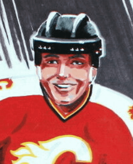
UW: I was also struck by the fact that the player in your mock-ups is smiling. Nowadays, most uniform mock-ups show a player who looks aggressive, very rough and tough. Your player just looks like he was out there having fun.
BB [laughing]: I’ve been involved with painting and drawing hockey all my life, and loving the game. I’ve always been upset that hockey is the only professional sport that allows and glorifies fighting. [One of Bill’s children’s books is called The Boy Who Wouldn’t Fight. — PL] So I wouldn’t want to put a grim-looking face on the guy — that’s almost a hockey cliché.
UW: Was the player shown in the mock-ups based on a real person?
BB: My friend Gary Makar — his son, Cale Makar, plays for the Avalanche now — Gary is the one who modeled that first [prototype] uniform, so it might have been his face. I’m not sure, though.
UW: The mock-ups show the player wearing No. 35. Is there any personal significance to that number? [Goalie Jeff Reese wore that number in 1993-94, which is when Bill would have been creating the design. — PL]
BB: No, there wasn’t.
UW: I’m a bit surprised you were able to retain the mock-ups. Why didn’t the Flames keep them for their own files?
BB: That’s a good question. I don’t know if they even kept Xerox copies.
UW: Did the Flames ever publicly identify you as the designer of their uniforms?
BB: Not to my recollection. There wasn’t a big [unveiling] presentation.
UW: I was going to ask if you recalled what you were paid for the job. But if you were on staff at the ad agency, then this project was just part of your salaried job responsibilities, is that right?
BB: Yes, that’s right. Just part of the job.
UW: Were you there in Calgary when the Flames wore these uniforms on the ice for the first time?
BB: Yes. It was a big thrill. I thought it looked pretty good!
UW: How do you feel the team’s fan base responded to the uniforms during the period when they were being worn?
BB: I think they liked it at first. But I think I made the flaming “C” too small. Nobody ever said that to me, but the “C” was larger in the next uniform design after mine.
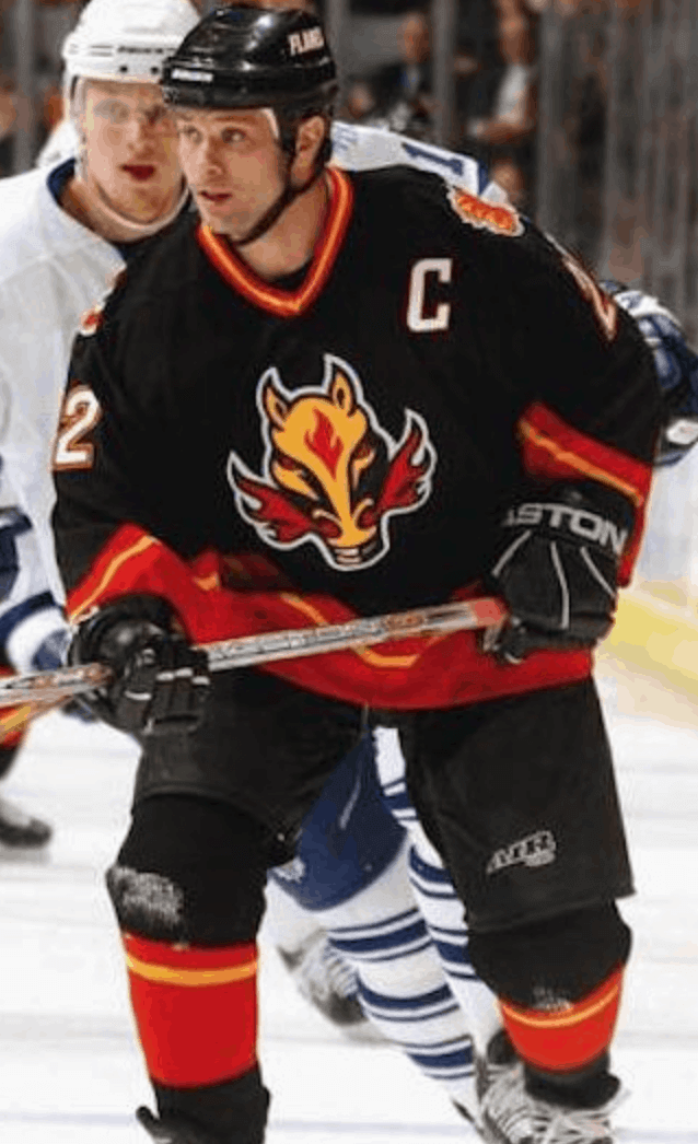
UW: In 1998, the Flames added a black alternate uniform with the fire-breathing horsehead design. Did you or your agency design that as well?
BB: We had offered something similar as an option for the original assignment, so that might have been the inspiration. But they went with someone else when they created that alternate design.
UW: After five seasons, the team stopped wearing your design and moved on to a new design. How did you feel about that, and did you have anything to do with the new design that they started wearing in 2000?
BB: I was a bit disappointed. But on the other hand, I felt I had misread the situation a bit by not making the flaming “C” as large as I could make it. And no, I had nothing to do with the next design.
UW: Did you ever design another NHL uniform?
BB: No, unfortunately.
UW: What other work have you done over the years for the Flames?
BB: Some programs, some ads, and some paintings of mine are hanging in their offices.
———
Paul here. It’s always sooooo interesting to get the backstory on a uniform design. I love being able to get this type of peek behind the creative curtain.
One thing you can’t tell from a printed transcript is what an absolute gentleman Bill is. It was such a pleasure talking with him! His artwork is gorgeous and his children’s books look fantastic. A major talent!
(Mega-thanks to reader Will Scheibler for spotting and sharing the eBay listing for Bill’s uniform mock-up artwork, which made today’s entry possible.)
Clown prince: My friend Rex hepped me to this eight-minute 1947 film called Diamond Demon. It showcases the acrobatic high jinks of baseball trickster Johnny “Jackie” Price, who was renowned for throwing two or even three balls at once, catching thrown balls in entertainingly dangerous ways, and even hitting pitched balls while hanging upside-side down! He does all of that, and more, in Diamond Demon, all while wearing a handsome Oakland Oaks uniform.
Price was a legit ballplayer — he had a cup of coffee in the bigs with Cleveland in 1946 — but his stunts took a tremendous toll on his body, which was riddled with dozens of broken bones, bruises, and probable concussions. He later sank into alcoholism and died by suicide in 1967. You can learn more about him here and here.
MLB musings: One thing I’ve been dreading for a while now is the prospect of Major League Baseball starting its season on the Fourth of July, a scenario that would surely result in such an over-the-top display of rah-rah silliness, complete with stars/stripes uniforms that would likely include another display of historical ignorance, that I’d probably forget why I ever liked baseball in the first place.
They’ve been saying all along that they need about three weeks to go from the start of “spring” training 2.0 to Opening Day, so the deadline for the players and owners to negotiate a deal in time to open the season on July 4 was last weekend. When the weekend passed without a deal, I quietly celebrated to myself and thought, “Now they can go ahead and strike a deal whenever they want — all good!” I posted a tweet about that yesterday afternoon.
I'm hoping MLB plays this year. But I'm glad the negotiations have now stretched out so long that they won't be able to launch on the season on July 4th, because that would've been a cringe-inducing rah-rah jamboroo to end all rah-rah jamboroos.
— Paul Lukas (@UniWatch) June 15, 2020
A few hours later, MLB commish Rob Manfred — a man who has been ruinous for the uni-verse and who also, I’m fairly certain, does not actually like baseball — said he wasn’t so sure there would actually be a season this year after all. A few hours after that, in a very conveniently timed leak, the Associated Press reported that they’d obtained a letter indicating that several MLB players and staffers had tested positive for the coronavirus.
It’s not hard to see where this is heading. A blind man could see it with a cane.
Enough — just make it official and cancel the season already. Even if you manage to get it started, you’ll likely have to shut it back down a few weeks later after the whole Mets bullpen (or whomever) tests positive. And even if you somehow manage to play the “full” schedule, that will likely be only 65-ish games anyway. Who wants to be the champion of a 65-game season? If your favorite team came out on top, would you really want your city to throw them a “championship” parade for that? Oh, wait — there won’t be any parades this fall because of the plague.
So just shut it down. It’s probably best for everyone. We’ll all be fine without baseball in 2020. Like I said last week, I don’t miss sports (and judging by the responses I got, neither do many of you). Extending the cold-turkey period seems like a healthier development than paying habit-formed attention to a sham season in the midst of two national crises.
Manfred is clearly out of his depth here. But unlike many fans and writers, I’m not particularly disgusted with either the owners (who, understandably, don’t want to lose money by hosting games without paying customers) or the players (who, understandably, don’t want to take a pay cut while risking their health and the health of their families). I don’t think either side “owes it” to everyone to play ball for the “greater good of the country” or any mythmaking nonsense like that. Are both sides looking out after their own best interests? Obviously. But I don’t blame either of them for that.
So call it a day, put up the “Gone Fishin'” sign, and hope that there’s either a vaccine or at least a better set of health and safety protocols by the time pitchers and catchers are due to report next February. If anything, going without baseball this year will make it easier to go without it again in 2022, when many observers expect there to be a work stoppage.
On the plus side, scrapping the season will delay the debuts of two things I’ve been dreading even more than a Fourth of July season opener: the Nike chest mark and a National League DH.
Click to enlarge
Collector’s Corner
By Brinke Guthrie
Follow @brinkeguthrie
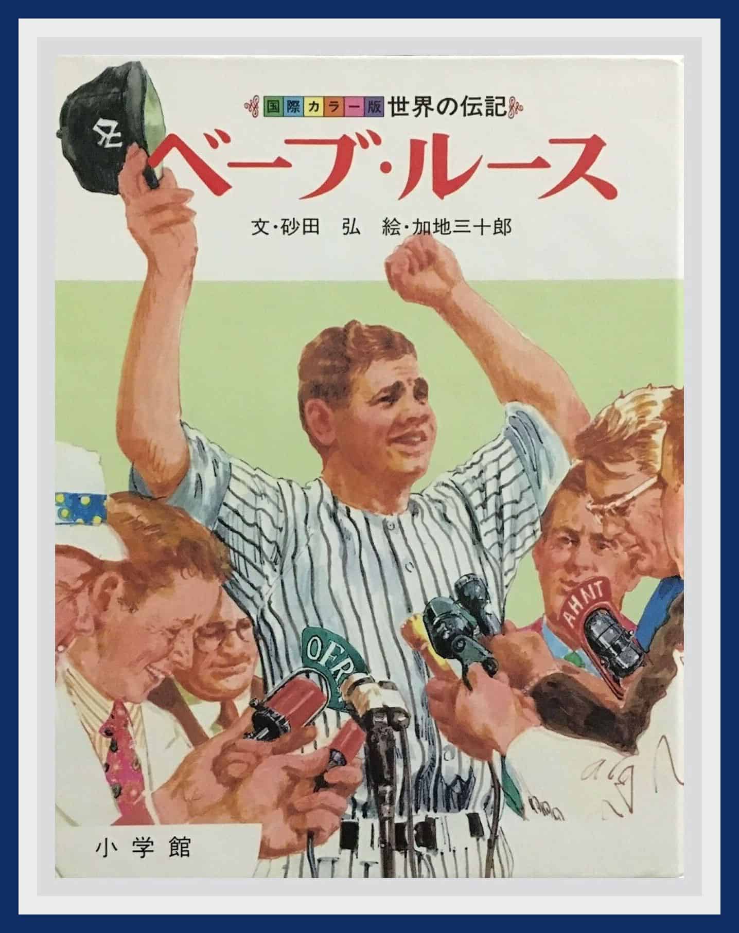
We kick off the week with this Japanese hardcover book about Babe Ruth-san. This one’s from 1983, with 120 pages and terrific illustrations throughout! Wonder what Japan’s own version of the Babe, Sadaharu Oh, thought of that.
Now for the rest of this week’s picks:
• Back in March, I featured a menu from Joe DiMaggio’s restaurant in San Francisco. With the Giants/Dodgers rivalry being what it is, and in the interests of equal time, today we have a menu for Don Drysdale’s Dugout in Van Nuys, with your hosts, Don Drysdale and Jack La Faye. “Your Favorite Cocktail Is Served by Our Dodgerettes.”
• I have no clue how to work this game, but the Damon Runyon Memorial Cancer Fund was the beneficiary of this board game from 1948. Look at some of the text here! “Arrest Cancer, It’s Wanted For Murder!” “For Amusement Only! No Prizes!” You got “three complete innings of baseball on one punch, for one cent.” (Runyan, of course, was a famous newspaper writer and author. He died of cancer in 1946. Wikipedia says he was cremated, and his ashes were “illegally scattered from a DC-3 airplane over Broadway in Manhattan.” Now that is a bigtime send-off!)
• Bruins fans! Pull out your old record player and cue up this Boston Bruins record commemorating their 1970 Stanley Cup win, called Goal: Bruins!. Nice painting, for sure, but why are we looking at Bobby Orr’s back? (Here’s another Bruins album, this one from the 1971-72 season, called The Avengers. )
• These Baltimore Colts binoculars come with their case marked “World Champs 58-59.”
• Speaking of the Colts, they were back in the big game a few years later but didn’t get quite the same result. Here’s the media guide for the 1964 NFL World Championship Game between the visiting Colts and the Cleveland Browns, which the Browns won easily.
• June 8, 1969 was “A Day To Remember” at Yankee Stadium, as spelled out on this button that marked Mickey Mantle’s retirement. (Although the design kinda reads as No. 77, instead of No. 7!)
• Staying in that same general era, this Cadaco All-Star Baseball Game from 1968-1969 is described as “in very good complete condition, there are 62 cards plus one strategy card. Cards include Rose, Munson, Seaver, Brett, Carew, Bench plus many more.” Great box cover photo — did the Phillies have gigantic uni numbers back then or what?
• Couple of items here for the great NFL QB Roman Gabriel. First, a Roman Gabriel Dart Game. (So you can…what? Practice how to toss a football?) Roman’s shown on the box cover in a solid-blue helmet, and for some reason they whited out his No. 18. Then here’s a 1970 Beautyrest by Simmons mattress ad featuring Roman and Mrs. G, too. “(He’s) the 6 foot four, 225 pound quarterback for the Los Angeles Rams. And when that much man hits the sack, it better be ready for him.” Also: “The only mattress firm enough for Roman Gabriel, and comfortable enough for his wife.” ’Nuff said.
• Kids who were Dolphins fans in the 1970s would’ve gone nuts for this
Dolphins Muscle Bike customizing kit from Sears (of course).
• This early-1970s 7-11 Slurpee Trading Cups Scorecard was the perfect way to keep track of which ones you had. I wish I had this, ’cause I had a lot of those cups! My favorite Slurpee (or Icee) mix: half-cherry, half-cola.
• This 1960s-70s New York Jets uniform set has the helmet, No. 66 jersey, and pads, but no pants. “Ma, how am I gonna play with the guys with no pants?!” Back to Sears you go.

Father’s Day reminder from Phil: Phil here. Sunday is Father’s Day, and I’ll once again be posting photos of Uni Watch readers’ “Dads In Uniform,” a tradition that began in 2013 (and has continued in 2014, 2015, 2016, 2017, 2018, and last year). This is always a very special day, and I’d love for as many readers as possible to participate — especially those of you who haven’t done so before.
To take part in this annual tradition, select one photo of your father (or grandfather or uncle) in uniform (it can be sports, military, work — as long as it’s a uniform) along with a short description of 100 words or fewer (refer to our prior years’ entries to get a feel for the style of the descriptions). Then email the photo — again, only one, please — and text to phil.hecken@gmail.com with the subject line “Uni Watch Father’s Day 2020” by this Thursday, June 18, midnight Eastern. I’ll run all of the submissions this Sunday. Thanks!
The Ticker
By Alex Hider

Baseball News: A uniform once worn by actor James Garner for a 1967 celebrity softball game is up for auction (from Dane Drutis and Adam Herbst). … In yesterday’s post, Paul mentioned a bogus Mets “NY” logo that graced the pages of a 1971 Mets publication. Reader Brice Wallace says Fleer stickers used that same strange logo throughout the 1970s. … Did you know the St. Louis Browns were set to relocate to Los Angeles for the 1942 season? But they had scheduled the announcement for the day after the Pearl Harbor attack, so the move was scrapped, and then the Browns ended up moving to Baltimore and becoming the Orioles instead. MLB.com did some fascinating revisionist “What if..?” history to see how things might have shaken out if the Browns had made the leap to the West Coast (from @texastrevor). … The Northwoods League, a collegiate summer league, will begin play on July 1. To cut down on travel, two new teams will play in Traverse City alongside the defending champion Pit Spitters — the Great Lakes Resorters and the Northern Michigan Dune Bears (from Jack Goods). … After word began circulating yesterday that the 2020 MLB season might not happen, Phillies OF Bryce Harper posted a photo of himself Photoshopped into a Philadelphia Eagles uniform (from Michael Zoid).

Pro Football News: Designer Peter Rogers took a stab at redesigning every NFL team’s jerseys (from Sam Kucera). … Some of the photos at the Packers’ pro shop have been touched up to render opposing teams’ fans in green and yellow (from @Calvin_Bruce61). … Former Broncos QB Tim Tebow posted a photo of himself in a white/carbon fiber concept Broncos helmet yesterday (from Sam Schwaller). … Cross-listed from the baseball section: After word began circulating yesterday that the 2020 MLB season might not happen, Philadelphia Phillies OF Bryce Harper posted a photo of himself Photoshopped into an Eagles uniform (from Michael Zoid). … Rider Prophet is recounting the best members of the Saskatchewan Roughriders to wear every number. Here’s the list for Nos. 60 through 69 (from Wade Heidt).
College and High School Football News:: Oklahoma State RB Chuba Hubbard was very upset yesterday after seeing a photo of coach Mike Gundy wearing a T-shirt promoting the One America News TV network, a sketchy operation known for spreading baseless conspiracy theories, but Hubbard and Gundy talked things out and now everything’s copacetic (from Dave Sikula and Timmy Donahue). … All Sports Tucson is running a bracket-style tournament to determine the best University of Arizona helmet of the last 50 years (from Rock De La Rosa and Javier Morales). … Robert Behrens is back with another edition of his excellent series, “Needlessly fixing college football logos.” Be warned: Lots of “Once you see it, you can’t un-see it” stuff in that link. .. Tim Tebow posted a photo of himself in a BFBS/camo concept Florida helmet yesterday (from Sam Schwaller). … Two high schools in Sun Prairie, Wisconsin — East High School and West High School — share a football stadium. The schools’ new turf field will feature a half-and-half design and unique end zone colors (from Zach Heller). … Speaking of field designs, Avon Lake High School in Ohio will have a new field next season (from Brian Kelley).

Hockey News: The NHL wrapped up its “Who Wore It Best” series by counting down the best players to ever wear Nos. 10 through 1 (from Wade Heidt).
.

Basketball News: The Raptors are reportedly getting new uniforms and a logo tweak in 2021. According to Chris Creamer, who broke the news, the main designs will heavily feature a chevron. But Chris also says his info for this report was pre-pandemic, so the plan may have changed due to the world turning upside-down since then (thanks to all who shared).

Soccer News: The MLS in ’96 Twitter account, which is following the league as it happened in real-time during its inaugural season, has been using the wrong D.C. United crest in its standings graphics. The logo they’re using wasn’t introduced until 1998 (from John Flory). … Sky Blue FC of the NWSL will unveil their uniforms on June 25 — two days before the league returns to play with the Challenge Cup (from our own Jamie Rathjen). … Staying in the NWSL, the North Carolina Courage have released their new uniforms (also from Jamie Rathjen). … Mexican club Atlas have signed a new deal with apparel company Charly (from Josh Hinton). … Following up on a Ticker item from last week, Umbro has apologized for a uniform it made for Linfield FC, a club in Northern Ireland. Critics said the purple-and-orange design closely resembled the flag for UVF, a loyalist paramilitary group responsible for hundreds of murders in Northern Ireland (from Ed Żelaski). … For tomorrow’s game against Arsenal, Manchester City will wear a shirt ad promoting their charity, Cityzens Giving for Recovery. … Here’s a pretty funny 10-second video on how designers come up with away kit designs (from Charlie Kranz).

Grab Bag: Virginia athletics have not taken the field since the school unveiled its new logo set earlier this year, but they’ve already made some tweaks. The sword elements included wavy hilts based on the walls, some serpentine and some straight, that enclose the pavilion gardens of the school’s Lawn — walls that some say have connections to slavery. The new tweaks replace the hilts of the swords (thanks to all who shared. … Longtime readers probably know most of these hidden meanings in sports logos, but there may be a few you haven’t noticed (from Scott Adams). … NASCAR is considering moving the cars’ side numbers to the rear quarter panel for next month’s All-Star race. It would be a one-time experiment based on the possibility of increasing ad revenue (from Greg Royce). … Speaking of NASCAR, Xfinity Series driver Kyle Weatherman will drive a car with a pro-police paint scheme that includes a “Thin Blue Line” flag and a #BackTheBlue hashtag (from Kary Klismet). … Dartmouth has removed the controversial weather vane that tops Baker Library on campus. The weather vane, which has been criticized for promoting racial stereotypes, was depicted on a Dartmouth lacrosse team helmet decal for one scrimmage in 2011 but was never worn again (from Tris Wykes). … With Independence Day approaching, Budweiser is planning a limited-edition can design featuring red, white, and blue camouflage patterns (from Paul Panganiban).

Click to enlarge
What Paul did last night: For the past week or two we’ve been wanting to make this recipe for lemon “goop,” which among other things is supposed to be good on fish. So on my way home from my daily bike ride yesterday, I stopped at the fishmonger and got a nice cod fillet. And after Pandemic Porch Cocktails™, we started cooking.
We made the goop, which basically involves zesting a bunch of lemons and then cooking the zest and the lemon segments in a saucepan with a little bit of salt, a lot of sugar, and two cups of water for about an hour; straining out the resulting lemon-pulp solids; and using an immersion blender to whip the pulp into a paste:

The process and the resulting condiment are both interesting, if not quite life-altering.
Once the goop was ready, I seasoned the cod with salt, pepper, garlic powder, and paprika and cooked it in a skilled with a few tablespoons of butter:

I’d show you how it looked fully cooked on the plate, but it turns out that a white-fleshed fish topped with pale goop, with white rice on the side, all served on a white plate, is not very photogenic. But it tasted really good.
Meanwhile: The branch is still there. (I’ve been thinking it’s too bad my name isn’t David, because then I could be a branch Davidian.)
As always, you can see the full set of Pandemic Porch Cocktails™ photos here.
Our latest raffle winner is Jake Arkless, who’s won himself a new Uni Watch membership card. Congrats to him, and thanks to Gavin Whitehead for sponsoring this one. — Paul
There’s no way that Cadaco All-Star Baseball Game came out in 1968 or ’69. If you click on one of the photos in the listing, Rennie Stennett is one of the player cards, and he did not debut until 1971.
You’re correct. That version of the game came out in the late ’70s because it looks just like the one I had as a kid around that time. The player cards included make that obvious also.
One of the photos with that eBay entry showed a “1968 Cadaco” in small type on the bottom of the box, but I’m guessing that’s just when the company got the trademark for the “All-Star Baseball” name.
The cars in the porch photo don’t appear to be practicing proper “car social distancing”
Interesting interview, funky sock stripes was a definite trend in hockey for a period of time. This included the straight vertical stripe, which I’ve been reminded of recently – by our Sports Network replaying classic World Junior hockey games
Those two cars are owned by the same couple, so they get as close as possible to provide more driveway clearance fore and aft.
Those NFL jersey designs should crossover (like DRI) to the soccer section. Some of the design elements were good, but why use a soccer template?
So many sleeves that will never be seen!
I agree with what you said about baseball. Bravo.
It’s not true that baseball owners lose money by playing in front of empty stands. The Marlins have been doing it for decades.
A good call by the Flames not to use the socks with the chevron design. Instantly reminds me of the original Flying V socks used by their rivals, the Vancouver Canucks.
link
Someone nominated Branch Rickey for said branch. I prefer Cliff.
Agreed about baseball this season. While In theory I would love to watch games, it wouldn’t really be relaxing for me. I watched golf on Sunday but spent most of the time flinching whenever players, , and tournament workers caddies stood too close, grabbed pins, swapped clubs, high fived, etc. Instead of being a break from the real world, it only served to constantly remind me of it.
1/2 cup of mayo, 1/2 cup of parmesan cheese, juice of one lemon, chopped fresh parsley, salt and pepper to taste.
So simple, but so incredible on fish. It’s good as is, but also lends itself to additions like dill, onions, capers, etc..
The Browns move to LA would have been ’42, not ’43.
Right. Fixed.
‘Who wants to be the champion of a 65-game season? If your favorite team came out on top, would you really want your city to throw them a “championship” parade for that?’
It doesn’t take long to forget those extenuating circumstances. There are a couple of Stanley Cups that were awarded after seasons that were shortened by labor disputes, and I’d have to look up what years those were. And you have to think about it to remember that the ’81 Dodgers won the Series after the infamous split season. People will accept this year’s champions, regardless of how strange the pandemic makes their seasons and playoffs. That will even apply to baseball with the labor dispute.
Conversely, I’m a little bit tickled as a Nationals fan by the idea of the franchise that was denied a potential 1994 championship might be denied a chance to repeat as champions after its first title in 2019. I love that kind of historical quirk!
And if MLB winds up playing some kind of glorified round-robin tournament in 2020 – which is what any “season” would be at this point – baseball fans would tend to remember the champion with an asterisk. The culture of baseball fandom is different from most other sports in that regard. Continuity and a sense of integrity are much more part of the game. (By “integrity” I means a sense that change or disruption can render the game illegitimate, not that there’s actually more integrity in the game. I mean to describe a perception, not pass a moral judgment.) Say the Yankees win trophy number 28 at the end of a glorified round-robin tournament. Yanks fans of course will revel in extending the ring count and ending the latest drought. Fans of every other team will forever read the Yankees championship list as 28*. And if, say, the Nationals win again in 2021, or whenever a full season is next played, lots of people will regard 2019-21 as an asterisked entry on the list of repeat champions. Sort of the Grover Cleveland of baseball, which would be quite apt for a DC team.
Think of it this way: If the season is cancelled, the Nats championship reign is extended by another calendar year!
Exactly! I’m the dourest of sports pessimists – not nearly as bad as was my dad, but I’m definitely his son in this regard – so no 2020 season means that the 2020 Nats can’t disappoint me by going on a September swoon and finishing a game shy of the second Wild Card.
Regarding the shared field at the Wisconsin high school.
Girls’ high-school lacrosse has made some sort of impact in the school district, given the fact that the arc, fan, and crease are the only other lines on the sketch other than the football lines.
The NASCAR all-star cars, if the numbers are moved off the doors, will look a lot like the NASCAR series that is run in Mexico, with full ads on the doors and really small numbers either on the rear fender or the A-pillar window.
It would be weird to see all the Penske “2”s not on the door.
Hopefully this is a one-and-done deal, unless the plan is to ultimately clear the hoods of ‘sponsorship’ ;)
In the waning years of the IROC Series (right before it went belly-up), the numbers were slid toward the rear of the car body to advertise the driver’s name.
The race has been moved from Charlotte to Bristol due to health concerns in NC; moving forward I’d like to see NASCAR move the annual All-Star event around to other tracks like most of the other big leagues do.
The ASA racing series tried running the numbers in front of the rear wheel opening and behind the opening back in the late 90’s/ early 2000’s. It did not go over well with the fans.
“MLB commish Rob Manfred — a man who has been ruinous for the uni-verse and who also, I’m fairly certain, does not actually like baseball”
that’s gold! hahaha
You may not be a Branch Davidian, but your porch is your branch office.
Not a fan of the broken pins on the Courage shirt. Looks like there’s a diagonal seam randomly placed across the chest, and the two pieces were misaligned.
Me either. They didn’t try any storytelling, so there’s not even a made-up explanation for why they’re broken.
How about Branch Paulinian? :)
Hi Paul. I’ve been a devoted reader for quite some time. Your comments on canceling the MLB season are perfect.
RE: The New York Mets “Today’s Baseball” cover may be the Phillies in red. That looks suspiciously like a Jim Bunning follow through.
Great interview, my how the times have changed. Imagine a team today just sending over a design to the firm and one guy doing it.
Hi Paul.
Thanks for featuring Bill Brownridge today. I purchased one of his original paintings years ago at an art gallery in Banff, Alberta. It’s of kids playing shinny. I have it hanging up in my front hallway. It always makes me smile – the colours are vibrant and he really incorporates a feel of movement, and more importantly, fun in his paintings, especially of kids playing hockey.
A great backstory too. He was born with spina bifida and club feet and as such couldn’t skate. He did play goalie though by wearing rubber boots over his moccasins – and wrote a children’s book called The Moccasin goalie – link
There is a short video in which he mentions Van Gogh as his inspiration and it shows a bit of his painting process.- link
Cheers
Ted
Thank you Paul for doing all the real legwork – getting in contact with and arranging an interview with Bill Brownridge.
Aw, thanks, Will — but it literally couldn’t and wouldn’t have happened without you!
Scott Adams, of Dilbert fame?
Seems unlikely. It’s a pretty common name, after all!
Really enjoyed the interview with Bill. I’ve always loved his design on the Calgary Centennials uni from the 1970s.
link
Oh, thank you — I’ll add that link to his mention of it in the interview!
I understand Paul’s position. I don’t want to see any player needlessly exposed to this deadly virus.
As a White Sox fan, I cannot but feel a little snakebit. The last time the World Series was cancelled the White Sox had been in a prime position to win it. Likewise in 2020, the Sox looked to be a team on the rise and its a bit of a bummer I don’t get to see it play out.
I’ve always been upset that hockey is the only professional sport that allows and glorifies fighting. [One of Bill’s children’s books is called The Boy Who Wouldn’t Fight. — PL]
THANK YOU. Sometimes I think I’m the only one tilting at that windmill.
I really am a great believer in the diagonal in uniforms — you don’t see too many diagonals
Agreed. In fact, this reminds me of Belgium’s 2014 World Cup jerseys.
link
MLB commish Rob Manfred — a man who has been ruinous for the uni-verse and who also, I’m fairly certain, does not actually like baseball — said he wasn’t so sure there would actually be a season this year after all.
If anything, going without baseball this year will make it easier to go without it again in 2022, when many observers expect there to be a work stoppage.
On the plus side, scrapping the season will delay the debuts of two things I’ve been dreading even more than a Fourth of July season opener: the Nike chest mark and a National League DH.
I miss live sports. I do not miss Manfred League Baseball, though. Shut it down. Get a labor agreement nailed down, replace Manfred and keep pitchers batting. Otherwise, I’m more than satisfied with cricket this time of year.
…did the Phillies have gigantic uni numbers back then or what?
No, Brinke, they had properly sized numbers. Everyone else’s numbers are too small.
Two high schools in Sun Prairie, Wisconsin — East High School and West High School — share a football stadium. The schools’ new turf field will feature a half-and-half design and unique end zone colors
That’s how the Meadowlands stadium and the new LA stadium should look! It’s nice to share.
No, Brinke, they had properly sized numbers. Everyone else’s numbers are too small.
Jimmer bringing the absolute truth to the masses. Every team should have big readable numbers! (The sizes should be big. The values of the numbers should not be big.)
Another shoutout to the chevron was the first alternate uniform of the Carolina Hurricanes – sleeve stripes and socks.
Ah, good one — I forgot about that one! (Thanks for always representing Carolina well, Gabe!)
Here’s the design Gabe is referring to:
link
Did the uni-watch masks get sold? I have tried to keep an eye out but may have missed it.
Teespring’s warehouse has been busy and they weren’t ready to deal with the masks yet. But I finally sent the masks to them yesterday — they should receive them tomorrow, and then we should have them available for sale by Thurs or Fri. Thanks for your patience!
Great post today Paul.
Curious if you could go into more detail regarding your takes on Manfred not liking baseball, and that he’s out of his depth as a Commissioner. I’ve felt a lack of confidence in him from the start, but haven’t been able to put my finger on why that is.
I feel he doesn’t like baseball because he has relentlessly campaigned to *change* baseball, primarily by making the games shorter. I’m not necessarily opposed to shorter games, but Manfred is obsessed with the topic — pitch clocks, experimenting with gimmicks to eliminate extra innings, seven-inning games for doubleheaders, etc. He’s like a federal cabinet appointee put in charge of a department whose mission he doesn’t actually support. I rarely if ever see him defend or champion baseball; I just see him say how baseball needs to change in order to appeal to The Youth.
As for him being out of his depth, his statement here was enough for me (although going from “We are unequivocally, 100% playing this season” to “Eh, maybe not” in less than a week’s time also qualifies):
link
And although you didn’t ask, I’ll also explain my statement about how he’s been ruinous for the uni-verse. Here’s some of what’s happened to MLB uniforms under Manfred’s watch:
1) Selling the side of the cap to New Era.
2) Selling the jersey chest to Nike.
3) Putting out feelers regarding uni ads.
4) MLB logo added to back of pants.
5) Holiday unis expanded to holiday-WEEKEND unis
6) Absurd/inconsistent socks with maker’s mark
7) Absurd Players Weekend uniforms
8) All-Star caps instead of regular team caps
9) Maker’s mark added to coaches’ helmets
Obviously, some of these things are worse than others (and I realize some people actually like Players Weekend and ASG caps). Overall, though, it’s hard to view Manfred’s administration as anything but a disaster for baseball uniforms.
It’s one thing to want games to go faster – most fans would agree with that, up to a point. Simply enforcing the rules of the game as regards batters standing in the batter’s box without extraneous timeouts would largely solve that problem.
It’s another thing to campaign, systematically and strategically, for there to be less baseball, as Manfred has done for years. Not “baseball, but better” as in faster games, but an absolute reduction in the amount of professional baseball played. The acme of which campaign is the 42-team contraction of the minor leagues scheduled to take effect in 2021. Less baseball: Fewer teams, in fewer cities, playing fewer games, fielding fewer players, for fewer fans. Combined with the doubleheader thing, declining support for youth ball, and the avoid-extra-innings business, the unified field theory of Manfred’s commissionership is a drive to reduce the amount of baseball being played in the world.
I get that. Thank you. Whether you agreed or disagreed with Bud Selig on the issues, there was never any argument that he loved the game, enjoyed its rich tradition and could easily speak of it in the same reverential tones as a Ken Burns doc.
And yes, the uniform implications of his tenure are disastrous.
The MLB article about the Browns near-move to Los Angeles is a fascinating what-if exercise, and it got me thinking about another potential game-changer franchise move. The San Diego Padres were supposed to relocate to Washington, and change their name to the Stars, for the 1974 season. What if that actually happened? How would baseball have realigned the National League divisions to accommodate for the new DC team coming over from California? Would San Diego have copied Seattle’s suit against MLB and likewise sued for breach of contract? What would a successful Washington Stars have meant for baseball expansion or relocation? It’s a fun rabbit hole to explore.
> National League DH
Embarrassing. Imagine kids playing Little League generations from now aspiring to make it to the big leagues so they can be a DH.
“I want to be a pitcher!”
“I want to be a first baseman!”
“I want to only do half the things everyone else does!”
That’s the thing, right? It just feels wrong to have a ballplayer who doesn’t play the field.
One of the first things kids are taught is that you can’t take BP until you’ve put in some time in the field, or shagged flies, or whatever.
I’m not wedded to the idea of pitchers hitting, but I *hate* the idea of hitters who don’t play the field. For people who hate watching pitchers hit (I don’t mind it myself, but I understand why some people do), I’ve always offered the compromise of simply eliminating the pitcher’s spot in the batting order. Go with an eight-man batting order — problem solved.
If MLB starts up, it would be the Mets luck to win the World Series, then we suffer torment for winning a “bogus” season and series. No thank you.
Considering the circumstances leading to the branch-watching, might I suggest “Branch Covidian”?
How did I not think of that?!
You win. You win EVERYTHING.
I totally had that Jets uni set when I was a kid.
*whistle*
Five-yard penalty
Misuse of whomever
I agree with Paul on the baseball season being a wash. I think the biggest difference between this year and other instances like strikes is that fans couldn’t go to games no matter what happens this year. No matter what anyone tries to say, when next season rolls around we’ll all pack the stadiums. And if they don’t, hey better and cheaper tickets for the 10 to 15 stadiums I intend to visit next summer.
The diagonal striping on the Calgary jerseys always reminded me of a bath robe. Nice to have a diagonal element but it never worked for me.
“One America News TV network, a sketchy operation known for spreading baseless conspiracy theories”
I think you nailed it there. If only the coach would have been wearing a CNN, MSNBC, CBS, ABC, NBC, NPR, New York Times, Washington Post, LA Times, New York Daily News, or PBS shirt all would have been well. No spreading of baseless conspiracy theories from these noble institutions.
Good comment Bob. I’m a Conservative and it makes zero difference to me what someone wears or supports. I don’t care for CNN but support free speech and any coach/athlete wearing their t-shirt is A-Okay with me.
Colin K. can wear “cops are pigs” are whatever if he wants. And fans can choose to boycott Nike or the NFL if they want. Let’s celebrate FREEDOM.
Actually, John, Bob’s comment had nothing to do with freedom of speech. It had to do with a specious conflation of a fringe conspiracy-driven media operation with legitimate media operations.
Paul, you’ve got a typo — the great Japanese home run hitter’s name is Sadaharu Oh, not *Sadahara. (Or, since his father was from Taiwan and he has always had ROC citizenship, you can say it in Chinese and call him Chen-chih Wang.)
Fixed.
Wow. Gundy and his player “talked things out”.
What a novel concept these days…