
By Phil Hecken
Follow @PhilHecken
I’m back again today with Matthew Drake, who you may recall did some pretty exhaustive redesign work on the 30 MLB teams, and who shared his designs with us recently. You might think he’d run out of ideas, but it turns out what we saw earlier wasn’t quite all he’d done.
I had hoped this weekend to bring you an interview with Matt, but my grad school classes are winding down and I’ve been very busy this past week with final projects and papers. It’ll all be over mid-week, so until summer classes start up at the end of this month, I can breathe a little Ethier easier.
Since I wasn’t able to complete the interview with Matt, I asked him for a brief set up of what you’re about to see. This is his Cooperstown Collection “outtakes” (NL edition). I’ll be back with Matt (and that interview) and his AL outtakes in the near future. Click on any image below to enlarge, and enjoy!
Here’s Matt:
Cooperstown Collection “Outtakes”
By Matthew Drake
These sets are basically alternative “outtake” options for the Cooperstown Collection uniforms I showcased in the main MLB series. Similar to how the NBA City Edition and Statement uniforms rotate out every so often, I imagined every team could switch to a new Cooperstown Collection uniform every year/few years if they’d like, especially since some teams have such rich histories full of many diverse designs. Or, unlike the City Edition uniforms, a team can keep their one uniform if it sticks and becomes an iconic part of the brand. I don’t have any Cooperstown Collection “outtakes” for some teams, especially those with more consistent uniform histories, so these designs are a bit less “organized.” However, I would love to have feedback from the readers on some of their ideas of what they’d like to see for designs inspired by team’s pasts.
Arizona Diamondbacks

A couple more variations on a purple & teal 90’s uniforms.
Atlanta Braves

An off-white 50’s throwback (like the current uniform), as well as a road gray version of the 70’s uniform.
Chicago Cubs

A fauxback using the fancy 1933 script, as well as a more true throwback to the 1940 uniform.

The road version of the 1940 uniform, as well as a 1957 full-team-name throwback uniform.

A couple of light blue uniforms based on the 70’s away uniforms, with more red injected in as a tribute to the Chicago flag.
Cincinnati Reds

A creme version of the 1936 fauxback, as well as a 1956 fauxback featuring Mr. Redleg.
Philadelphia Phillies

A couple more options with the old maroon scheme.
Pittsburgh Pirates

A couple of “We Are Family” 70’s fauxback designs.

Some variations on the mustard gold set.

Gold and black alternates of the mustard gold set.

White and gray iterations of a fauxback to Pittsburgh’s 1914 Federal League team.
San Diego Padres

Yellow and brown versions of the 1978 design.

A yellow top based on the Friars’ old BP jersey, one with orange outlines and one without.
San Francisco Giants

A couple of cream fauxbacks with the “Giants” script, one with Northwestern stripes and one without.
St. Louis Cardinals

An off-white fauxback to the 1940’s uniforms, as well as a navy uniform based off of an 80’s BP jersey.
Washington Nationals

A powder blue version of the racing stripe Expos set, as well as a powder blue version of the inaugural Expos set.
Thanks, Matt! OK readers — what say you? Please let Matt know your thoughts on these Cooperstown Collection “outtakes.”
I’ll be back soon with Matt with his AL outtakes and (hopefully!) a full interview.


Guess The Game…
from the scoreboard
Today’s scoreboard comes from Jackson Straw.
The premise of the game (GTGFTS) is simple: I’ll post a scoreboard and you guys simply identify the game depicted. In the past, I don’t know if I’ve ever completely stumped you (some are easier than others).
Here’s the Scoreboard. In the comments below, try to identify the game (date & location, as well as final score). If anything noteworthy occurred during the game, please add that in (and if you were AT the game, well bonus points for you!):

Please continue sending these in! You’re welcome to send me any scoreboard photos (with answers please), and I’ll keep running them.

Mail in the Age of CoronaVilkmas
Uni Watch readers will recall that about a month ago, the one and only Jimmer Vilk broke protocol to introduce a very special “Corona Vilkmas” in March, in an attempt to spread a little of his holiday cheer to his fellow UWers during the current COVID-19 epidemic.
A week later, the five lucky winners were announced, one of whom was John Chapman, whose name Jim drew to receive one of the five prizes.
Last weekend (I forgot to announce it!) Jimmer informed me he’d mailed out all of the packages to the lucky five.
And just two days ago, I received the following e-mail from John Chapman, who’d gotten Jimmer’s package in the mail.
I’ll let John take it from here. This is a great feel-good story. Take it away John:
Gents-
In the before times, most of the mail we receive was unsolicited advertising and school communications (usually redundant with text, email and robocalls.) We didn’t look forward to the mail or even check it daily. Snail mail was not a priority.
However, since we’ve been stuck at home, the mail has come to represent a connection to the outside world. We look forward to the letter carrier’s arrival and what could await in the mailbox – we even track the exact arrival time as a way to mark the days. Maybe a card from grandparents, a response to one of the kids’ letters, one of our much more frequent online orders.
Today was like all the rest, listening for the mail truck’s steady moan as it lunges up and down the street knowing full well that the first time we hear it the deliveries are being made on the other side of the street. Now, the second time. The second time! That’s when we get excited!
Our daughter went to get the mail and with an anxious excitement delivered a package to me. It had my name on it in unfamiliar handwriting and was not shaped like anything I’d ordered. The return address was personal, not a business and was a name that I could recognize. Or not. Who’s it from again?
Of course I opened it.
It was a copy of a book about John Wooden. I did not order a book about John Wooden. Is there a note? No, but there’s a Ziploc bag of NBA trading cards from the early 90’s!!! Things started to click!
Since the coronavirus panic has sent me home from the office my days have been stressful as my business has been busier than ever with less bandwidth as kids are home too. I recall sending my name and address in for a Uni-Watch raffle as I usually do when there’s an opportunity but I haven’t been on the site regularly as work has been infringing on my personal internet consumption.
I was on a work call when the package arrived and had to stop the business training that I was leading to discuss this delightfully strange arrival. My coworker was born just a month before me and as I virtually shared the cards with him he asked about the other players. It gave us a chance to connect on shared experiences of collecting cards in our youth, the memories of the Atlanta 1996 Olympics and build a tighter bond. We looked up uni-watch.com together and found the post with the listings and had a great chat about uniforms and our childhood.
The package arrived today and I was not expecting these trinkets. I’ll have to figure out how to display these relics that bridge my childhood and adult interests!
As always, thanks for maintaining this unique, interesting community. Otherwise, I never would have met kind and generous internet strangers like Jimmer Vilk!
Thank you!
John
How great is that! Thanks (again) to Jimmer for his generosity, and to John for sharing this experience with us all. ‘Twas a little ray of sunshine during an otherwise bleak time!
Click to enlarge
And now a few words from Paul
Hi there. Lots of stuff to tell you about:
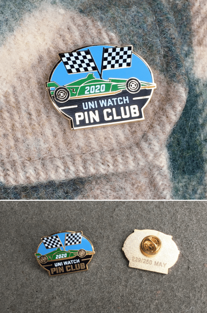
• As you can see above, the Uni Watch Pin Club’s design for May has launched. Designer Todd Radom and I came up with the Indy500 theme back in early March, before the world turned upside-down. But even though the race has been postponed due to the pandemic, it’s still a cool-looking pin! We’ve produced this one in a numbered edition of 250, and more than half of them sold on the first day, so move fast if you want one — it’s available here. (And if you need to get caught up, the January, February, and March pins are still available. April is sold out!)
• In case you missed it on Friday: I had previously mentioned that the folks at Topps were going to enshrine me on my very own official trading card. Now it turns out that it’s not going to happen after all — but not because of the pandemic. It’s a story of corporate pettiness (not by Topps), and you can read all about it here.
• The Kentucky Derby would normally be taking place today. Obviously, that won’t be happening, but I’m still maintaining my annual ritual of making Derby Pie, and I’ve written a short article about that for The Boston Globe. Their online content is paywalled, but here’s a screen shot of the print version.
• In case you missed it earlier this week, here are the Uni Watch MLB Power Rankings — my first-to-worst assessment of all 30 current MLB uniform sets.
That’s it. Now back to Phil!
The Greatest Two Minutes In Sports

[Editor’s note: The following is a column I’ve run in the past — but it’s always good on Derby Day (most of the links should still be good). Enjoy! — PH]
So, the Derby’s today. The Kentucky Derby. You know, the “Most Exciting 2 Minutes in Sports.” The kick-off to the triple crown. The Sport of Kings (or is that boxing?). No matter. It’s Derby Day!
Well, due to COVID-19, all sporting events have been cancelled or rescheduled — and the Derby wasn’t spared either. It has been postponed — assuming things have improved enough by then to still run the race. Since its inaugural running on May 17, 1875, the race has been held without interruption at Churchill Downs in Louisville, Kentucky, and has brought us all the mint juleps, oversized hats, and thrilling close calls our hearts can handle. But this year, things will be different. Instead of being held on the first Saturday in May, the Derby has been rescheduled to September 5, 2020.
You can still watch the Kentucky Derby today — only it will be a replay of the 2015 race. And that’s not all: The day’s festivities also include a “virtual horse race” in which fans can choose their favorite horse to win the virtual race on kentuckyderby.com and make a donation for COVID-19 aid efforts. Not only that, there will also be something called the Kentucky Turtle Derby (the slowest two minutes in sports?) as well.
So, even though we won’t have an actual race today, we can still break the Derby down into its few basis elements.

The Mint Juleps: The first (and in many eyes, most important) is the Mint Julep. I mean, c’mon — is there a single drink that is more synonymous with a sporting event than this one? I think not.
The Hats: For many, it’s all about see and being seen. And that means sporting the classiest chapeau, the hottest hats, the largest lid or the tastiest topper you can find. Some are simply stunning. But usually, especially since the aforementioned mint julep is a part of the day’s activities, the choice of headwear is never boring, although frequently what is lacking in taste is more than made up for in original design. Of course, some might say this is the height of douchebaggery. But where else can you wear a funny hat, get liquored to the gills, AND walk away with more bank than you came? Not too many places.
The Silks: Those colorful outfits the jockeys wear? Yup, silks. And there’s nothing purdier than seeing them on top of the ponies on race day. Whether they’re heading for the gate before the race or just breaking on their run, there’s something incredibly beautiful about what can only be described as poetry in motion. When you get a muddy track or an overcast day, the men in silks just seem to burst into magnificent color throughout the race.

The Roses: They call the Kentucky Derby the “Run for the Roses.” Why? Well, because the winning horse gets a shitload of the pungent red flowers. Sometimes they even put ’em on the jockey. They’ve been doing it forever. It’s a nice tradition. Seems like every year the bouquets and blankets get bigger and bigger.
The Spires: No matter when the race, no matter what the year, there are few landmarks so associated with a single event than the famous spires at Churchill Downs. And why not? They make a fantastic frame for a shot. They are as much a part of the race as the race itself. Anytime you see a picture that includes this architectural icon, you know it’s Churchill Downs, and you can be pretty certain it’s from The Kentucky Derby.
The Starting Gate: Not nearly as iconic as the spires, but still an integral part of the race. There is usually a pretty large field in the Derby, and the gate used to be both beautiful and classic. As time progressed, however, it sadly became less classic and more of a corporate billboard. Here’s what it looked like in 2008. Can they put any more shit on there?
The Bugler: Some call him the trumpeter, others call him the bugler. But no matter what you call him, there is no more anticipated music maker on race day at Churchill Downs than the man in the funny red jacket. Well … maybe the people enjoy a rousing chorus of My Old Kentucky Home more than they do the call to post, but the bugler is the most anticipated fat man in a red jacket fat man in a red suit in Kentucky on the first Saturday in May.

The Pose: Ah yes. The win. And with the win comes the pose. It’s not unique to the Kentucky Derby by any means, but there’s something about winning the Run for the Roses that makes the win all that sweeter. It’s like the ultimate aphrodesiac right there.
The Red Carpet: Wait…what? This aint the Oscars. No, but that doesn’t mean the really special people don’t get the Hollywood treatment. After all, what would the Derby be without Visa and some Grade B talent to share in the fun? OK — VY looks great in that suit, but really, you have to wonderlic if he really likes the ponies or the attention. Seriously, are they there to hit the Exacta or just to show off a really nice hat?
The Jockey Room: I’m not sure what exactly they call the place where the jockeys hang out before and after they race. But it is a really cool place where they keep all the silks. So many to chose from. I wonder, do they just randomly pick one or what? “I like this purple one, I think I’ll wear this one today.” No?

The Rail: No photographer worth his salt would take a shot at the Derby without taking one from beneath the rail. It is the classic shot of the race. No matter what the year, no matter what the horse, you can always count on the classic shot perfectly framed by the rail.
The Finish Pole: That almost sounds like an oxymoron or a really messed up European. But in reality, while the horses cross an invisible “line,” they are actually passing the finish pole. Now, the lettering on the obelisk has changed slightly over the years, the grand finale of the race has always been accomplished by crossing the finish line and passing the finish pole. Yep. That’s one sweet sight for a weary rider after the most exciting two minutes in sports.
Enjoy the race today. Throw a party. Make some mint juleps. Wear a silly hat. Go on — you know you want to. It’s Kentucky Derby Day. We’ll just have to wait a few months for this one…
The Ticker
By Anthony Emerson

Baseball News: Traditionalists, beware: tweaks are coming to the Red Sox’s uniform, according to team president Sam Kennedy. The money quote from Kennedy: “(The changes will be) likely geared to get us to a uniform that is geared towards high performance. We will always be respectful of our incredible traditional look and feel, but we are always open to new and different concepts as time goes by.” Full (paywalled) article here (from Peter H. Fahey). … Nike and New Era apparently have different understandings of what shade of yellow the Brewers are now wearing. … Check out the difference in uni number fonts for Cleveland manager Mike Hargrove and OF Paul Sorrento. Sorrento’s “1” is thicker (from @Finerific). … Inspired by yesterday’s ticker item about the Hawaiian Winter League, reader Jack O’Connor writes in: I took a trip to Hawaii in 1994 and came home with shirts or caps of a few of the Winter Baseball teams. I remember the Honolulu Sharks, Waikiki Beach Boys, Lahaina Whalers, and Kauai Emeralds. This Maui Sting Rays shirt is the only one I have left (I always thought they had the best logo of all the teams). I tried to share int he comments but couldn’t upload the pic.” … A Rockies blog has evaluated each uniform in the team’s history to try to determine which one is the best (from Kary Klismet).

NFL News: Here’s a good article about what it would take for the ownership of the Titans to return the Oilers’ branding to the city of Houston (from Kary Klismet). … Kansas City has revealed what numbers the team’s rookies will be wearing (from Spencer Davis). … Can we get some condensed letters for Donovan Peoples-Jones’ NOB? Come on, Browns (from Brian Eddy and @JThrock45).
College Football News: An Iowa State blog has ranked the top 20 uniforms in team history (from Kary Klismet). … Also from Kary: The Athletic has ranked the best and worst alternate uniforms in college football history (paywalled).

Hockey News: Here’s an all-time power ranking of the Sabres’ uniforms (from Steve Necaster). … Fascinating read on the old technology at the Nassau Coliseum (from Oleg Kvasha). … Next week, the AHL’s Toledo Walleye are having some sort of football crossover with their nixed identity, the Toledo Bullfrogs (from Mark Monroe and Devin Meyer).

NBA News: A Michael Jordan fan is collecting a ticket stub from every game Jordan played in with the Bulls and Wizards (from Mike Chamernik). … A Rockets blog has a rather thorough look at the team’s uniform history (from Kary Klismet).

Soccer News: New third shirt for Borussia Mönchengladbach, which has no uni ad. A uni ad will be added on July 1, when the team’s new advertiser takes over the contract (from Ed Żelaski and Josh Hinton). … The Dallas Burn had the largest live animal mascot in MLS history, a stallion named Islamico (from Wade Heidt). … Also from Wade: FC Cincinnati’s stadium is progressing despite the pandemic. … Altrincham F.C. of England’s 6th-tier National League North have released renderings on what they’re redeveloped park will look like (from Kary Klismet).

Grab Bag: The Athletic has conducted a survey (paywalled), and found the Braves and Georgia football have the best unis according to Atlanta sports fans (from Shano Spink). … The Athletic also did a similar piece for Dallas (from Chris Mycoskie). … The FCC has a new seal. Old one is here (from William F. Yurasko). … Big masks were put on the lions outside of the Art Institute of Chicago. One night in, someone stole one of the masks (from Mike Chamernik). … A curling broom company is having a contest to design contest to create a USA-themed handle (from R. Scott Rogers). … Ohio Governor Mike DeWine loves showing up in Uni Watch tickers, apparently: he pulled off a mid-presser tie change during his most recent coronavirus press conference (from Joey Rogers).
And finally… that’s it for today. Sorry for the (relatively, for me, anyway) short post, but I’m in the last week of my spring semester of grad school and have had final projects and papers galore, so my Uni Watching has been limited at best. But be sure to check back tomorrow, as a favorite guest author (and pal of mine) returns with another great story! Catch you then.
Looks like the game on the scoreboard is Giants @ Phillies, the second game of a doubleheader on Thursday July 8, 1965. I don’t know if anything about it is particularly historic, but it looks like the first game of the doubleheader started at 6 PM eastern, which would be insane today.
I grabbed July 8th, 1965 as well.
Best guess I can figure: Dick Allen hit a grand slam in the first inning.
Also, Allen had gotten into a fight with teammate Frank Thomas a few days earlier, in which Thomas swung a bat at him.
The Phillies released Thomas – he was officially acquired by Houston on July 10th.
I’ll take a shot at it…
Dick Allen, Willie Mays and Willie McCovey are all part of a list of players who won both Rookie of the Year and an MVP in their MLB careers.
Final score shows to be 4-2. The scoring is a Dick Allen Grand Slam in the first and two Solo HR’s by Mays and McCovey accounting for the Giants scores.
Unfortunately, only Mays and McCovey are in the HOF. Hopefully when the Golden Era HOF committee meets in December, they’ll right a wrong and select Dick Allen for HOF.
GTGFTS Giants-Phils July 8, 1965. Game was over in less than two hours.
I want to be Nikesceptic in all things, but that Brewers yellow thing looks more like a clash between on-field and fan-merch styles. Fan merchandise usually differs from on-field items.
If the Phillies would go back to their maroon unis, they would instantly go from my most-hated MLB team to my fallback NL East team. Such a good look. And boy howdy would the Nats look good in racing-stripe Expos power blues and pinwheel caps. Especially if they used their new block-W-and-dome logo instead of the curly W.
Great post on those baseball uni concepts!!! Terrifying news in the ticket though about the Red Sox tweaking things ! What is that all about! Doesn’t sound good for the Red Sox or any team for that matter !!!!
The Red Sox have hardly been an example of a team that has held to tradition. They’ve gone full bore on softball jerseys, they abandoned the navy undersleeves, they went to the pajamas look in the 1970s, etc. I’d be more worried if it was a team like the Dodgers or Yankees abandoning tradition.
Hopefully they go back to blue undershirts/accessories. The red is a bit too garish for my tastes. I always loved the blue sleeved look. Pair it with some late 60s stirrups and call it good.
A lost May. Usually, we get two of the greatest single-day sporting events, the Indianapolis 500 and the Kentucky Derby. Maybe not uni-specific, but I love the colors and designs of the different car liverys and jockey silks we get with these two great American events.
I worked in sports in newspapers for 15 years. Each time I designed a front page with that day’s Kentucky Derby results, I always used the photo of the finish with the twin spires of Churchill Downs as the backdrop. Can’t think of anything more eye-catching.
I love the colors and tweaks on just about all of Matt’s uniforms and wouldn’t mind seeing them on the field, but as a Chicago Cubs fan, I have to take issue with one thing: NOBs on all the Cubs’ uniforms, even the throwbacks that link, whereas other more NOB-loving teams like the Cardinals get theirs removed.
The 1930s fauxback (which looks amazing; that script logo is underused) and the ’30s/40s throwback (which they wore in 2014) would look infinitely better without those hideous NOBs. I’d also swap out the modern number font for the beautiful Shepard original, featured on this site with its distinctive unserifed 1, but either is fine.
I like the light blue with pinstripes, too; right around when the Cubs were wearing their circa-1980 version of this, with almost no red, the link had a design very similar to Matt’s. Chicago city colors are so close to the Cubs’ colors that they really should put some “city” elements into some of their uniforms, particularly if they ever go back to powder blue on the road.
Other than the NOB thing I really like all the others — the Phillies look great in maroon; the Pirates in mustard, and the Padres in brown. Baseball needs more color!
Jockey room and silks.. the Derby is usually the last race on the card. The jockeys usually ride more than one mount a day, often for more than one farm so different silks.
The Athletic piece about UGA and the Braves having the best uniforms in Georgia is the most self-evident thing ever written. Look at the competition! Wish I could get paid for that.
Agreed, and not worth the paywall.
Great job, Matt. Brought back fond memories of the first baseball game I ever attended- a Phillies – Pirates game in 1978 at the Vet. Stargell, Schmidt, Parker, Bowa, Luzinski, Tekulve. What a uni match up.
The only change I’d even think to ask for is instead of using the Senator style W, you simply turn the Montreal M upside down. Other than that, spot on!
Yeah, some sort of bizarre mash up of a W with a DC worked in. An upside down Montreal M is a good starting point.
In Hockey News – Toledo Walleye are in the ECHL not the AHL
Renaming the Texans as the Oilers would be righting a wrong which has gone on for too long. Didn’t know The Adamses retained the legal use of the name; I thought it was an NHL-type system where the league owns all the identities. What I wouldn’t give to see the oil derrick return.
I really wish the Phillies would go back to the maroon. It’s a unique color for baseball that they alone owned.
A little late…
The Phillies have a rich uniform history, but the one look most pine for is the Schmidt-era maroons?
They are dated and over-rated.
Matt-you know what I’m gonna say, right? The Nationals concept needs the Expos number font!
Solid work overall, love the D’Backs treatment (if Florida refuses to embrace teal, Arizona can own it).
As if the Houston Oilers identity, it’s been my long-held view that it’s Tennessee’s franchise property and should remain so.
The spires at Pocono Raceway were modeled after the ones at Churchill Downs.
Hope to see them when NASCAR racing resumes!