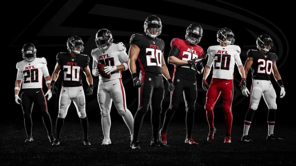
Click to enlarge
At about 7:30am yesterday, I posted yesterday’s blog post, which was about the Bucs’ Tuesday unveiling and the purported Falcons leaks that had been circulating. At 9am, the Falcons — who had been slated to unveil next week — shifted into “Ah, fuck it” mode and revealed their new set (lots of additional photos here).
So the bad news was that yesterday’s daily post was already up before the surprise unveiling. The good news is that I’ve had a full day to write the entry you’re about to read, so it’s a lot more complete that it would have been if I’d written something on the fly.
Before we get to assessing the uniforms’ pros and cons, here’s some basic factual info:
• As you can see above, there are lots of mix-and-match options, including a throwback (easy to spot at far-right because it’s the only one that looks like an NFL uniform). The team’s press release says there are eight different combos, including the throwback, but the photo shows only seven. I asked a team official what the eighth combo would be and was told, “Black top with red pants.” If you need help visualizing that, it would be something like this:
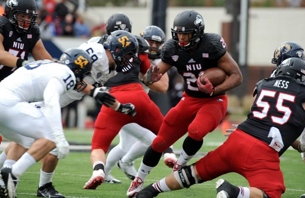
• The various combos notwithstanding, the press release says this: “The new official Falcons home look will feature black jerseys and black pants with the away look going white on white.” So those are presumably the two looks we’ll see most often.
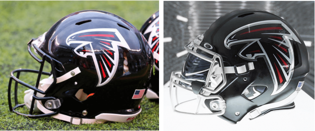
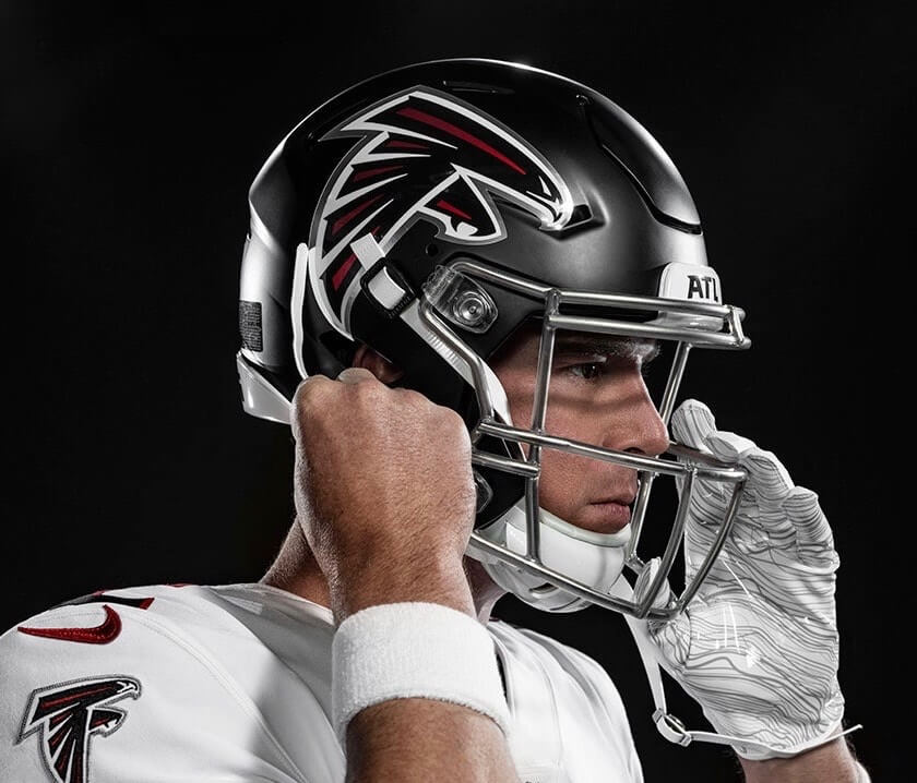
• As the leaked photos indicated, the new helmet has a satin matte shell and a chrome mask. What wasn’t so apparent from the leaks, however, is that the side logo is now larger — “nearly 30 percent larger,” according to the press release. It also has a chrome outline. Here’s a side-by-side comparison — old helmet on the left, new on the right — followed by a closer look at the new design (click to enlarge):
• As you can see, they didn’t even go through the pretense of having socks for the non-throwback uniforms. That’s disappointing, but it’s also an accurate reflection of where the league is at these days in terms of hosiery, as most players just wear tights anyway, regardless of the official sock specs.
• They are referring to the gradient uni simply as a “gradient alternate,” not as a Color Rush design, although I assume it will essentially function like a CR uni. In other words, I don’t think they’re going to add a mono CR uni on top of what they’ve already unveiled.
• A team official says that if the one-shell rule is lifted in 2021, they’ll add a red throwback to the mix.
Okay, those are the basics. Now then: How bad is this uniform set? Let us count the ways:
1. The Jersey Side Panels
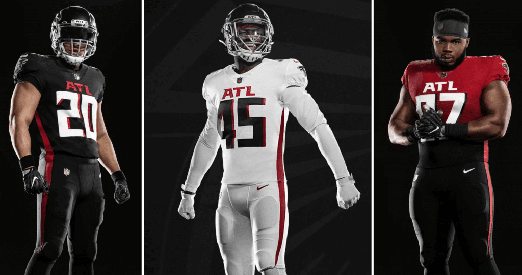
Here it is, the year 2020, nearly a quarter-century after Nike brought its wretched side panels to the NFL via the Broncos’ 1997 uniforms. That look was never good and is now horribly dated to boot — that’s why we all cringe when we see the Patriots’ side panels, or the Bengals’ side panels, or any fucking team with side panels. It’s a miserable look. True, the Falcons’ new panels are thinner, but it still looks like dreck, and it’ll look even worse on the field because we all know that players in a game don’t keep their jersey stripes and pants stripes perfectly aligned like they do during a photo shoot:
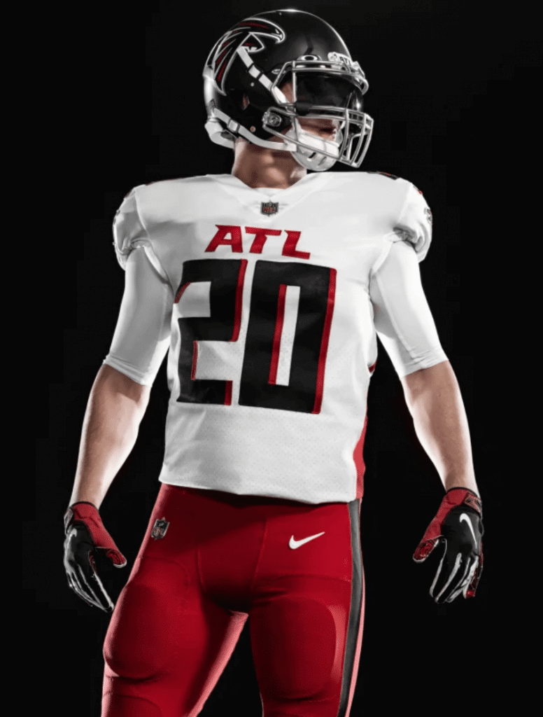
In addition, it appears that the side panels on the white jersey won’t match the color of the piping on the red pants, which defeats the whole point:
The same problem will occur with the black-over-red combo.
2. The Number Font
Cartoonishly bold and filled with needless little beaks and talons (oooh, very falcon-like!), this is classic Nike typography — long on style but not built to last. It’s nowhere near as bad as Tampa Bay’s alarm clock font, of course, but that’s about the best thing I can say about it. And as I mentioned yesterday, I really dislike it when drop or block shadows go directly to the right, instead of down and to the right, because you only get the three-dimensional effect along one axis instead of two. (I feel the same way about the Lakers’ current block shadows, which go straight down instead of the original down and to the right.)
3. The Chest Mark
Oooh, they’re repping the ATL — edgy! It makes the whole package look XFL/arena/high school (take your pick). As reader Brad Susany put it in an email to me yesterday, why not just put “Hotlanta” on there and get it over with?
4. The Gradient Alternate
Look, I get it: They’ve gone full-on superhero video game with this set. That’s the whole point — it’s why they’re wearing mono-black at home and mono-white on the road, to create that bodysuit/costume effect. But even by those standards, the gradient thing is laughably bad, an instant classic destined to be included on lots of “Worst Uniforms Ever” lists (maybe before it even takes the field!). Thankfully, it’ll be worn only once or twice per season, which seems like exactly once or twice too many. I mean, look at this shit (click to enlarge):
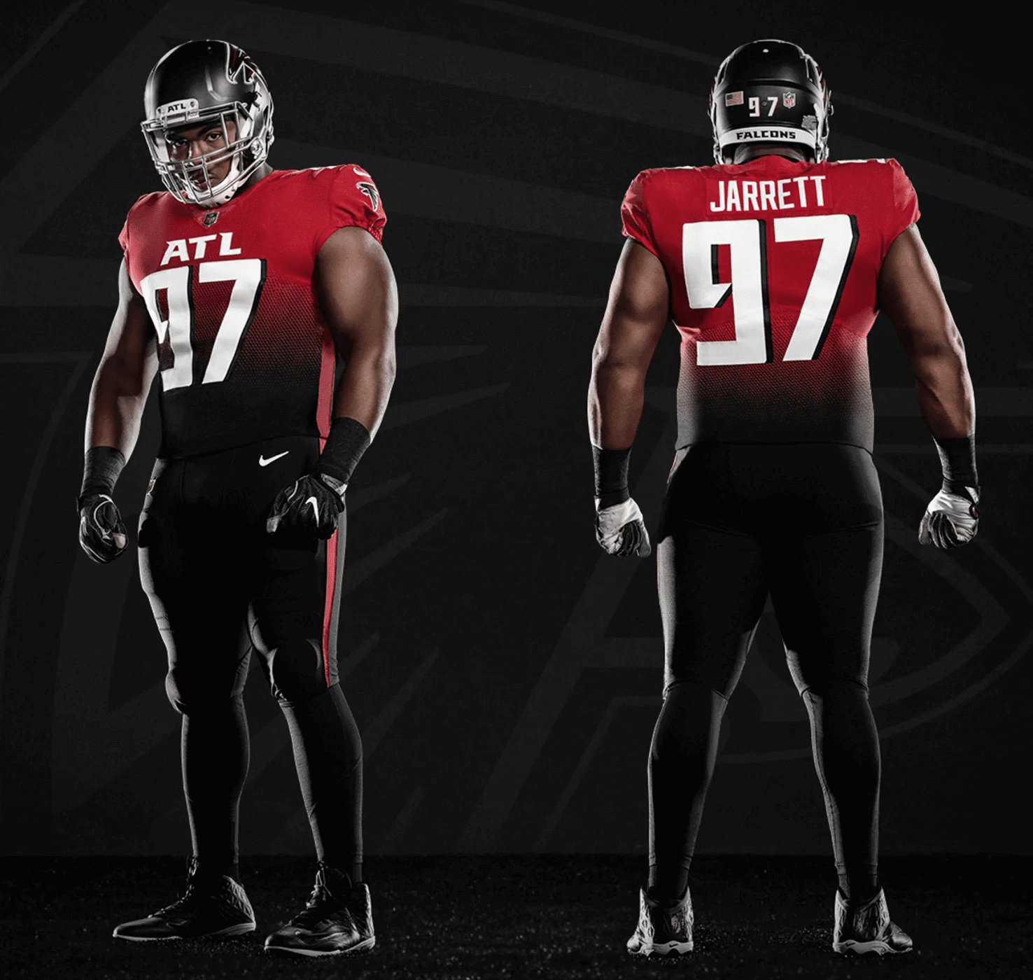
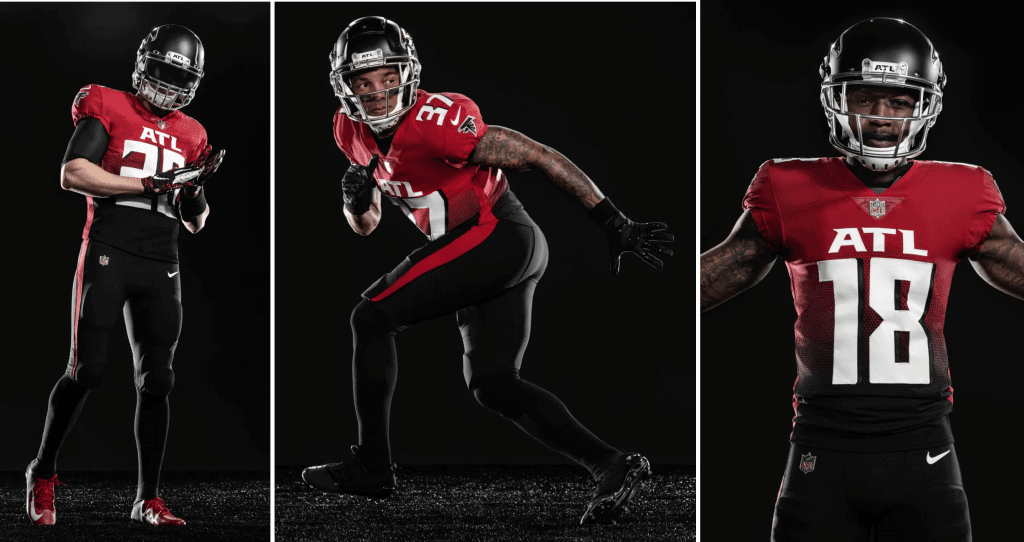
I guess you could say this uniform neatly symbolizes the Falcons’ longstanding flip-flopping between black and red (maybe the Texas Rangers should do something similar!), but that’s about the best I can say for it.
Also, as lots of folks have pointed out, this design resembles, well, several other designs that you wouldn’t really want your new uni to resemble:
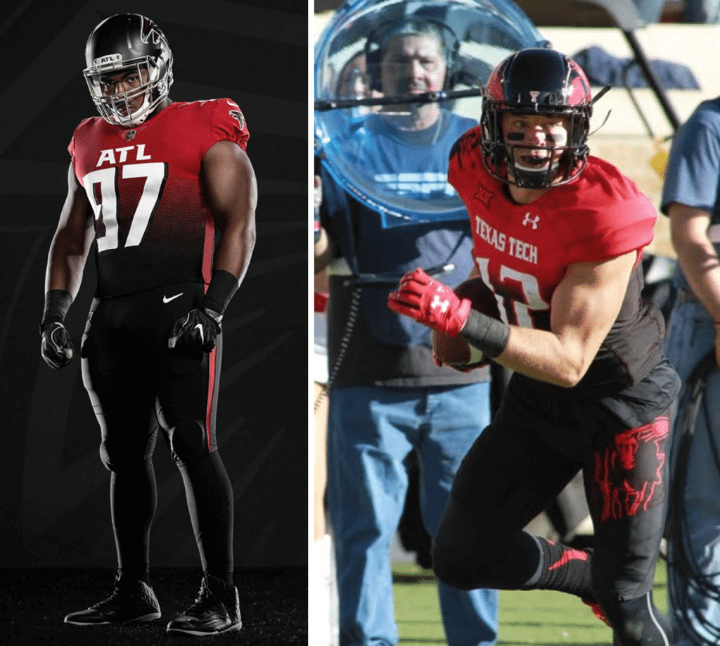
Thought these looked familiar @PardonMyTake @UniWatch pic.twitter.com/yifJOsjT6e
— Kevin Sprague (@Kev_Sprague) April 8, 2020
Who did it better? https://t.co/rmTQbTtiIj pic.twitter.com/fQQxpoaBsd
— Football Kit Watch (@Kit_Watch) April 8, 2020
Obviously, the whole point of this design is to be polarizing. Classicists like me are supposed to hate it (and I’m dutifully doing my part); kids who’ve never heard of Steve Bartkowski are supposed to think it’s dope, or fire, or whatever. And that divide is supposed to weed out all the squares or some such. That’s not a bad approach for certain things (art, for example), but polarization is a really unfortunate route to take in sports, because the whole point is to unite, to bring fans together across generations. But that’s never been Nike’s approach to anything.
Do I have any good things to say about this set? Yes:
• They got rid of the clown sleeves. That’s a big plus. (Now we just need to get the Cardinals to do likewise.)
• Chrome facemasks are a newfangled trend that I kinda like, depending on the team. I think they look fine here. (I thought the same about the Bucs’ outgoing masks, for what that’s worth. In fact, the chrome masks were about the only thing I liked about that Bucs uni set, and I wish they’d kept them instead of going back to black.)
• The throwback is very nice.
• We can already start marking our calendars for the Falcons’ next uniform unveiling, which should be coming in the spring of 2025 or ’26.
Think I’m being hard on the Falcons? That’s nothing compared to what another NFL team had to say yesterday:
https://t.co/p3KLugxW1o pic.twitter.com/KJAzCARsUT
— Carolina Panthers (@Panthers) April 8, 2020
Finally, there’s this: With the Hawks having the worst uniforms in the NBA, the Braves still mired in Native American iconography, and now this new Falcons set, Atlanta is a seriously bad-looking pro sports town right now. To all our friends and readers down there — Marty Buccafusco, Jason Von Stein, and many others — you have my deepest sympathies. At least there’s still Georgia Tech.
And in still more NFL news…: Last November, Packers team prexy Mark Murphy said that Green Bay would have “a new historic third jersey” — i.e., a throwback — for 2020. There’s been zero news about it since then, and apparently for good reason: It’s not happening.
That news comes from reader Jimmy Johnson, who was curious about when the new throwback jerseys might be available, so he contacted the Packers Pro Shop. Yesterday morning he received this response: “[U]nfortunately, the organization will not have a classic or throwback jersey for the upcoming 2020 season but plan[s] to have one available for the 2021 season.”
Now, that could mean that the Packers just pushed back the 2020 throwback plan for some reason. Or it could be another hint that the one-shell rule will be lifted in 2021.
EXCLUSIVE — even more NFL news: I now know what the Colts’ upcoming uni changes will be. I can’t tell you what they are, but I can assure you that they are teeny-tiny. Most fans won’t even notice (although seasoned uni-watchers will, of course).
I don’t know when they’ll officially announce these teeny-tiny changes, but I think we can safely assume that it’ll be before the start of the draft, which is slated to begin on April 23.
Looking ahead:
• The Browns are scheduled to unveil their new uniforms next Wednesday — April 15 (although, as we’ve just seen with the Falcons, leaks and other factors can sometimes affect unveiling dates).
• The Chargers are scheduled to unveil their next uniforms the Tuesday after that — April 21 (ditto).
• We still don’t have a date for whatever the Patriots are up to.
• The Rams will unveil their new uniforms sometime in May.
CORRECTION: Depending on when you read yesterday’s entry, you may have seen me question the Buccaneers for apparently doing a photo shoot in either late March or early April that showed players Chris Godwin, Davonte David, and Devin White not observing proper social distancing practices. I based that on the sight of Godwin wearing No. 14 in the photos, a number that he took on March 31 after surrendering his old No. 12 to Tom Brady.
Yesterday afternoon I heard from a Bucs spokesman, who explained that the photo shoot took place in early March — before social distancing became a common thing across the country — and that Godwin’s number had been Photoshopped from 12 to 14 in all of the pics. I had actually considered that possibility, but I looked closely at a bunch of the photos and thought they looked real. In other words, the Bucs did such a good Photoshop job that they fooled me!
But that’s an explanation, not a justification. I should have contacted the Bucs to make sure. My apologies to them, and also my thanks for setting me straight.
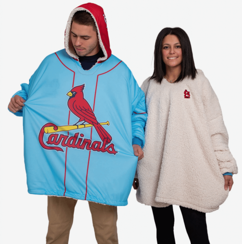
Click to enlarge
ITEM! New FOCO raffle: The folks at FOCO recently let me raffle off one of their oversized reversible NHL hoodies. Now they have the same product for six MLB teams and are once again allowing me to raffle off one of them to a lucky Uni Watch reader.
This will be a one-day raffle. To enter, send an email with your mailing address and team choice (Cards, Yanks, Nats, Cubs, Bosox, or Dodgers) to the raffle address by 8pm Eastern tonight. I’ll announce the winner tomorrow. Good luck, and thanks to FOCO for sponsoring this one.
Meanwhile, the winner of the Vintage Brand raffle is Adam Strohm. Congrats to him, and my continued thanks to VB for sponsoring these monthly raffles.

Happy birthday to my biggest fan: My mom turns 96 today. Normally, our family would be taking her out for the occasion (the photo above is from her birthday in 2018), but obviously that won’t be happening this year.
Mom was born in 1924, so she’s lived through the Great Depression, the rise of fascism and World War II, McCarthyism, Jim Crow, Vietnam, Watergate, Sept. 11, and more. She says the pandemic feels worse than any of those things, which breaks my heart. I hate that she has to experience all of this during this phase of her life. One reason I want her to stay healthy and alive — aside from, you know, the obvious reasons — is so she can see better days than the ones we’re experiencing now.
Mom is in assisted living these days. They’ve been on lockdown since last month — no visitors. Mom has always been flummoxed by technology, so she doesn’t have a computer or even a cell phone, but I’ve arranged for the staff where she lives to provide her with an iPad today so she can do a video chat with my brother, the Tugboat Captain, and me. I think she’ll like that.
Happy birthday, Mom — looking forward to celebrating it in person again in the years ahead.

Help wanted: Looking for some busywork to alleviate the boredom of sheltering in place? Tired of calculating your family’s toilet paper consumption rate against your available supply? Need a distraction to keep you from throttling your kids?
If so, I may have just the thing for you. I’m about to start a uni-related project that entails some fairly monotonous groundwork and could use some assistance. It would probably be more fun for someone who’s a baseball fan, but that’s certainly not a requirement.
If you’re interested, shoot me a note. Thanks in advance. I now have more than enough volunteers — thanks! If I need more help, I’ll run this item again.
The Ticker
By Paul

’Skins Watch: The latest episode of the TV show Brockmire had a coalition of Native American tribes buy the Cleveland Indians and change the team’s name to the Cleveland Colonizers. “They added a new logo that they described as a ‘cartoon white man licking the blood off a bayonet,'” says Mike Hersh. “The uniforms have the same theme, although they were inconsistent about sleeve numbers.” You can see a video clip here.

Baseball News: Fun note from reader Ted Arnold: “For the past week or so The Globe and Mail has run a computer-simulated tournament between four of the greatest Canadian-based MLB teams using Strat-O-Matic software. In the first round, the 1993 Blue Jays defeated the 1985 Jays, while the 1994 Expos defeated their 1981 brethren. Game One of the championship was in Wednesday’s paper. It’s a fun read with lots of good quotes and Canadian anecdotal content added in.” … A Cubs fan is nearly halfway toward his goal of amassing a million Cubs trading cards (from Mike Chamernik). … A 1922 Lou Gehrig bat was auctioned off this week for more than $1 million. … A DC-area brewery has come out with a Nats-themed beer called Curly W (WaPo link) (from Tom Turner). … Here’s a video of former MLB greats Pete Rose and Nolan Ryan interviewing each other, in which Rose asks the audience about how Ryan looked “in that Houston outfit with that orange shit,” and then Ryan responds by saying that “that clown uniform” was his first thought when he signed with the ’Stros (from Scott Unes).

Football News: A Ravens blogger thinks the team’s shield logo should be used more. … High schools across the country are turning on their football stadium lights as a way to recognize their students who won’t be returning in person to finish out the school year (from Kary Klismet). … A Masters golf tourney-themed football helmet? Sure, why not (from Scott Cummings). … Here’s our best look yet at that new Sun Belt Conference logo (from Don Hammack).

Hockey News: Here’s an article on six weird hockey skate designs, including one that Wade Heidt himself had never seen before! … Also from Wade (and also from Ted Arnold): Hockey gear brand CCM is donating (not manufacturing) half a million surgical masks to healthcare workers. … Reader Kevin Vautour wrote a little book report on a three-volume set called The Trail of the Stanley Cup, which features lots of great old jersey mock-ups.

NBA News: The Mavs apparently have new uniforms in the works. … Kareem Abdul-Jabbar, who famously wore goggles during most of his NBA career, is donating 900 pairs of safety goggles to UCLA Health to help fight the pandemic (from Mike Chamernik). … As you’ve probably seen, lots of sports teams are offering fans the chance to make custom jersey-based digital wallpapers. One such team is the Rockets, and one of their fans got the team’s social media people to tweet a Nazi-themed wallpaper design before it was quickly taken down.

Soccer News: Here’s what four of MLS’s newer teams might have looked like if they’d been part of the league when it debuted in 1996 (from Wade Heidt). … New kit for Scottish Championship side Dundee, which will have white sleeves for the first time in 20 years (from our own Jamie Rathjen). … Also from Jamie: “The NWSL’s Sky Blue FC is holding a design-a-scarf contest. More importantly, they’re using it to hint at a new color scheme that primarily uses a paler blue and black. The shade of blue they used before was closer to azure, while this is closer to powder blue. SBFC, for having a color in their name, actually have an erratic color history — they surprisingly wore dark blue last season with no prior warning, and they wore at least three different orange or orange/white shirts from 2009 to 2013.” … Germany’s Bundesliga is preparing to resume games, without live crowds, in early May (NYT link).

Grab Bag: Temple, which has been outfitted by Under Armour in recent years, is switching to Nike (from many readers). … Really good article about how statues of competitive runners around the country have been adorned with symbolic masks (NYT link) during the pandemic. … New logo for the African Handball Confederation (from Chris Corbaz). … A Baltimore brewery has a 12-pack package deisgn based on the Maryland flag (from Andrew Cosentino). … A 17-year-old kid who created one of the first coronavirus tracking sites — who has excellent taste in sweater colors — was approached by companies who wanted to advertise on his site, including one that offered him $8 million. He turned them down (h/t Gil Neumann III). … Pro video game streamers may have the world’s most virus-proof job (NYT link). … Cross-listed from the football section: A Masters golf tourney-themed football helmet? Sure, why not (from Scott Cummings). … New logo for the UK civil liberties organization Liberty. … Soooo many great uniforms, from many sports, in this article about Montana’s early sports history (big thanks to Doug Brei — say hi to Maddie for me, Doug!).

Click to enlarge
What Paul did last night: Lovely time on the porch yesterday. We started a bit earlier than usual, because the Tugboat Captain had a class to attend (virtually, of course) at 5:30pm. Bud Copper for me, vodka soda for her. I mentioned how Passover would start at sundown, and how this will be the first Passover in my memory — and possibly in my life — that doesn’t feature Streit’s matzos in my home, because we haven’t been able to get to the supermarket and I pretty much forgot about matzos when we arranged some grocery deliveries a few weeks ago. Now I’m sure it’s too late.
And then I told her a matzo story from my youth that I’ve told many times before (including once here on this website), and she humored me by listening to it once more. Maybe you’ll humor me as well:
And then it was time for her class. We usually go back inside together, but this time I lingered on the porch for a bit and thought about stuff.
Stay safe, everyone. See you back here tomorrow. — Paul
“kids who’ve never heard of Steve Bartkowski are supposed to think it’s dope, or fire, or whatever.”
My exact thoughts, a fad uniforms, but these are still bad looking. Sadly the Jeys and Bucs fooled us into thinking maybe the shitty custom nike fonts were gone. Even tho if the numbers were regular sized and there was no big honking ATL on the front, it would certainly bit a bit better. For some reason the side panels bug me the least. These uniforms remind me of the Diamondbacks a few years ago who tried too much goofy stuff and ultimately scaled back on it this year.
And I feel like, just like the diamondbacks, and even dolphins, the falcons will be changing these a bit in 5 years.
Yes definitely a fab uniform. Sad. I had low expectations for this change, and they were realized. Still think the ticket-buying demographic will like these costumes.
Look for Matt Ryan to wear white sleeves with the all black uni. Hopefully they’ll quickly ditch the black pants, like they did in the Mick Vick era. Like many, I think the helmet and mask isn’t that bad.
But even in comparison to these Falcon monstrosities, my alma mater Georgia Tech by no means has good-looking football uniforms. Heck they wear a different costume every week.
Hey! A fellow Ramblin’ Wreck! WTGW?
Yep, from way back when the Jackets had nice unis (the 70’s).
All it takes is one look at the headline on the Falcons website:
New Drip | Atlanta Falcons unveil new uniforms
link
I cringe hearing the term “drip” anymore, especially from a professional sports team and their website. Ugh, I hate even typing it out.
The D’backs analogy is perfect. Almost every part of this screams “focus groups and kewl trends”! I skew more traditional but there are modern uniforms that look good. This is shoehorning everything trendy into one set and it didn’t work. At least with the D’backs, the mockery was so endless that they made changes quickly. We will see.
The helmets are the only part of the new Falcons uniform I like. Like Paul, I also liked the Buc’s previous helmets as well. I think the chrome facemasks would go well with the Jets new helmets.
Happy birthday to uni-Mom. Glad she is safe and feeling well!
Good Morning Everyone.
Has anyone else every noticed that the skull in the TB Bucs’ logo appears to have a combover? Just noticed it.
Never noticed that before! Wow!
My initial reactions to various elements of the new uni’s are similar to yours, but for some reason when viewing them via all of the pictures my reaction is a bit more muted. I honestly do not think they look that bad. Might need to see them in games when the conditions are less perfect. I suspect they will look worse then.
The most obvious criticism for almost every team’s uniforms is that their uni’s from the 1970’s look so much better why do they make it so complicated? The Falcons, Vikings, Patriots, Browns, Bucs .. take your pick. Just wear the set from the 1970’s and your problems would be solved.
I like the new Falcons helmets. I think they are an improvement (though prefer the red helmets). Looking through their pictures, I am unclear about the second helmet logo. Is that an alternate design they plan to use? The helmet is the best part of this uni so I hope not.
I agree with everything! But just a comment that satin and matte are two completely different finishes. These are most certainly Satin.
If they had scrapped the jersey side panels, eliminated or went more traditional with the pants stripe, incorporated some of the silver/chrome from the helmet other places in the uniform, and had a traditional sock option this would have been decent to average. The gradient is not salvageable. When the Panthers (who started doing the whole mix/match superhero costume thing the last couple years themselves) can justifiably mock your uniforms, then you know they’re bad.
Who are u? I luv the FALCONS NEW UNI..If u are not from ATLANTA u will not understand the ATL!…Don’t nobody but people outside of Atlanta say Hotlanta!!.The all White is clean and the ALL BLACK IS MONSTER!!..I luv everything about it from Head to Toe
My post never mentioned the ATL on the chest, which is actually one of the LEAST objectionable things on these clown suits (far behind gradient, side panels, the lack of socks, et al).
Why not be totally “edgy” and have “404” on the jerseys instead of ATL? I mean, if you’re going to look that ugly you may as well go all they way. Matte helmets are played out, but at least Tampa Bay’s chrome cages have been re-homed. The best thing about that whole reveal was the Carolina Panthers’ tweet.
Ha! Took me a second to realize that 404 is the Atlanta area code and you weren’t referencing the link
Hmm. Yours would have worked well too!
How bad are the Falcons’ gradient jerseys? So bad that they drove renowned and erudite uniform columnist Paul Lukas, for the first time in the long history of his written column, to “I mean, look at this shit.”
;)
Slight nitpick: I don’t think the facemasks are chrome, like what the Bucs used to be. I think they’re silver, more similar to what the Lions have now.
The Monument City 12-pack design is based on the Maryland state flag, not the Baltimore city flag.
Fixed.
Though the Baltimore city flag is still worth a look: link
I kind of like the old Bucs flag better than the current one; it has a sort of rough-and-ragged piratey look to it, whereas the current one comes across as “cleaner” and more “sophisticated.”
In a way it’s like the AZ Cardinals’ logo change; the old bird to me looks more regal and imposing, whereas the current one just looks pissed.
Totally agree on the Bucs logo. Definitely Nike coming in and trying to polish something up with their style. Makes me wonder if Nike even realized that the rougher look was intentional to emphasize the pirate theme. By cleaning it up and adding in those finer details it almost feels more generic and clip arty.
My thoughts exactly on the Falcons’ dumpster fire of uniforms. Clown sleeve elimination, helmet, chrome face mask, and throwback jerseys all look nice. Everything else doesn’t. Looks like Tampa and Atlanta swapped spots for worst uniform in the NFL.
What do you think of the Budweiser Copper? I am a big Budweiser drinker like yourself I thought it was ok nothing special.
I love it. More roasty-toasty, thanks to the bourbon barrel staves. Probably not good in summer, but perfect for a crisp spring porch session.
Ive been doing many porch sessions lately. Besides the Covid I found out a few months ago that my “wife’ has been cheating on me for sometime.
Paul, happy birthday to your mom! I have been, and would encourage others to keep the elderly who are on lockdown in assisted living center in your thoughts and prayers. You often hear of sick and elderly folks who quickly deteriorate when they are put into homes, because the mental and emotional stress of being alone manifests physically. Now even those who received regular visitors to boost their spirits have lost them. While being the most vulnerable and in need of quarantine, they are probably also some of the most susceptible to emotional effects of the isolation.
Happy birthday to your mom, and a kosher and joyous Passover to all who observe.
Happy Birthday to your Mom!I’m so glad the staff is helping with the video chat. I’m sure she will appreciate it.
I think it’s safe to say that when it comes to uniforms, there are two things Paul is always going to hate:
1. The color purple.
2. Any number font that wasn’t in existence prior to 1980.
;)
Actually, I like the Broncos’ custom font quite a bit!
That would be known as “the exception that proves the rule”…
As a Browns fan, I can tell you what it’s like to live through horrible jerseys. It’s one thing to not play well. It’s another to look like crap doing it.
In the reactions to these uniforms, I’m really starting to think about the demographics of this group. What exactly is “unifying”? Who says what’s unifiying?
Good point, this is a real problem for Atlanta, and it is 3 fold.
1) There are no true legacy professional franchises here. The Braves and Falcons came in 1966, the Hawks in 68. We have tried NHL twice and lost both franchises (Calgary and Winnipeg). There is also no history of Championships, only the 1995 Braves.
2) Related to above, Atlanta is a growing city. While this is great for the economy, it is terrible for sport fandom. The people moving to Atlanta bring with them their teams, and with the TV coverage available now, have no reason to assimilate. Metro area is +700,000 residents since 2010. You can see this in the stands anytime a large-city legacy team plays.
3) The state is a hotbed for college football. While the NFL and CFB do not compete directly for eyeballs, they do for allegiance and share of wallet. Just drive around Atlanta for one day and I guarantee you see hundreds more college team plates, stickers, flags, emblems than Falcons/Braves/Hawks. I am just as guilty, I own far more Georgia stuff than Falcons/Braves/Hawks combined—and I love the braves!
It is hard to create something, uniform or otherwise, which unites a diverse and distributed fan base. To resonate here long term you need to entice younger fans without allegiances elsewhere. You probably need to be a little different to stand out. The falcons are not a legacy team, if they want a more updated look that younger fans like, I can understand their reasoning.
Honest question: What qualifies as a “legacy team”? Is there a baseline metric, or just an “I know it when I feel it” standard?
One reason I ask is that, as a Mets fan, I would say the Mets are essentially a legacy team at at this point. They debuted in 1962. Atlanta got the Braves and Falcons in ’66 and the Hawks in ’68, so the time frames are all similar (i.e., the Mets are a bit older than the Atlanta teams, but not by much).
I think it is more of a “know it when I feel it” standard than a metric. But forced to put parameters I would say:
3+ generations of fans. If you and your Grandfather could both be fans of the same team, that has equity. Braves and Falcons are in their 54th year, so that would pass that hurdle.
I also think there is a “team success” factor as well. A dominate stretch creates a “legacy value” for the fans. The Spurs got to San Antonio in the early 70’s but 5 championships creates a ton of equity.
I live in Fort Worth and I’d consider the Braves to be a legacy team. My first memories are of Hank Aaron. Y’all had that. Growing up in the 80s, there was a Braves game on daily thanks to WTBS. We didn’t get every Rangers game. I have many friends my age that are Braves and Cubs fans for that reason. And when the Braves come to town? There’s an large amount in the stands. Enough to annoy you if they are loud enough. Just my perspective from an out of Towner.
As a NC native, I understand what you are saying. As Southern Metropolitan areas grow (Charlotte, Atlanta, Raleigh, etc) they are becoming attractive for younger professionals who move here for technology or financial jobs from other cities. They bring those allegiances with them. Add to that the retirees who are coming south, and not just to the coast anymore. They will put up with a milder, shorter winter to be closer to a larger city. It’s very evident if you attend a Panther, Falcon, or Hurricane game when they are having a down year. Most of the Steeler, Cowboy, Brown, and Ranger fans that pack into the seats aren’t traveling from Pittsburgh, Dallas, Cleveland, or New York. They’re from here.
Happy Birthday Uni-Mom !!!
The gradient jersey black pants combo looks like the player was just pulled out of a tar pit.
I love these posts but the “new is bad, old is good” mentality on everything gets old.
Actually, it’s “Good is good, bad is bad.”
If you’re find a pattern to what I find to be good and bad, then you’re basically saying that I’m consistent, which I take as a compliment. Thank you!
Mike are you a Falcons’ fan? Or a fan of a team whose uniforms Paul hated? I’m not Trying to be funny, but I find that it’s usually a big factor into whether or not you agree with him or not. If you are a fan of the Falcons (or another team that got a bad review here) can you honestly say you like said uniforms? Or are you clouded by your fandom? I’m a Clippers’ fan, their uniforms are trash, I can say that.
Paul,
Falcons fan here. Hate the unis. Loved your breakdown. It’s especially frustrating because the team consistently reassured us that they were “listening to the fans” and going to “pay homage to our roots.” We all assumed this would be either a red or black throwback look -which is beloved by virtually all fans.
I agree with everything you said, but I think you went too easy on the font. It looks like something a 3rd grader sketched in a composition book.
It’s hard to believe Georgia Tech has gone from Russell Athletic purgatory to being the best uni set in the city in just a few short years. Hopefully the Hawks don’t whiff on their upcoming re-rebrand.
This is what now scares me about the Chargers new uniforms. They’ve gotten my hopes up by doing the same thing on social media; posting videos with classic footage, saying “Don’t worry, we got this”, we hear you, etc., etc. I can see them coming out with something very similar to this. “Hey! Look at our new DRIP! These uniforms are straight Fire! The fans wanted powder blue, well here it is. Powder Blue over Powder Blue with Powder Blue socks! This new number font that invokes the nightlife of the Los Angeles area! This gradient jersey that represents the waves brushing up against a SoCal Beach! Blah, Blah, Blah.” I’m extra worried now that their latest uniform tease involves a popular Spongebob Squarepants meme. That tells me the demographic they’re aiming for. Ugh.
Might just go ahead and get ready for the future Falcons Redesign contest because of the inevitable uniform release coming in five or six years. Happy birthday to your mom!
Also, “dope, or fire”? “repping the ATL”? C’mon, Those dog-whistles are really really loud. Especially considering the Falcons, their most famous players, teams, and the fanbase/population of the city they’re in.
I gather you’re accusing me of racism, although apparently you’re too cowardly to simply come out and say it. (The term “dog whistle” is itself a dog whistle.)
Anyway: Actually, I know a lot of white people who say “dope” (out loud) and “fire” (on the internet).
I said what I said. A dog whistle is what it is. I saw you write derisively use black originated slang to disparage these uniforms (which I don’t personally love, but whatever). I’m a long time black reader and I don’t like this one bit. It really seems to be shitting on the fashion opinions and slang of young (hell not even that young anymore, just non-old) black people, who may appreciate things like being proud of the term “ATL”. You could have made your review without using the words you did, but you did, in a mocking way. So own up who you are slamming, don’t hide behind some “some of my white friends” nonsense. But hey, if you want to call me a coward, My email is tied to thsi message and you can take it up with me directly.
I’m with Mike K.
Not saying you are advocating Black genocide, but definitely racist. The “Hotlanta” comment, too.
I respect you for simply coming out and saying it, Ben (although, obviously, I disagree).
To me, these are all just trendy youth/pop culture terms, not black or white terms. Seriously, is “fire” a black thing? If so, that’s news to me.
I prefer to call you a coward in public, not in a private email, because you accused me of being a racist in public but were too cowardly to use the term and instead resorted to code.
I’ve actually addressed some of these issues before — in relation to another Atlanta team, in fact! It led to a good discussion. Here;
link
I, for one, vividly remember that 2012 post. Yes, that post was racist.
Try seeing groups by culture or class (“blue collar”, et al.) rather than race.
You must not remember it all that vividly, because it was actually from 2015, not 2012.
For the record, I’m not saying you’re some evil person, Paul.
Many of my Progressive friends — perhaps most — look down upon Black culture. They weren’t lucky enough to grow up in an era of forced integration of Milwaukee public schools, as I was.
I didn’t say you were a racist. I don’t know you personally. I know what you wrote. I know how it feels as black person to hear white writers use those terms when slamming something and how it feels to hear my culture seemingly diminished.
I did read the article you linked when it was written (because I have been visiting the site forever). It was a good discussion and I think maybe some of the discussion should have gone further if the first impulse you get one someone pushes back on the issue of race, especially from someone of said race affected, is to call them and question why they didn’t use the term “racism”. I used the term that was appropriate for the discussion.
2015! Even more vivid!
I think that slang has become so passe and overused that it’s safe to assume Paul is mocking the team of marketing reps who are using the phrases inauthentically in an attempt to sound hip.
I second this.
“Dope” and “fire” have long become descriptors in mainstream pop culture, not just in black culture. I can fully see corporate branding types using them as buzzwords for what the wanted to make during the design process.
Gonna third this. Anyone over the age who uses those words is being ironic, and making fun of how today’s youth (including millennials) talk. There’s enough real racism in this world without having to call it out where it doesn’t exist.
What a ridiculous thing to say. For starters anyone who reads Paul would know his character and have a sense of his beliefs enough to know this is absurd. Secondly it was obviously a jab at the twitter/meme culture, their phrasing, and 20 second attention span that dictates a love of in the moment fad things as compared to actual thoughtful examination of things that are good or bad.
Some terms and phrasings are “fads” to some people. But to others, particularly the ones who came up with such terms, phrasings, and etc, they ARE culture. One can take aim at use of marketing terms by big corporation, but inadvertently hit and insult a marginalized population of black people that gets its terms commodified without compensation to be used as fads.
That’s all fair, Mike. I’ll be frank: If “fire” started as black term, I’m ignorant of that. I thought it just started as an internet thing, based on emojis and then people started spelling it out.
If “Hotlanta” is a black thing, that too is news to me. I thought it was just an Atlanta thing. It’s even used by the tourism bureau!
I do know that “dope” started as a black thing, although I know exactly when I first started hearing it, and it was all being spoken by white people. (I realize this could be seen as cultural co-opting or misappropriation, etc.)
I think of all of this as generational and pop-cultural. I tend to dislike it when sports teams get pop-cultural, because pop culture, by definition, is always channging, which means any marketing or design pitch based on the pop culture of the moment will not be built to last and will almost immediately seem dated, which is the opposite of what I consider to be good design/branding/etc. I’d have the same reaction to a team doing a Beatles-influnced design in the 1960s or a Nirvana-influenced design in the 1990s.
Thanks for the feedback — good food for thought.
But sports and design are pop-culture. Sports designs permeates the broader culture (Yankees & Sox hats), and popular culture (even pop culture) has always affected sports, especially going down to branding and design. What we even consider good design and branding is affected by the culture. Who moves the culture is the question and who is the designed is something that is important for a critic to know about. Its generational but its also racial too since, non-white men didn’t have as much cultural influence on branding and design, especially in sports until the 70s at the earliest, and certainly were never decision-makers in the process.
If writing as a cultural critic of uniforms, knowing how the current pop culture is implemented in uniforms and branding is important. Before using terms like “dope and fire” having some knowledge of what they mean is important, and knowing the impression that gives using them is important. I don’t appreciate being called a coward for responding to what I saw on a site that I’ve been a loyal reader to a site that who’s opinion I respect and have enjoyed for years. Especially over a topic as serious as race.
I don’t appreciate being called a coward for responding to what I saw on a site that I’ve been a loyal reader to a site that who’s opinion I respect and have enjoyed for years. Especially over a topic as serious as race.
You didn’t even use the word “race.” And that’s why it was cowardly. If it’s such a “serious topic,” why not come out and say it? Instead, you put out your own dog whistle. And *I* didn’t appreciate *that.* But this has all been good food for thought — thanks for raising it.
As for pop culture and sports, we’ll have to agree to disagree. Take care, and stay safe.
Well Mike, it is a perfectly reasonable take to dislike them because they are fads, no matter who started them, to dislike trendy things because so many people use them simply because they are trendy.
Plenty of people HATE buzzword office lingo that most certainly was started by cringe inducing white corporate folk. And you might retort, “well those were cringe inducing before they became buzzwords.” Well there are people who might also think “fire” was the same before it became a buzzword. And it is okay to think that without being racist. There are things that come from every different culture we can call out as silly, or simply dislike. I gag every time I see some preppy white person in vineyard vines attire. It is intellectually dishonest to think various cultures cannot have aspects which are not particularly good. Was the 80s white surfer culture not mocked for its lingo? It is likewise intellectually dishonest to say because racism against black culture does exist any criticism of black culture (specifically in this case something as small as a slang word) is automatically racist. And given that Paul is a writer, I would assume he has a distaste for any time trendy slag or buzzwords are used by professional writers to sell something.
This is the dumbest fucking argument. To say the black community has an exclusive license to use the adjectives “dope” and “fire” is asinine.
It’s not about who has the right to use the terms. It’s about using the terms as a coded way to denigrate Black culture, becaus the Progressive doing the denigrate is trying to avoid coming off as racist.
If you cut through your word salad, it is. Mike K said verbatim “these terms, phrasings, and etc, they ARE culture,” meaning black culture. But in reality, as Britton Thomas noted above, these terms are so mainstream that that marketing/branding agencies now use them regularly, which is clearly what Paul was making fun of.
So the actual argument you’re trying to make is that you are upset that these words, which allegedly originated in the black community, are now so cliche that they are now open to mockery.
Some consideration needs to given that using these terms is in reference to the Atlanta Falcons. A team with a heavy black fanbase, which has very prominent black players (Sanders, Vick), has always been historically steeped in black culture the 1991 2 Legit team, the Dirty Birds). The terms may be used by non-black people, but they still originated from black people and terms like the ATL, are important black culture. Cultural knowledge of this is important. If this was used to described the Green Bay Packers, everything about it would be pandering. But to the Atlanta Falcons and the city of Atlanta, it’s going to hit different, and the mockery can be construed of mockery of black culture.
Also, your response below states “By avoiding using words associated with others’ cultures (like “fire”) sarcastically. (Unless you’re having a private conversation, in which case anything goes.”
So thank you for admitting you’re completely intellectually dishonest.
No one here is saying that, and that’s not what the argument is about.
Mike K. is saying that. Me too.
Ben, I was replying to Patrick, and essentially saying the same thing to him that you did. Your comment wasn’t there when I posted mine.
Noted!
Are you actually from Atlanta? Just curious.
As a lifelong Atlantan, I think Paul is pretty spot on with what he said on this topic, because things like ATL and Hotlanta are basically just cringe buzzwords that anyone FROM Atlanta absolutely hates. I actually made the same joke to a friend yesterday before reading this, because it really is the first thing that comes to mind. For some reason, national outlets seem to think that Atlanta really does refer to itself as ATL or Hotlanta, when in reality, hearing anyone say those things is an instant marker that they’re not really from around here. No one here calls it ATL. No one here calls it Hotlanta. No one here calls it The A. That’s why it’s frustrating to see the Falcons succumb and print ATL across the front of their jerseys. It’s just begging for jokes about all the other useless nicknames that get thrown around for the city.
Which neighborhood of Atlanta are you from?
I’m pretty sure it is ok to not like something influenced by a minority culture if your reasons are about the substance of said thing.
I dislike the fetishization of modern, being modern for modern’s sake. That is what I see in the usage of certain terms and styles in the new Falcons uniforms. Some of these terms and styles are influenced by black culture. It is not wrong to dislike those terms and styles being used in a design or art.
I don’t dislike these things BECAUSE they originate from black culture. I dislike them for reasons that have nothing to do with race.
Some people DO dislike these things BECAUSE they originate from black culture. They are racist.
I feel these things we’re discussing are co-opting MODERN culture merely for the sake of being modern. That is an opinion, not fact. As well it is not racist.
Every criticism of some other’s culture is based on substance, in the mind of the critic.
They key here is the interloping. The Falcons have the Blackest fanbase in the NFL. Atlanta is the Blackest city with an NFL team. The new unis are obviously (or maybe not so obviously, to Paul and others) catering to Black fans. In your country club (or on your front porch in Brooklyn), it’s fine to bury these unis by sarcastically calling them “fire”. On an influential public platform — the undisputed leader in sports uniform journalism, in fact, that same venom is inappropriate. It comes off as racist, point black (which means “period”, for those who are unaware of the origin of “fire”.)
The Falcons have the Blackest fanbase in the NFL. Atlanta is the Blackest city with an NFL team.
Source for either of those assertions?
I’m not saying you’re wrong. But if you’re right, I’d like to see some substantiation.
Paul, are you looking for stats or anecdotes? Jeff Bezos, founder of Amazon, has made it clear that stats and anecdotes must line up for evidence to be taken seriously.
Anecdotes: attend a Falcons tailgate at The Gulch, Tyler Perry chose the ATL for his studio
Stats: 26 consecutive years of Black mayors, 2/3 of city council is Black
I was looking for stats. Anecdotes are not data, especially since they tend to be distortingly selective. For example, your anecdote about tailgate parties is meaningless (in fact, it’s not even an anecdote; it’s a proposition), because only a small fraction of the team’s overall fan base attends live tailgates on game day. Moreover, you didn’t claim that the Falcons have a big black fan base; you claimed they have the BIGGEST black fan base. So even by the (poor) standards of the tailgate non-anecdote, we’d need to compare it to tailgating for other NFL teams.
Again: Not saying you’re wrong (although someone from Detroit might say you’re wrong). But it seems like a shaky assertion on which to base an argument.
Perhaps Paul could’ve said it better like “These are clearly for the young crowd obsessed with the latest fads and being cool in the Atlanta area”
Ben Miller: Then how, in your mind, can a white person criticize a phenomenon that has co-opted black culture?
I fully understand words like “fire” and “dope” have roots in black culture.
They also have roots in the fetishization of being as modern as possible, to the point of creating phenomena that will be outdated and thrown away far too quickly than I feel such phenomena should be disregarded (in this case, uniforms representing an entire city.) This has nothing to do with race. It has, in my mind, everything to do with trying so hard to be modern that becoming “classic” is impossible. And I dislike that- and that is merely an opinion.
Paul, you cannot be taken seriously if you disregard anecdotal evidence. Did you not read what I said about Bezos.
There’s no way the Falcons have the biggest Black fanbase. That honor belongs to either the Cowboys, Packers or Eagles. I said they have the blackest fanbase. If you attend a tailgate at The Gulch, you will see that. I can best describe it as the Black version of an NFL tailgate, and all that entails.
Christopher,
By avoiding using words associated with others’ cultures (like “fire”) sarcastically. (Unless you’re having a private conversation, in which case anything goes.)
Ben, I disagree with you first on public vs. private conversation. If I say something racist privately, publicly (in a forum), or publicly on my blog (I have one)… it is still wrong.
Now then.
If I am educated enough to know that “fire” and “dope” have roots in black culture, I can absolutely use them sarcastically if my intent is to downplay use of such terms as “trying too hard to be modern without any regard to the ability to be considered classic after some amount of time.” (If you will, that is what I feel about these uniforms)
“fire” and “dope” have MANY underlying roots and definitions.
One of which has to do with race.
Another has to do with merely being modern.
If I know and understand BOTH (or ALL) of these underlying roots… I can use the non-racial one to be sarcastic.
Christopher, Let’s not stoop so low as to demagogue. A fundamental aspect of human nature is the diversion between public life and private life.
Ben, of course there is some diversion between public and private *life.* I was merely trying to move us out of even discussing public vs. private by saying anything that is racist in public is also racist in private. We can disagree here and move on to the substance:
Can a non-black person use the terms “fire” and/or “dope” sarcastically to look down upon a phenomenon that is trying too hard to be modern?
I say yes. As long as I understand these terms have roots in the black community.
You’re saying I am taking a mental/logical/rhetorical shortcut past the racial roots of the words. How else can one succinctly use sarcasm such as this? Are you saying it is not possible for a non-black person to do so?
If this is the case, brevity is impossible with words that merely have roots in a minority culture.
You’re way off the mark. Paul can obviously correct me if I’m off-base, but I can imagine those were the exact terms that the braintrust were using in their meetings when they thought that these designs would be cool and appeal to the right demo. So to use the terms derisively isn’t mocking the community that developed them, but moreso mocking the individuals who were likely tossing these words around during the design process
Oh no two ways about it. I think the discussion here is on the sarcastic usage of terms that have their roots in the black community.
At the macro level, this is a bunch of white billionaires hiring white millionaires to help better attach themselves to the black community.
First, long-time reader and uber-uni fan and of yours. MLB uniforms is what got me into baseball as my passion. Second, happy birthday to your momma! Third, it’s funny that you mentioned the Texas Rangers blue/red issue as I recall a certain uni-watch columnist, at the time with ESPN.com, writing an article about a new, two-toned batting helmet that the Rangers were supposed to have debuted in 2009 or so (I lived near Arlington, TX at the time and saw this on the local news–it was frightening): link. Image here (if you date looking at Chris Davis: link) Thankfully, these never saw the field. Good work, Paul.
You are a cited source:
link
Where’s the mythical smallpox blanket?? Come on, Brockmire!
I don’t watch Brockmire, if that’s where this is from. What does this mean?
I don’t watch ‘Brockmire’ either, and judging by its ratings few people do.
I’m still wondering what your original post means. I must have missed your reference.
The first thing I thought of when I saw the new Falcons uniforms was minor leagues – XFL, arena ball or high school, but DEFINITELY not NFL. The only nice looking uni in this set is the throwback!! I also hate the new OVERSIZED logo on the helmet – what was wrong with the logo size on the old ones??? Personally, I would have loved to see them go back to the silver pants, black top look of the Vick era.
The Buccaneers uniform change is BIG correction of horrible uniform, while the Falcons change has almost gone from really bad to worse!! Let’s hope the Browns, Rams & Chargers go the way of Tampa, not Atlanta!!
Ah, much better job of parking.
I guess I must be in the minority, but I do kinda like the Falcons new unis. Yes I agree that the gradient one is a total mistake and the ATL was a bit of a weird choice and a touch too big. But down the road in a season or two isn’t that something they could easily fix without having to scrap everything? Change the ATL to Falcons and reduce the size by half and I think that would change some people’s minds. The all white is a great look imo, and think they have a few combos that could work (black/white, white/black) and just ditch the red pants.
I either like or don’t mind most of the individual elements that go into the new Falcons set. (Do they want us to call them the FALs now? Or the FLCs?) But taken together, it just doesn’t work for me. There’s a lot of BS talk about “storytelling” when new logos brand dressings are unveiled, and it’s nauseating to hear or read. But there is a kernel of truth that any successful visual branding does tell a story about the thing it describes, and it does so clearly. All I get here is a sort of hazy muddle. It’s like each new element was picked on its own by somebody who didn’t know what other choices were being made, with each element chosen because in isolation it looked cool. Which was mostly true! This sort of thinking seems reflected in the vast array of combinations the team proposes to wear. Next season, what will the ATL FALs look like? Who knows! There’s no uniformity, no identity being projected here.
Heck even the number font and side-shadowing, I basically like. Too bad the specific font fails to be legible at the size chosen for the back of the uniform. It’s like, either choose a cool distinctive font but then take care to size it so it can be read, or choose a cool innovative oversized number placement but then take care to choose a font that retains legibility when wrapped slightly around the sides.
“Atlanta is a seriously bad-looking pro sports town right now.”
Even Atlanta United, who debuted with one of the sharpest kits in MLS history (link), followed it up with what appears to be the $20 bootleg version (link).
The first jersey inspired their nickname “the Five Stripes” (link)
The second jersey makes fans looks like they just finished a catering shift (link).
Bad-looking sports town all around. :(
And this doesn’t include the abominations the Thrashers wore during their brief existence.
Just love how the close up hero shot of the Falcons’ helmet shows the beak of the logo dipping into one of the vent holes. It’s like the designers didn’t even test fit it on a modern helmet to see if it would work.
Paul, Happy Birthday to your mom. It must suck not being able to see her in person, but as long as she is safe that’s the important thing. Stay safe!
Surprised that the Masters football helmet has advertising on it. The “Titlelist Pro V 1“ Stripe, and the “Fedex” sticker, seem to go against the purest approach of Augusta National.
Happy birthday to your mom!
Regarding the Falcons unis, I don’t disagree with anything you said, but I think they are an improvement on the current set. The gradient in this case doesn’t bother me. The Jaguars helmet gradient was much worse in my opinion. Not great, but not terrible.
“Oooh, they’re repping the ATL — edgy!”
Mwah ha ha ha ha.
Oh Falcons…
just when we think you’ve got it figured out and are turning a corner, you crap yourselves again.
1) It’s really saying something when a franchise that has featured a black bird on a black helmet since 1991 has a uniform in which the helmet provides the most contrast throughout the set.
2) They did the earth a green service by simply switching actual physical facemasks with the Bucs, right?
3) Aside from the moronic side panels, the home and away leotards must be an homage to their owner: Blank.
4) It’s almost like they went to Nike and said “we want what the Jets have because they “fly” too and we think we’re the New York of the South. Just don’t make it too obvious. Oooh speaking of flying, since we have the busiest airport in the world, let’s beat people over the head with it more and put ATL on there!” In other words, these are as boring as a layover.
5) On the gradient: did the f**king Jaguars helmet of ’13-’17 teach the league NOTHING?
6) I’m sure there was some “franchise history” thing they were going to announce with this. So unless I missed it, I’ll safely assume that it’s the gradient uniform: slipping into epic darkness after being red hot with a 28-3 lead.
In all seriousness, if they gravitate toward the white over black on the road, black over white at home, or have some form of sock to counter the leotard look, and ditch the gradient aspect to just straight red over black (or white, still their best look) this will upgrade dramatically. And I do like the helmet, FWIW. Also sort of surprised, based on that, that they didn’t bring back silver (chrome) pants and/or update the throwback.
What gets me is that they touted how they were “getting back to their roots”. Excluding the throwback set, nothing about this is traditional. There isn’t much red. They shoehorned as many trendy ideas into one set and left it at that. Gradients, City nicknames/airport codes, shadows that aren’t 3-D shadows, clunky bespoke typefaces. It has everything. It almost feels like their focus groups had nobody over the age of 28.
Happy birthday to uni-mom!
With regards to the Colts, I think Jim Irsay did leak the change in a video he posted about COVID-19 and staying safe. Irsay has always been about making the Colts “look like the Colts.” He has a real affinity for how the team dressed during the Johnny Unitas years and the last uniform change was going back to the gray facemask and changing the blue to be closer to what it was back in the 50s and 60s. If you look at the signature horseshoe on the current helmets, it doesn’t quite work. It appears he noticed this detail and wants to correct it. And how knows, maybe they will tweak the blue again.
24 hours later I still haven’t changed my mind about the AWFUL ATLANTA unis! BAD. BAD. BAD.
One bonus nugget–Brinke is a co-worker of mine.
Please give my best to your mom; I can’t imagine how much it must suck not being able to see her.
The Atlanta Braves’ uniforms may be troubling to you, but they are not ugly. One of these days that tomahawk will look as inappropriate as a cigarette, I admit. But I’m glad I lived to see them.
Pete Rose and Nolan Ryan may be good ballplayers, but they are not arbiters of taste. Shit, they might just be the lowest common denominators as far as fashion is concerned. I’ve always loved the tequila sunrise uniforms and will never get sick of looking at them; I’m happy the world has caught up with me.
…and if you watch the entire clip, Ryan said that by the end of his career, he thought he looked pretty good in that uniform.
In other words “I/we don’t like new things”. C’mon now. Every other aspect of culture evolves and changes, why not uniforms too. What’s with the hate, for example, toward the red-to-black color gradient jersey? Why the hate for gradients in general? Personally i frequently like the use of gradients original Devil Rays, new LA Rams, the Jags helmet is an exception because it was sloppily done). I also consider lots of classic looks (Yankees, Green Bay) to be essentially boring but grandfathered in by tradition. Are we supposed to forever stick with & recycle old concepts?
In other words “I/we don’t like new things”.
Actually, I like plenty of new things. I just don’t like bad things.
Look, it’s simple:
– If I think something is good, I say, “That’s good!”
– If I think something sucks, I say, “That sucks!”
That’s about it. An honest response, which I usually (including today) explain in fairly granular detail. Your mileage may vary, of course.
If you truly liked the original Devil Rays, gradient and all, I think it’s fair to say we don’t live on the same aesthetic planet. There’s nothing wrong with that, of course, but my opinions on my website are gonna live on, you know, *my planet.* Not sure what else you expect or want me to do. Should I lie and pretend to like something I don’t?
Are we supposed to forever stick with & recycle old concepts?
If something works, there’s nothing wrong with sticking with it. As I’ve explained many times, that’s the difference between a traditionalist and a classicist. A traditionalist says, “Nothing should ever change, because change is bad.” A classicist (that’s me) says, “If it ain’t broke, don’t fix it.”
This same debate comes up every time some shitty newfangled uniform is released. It happened with the Browns, it happened with the Bucs, blah-blah-blah. How did those turn out? The same thing will happen here. This set is broken, and will definitely be fixed.
Dislike what Nike did to the Buccaneers’ skull, turning it from a “cartoon” skull to a “horror” skull.
Black tops, red pants? With DIFFERENT side panels on each? Yeah, that’s gonna be shitty look, but somehow that WON’T be the worst look of the bunch because, for some dumbass reason, they have a gradient uniform. Hey, the Diamondbacks called, they said “trust us, fucking don’t”
Paul– Your blog post on the Falcons uniform reveal was about the best thing I’ve read since I’ve been jammed in my house for the past 25 days. Thank you.
Happy birthday to your mom, Paul…I hope you guys have a great chat, and that she has a wonderful day.
Happy birthday Paul’s Mom!
Poll for the best jerseys in Ohio high school hockey at
link
NFL helmets have become a bone of contention for me:
1) Baseball can get away with it because it ‘s reminiscent of the flocking they used to put on batting helmets, but for the NFL matte has quickly gone from archetype to cliche. Done. Out.
2) oversized decals – in a time where there’s less useable space and more holes/vents and creases to consider, making larger decals that don’t really fit seems counterintuitive. Smaller details are more visible than ever, what with mega screens at stadia and HDTV at home, so bigger doesn’t serve teh purpose it might have 20 yeas ago.
Is anyone else having trouble with the mobile site even with ?amp or is it just me?
Three things,
1. Yes, the site is no longer going mobile for me, either.
2. Paul, best wishes and prayers to/for your Mom!! I am so sorry you can’t be with her today :-(
3. Paul, I share your cultural-Judiasm Matzoh background. My grandparents were Jewish, born in Poland, emigrated to Latin America in the 1920s/30s. My Mom was not raised Jewish, and in no way thinks of herself as Jewish. But when my grandparents would visit, we would always have matzoh, and herring, and lox… etc. But especially matzoh. I lived snacking.on them – and I still do!
One Saturday in the early 90s, my Grandmother was visiting (my Grandfather had already passed), and my college and immediately post-college roomate dropped by… we were about to have lunch, so he was staying… I went to the fridge and got out the herring in sour cream with onions and the matzoh from the pantry… and my ex-roomate’s eyes get big and he looks a bit pale. He thought that was lunch for all of us!!!
I would offer something worse about these uniforms. While they were designed to be divisive and generate controversy, my response is actually: boring.
Glad I don’t get Falcons games.
Human nature to hate changes and new things, I hated the 72 Braves unis and 77 ones now the 72 ones are classics. Not to mention everybody has a CoVid19 bug up their collective azzes. These are better than the previous version. Lose the ATL and use a normal number font and they would be good of course, nothing fixes the gradient. Negative publicity is still publicity certainly gets people reading and writing websites too like this one. Which ultimately is great cause this website rocks
You saying to remove the ATL and go to a normal font is you basically saying go back to the classic uniforms. That’s what most of us are saying. If you remove the ATL and the goofy font and the side panels become somewhat acceptable.
SL Putnam knows about the Tarrant Theory.
Yo dem falcons unis look fire as fuck yo. You old bitches hating on dese unis best watch out for dat rona yo.
The Panthers twitter burn at the Falcons was terrific.
But that Panthers look is pretty dated, too. Hopefully they won’t plaster CLT the chest, right?
Panthers uniforms are great, especially now with the black pants in the mix. Not even a panthers fan but I’d be very sad if they changed it :'( I bet paul disagrees tho
Happy Birthday to your mom, Paul. I’m sorry to hear she is down, but we continue to pray this will be (somewhat) temporary.
I had a friend’s father pass away last week (other health reasons) and my neighbor is in his final days (battling cancer at home). I was struck by how awful it must be for people to be dying during this time, even if they haven’t been affected by the virus. Normally, one would think people who have lived a good long life would take some solace in their final days knowing their families would be OK and continue on, especially those people of faith. The uncertainty and underlying stress of this pandemic must eat away at those thoughts. That seems very sad, so reach out to someone like this. You never know what good it could do.
Falcons uniforms–an marketing exercise that is an attempt to “rebrand” not the Falcons, but UGA. That’s why they look so much like a mid-major college program.
Because outside Atlanta UGA is “football”. It’s been over fifty years since UGA changed their uniforms, and they last won a national championship forty years ago. (Which is why they won’t change their uniforms.)
The Falcons owners care more for marketing than football. This change for change’s sake (CFCS) is aimed at the children/grandchildren/great-grandchildren of Sanford Stadium season ticket holders, who they’d like to see at the Mercedes-Benz Stadium instead.
It’s been over fifty years since UGA changed their uniforms…
This statement is false.
I’m surprised but not surprised at the backlash on the Falcons uniforms. I’ve been a long suffering fan of the franchise since the Bartkowski era and I’m way closer to 50 than I care to be.
Sure I’d prefer to slap the current logo on the Glanville era uniforms but compared to our previous ugly red clownsuits these are a major upgrade. Sure they have their flaws but there’s no red helmet & that hideous red alternate will hopefully only be seen once a year at most & will hopefully be mothballed after one use just like our color rash was. But black at home with black pants as an option (hopefully they reverse the uses and go white pants at home & black on the road) make this a win overall for me. And please no making the throwbacks the permanent look again. It’s not 1966 anymore. It’s time to move on.
No red helmet is the big miss here for me. A red helmet, shiny not matte, would look great with the all-black look. Keep the current logo, not the throwback. Black or silver facemask. Not a bad look. But that still doesn’t makeup for the piping and A-T-L on the front or the gradient red. Falcons missed badly here.
Happy Birthday to your mom, Paul!
Cheers to her!
My mother is on the other side of 90 years old and is in a similar lockdown/no in-person visitation situation.
It’s heartbreaking, but necessary.
Re: Temple becoming a Nike school:
Can Bruce Arians be reached for comment?
As for the Falcons new uniforms, I do like the chrome facemask. That’s all…nothing else.
As a Falcons fan who thought the last set should have been changed years ago, my excitement for a refresh was diminished by the leak picture. After seeing the complete gallery I don’t get the outcry and think it’s a big improvement. Piping: gone. Weak looking red primaries with white pants: gone.
I agree the gradient and red pants are horrid but other than that the set seems clean and modern, much less busy than the old ones. I personally like the ATL lettering, the number font and the side stripe (except when it doesn’t match). To me the biggest missed opportunity here is keeping the same logo and not firing whoever came up with the “Rise Up” slogan.
If they had any players I actually liked I would buy a jersey (last one was a black 2006 Vick).
Side note I think the Braves have some of the classiest uniforms there are, until they break out the red jerseys.
Classic example of trying a bit too hard for the hep cat audience…..need a 12-4 season minimum to erase the stench of these clown suits