Over the years, we’ve had a smattering of Ticker submissions about score bugs — the little box or banner that shows the score, the game clock, and so on. Then, last month, I noticed something new: a Twitter account called @artofscorebug — an account devoted to this super-specific niche!
The person running the account seemed to have strong opinions about certain things, like when both teams were represented by the same color in the score bug, such as in this red-vs.-red design:
Hmm, yes, this isn't helping @espn @IUPUIMensBball @YSUMensHoops pic.twitter.com/8PJn3G7Rrx
— artofscorebug (@artofscorebug) February 1, 2020
He also didn’t like it when the bug colors didn’t match what the teams were wearing:
Its #play4kay for @DelawareWBB (in pink, blue bug) v @Towson_WBB (in yellow, black bug), and @FloHoops decided on these colors. The strange part is the pink on the far right of the scorebug. Is that meant to be next to the Delaware blue? Why no yellow for Towson? @UniWatch pic.twitter.com/VMGbf9c7eu
— artofscorebug (@artofscorebug) February 2, 2020
Welp. Let's all go home.@UpstateSpartans in gray but repped green, @GoCamelsMBB in black but shown orange.
This is why we can't have nice things, @espn.@UniWatch @timmydhue @PhilHecken pic.twitter.com/w3NytYrl7X
— artofscorebug (@artofscorebug) February 1, 2020
But it wasn’t just a complaint/gripe account — there was also lots of positive commentary:
Special shout out to @CBSSportsCBB and the alma mater @HofstraMBB for the blue, the gold, the matching, for everything about this scorebug and view. Going to be hard to top this tonight. #RoarWithPride @PhilHecken pic.twitter.com/Yxro9XmS2O
— artofscorebug (@artofscorebug) January 24, 2020
A pleasant surprise out of @MW_MBB!
Match @wyo_mbb?👍
Match @SDSUBasketball uniform accent & dominant floor color 👍
Simple and effective? 👍 pic.twitter.com/GWwDfkOR3l
— artofscorebug (@artofscorebug) January 22, 2020
I loved that someone was treating score bug design as its own critique-worthy discipline — brilliant! So I contacted the Twitter-er behind the account and was surprised when he turned out to be longtime Ticker contributor John Muir.
I asked John if he’d be willing to an email interview, and he agreed. Here are the questions I sent him and his responses:

Uni Watch: First, please tell us a little about yourself.
John Muir [shown at right; click to enlarge]: I’m 38, and I live and work in DC. I have no graphics, illustration, or broadcasting background, but here we are.
UW: You’ve been a Uni Watch reader for a long time — maybe since the pre-blog days..?
JM: I’ve been reading Uni Watch since college, the Page 2 days. It’s part of my morning routine.
UW: When did you first notice score bugs and become a “score bug guy”? Like, is this a recent thing for you, or have you been nurturing this obsession for a long time?
JM: Was never trying to be That Guy. It started out as a “Huh, that’s weird” observation but it’s only recently that it’s become a full-on pet peeve. Given how many teams now release their jersey/uniform schedules and announce special promotions so far in advance, there’s really no excuse for getting the colors wrong on a score bug. The discrepancy between MSG Network’s Islanders and Rangers displays is what really, really got me started on this. The inconsistent use of red between the two channels of the same media outlet, the constant “No, we’re blue!” display, the use of blue for both teams when they play each other — madness.
UW: Do you ever talk about score bugs with other people (not online, but actually talking in the real world)?
JM: Just with my wife, who’s had to hear me say, “This score bug really … bugs … me” many times without a hint of self-awareness on my part. She’s quickly gone from a “I love you, weirdo, whatever makes you happy” stance to pointing things out well before I do, genuinely supportive of this insanity.
UW: When and why did you establish the @artofscorebug Twitter account, how have people responded to it, and what do you hope to achieve with it?
JM: I launched it on Jan. 19, once I realized there’s enough content to support a dedicated account. It’s been pretty easy so far — games are scheduled at set times, my cable provider has a neat live score feature for all games they broadcast, and we have the Big Ten, NHL, and Cricket packages. Making sure the pictures of my TV don’t suck is the hardest part.
Seeing the comparison between (a) pro team sports with a Total/Final scoring system; (b) team sports of individual scores, like wrestling; (c) individual sports like tennis; and (d) the X-for-Y scoring of cricket has been an unexpected learning experience.
More people than I expected Get It™. I don’t expect to change the world with this account, or the tracking of these things. But like the rest of the internet, and the madness that is Twitter, it’s a void to scream into to see if there’s anyone else listening.
UW: When you turn on a game, or see a game on TV at a bar or wherever, do you instantly fixate on the score bug and assess it?
JM: Not fixate, but it’s the first thing I’m looking for. If you can’t tell who’s who because the bug’s colors are off, something is amiss.
UW: For you, what makes a good score bug? What elements are you looking for in terms of color, typography, team abbreviations, clock design, position of the bug on the screen and anything else? What’s your single biggest gripe or pet peeve?
JM: Not using the obvious team color, or not going with an equally obvious secondary color that contrasts with their opponent, is really the crux of this itch.
The two common executions of the score bug are the minimalist upper-corner box or the lower-screen extended ticker style. Neither is particularly intrusive, and both formats are good at conveying the necessary information.
I haven’t seen severe variations in typography, which is good. The switch from the once-standard three-letter abbreviation to four-letters has given birth to good content. My cable provider uses MISS for Ole Miss, Mississippi State, and Missouri, which is wrong, because MISS is Ole Miss. AUBU for Auburn is strange. While it’s sacrilegious to say anything nice about Georgetown in our house, seeing GTOW is pretty good, though GTWN would be even better.
Georgetown is a good segue to the use of grey for the team in white. The Hoyas’ standard uniform set is grey at home and navy on the road, so grey works for them. Big Ten Network uses grey for the white-clad team more frequently than other networks, which is fine for for Georgetown and Penn State, but not for Rutgers when they’re hosting Nebraska.
How do you handle two red clad teams, when one wears red on the road, in a home arena that is red red red red red? Represent the home team, wearing white, with gray.
Sure thing, @BigTenNetwork. #GBR #Nebrasketball pic.twitter.com/fOHvUwFaYD
— artofscorebug (@artofscorebug) January 25, 2020
This shouldn’t be so hard. Just make the information match the event in the closest and clearest way possible.
UW: Which TV networks currently have, in your opinion, the best and worst score bugs, and why?
JM: It really depends on the level of the sport being broadcast. Major networks at the Big Four level tend to handle score bugs accurately, since those networks are the broadcast rights holders. While that’s become more of a challenge in the NBA, thanks to Nike’s uniform program, ESPN and TNT do fairly well to keep things clear.
For D1 college sports, Fox/CBS/ESPN/etc. handle things well even with a greater depth of uniform choices for some schools. When you get down to the current ESPN regional model with mid-major, D2, and D3 events, it can get hairy.
UW: Tell me something about score bugs that the average fan might not know or be aware of.
JM: Unscientific calculation: 95% of score bugs, across all sports, use white typography, as white offers the most contrast against team colors. While other information in a score bug may be rendered in other colors, the team name and score tend to be white. But it’s a double-edged sword — if one team is wearing white, which is usually the case, how do you create a visual cue that doesn’t lose the information on display?
UW: Baseball score bugs seem different than the ones from most other sports, because baseball doesn’t have a clock, plus the bug usually has a little diamond showing if there are runners on base. Is assessing/critiquing a baseball bug different than for other sports?
JM: Haven’t thought about it since we’re firmly within the hockey and basketball seasons, and football just wrapped up. MLB has more uniform options than ever, MLS is moving toward single-color kits, and the Summer Olympics are this year, so there are more opportunities than ever to be confused!
UW: Anything I haven’t asked about that you want me to know? Any overlooked aspects to this topic? The floor is yours!
JM: Like I said before, I’m not trying to change the world, just venting about the seemingly innocuous. Obviously, I can see only a small slice of the broadcasts out there, so my open floor is to invite others to add more to the conversation at both @artofscorebug on Twitter or by emailing me at artofscorebug@gmail.com.
———
Fascinating stuff, right? After we spoke, I asked John to send me some of his favorite @artofscorebug tweets, along with some additional commentary on each one. Here are some of the ones he chose, followed in each case by his comments (in some cases, because of Twitter’s auto-cropping, you’ll have to click on the photos to see the score bugs):
Side by side comparison of @IslesMSGN and @CanesOnFSCR interpretation of team colors #isles #LetsGoCanes pic.twitter.com/5mlKr6Sz7i
— artofscorebug (@artofscorebug) January 19, 2020
“Stuff like this is what started me down this road,” says John. “I’m an Islanders fan and I’m sometimes baffled by the choices made by MSG Network. Same game, different networks, but Fox Sports Carolina [on the right] addressed the teams as they can be most quickly identified, not by the officially listed colors. While red/blue and orange/black do offer the right amount of clash, they’re not the dominant colors on the ice.”
Next:
I literally had to wait for a @SECNetwork close up to figure out who's who. This is just sad. pic.twitter.com/jPPESSY3Pk
— artofscorebug (@artofscorebug) January 29, 2020
“I could probably tell you every day that the white team is Missouri and the black team is Georgia, but you wouldn’t believe me,” says John.
Next:
Had this on in the background, thought the whole time @usabasketball was in white and @LouisvilleWBB was red. Because I'm a fool, apparently. Tell me that's not purple, either.
*GREAT* job, @espn 🙄@UniWatch @timmydhue pic.twitter.com/F92ldQLHnS
— artofscorebug (@artofscorebug) February 2, 2020
John says: “Team USA in red, represented blue. Louisville in white, on a court with high levels of red, represented red. Why?”
Next:
Detail here is incredible. The 'bug not only displays a primary color (but Udinese is black not blue), but the colors that comprise the shirt striping. And it appears there's even a break between the color sets on the @Inter side, not quite clear on the @Udinese_1896 side. Wow. pic.twitter.com/0HUVR8V78q
— artofscorebug (@artofscorebug) February 2, 2020
John: “Italian Serie A on an ESPN property. The detail given to the teams is tremendous, showing not only which colors the teams are wearing but the colors of the stripes on the shirts. Curious to see how the new MLS kits are handled this summer, considering every team will have striped(-ish) shirts.”
Next:
Cricket Scorebug? More like Cricket Ticker. Women's T20I Tri-Series match between @englandcricket and @BCCI in Canberra, Australia. @willowtv @UniWatch pic.twitter.com/XstkQKE5mY
— artofscorebug (@artofscorebug) February 1, 2020
John: “Cricket doesn’t do a score bug — it’s a full-fledged ticker. Some are one-liners, others two like seen here. There’s so much information to present and process during a cricket match this is the best way to pull it off.”
———
And there we are. Such an interesting subject! I confess that I’ve never thought too seriously about score bug design in the past, but I may have to start now. Big thanks to John for opening up this new category of athletics aesthetics!
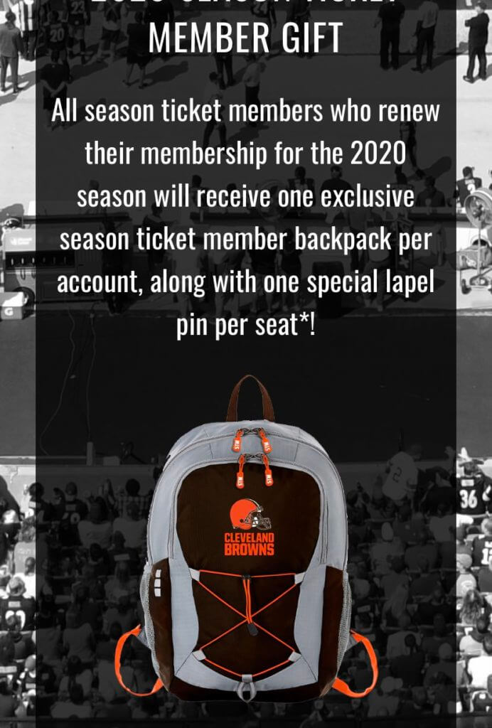
Back to basics … mostly: We’ve been hearing all along that the Cleveland Browns’ new uniforms, set to be unveiled sometime this spring, would mostly be a return to the team’s traditional look. But based on a communiqué recently sent to season ticket holders, it appears that the team is sticking with the brown facemasks. (I suppose it’s possible that that backpack design could be just a placeholder. But that would be unusual, since it’s being used as a ticket-purchase incentive.)
If that holds up, color me surprised. I figured (and hoped) they’d go back to the white masks.
(My thanks to John Wandell for this one.)
For all photos, click to enlarge
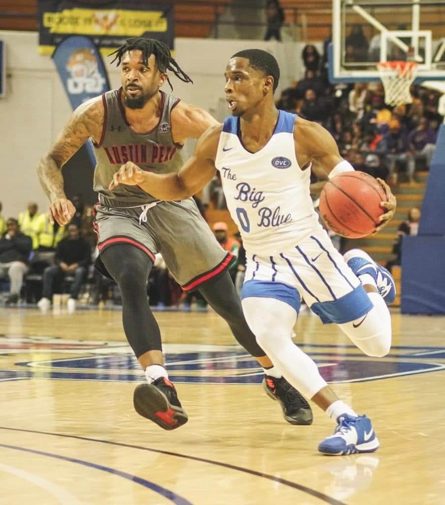
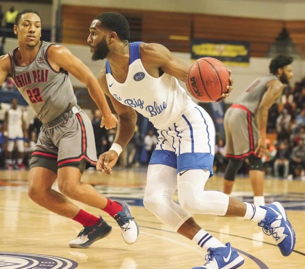
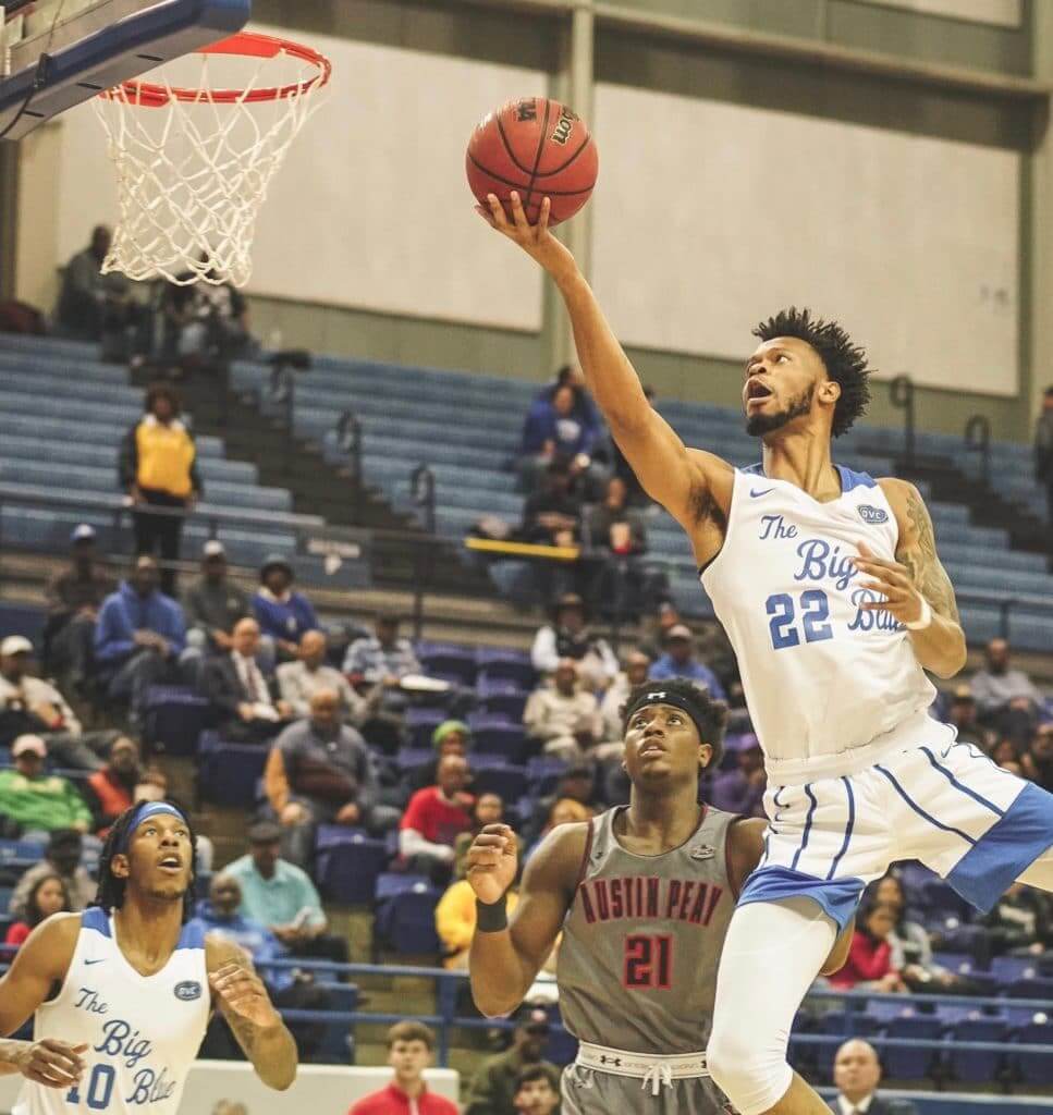
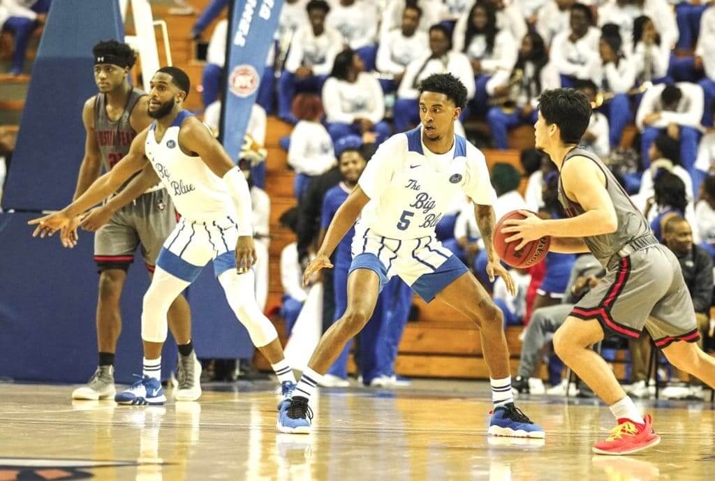
Too good for the Ticker: Tennessee State wore some v-e-r-y endearingly dorky throwbacks for last night’s game against Austin Peay. Here are the 1973 originals they were based on:
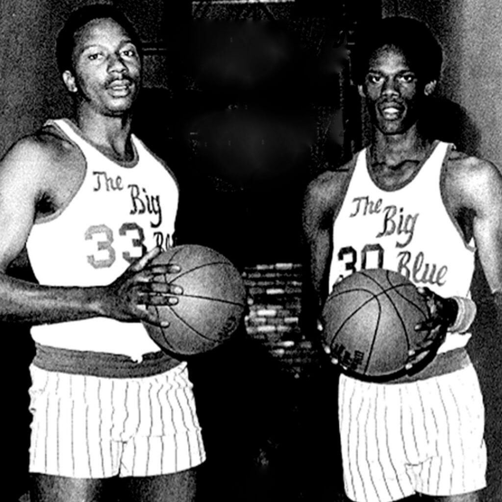
Let the record show that Al McGuire wasn’t the only college hoops coach pushing the envelope in the ’70s, right? As you can see, they didn’t quite match the original script, the pinstripe density on the shorts is all wrong, and why did they add that shoulder harness? But still — fun!
Here are a few more shots from last night:
And here’s a video clip of the throwbacks in action:
H2 | 4:09
Chef Los gets the people goin
TSU – 65
APSU – 62#BigBlueRising pic.twitter.com/BoLyTTCYav— TSU Men's Basketball (@TSUTigersMBB) February 7, 2020
(Big thanks to Zak Buncik for this one.)

Click to enlarge
Super poster: Poster designer John Williams, who I interviewed a few weeks ago, has created a new poster that recaps the history of the Super Bowl. Like all of his work, it’s not for sale, but it sure is nice to look at, even if only digitally. Nicely done, John!
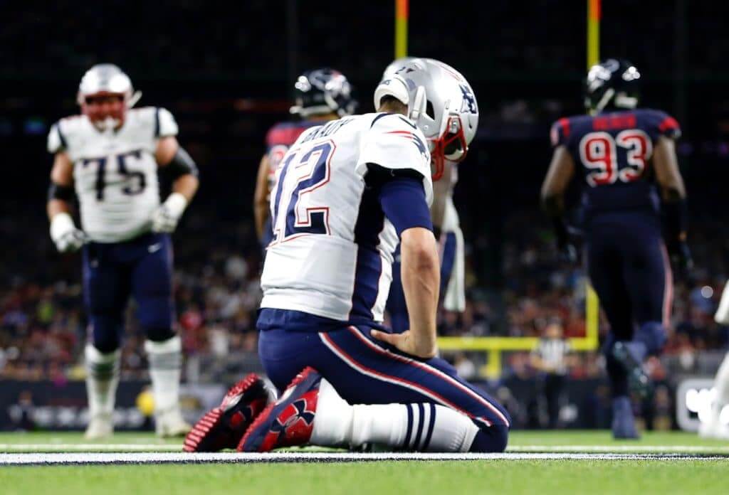
Design contest reminder: In case you missed it on Thursday, my latest Uni Watch design challenge, which I’m doing in conjunction with InsideHook, is to redesign the New England Patriots. With the Brady/Belichick era nearing its conclusion, this seems like the right time for it. Full details here.
Click to enlarge

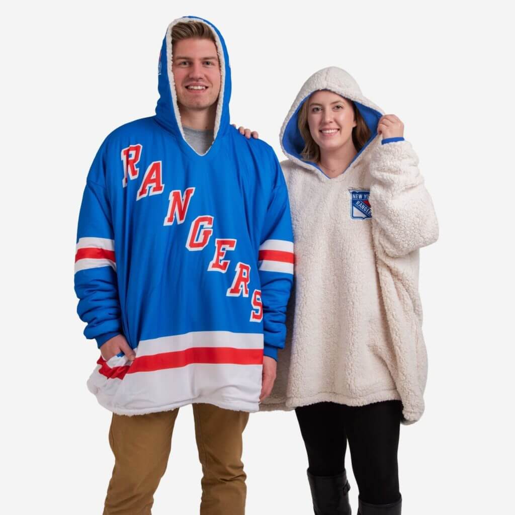
Raffle reminder: The sports merchandise company FOCO (that’s short for Forever Collectibles) recently launched a new line of enormous reversible one-size-fits-all NHL hoodies (or as they call them, “hoodeez”) and has invited me to raffle off two of them, so that’s our latest giveaway.
To enter, send an email with your chosen team and your shipping info to the raffle address by 8pm Eastern today. One entry per person. I’ll announce the two winners next Monday.

Click to enlarge
Pin Club reminder: The February design for the Uni Watch Pin Club is now available. As you can see, we’re going with a Presidents Day-themed design. Note Honest Abe’s stovepipe squatchee!
Just like in January, we’re doing a numbered edition of 350, with the number and month laser-etched on the back of each pin.
This pin is available here. And if you need to get caught up, here’s the January pin (we’ll keep selling that one until it sells out) and our basic winged stirrup pin.
My thanks, as always, for your support of Uni Watch — much appreciated.

Click to enlarge
Hockey jersey reminder: Just a few days remaining to get in on the first-ever Uni Watch hockey jerseys. You can place your order here through next Monday, and there’s more info here.
The Ticker
By Anthony Emerson

Baseball News: Mets P Jacob deGrom was wearing the team’s regular game cap rather than the spring/BP cap while working out in St. Lucie yesterday. Also, as you can see in that shot, Nike would like you to know they make shorts. … The Lakewood BlueClaws, Class-A affiliates of the Phillies, have unveiled a new Thursday alternate jersey and cap. Love the logo. On Wednesdays, the they’ll cash in on the White Claw hard seltzer phenomenon by offering discounts on the beverage at the park and wearing another alternate jersey (from Timmy Donahue and John Cerone). … New unis for Georgia Tech softball (from Kary Klismet). … The Angels will honor Orange County College coach John Altobelli, who died in the Kobe Bryant helicopter crash, by wearing this cap on Feb. 22 (from Jake Tilley). … New jerseys for D3 school Pine Manor (from Jon Dougherty).

Football News: Niners RB Raheem Mostert and Chiefs RB Damien Williams swapped jerseys after the Super Bowl, but now Williams wants his back and Mostert will oblige (from Josh Claywell and Mike Chamernik). … Artist Fraser Davidson and Cub Studio have put together an amazing infographic featuring the uni matchups of all 54 Super Bowls, plus a whole bunch of neat Supe stuff. Highly recommended. … The XFL, which begins play tomorrow, has unveiled its sideline caps (from recent raffle winner Jackson Rohde).

Hockey News: It appears that the Islanders might be bringing back the Fishsticks uni in some capacity, if this clipped Snapchat post from the team’s pro shop is to be believed (from @FinallySock). … The Sabres wore white at home last night (from @bosproshops). … New numbers in the aftermath of the Kings/Leafs trade from earlier this week: New Leafs G Jack Campbell will wear 36 and LW Kyle Clifford will wear 73, and new Kings LW Trevor Moore will wear 12 (from Jakob Fox). … Also from Jakob: the Syracuse Crunch, AHL affiliates of the Lightning, have revealed their LGBTQ Pride Night jerseys. … The Golden Knights have purchased their AHL affiliate, the San Antonio Rampage, and plan to move the team to Nevada for the 2020-21 season (from Wade Heidt).

NBA News: The NBA has released a few player T-shirts with the player’s name styled after the team’s city edition wordmark (from Andrew Cosentino). … Thunder PG Chris Paul gave his game jersey to a young fan for her birthday on Wednesday evening. If you watch her, it looked like she wanted to do the jersey swap with him! Adorable. … In the wake of the trade-deadline frenzy, there are lots of new uni number assignments on Etienne Catalan’s Twitter feed. … Earlier this week we noted that Pelicans F Zion Williamson’s NOB lettering was merging into his jersey’s purple stripe. They’ve now addressed that problem (from @Fantasy_Bandits).

College and High School Hoops News: Nike released the 100th-anniversary matchup jerseys for Duke and UNC yesterday, and they’re pretty bad! It’s like they didn’t even try. Would rather just have both teams in their standard unis, which are both some of the best in college hoops. Also, as many observers have pointed out, NCAA rules require front numbers, so these jerseys aren’t up to code, but maybe the schools got a waiver (from multiple readers). … Michigan State wore green at home and Penn State went GFGS on Wednesday night (from Kary Klismet). … East Carolina went purple at home last night (from Brian Weingartz). … Western Kentucky went BFBS at home against Louisiana Tech, which wore Karl Malone-era throwbacks (from Chris Mycoskie). … Arizona State wore throwbacks last night (from Timmy Donahue). … A Missouri girl is wearing a skirt instead of shorts as part of her high school hoops team, for religious reasons (from Ben Traxel).

Soccer News: FC Cincinnati has a nice jersey timeline on their website. It’s not very long — the team’s only been around since 2016 — but I wish more clubs would do this (from @labflyer). … USL Championship side Rio Grande Valley Toros released their 2020 kits yesterday.

Grab Bag: Austin Gilgronis of Major League Rugby released their 2020 kits yesterday. Oh, also: Austin Elite Rugby are now going by Austin Gilgronis. Early this offseason, they were going by Austin Herd. What’s a gilgronis, you might ask? A “new cocktail” someone in the ownership group cooked up. All of these things are definitely signs of a stable and well-functioning organization (from Sy Hart and Justin Simmons). … Here’s a very good article about the debacle surrounding Milwaukee’s near-five-year effort to create a new city flag (from Joseph Foro). … The Sturgis Journal out of Michigan has released the most recent two installments of its ongoing series going into the history of local high school mascots (from Kary Klismet). … NASCAR has released a gallery of drivers’ firesuits for the new season (from Christopher Hickey). … Speaking of NASCAR, Jimmie Johnson showed off his new helmet on Twitter yesterday (from Patrick Lind). … This article about Kaohsiung National Stadium in Taiwan is wild in two regards: First, the stadium is covered in solar panels and runs completely on its own energy. And second, it’s shaped like a dragon! (From @walbergLines.) … Kent State gymnastics will have throwback leotards tonight (from Griffin T. Smith). … Only 11% of people prefer the new Warner Bros. logo to the old one (from Timmy Donahue).
Great article and great Twitter find, Paul. An instant follow for me, and one of the things I come here to UW for–to find people who are as passionate about something else as we are about uniforms. Love it!
My sentiments exactly. What a great project, and a terrific interview and feature.
As someone who has attended quite a few Islanders game so far this season at NVMC & Bklyn they have had the fisherman logo merchandise out for sometime. Its more of a trial balloon by management. I hate it b/c it brings fans of a certain age (raises hand) back to a time of the franchises darkest days. However since its all about the $$ the millennials and younger kids love it. Not sure why when the Isles current logo (original) along with the home/away sweaters are classic.
Okay, so I have THOUGHTS! I’m a die-hard Isles fan. I was born in the ’80s, but post-Dynasty. My dad and I had season tickets from 1996-to-2004. So all those bad times you’re talking about: UGH, I lived ’em. I was in elementary school when the fisherman came out, and us kids thought it was SO COOL. But by the time they canned it, I couldn’t wait for them to get rid of it. Suffice it to say that I realize what the uniform and logo represent to us Isles fans, and why it made little-to-no sense as a primary jersey.
That said, I love fisherman merchandise. I went to the Pro Shop and grabbed a couple of fisherman/lighthouse caps. Had it been initially introduced as simply a third jersey and it retained the traditional team colors, I think it could still be around in some form today. The logos are actually pretty underrated, IMO.
But, there’s no way this comes back to the ice (with maybe the exception of an outdoor game shoulder patch), especially not with Lou in charge. The Isles Pro Shop sells fisherman Fanatics-made replicas and offers customization. I’d venture to say they used a jersey made for a fan as a backdrop for that picture. In fact, if you look at last night’s highlights on the Isles home page right now and fast forward to the 1:31 mark, you’ll see a guy in a fisherman Beauvillier jersey in the bottom left of your screen. Heck, it might even be the same guy’s jersey used in the Pro Shop picture!
Very good interview! I have always been a fan of the model NBC uses when they broadcast the Premier League, which has each team’s uniform color as the fill color on the score bug.
Soccer score bugs are usually pretty good about color accuracy of the kits and they don’t have any problem using white if it’s the color of the kit being worn by one of the teams. It makes me wish the other broadcasters of other sports here in the States do a better job of making each team easily identifiable by colors being worn.
I prefer the Premier Leagues default broadcast presentation package, NBCs is very in your face (especially the super glossy Sky Sports style they now use), PL is subtle, and the kinetic motion is it is just beautiful
Wonderful stuff, John (and Paul)!
Bad scorebugs can ruin a game. This Twitter account is indeed a follow- and I only follow like 5 accounts.
A bad scorebug can ruin a game, especially one where I’m not very familiar with the teams.
It’s awfully funny that the Browns are giving season ticket holders backpacks that can’t be brought into the stadium (NFL’s clear bag policy)
Typo: “The Angels will honor Orange County College coach John Altobelli…BUT wearing this cap on Feb. 22”
Fixed.
Just to clarify a matter regarding the Golden Knights’ AHL affiliate. They did purchase the Rampage, but that team is not their current affiliate. The Knights’ current affiliate is the Chicago Wolves. That relationship will end after this year. The San Antonio Rampage are the AHL affiliate of the St. Louis Blues.
And so the Blues’ AHL game of musical chairs continues. Back to Chicago I guess.
The Serie A example provided is misinterpreted slightly — the score bug always has a blue background, it’s just a coincidence that it happened to match Inter’s colors. The team color(s) are displayed next to the score. As Josh says, NBC (and Fox, actually) tries to match the background to the team’s shirt color.
Didn’t realize that about the Serie A. I knew that particular match was the first for Christian Eriksen since the transfer from Spurs so to me it looked like it was all by design.
I love NBC/NBCSN’s Premier League coverage. It’s miles ahead of other networks. The one thing I want them to do is add “substitutions remaining” info on their Premier League score bug, a la score bugs that show remaining timeouts in football. Just three dots or dashes that change when a team uses a sub.
Tom hit the nail on the head.
The NBA player t-shirts are from 47 Brand, not Nike (otherwise they’d have a swoosh of course).
Got it.
Good score-bug interview.
It bothered me that for the Super Bowl they had a brand new one
Seems like it was essentially a live test of a new package, as a huge number of viewers would be doing their user acceptance testing for the network. Remains to be seen if Fox sticks with it (the previous Super Bowl broadcast by Fox also had a new graphics package but it didn’t carry over beyond that super bowl.)
I’m pleased at the prospect that just maybe the Browns will keep the one good element of their current cluster of a uniform. However, I wouldn’t be so quick to discount the placeholder hypothesis. All we’ve seen is an easily altered image of the bag. The real bags could very well have a new logo on them when they show up. The Browns might be trying to avoid leaking details of the new look. Or they might be using the old logo on the theory that if the only thing that changes is the facemask, nobody will notice or care. Which is not how the NFL usually handles this sort of thing, but it’s not implausible that the Browns front office would act thusly.
Pine Manor baseball … the school only started admitting males in 2015.
Oh, and RAINBOW GUTS!
I like the Browns’ brown facemasks. White would be good too. Just not grey, please.
When it comes to score bugs, I don’t Get It.
Just give me the old all-yellow or all-white graphics. They were perfectly fine.
link
The announcers did a good job back then of apprising you of the score, outs, count, baserunners…
Now it’s just a blitz of peripheral information and esoteric statistics since the basics are all on the screen.
For the design entry content. What are people using for templates and programs? I don’t have Adobe, but this is something I’d like to do.
If someone that is great at Photoshop and wants to collaborate, I’d be open to that too.
re: the UNC vs DUKE jerseys. I bet they will do like OLE MISS did against Auburn recently and add a # on the front of these pics are any indication.
link
I think the photo you have for UNC DUKE is meant to be generic and not name a specific player.
UNC released a video on their Twitter feed with Garrison Brooks wearing the uniform. There was no number on the front but the back was numbered and lettered with his name.
Two words to explain the Austin Gilgronas team name… it’s Rugby.
The score bug from the Hockey Night in Canada broadcast shows the logo of teams playing. I like this way of displaying the game but they have the logos blown up so large that you see maybe 20% of the logos, it looks ridiculous. Why can’t they just have the logos displayed to fit the space, it’s not rocket science.
Regarding the score bugs, It seems more often than not, the bug will be the first three letters of the city or state playing; i.e. Boston=BOS, Detroit=DET, Arizona=ARI, Dallas=DAL, and so on….so heres something I’ve noticed and pondered, I thought would be a good question for John: As a DC resident and fan, does it bother you that scorebugs for DC teams typically use WSH as opposed to WAS or DC?
Re: Browns Helmets
the browns own daily radio show has said many times “the logo will not change” and have heavily implied since the logo is the helmet, the helmet will not change.
also IMO Brown face mask > white face mask >>>>>>>>>>> grey face mask
also the the one host had an interesting story about how he was lead to believe the last set of unis would have been more traditional but had a little flair to them. he said that he had seen mocks that made them look like the pro bowl jerseys from 2014. and then had the rug pulled out from under him by the team’s president, Alec Scheiner the day of the reveal.
I follow NASCAR, but hadn’t realized that Jimmie Johnson had a personal logo. Ehh.
And I’m disappointed that It seems the Cleveland will be sticking with the brown face masks as their primary look(maybe break out the white One for a new throwback option that could be in the works?)
The Super Bowl infographic was great! I could spend an hour checking it all out. And the SB poster by John Williams was awesome too. I guess I’m on a Super Bowl high this week. :-)
As always, I’m fascinated by the different ways that people look at sports. Great interview today. I’m most pleased by the fact that one of John’s score bug examples featured my alma mater, Towson University.
If we’re talking about scorebugs, can I mention my biggest pet peeve about them, which is so annoying that it’s the only thing that has ever bothered me about them?
In baseball, when someone hits a home run, some TV stations immediately update the score to reflect what it will be after the batter touches home plate, even if he and other baserunners are still on the basepaths.
Years ago when scorebugs first appeared, they updated in real time; when a man stepped on home plate, the score went up by one.
The stations who add the runs in advance break what’s so great about scorebugs — that they show you what the score is at that exact moment. More than once I’ve tuned into a game, or looked at a screen suddenly because of crowd noise, and looked at the scorebug to see the wrong score. Imagine your team has a three-run lead (you’re winning 4-1, let’s say), and the other team hits a home run with a man on base. You look up to see a 4-3 score with two guys joggging around the bases and it looks like you’re about to be behind.
It’s ridiculous. Update the scorebug only when the score actually changes!
On the SB poster I like how Walter Payton is featured on SB XX when he was more or less overlooked by the 46 defense, Jim McMahon’s headband, and the Fridge’s TD. I’m not a Bears fan, but Walter Payton is one of my all time favorite NFL players.
Fox has, more often than not, annoyed me with their score bug, as this graphic suggests:
link
The biggest issue for me is how they change their graphics seemingly at random, and hardly ever for the better. Biggest gripe? If you have the ability to display logos in your score bug, why would you get rid of it? I figured we were done with city/state abbreviations by now, as 2003 would suggest there. I’m glad Fox is back to using logos, but my money is on them randomly changing it around week 12.
Strangely, Austin Peay had identical pinstripe uniforms in the 70s.
link