
For all photos, click to enlarge
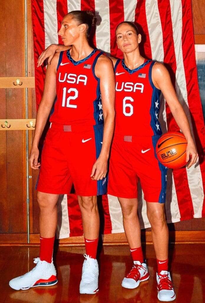
The Tokyo Olympics will be taking place this summer, and some of the uniforms have been trickling out in recent weeks. That trickle turned into a steady stream yesterday, as Nike unveiled a bunch of designs, including the uniforms for the Team USA men’s and women’s basketball teams (shown above). Personally, I’m a bit surprised by how straightforward and minimalist they are.
Here’s another shot of the women’s set, which provides a better view of the stars running down the sides:
Wow. Immediately recognized the unique jacquard collar trim pattern I designed for USA Women’s National Basketball team way back in 1996! @nikebasketball @usabasketball @UniWatch @PhilHecken pic.twitter.com/hT2lG957ei
— GameplanCreativeCHI (@GameplanChicago) February 5, 2020
Other Olympic designs released yesterday included the following:
• Team USA’s track and field uniforms:
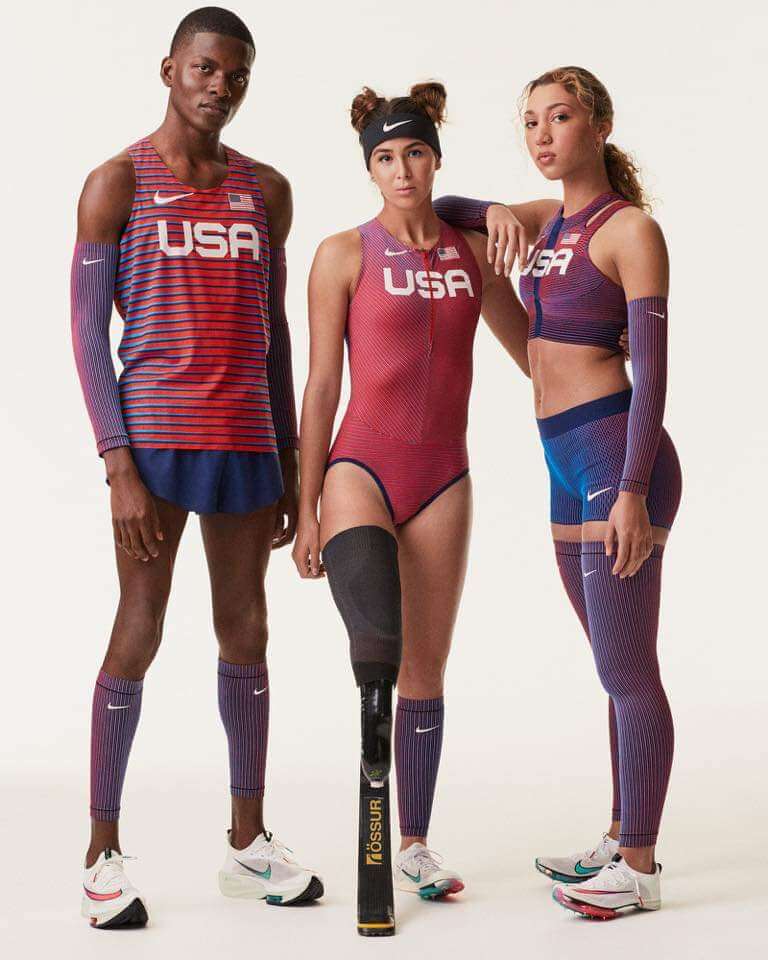
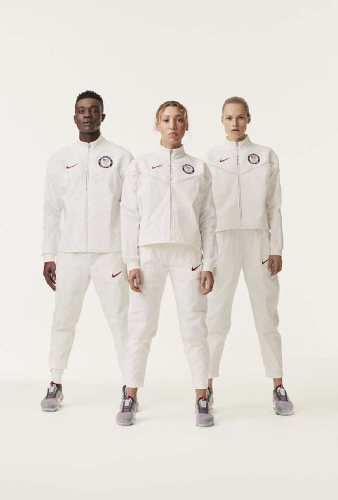
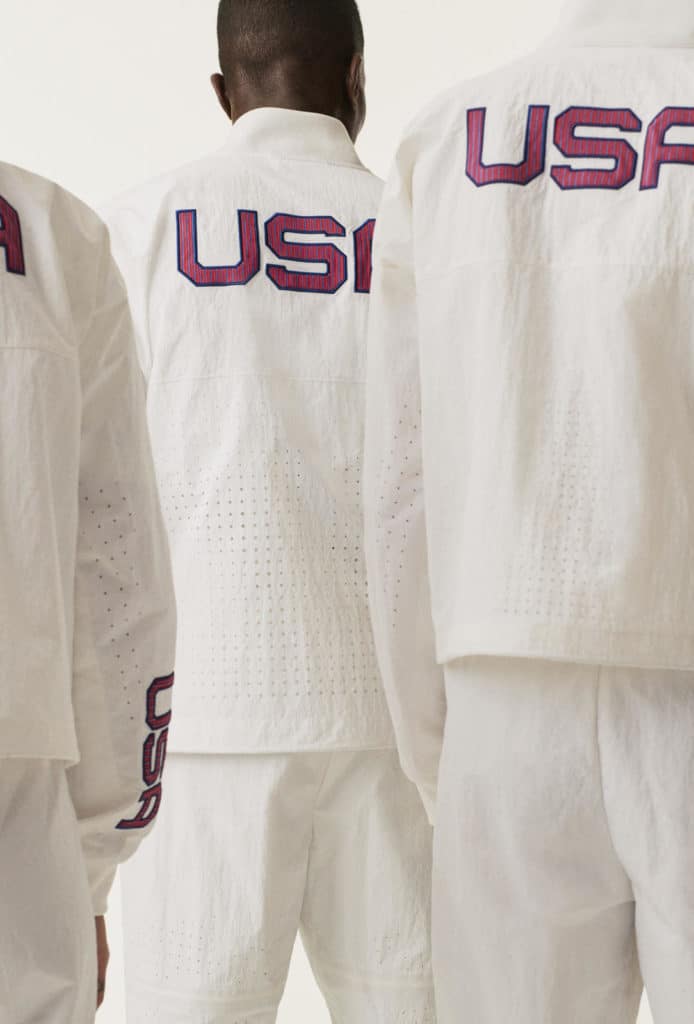
Nike reveals the Air Zoom Alphafly NEXT%, the shoe famously on Eliud Kipchoge when he ran the marathon in under two hours. @WorldAthletics has determined this shoe is legal for the Olympics as long as Nike makes it available for mass retail. Nike will, cost not determined. pic.twitter.com/huAiIM3mzp
— Darren Rovell (@darrenrovell) February 5, 2020
New Nike CEO John Donohoe to @SaraEisen on the VaporFly Next% shoe that can be used in Olympics: “It’s not a mechanical advantage. It’s simply using the same materials that go into a shoe & putting them together in an innovative way that allows the athlete to do their very best.” pic.twitter.com/NFbNlQLMdd
— Darren Rovell (@darrenrovell) February 5, 2020
There were also three new soccer kits for the American, Korean, and Nigerian national teams, which could end up being worn in the Olympics. But Jamie Rathjen will handle those in the next section of today’s post. Speaking of which…
Click to enlarge
Soccer Roundup
By Jamie Rathjen
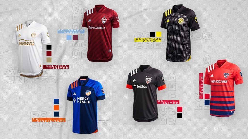
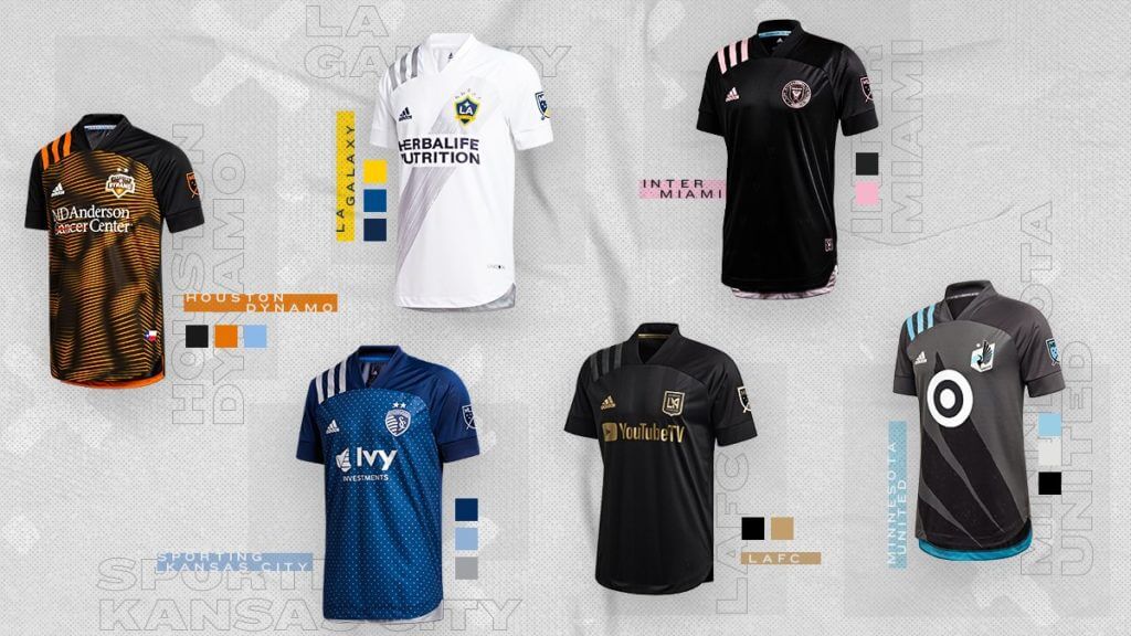
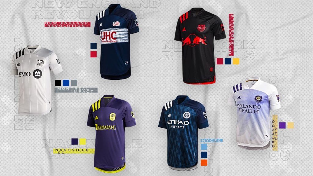
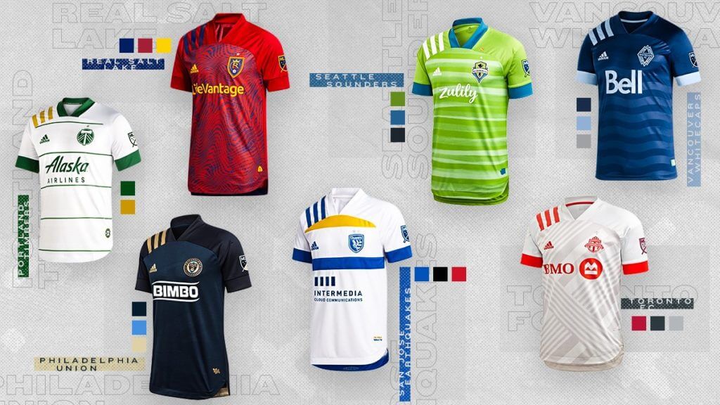
MLS marked its 25th anniversary yesterday by releasing a new shirt for each team, though many of them had already leaked and therefore were not surprises. As always, they’re a mixture of first and second shirts.
The most notable design element is the large triple-stripe branding on the right shoulder of all the shirts, which is an anniversary reference to this early-’90s template. If anything, that cuts down on the number of otherwise solid-white shirts we would have, of which five were revealed yesterday.
I won’t go over all of them in great detail, but some highlights for me include the San Jose Earthquakes’ white effort with very nice blue and yellow accents, D.C. United’s black shirt with red sleeve stripes, and the Montréal Impact’s white shirt, purely because black is a team color and works well as the only accent color.
D.C. United also revealed a sleeve ad last night — a gambling ad. I’m disappointed that those have spread to MLS. The league has definitely oriented itself toward the UK and other European countries in the last decade or so, but I see that now means adopting the most infamous category of ad, even if it doesn’t yet come with the ethical baggage that is attached to it in the UK in particular.
Oddly, the Chicago Fire, who just got a new color scheme and crest, were not represented in the leaguewide graphics released last night, including the one at the top of this section, but the league did include their first shirt as part of the reveal. It was the only one that didn’t get the large shoulder stripes.
In an interesting uni-related development, DeAndre Hopkins of the NFL’s Houston Texans, who attended the reveal as the Houston Dynamo’s designated celebrity, said he wears No. 10 because of Barcelona striker Lionel Messi.
If you’d like to see more info, including the new shirts’ cringe-inducing names and two dozen instances of MLS using “kit” when they mean “shirt,” you can do so here.
Meanwhile, as Paul alluded to in today’s lede, Nike also revealed kits yesterday for three of their men’s and women’s national teams. Let’s start with the U.S.:
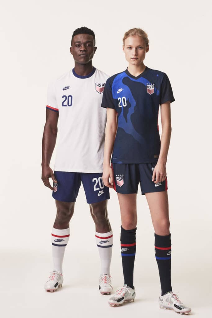
The new kits are to be first worn by the MNT for a European road trip against the Netherlands and Wales at the end of March, and by the WNT in the SheBelieves Cup at the beginning of March. Nike also mentioned that these kits would be worn at the Olympics, should one or both teams qualify, but the crest would be replaced with the Team USA logo.
The second national team to receive new kits yesterday was South Korea:
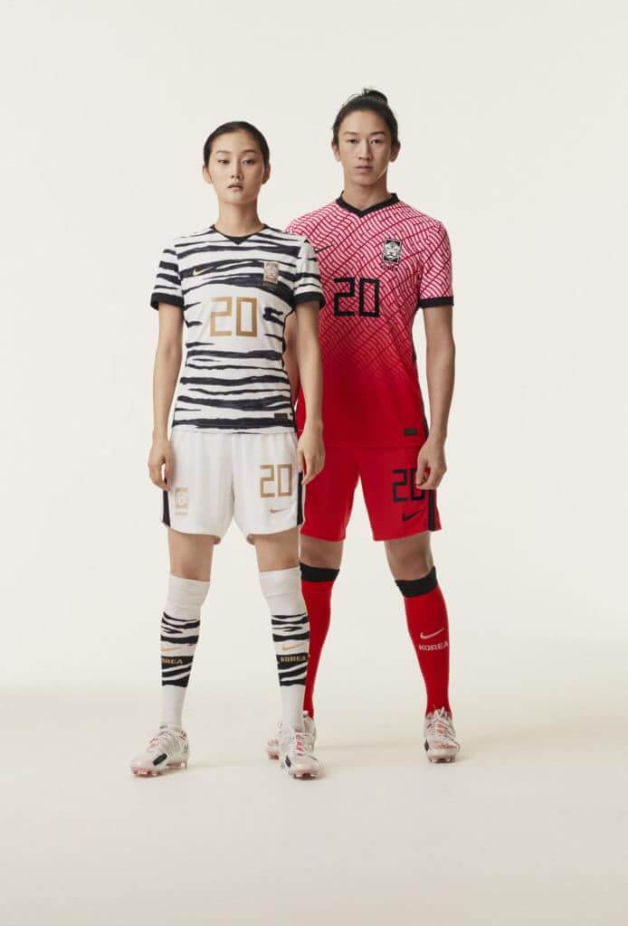
The real highlight, however, is the white second shirt with tiger stripes. I’m sure some of you don’t care for it, but I’m not here to complain about it. It’s an idea that seems fairly obvious, given that South Korea has had a white tiger as a crest for a long time, yet also ambitious, because the designers wouldn’t have many examples to look at and would have to toe the line between overcomplicating the shirt and producing something insufficiently tiger-ish. Compare this season’s shirts for English Championship team Hull City (another team with a tiger in its crest) with their shirts from the early ’90s: This season’s, while not a bad design, doesn’t commit to the tiger-stripe motif, and ends up as largely solid amber. The ’90s shirts missed the mark by being too intricate; the stripes are too small and just look like indistinct swirls in action photos. The spacing of South Korea’s stripes seems to be wide enough to avoid that problem, while the stripes seem to extend to the entire shirt, though of course we haven’t yet seen the back.
The shorts don’t appear to have tiger stripes, while the understated stripes on the socks divide them into thirds, with primarily white on the top and bottom and black in the middle. Obviously, we’ll have to judge this one in action, but for now it sure beats another plain white kit.
What I’m not sure about is the legibility of the gold numbers. When France’s Women’s World Cup kits were revealed last year, the white shirts also had gold numbers, which were barely visible on release and were quickly changed to blue. Black numbers would blend in, but perhaps red might have been a better choice, both to represent the primary team color and as a color actually sometimes chosen for numbers by other teams that wear black and white.
South Korea also revealed a new crest on Tuesday, complete with an obligatory infographic.
The other national team to receive new kits yesterday was Nigeria:
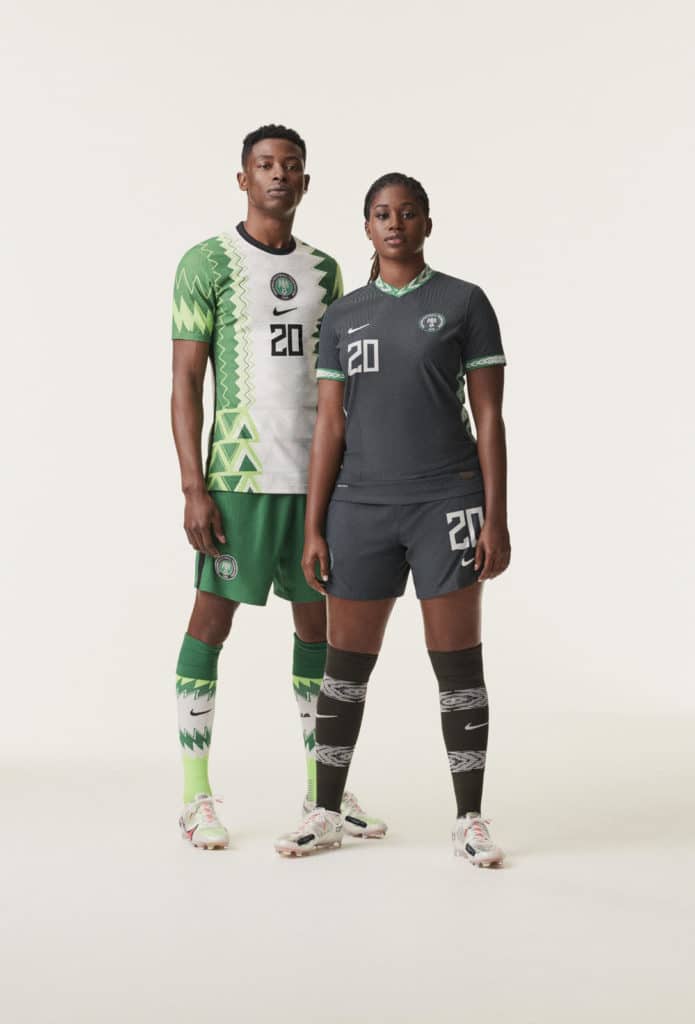
The second kit is mono-dark grey, which is a better choice than the previous mono-dark green because it’s not repeating a color already seen in the first shirt. Otherwise, it’s fairly nondescript except for a mix of white and green accents — the former on the socks, and the latter on the shirt, when it seems they should have picked one for both.
There’s additional info on these three kits here.
(Phil and his soccer contributors Kyle Evans and CJ Fleck will have a more detailed look at the new MLS kits right before the season kicks off.)
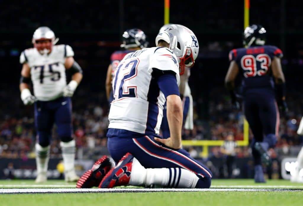
ITEM! New design contest: With the Pats making their earliest postseason exit in a decade, the Brady/Belichick era nearing its end, and Flying Elvis clearly past his sell-by date, I thought it would be interesting for our next Uni Watch design contest to center on the Patriots.
I’m doing this one in conjunction with InsideHook. Here are the particulars:
• Your entry must include a primary logo, full home and road uniforms (helmet, jersey, pants, socks), and up to two alternate, Color Rush or throwback uniforms. If you like, you can also include secondary logos and a field design, but those aren’t required.
• You can maintain some of the team’s current elements (the helmet design, say, or the color scheme), draw upon the team’s visual history, or start from scratch and change everything. Up to you.
• Your designs can be created in any digital or analog medium (Illustrator, Photoshop, crayon, whatever) and can be submitted in any standard digital format (JPG, PDF, TIFF, etc.). You can also create a video presentation, upload it to YouTube and submit the YouTube link as your entry.
• The files you submit should be named after yourself (JohnDoe.jpg, for example). If you’re submitting multiple files, please either number them (JohnDoe1.jpg, JohnDoe2.jpg) or use some other designation (JohnDoe-HomeUni.jpg, JohnDoe-logo.jpg, etc.). Entries that don’t follow this format will not be considered.
• In keeping with longstanding Uni Watch chromatic policy, entries with even a hint of purple will not be considered.
• Email your entry to Uni Watch HQ. If you have more than one concept, feel free to enter as many times as you like.
• Deadline: Submit all entries by Wednesday, Feb. 19. The best entries will be showcased on InsideHook shortly thereafter. Good luck!
Click to enlarge

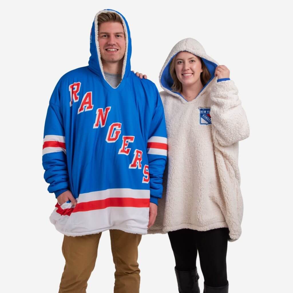
ITEM! New raffle: The sports merchandise company FOCO (that’s short for Forever Collectibles) recently launched a new line of enormous reversible one-size-fits-all NHL hoodies (or as they call them, “hoodeez”) and has invited me to raffle off two of them, so that’s our latest giveaway.
This will be a two-day raffle. To enter, send an email with your chosen team and your shipping info to the raffle address by 8pm Eastern tomorrow, Feb. 7. One entry per person. I’ll announce the two winners next Monday.
Meanwhile, speaking of raffles, this winner of this month’s Vintage Brand raffle is Jackson Rohde. Congrats to him, and my thanks to Vintage Brand for sponsoring that giveaway.

Click to enlarge
Pin Club reminder: In case you missed it on Tuesday, we’ve launched the February design for the Uni Watch Pin Club. As you can see, we’re going with a Presidents Day-themed design. Note Honest Abe’s stovepipe squatchee!
Just like in January, we’re doing a numbered edition of 350, with the number and month laser-etched on the back of each pin.
This pin is available here. And if you need to get caught up, here’s the January pin (we’ll keep selling that one until it sells out) and our basic winged stirrup pin.
My thanks, as always, for your support of Uni Watch — much appreciated.

Click to enlarge
Hockey jersey reminder: You now have less than a week remaining to get in on the first-ever Uni Watch hockey jerseys. You can place your order here through next Monday, and there’s more info here.

Membership update: A bunch of new designs have been added to the membership design gallery, including Sam Hozman’s card, which is based on his old USC marching band uniform (one of our rare vertically oriented cards). I expect to have these cards printed, laminated, and shipped by early next week.
Ordering a membership card is a good way to support Uni Watch (which, frankly, could use your support these days). And remember, a Uni Watch membership card entitles you to a 15% discount on any of the merchandise in our Teespring shop and our Naming Wrongs shop. (If you’re an existing member and would like to have the discount code, email me and I’ll hook you up.)
As always, you can sign up for your own custom-designed card here, you can see all the cards we’ve designed so far here (now more than 2,400 of them!), and you can see how we produce the cards here.
makes for a great late night snack! @UniWatch pic.twitter.com/zZdYxvkzJR
— Bryan Molloy (@bmolloydesign) February 6, 2020
Okay, so this is pretty funny: If you agree, drop me a line.
By Paul

Working Class Wannabes™: The other day I asked if there were any women’s teams out there pulling the blue-collar bullshit routine. Turns out there is: the women’s hoops team at St. Peter’s University (from @johnnygogo97). … With Virginia Tech defensive coordinator Bud Foster having retired, the future of the team’s lunch pail tradition is now up in the air, as is the fate of the actual lunch pail itself (from James Gilbert).

Baseball News: From many readers: Scroll through this thread to see Miami’s new 2020 jerseys (but not full unis, sigh). … James Paterson notes that with P David Price being traded from the Red Sox to the Dodgers, his habit of going squatchee-free will be all the more noticeable because of LA’s contrasting white squatchee. Which means I’m going to get soooooo many “His button is missing!” emails and tweets from people who don’t realize Price has been doing this for years. … If you like charts, graphs, and data visualization, you’ll like this little site devoted to the Astros’ sign-stealing scandal (from the Tugboat Captain, who came across the site as part of her data science studies in library school). … Here’s a weird one: Mets mascot Mr. Met is scheduled to appear at an event today for presidential candidate Mike Bloomberg, which I assume means the Wilpons are supporting Bloomberg’s campaign (from our own Anthony Emerson). … I’m briefly quoted in this article about the summer collegiate team Jamestown Jammers rebranding as the Tarp Skunks. … The Big 12 conference is moving its annual tournament to the Rangers’ new ballpark in 2022. The announcement was made with an outdated Rangers jersey (from Chris Mycoskie and Scott Hennigan). … New uniforms for Canisius (from Joseph Pitirri). … Not a new article, but new to the Ticker: this amazing National Geographic piece on how old 1927 blueprints were used to renovate the original Yankee Stadium (from Kary Klismet). … New uniforms for BYU (from Jeremy Zavoral). … The latest MiLB team to get a food-based makeover is Lehigh Valley IronPigs, who’ll be reborn as the Fastnachts, referring to a German-style doughnut (from Jonathan Clark).

Pro Football News: What if NFL team names were the opposite of their current names? Their logos might look like this (from Jeff Perilman). … The score bugs on XFL broadcasts will include the betting line and the over/under (from Timmy Donahue).
College and High School Football News: Several schools yesterday posted photos of new commits wearing jerseys with the CFB150 patch, which those players will never wear (from Erik Johnson and Timmy Donahue). … Oh for fuck’s sake: Nike contributed some cash to help renovate a Florida high school football field, which is nice, but now there’s a giant swoosh serving as the midfield logo. Seriously gross. Interestingly, the NFL’s Miami Dolphins also contributed toward the renovation, but there’s no sign of their logo. Hmmmmm (from @VictoryCB). … Colorado is unretiring three numbers. New players wearing the numbers will wear a patch acknowledging the old players for whom the numbers had been retired (from Ron Ruelle and Timmy Donahue).

Hockey News: The is pretty cool: Every year the North Dakota hockey team holds an outdoor public practice (from Greg Enkers). … Here’s how Bruins D Torey Krug chose his uni number (from Mike Engle). … “Daniel and Henrik Sedin will have their numbers retired by the Canucks next week,” says Wade Heidt. “As part of the celebration, you can buy a “Sedin Pack” of Budweiser, but only in British Columbia. Daniel’s can is the white jersey, Henrik’s is the blue jersey.”

NBA News: Last night the Celtics gave away a poster featuring their jersey ad logo, the Nike maker’s mark, and a bank logo — oh, and a teeny-tiny Celtics logo (from @dylb88). … The Italian team that Kobe Bryant’s father played for has retired No. 24 (from Mike Chamernik). … Mavs C/PF Willie Cauley-Stein’s jersey number was centered instead of flush-right last night. … New Hawks C Clint Capela will wear No. 17.

College Hoops News: Auburn PG J’Von McCormick had to switch to a blood jersey after his jersey got torn two nights ago. … Purdue wore throwbacks last night (from Beau Parsons). … New Mardi Gras-themed uniforms for New Orleans (from Adam Norris). … Retro unis last night for Northern Iowa. Nice enough design, but anytime this school doesn’t wear “UNI” on the chest it’s a miss (from Caleb Hamer).

Soccer News: Our own Anthony Emerson has some interesting observations on the uni numbers given to Manchester United’s two newest signings. … Also from Anthony: Cillian Sheridan, newly signed to Polish side Wisła Płock, poked some fun at how players arrive at their uni numbers. … Good story on D.C. United’s 1996 kit (from Wade Heidt).

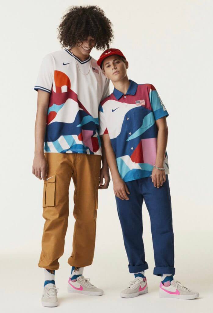
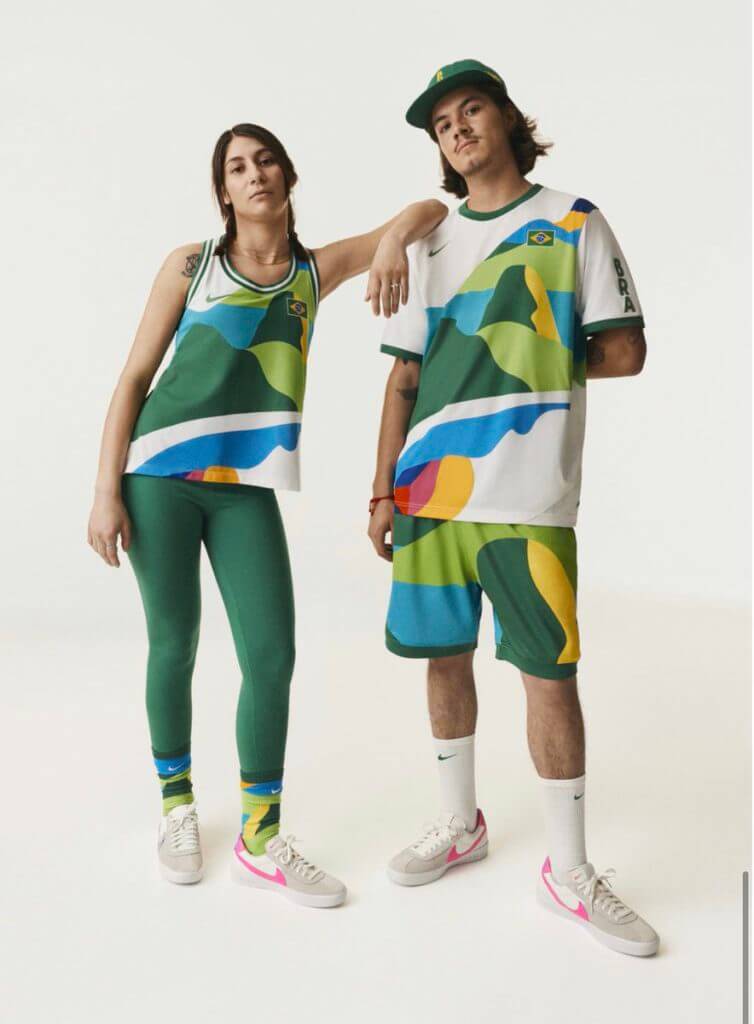
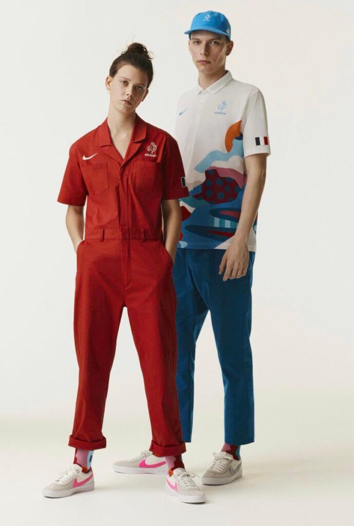
Grab Bag: New crew uniforms for Saudi Arabian Airlines (from Timmy Donahue). … Also from Timmy: The CBS legal drama All Rise uses a fudged version of the L.A. district attorney’s seal, among other inconsistencies. … New logo for Columbia Metropolitan Airport in South Carolina. … New McDonald’s advertising takes the unusual approach of not showing the company’s logo. … Drake’s live mascot, a pooch named Griff, has announced his retirement. … New lacrosse helmets for Syracuse (from Jakob Fox). … The Trump Administration is reportedly seeking to impose a new aesthetic standard on federal architecture guidelines. … Did you know skateboarding will be making its Olympics debut this summer? Here are the uniforms for the USA, Brazil, and France (from Andrew Cosentino). … Interesting article on how public defenders choose their courtroom attire (from Timmy Donahue, who’s a public defender himself). … Buried within this page is the news that UCLA’s gymnastics team will wear a “multi-color leotard and rainbow ribbons in support of the LGBTQIA+ community” this Sunday (from Griffin Smith).
That should be Torey Krug, not Tony.
Fixed.
The South Korea kits are reminiscent of the old Domina Vacanze cycling team. In case you were wondering what that could have looked like with striped shorts:
link
re: McD’s ads – the Big Mac is missing onions.
Do Big Macs have onions on them?
(sings song to self)
Yes they do!
The question would actually be “do British Big Macs have onions?” as I believe the ad uses gherkin instead of pickles and that’s not a word we use in the US.
(sings song to self in British)
I don’t know.
Paul,
What color helmet and breezers/pants would you pick to complete the whole look for the Uni Watch Hockey jersey? I’m thinking green for each jersey. Yellow might work with the green jersey though.
Definitely green for the white and yellow jerseys. And yes, I think yellow would probably be best for the green jersey, although green would also be fine.
Not black? ;-)
If you feel secure enough wearing an old Cooper SK100 – this should be the one:
link
Let me try that again:
a0.amlimg.com/ZjhhMTkyNDViMjA4ZGVlNzIxMzFmYTU4N2UwNDQwMGOJD4RIVQNU5cnr7NSzE6CqaHR0cDovL21lZGlhLmFkc2ltZy5jb20vYjg0YWI0YzI5Y2M1N2MzYzBhMTdmZjM5OWU4NGMwMzI5YzI2Nzk1YmM2ZmNiMDI4N2M3NDdlZmE3ZTUxNGFhYi5qcGd8fHx8fHw2NDB4NDgwfGh0dHA6Ly93d3cuYWR2ZXJ0cy5pZS9zdGF0aWMvaS93YXRlcm1hcmsucG5nfHx8.jpg
BFBS. Because we all love that. :-P
First time Im ever going to say that Nike got it right with the basketball uniforms and the white soccer uni. Hopefully its a sign of things to come since they have their claws in everything.
My usual response to new USNT uniforms is along the lines of, “Meh, it’s not great, but whatever, can’t we just please pick one general look and stick with it for a few Olympic/WC cycles to establish that USA is a country that looks like something?”
Not this year. The white is adequate, but the bleach-spill blue needs to be destroyed with fire.
Not a fan of the USA track and field uniforms. We have lately went with primary red or blue. This years is a gradient of pink and purple. We will be stuck with these for an Olympics and two world championships. The basketball uniforms are much better.
Couldn’t agree more. My all time favorites were the athens ’04 track uniforms which contained only red, white blue.
link
Love the bizarro NFL logos, did not get the Panthers, Bears or Bengals. Wouldn’t the opposite of a cowboy be a cow? Cowgirl? City slicker?
Killmonger was the villain in the Black Panther movie. Also not sure about the Bears and Bengals.
Thanks! I just looked that one up but the other 2 stumped me.
A lot of these were odd choices, the Bears logo is a Care Bears reference. The Phils and Rantins really confuse the hell out of me though.
Rantin and raven…thats why the ravens mouth is open…hes on a rant
But…..rantin’ and raven would be the same….not opposite. This is more confusing than it should be.
Bengals/Phils is the only one that I completely just don’t understand. I tried to google it and came up with multiple articles about an apparently much-beloved Cincy-area high school teacher named Phil Bengal. Unrelated, I assume, but pretty cool having Mr. Bengal as your teacher in Cincy. I got through 12 years of public school in Philly & Minneapolis and never had a Miss Flyer, Mr. Twin, or Ms. Viking.
Eagles seems like a miss with Doves. A dove isn’t the opposite of an eagle in the sense that it might be for a hawk. Eagles are opportunistic and will eat just about anything if they have to, but they prefer fish or, sometimes, human trash like Philly-relevant spilled french fries at a boardwalk.
Eagles opposite….. Double Bogeys.
I think the Phils is Mickelson, being the opposite of Tiger
McSean, thanks! Must be that. Kind of too-clever-by-half, but props to the designer for the deep cut. But if that’s the case, then instead of tiger stripes, the P should have the outlines of four portrait-orientation rectangles.
As far as the cowboys, I think “Dude was originally slang for a city slicker
Also how is a New Yorker the opposite of a Texan? As a Texan, I would have said Californian or Okie.
And the Patriots should have been Red Coats.
Why is the bizarro Cowboys logo the same as the regular Cowboys logo?
I liked the Broncos-Ponies logo, though here in Denver when the Broncos do horribly, we generally refer to them as the “Donkeys”.
The Washington White Potatoes is beautifully clever on its own, but the addition of the potato masher is *chef’s kiss* perfection.
Some observations from Canada’s West Coast and a Vancouver Whitecaps fan. Despite the three stripes over the right shoulder, I am pleased with the new Whitecaps kit.
A pleasant surprise that they will be wearing light blue shorts with the navy jersey. This kit will replace the dark grey and silver kit, so definitely an upgrade in my mind. The Whitecaps will have a solid look next season with the two kits they will be wearing.
Full look at new Whitecaps kit:
link
Will there be a Falcons uni contest since they’re actually confirmed to be getting new ones?
I proposed that to InsideHook. Since we had recently done the Bucs, they didn’t want to do another team in that same division. Honestly, I don’t think the Falcons are as interesting a design proposition as the Pats.
Makers mark feels excessive on the national squad uniforms. In most cases, there are four (or more!) swooshes per person. On the medal stand, from the front, it’ll appear the athletes are from Nike.
On the US soccer squad, the mark apparently wasn’t enough, so they added the company name too. On the shirt, shorts, and socks!
… from the front, it’ll appear the athletes are from Nike.
I believe this is what the Nike marketers refer to as “a feature, not a bug.”
Generally like the US national team gear, tastefully understated.
The adidas MLS kits would look better without the HUGE 3 stripes over the shoulder. At least LAFC was allowed black on black, where it is far subtler. I don’t understand the need for that AND the maker’s mark right below it. And if it is an homage to the 1990 template, that maker’s mark looked more like a design element, especially with the multiple colors used. This is more overt. And not in a good way.
The Korea tiger stripe jersey is fantastic.
Man, Nike needs to invest in competent typeface designers. Nearly everything they do on uniforms is bad… college hoops, Olympics, year-after-year…just bad. Devoid of any personality, energy, motion, arch…you name it.
You can see where they want to go with this vintage aesthetic, they just don’t employ the skills of someone talented enough at type to pull it off.
Overall I like the USA unis OK, except for the medal stand ones. Not a fan of the all-white look, they look like staff in a psychiatric ward.
I’m nowhere near talented enough to design an entry for the Patriots contest, but I look forward to seeing other’s ideas! (For me, my preference would be to use something very close to the color rash jerseys they use now with white pants, and corresponding white version of said jersey with blue pants. Keep flying Elvis as the primary logo, but use white helmets so that their alternate can be a Pat Patriot throwback, preferably with AFL-era striping.)
As a Pats fan I would love to throw my hat in the ring but I likely wouldn’t be able to make anything as polished as I’d like and I really don’t have any great ideas.
Personally would love to see a move away from flying Elvis in this content, but not quite going back to Pat Patriot either.
Contest entries done in non-digital or unconventional ways are often the most interesting ones.
For sure!
As a high school football coach, I’ll gladly take having the Nike swoosh on my field to get a new turf field
Never understood why PATRIOTS wouldn’t go with a more blatant American Flag theme. Stars and strips and I’m not talking about The Cowboys and Bengals.. They need to look way more like freakin Evel Kneivel and a lot less like Silver Surfer..
I imagine they went with their current look as a nod to how Revolutionary War soldiers looked with the darker blue coats. I don’t think we need to conflate this with American flag based design
Though designs inspired by Revolutionary-era flags from New England could be fun. Lot of different proportions of red and blue, and in New England, a lot of green and symbols of trees instead of stars.
So McDonalds is taking a page from the Doritos ad campaign where they say that an ad with no logo is “on another level?” How groundbreaking! *pukes*
When you posted the “opposite” baseball teams a month or so ago, I was so inspired I zipped off versions for every professional league! Some of the posted ones I think I improved on, but you be the judge: Dallas Indians, Philadelphia Lebowskis (VERY proud of that one), New England Communists, Cincinnati Mowglis, Cleveland Cub Scouts, Baltimore Bluebirds, Minnesota Saxons, Atlanta Corvairs, Houston Santa Anas, Tennessee Gorgons, Jacksonville Triumphs (So there are two which are car-related), San Francisco 67ers, Arizona Ordinals, Kansas City Assistants, and the Oakland Panties.
Well, a communist is not the opposite of a patriot, but I like your thinking on Jacksonville. I don’t know enough about British-originated automobile brands; is a Triumph the opposite of a Jag? Cheap, low-quality, low performance? Or are you thinking motorcycle as opposed to a car?
Lebowskis are great, as would be the Philadelphia Dudes to make it an even deeper cut. (What would replace the wings on the helmet? A rug? A glass with a White Russian? An Elmer Fudd-style viking helmet?) I’m also a fan of your ideas for Minnesota, Atlanta, Houston, Tennessee, Arizona, and KC. Fun stuff!
Patriots opposite…. Insurgents.
What’s with all the pissed-off faces in the Olympic uniform photo shoot? Would’ve looked better if a few of them cracked a smile here and there.
Have to give that “I’m Baaaddd” look to make the uniform work for them.
Re: Browns helmet
the browns own daily radio show has said many times “the logo will not change” and have heavily implied since the logo is the helmet, the helmet will not change.
also IMO Brown face mask > white face mask >>>>>>>>>>> grey face mask
also the the one host that made that claim, had an interesting story about how he was lead to believe the last set of unis would have been more traditional but had a little flair to them. he said that he had seen mocks that made them look like the pro bowl jerseys from 2014. and then had the rug pulled out from under him by the team’s president, Alec Scheiner the day of the reveal.