
By Phil Hecken
Follow @PhilHecken
Weekend readers are (or should be) very familiar with the tremendous artwork of artist Graig Kreindler (who I’ve featured several times in lede articles, and whose “Kreindler’s Korner” appears on an almost weekly basis). If you’ve been reading those over the past couple months, you’ll note Graig will have over 200 of his paintings featured at the Negro Leagues Baseball Museum in Kansas City, as the NLBM kicks off a year-long 100th Anniversary celebration. That time is now nigh.
As you can see in the splash photo above (and click for a much, much larger view), those are just a few of the paintings Graig has done for the Show, which is being called, “Black Baseball in Living Color,” and which debuts next month. I talked to Graig to get a bit of background on how this immense project came to be.
Uni Watch: So, Graig, can you give me a bit of background on how this all started? Had you always been interested in the Negro Leagues and painting the players, or is this kind of a new venture for you?
Graig Kreindler: I met Jay Caldwell through a mutual friend at the National Sports Collectors Convention a great years back. I had heard of him as a great patron of the arts, as well as a huge baseball fanatic (both in his knowledge and collecting appetites). All in all, totally the kind of person you’d want to know. When we met, one or two of my small color studies were at a friend’s booth, which he had the opportunity to look at (the first time he’d seen any of my work in person, I believe). He proceeded to ask me if I had painted many Negro League players, which I had not. He was interested in possibly having something done of one of his favorite players, Oliver ‘Ghost’ Marcell. I told him it would be something I’d be down for, and we parted ways soon after.
UW: So what happened next?
GK: A couple of weeks down the line, Jay got in touch, and expressed interest in having me paint small portraits of a number of Negro League players — similar to the color studies he’d seen at the National. It was a list of about 30 at the time. I, of course, was totally into the idea. Especially since it would give me the opportunity to paint some guys that I had only a little (if any) knowledge about. He said he’d come up with a tentative list of players and would get back to me. This was after we talked about pricing and timelines.
After a week or so, he wrote me and exclaimed he had an idea. At the time, it was late 2017. 2020 he claimed, was to be the centennial of the Negro National League’s formation – an event considered to be one of the most important in the annals of sport. With that notion, he thought that putting together an exhibition celebrating that event, as well as shedding light on the civil rights issues of the day, could be a really interesting idea.
UW: And that was the beginning of what’s about to happen…
GK: What he had in mind was an expansive chronicling of the history of the Negro Leagues, going back to the independent teams of the 19th century, through the birth of the Negro National League and ending with the breaking of the color barrier in the late 1940s and early 1950s. Also to be celebrated were the many players who played in the Latin American Leagues as well, where they were often treated as kings. He would achieve this not only through his impressive collection of memorabilia, but also by telling the stories of these players through artwork. Suddenly, this became a real project. The number of portraits jumped from 30 to 75, then to 100, then to 150, then to 200, and then finally the 230 that will be in the show.
UW: 230. Two. Hundred. Thirty. Wow. That’s an amazing amount of work. Are you the only one whose portraits will be shown?
GK: I was not to be the only artist having their work featured in Jay’s brainstorming. Also commissioned to create works for this grand vision were the likes of Monty Sheldon, Jeff Suntala, Noah Stokes and Curt Chaplin.
But, yeah, 230 paintings from me, all to be completed in two years to coincide with the centennial. And my goal, as always, was to bring these players back to life, most of whom never got a chance in the big leagues just because of their skin color.
UW: So true. Anyone who saw Negro Leaguers play say many were at least as good, and many were better, than Major Leaguers. And if the relatively few “barnstorming” games between whites and black players are any indication, they more than held their own and I think won the majority of games played. But I digress. Tell me how this all started to come together.
GK: It was not an easy task. Photographs and images of these guys were not easy things to come by. Though an important African American enterprise, it was not covered by newspapers throughout the country. So, not only are the games not as well documented within regards to stats, they were also not visually chronicled as thoroughly. Add those ingredients to the ravages of time, and I was in need of a LOT of help. And thankfully, there were plenty of people from all around the baseball world who were happy to help, be it a collector, a historian, a museum, or a combination of all three. Unfortunately, even with all of the unique players being depicted, there were still going to be those that couldn’t be fit in due to time restraints or lack of available images to work from (a big deal considering how historically accurate I strive to be).
UW: Now, was NLBM (Negro Leagues Baseball Museum) involved with this from the get-go?
GK: At some point, Jay approached Bob Kendrick and the good folks at the Negro Leagues Baseball Museum in Kansas City, MO, wondering if they would be interested in housing the first showing of the exhibition. Thankfully, they were!
UW: Awesome. So we’re pretty much up to speed. What’s next? When does this all actually happen?
GK: So, on the morning of Thursday, February 13, 2020 there will be a press conference at the Paseo YMCA, where a reenactment of the signing of the Negro National League constitution (the YMCA being the original sighting for the birth of the Negro National League in 1920). The opening reception of the show “Black Baseball in Living Color: The Art of Graig Kreindler” will be on that same Thursday night of February 13 at the Negro Leagues Baseball Museum.
UW: So can anyone attend?
GK: The event is a private one, for which there are only 100 tickets available. Those can be purchased here.
UW: You’ll be there, obviously…
GK: I’ll be in attendance, as well Jay, Monty and Jeff. There will also be a “Meet the Artist” event at 11:00 AM on Saturday, February 15 at the museum, also including myself, Jay and the other artists.
UW: And how long will your paintings be available for visitors to see? It lasts a couple months, right?
GK: The show will go on until late May, I believe. To learn more about the Negro Leagues Baseball Museum (including hours, directions, and ticket prices), you can go here.
UW: Anything else we need to know?
GK: To learn more about the mission of the exhibition, as well as how to support it, you can go here.
UW: How can any visitors help the NLBM or any of the players (and their families)?
GK: A percentage of the proceeds from ALL sales of any items from this store go to the Negro Leagues Baseball Museum, as well as the estates of various players from the leagues.
UW: Thanks, Graig. I wish I could be there for the opening and hope to get out to KC at some point to see the exhibit. Can you share a few of the paintings that will be at the show with the readers?
GK: Sure thing! Here are Rube Foster, Crush Holloway, Biz Mackey, Larry Doby and Satchel Paige.
Rube Foster:

Crush Holloway:

Biz Mackey:

Larry Doby:

Satchel Paige:

Thanks (again) Graig! Hope some of our readers, especially those who live close to the NLBM, can get a chance to check your portraits out. The 100th Anniversary of the Negro Leagues founding is definitely going to be a huge deal, and it’s wonderful that your work is a small part of the yearlong celebration. If any readers do get to attend, I’d love to have your impressions of the show (including Graig’s section), so please feel free to take pics and send in your own stories.


Uni Concepts & Tweaks
After being dormant for a while, the Uni Tweaks/Concepts have returned!
I hope you guys like this feature and will want to continue to submit your concepts and tweaks to me. If you do, Shoot me an E-mail (Phil (dot) Hecken (at) gmail (dot) com).
Occasionally I’ll have some concepts tweeted at me. This one comes from Saint Ledgewood, who has a bunch of new Browns concepts.

Thanks. OK readers, tweeters (and concepters). If you have some tweaks or concepts, shoot ’em my way with a brief description of your creation and I’ll run ’em here.
The Wing’s The Thing…

I honestly can’t remember if this was discussed on Uni Watch — I want to think it was, if not on SMUW then perhaps in the ticker during the regular season. I KNOW it was on the Twitter, but even so, it does bear repeating.
Michigan’s famed winged helmet design has undergone some subtle changes. I’ll let reader Jeffrey Moulden take it from here.
Have you ever looked into the changing shape of the Michigan Wing on the helmets. It appears that bottom of the wing is now more curved than it was in the past. This used to be because Russ Hawkins of Capitol Varsity would paint all the Schutt Helmets and Riddell would paint the Riddell helmets. I had Russ paint me a helmet in 2009 and he explained to me the process. Now that Russ is retired all brand helmets go through Riddell for painting. Along with changing the Maize color it appears they are now changing the shape of the wing. If you look at any of the decal supplier websites, you will realize there are many different shapes of the wing. Now Michigan isn’t consistent with the one they are using.
Jeff Moulden


Thanks Jeff!
Some Supe Helmet Fun Facts

from reader David Augusto
This year’s Super Bowl will feature a matchup of two teams that each have their respective city’s initials on their helmet logos (SF & KC). This will only be the 5th time in the 54 year history of the big game with such a matchup.
The others?
Super Bowl 1: Green Bay (G) vs Kansas City (KC)
Super Bowl 24: San Francisco (SF) vs Denver (D)
Super Bowl 35: NY Giants (NY) vs Baltimore (B)
Super Bowl 47: San Francisco (SF) vs Baltimore (B)
and coming next Sunday…
Super Bowl 54: San Francisco (SF) vs Kansas City (KC)
And now a few words from Paul
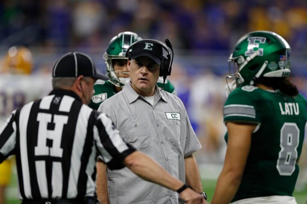
Hi there. In case you missed it on Friday, I have a new article in The New Republic about the spike in how the sports world is fetishizing of the working class (including Eastern Michigan football coach Chris Creighton wearing a janitor-style work shirt during a recent bowl game, as shown above), which I view as little more than a class-based form of stolen valor. I hope you’ll check out the article here. Thanks.
Back to you, Phil.
Uni Watch News Ticker
By Phil

Baseball News: Looks like we have some new uniforms for the Yokohama Bay Stars (from Big Daddy). … LaGrange College baseball also has new uniforms (from Matt East). … Hawai’ian born Benny Agbayani, who famously wore #50 with the Mets (Hawai’i Five-o, get it?), will have his jersey, number 28, retired by the Hawai’i Pacific Baseball Team. … This season, Milwaukee will Brewers introduce “Decade Weekends: – five special weekends honoring Brewers (uniform) history during their 50th Anniversary Season (from Johnny Okray). … Pretty sure everyone knows this, but Nike isn’t actually making this year’s MLB unis — they’re the exact same as the Majestic ones, made it the exact same plant in Palmer, PA. — but they ARE paying mightily to put their MOTB front and center (from Aaron Rusnak). … Has the Mets’ Dom Smith switched from #22 to #2? (via Paul). … Here’s our first look at the MOTB on a Braves jersey (from Hunter Jones). … Los Angeles Dodgers players were still wearing last year’s Majestic jerseys at their FanFest yesterday (from Jakob Fox). … Very cool photos here showing Shea CitiField and Ebbets Field at night (from Paul Hollingsworth). … Hopefully I can get to Kansas City for the NLBM 100th Anniversary Celebration, but another great reason will be for a Royals game — lots of promos this season, including Grateful Dead night. … In this piece, it is noted the Dodgers fan club is called Pantone 294 (from David Raglin). … The Saturday edition of the Chicago Sun-Times featured all of the White Sox’s logos on the cover (from Mike Chamernik).

NFL/XFL News: We’ve already seen the uniforms for the XFL 2.0 teams, and now we’ve seen the helmets, some of which are actually not awful. … Each XFL team will have its own ball this season (or at least as long as the season lasts). From Rusty Flynn. … From the always-awesome Blaise D’Sylva, check out these prototypes for new or existing NFL teams & proposed teams. … Also from Blaise, he’s begun his look at the AFC East helmet history (obviously that’s the *current* AFC East, as the Colts — one time AFC East denizens — have been moved to the AFC “South”). … “We don’t know what the Rams’ new uniforms will look like, but it’s safe to say they’ll be a huge upgrade over the team’s awful navy look from 2018.” So says this piece from the Rams Wire. … The headline: “Former U.S. Senator rooting on her Chiefs during coverage of the impeachment hearings.” Submitter Max Weintraub adds, “Nice pin! Good thing she has her priorities in order.” … Interesting find at the Super Bowl Experience in Miami Beach – A white Broncos helmet with a blue one in the background in the Lowe’s sponsored section (from Alexander Baretto). … Do you like Supe “fun facts”? Well, these are mostly non-uni related, but it does include the tid bit that this is actually the first Supe where both teams have red primary jerseys. Hard to believe it’s never happened before! … “Seen a lot of “Luv Ya Blue!” memorabilia over the years, but this takes the cake,” says tweeter BayouCityHistory (from Ignacio Salazar).
College Football News: Here’s one from Kary Klismet: “I love these fantastic pullovers with the bucking bronco logo worn by Santa Clara’s coaching staff, c. 1949. The image of Hall of Fame coach Len Casanova appears to have been taken from this vintage 1949 Stanford/Santa Clara game program. These pullovers seem so far ahead of their time for the era of stenciled grey heather athletic department sweatshirts. I’d love to find a color photo of them somewhere to get a sense of what they looked like in all their glory!” … LSU’s Damien Lewis, Lloyd Cushenberry and Stephen Sullivan still have CFP stickers on their helmets for the Senior Bowl (from Evan Saacks). … Tweeter Ken III offers this review: “Nike with the extremely, uncharacteristically blah 2020 @seniorbowl unis…No Reese’s peanut butter cup TV numbers this year (like adidas featured in previous games).” … “Money raised by LSU fan to help buy Clemson a new mascot will be donated to Tigers United University Consortium, an organization dedicated to saving wild tigers worldwide” says Timmy Donahue).

Hockey News: On Friday night, the WHL Regina Pats “decided to go with a standard looking hockey jersey rather than trying to make it look like the Hockey Night in Canada blazer with tie,” says Wade Heidt. “They went with the powder blue that was a trademark of the blazer. Vintage Hockey Night in Canada logo as the crest. Solid navy blue socks.” … Remember when the Penguins switched their colors from powder blue/blue to black/gold to match the Steelers & Pirates? And the Bruins complained? Well, if Twitter existed back then, here’s how it might have been handled (from Vintage Oilers). … More from Wade Heidt: “We had more colour vs. colour in the BCHL on Friday Night. A rare red versus green match-up. The Prince George Spruce Kings wore their red alternates while visiting Surrey. The Surrey Eagles wore their green uniforms at home.” … Still more from Wade: The major junior hockey powerhouse Sherbrooke Phoenix wore special Hockey Fights Cancer uniforms trimmed in light purple. … “Beautiful jerseys from the Spruce Grove, Alberta Saints (AJHL) honouring former teammates (Conner Lukan and Parker Tobin) were playing for the Humbolt Broncos (SJHL) who passed away in the tragic bus crash in 2018,” writes Will Leslie. Here’s a closeup of both the front and back. … A well known chain of barber shops is sponsoring the mascot competition at the NHL Fan Fair and its mascot is Suds, a bottle of shampoo (from David Dahl). David adds, “This mascot is at least in a venue solely for the purpose of promoting this company, as opposed to marring a fan-focused event like the mascot competition.” … Color v. Color matchup yesterday as UConn took on Quinnipiac in the Connecticut Ice Festival, complete with matching score bug (from Timmy Donahue).

College/High School Hoops News: Timmy Donahue notes, “Nevada HS basketball, Bishop Gorman v. Coronado. CHS wearing Viva Las Veas themed unis complete w/ CHS on the Welcome to Las Vegas sign & cartoonishly large font for NOB. BGHS has a large space btwn the M & A on their jerseys.” … Here’s a look at some of the Coaches vs. Cancer kicks worn yesterday (from Cleveland Rocks). … Hope Paul wasn’t looking: Clemson broke out their all purple uniforms for their game against Louisville (from Clemson Uniform Tracker). … William and Mary will retire Marcus Thornton’s jersey on Feburary 15. … Texas A&M had a special black & pink uni “for a good cause” (from Timmy Donahue). Interestingly, they don’t specify that “good cause” but with the color scheme, we can probably figure it out. … A tweeter by the handle Juney of Black Eagle House writes, “An absolutely abysmal uniform matchup between NIU and WMU on the notoriously divisive Huskies court. Both teams in dark colors to the point where you can’t tell who’s who.” Juney is correct. … “With Kansas State wearing black uniforms versus Alabama, here is an article from 2006 when the BFBS was first introduced under Bob Huggins,” says Timmy Donahue. He adds, “(t)he absurdly long shorts are quite a contrast to the Tucked Under Short Shorts of today’s era.” … More from Timmy Donahue: Tulane wore a BFBS version of their 2016 GFGS “Big Easy Streetcar” uniforms against East Carolina.

Soccer News: Check out the new away shirt for Bray Wanderers (from Ed Żelaski. … “Argentine side River Plate’s jersey number had a picture of their manager on them,” says Erwin Pérez.

Grab Bag: “Not sports related,” writes Will Scheibler, “but my city is celebrating its 50th anniversary and the city’s website has a spot where it explains the details of the 50th anniversary logo.” … New uniforms for the Multnomah County Sheriff’s Dept in Oregon (from Timmy Donahue). … Also from Timmy: “Went to an open house at the local elementary school. One of the classes had student designs for sports teams. These 2 were my favorite, especially the ‘New York Piranhas Swim Team’.” … Jeremy Brahm thinks the logo for the European Figure Skating Championships looks similar to the 2006 FIFA World Cup logo with the laughing faces.
The G on the Packers helmet stands for greatness, not Green Bay
It makes more sense than having a “G” be for Green Bay. It would be like the Niners having only a “S”, or the Chiefs only having a “K”.
Tiki Barber falsely reported[81] it to stand for “greatness” without a reliable source to back up his claims. Other reputable media outlets then published similar stories using Barber’s false claim as a source.[82] The Packers’ Assistant Director of PR and Corporate Communications had the following to say: “There’s nothing in our history that suggests there’s any truth to this. The Packers Hall of Fame archivist said the same thing.”
Yes. Everyone on this site is aware. It was a joke.
Super Bowl XIX, Miami vs. SF, the helmet on the dolphin has an M for Miami. This will be the sixth time, not 5th as mentioned.
This year and SB 35 don’t count. The Giants didn’t have “er” for East Rutherford and the Niners still have SF instead of SC for Santa Clara.
What’s a hemlet?
Good concept otherwise. Would like to see white pants too.
Until I read about its origin and learned of the term, I had always thought the winged football helmet was supposed to represent a claw with long nails protruding to the back of the helmet. Mostly because I new of teams with animal names wearing it. Being associated with the Michigan Wolverines and Princeton Tigers. CFL’s BC Lions also wearing this helmet design for 2 seasons in 1960 and 1961.
link
The Chicago Bears also wore a similar style for a few years staring in 1931.
link
There’s also the link, but a hen’s foot wouldn’t have so many forward-facing claws.
With this being the first time “both teams have red primary jerseys”, I realized that KC is the only NFL team with red helmets. I guess you might include Washington’s burgundy being a dark red, but when you consider how popular red is, and how many red lids there are in MLB, I’m surprised there aren’t more red helmets. Atlanta used to have red helmets, but I think their black looks better. Without changing a team’s colors, the Cardinals seem like the best option to go with red, and I doubt they’d ever consider this since they’ve been white forever. Tampa Bay is another, but they seem pretty set on pewter, and if they did change I’d like to see them go back to white. Here’s a breakdown of the helmet colors, with the various shades of a color being lumped in together. I will say the NFL lids are more diversified than MLB, where red, black, and blue dominate. At least the Padres brown now joins the A’s green as a break from these 3 color
7 Blue, 5 White, 5 Silver, 4 Black, 2 Gold, 2 Green, 2 Orange, 2 Red, 1 Yellow, 1 Purple, 1 Pewter
Started thinking about the helmet colours in the CFL after reading this. Realized in a 10-year period, the CFL as league has become less diversified in helmet colours.
Back in 2010, all 8 teams had their own helmet colours. 1 white, 1 yellow, 1 red, 1 green, 1 gold, 1 black, 1 navy blue, 1 silver.
As we enter 2020 for the 9 teams. 3 black, 2 navy blue, 1 yellow, 1 red, 1 green, 1 gold.
When reading about this being the first SB where both team’s primary jersey color is red, I realized that KC is the only team in the NFL with red helmets. I guess you could include Washington’s burgundy as dark red, but considering how popular red is I’m surprised there aren’t more red lids. Atlanta used to have red, but I prefer their black helmets. Here’s a breakdown of the NFL helmet colors, with the shades of a particular color being lumped together:
7 Blue, 5 White, 5 Silver, 4 Black, 2 Gold, 2 Green, 2 Orange, 2 Red, 1 Yellow, 1 Pewter, 1 Purple
By the way, posted this twice since when I posted it it didn’t show up for at least 10 minutes. Actually both times I posted this.
Seeing that Chicago Sun-Times cover makes me wonder whether the White Sox are aware of UniWatch’s use of the winged sock.
the legal defence would be “it’s a winged STIRRUP, not a sock”
;)
Actually, the defense would be that all winged foot imagery — the White Sox’s, Uni Watch’s, FTD’s, Prince Namor’s, and many, many others — derives from the Roman god Mercury. It’s a trope.
Makes perfect sense, Paul. Thanks for the explanation.
Is that one-day-only Niners version avail to buy?
Re: the Twitter bit on the Penguins-Bruins controversy… I will reiterate once more that people back then seemed to miss the fact that several teams already shared color schemes in the 1979-80 season – Islanders and Oilers, Blues and Sabres, Rangers and Jets, Canadiens and Capitals… plus, the fact that black and gold had been front and center on the Pens’ jerseys in the form of the skating penguin on the Golden Triangle since 1968.
There were two red vs orange matchups in the’80s, as the Broncos faced both Washington and the Niners.
Trying to think of the first blue vs blue, you run into the question of whether the Cowboys count as a “blue primary” or “white primary”. Leaving them out, the first one is Giants vs Bills in 1991.
hey the dominic smith item links to my tweet not paul…?
The blue collar cosplay uniform article was great, thanks for that.
I agree! Sorry but I just now got around to reading it. Another point you could add about the Pistons: About 10-12 years ago their marketing mantra was “Going to work.” I believe they even had metal lunch boxes with the slogan, logos, team photos, etc.
I just came inside a hooker.
Hawaii.
Does the home team in the XFL use their own ball for the game?
How about the Browns go back to what they had in like 1964. Orange Helmets, Brown and White Stripes on the helmet, Brown Home Jerseys, White away jerseys, white pants with Brown and Orange stripes. And some Block Numerals so you can actually SEE the numbers?
RIP Kobe
Extra note on LSU’s Cushenberry: He was voted as a #18 (a big deal in the program), but wasn’t allowed to wear it this year because of the NCAA’s rules about uniform numbers for Offensive Lineman. To compensate, he wore a patch all year.
link
Because of the peculiar nature of the Senior Bowl, Cushenberry was finally allowed to wear his number on the field.
link