
Click to enlarge
In the fall of 1970, when I was six years old, I reached into a box of Kellogg’s Corn Flakes and pulled out a 3D football card for a San Francisco 49ers running back named Ken Willard. I’d never heard of Willard (or probably any other football player), and I had only the vaguest sense of where San Francisco was, but at that point Willard immediately became my favorite player and the 49ers became my favorite team. Nearly half a century later, that is still the case. So I’m very excited about the Niners earning a spot in Super Bowl LIV by defeating the Packers in yesterday’s NFC Championship Game.
That makes no sense, of course. Willard and all his teammates have long since retired, the roster has turned over umpteen times, ownership has changed, and the team doesn’t even play in San Francisco anymore. By any reasonable standard, the team I root for today has little if any relation to the team I first began rooting for as a result of that Corn Flakes card. And yet I feel as passionate about the 49ers today as I ever have.
That, my friends, is the power of a uniform. For 50 years, I have rooted for any and every player wearing that 49ers uniform. It’s not rational, it makes no sense, but it’s a very powerful thing. It’s a great example of how, as I’ve said many times before, rooting for a team is probably the greatest example of brand loyalty on our consumer landscape.
As for yesterday’s games, I thought they both looked great, but I’m not aware of any uni-notable moments from either of them. Fortunately, Super Bowl scholar Jay Braiman contributed the following observation:
All four teams playing on Sunday had letters of the alphabet in their helmet logos, and all four starting quarterbacks wore double-digit numbers. That had never happened before in the Super Bowl era. The only time all four Super Bowl semifinalists had letters in their helmet logos was 1984-85 (49ers, Bears, Dolphins, Steelers), but the Bears started Steve Fuller, wearing No. 4, in the NFC title game. (The other quarterbacks were Joe Montana [No. 16], Dan Marino [No. 13], and Mark Malone [No. 16].)
The last time all four starting QBs wore double-digit numbers was 1990-91: Jeff Hostetler (No. 15), Montana, Jim Kelly (No. 12) and Jay Schroeder (No. 13). Before that it happened in 1981-82 (Montana, Danny White (No. 11), Ken Anderson (No. 14) and Dan Fouts (No. 14), and fairly regularly prior to that. But those years all featured at least one team that didn’t have letters as part of its helmet logo.
I’ll have more of Jay’s wisdom as part of my annual Uni Watch Super Bowl Preview, which will run on InsideHook either later this week or, more likely, early next week. Stay tuned.
Meanwhile, let’s start looking ahead to the Super Bowl:
• Some people are making a big fuss about how this will be the first Supe featuring two teams whose primary colors are both red. True enough, although it doesn’t mean much, because one team has to wear white. The AFC is the designated home team this year, so it’s a safe bet that the Chiefs will wear red and the 49ers will wear white.
• Speaking of which, some people are pointing out that 13 of the last 15 Super Bowl winners have worn white. “So,” these people say, “couldn’t the Chiefs choose to wear white out of superstition?” Sure, it’s possible, but I don’t think it’s likely. The Chiefs almost never choose to wear white at home, and I don’t think they’d let a superstition force them out of their standard home uniform.
• Assuming the Chiefs do wear red and the Niners wear white, the Niners apparently want to wear their mono-white throwbacks, although it’s not yet clear if that will be permitted:
Some news: The 49ers will make a push to wear their all-white ‘94 throwback uniforms in the Super Bowl at Miami. The problem, Richard Sherman tells me, is that the NFL currently won’t allow it. The 49ers got an exception to wear these unis Week 17 at Seattle; would like one again
— David Lombardi (@LombardiHimself) January 20, 2020
For this, let’s shift into FAQ mode:
The Rams wore their throwbacks in last year’s Super Bowl, so why wouldn’t the Niners be allowed to wear theirs?
The Rams’ throwbacks had become their primary colored uniform and were no longer an alternate design.
The Niners wore throwbacks in Super Bowl XXIX, so why wouldn’t they be allowed to wear throwbacks this time around?
The 49ers had worn those earlier throwbacks for much of the 1994 season as part of the NFL’s 75th-anniversary program, and the team had requested and received permission from the league to wear them throughout the postseason.
Well, why can’t they request permission again?
That’s apparently what they’re doing, but it’s not clear whether the league will approve the request. Remember, they reportedly turned down the Saints’ request to wear their mono-white alternates during the Wild Card round.
What would be the rationale for turning down such a request?
One consideration would be whether they have enough of those throwback jerseys in the retail pipeline (so, once again, we see the merch tail wagging the on-field dog). And then there are the league’s longstanding concerns about brand integrity, blah-blah-blah. Like most people, I think most of this is pretty silly. On the other hand, I’m glad that the NFL hasn’t turned into a revolving carousel of alternates, like the NBA or college football.
Which white Niners design do you prefer?
I like the throwbacks fine, but I prefer the standard white/gold combo and hope they go with that.
• The Chiefs’ captains will have a hard time fitting the Supe patch on their jerseys, thanks to the Lamar Hunt perma-memorial:
There have been other Super Bowl teams with chest patches, like the Steelers in Supe XLV. But the Steelers don’t wear captaincy patches, even in the postseason, so they didn’t have a patch-overcrowding issue.
The Chiefs don’t normally wear captaincy patches, but they add them for the postseason. Maybe they’ll remove them again to make room for the Supe patch.
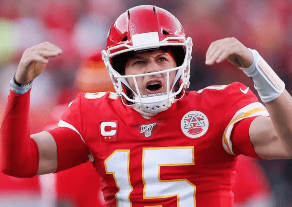
• As you can see in that last photo of KC quarterback Patrick Mahomes, the Chiefs are one of three NFL teams that have blank nose bumpers (the others are New Orleans and Washington). I haven’t yet had time to research how long it’s been since we had a blank-bumpered Super Bowl team, but I’m assuming it’s been quite a while.
• Finally, there’s this: Twitter-er @ryno_82 pointed me toward this uni-history page that was posted on the Chiefs’ website in 2008. It includes the following: “[Chiefs owner Lamar] Hunt’s inspiration for the interlocking ‘KC’ design was the ‘SF’ inside of an oval on San Francisco’s helmets.” I have never heard that before. Have any of you?
Meanwhile, in case you’re wondering: My original Ken Willard card was lost at some point during my youth. The one shown at the top of today’s post is a replacement that a Uni Watch reader sent to me some years ago. I’m embarrassed to say that I no longer recall who that generous reader was. If that person is reading this, please speak up in today’s comments, and thanks!


ITEM! Another membership raffle: Reader Rick Cuzzetto has generously purchased a Uni Watch membership for me to raffle off, so we’re going to do that today.
This will be a one-day raffle. To enter, send an email to the raffle address by 8pm Eastern today. I’ll announce the winner tomorrow. Big thanks to Rick for sponsoring this one!
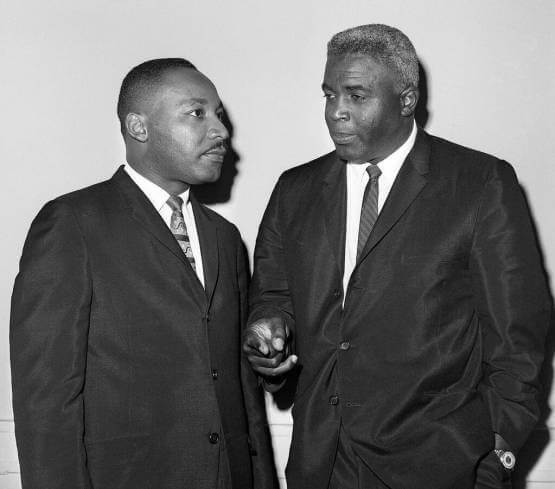
Today is Martin Luther King Jr. Day, the day when we celebrate the life of history’s greatest American. The photo above shows him with Jackie Robinson in 1962 — two heroic trailblazers.
King would have turned 91 this year. It’s incredible to think he was only 39 — 39! –when he was assassinated in 1968 (or to put it another way, paraphrasing the great Tom Lehrer, when King was my age, he’d been dead for 16 years). Think how much more he could have accomplished, and how different the world might be. What a waste. R.I.P.
The Ticker
By Jamie Rathjen

Football News: Texas athletic director Chris Del Conte reiterated his stance on not adding black jerseys for the Longhorns. That’s the third time we’ve had him saying that in the Ticker since May 2018 (from @TheNameIsBenhur). … A designer in Atlanta created logos for NFL and college football teams that are hybrids of the team’s name and logo and their city, or their stadium for the college teams (from Willard Kovacs). … Canadian football’s Grey Cup has been on a few adventures since the Winnipeg Blue Bombers won it in November: they brought it back to the city broken after their victory and on Saturday it was rescued from a hotel fire.

Hockey News: Blue Jackets G Matīss Kivlenieks made his NHL debut last night in a Joker-themed mask (from Alan Kreit). … Here’s every NHL team logo in the style of the Maple Leafs’ — that is to say, the team name is written inside the thing the team is named after or an element of its logo (from Mike Chamernik). … We recently mentioned that Canadian WHL teams wouldn’t wear jerseys themed after Don Cherry’s suits for an annual promotion anymore, with the jerseys instead based on the traditional powder blue Hockey Night in Canada blazer. On Saturday, Edmonton Oil Kings coach Brad Lauer actually wore one of the blazers (from Wade Heidt). … Kary Klismet sent us some renderings of Colorado College’s future arena.

Basketball News: Villanova wore warm-up shirts honoring Martin Luther King, Jr. on Saturday. That game was also blue-vs.-blue (from Kary Klismet). … Washington State retired No. 1 for current Warriors SG Klay Thompson (thanks, Brinke). … Columbia wore blue at home Saturday (from James Ketterer). … North Dakota State’s women’s team debuted gold alternates, and their game against North Dakota was color vs. color … LSU’s women’s team wore purple at home (from Josh Hinton). … NBA numerologist Etienne Catalan tells us that new Timberwolves SG Allen Crabbe will wear No. 9. … Cincinnati has added a memorial patch for longtime broadcaster Chuck Machock, who died recently (from our own Alex Hider).

Soccer News: Real Madrid center-back Raphaël Varane reached 300 appearances in all competitions for the team and received a No. 300 shirt — with the number on the front as well as the back (from Everard Santamarina). … Here were the shirts worn in this weekend’s Premier League games (from Josh Hinton). … The next three items are from the fourth round of the Scottish Cup: Rangers wore black armbands on Friday in memory of former goalie Bobby Brown. … Dumbarton midfielder Callum Wilson was missing his NOB for at least part of their game. … Livingston wore their white second kit at home for no good reason. … In England’s League One, Wycombe Wanderers and Rochdale, two teams that combine to wear three shades of blue, both changed to yellow and pink, respectively, on Saturday in order to not wear blue and to support the mental health charity Samaritans.

Grab Bag: A baking group in Sapporo, Japan, has been making “uniform cookies” — with numbers and NOBs! — for several different teams, including the local volleyball team, Safilva Hokkaido, and two NPB teams, the Hokkaido Nippon-Ham Fighters and the Tokyo Yakult Swallows (from Jeremy Brahm). … The Chinese esports team Gen.G got a new NBA 2K League team, nicknamed the Tigers, and is actually the first of 23 teams in the league not affiliated with an NBA team (from Zane Schwartz). … Cal State Northridge and UC Davis both appear to have new athletic logos this school year. Here’s CSUN’s logo on the men’s basketball team, while UC Davis’s is more of a secondary/shorts logo on uniforms for now (both from Erik Bogh). … Reader Kary Klismet sent us new school logos for New York’s Schodack Central School District and Louisiana’s Donaldsonville High School. … The radio show/podcast 99% Invisible used the new Space Force uniforms to look at the history of camouflage (from Kevin Zdancewicz).
In regard to the Super Bowl match up, neither teams wears black in their primary uniforms, with one exception, which is the same for both teams. Their helmet logo has black outlining. I don’t think this can be said of any other team
Here’s hoping that Kansas City never changes their uniforms.
I also find it interesting that two Missouri teams make it to the finals for the first time in 50 years in essentially the same year (Blues and the Chiefs )
The Royals and Cardinals played each other in the ’85 World Series, but point taken; 50 years later the Chiefs and Blues are in championship games again.
I think the point was the Chiefs and Blues waited 50 years between making SB / Cup Final appearances
The Royals and Cards had waited 5 and 3 years respectively between visits to the World Series in ’85.
Yep, i.e. in the space of less than 12 months the state of Missouri saw two very long droughts come to an end. Not saying all their teams have suffered, in fact the Cardinals seem to win the World Series every 5 or 6 years, sometimes with very forgettable teams :)
I’m pretty sure the Chiefs have gone the NFL longest without a significant redesign of their uniforms. Raiders may be the other but they looked different in early 60s. Chiefs jerseys and pants were basically the same as Dallas Texans from 1960-63. Minor changes include adding gold outline to jersey numbers in the 60’s, facemask color grey to white in ’70s, adding red road pants in the late ’60s. Helmet design never changed since being in KC.
It is strange too because Chiefs haven’t been very good since AFL/SB IV days (until now) If anyone could justify new look, it would be them. Check out Broncos, Patriots and Seahawks for a reason to redesign uniforms.
Any info on the Commish wearing a cap with the Roman numeral XLV instead of LIV?
I really hope the 49ers do not use the mono white throwback. Their regular sets are one of the best in the league. The gold/white/gold set matched with the KC red unis would make a beautiful Super Bowl.
Agree with this. I do wish the Niners would put the 3 stripes back on the sleeve but it is a minor quibble.
The 49ers tried to stuff 3 stripes back on the sleeve when they returned to their “classic” jersey design, and they were scrunched in or cut off for just about every player due to the lack of true sleeves. I think they look much better with two actual stripes than with whatever remnant of three stripes each player’s jersey tailoring will permit.
There’s a lot of space between the 2 stripes. Thin out the existing stripes a little and you could fit another stripe in there. The current set makes me think Nebraska more than SF, which I guess is fine if you are Roger Craig or Tom Rathman.
The throwbacks that they want to wear have three stripes.
When they returned to “the classic design,” the sleeve stripes were truncated by design- not just cut off for every player. I did not like that look one bit.
And of course then came the black alt disaster.
Now, IMO- those are the nicest, cleanest looking uniforms in the league. Two stripes on the helmet, the sleeves, the pants, it all matches.
“[Chiefs owner Lamar] Hunt’s inspiration for the interlocking ‘KC’ design was the ‘SF’ inside of an oval on San Francisco’s helmets.”
And that is a new one on me!
And I agree with PL; while I like the new white alts fine (could there be an all-red Color Rush lurking in the future?)-let’s stick with the standard white.
Agree. Never was a fan of the all white when they won the Super Bowl with them.
Those throwbacks were red over white, not all-white.
link
True, but I also hated those. I just didn’t like those throwbacks at all. Probably because I’m a fan of teams with gold or silver helmets wearing pants that match the helmets. This is why I love the Saints Gold/Black/Gold and Gold/White/Gold, and absolutely hate the Gold/Black/Black and the Gold/White/White. I love the Saints Color Rash jerseys, but I’d rather see them with gold pants.
Particularly if worn with the properly matching OLD GOLD pants, which they have worn on and off with Throwback jerseys before the Whole Color Rush/One Shell Thursday Game foolishness started and created the Unitard/Monochrome Look with boring ridiculous matching socks …. The White over White “Color Rush” look isn’t particularly bad, compared to the Black or White regular uniform stripe less pants, but the Old Gold pants with Color Rush jerseys, and some type of striped or detailed socks, would be immensely better. Isn’t the entire point of uniforms to look your best?
If they did wear the all whites (personally, I love both of the ’55 throwbacks), and they won, it would be the 4th different uniform they would win a Super Bowl in, pretty sure that would be a uniform record.
The Niners have worn red in four Super Bowls (3-1) and white in two (2-0). The last time they wore white was SB24 against Denver in 1990.
The Chiefs have worn each jersey once, losing in white and winning in red.
Misspelling in the first bullet point, just says “supe” instead of super bowl.
Thanks, but that’s not a misspelling. It’s a slang term that I’ve been using for years, because it gets tedious to write “Super Bowl” over and over.
There is a real typo in the hockey section of the ticket.
We “recnetly” mentioned that Canadian WHL…
*ticker
A typo in a post highlighting a typo was very meta of me.
Fixed!
And you don’t have the NFL coming after you for trademark infringement/non-payment of royalties for using “Super Bowl”.
Actually, journalists are free to use the term “Super Bowl” all they like.
The MLK shirts are a BIG EAST-wide inn initiative, worn in a number of other games as well. link
This is the first Super Bowl in a while where both teams use standard Varsity Block numbers. It’s a nice change at a time where everybody has to have a bespoke font heralded by pages of corporatespeak.
And it’s glorious! The way numbers should look!
Please Niners, why are you doing this? Just wear your regular road uniforms. Don’t want to see the Niners in their throwbacks for the Super Bowl.
Your “power of a uniform” story totally says it all. I was a kid from Indiana who fell in love with the Toronto Blue Jays during the 1993 World Series because of the uniform. I had no connection to Toronto or Canada whatsoever. It made no sense. But still to this day, when I see that uniform, I instantly feel connected to that feeling of being a little kid who stupidly loves baseball and the (fortunately well-outfitted) Blue Jays are still my favorite baseball team.
Same for me, I was a bay area raised kid who at switched allegiances from A’s to the White Sox in ’91. All dues to the uniform.
49ers should make the throwbacks their primary uni.
Seconded, and they should bring back the red ones too.
As a Rutgers alumnus who saw his team look great (not play great; just look great) in almost this exact design two decades ago, it has become my favorite football uniform.
A really clean jersey but with block shadows as the one element that stands out. It looks so good.
Typo — I haven’t had time to research hong long it’s been…
Fixed.
I truly hope San Francisco wears their normal unis. It looks way better than those mono-white duds. And I do mean duds.
I liked the alternate logos for the NFL and college teams. I just wish he had done every NFL team. Would have been interesting to see New Orleans or Detroit.
Agreed that the all whites are duds! The gold pants and white tops will make for a NICE contrast to KC’s red top and white bottoms. They are the 49ers because of the 19th century GOLD rush after all…
It frustrated me last year when I got to go to the Super Bowl to see my Rams play and the only Rams jerseys for sale with the patch WERE NOT the ones they wore. Miffed the fanbase so much some Nike Outlets were spotted with $20 leftovers this year.
I get the 49ers players being superstitious and wanting to play in the uniform they think they’ve played the best in. But fans? Good God it’s so much worse than their regular uniform, why on Earth would you prefer that over their normal road uni, which is one of the best in football?
I think Uni Watch has previously discussed how the Chiefs and Rams have strange uniforms because one of the colors on their uniform (yellow and gold, respectively) doesn’t appear on their helmet.
The 49ers’ white throwbacks have the opposite problem: the helmet is primarily gold, but the uniforms are only red/white/black. No other team has a helmet that is primarily a color that doesn’t occur anywhere else on the uniform. There are plenty of detail colors (the Cardinal’s beak, the Steelers’ hypocycloids, etc.) that don’t appear elsewhere on the uniform, but no primary colors. The closest example is probably when the Cowboys wear white pants, but in that case the pants stripe is silver.
Their regular jerseys also have no gold in them (the pants do) which looks like they picked a random generic jersey online to me. Technically you could say the Cowboys have helmets that dont match their white uniform combo (royal blue on the jerseys and pants, non matching blueish silver pants vs silver and navy on the helmet).
The Giants away jerseys are a pretty classic example of this
I’m from KC and used to work for the Chiefs during a previous regime. The lack of yellow and use of Black on the helmet has always driven me nuts. It’s a small detail that holds our unis back from being in the NFL Best In Show group with GB, Pittsburgh, Saints, Bears & Las Vegas (that’s going to be weird to say or type for a long time)
I had a conversation with our old Asst GM about the Chiefs helmet inconsistency/oversight/ommission/whatever you want to call it and he agreed with me but the Hunt’s are so conservative and resident to any uniform changes it would never happen.
If you look at the Chiefs 60th anniversary branding you’ll see they use a cream/off white and red combo with two cream horizontal stripes and it’s really sharp. I’d love to see us adopt that shade of white for our uniforms and change to shade of yellow to a duller and a bit darker shade of yellow. Use said yellow as the Arrowhead outline and the cream in place of the white. Then get rid of the black interlocking KC and have the letters written out separate just like it looks here “KC” in a simple font.
If you’ve seen the Baldwin denim KC hats or T-shirt’s that have a heart and KC simply written in it…just like that. Very basic but classic. Maybe even two cream stripes going down the middle of the helmet but that might be too much. The KC could be in the yellow if it was viable enough or in red. Would prefer no outline so no black on the helmet or uniforms at all.
CSUN has an interesting sign in front of its campus that spells CSUN from multiple angles.
link
It’s been there for going on 50 years…Drive by it quite a bit when I visit the Valley.
Didn’t both gridirons in the championship games have helmets with the double bar facemask? I wonder when the last time that happened was in conference finals or Supe?
Also, the double bar was an awful facemask. I had that in Anklebiters and 2 years later. I think nothing would have been better.
Cowboys also wore throwbacks in the ‘94 playoffs
Actually, those were link. IIRC they only wore the actual throwbacks once, in the regular season.
The 49ers standard road white jerseys are nearly identical to the Giants road white jerseys. Slight difference in striping.
Also, serif NOBs.
Pretty much, very plain and boring on their own.
Still have my entire set of the Kellogg’s 1970 3-D NFL players. Just about the only items saved from Mom’s ruthless purgings LOL.
Not uni-related, but Cal State Northridge (where my wife graduated from) has a very interesting sculpture on a prominent street corner known as the “worm sculpture” which spells out “csun” in lower case letters regardless of which corner you’re viewing it from.
link
The “logos in the style of the Maple Leafs” was a fun exercise. The ones I actually like to see on a jersey were the Bruins, Jets, Capitals and Lightning.
-Jet
This is nuts but I’m pretty sure the first 3D Kelloggs card I ever got in a box of cornflakes was also Ken Willard! Of course I no longer have it but I’m pretty sure that’s who I had.
-Jet
Have the 49ers ever done a throwback to the uniforms with the gold and black trim around the numbers and logo on the sleeve? Famously worn during the late Jerry Rice and Steve Young era and entirety of the T.O. era. According to Gridiron Uni Database, they wore those from 96 to 06. I had that Jerry Rice jersey and while I don’t normally care for black accents, I think it came together very nicely! Also I favor logos on sleeves as it complements the helmet logos/graphics.
JR jersey: link
They have not yet thrown back to those (which makes sense, since it’s only been 13 seasons since they last wore them).
Thanks Paul. I guess I could have also answered my own question with a quick check of the GUD. Approximately how long do teams wait before introducing a throwback?
I see that Tampa brought back the creamsicles after only 13 years, so there’s some precedent. While there’s no rule, it seems like teams tend to wait at least 25 years (and often a lot longer) before reviving a design.
You know it’s funny, and maybe some people forget, but the 49ers brought back their classic scarlet throwbacks and wore them as alternates in 2002, and 2005-2008. The last time they were primary uniforms was 1995. So they brought those throwbacks back after only 7 seasons!
it appeared like Richard Sherman had his towel velcroed on his pant’s last night. I was having a hard time finding a picture of it but if he did, that is the first time I’ve ever seen that
Actually it looks like they sewed in a loop for it but still first time Ive seen that
link
Good spot! Here’s a better view:
link
He’s apparently been doing it for a while.
And of course they have to make sure it doesn’t cover up the Nike logo haha
The towels now do have velcro loops to put the belt through (even though a lot of pants today dont have real belts or belt loops anymore).
The UC Davis logo is more of a throwback than a new logo: link
Thanks for this. I was curious as to why Cal-Davis used a CA logo. Looks good too!
There’s a few jerseys in the auction with built in hand warmers from the 80’s. Sad to see these weren’t featured!
link
Looks like no throwbacks for the 49ers
link
How has ownership of the 49ers changed? It’s been in the DeBartolo-York family since 1977. First, Eddie Jr, then his sister Denise DeBartolo-York (who still technically owns the team), then Eddie’s nephew Jed York. Yes, there was some controversy as to how Eddie Jr. lost the team, but for a family that comes from the Mahoning Valley and still resides there, should that be a surprise? (Note: I’m a Youngstown State graduate and I know the Youngstown area well.) In any event, I dont know if having the team change hands within a family counts as an ownership change, especially since all except Eddie DeBartolo Sr. (who actually bought the team for his son) are still alive.
As far as Ken Willard goes, he’s still alive too at 76. According to Wikipedia he played for the 49ers from 1965-73, going to four Pro Bowls, before finishing his career with the Cardinals in 1974. BTW, the Cards were in St. Louis at the time, so another Missouri connection to this story
My bad — the ownership has changed once, not several times, since I got the Willard card. I’ll change that in the text.
I saw Willard play quite a few times with the Niners and the Cardinals (both on TV) in the early 1970s. Unfortunately, he was past his Pro Bowl prime by that point.
Niners to wear standard white jersey/ road uni for SB link
The standard road white jersey, gold pants worked just fine in SB XVI and XXIV, two Niners’ rout wins.
The mono-black alternate set was easily 49er all-time low look.
I think the best SF 49er unis were in the roughly 2000-10 period. The helmet, jersey and pants all had red, gold and black trim. The facemasks were a team color (red) not grey because that’s only color you could get in 1964. Very attractive set. Problem? No winning of titles with these threads. Back to Montana/Rice era look. Agree that the present jersey sleeves should have 3 stripes. This is not rocket science.
I’ll do you one better: The inaugural year of that uniform had three-color player names in addition to the numbers. Subsequent years, the names were simpler. The team logos on the sleeves were good, but would have been great had they been embroidered instead of screened.
Paul-
So if you like the Niners (and their Red/Gold/White), how did Green/Yellow/White become the colors of UniWatch?
Green has always been my favorite color, for as long as I can remember. I particularly like it when paired with yellow/gold/mustard/etc. Simple as that!
Fair Enough. I’m that way with Blue and Red. I also carry a soft spot for Brown/Yellow.
Paul are you going to do a uniform history/retrospective for both of the Super Bowl teams like you’ve done in the past?
I know you did one for the Niners 7 years ago…
Phil will have a detailed retrospective for both teams this weekend. I will have my usual “10 (or maybe 12, or 15) interesting uni-related factoids about the Super Bowl.”
Paul – great stuff as always. Within an organization, who typically makes the decision on which unis to wear? For example, is the Chiefs owner that decides they wear red in the Super Bowl? Team president? Equipment manager?
Varies by team. Any or all of the people you listed can have input, as can the players, the coach, etc.