For all photos, click to enlarge
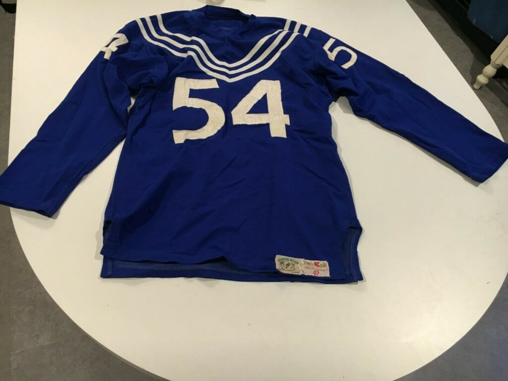
I was looking at vintage uniforms on eBay yesterday and came across this circa-1950s football jersey with an unusual stripe pattern running from the chest to the shoulders. I’d never seen anything like it! It didn’t look like something I’d want to bid on, but it still seemed interesting, so I clicked on the listing. That’s when I discovered what the stripes look like from that back:
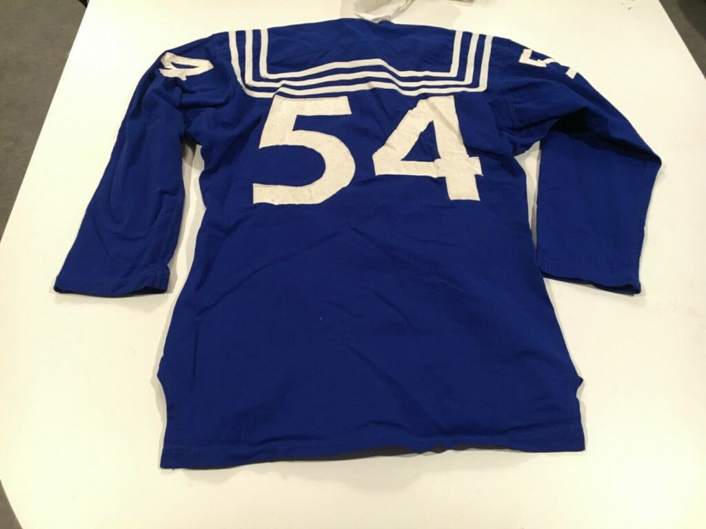
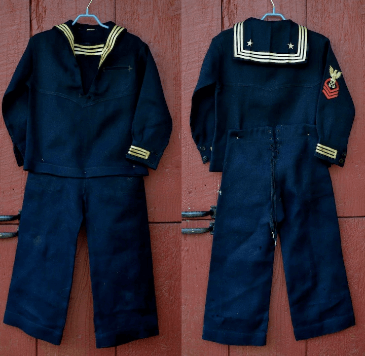
Wow! While we obviously can’t know for certain, it seems pretty apparent that the intent here was to mimic the design of a sailor’s uniform:
Unfortunately, the eBay listing doesn’t provide any background info regarding which team or school the jersey might have been from, so I sent a note to the seller. No response yet. For now, the only clues we have are from the (very beautiful) tagging, which indicates that the jersey — and hence probably the team — was from the Pacific northwest:
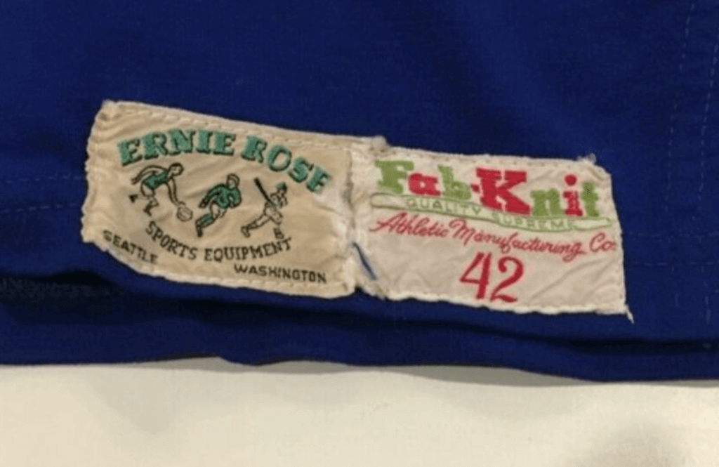
Alas, Ernie Rose Sports Equipment is no longer with us (ditto for Ernie Rose himself). And Fab-Knit, a Waco operation that presumably sold uniforms to local shops like Ernie Rose, went bust in 2015. So we can’t ask either of those companies about the jersey’s history.
But I’m officially intrigued. Was this jersey from some sort of naval academy? From a school whose teams had a nautically themed named like the Commodores or the Admirals? Something else? Almost seems like something Nike or Under Armour would do, doesn’t it?
Meanwhile, the jersey is still up for bids through this Sunday. If you’re interested, it’s available here.
The Ticker
By Alex Hider

Baseball News: During the Reds’ 1978 goodwill tour of Japan, Cincy players wore uniforms with Rawlings logo creep on the right thigh. Wilson had supplied the Reds’ road unis that season (from Christopher Schlueter).

NFL News: With the Broncos wearing orange over white for Sunday’s season finale, it was the fourth uniform combo that rookie QB Drew Lock had worn in his first five starts (from @theREALBGott). … Interesting note from Billy Rothman: Every AFC team that will play in a Wild Card game next week (Patriots, Titans, Texans and Bills) has a red/white/blue color scheme. No NFC team in the playoffs has a red/white/blue color scheme. … The NFL Shop used an outdated Titans helmet in a web graphic yesterday (from Peyton Winters). … Couple of notes from Brad Eenhuis: Vikings DT Gary Larsen once wore No. 140 during training camp prior to the 1973 season because he thought the team should go 14-0 in the upcoming year. Brad also sent along this awesome shot of the NFL helmet buggies from the 1970s. … The Jags wore eight of their nine possible uniform combinations this year. They’ve yet to break out an mono-teal look since adopting this current set (from Brad Gude and @BosBruinsFanMN). … 49ers QB Joe Montana once wore a T-shirt that said, “Forty Fuckin’ Niners.”
College Football News: Great-looking color-on-color Orange Bowl last night between Virginia and Florida — two orange-clad teams! (Thanks to all who shared.) … Speaking of the Orange Bowl, the trophy awarded last night said “2020 Champion.” It’s apparently standard practice for the Orange Bowl trophy to list the new year, even if the game is played in late December (from Gabe Flores). … Oregon will wear silver helmets along with dark green jerseys and pants in the Rose Bowl tomorrow, while Wisconsin will wear all white (from Troy Salinger and Johnny O). … Virginia Tech will wear white in the Belk Bowl today, while Kentucky will wear blue (thanks to all who shared). … The First Responder Bowl, played at SMU’s home stadium in Dallas, had the bowl logo at midfield and team logos at the 25, but kept SMU’s logo in the end zones (from Chris Mycoskie). … Redshirt freshman Virginia DL Samson Reed has not played this season and had not been given a number — until he dressed in No. 9 for last night’s Orange Bowl (from our own Jamie Rathjen). … Couple of notes from Josh Hinton: Here’s what the Rose Bowl field will look like tomorrow; and the Titans’ wordmark was visible beneath the Music City Bowl end zones. For more bowl game coverage, head to Josh’s College FootBOWL Tracker Twitter account. … Georgia was Blaise D’Sylva’s mini-helmet team of the day yesterday. … @PrideOfTheTide notes that some Alabama players wore TV numbers on their jerseys in the 70s while others didn’t. The Tide scrapped TV numbers on their jerseys for good in 1974. … In 1982, players at Swarthmore College near Philadelphia removed their helmet decals to protest a school committee’s decision to investigate whether the successful football program was good for the school’s academic image (from Brad Eenhuis).

Hockey News: With the Predators set to wear retro uniforms for tomorrow’s NHL Winter Classic, they’ve now added matching helmet logos (from Garrett Roberts). … Speaking of the Winter Classic, here’s a good piece on how the Stars will keep the ice cool for tomorrow’s game at the Cotton Bowl (from Michael Kimball). … This piece on the Bruins website breaks down every player by jersey number over the last decade (from Sean Scales). … Czech Republic G Lukas Parik was wearing a glove underneath his blocker during World Junior Championship play yesterday (from Jakob Fox). … 41 years ago yesterday, a referee during an Islanders/Flames game fractured his jaw during play, prompting a retired referee to fill in wearing his street pants and a replacement jersey (from Jerry Wolper).

Basketball News: Reader Matthew Wolfram spotted a Chicago Bulls logo lookalike in a mural on a building in Bogotá, Colombia. … Texas women’s basketball will retire No. 24 for Clarissa Davis on March 8 (from Griffin T. Smith). … Xavier went GFGS last night at Villanova. … The Presbyterian College women’s team has an abnormally large Big South Conference logo on their jerseys (from Will Chitty). … Interesting question posed by Greg Fallon: If you dress a dog in a basketball jersey, should it wear the number and NOB on its back like a human? Or do you turn the jersey around so the team name is on display?

Soccer News: Per video game leaks, this is what the Netherlands will allegedly be wearing in the 2020 Euros (from Josh Hinton). … Also from Josh: Barcelona will reportedly use this shirt as a “pre-match jersey” in 2020. … The San Diego Sockers of the Major Arena Soccer League wore Darth Vader Star Wars jerseys during a recent game (from Jonathan Greene). … “Spanish team Valencia has worn five combos this season, with three coming in three Champions League away games,” says our own Jamie Rathjen. “For two of the combos, the crests on the shirt and shorts didn’t match, because the shirt from the second kit has a false-color orange and black crest, while the shorts from the first kit have the crest in the right colors.”

Grab Bag: Reader David Petroff has quite the collection of classic tourist and sports pennants from the 1960s and ’70s. … A Nevada National Guardsman has been granted a religious waiver to grow a beard because he’s a Norse Pagan (from Timmy Donahue).
As 2019 draws to a close, I’d like to thank everyone on the Uni Watch team and also everyone who comprises the Uni Watch comm-uni-ty. While this was a tumultuous year for me on certain fronts, it was definitely not a bad year, in part because of all the support I received from you folks in the wake of all that tumult. Thanks for that — it’s very Special, and it means a lot.
It was also a good year for content here on the blog, thanks in part to the great interviews I got to do with Nick Francona, the “God Bless America” guy, Hal the Hot Dog Guy, and military uniform expert Timmy Donahue, all of which were very well received and were among the best and most interesting content we’ve ever had on the site. Here’s to more good things in 2020, yes? Yes! — Paul
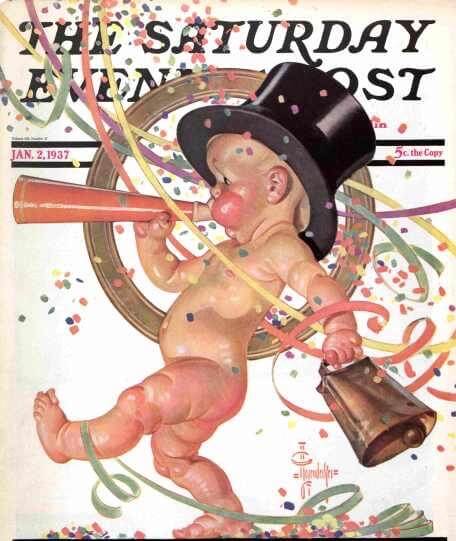
Happy New Year everyone! Be safe tonight.
They say most accidents occur within a mile of home, so maybe I should just crash a party. Right?
I’m not sure that Xavier falls under the category of GFGS. Gray (Pantone 422, Xavier Silver) is listed as one of the school colors, along with navy.
Happy New Year’s to all, and may 2020 be better, wherever you are.
The Orange Bowl was always on January 1 or later until we got the CFP and New Year’s Six. That’s probably why they use the next year for the champion. When I went in 2008 (BCS era) the game was played on January 3.
But, despite when it’s played, it’s the conclusion to the 2019 season. So shouldn’t it say that?
It should signify the season, but they always seem to go forward with their labeling. There’s even been some years where there were two Orange Bowls within the same calendar year.
Small clarification to the ticker item on Netherlands kits for Euro 2020. The linked images are not a video game leak. They were created in the game by a user based on images leaked elsewhere
I’m curious about that set of Service Dress Blues you have pictured. That’s a Chief Boatswain Mate’s rating badge on a set of E6 and below SBD’s. Since it’s on the right arm I’d guess that’s a WWII era uniform but even then the Chief’s SBD was the jacket/pants, not the cracker jacks.
Just received my Purp Walk raffle tee! Thank you so much! Happy new year to all!
Merry New Year everyone!
re: that football uni…Mapleton Oregon is 300 or so miles from Seattle, their high school macot is the Sailors and the colors match. I guess that’s a possibility.
Great info, Bob!
Are you from that town or area? Or did you research that somehow??
I’m not from there but I googled different combos of ‘football sailor mascot’ ‘sailor team uniform’, etc. Found Sarasota High in Florida first but then this one came up. Makes more sense.
I tried to find old pics of their team but came up empty.
Smart — nice work!
Another possibility is a Navy unit team. There are a number of Navy bases in the Seattle area, and if you go back to the middle of the last century, I think you’ll find that a number of them fielded sports teams.
In regard to Alabama having both TV numbers and no TV numbers, that picture was likely in the era of the backfield (shown in the photo) and receivers wearing tear-away jerseys that were essentially thin t-shirts with numbers printed on them. They had to have stacks of them for each game, so it was easier to just do the front/back printing.
If I were to guess I would say that the Alabama jerseys without TV numbers were the old tear away jerseys while the ones with TV numbers were regular jerseys.
Too bad Oregon is wearing that gawd awful dark green. The Rose Bowl is such a beautiful setting, and it would have looked great for them to wear their regular green and yellow uniforms opposite the Wisconsin white with red trim.
Agreed, but it’s a shame that Wisconsin can’t be in their red jersey. Oregon has no uniform tradition, so it’s too bad they wouldn’t go into their enormous Nike closet and pull out a white jersey to allow that.
Serious question (not nit-picking, I assure you):
It seems that when MLB teams visit Japan and play exhibition games that the visits are called “goodwill tours”. What is the story behind this? Is there more to the visit than playing the games? Are there “goodwill” events of the kind that we see college football teams participate in during bowl season? I’m very curious if calling these visits “goodwill tours” is merely a traditional thing or if there’s more to them.
The idea is to promote cross-cultural awareness while also promoting the sport. So the touring team (the Reds, in this case) will visit notable civic/historic sites in the host country, etc.
Thanks for the info.
Visit … and sometimes spy on, as in the case of catcher Moe Berg on the 1934 goodwill tour of Japan: link
Here are some helmet buggies in action!
link
Happy New Year to all. While I love news and analysis of sports uniforms, I really appreciate the times when the content branches off into cultural and aesthetic topics. That’s what separates this blog from others that offer something similar.
In the Joe Montana picture there’s a Detroit Lions pennant above the lockers. Was this pre-game for SB XVI at the Silverdome?
Happy New Year everyone!
Thanks for another great year of UniWatch Paul!
The field at Ford Stadium at SMU has sewn in lines and graphics. The center logo was able to have temporary paint over the Mustang logo while the endzones would have been nearly impossible to cover. (You can actually see the green paint covering the Mustang)
As an aside, when SMU joined the American, they had to remove CUSA logos and decided to paint the American logo instead of replacing the turf with a sewn in logo. They still paint it in today.
Happy New Year, everyone! Thanks, Paul, for a great year of Uni Watching in 2019! It’s been notable for many reasons, not least of which is Uni Watch’s 20th Universary. The parties across the globe gave many of us a great excuse to meet in person for the first time, which was definitely a highlight for me. Here’s hoping 2020 provides just as many if not more great moments in the Uni-verse!
Regarding today’s lede, Paul, your comment about how the sailor-style striping on the jersey almost looks like something that Nike or Under Armour would do got me thinking. Why is it that for many of us who would identify as classicists when it comes to uniform design, and old jersey like this is cool and interesting, but similar design elements on a brand new uniform might well be met with rolled eyes and critical comments? I admit that I am likely guilty of such reactions.
My initial response is that it reveals a couple of things that are true about the universe. The first one is that there may be something of an anti-recency bias among those of us who are classicists – a preference for a simpler, less complicated age of uniform design.
The flip side of that coin, however, is that there was something less cynical, less retail-driven about the designs of those earlier eras, so they seem more sincere, more honest. I’m more inclined to appreciate the earnest intent behind those design choices of old, whereas a similar design on a modern uniform might invoke an involuntary cringe at the accompanying BS marketing “story” that is soon to follow in an accompanying press release or hype video.
Does that mean those design elements in a modern uniform should be less aesthetically appealing to me? I don’t know. Everything is contextual, so it’s hard for me to separate the designs from their eras of origin. But I can’t help but admit that I often do find unusual design elements in old uniforms much more intriguing than oddly-placed gewgaws on new uniforms.
What you are invoking is the Tarrant Theory, which states that given enough time, any uniform design will eventually become a “classic”, even if a similar design would be widely mocked if released today.
I am going to fight to the grave to get Paul to include this in the official UW lexicon.
Hmmn… Interesting… I agree there’s some overlap in the concepts. Perhaps only time will tell if some of the band designs we see nowadays develop the nostalgic cachet that many older designs have. It’s certainly happened with the Astros’ Tequila Sunrise uniforms and even some of the sublimated jerseys designs from the ’90s-era NBA (although I think popularity of those is still geared more toward irony than nostalgia).
Do you have a shelf life built into the Tarrant Theory? I’m guessing a minimum of 20 years. Just wondering how long it will be before these link of recent vintage are viewed with the same so-bad-they’re-good sentimentality as the old link?
And one last thought on the Tarrant Theory: might is applicability in the future be affected by the current merch-dump era of uniform (or, more specifically, jersey) design in which we currently live? I look at the Toros jerseys, and as bad as they are, there’s something (ever-so-slightly) enduring about their misguided sincerity in an a pre-merch era. Will uniforms like these link ever be viewed with nostalgia in the future when the only reason they existed in the first place was to push product? I don’t know the answer, but I can’t imagine ever looking back with fondness on those things.
First, I certainly don’t claim to be the first person to have ever made this observation. And, no, there are no specific number of years required.
In fact, that’s the whole point. Some new designs will come out and people like them and they might become classics right away. Others, they will be derided as ugly at first only to be appreciated on down the line.
I have firsthand experience with this, I remember when the Charlotte Hornets came out with their pinstriped uniforms and people here generally thought they looked ridiculous…now, they are beloved nationwide.
Theory is an old one, probably didn’t originate with you, Unless you’re a couple hundred years old. If so, apologies.
So what’s the theory called then?
Re: the lead story.
It could be Western Washington University, which is in Bellingham, just 90 miles from Seattle. The jersey is Bay Blue, which is one of the school’s colors.
But the Vikings nickname wouldn’t fit the doughboy outfit.
Color vs. color should generally be avoided, but the Florida – Virginia Orange Bowl was at least tolerable since there was plenty of white on both teams’ uniforms, lowering the eyesore factor.
Auburn to wear a number 7 on one side of helmet with grey facemasks in Outback Bowl to honor Pat Sullivan.
link
Check out Mapleton hoops court logo!
link
Re: the jersey.
Could be from one of the navy bases around the PNW – they had football teams that played against the semi-pro teams.
link