Photo by Vernon Bryant, Dallas Morning News; for all images, click to enlarge
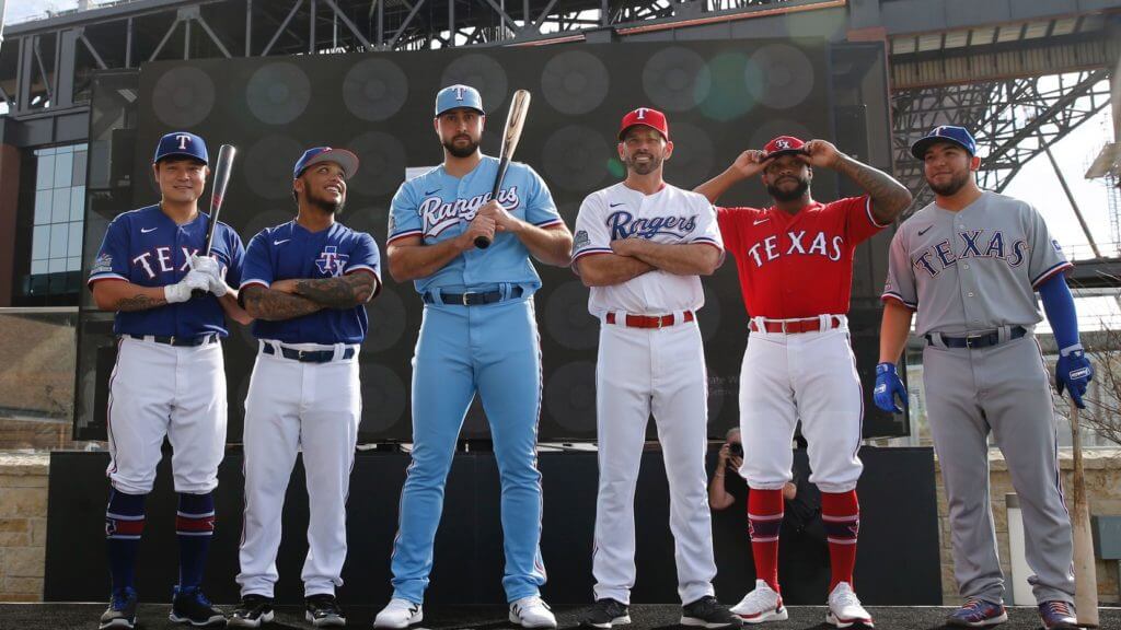
The Rangers unveiled their new uniform set yesterday afternoon. There’s a lot to cover here, so let’s start with a breakdown of all the new uniform elements, followed by assessments of the new uniforms themselves:
The New Script
Two of the home uniforms will feature a new script insignia of the team’s name. This will mark the first time since 2008 that the Rangers have worn the word “Rangers.”

I’m all in favor of the team being the Rangers instead of the Texases, but I can’t say I’m in love with this script. I don’t like how the “Ran” sits flush against the tail while the “gers” floats above it, the “g” looks like it was tipping over until it bumped into the “e,” the negative space inside the “a,” “g,” and “e” is too small so no white shows through, and the whole thing feels a bit off.
The New Rear Typography
For years now the Rangers’ jersey typography has been super-clunky, thanks to a spiky font combined with two layers of color outlining. They’ve now addressed that on the back of the jerseys, where the numbers and NOB lettering will have one-color outlining with the second color converted to a drop shadow. The result is, well, still clunky, but definitely an improvement over what they had before. Check out these side-by-side-comparisons — in each case, it’s the old version on the left, new version on the right:
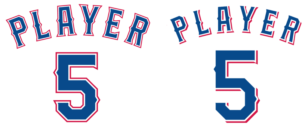
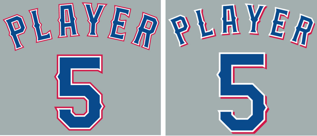
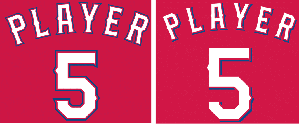
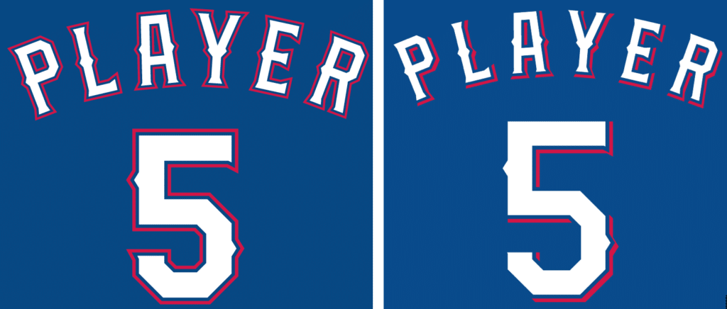
Like I said, I view it as an improvement. But here’s the weird thing: For the jerseys that still have “Texas” on the front, they’re not making the corresponding change to the front lettering — they’re keeping the two-color outlining on the front:
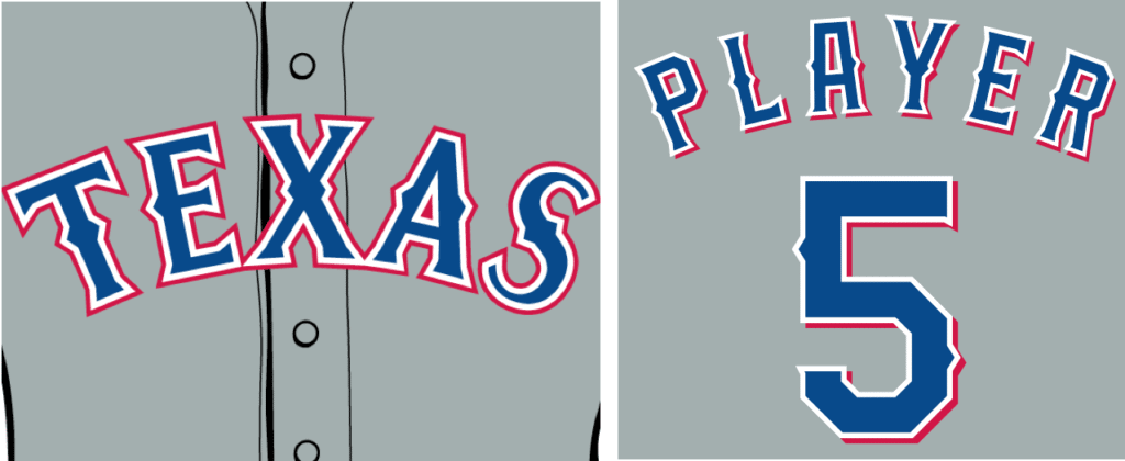
So not only are they missing an opportunity to improve the front-jersey typography, but now the front and back type styles don’t match. Makes no sense.
The New Secondary Logo
There’s a new “TX” secondary logo, which appears on an alternate cap and on the new spring training jersey:
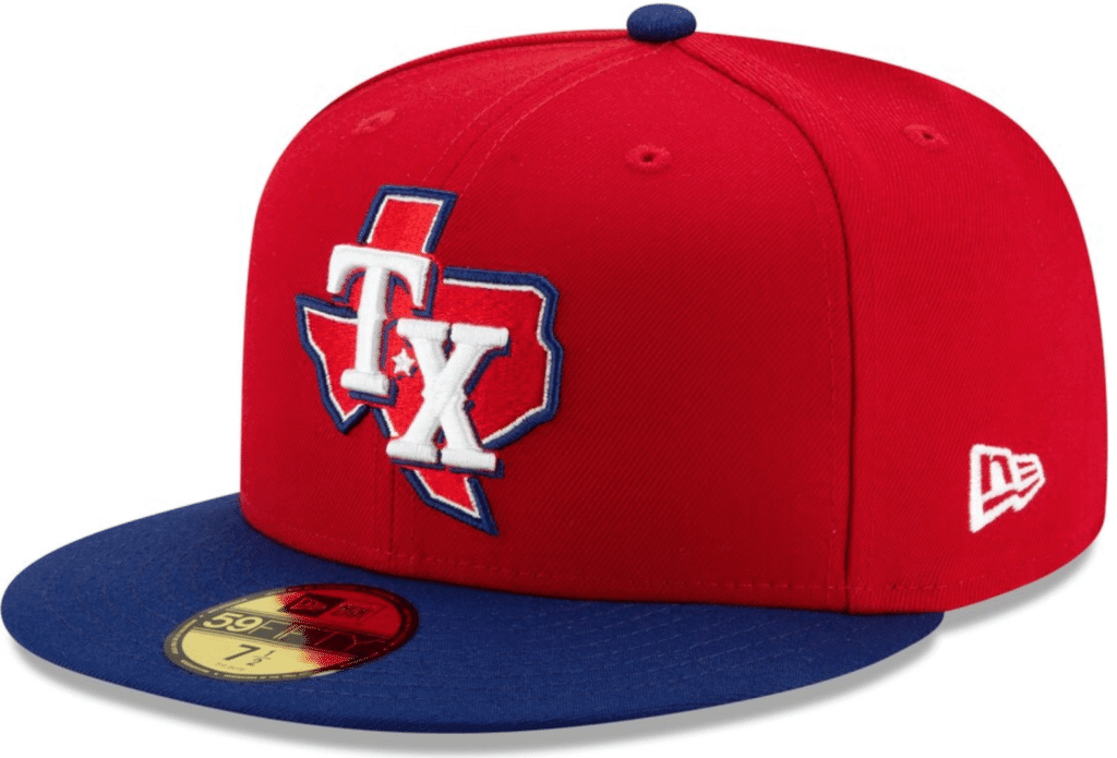
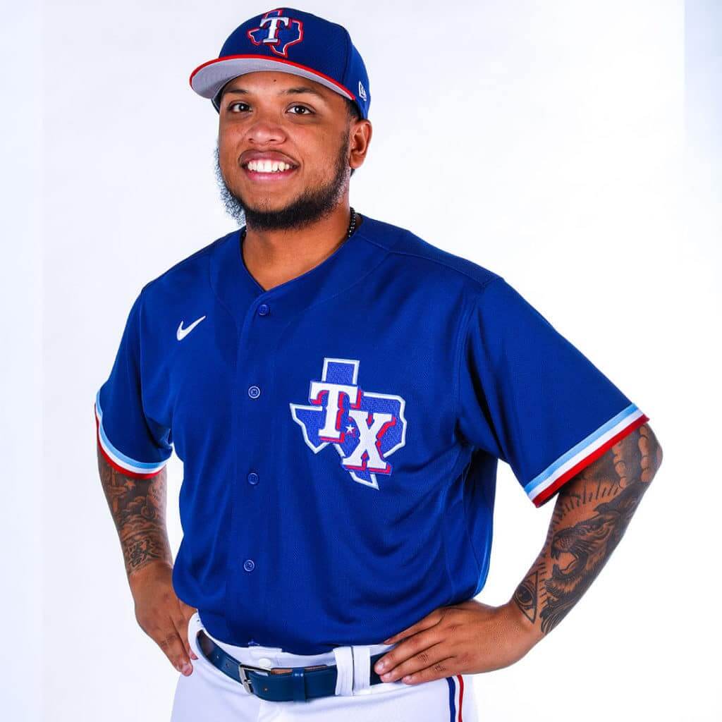
I kinda hate this logo. Too busy, too unwieldy. Not as awful on the jersey as it is on the cap, but still something that should have been left on the cutting room floor. Also: A star on a state-outline logo usually indicates the location of the team’s city, but that star is nowhere near Arlington.
The Stadium Patch
A right-sleeve patch to commemorate the inaugural season of the team’s new stadium will appear on all of the jerseys (including the road jerseys, which makes no sense). This logo design was revealed months ago, so it’s not a surprise, but this is the first time we’ve seen it in patch form:

The New Flag Patch
Everything’s supposed to be bigger in Texas, but Rangers players said that the team’s flag patch was too large and stiff, so it’s now it’s gotten a bit smaller — old version on left, new on right:
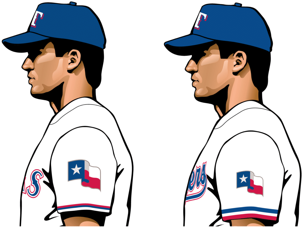
One thing they haven’t fixed: If you unfurled that flag as depicted on the patch, it would be the wrong dimensions — too horizontal. Shouldn’t this be, like, a capital offense in Texas?
The Sleeve and Pants Trim
As you can see in those patch images, the sleeve has new three-color trim. That appears throughout the next uni program, along with new three-color pants piping. This is supposedly a shout-out to the team’s 1970s uniforms. I won’t go through the ordeal of showing comparisons for every single jersey and pants color, but a side-view comparison of the home whites should give you an idea of what they’ve done — old version on left, new on right:
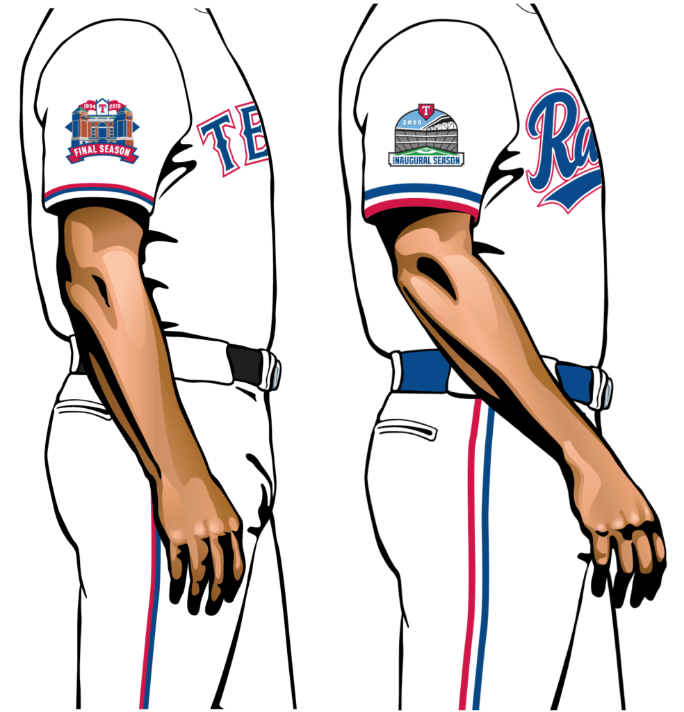
I’m okay with this on the sleeves, not a fan of it on the pants. The difference is more apparent in some of the photos I’ll be showing later in this entry. (As you can see, they’ve also changed their belt color from black to blue, which is an upgrade — except when the belt is red, which is another issue I’ll be getting to.)
Okay, so those are the big issues. Now let’s look at the individual uniforms, beginning with…
The Home Whites
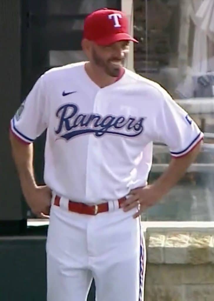
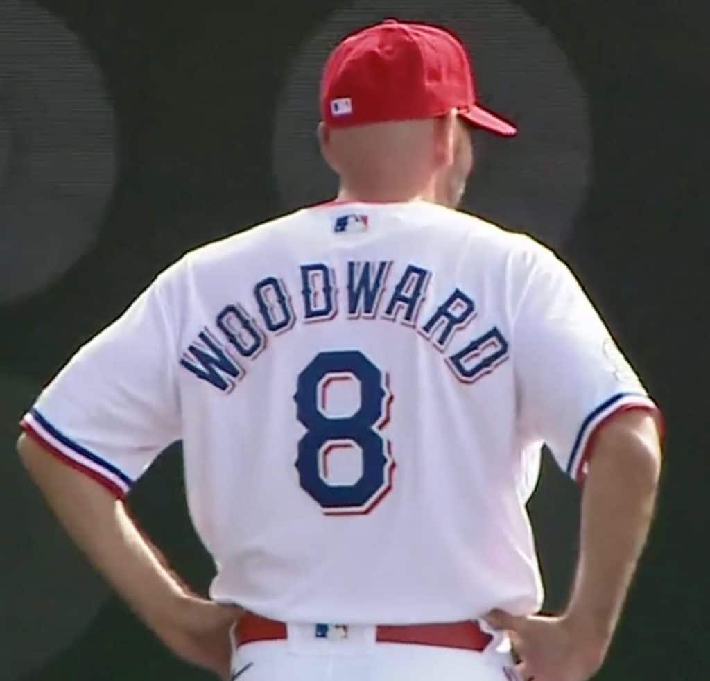
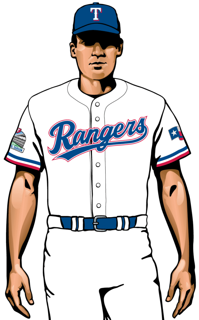
Best thing I can say about this is that they’re finally wearing their team name at home, which is as it should be. But the script is weak, the front and back designs are horribly mismatched, and they still can’t decide whether they’re a blue team or a red team. A mess. Grade: C+
The Road Greys
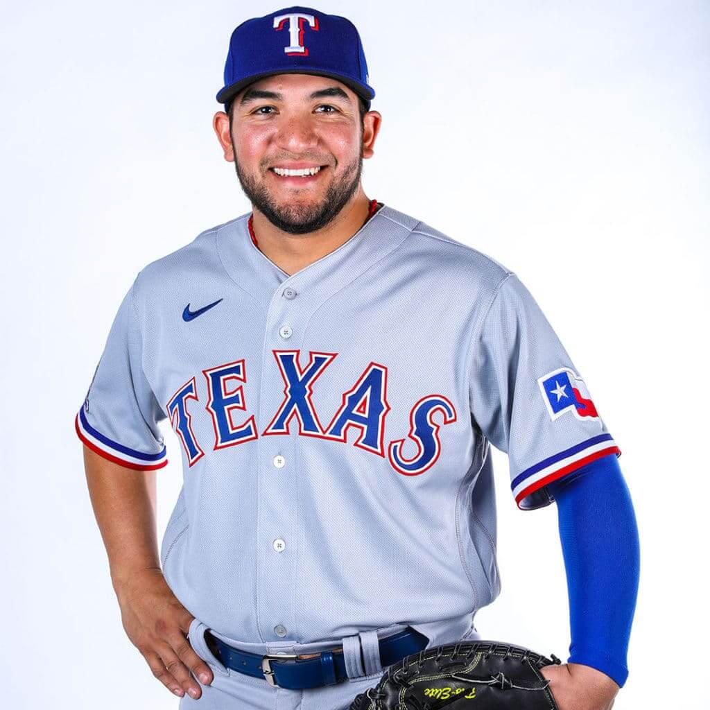
This is essentially the same thing they’ve been wearing, but with the new sleeve trim, the new pants striping, and the new rear-jersey typography. Perfectly reasonable, if not remarkable. Grade: B
The Friday Home Alternate
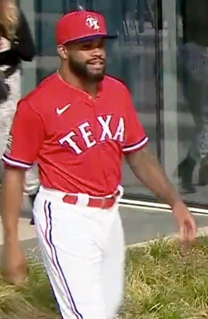
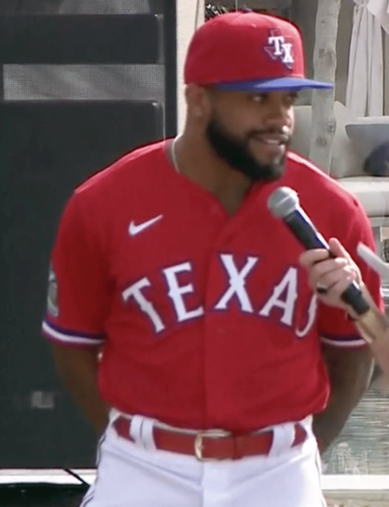
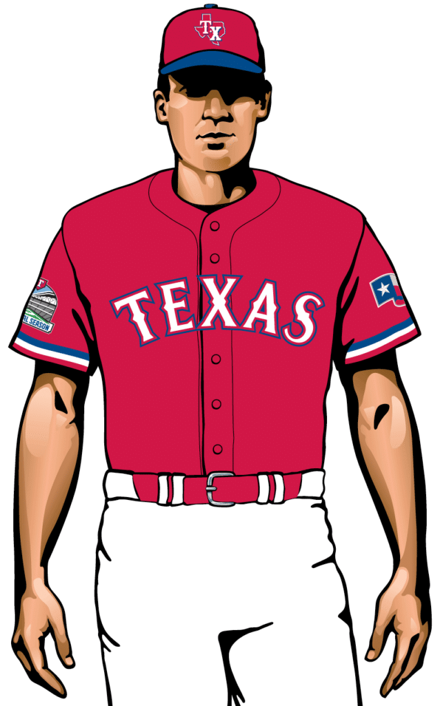
This uniform will be worn for Friday home games. I don’t like the Rangers in red, I don’t like that cap logo, and it’s sort of hilarious that the cap for the red jersey has a blue brim, symbolizing the team’s chromatic identity crisis. Grade: C-
The Sunday Home Alternate
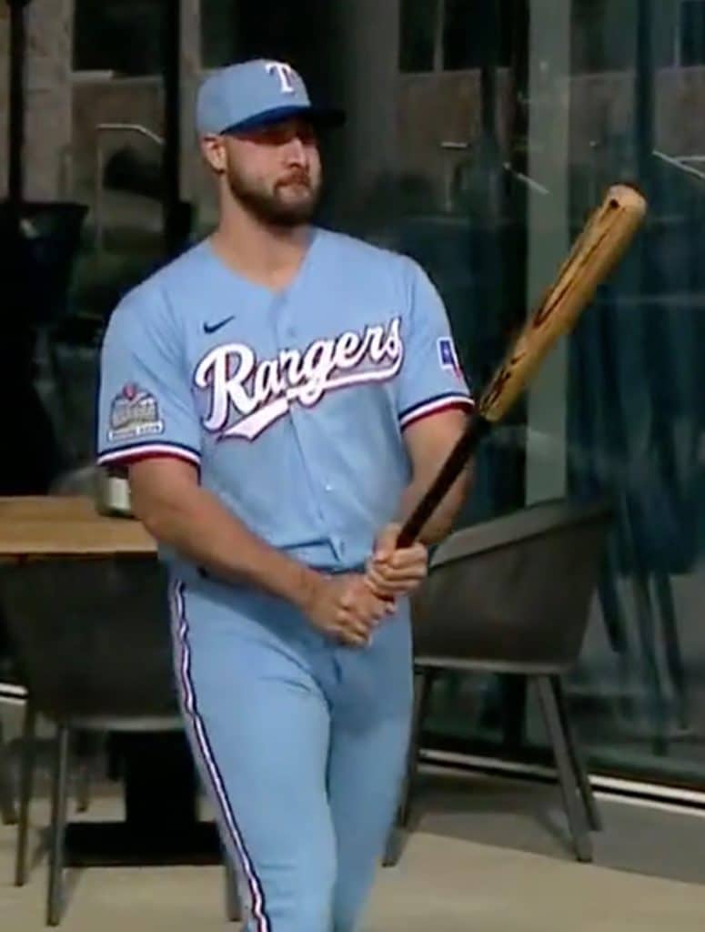

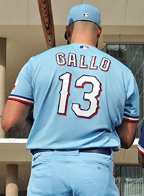
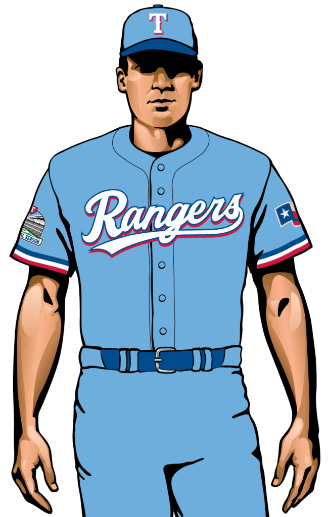
This uniform will be worn for Sunday home games. I’m not a fan of powder blue at home, and the script looks even worse on this jersey. I suppose we should be relieved that the cap brim isn’t red, but a royal brim on a powder blue cap isn’t exactly what I’d call progress. Also, nobody needs three different home uniforms. You’ve heard of addition by subtraction? This is subtraction by addition. Grade: D+
The Road Alternate
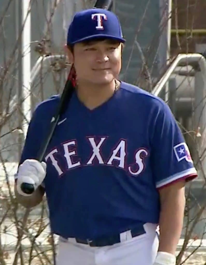
For some reason they sent out Shin-Soo Choo in a blue jersey and white pants, even though this is actually the road alternate. (They later clarified that he was supposed to have been wearing grey pants.) Much like the road greys, this is essentially the same thing they’ve been wearing, except for the minor adjustments to the sleeve trim, pants piping, and rear-jersey typography. No major complaints. Grade: B
———
Overall: The Rangers keep tinkering with their look, which keeps introducing more inconsistencies to a design that was never that strong to begin with. They need to blow it all up and start over. Lose the clunky font, decide whether you’re a blue team or a red team, cut down on the number of uniforms, and either go classic/retro or go modern. As it stands now, this team has seriously lost its way.
Meanwhile, the Rangers also announced the dimensions of their new ballpark. Many of the measurements pay tribute to former players (additional info here):

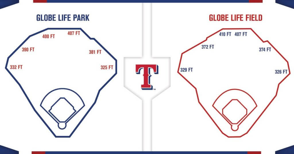
Note that the measurement listings in the first graphic incorrectly use apostrophes instead of proper “foot” symbols. Also, I love how the second graphic shows the old stadium diagram in blue and the new one in red — a perfect nutshell example of the franchise’s longstanding inability to choose between those two colors.
(Big thanks to Bill Henderson for research assistance.)

Click to enlarge
Gift Guide reminder: In case you missed it on Wednesday, the annual Uni Watch Holiday Gift Guide, featuring all sorts of cool stuff (including artist Pop Chart’s scratch-off stadium posters, shown above), is now available for your enjoyment over at InsideHook. My thanks to everyone who suggested items for inclusion!
Click to enlarge
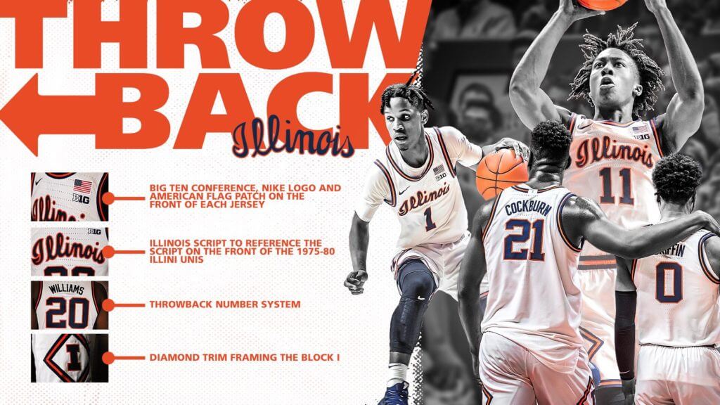
A systemic problem: Illinois used the graphic shown above to introduce new throwbacks yesterday. Leaving aside its more laughable aspects (calling out the conference logo, flag, and maker’s mark as the very first item really reinforces that throwback feel, right?), I was struck by the third item on the list: “throwback number system.”
What exactly is a “throwback number system” (assuming it’s not, you know, Roman numerals)? For that matter, what is a non-throwback number system? Did they simply mean “throwback font”? Did they just use “system” because it sounds more sophisticated and official?
Who writes this stuff? How stupid do they think everyone else is? How do they look in the mirror?
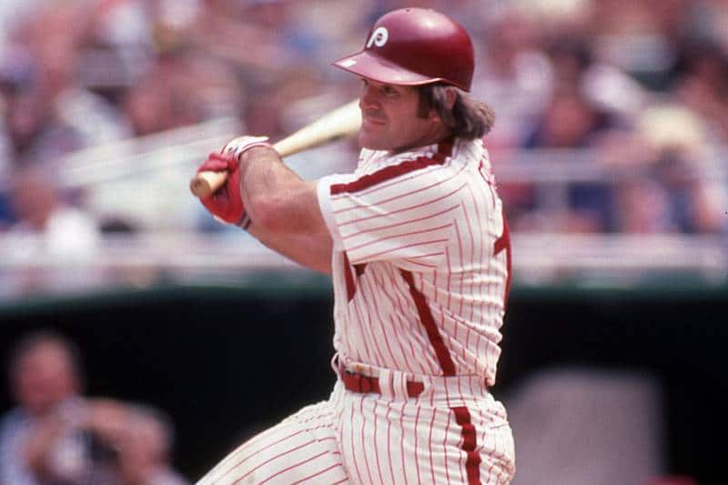
It’s the little things: Reader Jason Hillyer has been reading a Pete Rose biography, and it includes some great uni-centric bits. Check this out (click to enlarge):
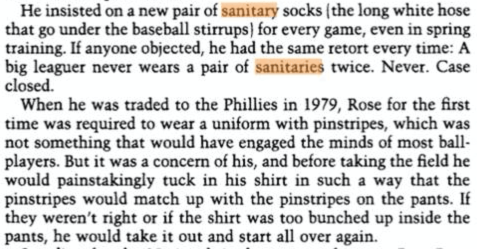
Wow. The bit about the pinstripes is so insane that I wonder if the writer somehow misinterpreted something along the way in his research. Like, maybe Rose was just picky about aligning the side piping (not pinstripes) on his jersey and pants..?
In any case, this is primo stuff. Big thanks to Jason for sharing.
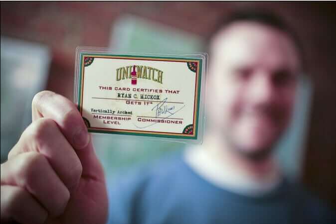

ITEM! Another membership raffle: Today we’re raffling off another Uni Watch membership that’s been generously donated by reader David Cline.
This will be a one-day raffle. To enter, send an email to the raffle address by 7pm Eastern tonight. One entry per person. I’ll announce the winner tomorrow. Big thanks to David for making this raffle possible.
Meanwhile, the winner of our latest Vintage Brand raffle is Charles Rogers, who’s won himself an item of his choice from the VB website. Congrats to him and my thanks to VB for sponsoring this raffle.
The Ticker
By Paul

Baseball News: The Pirates introduced new skipper Derek Shelton yesterday, providing our first look at the Nike maker’s mark on a Buccos jersey (from several readers). … After the presser, Shelton posed for a photo with his family. He was still wearing the Nike jersey, while his family wore Majestic jerseys (from @DaddyKleinBucks). … The Royals have apparently created a logo for Raul Mondesi Jr.’s recovery from injury (from Joseph Giordano). … New logo and colors for the North Shore Navigators, a summer collegiate league team. … Another summer collegiate team, the Wareham Gatemen, is threatening to sue the Worcester Red Sox over the WooSox’s new “W” logo, which the Gatemen believe is a copy of their own similar mark. … Nice shot of Padres P Chris Paddack in his new brown stirrups (from Brandon Lewis). … New uniforms for Dakota State (from Paul Vold).

NFL News: Here’s a look at a bunch of the custom-painted charity cleats players will be wearing this week. … Representatives from the Archdiocese of Baltimore gave Pope Francis a Ravens jersey yesterday (thanks, Brinke). … Are the Panthers’ mono-black uniforms cursed? Maybe. … The Bills will wear their mono-red alternates this weekend (from Andrew Cosentino).
College Football News: The latest school featured in Blaise D’Sylva’s helmet collection is Arizona. … Purdue’s field will get a new name next season (from @jffdmrly).

Hockey News: The Canadiens wore jerseys representing former captains and Hall of Famers during Tuesday night’s pregame activities. Some additional pics here (from Wade Heidt). … Also from Wade: Earlier this week we Ticker-mentioned that the Canucks inducted Alex Burrows into their Ring of Honor. What we didn’t mention was that the team wore throwback Burrows jerseys for pregame activities. … Speaking of the Canucks, they’ve decided to wear their “flying skate” throwback jerseys uniforms for an additional game this Saturday, and they’ll also wear their “flying V” throwbacks for pregame activities on that same date (from Wade yet again). … G.I. Joke uniforms last night for the Maryland Black Bears (from OlegKvasha). … Whoa: Caps LW Alex Ovechkin did some sort of equipment repair on the bench last night with a blow torch. He later said he was doing it to remove a sticker from his visor (from @bryanwdc and Eric Griffin).

Basketball News: A Bucks fan did an all-time ranking of the team’s uniforms. … New light-blue alternates for Villanova (from Bill McClain). … Throwbacks last night for Ohio State (from Ross Drucker). … New black uniforms for Marshall. The old black unis didn’t have the white outlining (from Michael Misiti). … UNC wore Stuart Scott caricature pregame shirts two nights ago (from James Gilbert). … Pink/black throwbacks last night for Penn State (from Chris Grosse). … San Jose State wore TNOB — that’s team name on back — last night.

Soccer News: Bimbo will continue to sponsor advertise on the Philadelphia Union’s jerseys for four more years, but the away jersey will have one of Bimbo’s sub-brands instead of a Bimbo banner (from several readers). … The USL Championship’s Tulsa Roughnecks FC will now be known as FC Tulsa (from @UtahDust). … The Premier League is promoting its Rainbow Laces campaign this week, with captains wearing rainbow armbands (look here and then scroll down for additional team captains) and some players, coaches, and refs wearing rainbow shoelaces as a pro-LGBT inclusion statement (from Jakob Fox).

Grab Bag: New logo for the St. Louis Aquarium (from @theREALBgott). … U.S. Army soldiers are now permitted to wear brown fleece caps as part of their combat uniforms. … A man robbed a currency exchange in Chicago on Monday night while dressed in a police uniform. … For reasons that are unclear, at least to me, reporters at yesterday’s House Judiciary Committee impeachment hearing were asked to cover the logos on their coffee cups (from @jffdmrly). … “After going down two sets to none to St. John’s in the Big East Volleyball Championship, Marquette changed from their sky blue uniforms to bright yellow mid-match,” says Scott Kaplan. This video doesn’t mention the uni change, but you can see the different uniforms during the 0:14-21 sequence.” … Interesting article about typography over the past decade (from Rob Curtin). … U.S. Army veteran Timmy Donahue spotted a lot of uniform inconsistencies and fouls in this Army Times stock photo. … Hey, remember my old Gromm•It project from a few years ago? It just got a nice entry, with lots of fun comments, on MetaFilter (big thanks to Beth Renaud for letting me know).

What Paul did last night: Oh man, so much happened last night. Hmmm, where to begin?
There’s this design writer/author/professor named Jessica Helfand. We’ve corresponded a bit over the years, in part because our work has occasionally overlapped and in part because she wrote a book about volvelles, which my then-girlfriend Kirsten was obsessed with. About a year ago Helfand wrote to me and said she was writing a new book about faces and portraits, and she asked if she could use some images of the old Manhattan Trade School report cards that had formed the basis for my Permanent Record project, because many of the report cards included little mug shots of the students. I said sure, emailed her scans of a few report cards, and then forgot about it.
A few weeks ago I received an invitation to the launch party for Helfand’s new book, which is called Face: A Visual Odyssey (Face book, get it?). The party was last night at Poster House, a new museum of posters that opened six months ago in Manhattan. I’d been meaning to check out Poster House anyway, so that was a nice bonus to the party invitation.
When I arrived, I grabbed a copy of the book and figured it would take me a bit of time to hunt through its pages in order to find the bit about the report cards. Instead, to my surprise, the book’s very first chapter begins with one of the report cards. So the report card actually sets the tone for everything that follows in the book — nice! (For all of these photos, you can click to enlarge.)

I eventually found Helfand, who I’d never met before in person, and introduced myself. She hugged me, thanked me for the use of the report cards, and then took off the scarf she was wearing and held it up:

How cool is that? She had turned one of the report cards into a scarf design! She gave me the scarf and insisted that I take it — a nice treat.
Since the party was taking place at the Poster House museum, I checked out the main gallery, which had an exhibit of completely amazing hand-painted movie posters from Ghana. Holy shit:


I also liked a digital display that showed a rotating series of notable posters from design history:


I wasn’t expecting much in the food/drink department, because book parties and parties at museums both tend to feature rabbit food and wine. But to my surprise, last night’s offerings included beer and some very rare beef skewers — alright then!

While mingling with people, I found myself chatting with a woman who was wearing a really cool green and yellow ring — my favorite color combo. I asked her if I could photograph it and she happily obliged:

On my way to the subway after the party, I stopped in at a deli to grab a soda and spotted these heaping bins of bacon on a back counter. I assume they were for this morning’s breakfast sandwich rush. Whatever they were for, it’s probably the most bacon I’ve ever seen at one time:

And then I went home and stayed up past midnight writing about the Rangers. A very good night! Hope yours was good too.
I REALLY hate that new Rangers wordmark and it took me a little while to figure out why. It’s the tail under the script and specifically the curvature of it. To me it reads as a touch of forced whimsy representing an antiquated and excessively jocular notion of baseball culture, redolent of a community theater dramatization of “Casey at the Bat” or a nostalgic ad for bubble gum
Now that is some really great design criticism!
One of the reasons I like visiting the site is that I often have trouble articulating what I like and dislike about designs. My overall impressions/opinions are usually similar to yours, Paul, but even if they weren’t, thank you for your take, and thank you, Martina, very well said!
You completely nailed it. I pulled out my old “throwback” Rangers script pullover to compare the new and the old. There are tons of little differences (and you noted the tail issues and Paul noted the negative space issues).
For me, the “R” is the major problem. Before, it had style. It flowed…especially where the straight line met the top of the curved line (link). Now, it looks fat and dull.
We’re stuck with it (along with that AWFUL TX logo), but it looks very amateurish. Hopefully it’ll get tweaked over the course of its existence. Nice job.
Having grown up in Texas, I’ve always loved the Rangers’ look with how much the blue and red tops stand out and have always enjoyed not knowing if I’d turn on the TV and see one or the other. Both have felt like a little snapshot of our state flag with its big blocks of color, and to me that’s probably the main reason I don’t like the new striping on the jerseys. It’s a distraction to what’s basically a cut-out of a giant Texas flag.
I’m all for powder blues but yeah the powder blue hat is a huge distraction and I wish they would’ve just brought back the old cursive font.
But maybe kids growing up in Texas with this set will love it all. One of the big reasons I’ve always enjoyed the Rangers unis is because they were roughly the same in their two World Series appearances as they were in the Juan Gonzalez/Pudge Rodriguez days of my childhood.
I’m with you Mark, I grew up a life-long Rangers fan and don’t find the new set so egregious. I do miss the Gonzalez/Pudge/Will Clark era home whites with “Rangers” in the current Texas script on the front with the red piping on the jersey. Back then the Rangers were solidly a red team, where before they had been solidly blue. I’m with you though, I actually like the red and blue jerseys. I even like the way the Giants have different primary colors with their uniforms and I’m a Cowboys fan. I definitely agree with Paul on the Rangers script, it’s weird, and the powder blues need white pants and a white cap.
Exactly. Also the sharpness of the bottom left tail of the R. Made me think the script belongs on a jersey on a package of Big League Chew or some other setting where the point is to depict “generic baseball uniform.”
Also, contra Paul, there is white inside the negative space of the G, which just illustrates how poorly designed the script is. The negative space for each lowercase letter should have similar proportions of white. None at all would be fine, a similar amount of some would be fine, but none and also some is wrong.
The new alternate TX logo is also a perfect example of objectively bad design. TX is a typographic symbol for the state of Texas. The geographic shape of the state of Texas is also a symbol for the state of Texas. If you’re trying to communicate “Texas” or “Texas-ness,” then either TX or the state outline gets the job done. But using both is redundant.
I could not agree more with Martina. To be blunt, the new wordmark does not appear to be “Major League” caliber at all but is rather a poor and generic caricature of what one should be. It lacks that professional feel and whimsy was the perfect word. Why not bring back the 1980s-1990s script?
That Rangers script looks like it was ripped off from a minor-league team. They would have been better served with the original Rangers script from 1984-1993. Typical overuse of outlines, too, which is a problem that’s plagued this franchise for years. And the whole powder-blue movement going on in MLB these days seems half baked. Go full bore and wear powder blue on the road full time or don’t do it at all.
The state/T and state/TX caps look terrible, and the drawing mannequin shows a different cap than what was displayed yesterday: Note the red front panel, but blue back and blue squatchee compared to the full red crown with blue bill and blue squatchee in the actual photo.
Overall, just a mess.
Bizarre that the blue TX jersey was paired with a blue T hat.
Yeah, my mind went straight to the vintage Seattle Rainiers on that script R. Yes I’m sympathetic to the idea that there are only so many ways to do a capital R in cursive, but try to pick a different way!
I problem I have with the script is that I don’t consider the RangerS to be a script team (though I guess one could argue that the Senators 2.0 were).
And hopefully there’s only 1 more team to trot out the part-time powder blues…The Nationals (Expos throwback).
All I know is, I lived in Dallas spring of 72 and went to the very first Rangers games at Arlington Stadium. I think they renamed it that from “Turnpike Stadium,” which was a dandy name.
Cannot beat that first year with the little sheriff’s badge in the R.
Did I read somewhere that RangerS was capped on either end for owner Robert Short?
Yes.
Don’t forget that the reverse side of the patch flag still looks to be solid blue due to the way the colors are laid out on that patch. That’s a detail of the Rangers’ unis that’s always bugged me.
The set right now reminds me of the odd period where the Nationals were in between the beveled lettering look and their current curly-w look. I have a suspicion that the Rangers might be doing something similar and the set will look more cohesive in a year or two.
Paul, you summarized the brutal problems with the Rangers uniforms perfectly.
It’s hard to imagine any professional team getting things more wrong. Just terrible.
They kept everything that was bad from the previous set and then added even more things that are horrible. Amazing.
Pete Rose wore pinstripes when he came up with the Reds… link
Good point! Again, that makes me wonder if he really meant the side piping, not the pinstripes.
That’s what I was thinking too…
would it even be possible to line up the pinstripes? It would only be possible if the pants and jersey had the same number of stripes
Rose wore pinstripes for several years with the Reds. Not just when coming up, but also in 1967.
Poor research.
I used my first edition, hardback Marc Okkenon’s “Baseball Uniforms of the 20th Century” to confirm my thought that Pete Rose wore pinstripes when he first came up with the Reds. Sure enough, according to Mr. Okkonen’s research, the Reds wore home pinstripes through 1967.
An episode of Conan Without Borders went to Ghana and O’Brien met with an artist who made movie posters. I didn’t know it was a famous thing until I saw it on TV, funny to see it again in your post
Nice story on the Army football uniforms: link
Alex Ovechkin opens online store for gear with his logo: link
Man there is so much wasted potential with these Rangers unis. I don’t know why they didn’t ditch the royal blue jersey and replace it with the powder blue. Then the powder blue could be paired with the blue pants on the road or white pants at home. And I think a powder blue hat is always a mistake.
Another missed opportunity for the Rangers. I think we are in order for a Rangers redesign contest.
If they wanted to go fauxback like the Pads or Brewers, they could have done no worse than working off of their 70s unis and the ten gallon hat logo, and they would be 100% better than these in my opinion.
I am not usually one to participate in the uni redesigns largely because of time and lack of Photoshop skills, however, since I was a kid, I always thought the Rangers should use the Texas Rangers badge (obvious to me) as the logo and design element around which to design their uniforms. link
They had a logo like this back in 1994.
link
My uni concept design brief is below. Hasn’t changed much since I was a young lad.
Colors: Primary Blue, Secondary Red
Cap: Blue (maybe with red brim) and serif “T”
Jersey Basis of Design:
Home – White with blue headspoon piping and Texas Ranger badge logo on the left breast.
Road – Gray with Texas in blue across the front in a serifed Texasy font
A logo based on the Texas Rangers badge is a pretty good idea but I think one reason they probably didn’t/shouldn’t do that was that the Astros have kind of owned the star as a logo element for most of their existence. And they existed before the Rangers did
Very good point, but in my universe, the Astros would go back to the unis they had in the late 60’s and a Minute Maid Park take on the original Astros molecule logo. That would solve that problem!
link
I wouldn’t call that a molecule. It seems to me that the baseballs are orbiting satellites.
And frankly, I’d be ok with the badge logo on the road uni too, i.e. the Sheriff, er, Ranger’s comin’ into town.
These look like the uniforms a fictional team would wear in an HBO show. There’s just something off. Not polished enough to be an MLB wordmark, and it’s not quirky enough to be an MiLB wordmark. like the worst of both worlds.
Other things I don’t like: “TX” logo… is it a shout-out to the old “TR” monogram from the 1980s? Does any other team use a post code for an abbreviation? The star… why is it somewhere east of San Angelo? White lettering on powder blues… never a good look, barring MAYBE the ’80s Royals and Jays. The inability to decide red/blue as a primary color… just pick one, guys.
Things I do like: sleeve stripes, and the number/NOB are a little less clunky.
I’m probably in the minority, I like the powder blues with white lettering. The trim looks better with the cartoonish Rangers script than the home white outlines. The front and back match. I dig white lettering on away unis (Miami’s last road uni was great). But be daring and wear it on the road. The hat is atrocious, the gray hat trend in the 90’s was terrible, so was KC’s powder blue.
“Does any other team use a post code for an abbreviation?”
Technically, the Nats and Wizards and their DC logos.
The Yankees and the Mets do.
I should amend my comment then. In the case of the Yankees and Mets, “NY” is more representative of New York City. And “NY” (or “NYC”) is a commonly used shorthand form for the city, just like LA (and SF, SD, to a lesser degree). Similarly, the abbreviation for the District of Columbia is “DC”. But who calls the state of Texas “TX”? No sane person, for sure.
The New Jersey Devils?
I think the Rangers home white looks almost acceptable in the graphic. But the whole thing falls apart for me in the real photograph. That Nike logo is either too big or too close to the wordmark.
I’m sure Nike thinks the swoosh goes with everything, but to me it clashes with certain typography. Or possibly the tail direction on the logo should be angled to complement the tail on “Rangers.”
Or, knowing that this will be there for at least a few years, the Rangers should have considered how the two parts of the jersey go together.
ADDENDUM: things I learned today. The symbols for feet/inches (and minutes/seconds) should not be represented by apostrophes, as they are primes, not apostrophes. Thanks, Paul.
To me, a throwback number system in college basketball means that they can use the numerals 6, 7, 8 and 9.
What, no Chuck Norris, Walker Texas Ranger jokes yet? Sad.
I don’t love the TR logo either, but at least it’s kind of a throwback to a previous identity they had in the 80’s (which is what I think they were going for)
link
Ranger redesign is a win if for no other reason than they made the blue softball a road only jersey. For the last few years, starting pitchers picked the jersey. Minor and Lynn picked blue for every home and road game. Others followed so the team probably wore it 60% of the time.
As for not picking either blue or red, I don’t get the anger aimed at the Rangers. Red Sox, Nationals, Phillies, Twins, Angels, Braves, Cardinals, Cubs, and Dodgers (little bit of red) are all red/blue teams.
I like the changes, but don’t love them. Radical redesign using Texas Ranger badge and a bit of yellow/gold would have worked nicely. I’m thinking UCLA colors maybe…
Cubs are blue with a dash of red. Angels today are red with a dash of blue. Red Sox today are blue hats but mostly red everywhere else. Nationals, fair criticism, they used to be red at home and blue away but that’s muddied up. 1980’s Expos did a great job of being red and blue at the same time. What I don’t love about the Texas Rangers is that everything they wear has a red version and a blue version but there’s not as much consistency. Not saying red and blue can’t go together. Just, try to pick a lane please?
Their lane is red/blue. Always has been except for 94-00 where they were full on red with a tiny amount of blue outline.
Demonstrably untrue. From 1972-83, the Rangers were clearly a blue team with red trim. They had blue caps, blue undersleeves, blue stirrups:
link
Now, it’s true that more *recently* their “lane,” as you put it, has been a confused and often clashing mix of red and blue, with neither color establishing primacy. And that is precisely the problem. The fact that they’ve been doing it for a long time doesn’t make it OK; on the contrary, it speaks to their longstanding aesthetic muddle.
With respect I disagree. Blue hats all the way until that Juan Gonzalez/Pudge Rodriguez era (and in a vacuum, I liked those uniforms, and especially the star in a circle in a diamond sleeve patch logo, and coincidentally I was a 90’s kid). Nolan Ryan didn’t have much red in his Texas Rangers uniform save for the fill in his hat insignia and on home uniform outlines. Not even those road grays had red in them! I’m seeing a team that’s supposed to be blue by history and by their fundamental uniform today, but too many red options mixed and matched at will make it look like they got dressed in the dark.
“The Crisp” is an excellent beer! One of my favorites.
Correct. Unfortunately, as an engineer I use the apostrophe all the time as shorthand, because a computer keyboard doesn’t have prime character. I hope that minor transgression doesn’t rise to the level of apostrophe catastrophe.
Google “how to insert prime symbol” — it’s doable!
Or just copy/paste an existing prime symbol. Here’s one: ′
I’m thinking a red brim on the powder blue cap would actually help.
Better yet make that cap crown royal blue.
The whole presentation just seems gutless. Pick a look and go with it; they seem so….undecided.
If they felt compelled to jump onto the powder-blue bandwagon, the Rangers should have gone with a straight-up ’76-’82 throwback (Henley or full-button, whichever would sell better at the fan shop).
Didn’t Pete Rose wear pinstripes when playing for the Reds from 1963-1967? I know it had been some time since his arrival in Philadelphia but it was not his first time in stripes. He had worn them for 5 years at the start of his major league career.
Eddie Stanky would have told the Rangers what to do with these baby blue caps! I have a feeling that players will be requesting to wear either a blue or red cap with these alternatives by May.
Navy releases their uniforms for the Army-Navy Game. Thoughts? link
Army’s are better:
link
Someone NEEDS to troll Illinois with an April Fool’s Day “announcement” of a “throwback number system” with Roman numerals. That would be great. Northwestern basketball, I’m looking at you!
I’ll give you a high-five with my index and middle fingers for that one!
I’m not the most patriotic American but what is the purpose of a US college basketball team having and American flag patch on their uniform?? There’s not much room on the Illinois basketball jersey so it looks squished in there so it almost looks as if it was an after thought because it was something they were forced to do.
I played college football in the early aughts and I remember our first game after 9/11 they added American flag decals to our helmets which I remember thinking at the time felt right because we as nation we’re going through a collective healing period. But then I played for like 3 more years after that and we never played another game without flag decals. Ive checked and they’ve since gotten rid of the flag decals at some point. Maybe some colleges don’t want to appear like they’re not patriotic institutions.
I would guess you’re right, they may feel pressure to not remove the flags. If I’m being honest, I feel the same way about the singing/playing of the anthem as well. I’m okay with it for bigger events, I guess, but to me, over saturation diminishes the meaning/significance of it. I assume a lot of teams started doing that after 9/11, anyone know of teams wearing flags on jerseys/helmets prior to that? I was only 14 in 2001, so I don’t recall noticing that type of change back then.
Edit to the InsideHook guide! The Nashville print shop that did the NFL posters is “Hatch SHOW Print,” not “Hatch Shaw Print” that it’s listed as there.
Thanks. I’ll get my editor to fix it.
I don’t see the issue with the WooSox. Their W looks different enough to me. How many different ways can you make a W?
Paddack’s brown stirrups look great!
These Nike swooshes are going to kill me next baseball season.
Pretty neat about the Burrows warmups. Anyone know of similar instances of that type of thing?
So the Ranger’s new field has almost the exact same dimensions, just in a new stadium?
I hope the St. Louis aquarium is half as good as that logo. My family always goes to the zoo when we go down for Cards games, we’re excited to check out the aquarium next year.
“Pretty neat about the Burrows warmups. Anyone know of similar instances of that type of thing?”
Has happened lots I think. The Canucks have done it before. In warmup for the game when Pavel Bure’s number was retired. They wore what was their current uniform at the time, all with #10 and Bure on the back. Which looked strange because Pavel Bure never wore blue and green at all during his years with the Canucks.
link
Not only do the Rangers not know if they are a blue or red team, but adding the powder set and the powder blue sleeve striping to the two blue jersey indicates they don’t know if they are a powder blue team or royal blue team. The powder blue stripe is ridiculous. Powder blue is quickly turning into the trendy color of the 2020’s as teal and black were in the 1990’s…Powder Blue for Powder Blue Sake.
It’s the subtle blurring of history that annoys me. Powder blue was a road uniform color, like grey. It’s a home color now that they’re selling them in the fan shops.
It vaguely bothers me that fans will think those 70s/80s baby blues were home unis, and that they once constituted a “team color”.
I believe a throwback number system in basketball means that only the numbers 0, 1, 2, 3, 4, and 5 – or any 2 digit combination of those numbers – will be worn.
At one time all teams were required to use this system since it made it easier for referees to signify a player’s number when calling fouls.
Actually, that’s still the NCAA rule — it’s the “number system” they currently play under.
LOL. That’s funny, I assumed since the NBA went away from that system, so did the NCAA (shows you how much I pay attention to college basketball anymore).
The NBA never had that system.
That’s exactly what I thought they meant when they said “throwback number system.” As Paul pointed out, it’s redundant since it’s already an NCAA rule. The language utilized within these uniforms releases is absurd.
I could be wrong in all of this, but the Rangers new pants striping could affect the Nashville Sounds uniforms.
Last year, many Sounds players wore their big league Rangers pants because the Rangers and Sounds had the same striping. Also noticed that many of the Sounds players had hand me downs from other guys, like Elvis Andrus or someone else.
Who knows how it will be this year. Interested to see if the Sounds will just get all the hand me downs, or how many players have different pant stripes.
Adding to all the red vs. blue talk in today’s comments, I’ll go ahead and say I still dislike the Bills red uniforms. They are a blue team. Full stop. When I see red jerseys, I think about the old Pats uniforms. And looking more like the Pats is nothing any Bills fan would likely want.
Surprisingly, the red jerseys are fairly popular locally since their introduction. That surprises me, given how much of the fanbase loves to espouse their love of Buffalo’s alleged “blue collar” nature.
I still dislike the Bills red uniforms. They are a blue team. Full stop.
Completely agree. I never liked the Bills’ red helmets for this very reason!
Seconded! The Bills are blue. Period.
Paul, excellent review. As one comment noted, Nailed it.
If the Rangers are that lazy or haphazard with their uniforms I wouldn’t bother to do a redesign contest since the end user apparently does not care.
As a diehard Rangers fan, I don’t have any issues with the red/blue primary conundrum – to me, red and blue are their colors, like purple and gold are for the Lakers; I don’t have any disassociation with either.
It’s the execution that kills me. The new home script uses the same outlined format that they’ve moved away from on the backs of the jerseys. While Paul said he especially disliked the script on the powder blue, I strongly disagree because it at least uses the drop shadow style on the backs of the jerseys.
I’m very limited in my graphic design skills, but I spent some time trying to PhotoShop the powder blue “Rangers” logo into colors that would go onto the primary whites (blue with red drop shadow), and I thought it looked SO much better.
I’m also curious whether the Rangers plan to use Powder Blue batting helmets and/or “T*X” helmets to correspond with their caps or if they’re sticking with only their red/blue T helmets no matter what cap they wear.
Am I the only one who likes the powder blues just hates the powder blue hat. The hat looks like some fashion cap sold by new era for people who love that uniform to much.
I think what bugs me most about the Rangers’ new script is the inconsistency in the negative space. As mentioned, the ‘a’ and the ‘e’ is just solid red. The ‘g’ gives just enough room for a little white to peek through. But the ‘s’ has some white showing through in the bottom, but the top opening somehow omits the red outline and is only white. Really, the entire design of the ‘s’ is like nails-on-a-chalkboard to me.
I’m a Rangers fan. I HATE the Rangers script. I like Texas on all the uniforms. Lots of people do. I don’t really understand the hate for that either. I think the hate comes from non Texans though. I loved that the Mavs jerseys just said Dallas for a while too. No one says anything about the Yankees not having the word Yankees on their home whites. They should have used the script from the Bobby Valentine days. That was their best uniform in my opinion. Current blue hat of course though. To me it looks like the logo for Ranger boats.
I don’t like the baby blue. It’s not one of our colors. If you’re gonna throw back, throw back to what it was.
I hate the drop shadow. Ugh. I don’t mind being both red and blue. Though. Other teams wear their secondary color. May all the hate for that is red and blue are usually prime colors? Oakland wears both green and yellow tops and you don’t hear about that.
At least they didn’t drastically change all their jerseys. I have spoken.
I don’t think anyone said they “hate” the Texas home lettering. Speaking only for myself, I just think it’s boring to have the same insignia on the home and road jerseys. Sure, the Yankees don’t wear their team name (and neither do the Tigers, among others), but at least they don’t just copy/paste the same insignia.
I was talking about people hating that they didn’t have Rangers on their home whites. I ,myself hate the new script. Texases. I could see how non fans might find it irritating, but everyone I know liked it.
I’m telling you though, it looks like Ranger boats.
As far as CR on the Rockies, I don’t think that’s the same. It clearly means Colorado Rockies. TX is IS how you abbreviate Texas. I didn’t think it was that hard though. But speaking as a Texan, you really could just use the state outline. Every one knows what Texas look like. I don’t the abbreviation either. Not needed.
But the Rangers have worn powder blue in the past, starting in 1976 according to Dressed to the Nines.
By Rangers logic, if TX stands for TeXas, does the Rockies’ CR logo stand for ColoRado?
Talk to the US Post Office. Where MO stands for MissOuri.
Mi is Michigan. MS is Mississippi. The next possible letter is O. It’s alphabetical. Missouri comes after the other two.
If the Rangers were going to “go back” to something, why not the 72-74 uniform/typeface. I always thought that was very unique and quite a good look.
link
No idea if this is correct or not, but I’ve always assumed the Rangers’ “inability” to decide between blue and red was more of a conscious choice. They seem to go out of their way to have uniforms that highlight both of their primary colors, and I like it. I think it makes the uni set as a whole more interesting.
Also, there’s plenty of historical precedent for it in other sports, if not so much in baseball. Just to use hockey as an example (since it’s what I know best), the Blackhawks have worn a variety of uniforms that were primarily black or primarily red; the Penguins have worn several uniforms that were primarily black or primarily yellow; the Oilers have worn several uniforms that were primarily blue/navy or primarily orange, etc.
In summary, I see it as more of an attempt to highlight all facets of their color palette, rather than an identity crisis.
It clearly is a deliberate choice, not an accident or a failure, and I am annoyed by criticism that assumes that a team cannot possibly choose to emphasize two colors in roughly equal terms. It’s a choice!
But I’m even more annoyed by the Rangers consistent inability to implement that choice in any sensible manner. Step one ought to be you start with jerseys that emphasize either red or blue. Then you pair that with a cap that emphasizes the other color. Or you choose red or blue to dominate the home uniform, the other color for the road uniforms. What you don’t do is sometimes pair blue with blue, blue with red, red with red, and another blue with blue. At the very least, if you’re trying to be a blue-and-red team without committing to either, you certainly don’t paint one of your entire uniforms blue from head to to.
The 2020 Rangers will have a D-plus uniform set in my book, which is a shame to me in part because I was a Rangers-era Nolan Ryan fan as a kid but mainly because the Rangers have all the elements in hand that they’d need to have a B-plus or even A-minus uniform set. The Rangers will have some of the worst uniforms in MLB next year, but they’re like four small tweaks away from uniform excellence.
Rangers new script reminds me of the Reading Phillies late 90’s:
link
Both are minor league quality.
The new state logo is pretty bad… the script Rangers is too… if you’re gonna do it, why not go with the Nolan Ryan script? Personally, I like the font they use for Texas… what would that look like for the word Rangers?
Also, those powder blues have to go… or at least stick them with some white pants and a royal blue hat.
Like I said, I like the font on the Texas in the front, but maybe it’s too much on the back of the jerseys… why not go with just one color and make it bold?
Lastly, the Rangers are going with red, white, and blue and it looks fantastic… but in my opinion, they need to ditch the red jerseys and hats… looks too much like the Angels in the same division. Take away the red, the powder blue, and the godawful new logo and they have some really sharp unis.
What would Rangers look like in the same type as their current Texas scrip? Like this:
link
Which they wore in one form or another 1994-2008.
Yes, that is much better! Weird that I forgot about it since they’ve been wearing Texas at home for a while now…
I’m alright with these new Texas Rangers uniforms.
I think they would have been fine with leaving out the powder blue hat. One too many hats. Just going royal blue hat with the powder blue uniform is my preference.
Great review of the Rangers new set. Both funny and educational, I.e. pointing out the flaws in the “Rangers” script. While it is way too many; I like the powder blues with the exception of the cap
Excellent post all the way around today. I think Paul nailed it on the Rangers unis. I analyzed every photo and came to the same conclusion. Want to know how bad these new unis are? I didn’t even notice the Nike swoosh because I was blinded by these atrocities.
Also, Vancouver is getting one step closer to wearing the Vader sweaters in a real game. Come on Canucks, you can do it!
I agree with a lot of the sentiments shared today, mostly the lack of a cohesive direction design wise. Kudos to the design team on this effort, you made an already terrible look even worse-nice job Nike!
Nike had nothing to do with this. Like all of the 2020 MLB redesigns, this one was already in the pipeline before Nike took over.
But surely Nike is behind the $454.99 asking price for some of these new threads! Oof.
Yes, that much is true. And I’m loving this new pricing, because I’m hoping it will discourage people from purchasing jerseys, which would be a positive development on several fronts.
If there are any BC Lower Mainland baseball fans reading, you would also have experienced the “can’t decide if we are a blue or red team”.
Nothing sums that up better than the early aughts Single-A Vancouver Canadians. You would see them in blue hats with blue jerseys, then red hats with red jerseys. It was so murky what the primary colour was for a few years, I can’t really say there was one. You can even see that when you look at a couple of baseball cards from the same year:
link
link
I like the wordmark on the home whites and powder blues only in the sense that it exists. The letters aren’t a unified height or distance apart, they lean every which-way, and the swoosh coming off of the “s” arcs in a way that feels careless. The resulting effect is that if you were to trace the thing, you’d get a zig-zaggy, messy profile. Overall, I think that it looks like it belongs a caricature rather than on the front of a big-league jersey.
Wordmark notwithstanding, I think that the powder blue alternates look slick and I am glad that they’ve been added to the rotation. I don’t like the two-toned powder blue cap – I think that they’d look better with the red cap and belt, but I if that look is too Phillies-ish the royal cap and belt would look almost as good.
The red Friday home alternates are an abomination. The red alternates have always my favorite uniform and the fact that the wordmark doesn’t carry over to this new set, even though it is and always has been a home set makes zero sense to me. The cap is way too busy, and I can’t decide if I dislike the blue-red color combo or the new logo being added to it more. I think that if the wordmark was added to this uniform and the plain red cap was brought back, it’d be my favorite set.
Complaining aside, I was absolutely over the moon when I watched the reveal yesterday. I’m a lifelong (albeit young) Rangers fan whose baseball coming-of-age coincided with the World Series years, so I don’t really have any memories of my team wearing anything but “Texas” across their chests. The fact that the “Rangers” wordmark is making an appearance this season makes me so, so happy, if for no other reason than that it’s something different. I think that for that reason, from the standpoint of a Rangers fan who has never known anything but the red, white, grey and blue “Texas” jerseys, this set is a win and I am duty-bound to purchase one of everything.
I’m all in favor of the team being the Rangers instead of the Texases, but I can’t say I’m in love with this script. I don’t like how the “Ran” sits flush against the tail while the “gers” floats above it, the “g” looks like it was tipping over until it bumped into the “e,” the negative space inside the “a,” “g,” and “e” is too small so no white shows through, and the whole thing feels a bit off.
Don’t have a problem with any of that. Got a huuuge problem with the script not Respecting The Placket.
At least they continue to be a red and/or blue team to my delight, and I love the striping, but the split “n” in the script makes me want to make a powder jersey piñata and then take a bat to it.