The new XFL, which is due to debut on Feb. 8 (thankfully, I’ll be in Cooperstown to participate in a fun event that weekend — more info on that soon), unveiled the inaugural uniform sets for all eight of its teams last night. Before we get to the team-by-team breakdowns, a few general thoughts:
• Surprisingly, there are no maker’s marks on the jerseys or pants. Even the merch shop has no indication of who the manufacturer is. I have a feeling that this will change by the time the season opens — like, maybe they’re still negotiating with Under Armour, or whomever — but we’ll see. For now, the lack of maker’s marks arguably makes all of these uniforms better than any NFL or college uniform.
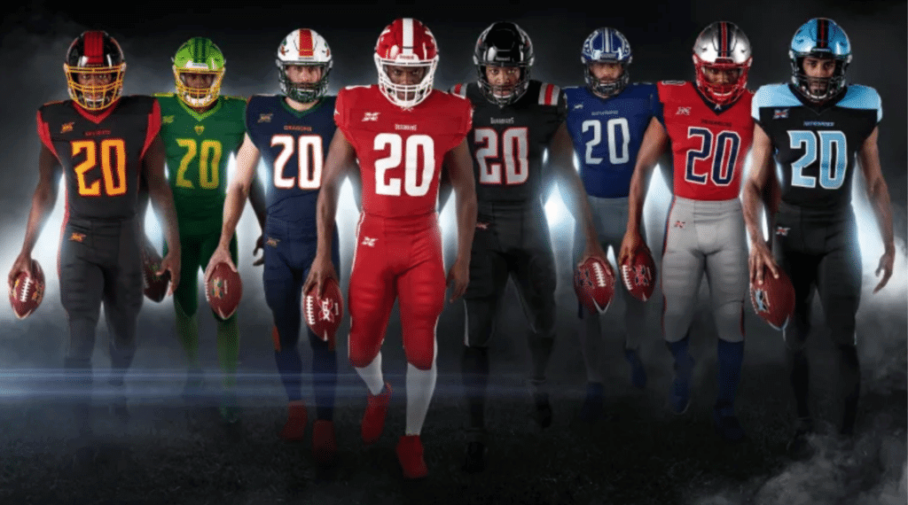
• As you can see in the group shot above, each team has a distinct number font, but they all seem very similar (and similarly awful). It’s like eight very close cousins.
• If the XFL is any indication, grey is going to be a very popular color in 2020.
• As you’ll see in a minute, they did an excellent job of showing full-body front and back views of every team’s home and road uniforms. That may seem like a simple enough thing, but so many teams only show the jersey, or only show the front. Kudos to the XFL for providing good visuals.
• Not a single jersey in any of the unveiling photos had a “He Hate Me” NOB, which really seems like a missed opportunity, no?
Okay, without further ado, here are the home uni, road uni, and helmet for all eight teams, along with links for more pics and hype-o-rama info that I dare you to read without laughing:
DC Defenders
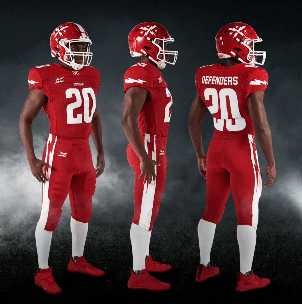
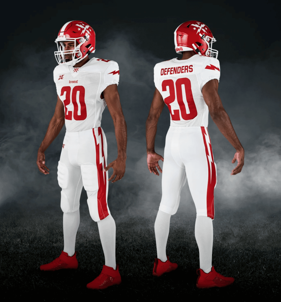
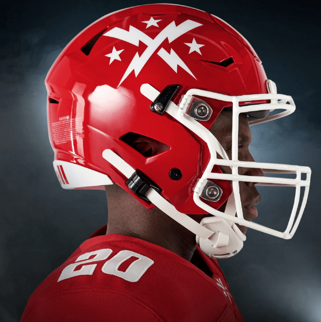
This is basically a high school uniform. The mono-red, the lightning bolts (Chargers-derivative on the pants, laughable on the sleeves) — it’s not awful, but it’s what I’d expect from a middling-level Uni Watch design contest submission. Additional photos and embarrassingly worded info here.
———
Los Angeles Wildcats
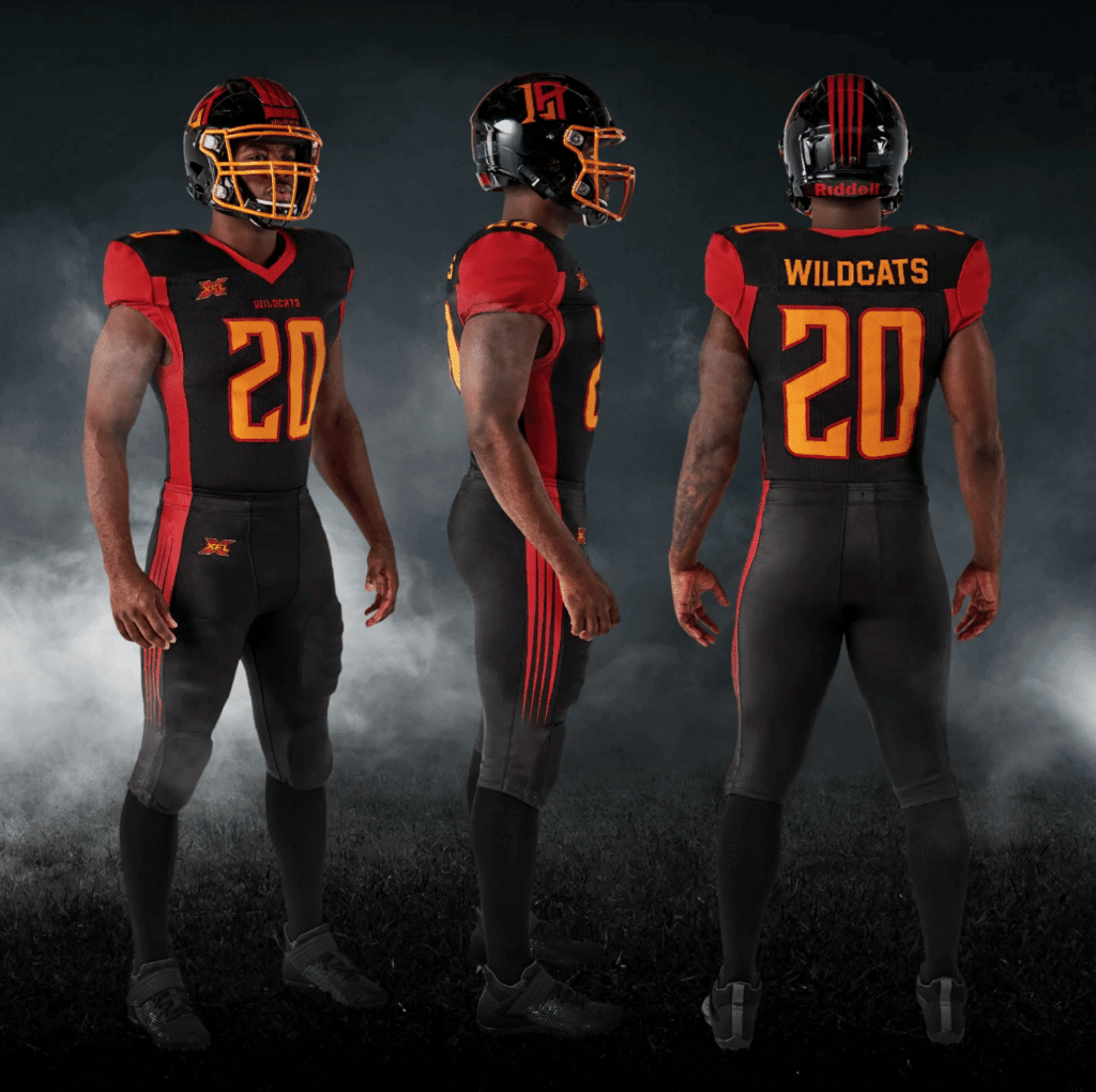
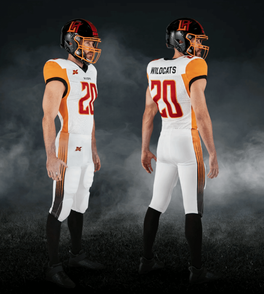
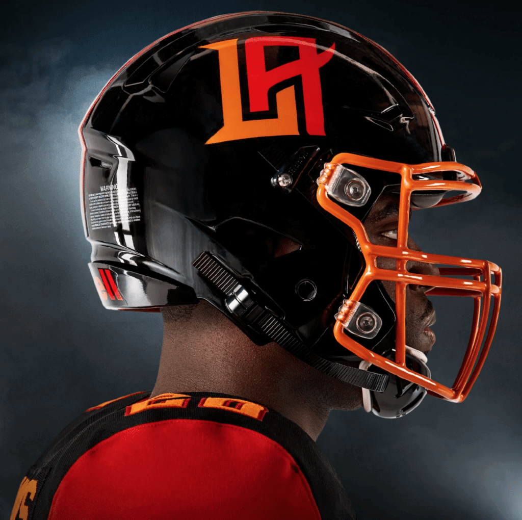
Love the color combo. Love the facemask color. Love the helmet logo. Love the pants striping. Hate the mono-format and the jersey side panels. Additional photos and embarrassingly worded info here.
———
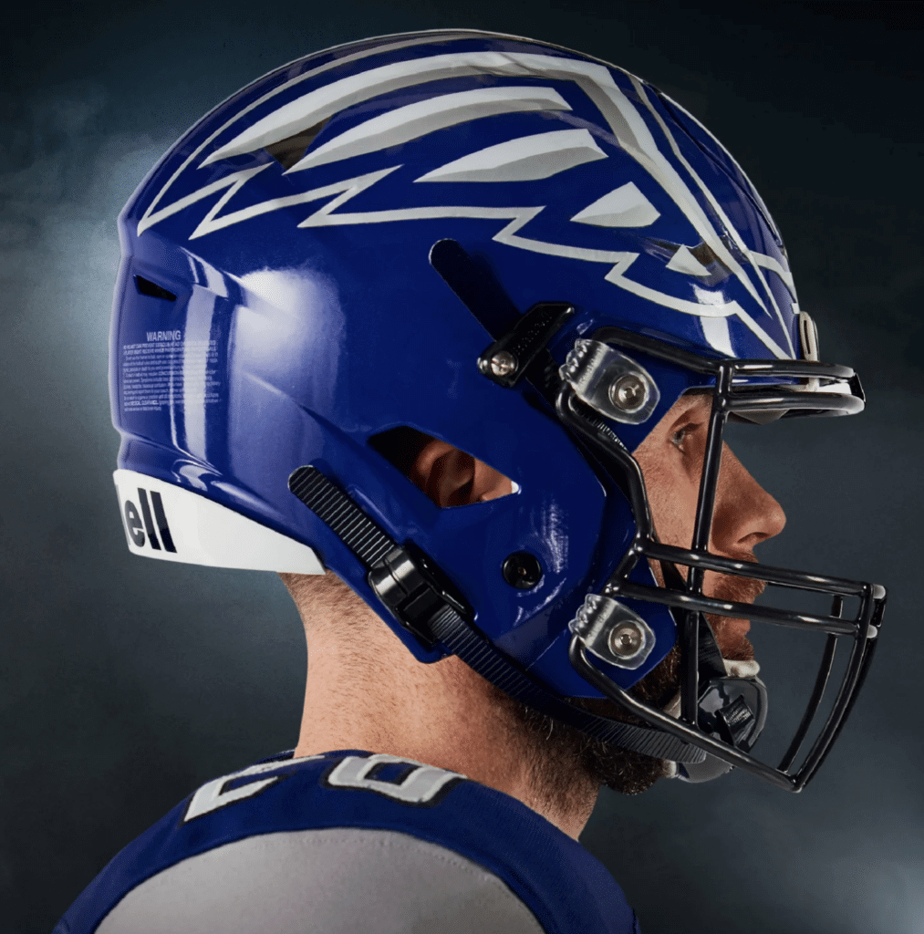
Seattle Dragons
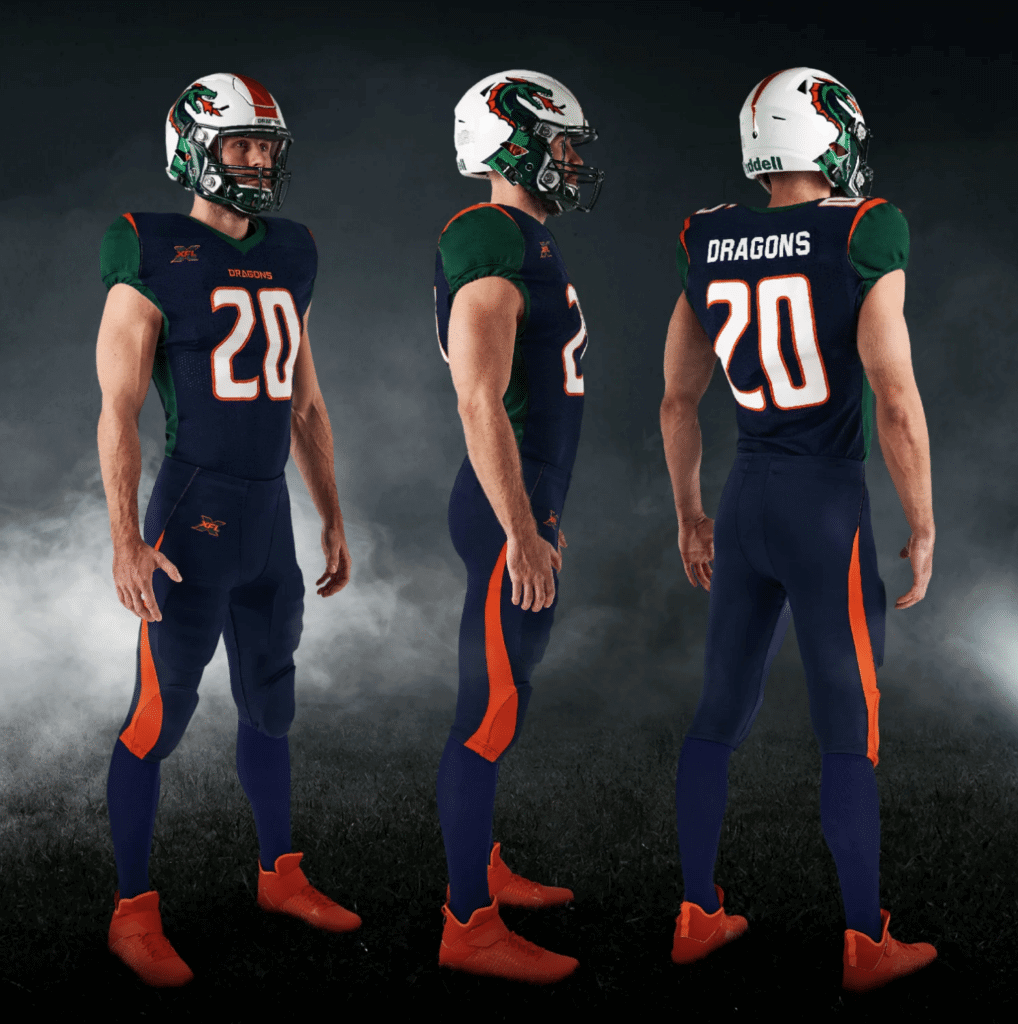
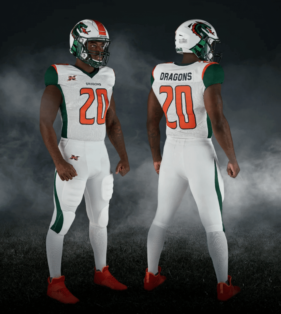
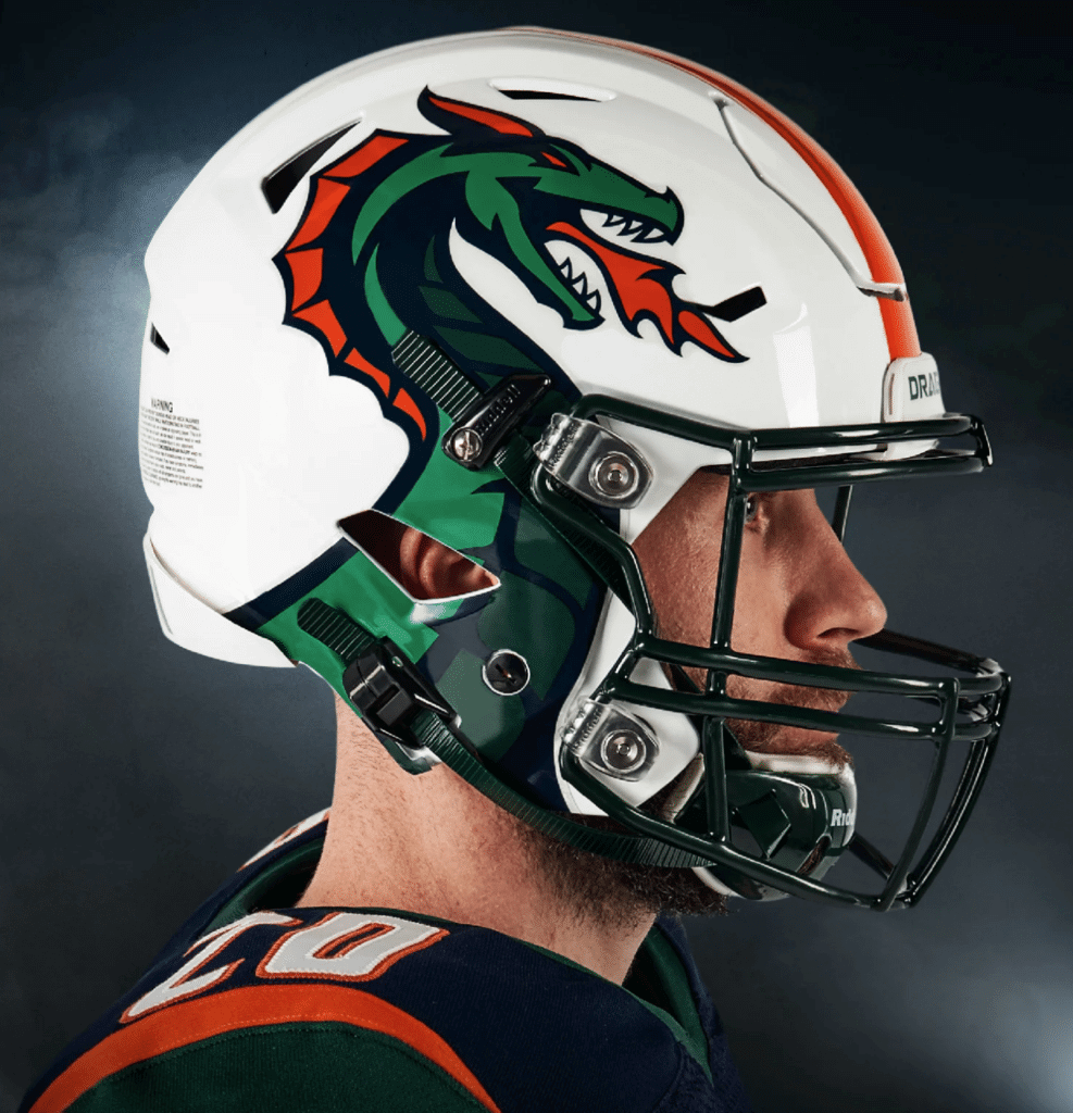
Green and orange is a completely underrated color combo — tremendous! Too bad about the jersey side panels and the pants piping, though. And I’m assuming that UAB’s legal department will be in touch shortly regarding the helmet logo. Additional photos and embarrassingly worded info here.
———
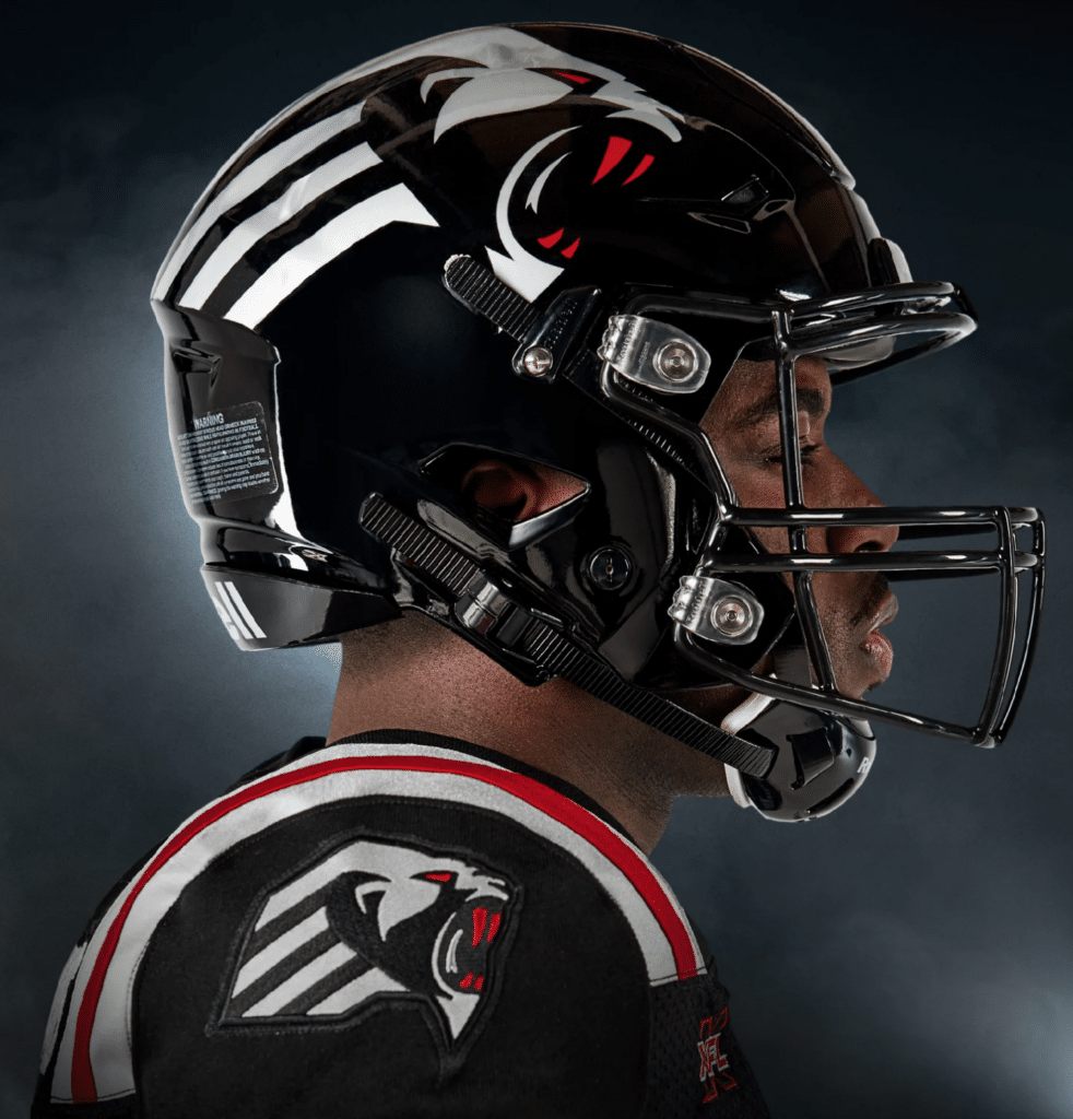
St. Louis Battlehawks
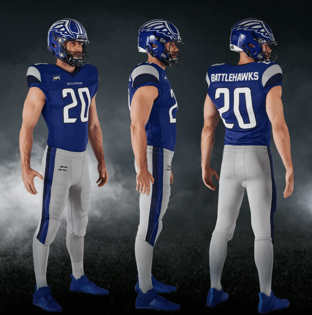
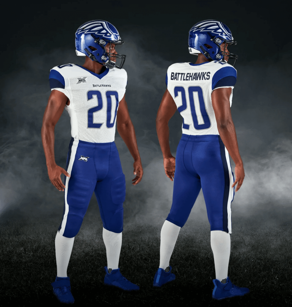
Looks like a stock uniform from the New Balance catalog. But hey, no mono! Additional photos and embarrassingly worded info here.
———
Tampa Bay Vipers
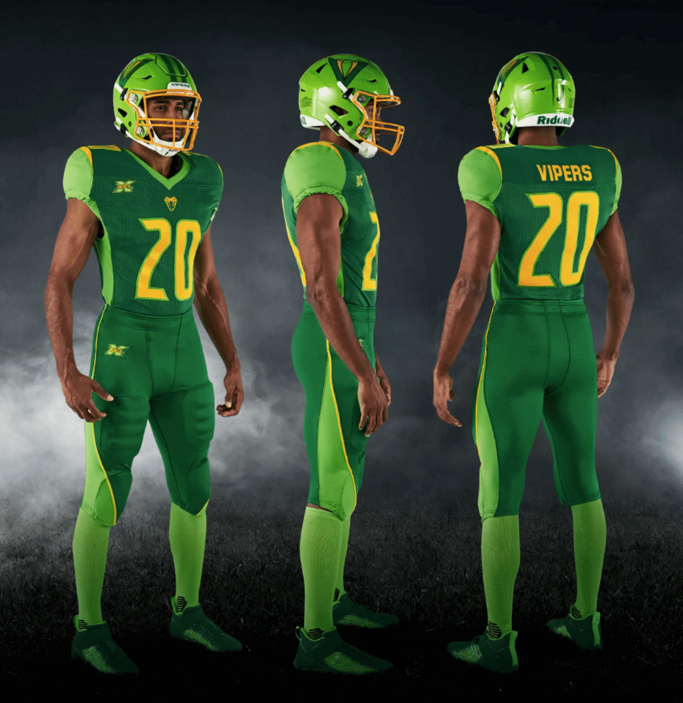
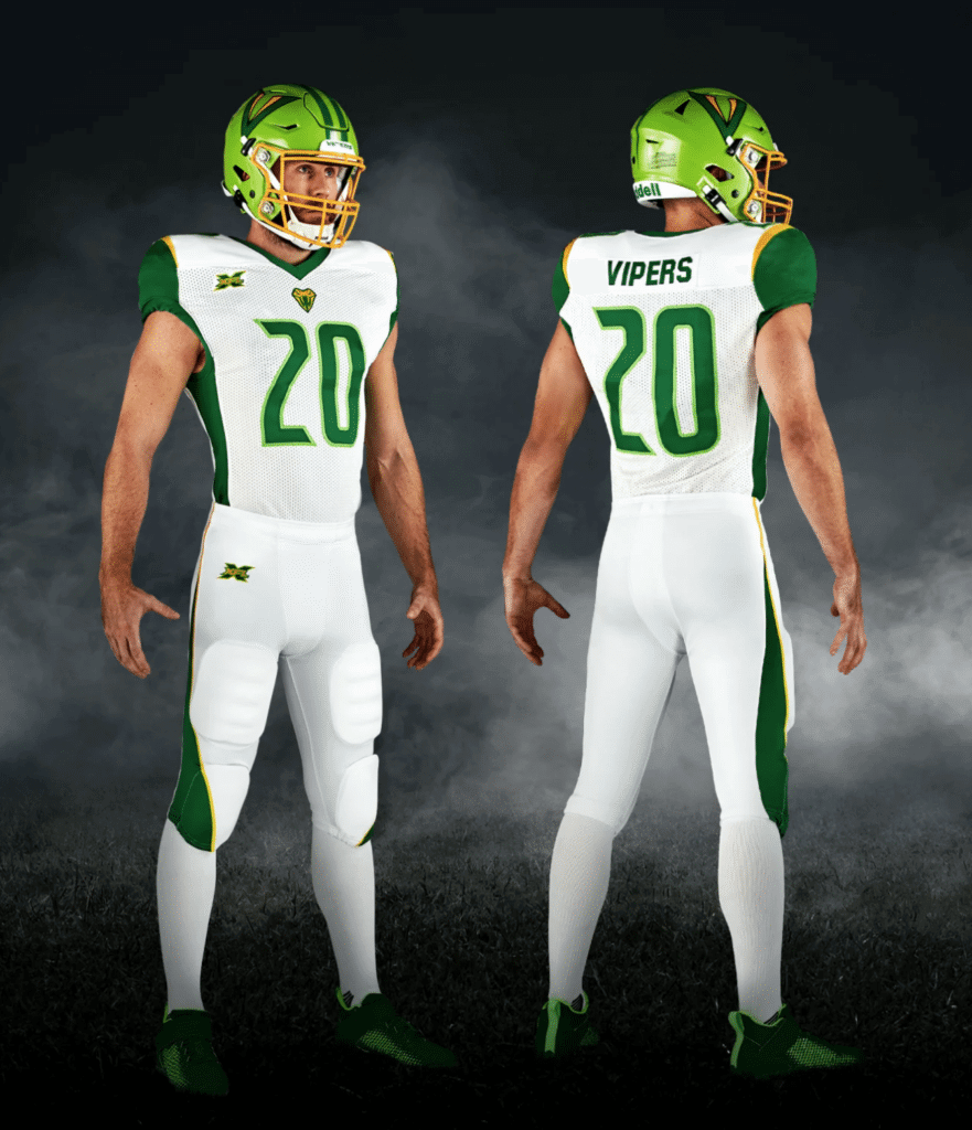
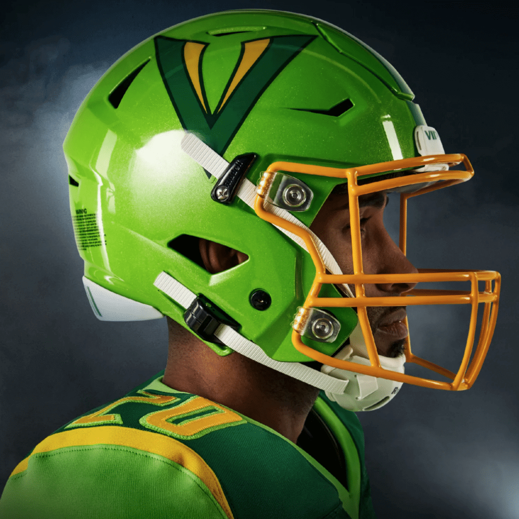
More or less what everyone was expecting the whole league to look like. Sort of refreshing in its transparently Oregon-aspirational approach. Additional photos and embarrassingly worded info here.
———
Houston Roughnecks
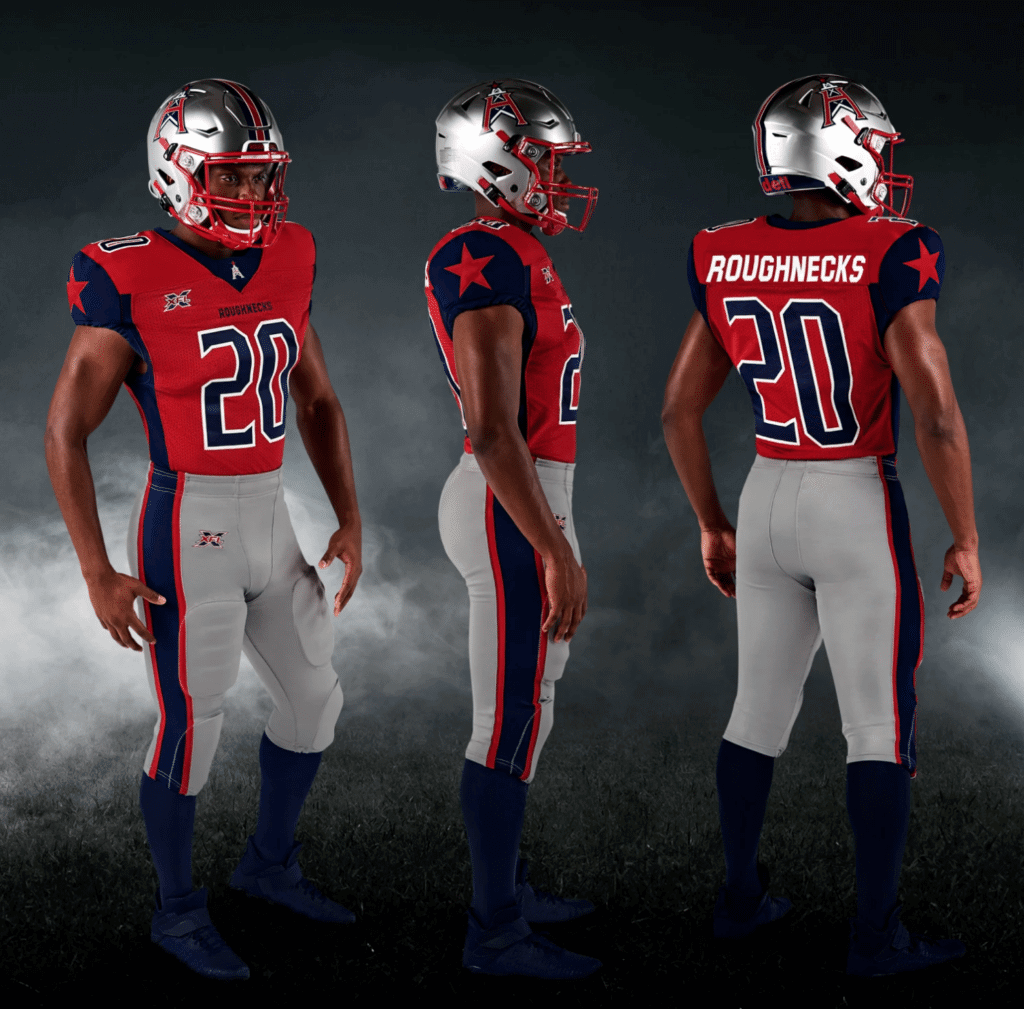
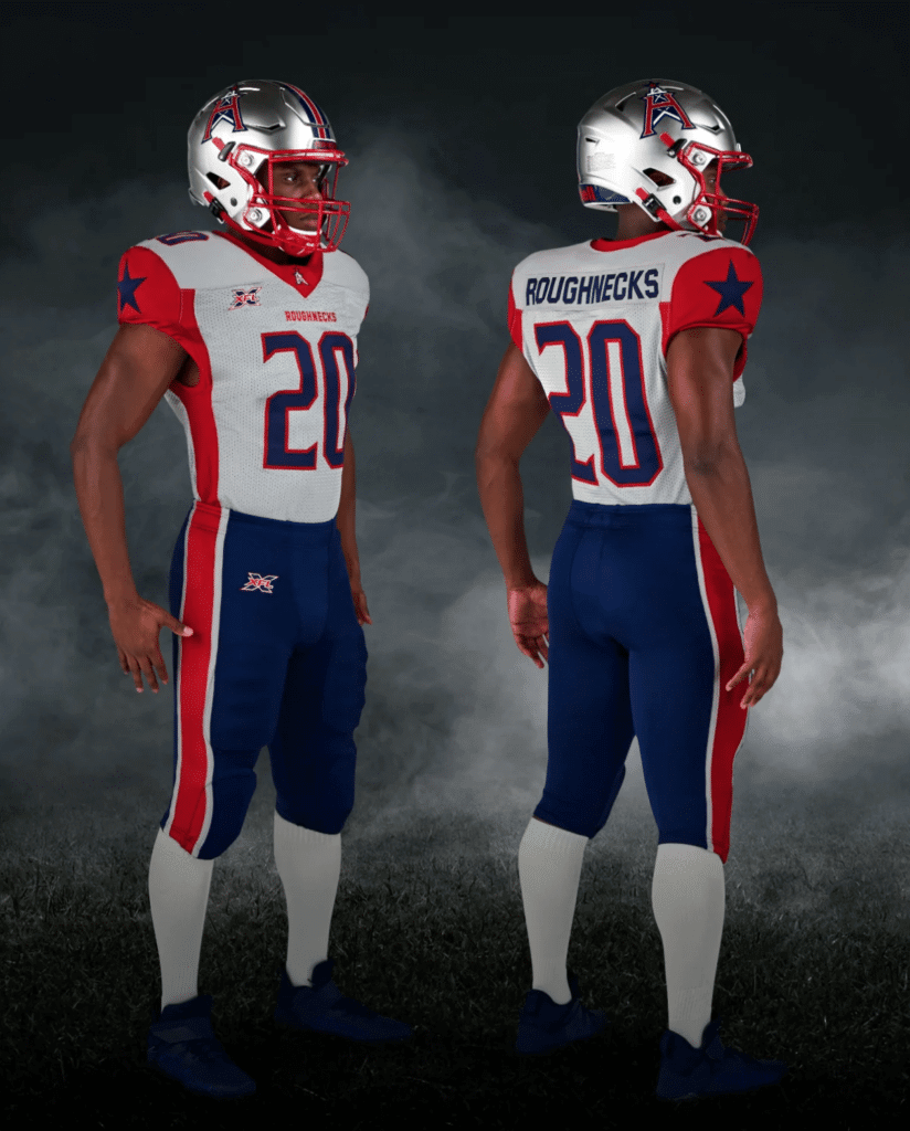
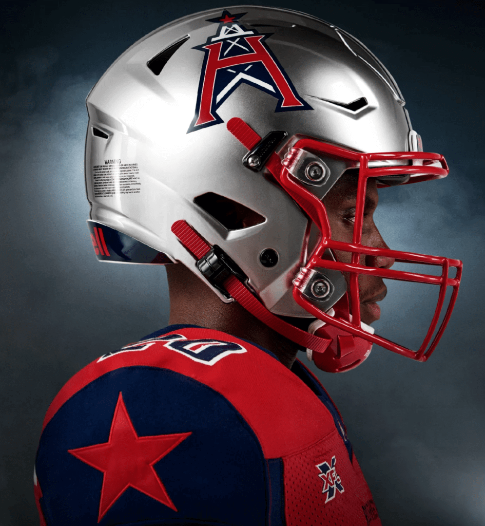
Don’t they know it’s supposed to be red, white, and blue (not red, grey, and blue)? Why do they hate America? Also, pairing a bright, shiny helmet with all those drab, grey tones makes no sense. Meanwhile: Something-something, Oilers-ripoff logo, something. Additional photos and embarrassingly worded info here.
———
Dallas Renegades
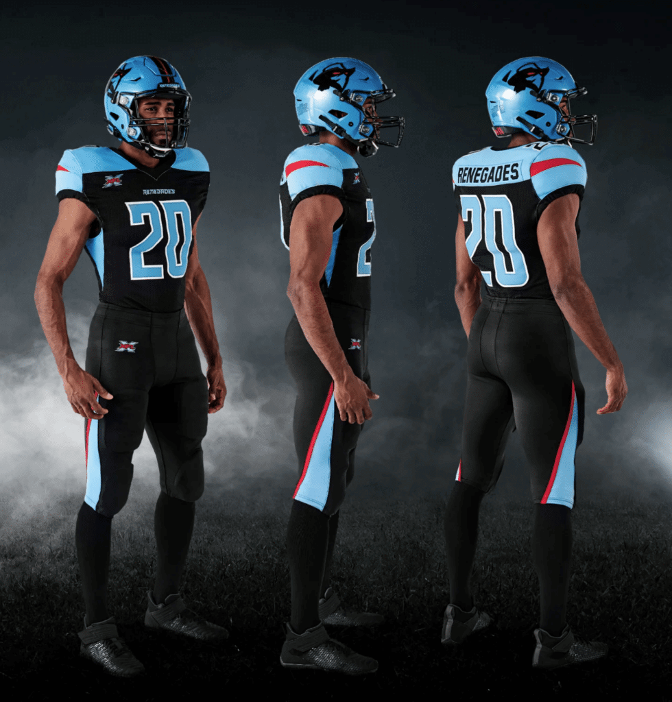
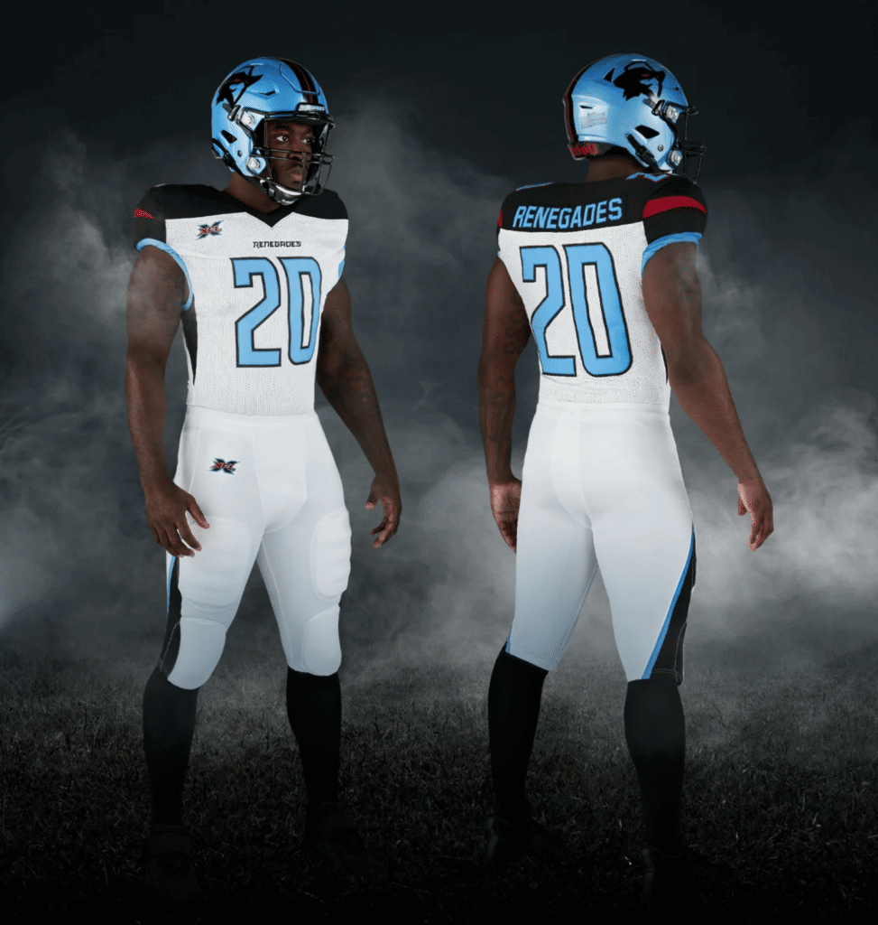
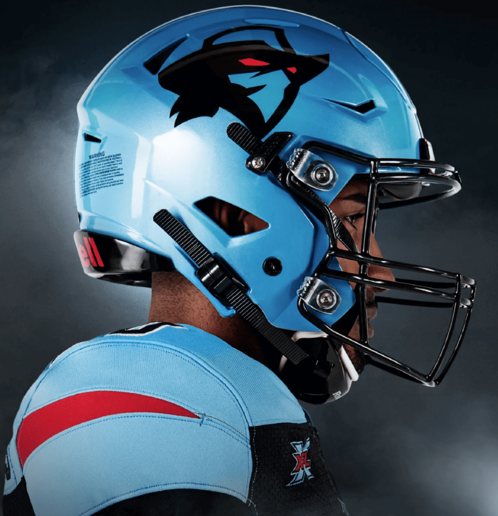
From the helmet logo to the color scheme, this uniform fairly screams, “Arena league!” Probably the worst set of the batch. Additional photos and embarrassingly worded info here.
———
New York Guardians
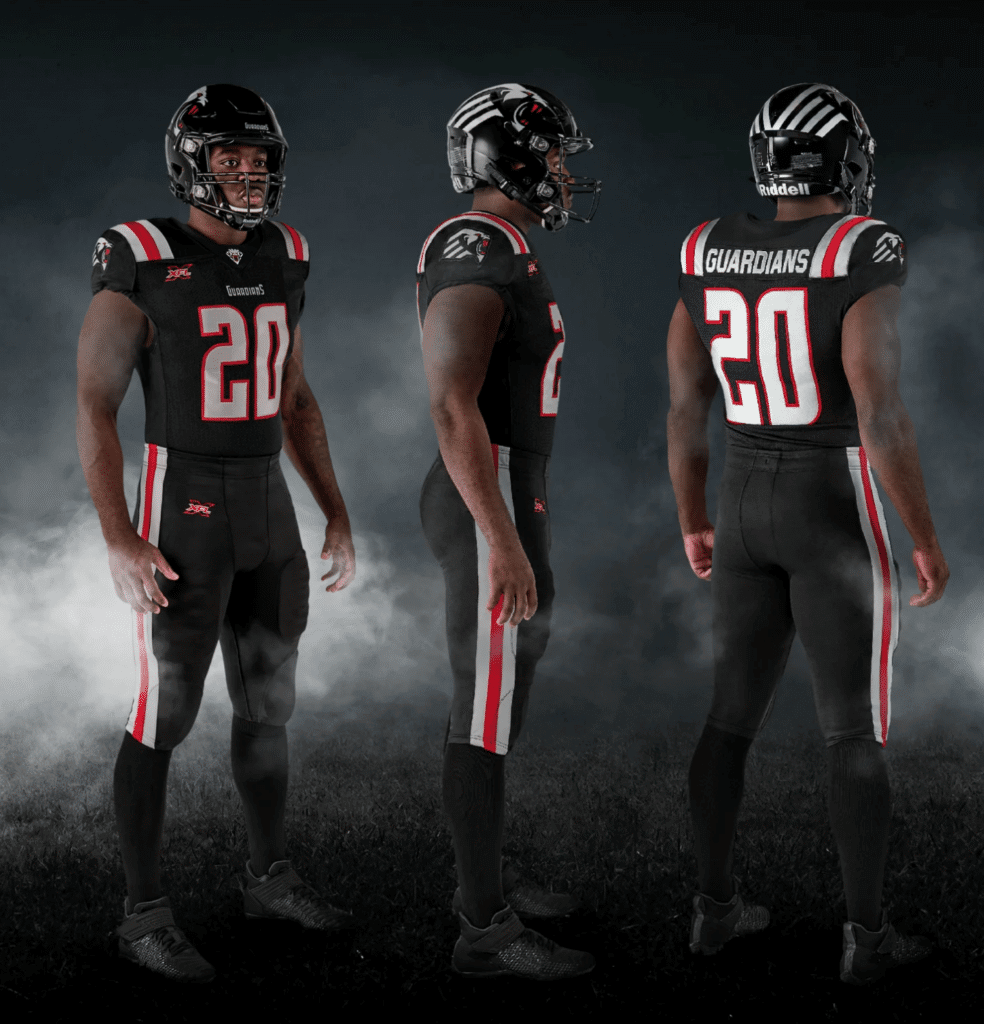
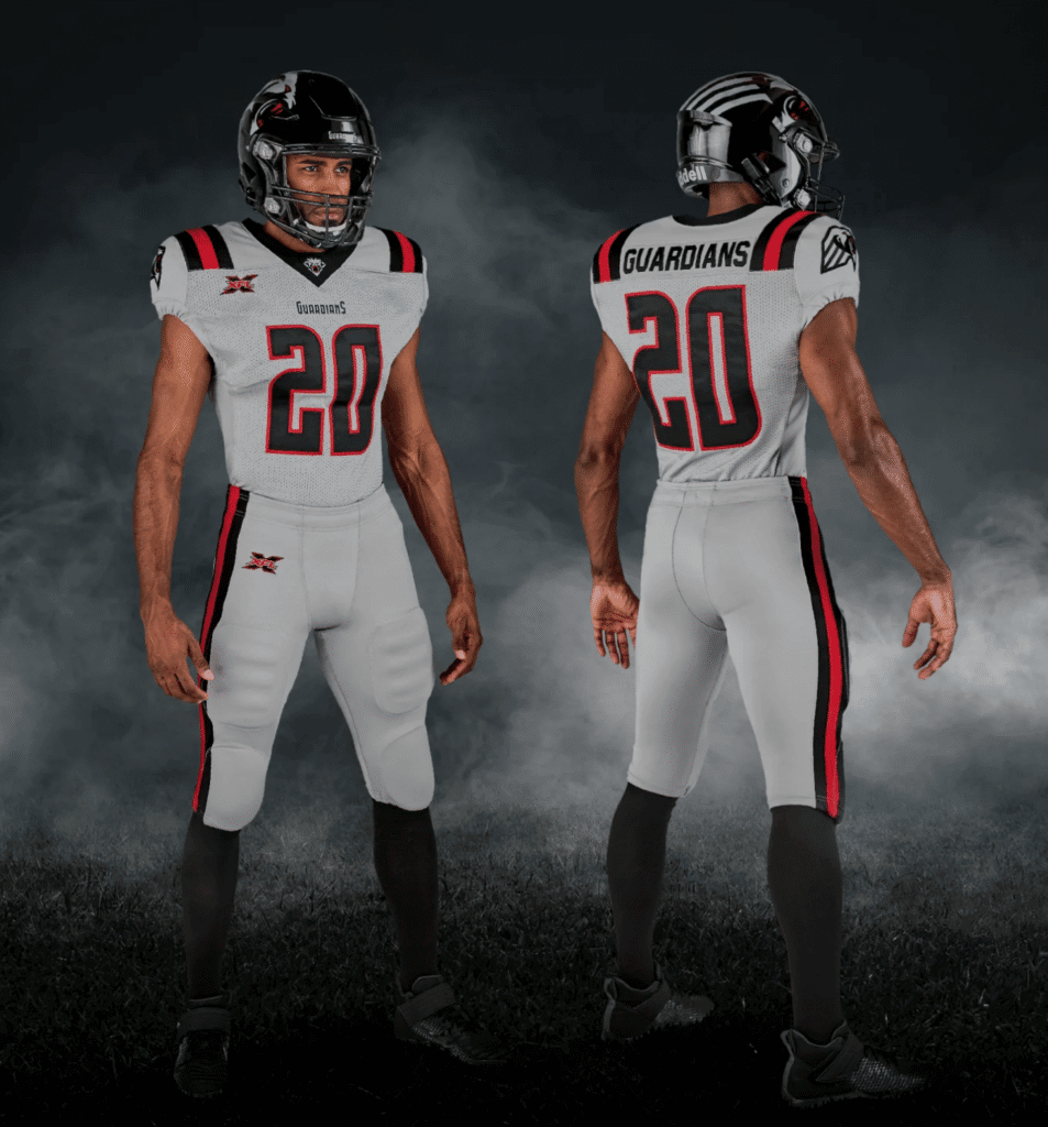
Another high school uniform. But hey, no side panels on the jerseys! How will the players know how to line up their pants striping? Also: No TV numbers! But nobody will be watching on TV, so it doesn’t really matter. Additional photos and embarrassingly worded info here.
———
And there you have it. Personally, I’m disappointed — not because the designs aren’t good (let’s face it, nobody expected them to be good), but because they’re so boring. Total snoozers. Who’da thunk?
Meanwhile, in case you’ve forgotten what the original XFL uniforms looked like back in 2001, here’s their original style guide.
Click to enlarge
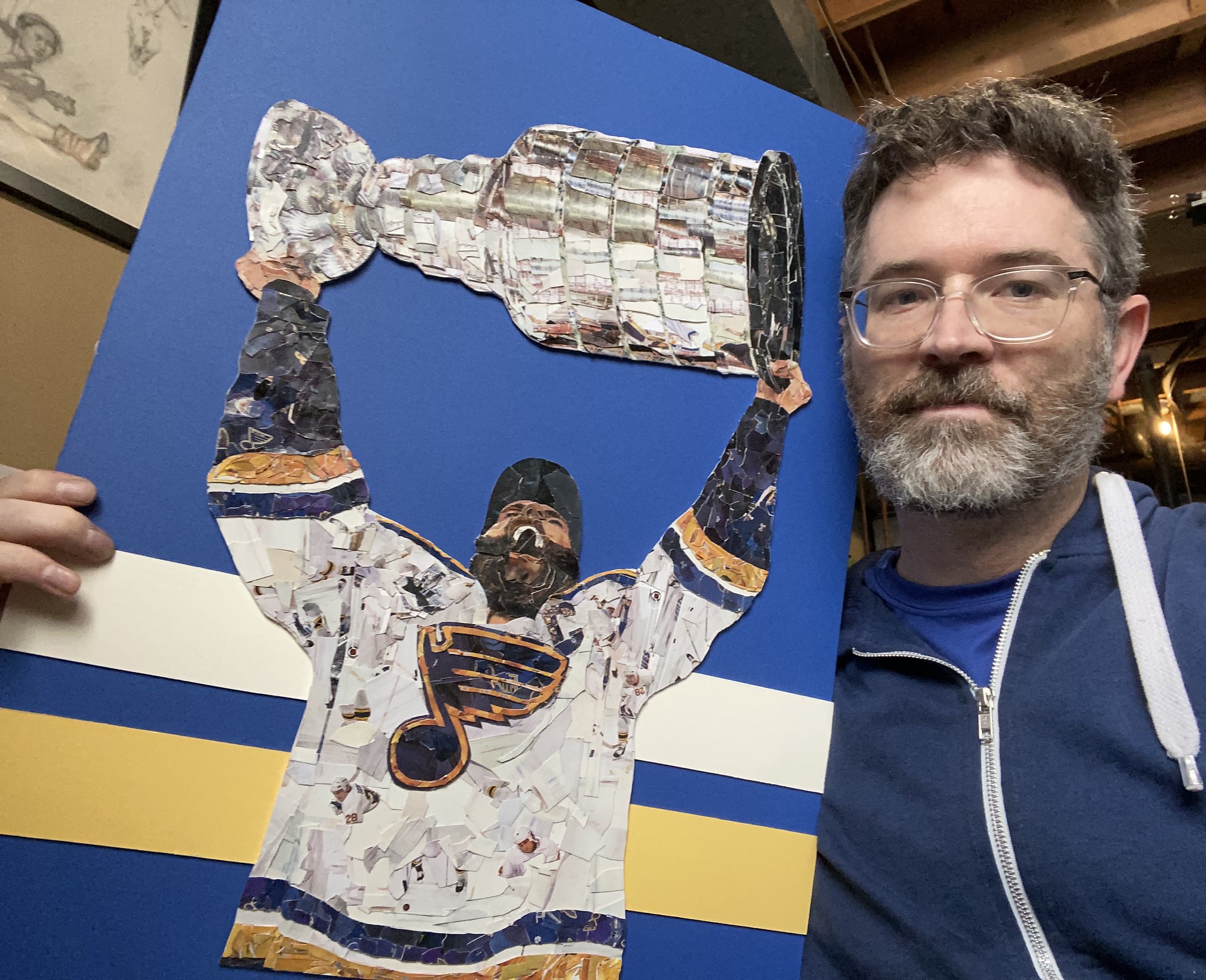
Gift Guide drops today: The annual Uni Watch Holiday Gift Guide, featuring all sorts of cool stuff (including artist Aaron Stilley’s hockey-themed collages made from cut-up hockey trading cards, shown above), is now available for your enjoyment over at InsideHook. My thanks to everyone who suggested items for inclusion!
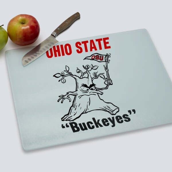
LAST CALL for the Vintage Brand raffle: Today is the final day for our latest Vintage Brand raffle. The lucky winner will get to choose any item from the Vintage Brand website (including the hilarious Ohio State cutting board shown above — they really need to bring back that logo!).
To enter, send an email to the raffle address by 8pm Eastern tonight. One entry per person. I’ll announce the winner tomorrow (and then we’ll have a new raffle that day to boot!).
Click to enlarge
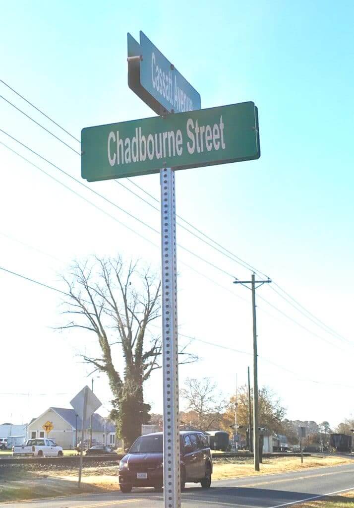
Design matters: Forgot to mention last week that when I recently went down to Virginia’s Eastern Shore for that annual oyster roast I always attend, I was struck once again by the absolutely brutal typography on the local street signs. Looks like they use a super-compressed version of Arial, plus they don’t abbreviate “Street” or “Avenue,” plus-plus they don’t even use all of the allotted space. The result is barely legible.
Seriously, who approved this? Terrible municipal design.
The Ticker
By Lloyd Alaban

Baseball News: George Shuba, who famously struck a blow for racial equality by shaking Jackie Robinson’s hand after Jackie homered in his minor league debut in 1946, was a native of Youngstown, Ohio. Now there’s an effort in that city, spearheaded by the brother of longtime Uni Watch reader Michael Planey, to create a statue depicting the handshake. “Although not mentioned in the article, the effort has been approved by both the Jackie Robinson Foundation and Major League Baseball,” says Michael. … The Fort Myers Mighty Mussels, the newly renamed Single A affiliate of the Twins, revealed their new logos yesterday (from multiple readers).

Football News: Throwbacks for Da Bears tomorrow (from our own Phil Hecken). … The UNC equipment staff did an amazing job getting RB Javonte Williams’s jersey white again after he got NC State red all over it (from James Gilbert). … Hysteria Brewing, based in Columbia, Md., made a beer can featuring the consensus NFL MVP frontrunner, Ravens QB Lamar Jackson. Great design touch with the football, which is a hop (from Andrew Cosentino). … Blaise D’Sylva closes out the helmet history of the Mountain West Conference with Wyoming.

Hockey News: New Golden Knights C Chandler Stephenson’s gloves can be seen uniquely taped in this photo (from @the_casserole). … Arizona State released a teaser video for their new uniforms (from Chase Drieberg). … Avalanche RW Mikko Rantanen carried his own skates onto the team plane yesterday (from Harvey Lee).

NBA News News: The Suns are 6-0 in their purple uniforms (from Josh Pearlman). … Last night, Wizards G Isaiah Thomas lost his shoe, put it back on while defending his man, and then drilled a three at the other end. Announcers were impressed (from Mike Chamernik).

College Hoops News: Louisville wore white alternates last night (from multiple readers). … As we previously reported, Pitt wore black and yellow unis against Rutgers, which went with red. Also notable is a missing maker’s mark on F Eric Hamilton’s jersey (from @unixsadm). … Color vs. color for Gonzaga and Michigan and Butler and Ole Miss (from Josh Hinton and Derek Bailey, respectively). … Difficult game to watch, as New Orleans and LSU went white vs. silver last night (from multiple readers). … Throwbacks last night for New Mexico State (from Jeremy Fallis). … New court for the University of Wisconsin-Green Bay (from Eric Fischer). … Apparently Duke men’s has an archive of posters at the school’s library, and yes, it’s awesome (from James Gilbert).

Soccer News: From Josh Hinton: Yesterday we reported a leak of FC Cincinnati’s away kit. Here’s the official release. … Here’s what the Premier League will wear this week. … The 2019-20 Chivas Guadalajara third kit has leaked. … As always, you can keep track of all the latest kit news by following Josh on Twitter.

Grab Bag: Here’s how PlayStation’s logo became a streetwear fashion trend. … Here are the designs for the medals and trophy of the 2019 Women’s Team Handball World Championship in Kumamoto, Japan (from Jeremy Brahm).

Click to enlarge

What Paul did last night: Last night the Tugboat Captain and I went to Manhattan to see the world’s greatest living graphic designer, Milton Glaser (in the center of the photo above), and his longtime collaborator Walter Bernard (on the right) discussing their new book, Mag Men: Fifty Years of Making Magazines, which is about their design and art direction work on such publications as New York (which Glaser co-founded), Time, Fortune, The Nation, and many others.
It was fascinating stuff, as they talked about the transition from analog magazine production to digital, the relative virtues of photography versus illustration, and a lot more. Glaser is now 90 years old but is still sharp and insightful, and he has this sonorous voice that I could listen to all night. A true American original, and a heroic figure in the world of design. It was a treat to see him in person.
Tomorrow: The Texas Rangers are unveiling new uniforms this afternoon, so I’ll have coverage of that tomorrow.
Funny that you say the Dallas team’s look is Arena League because their logo is almost an exact ripoff of the former Dallas Arena League Team: link
Do you think the 2 logos look almost like one another? I
One thing I like about the Dallas uniforms is how they have a contrasting-color shoulder yoke, and they put the NOB inside the yoke. That looks infinitely better than when teams have the yoke but then put both the NOB and number below it.
And speaking of shoulders, the Guardians have some nice classic shoulder stripes, and they put the NOB inside them unlike some hideous teams that put the NOB below them.
Anyone who even moderately follows WWE should have expected some truly uninspired design from the XFL. Between their truly awful wrestling t-shirts and these cut-and-paste graphics and uniforms, it’s like Vince McMahon-led companies only knows how to hire graphic designers who are limited to MS Paint.
How dare you say no one will watch the XFL on TV! They’ll have dozens of viewers! Dozens!
Loved that the old XFL style guide included chin strap color. That’s some serious detail info.
I would think that XFL went low cost on uniforms as they’ll need as much money as possible to make it thru first season.
I don’t really participate in the redesign contests (I’m not terribly creative) but I feel like taking a shot at the comm-uni-ty as you call it is a little mean, Paul. I’m sure people work hard on their designs, especially since I would assume most are amateurs. Just my two cents.
Actually, it wasn’t a “a shot” at our contest entrants at all. Uni Watch design contest entrants are amateurs who typically have 10 to 14 days to come with something. Some are very good, others not as good, but all are impressive considering the time constraints. The XFL, by contrast, is a (supposedly) professional organization that had lots and lots of time to create its uniforms. The comparison I was making reflected poorly on the XFL, not on contest entrants.
Fair enough, I seem to have misunderstood what you were trying to say. That’s on me.
CJ,
To be fair, while Paul did well to explain his approach, I initially read it the same way as you.
-C.
I am so used to seeing street signs in green or blue that it always shocks me when I drive through Bloomfield, NJ, and see their new red street signs.
link
Reminds me of Bloomfield Hills, Michigan. All city street signs, as well as all signs for businesses, must be gold lettering on a black background.
I don’t understand the criticism that the XFL unis are “boring”.
I think they’ve got some unique color schemes, some that wouldn’t look out of place in the NFL, a bit of silliness…
But “boring”?
Not very gimmicky or over-the-top. Seems off-brand (yes, I actually used that term), like if Oregon came out looking like, say, CMU. I mean, the XFL isn’t good for much, so it seems like they should at least provide a bit of a circus.
I have to say, I love WPDLN every time it appears. Such cool stuff.
I mean, no Maniax, no Demons, so I guess this is better? An awful lot of monochrome unitards. 6 of the 8 teams have an all-white set and an all-team color set. Nobody plays within 2 hours of my house and I don’t think I am going to have the time to get attached, so I am just a casual observer.
Does anyone else see a “DC” where the lightning bolts cross in the logo?
Now I do. Good eye!
Yep, I came here to say that while the uniforms are meh, the DC logo is actually a pretty good design, between the DC and the stars from the flag. Maybe even argue that the two bolts are the two stripes from the flag, but that could be a stretch.
I don’t mind the DC uni because it’s the least gimmicky. The fact that went went with just Red &White is kind of ballsy. Although i think a nice gold accent would have improved their look.
Those terrible new Fort Myers Mighty Mussels logos are not only cringe-worthy on a level that’s even more notable than typical Brandiose offerings, but at work there was a “sensitive material” warning I had to bypass before being able to see them. That’s troubling!
Chandler Stephenson. I’ve never seen gloves taped up like that, but judging by the tape job, seeing the Ticker describe him as “new” (sure enough, he just got traded to Vegas from Washington), and seeing that wacky tape job in his locker with a game jersey, I’m gonna guess that’s an effort to break in some gloves super fast.
The equipment managers have every model of gloves and helmets in every size, but in the team colors, lying around. Get the player, get his preferences from the old team, and get him some gloves off the shelf.
As I said last night, at least the AAF jerseys had some flair (Fleet and Hotshots specifically, plus I liked the Legends)
Don’t you mean the AAF *uniforms,* not jerseys?
Pet-peevishly,
Paul
Apologies good sir
All the same type of colors – mostly grey, black (navy fetish off black) blue or red for the new XFL. Colors don’t fit the cities either save for Washington. I wished NY was orange and blue for their flag and LA was silver and black to commemorate what should have been the Raiders coming back into town. Seattle could have done the blue right and made it royal and left out the orange to give all of us traditional Seahawks fans the old timeless look. Dumb names and ugly colors and designs. I have already lost interest just by the branding alone.
“Colors don’t fit the cities…”
Considering the Anaheim Ducks/Orange County are close by, and the (California!)Angels, USC and Cal State Dominguez Hills (Wildcats’ home field is on campus?) all use a shade of red, LA’s are an adequate fit.
The rest are mismatched IMO.
How’s about this:
Houston to DC(for patriotism’s sake?).
DC to StL (Football/Baseball Cardinals).
StL to Dallas (blue and silver…germane).
Dallas to NY (NYPD blue/Big Apple red?).
NY to Houston (harken-back to the Gamblers).
Seattle and Tampa swap (yellow/green were the Sonics’ colors and those’ll maybe appeal to Oregon fans, while green/orange are de facto Florida, right?).
What you consider an “adequate fit” would be seen by others as “derivative pandering”. If I am a new league, why would I intentionally try to make my outfit resemble established teams? I would want to make a new connection, not make people reminisce about some other team. Let Seattle try orange/green, or people in Tampa will see orange/green as a U Miami knockoff, which some will like and others hate.
I think in general the uniforms for the new XFL aren’t great, but I do really like a lot of the helmets and helmet logos. So there’s that.
Opposite for me: I’m mostly meh on the helmets and logos, but I mainly like the below-the-neck uniformery. Plain, sure, but these days I’ll take plain over what most college and recent NFL teams have to offer. “Off-brand,” as Paul complains? Sure, but when your brand is “shitty,” being on-brand isn’t a virtue.
For whoever long the XFL plays, it will looks like football. That’s a good thing in my book. As a league, a solid C-plus on the uniforms for me, with a few teams in the B to B-plus range.
The NFL should buy the XFL in order to shut it down, expel Dan Snyder, disband the Redskins, and use the XFL’s intellectual property to relaunch the Defenders as an expansion NFL team.
Yeah, this is where I’m at. Helmet logos are mostly poor with a few exceptions (I like how the Guardians logo extends on the entire helmet, reminds me of the Michigan Panthers), but I like some of the design flair on the uniforms themselves and a use of some adventurous colors for Dallas and Seattle.
I suspect that a single company probably did the identity work for the whole league which probably contributes a lot to the “sameyness” of the logo design. See: MiLB/Brandoise
I guess I don’t “get it” anymore. There is nothing wrong with most of these uniforms so I don’t understand all the hate. Not sure what constitutes a “high school” look or an “arena league” look. Football jerseys are pretty basic in design. Numbers in front, numbers in back and a stripe here or there. Somehow you have a “formula” you’ve concocted that’s allowed you to look at any uniform from a new league and crap on it. My high school uniforms were nearly identical to the Detroit Lions old school throwback with no logo on silver helmets, blue jerseys with no stripes and silver pants, so apparently old school NFL uniforms are “high school” too.
That “gets it” thing has always been elitist and annoying to me.
The whole tone of this article is like when a music critic gets burnt out and doesn’t enjoy anything anymore (thinking latter-day Dave Marsh here). Just like, too much snark and dogmatic rules (I think those DC uniforms are nice, but wait, mono-color is “high school” or “color rash” or something, so it’s bad). I mean opinions are opinions but this just seems less like criticism and more like cynicism.
The whole tone of this article is like when a music critic gets burnt out and doesn’t enjoy anything anymore.
Actually, I enjoy all sorts of things (look what I did last night, for example). But I don’t enjoy bad uniform designs from leagues that have little if any reason to exist. Am I “burnt-out” on that type of enterprise? You bet I am — it’s pathetic, depressing, and exhausting. I can almost feel my brain cells dying off just thinking about it. I gave it every bit of respect and seriousness that it deserved.
There were some things here that were good, so I said, “That’s good.” There was also a lot that was bad, so I said, “That’s bad.” Simple.
If you like mono-format football uniforms, that’s certainly your privilege. But I don’t. That’s not a “dogmatic rule”; it’s my personal taste, for reasons I’ve explained literally dozens of times literally for decades. Your mileage may vary and all that.
As for “cynicism,” I think you misunderstand the term. Launching an unnecessary new league and promoting it with the most cringe-worthy marketing language ever is the very definition of a cynical exercise. What I’m engaging in is skepticism, not cynicism.
The existence of the league may be cynical, but that doesn’t mean the design work necessarily is. I think the IOC/FIFA is a corrupt organization which these days seems to exist to get money from dictatorships who want to use sports to whitewash their regimes, but that doesn’t mean that the design work for the Olympics/World Cup/etc are tainted, and can’t be engaged with as design work.
I’m not trying to be like “why are you criticizing this bad movie? a lot of people worked REALLY HARD on it” but it’s not just that you don’t like it, it’s the perfunctory nature of “looks like high school, looks like arena league, mono=bad” and snark like the needless shot of reader-submitted uniform designs that make it hard to read this as anything other than reflexive cynicism.
Poor comparison. FIFA may be corrupt, but it has a reason to exist.
I suppose I could have just included a single Ticker link: “Here are all the new XFL uniforms.” That would arguably have been more appropriate. Instead, I gave them space — and, as I noted upthread, gave them all the respect and seriousness they deserved within that space. The league is a joke, the uniforms are mostly a joke, the idea that what this country needs is more pro football is a joke, etc. In light of all that, I think my tone was appropriate.
If you feel differently, that’s your prerogative, of course. But I can only address things in the way that makes sense to me, so that’s what I did.
I think we’ve pretty well explored this notion of “cynicism.” Let’s please move on. Thanks.
I think you guys are missing the point here. Paul seemed underwhelmed because being that the WWE is brash and “in your face”, the assumption was with the uniforms they’d really do for something off the wall and new. they instead with with pretty basic unis for the most part, so in a weird way, it’s disappointing. Sure they’re easier on the eyes than what many of us expected, but in a fly by night league, we sorta hoped for something wild and memorable. And “high school” to me seems kinda obvious, but difficult to describe too. its the old “know it when I see it” thing. Some of them look like something a high school team orders out of an old catalog, if that makes sense. It’s not bad per say, it’s just that you feel like you’ve seen it a hundred times on the front page of a Saturday news paper each fall. The designs aren’t bad, they’re tired.
It seems as of late (the reactions to Phil’s NBA review and today’s post), readers are seemingly getting worn out by what is consistently either negative or just beating down of these uniform designs.
This site has been providing a unique area for critiquing and evaluating uniforms. However, as these uniforms have evolved over time, it may have come for this site to have an aesthetic overhaul as well.
Weather featuring a new layout, guest writers, or even reducing content down to 3-5 days a week may improve everyones perspective (looking at this every single day does become redundant and stale. It becomes almost predictable to what Paul will link or write as he has responded to posters so many times, and that is not his fault, thats 15+ years of work).
It may be time for a change / update.
My entry into the suggestion box has been made.
It would be difficult for a music critic to write positive reviews if the majority of music he/she was subjected to was not very aesthetically pleasing.
I was impressed with the clean styling of the DC uniform, as it’s a better use of red and white than what the Arizona Cardinals now employ.
The Dallas uniform is brutal. Their helmet’s color scheme is reminiscent of the original XFL’s Memphis Maniax. As for the other Texas-based team, Houston makes me think of the USFL’s Chicago Blitz.
New York and St. Louis: meh. Nothing offensive, but nothing exciting.
Los Angeles: it would be funny if this team would outdraw the Chargers, but that’s highly unlikely. Also, Paul, I’d check your Tampa Bay Buccaneers redesign submissions, as I swear there’s an entry that looks similar to the Wildcats.
Seattle and Tampa Bay are probably my favorites of the new XFL uniforms. The monochrome designs work for me here, and there’s enough contrast with the piping to break up the leotard effect. When the league goes under, I’d be interested in picking up some of these two teams’ apparel on discount.
“Los Angeles: it would be funny if this team would outdraw the Chargers, but that’s highly unlikely. ”
I got a chuckle outta that one. Zing!
-C.
Houston makes me think what would happen if the Montreal Alouettes bought the historical rights to the Houston Oilers and decided to make fauxbacks.
It was a little spicy this morning. Putting a little spice on some blandness is a good thing. The new XFL uniforms are as bland as the original attempt was groundbreaking. Maybe they are trying to do everything opposite from their initial attempt. It’s not a bad idea to try the “we are more old school than the NFL, let’s remember when everything was good back in the day.”
Also, “Don’t they know it’s supposed to be red, white, and blue (not red, grey, and blue)? Why do they hate America?” has to be one of the best things Paul has ever written.
I don’t know about the overall design (or the logo), but I am really liking the Tampa Bay color combination, particularly the apple green of the helmet.
Plenty of legitimate criticisms for the new XFL unis, boring ain’t one of them. They take some risks, not all of them pay off, but except DC, none of them are just playing it safe and simple.
Ignoring that Seattle probably (definitely) plagiarized UAB, is this the first helmet where the logo extends down “over” the earhole like that?
Logos that covered the earhole:
WFL Chicago Fire
USFL Panthers and Breakers (barely)
Boise State (well, some of their helmet stickers) come darn close.
Air Force’s Shark/Warhawk/Flying Tiger.
bit was sort of an “all over” decal job.
link
Can’t forget the polarizing 2016-2018 BC Lions home and away helmets.
link
As a fan of all things non NFL football I found these a let down. Did a bunch of tweeting about it on Twitter. But in summery, worst is that Tampa monstrosity. Why can’t Florida ever get good football uniforms? My home town team, DC’s not much better. Weirdly, I like the Dallas ones.
link
I think this is really nice set of uniforms. The color combos all work, and I like all the number fonts. The Dallas logo is my favorite, and the LA side panels work well. No criticism here.
But yeah, no one is gonna watch this.
Wow that’s the greatest headline i’ve ever read on this website.
The Dallas logo looks really really similar to a “custom” logo for EAs NHL video games. Like really really similar.
I actually dig the New York Guardians uniform, it looks like a traditional look and has the stripes and colors where they need to be. I would love to have seen it paired up with a pair of silver pants. Am I blown over by many of them, probably not. However, with 2020 less than a month away it is interesting that there are football uniforms that don’t try to do “too much” like ones in the NFL in Tampa Bay, Atlanta, and Arizona.
the Seattle Dragons just remind me of the Amsterdam Admirals. A lot.
link
I like the Washington and St. Louis uniforms except for the ridiculous font. It’s disappointing Dallas looks so brutal. That’s the team I’d follow. Houston has a terrible Patriots rip off look to me.
The XFL uniforms can use some sock striping.
info about the new Texas Texases: link
Powder blue is the new black.
Explain what you mean by “mono format” ? Thanks :)
A football uniform with the jersey and pants in the same non-white color.
In my dictionary, all-white is mono too. Baseball and basketball are the only sports where it’s ever OK for pants to match shirt.
Soccer?
Curling? ;)
Rugby
All White-England
All Black – New Zealand
The Tampa uniforms feel like pretty strong riffs on the Tampa Bay Rowdies colors, would that be the first time a gridiron squad intentionally or unintentionally pay homage to a soccer team?
Also the NY helmet logo looks a whole lot like a flying version of U Cincy’s C
As a lifelong roadgeek, those street signs really bug me. I can see using a nonstandard typeface if the sign is itself nonstandard, but for basic green signs, they should really go by the standards laid out in the Manual on Uniform Traffic Control Devices, and stick to FHWA (Highway Gothic) or Clearview in the appropriate font widths.
One thing that gets overlooked about the XFL is that the emphasis has been on football. Oliver Luck (the commissioner) is a smart guy and has largely been given a free hand to reinvent the game. Mr. McMahon has all but stayed on the sidelines and there has been no real cross-promotion. The games will be on over air networks and if it’s at all competitive and they’re smart with money they have a chance.
Remember: 60 years ago the AFL was called ‘the foolish club’ and given no chance in hell. And they struggled – Ralph Wilson loaned Al Davis 450K to keep the Raiders alive – but made it through. Will this league? Probably not. But you never know.
Smart people … Network contract … Clever marketing … All about the football … These are literally the same exact things that were said about the WFL, the USFL, XFL 1.0, the UFL, the WLAF, the AAF, the Arena League, etc., etc.
Did the AFL succeed (more than 50 years ago)? Yes. But you’ll forgive me if I maintain a healthy skepticism based on the rule, not the exception.
Three questions:
1) If you had a chunk of money to invest, would you invest it in the XFL?
2) If I *gave* you a chunk of money to invest and told you that you had to choose between an index fund for five years or the XFL, which would you choose?
3) If I offered to bet you $1,000 on whether XFL 2.0 would last longer than XFL 1.0, would you bet on “Yes” or “No”?
A+ on the gift guide: I found the coasters a nice way to round out a gift set, and I have spent far too much time looking at all of the vintage pennants (don’t you hate when you look to buy gifts for friends and family and then it turns out you spot a bunch of great things for yourself?)
Correction on the gift guide. It should be Hatch Show Print, not Shaw. I can attest to their awesomeness as I have two (so far) framed prints from them.
At least research your subject, Paul. XFL isn’t going out of business any time soon. They’re well-capitalized and they have a stubbornly committed owner.
Hmmm, where have I heard that before? Oh, right, when the WFL, USFL, XFL 1.0, UFL, and AAF launched.
If you want to believe that the XFL 2.0 will be the exception, Ben, be my guest. I’ll believe it when I see it.
Three questions for you:
1) If you had a chunk of money to invest, would you invest it in the XFL?
2) If I *gave* you a chunk of money to invest and told you that you had to choose between an index fund for five years or the XFL, which would you choose?
3) If someone offered to bet you $1,000 on whether XFL 2.0 would last longer than XFL 1.0, would you bet on “Yes” or “No”?
All of these new football leagues seem completely half baked to me. Football is getting less popular in this country, why would people be clamoring for more of it–especially a minor league with players they’ve never heard of and teams they have no connection to?
Some XFL uniforms are good. Some could use improvement.
I think the road uniform for Seattle way better than the home uniform. Road uni looks good with just green and orange.
The dark blue combined with dark green on the home uniform is not an attractive colour combo. Does not work when both are dark. The white helmet mixed in with the mono-navy uniform does not fit well.
I am surprised that I like some of these. I really like DC’s white uni (and don’t hate their mono red) and like the other white and white topped uniforms. Comparing them to the NFL, DC beats the Cardinals, the Wildcats beat the Bucs, and the Renegades white beats the Titans. Sure, all of the number fonts are stupid but nowhere near as stupid as the Vikes, Bucs and Titans. I know I am setting an extremely low bar but I was expecting them all to be clown costumes.
Also, I agree that green and orange is a great combo that should be used more often and the N.Y. Renegades made me realize that GFGS sucks more than BFBS.
Overall the XFL Unis are a sh*tshow. But what else would we expect? Hate the fact that they all went with the same template and fonts. If I had to pick the least offensive outfit, I’d go with NY. The black, red and silver actually pops nicely. Not a fan of the all gray though. Looks like the uniform needs to be laundered.
Who. Writes. This. Stuff.
Inspiration: Forged from the fires of the oil fields comes a team that labors deep in the trenches. Resolute and rippling with heat, they toil in a red as fiery as a flaming flare stack.
Theirs is the metallic chrome of power plants and pipelines, manufacturing and machinery, of mercenaries in the muck. It’s a blue so dark and deep, it shimmers and shines like Texas crude in the midday sun. These are the scratching, grinding, never-bending few.
These are the Houston Roughnecks. #WorkingForHTown in February 2020
That’s so bad it’s good. Did every team write one of those?
Yes. Click on the “Additional embarrassing info” link at the end of each wrap-up.
Paul, I’ve been to this site almost daily over the last decade or so.
I must say, I’m a bit shocked at the hate. Some of these were bad, but to completely trash them like that seems to me like you have something personal going on. The subliminal “DC” in the helmet I felt was rather clever. The Guardians also have a pretty nice looking helmet, superior to some recent weak efforts like the Bucs or Jets. The jerseys certainly weren’t perfect and the Roughnecks were especially bad as pointed out. Earlier in the year, the New York Jets rolled out unarguably the ugliest jerseys in recent sports history (yes worse than the Jags) worthy of a thrashing. Compounded with the fact that they have the biggest company is sports apparel working on their brand adds salt to the wound. Yet they received hardly any criticism on your end. I know this field is all subjective but your bias clearly came to light and the write up on these is lazy.
Take care.
[The Jets] received hardly any criticism on your end.
Actually, Marty, I criticized quite a bit about the Jets’ new set. Here are a few quotes from my review of their unveiling back in April:
– “But ugh, those stripes, or wings, or contrails, or whatever they are — not a great look. It feels a bit like the Jets swooped in and salvaged the now-defunct AAF’s uniforms off the scrapheap.”
– “the combination of the green jersey, the chest lettering, the black outlining on the numbers feels a lot like Marshall and North Texas. Grade: C+”
– “that pointy [pants] striping feels more arena league than NFL. Grade: B-”
– “Look, the whole trend of sports teams wearing black alternates had already become tedious by 2003. Nowadays, it’s flat-out embarrassing (just ask the 49ers). Clearly the low point of the new uni set. Grade: D”
– “it doesn’t have the feel of a design that’s built to last. NFL rules stipulate that a team can’t change its uniforms more often than once every five years. Does anyone really think this design will last much longer than that?”
Shall I go on?
Frankly, I don’t see what the Jets have to do with today’s review of the XFL (nor can I imagine a universe or a uni-verse in which Nike’s involvement with a design somehow makes a 10-year Uni Watch reader expect something good instead of something awful, as appears to have been the case for you). But if you’re going to cite my past work in order to make an argument, at least cite it accurately instead of misrepresenting it. Thanks.
How about the XFL coaches ? June Jones ? Kevin Gilbride ? Bob Stoopes ? Once the league folds the NFL will surely gobble them up. Well maybe not Gilbride