[Editor’s Note: Today we have a guest entry from Drew Pelto, whose job entails a lot of uni-related details. I think you’re really going to like it. Enjoy. — PL.]
By Drew Pelto
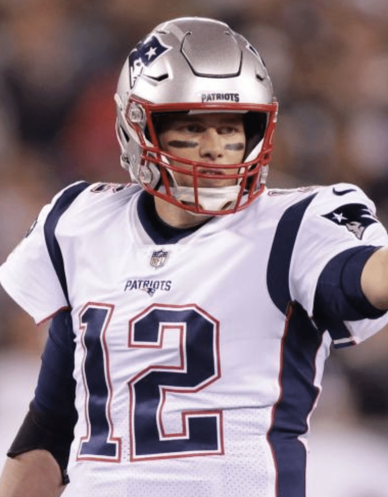
I was recently looking at a 2019 photo of Tom Brady for a work project. And that’s when I noticed it: Brady’s white jersey didn’t include the NFL 100 logo. For most people, this observation would be little more than a uniform-related curiosity. But for me, it had potentially huge implications, because I’m the lead collegiate photo editor at the trading card company Panini.
After I spotted the missing logo in the Brady photo, panic spread through my department. Did we mislabel a batch of old photos in our system? No, these were clearly 2019 images, as 2019 rookies were shown in other photos from the same group. Were the Patriots somehow like the Bears, not having the centennial logo on their collars? No, Brady’s blue jersey had the logo. Was it just their white jerseys? No, other New England players had the logo on their jerseys in that same game. Was it just that game? No, the logo has been consistently missing from Brady’s white jersey this season. Would our imaging department have to Photoshop the correct logo onto Brady’s cards? The jury’s still out on that part.
The job of photo selection for a card set starts out easily enough: Get the design, get the player list, pick a player’s photo that goes with the design, lather-rinse-repeat. It’s pretty simple until the special requests and regulations start to pile up. Let’s start with football…
For active players, we have to use photos that are as recent as possible. So, for example, once the new Jets uniforms debuted in the 2019 preseason, we couldn’t use any 2018 photos of them. That’s why Dwayne Bowe’s first cards with the Browns showed him at the team’s jersey uniform unveiling party. And that’s why the Brady situation is so tricky: If we use a proper 2019 shot, will the NFL think we picked an old photo?
On multi-player cards, we can’t mix eras if the players were teammates. So if Terrell Davis is in a dark blue jersey, we can’t pair him with a photo of John Elway from the Orange Crush years. If it’s Vance Johnson, we can’t use Elway winning a Super Bowl. But if they didn’t both wear the same uniform style at any given time, we’re in the clear — so Bernie Kosar and Baker Mayfield can be on a card together, or Bucco Bruce-era Vinny Testaverde and Pewter Power Brad Johnson.
If a player’s socks are too low, our imaging department has to cover any exposed skin. If the player’s base layer shirt is exposed and untucked, that has to be fixed as well. I’d bet we won’t be permitted to show the shoes worn by Jarvis Landry and Odell Beckham Jr. this past week either.
The NBA’s ad patches create problems, too. If one is added in the middle of the season, it renders all of that season’s pre-ad photos useless to us. Several retired players even have their own regulations: One player doesn’t want to be shown wearing Converse shoes, while another player wants to be only shown in Converse shoes; one player doesn’t want to be shown wearing a knee brace; one player requests that he not be shown with a Spalding basketball; one player wants his Afro to be neat, while another only wants to be shown bald; at least two request that their teeth not be shown; one player only wants photos from the 1980s due to a late-career weight gain.
The Washington Wizards have a fun one: We can’t show them in uniforms with the 1987-1997 “crab hands” Bullets logo. But the pre-’87 “fingers” logo is just fine.
Baseball is a whole other beast entirely. We have a deal with the players’ union to show players on cards, but we don’t have an MLB deal to show their logos. So typically when we pick baseball photos, we try to show something like a player batting with his arm across the front of his body, or a pitch from a side view. That way there isn’t a giant, glaring blank spot across their front when our imaging department has to remove the logos. One team can only be shown in road greys, unless we want to remove every pinstripe from their home jersey.
While most sports just require approval from the league or the union, NASCAR cards need to be approved by the teams, the sponsors, and the drivers. Sometimes even drivers’ family members will chime in (we actually had one wife reject photos of her husband without a hat, and even had a driver’s grandmother reject a photo). Sponsors get incredibly selective about things like fading and color distortion, wanting their branding to be 100% accurate and fully visible. If even a part of a logo is covered by a fold in a piece of clothing, the photo might get rejected. If a sponsor patch is missing, it needs to be added in. One photo was rejected over a driver wearing the wrong brand of sunglasses. Some retired drivers want the be shown with only a specific sponsor, even if they won with a different one.
A number of soccer teams, especially in the Premier League, require that they only be shown in their home kits, and that any ball depicted must be the league’s official ball. That can be challenging when using photos from friendlies. Rainy games are tough, as teams sometimes reject photos of players looking too wet. Also, no strained expressions or players with tongues out (a few national teams want their players to resemble something almost like marble statues). And only the team’s official captain can be shown with a captain’s armband, even if someone else wears it for a game.
Backgrounds often have to be blurred as well. No ads for alcohol, tobacco, or gambling, even casino resorts or state lotteries. Soccer teams want all banners in the background to be gone.
In college sports, which is my main area, East Carolina prefers that we use their purple or white uniforms instead of their black ones. Oklahoma football requests that we only use their main jerseys with “Sooners” on the front, as opposed to the thick-collared “Oklahoma” alternates. Some schools don’t want bowl patches to be shown.
We can use photos from almost any year that a player was at his school. As long as the team didn’t change uniform styles and the player didn’t change numbers, everything is safe to use (the latter limited us a bit on Braxton Miller a few years back). But sometimes even a small change to a jersey can result in us not being able to use a photo: a slight change to the Miami Hurricanes’ sleeve striping prevented us from using a 2014 photo of a player in our 2016 NFL Draft-related sets.
As a kid, I’d often stare at a card that featured an active player in an old uniform and thinking, “Wait, why doesn’t this look right?,” like the 1992 Mark Duper card with a pre-1986 photo, or several uses of pre-1989 Canucks jerseys on 1990-91 products. Now that I’m the one picking the photos, I can appreciate why we have all these regulations — to avoid cards like that.
———
Paul here. Was that fascinating or what? Big thanks to Drew for sharing his story with us. He in turn would like to thank Susan Chalifoux and Kevin Jairaj for their contributions to the NASCAR and soccer sections of this article.

Click to enlarge
Who wears short shorts? The photo shown above is from Wednesday night’s game between New Mexico (in white) and Eastern New Mexico (in dark grey, or whatever they’re calling that color). At first glance, Eastern’s uniform seems pretty unremarkable. The black-on-grey chest lettering is obviously a mistake, but we’ve all seen worse. Overall, there’s nothing wonderful here, but also nothing too awful.
Until you see the rear view, that is (click to enlarge):
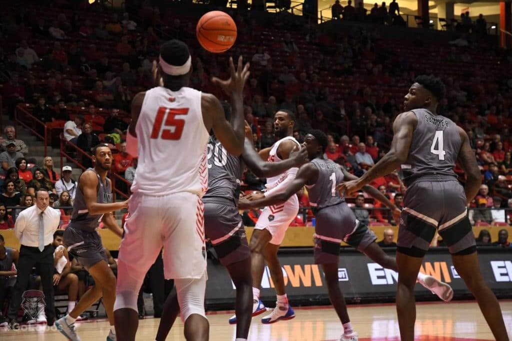
Yowza. For some inexplicable reason, the back of the shorts has white striping that makes it look like the players are wearing short shorts.
Maybe you’re thinking, “Okay, but it’s probably just that one photo that makes it look that way.” Nope — check out these video clips from the game:
Lobos win! #GoLobos pic.twitter.com/ozXs6oLFdk
— Lobo Basketball (@UNMLoboMBB) November 7, 2019
Lobos with the steal and one! #GoLobos pic.twitter.com/AxTfss1s8A
— Lobo Basketball (@UNMLoboMBB) November 7, 2019
It’s hard to understand the thinking here. Is this a standard Under Armour template and I’ve just never noticed before? Bizarre.
(My thanks to Trey Ortega for bringing this one to my attention.)
Click to enlarge
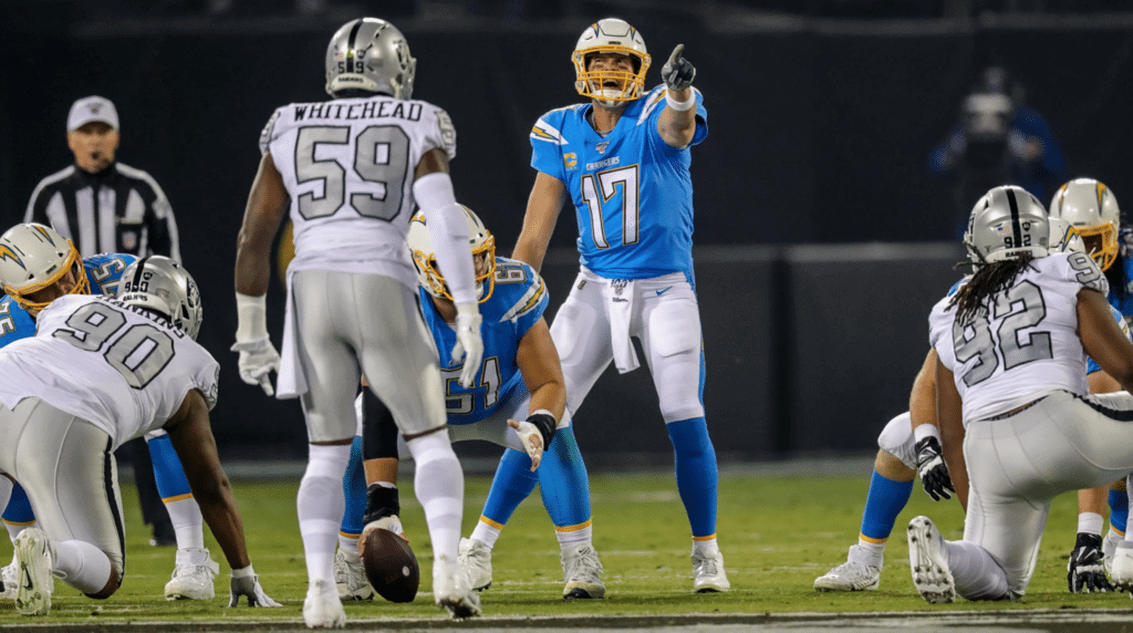
Sweet: It was a bit of an AFL flashback last night in Oakland, as the Raiders wore their silver-numbered white throwbacks against the Chargers’ powder blues — a good-looking matchup. Lots of additional photos here and here.
According to the Gridiron Uniform Database, this was only the fourth time in Raiders history that the team has worn white at home (with all four instances taking place in the past 11 years). Oddly, two of the three previous times were also against the Chargers.

Click to enlarge
Warning signs: The map-based infographic above shows how the change in the high school football participation rate has fallen in almost every state over the past decade — presumably due to concerns about head/brain injuries — including in places you might not expect, like Texas, Florida, and Ohio.
That graphic is one of several faaaascinating bits of info in this New York Times article, which is the start of a series about football’s role in America. Recommended reading.
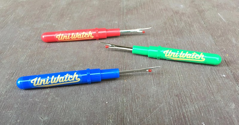
ITEM! Seam ripper update: Uni Watch Seam Rippers, which I initially showed you earlier this week, are now ready for purchase (and as you can see, blue ones are now available in addition to the green and red I previously showed you). Full details here.
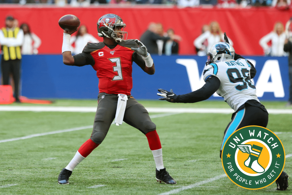
Bucs-redesign contest reminder: My latest Uni Watch design contest, conducted in conjunction with InsideHook, is to redesign the Tampa Bay Bucs. Full details here.

Gift Guide reminder: I’m currently working on my annual Uni Watch Holiday Gift Guide, which will be running on InsideHook. If you know of any interesting or unusual uni/logo-related items — or if you produce such an item yourself — please get in touch.
As usual, no need to tell me about the standard caps and jerseys that everyone already knows about. I’m looking for things a bit more unique. Can do? Thanks!
The Ticker
By Anthony Emerson

Baseball News: The Gwinnett Stripers, Triple-A affiliate of the Braves, unveiled new jerseys and caps yesterday. Another angle here and a launch video here (thanks to Nathan Owens, Jack Daley, David Clemons and everyone else who sent this in).

NFL News: Add Raiders RB Josh Jacobs to the list of players who have their uni number embossed on their thigh pads (from David Landesberg). … The Ravens are wearing white over white this weekend (from Joseph Young). … The Saints are going mono-black against Atlanta (thanks, Phil).
College Football News: For Virginia Tech, Frank Beamer’s No. 25 jersey is being given to DB Divine Deablo for the game against Wake Forest (from Andrew Cosentino). … Minnesota is wearing a helmet decal this Saturday that “recognizes the armory on campus” (from Casey Common). … Florida is going white-blue-white against Vanderbilt (thanks, Phil). … Louisville is going black-white-white this weekend (from M. Brinston Berry).

College Hoops News: New uniform set for Liberty men. Each jersey has a different primary mark, or a different location of the primary mark, which is unique to say the least. …

Soccer News: Brazilian side Corinthians wore the Star of David on their kits to honor victims of the Kristallnacht (thanks, Phil). … Celtic wore their charity’s logo instead of their betting company sponsor during yesterday’s match against Lazio in Italy (from Ed Żelaski). … The following are all from Josh Hinton: French side Angers has not worn their grey away kit since wearing it on the receiving end of a 6-0 thrashing a few months ago. … It’s November and we’re still getting kit launches. That’s Real Sociedad’s third kit. Can I just remind everyone they started playing in August? …Contrary to earlier reports, it appears Inter Milan is attempting to stick with Pirelli as primary kit advertiser. Pirelli has been Inter’s primary kit advertiser since 1995. … It appears there will be a major kit clash in the forthcoming Copa Sudamericana Final between Ecuador’s Independiente de Valle and Argentina’s Colón. …

Grab Bag: Major League Rugby has signed an apparel deal with Paladin (from Tim Dunn). … Speaking of MLR, the Glendale Raptors are now the Colorado Raptors, with a slight change in crest (from Sy Hart).
By this time tomorrow, I’ll be on my way to San Diego for the Padres’ uniform unveiling. The event is supposed to start at 7pm Pacific, so watch my Twitter feed around that time.
Phil will have his usual Saturday post tomorrow, and then I’ll have an assessment of the Padres’ new threads on Sunday. (Since I’ll be on West Coast time, Sunday’s and Monday’s posts may go live a bit later than usual.)
Also on Sunday, I hope to see many of you at our Uni Watch gathering at the Wonderland Ocean Pub, beginning at 4pm Pacific. Guests will include SportsLogos.net founder Chris Creamer, L.A. Kings equipment guy and Bobcat Athletic founder Bob Halfacre, and the Brandiose guys.
My repeated thanks to everyone who contributed to my travel fund. Should be a great weekend! — Paul
Fascinating. If schools like Oklahoma prefer that their main “classic” look be used, then they should get rid of their shitty alternates. It’s almost like they recognize and admit how those uniforms don’t truly represent the school accurately.
“The Washington Wizards have a fun one: We can’t show them in uniforms with the 1987-1997 “crab hands” Bullets logo. But the pre-’87 “fingers” logo is just fine.”
Now I have to know why!!
I wasn’t even aware of the differences in the logo until reading that today.
Ditto. And I love the fact that they call the one logo “crab hands”. Not for nothing, but that Manute Bol jersey is sublime.
I’ll use ANY excuse I can find to show Manute Bol.
It has something to do with trademark ownership. I’ve never asked for specific details, I just treat it as a big flashing “DO NOT USE” sign.
The card story is super interesting great stuff! I’m not sure the Ravens are confirmed white on white, as their twitter just showed white tops, unless I’m missing something.
Seconding the kudos to Drew and the thanks to Paul for running Drew’s story. Fascinating stuff!
Good stuff from Drew. Interesting juxtaposition to the Okkonen Files 2 days ago. Okkonen was using baseball card photos as reference material and Drew outlines some of the reasons that they can’t be assumed to be a true representation.
World Cup stickers must be one of Panini’s biggest challenges since they have to predict the players for each country well in advance of the tournament. I’m wondering if any teams provide any insider info as well as mandating how the players are represented.
As his fellow Finn, I can’t believe I wasn’t familiar with Okkonen’s work first-hand before now.
And for researching vintage uniforms via cards, I’d think there likely weren’t as many regulations on players’ appearances and they were more likely to abide by them. Or maybe it just seems that way to me.
I asked Kevin about the World Cup stickers, and a lot of it is estimation/assumption. Panini actually did a video on their process for it before the 2018 Cup (I don’t have a link on me at the moment, unfortunately). Most years they got it so accurate that people figured they must have some inside connection to the teams. And then they were off on a bunch in 2018 and released an update with players who were late additions.
I think it’s interesting that Panini does the cards with the piece of jersey cutout, considering that they don’t have MLB licensing—maybe it’s the mockups they used with jersey snips that are so blatantly the Rays and Angels
Fun NBA uniform matchup last night that people on the East Coast may have not had a chance to see. Looked like the 1970s. Trail Blazers in their throwback design in Los Angeles playing the Buffalo Braves.
link
Was just coming here to mention this! Great uni matchup. Those Braves throwbacks are perfect.
Are the Saints’ gold pants officially dead? I HATE the black on black look.
…that’s racist…
(oh grow up for those of you with out a sense of sarcasm / sense of humor)
good one. i’m guessing you’re white?
Thanks for posting the link to the NYT story on football participation. My son’s school in rural OH started the year with 17 kids. By week 2, due to injuries in the opener, they had to forfeit a game due to numbers. Another local school is in the same boat. While not uni related, this is something that is definitely worth watching.
I feel it actually *is* uni-related because the declining participation rate is clearly related to head/brain risk, which is in turn related to helmets. That’s why I shared it.
Paul, I should have said “not exclusively uni related. ” I agree completely that fear of brain injuries is causing a decline in football numbers but it’s not just brain injuries. It’s all football related injuries coupled with a growing number of athletes who elect to focus on one sport. Travel leagues and AAU have made baseball, softball, volleyball, basketball, etc year round activities.
My son was a three sport athlete thru middle school but basketball is his favorite and the one he truly excelled at. With a chance to make varsity this year as a freshman, he didn’t want to take the risk of any injury preventing him from missing basketball season.
Being a football player used to lend a certain social status in high school and I’m not sure that exists anymore either. Pay to play fees also make football and all sports less accessible to high school students. With a 27% participation drop in Ohio there has to be several reasons behind a reduction that drastic.
I will second this thought, after 12 years spent in ballparks watching youth baseball. Our son loved baseball, and played basketball for something to do in the winter. After the basketball coaches at our local high school made it clear that they didn’t spend any time with players that weren’t in their summer program, he became a full time baseball player.
When my son was very young (Kindergarten/first grade), he occasionally talked about wanting to play football. I was not nearly as concerned about CTE issues as I was knee injuries and broken bones. Also, the cost of participation ($500+ at the time) coupled with the large amount of practice time was a big disincentive to playing. I never encouraged his interest, and he never followed up to bug me about it.
The year my son was in the second grade, he played flag football in the fall. Ironically, one of his teammates broke an arm during one of the games. The next year, our local Little League began offering fall baseball. I was very grateful, as that was the end of any further football participation. Kiddo played fall baseball all the way through his senior year in high school.
I think there is a push for 8v8 or 9v9 in OHSAA, no? Seems like that would be ideal for your son’s school.
I’ve heard of some doing it. It’s rather common in the “more” midwest states — South Dakota, North Dakota, Kansas, Texas, etc.
You are correct-there is a rise in 8 man teams in Ohio. My alma mater had 58 kids out for football when I graduated 31 years ago. This year it was 15 and half their schedule consists of 8 man games. Some of the participation rates in rural areas can be explained thru declining enrollment in those districts but larger Ohio schools are also struggling for numbers. While Massilon will never hurt for numbers I think you are spot on-8 man football may be Ohio’s future.
Seconding thanks for the NYT link. Aside from being a terrific article, it was a masterpiece of data visualization and presentation. There’s a chart of high school injuries per body part per sport per 10,000 plays, and I was surprised by how relatively low-injury soccer is.
I would expect that in a few decades football as we know it won’t be a thing, it will turn into something much more similar to rugby or aussie football. Everyone will realize that these helmets just create the illusion of safety. A game like football that just involves tackling and takedowns as opposed to collisions and knock downs is what will survive.
link
So, I wonder if the Nike swoosh on the Spanish Heritage uniforms were emitted because it might get mistaken for an errant tilde over the ‘LOS’
Or, even Nike wanted to avoid any association with the ‘Los D-backs’ travesty
lol
link
Damn it.
Omitted
None of the above:
link
So what’s the deal with that “knee patch” thingy on the left leg of *some* of the pants shown here??
Reinforced for the slide-tuck leg, perhaps?
Other than the swoosh, this is a massive improvement.
Does anyone else think the logos on those caps looked like the plastic patches rather than embroidery? God forbid that happen this year too!
Anyone know if it’s possible to find a Navy Nationals jersey/shirsey to buy online? Closest I’ve come is weird knock-offs for sale on Ebay. Why isn’t it easy to find through MLB? Is this due to Nike taking over?
from WTOP:
There are a “limited supply” of the hard-to-find jerseys at the team store, said Nats spokesman Christopher Browne. The alternate uniform became a hot item when it proved to be a good-luck charm in the postseason.
But don’t expect to see more in the store anytime soon.
“Majestic stopped production of them since they are no longer the jersey provider for MLB after this season,” he wrote in an email.
Safe travels to San Diego.
Looking forward to reading about it and seeing pictures!
Great article with the trading card photo editor. I worked for SCORE/Pinnacle Brands in the 1990s and the NHLPA was an absolute pain in the ass to deal with. They would veto photos all the time if a player wasn’t presented in the best possible light. If a guy had some blood on his jersey? Forget that! If we showed someone with teeth missing? Oh the horror!!!!
I’d love to know what kind of a conniption the league and/or the PA had when Neil Wilkinson’s 1990-91 Upper Deck card showed him in a fight on the back!
I was a junior hockey broadcaster and media relations guy before this (North American Hockey League) and showed a goalie fight on our official pocket schedule one year. So glad that league had no approval process for it like the NHL had, or it would never have been permitted.
The USF Bulls have a new men’s hoops SoFlo uniform that they’ll wear when they host Boston College on Sunday afternoon.
link
The entry by Drew Pelto really brought back some memories. I worked as a copywriter at Upper Deck from 1996-2001, when the company did the four major sports and NASCAR among others.
As Drew alluded to, the NASCAR cards were especially a nightmare. With MLB, NBA, NFL and NHL, we just dealt with the league and the union as far as approvals, and their policies were pretty straight-forward to where we figured out what was allowed and what wasn’t. With NASCAR, you dealt with so many entities as far as approvals, and there was no rhyme or reason as to what they would object to.
I remember doing Matt Kenseth’s cards when he drove the DeWalt Tools-sponsored car, except you couldn’t just write “DeWalt” (usual caps and lowercase) when you were mentioning the sponsor; you had to write “DEWALT” in all caps, and then shrink down the size of the “E” to make it lowercase in regards to the rest of the word.
The photo guys would tell me about all the reasons photos would be rejected. For example, the camp for a driver named Jimmy Spencer would reject photos because “it makes him look fat.” For those not familiar with Spencer, google some photos of him and let that statement sink in.
They also said that photos of Dale Earnhardt and Jeff Gordon, to name a couple, had to have them wearing sunglasses or they would be rejected.
And for the NASCAR cards, approvals would take forever for a product, and by the time they got back, we would have already done a couple more NASCAR sets, and if there was a copy correction to be made on the earliest set, well, it was probably on the subsequent sets that we already sent out before we realized it was a mistake. Then, of course, they would complain that we kept repeating the mistake.
That’s just the tip of the iceberg. Though it was pretty cool working there when I did, there was stuff that could get pretty annoying, so I understand where Drew’s coming from.
Thanks to you, and Drew, for sharing. I wouldn’t have thought twice about this stuff.
Two uni related items from Cincinnati this weekend:
– The ECHL Cyclones are wearing Pride uniforms as part of a “SHUTOUT THE HATE” night.
– Cincinnati Bearcats are trotting out the throwbacks again tomorrow vs. UConn.
At the UniWatch party, please thank the Brandiose guys for ruining minor league baseball.
Especially the Lexington Legends.
Heck, thank the Brandiose guys for running baseball out of New Orleans. We went from the Zephyrs to the Baby Cakes to a moving truck to Wichita. New owner was terrible, but the rigged name change and logos from Brandiose were the icing on the cake.