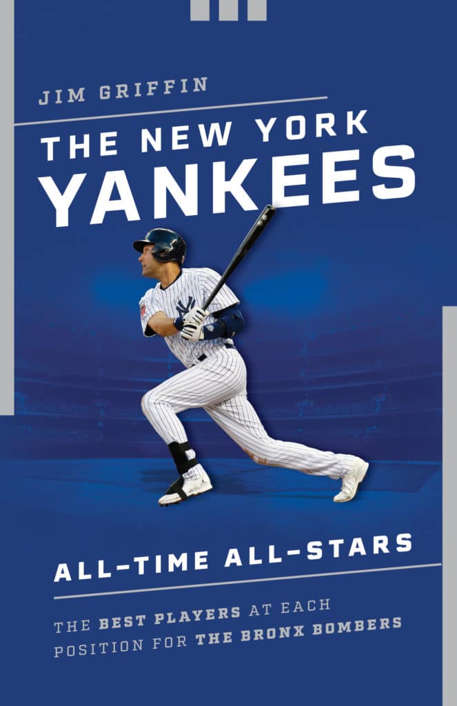
Jim Griffin recently wrote his first book — a position-by-position look at the best players in Yankees history, which was published about a month ago by Lyons Press. Along the way, he learned that, like most first-time authors, he had no say regarding the book’s cover design (shown at right, click to enlarge).
But as a longtime Uni Watch reader, Jim had a lot of thoughts regarding the design that his publisher ended up going with. And while his publisher may not care what he thinks, I think the Uni Watch readership will be interested in his analysis of his own book’s cover (which was done by a graphic designer named Devin Watson). Take it away, Jim:
Naturally part of me sees the design through a Uni Watch lens. For starters, they chose a shade of blue that more closely resembles that walls of the renovated, old version of Yankee Stadium than the midnight navy that the team wears. I think that was actually a good decision — if they’d gone more navy, it might entirely obscure the image of the stadium in the background.
Speaking of which: That stadium in the background is definitely not Yankee Stadium, new or old. The field in the foreground suggests that we’re looking from a viewpoint behind home plate, which would in turn suggest that this stadium is entirely enclosed. A cookie-cutter stadium for a Yankees book? Not ideal.
The three small notches at the top remind me of the sponsorship deal that the Yankees struck with Adidas years ago. Specifically, the notches call to mind the bullpen awnings and banners behind the bleachers that were added to the old Yankee Stadium after that deal was made. So at least this feels like a reminder of the team’s longtime home, which is good.
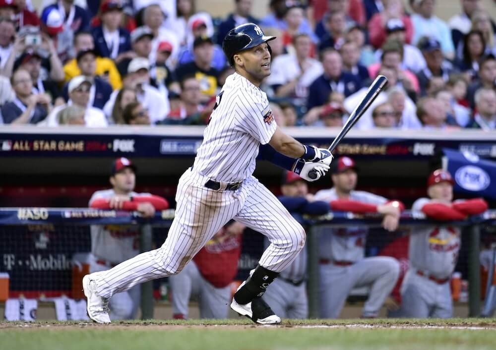
They used a photo of Derek Jeter on the cover. I suggested Mariano Rivera, given that he had just become the first unanimous Hall of Fame inductee, but that was roundly rejected. Anyhow, Jeter’s white cleats are a dead giveaway that it’s an image from an All-Star Game, and the somewhat obscured All-Star sleeve patch can help narrow it down. After some internet sleuthing, it’s clear that this is a shot of Jeter’s follow-through after hitting his lead-off double in his final All-Star Game in 2014 [click to enlarge]:
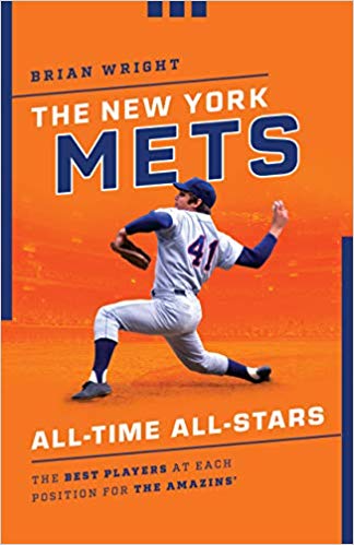
All very interesting! Jim said his book is the first in a series, with a Mets edition (written by a different author) due to be published in March. Here’s the cover design for that one:
Jim asked what I thought of that design, so here are some quick thoughts:
• Too bad about the recurring design template, right down to the three notches. Makes both cover designs feel too boilerplate and unimaginative. The repeated visual motif might arguably be okay if people were going to “collect ’em all” (that way they’d all feel like variations on a common, interconnected theme), but most fans will only be interested in the book about the team that they root for, not in the whole series. Why not give each one its own distinct design treatment? Lazy and disappointing.
• That said, the stadium in the background is not the same image used for the Yankees book cover. Good! It’s hard to tell at this size and resolution, but it might even be Shea Stadium.
• Putting Tom Seaver on the cover seems like a no-brainer, so no problem there. But that photo must be from very early in his career, because he usually did not wear his pants and stirrups like that. Generally speaking, he liked his pant cuffs lower and his stirrup openings higher. So the cover photo feels like a somewhat unrepresentative image of Seaver.
• Also: Instead of a rear-view shot of Seaver in a road uniform, I’d much rather see a front-view shot of the home uniform, showing the familiar Mets script. At first I thought maybe they avoided the front view because of licensing issues, but the Yankees chest logo is clearly visible on the cover of Jim’s book, so why not do the same for the Mets? Disappointing.
• It looks like the tag line at the bottom of the cover says THE BEST PLAYERS AT EACH POSITION FOR THE AMAZINS’. In other words, they appear to have put an apostrophe after the S. Sigh. Reminds me of this long-ago LP. Let’s hope that bit of illiteracy gets corrected before the book is published.
Having written a book and worked in book publishing, I know all about the things that can factor into (and put various restrictions on) a book cover design, so I realize the designer’s hands may have been tied. Interesting to see how these turned out. Thanks to Jim for sharing all of this, and congrats to him on the publication of his first book!
I don’t know about you, but this song is now stuck in my head (which is not a bad thing):
Click to enlarge
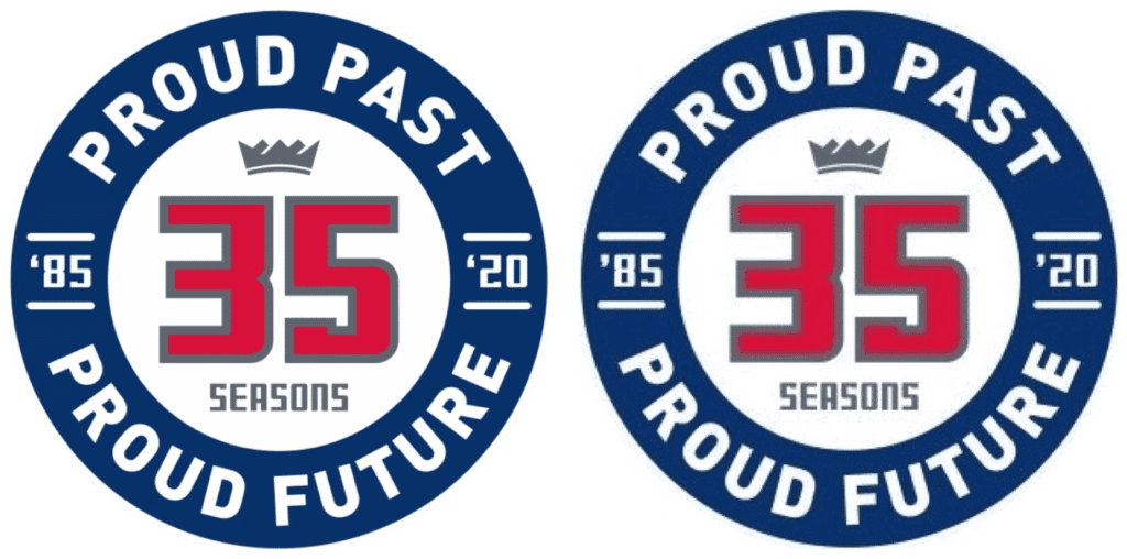
Apostrophe catastrophe update: Notice any distinction between the two Sacramento Kings 35th-season logos shown above?
The one on the left is the original version of the logo — which, as I noted in yesterday’s blog post, had a double apostrophe catastrophe. The one on the right is an updated/corrected version that appeared on the team’s social media channels yesterday, with properly oriented apostrophes — a small victory for grammar and literacy. Kudos to the Kings for making the fix!
Now we just have to do something about the Orioles’ cap logo.
(My thanks to Zack Evans for bringing the updated logo to my attention.)
Click to enlarge
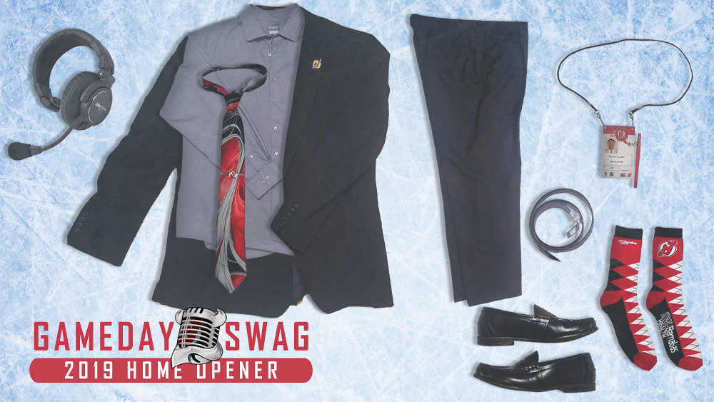
What, no Uni Watch lapel pin?: With teams now routinely posting photos of their gameday attire, Devils P.A. announcer Kevin Clark (who I got to meet back in February, and who also attended the Uni Watch 20th-anniversary party back in June) decided to do the same, at least for tonight’s season opener. I love that he’ll even be wearing Devils socks!
Speaking of the start of hockey season: In case you missed it earlier this week, the annual Uni Watch NHL Season Preview, with all of the new uniforms, logos, and center ice designs for 2019-20, is now available for your enjoyment.

Click for increased cuteness
Sun worshiper: Uni Watch girl mascot Caitlin usually likes to curl up in front of the other pillow. But she loves being in the sun more than anything. Li’l angel.
The Ticker
By Lloyd Alaban

Baseball News: The Nationals’ bullpen cart usually has advertising space on the front of it, but it was covered up by a Nats cap logo for last night’s Wild Card game. That’s part of MLB’s larger program of covering or changing stadium advertising in the postseason (from Tim Haller). … ESPN’s Pardon the Interruption used a strange-looking Red Sox logo yesterday (from Mike Sullivan). … Dugout sweaters from the early 1900s may be coming back in style (paywalled). … The Padres’ online shop includes a jersey for P Chris Paddack with his NOB misspelled (from @_pomdet). … Mets 1B Pete Alonso has donated his shoes and bat from the team’s Sept. 11 game to the National September 11 Memorial & Museum (from Peter Clark). … The A’s will wear their Kelly green alternates for tonight’s American League Wild Card Game (from Heath Carignan). … Speaking of the Wild Cards: After the Nats beat the Brewers last night, Nats SS Trea Turner wore a bizarre getup for a postgame presser (from Max Weintraub).

Pro Football News: Paul’s MMUW entry two days ago noted that Chiefs WRs Sammy Watkins and Demarcus Robinson were both missing their Lamar Hunt/AFL jersey patches on Sunday. Sam Wescott has now discovered that the patch was also missing for LB Anthony Hitchens and K Harrison Butker. … The Seahawks will wear their snot green alternates for tomorrow’s game against the Rams (from our own Phil Hecken). … The Toronto Argonauts of the CFL wore their throwback “sails” logo on their helmets for their Labour Day Classic match. It seems like that logo is staying for the rest of the season (from Wade Heidt). … Reader JC Bigornia found an interesting glitch while playing Madden NFL 20 that resulted in the Jets playing in their Namath-era helmets but in the current Bucs’ uniforms. The numbers on the Bucs/Jets jerseys are also oddly spaced. … Chris Markham found this 1994 Bills QB Jim Kelly throwback jersey being sold on Fanatics with multiple inaccuracies, cross-referenced by this screenshot of Kelly from Chris. The Bills didn’t wear their 35th anniversary patch with these jerseys — which were themselves throwbacks to the 1965 season — but did with their regular uniforms. The sleeve striping on the Fanatics jersey is red-white-red, while the actual 1994 throwback had white-red-white striping. The TV numbers are missing from the Fanatics jersey, and an apparent Photoshop mistake in the Fanatics listing placed the Jaguars’ 1995-era alternate logo on the Fanatics jersey’s right sleeve.
College and High School Football News: New BFBS unis for ECU (from Michael Grubb). … Cincinnati trolled Twitter by falsely stating they would play on a black field on Friday (from multiple readers). … Louisville will wear their Muhammad Ali-themed uniforms on Saturday against Boston College (from M. Brinston Berry). … Blaise D’Sylva‘s latest helmet collection is from Rutgers.

Hockey News: Here’s the Blue Jackets’ alternate uniform schedule (from Ben Teaford). … The Bruins will have a third uniform for this season, but it won’t be the “Pooh Bear” uniform. … Canadiens D Cale Fleury earned his spot on the big club and has now picked No. 20. He wore 83 in training camp, which was the reverse of his minor league 38 (from Michael Engle). … Thanks to an extended deal between the NHL and PPG Paints, all games this season will feature pucks that change color when they’re warmer than 22 degrees, the temperature at which pucks should be replaced. … New uniforms for Providence College men’s (from Timothy Finnegan).

Basketball News: The NBA released the Rockets’ alternate uniform schedule (from our own Phil Hecken). … The San Francisco Chronicle ranked all of the Warriors’ uniforms (from Peter Hartlaub). … As usual, you can keep up with the latest news in NBA uni numbers by following Etienne Catalan’s Twitter feed. … South Carolina men’s teased a throwback uniform reveal (from Will Lawson). … New court for North Texas (from Chris Mycoskie). … Looks like the Mavericks used a miniature plastic replica of the ball that was supposed to be NBA’s new ball in 2006 but was scrapped just months later because everyone hated it (from @TylerAtoms).

Soccer News: From Josh Hinton: Manchester City’s substitutes wore the shirt of injured teammate D Aymeric Laporte during warmups yesterday. … FC Shakhtar wore their second kit yesterday in their Champions League matchup. … River Plate’s number advertisers (gross) alternate between PES and PES 2020. … As usual, you can keep up with lots of other news by following Josh’s Twitter feed.

Grab Bag: The car numbers for Roush-Fenway’s NASCAR Cup entries will be pink for the entire month for Pinktober (from Christopher Hickey). … Here are the inaugural uniforms for the Halifax Thunderbirds of the National Lacrosse League (from Wade Heidt). … Here’s an article about the different numbering/lettering systems in rugby (primarily union, but also briefly league) and how they developed into the current system of 1-8 for forwards and 9-15 for backs (from our own Jamie Rathjen). … WWE’s old “scratch” logo, which was retired in 2014, is still in use on the company’s dividend mailers sent out to shareholders (from @StarofSavage). … Nike is now pushing into the extended size market (from our own Brinke Guthrie). … Speaking of Nike, its CEO is allegedly involved in a doping scandal. … You can find a ton of ghost signs while walking around Boston (from Ilana Hardesty). … Cincinnati has 52 neighborhoods, and now each one has its own flag (from multiple readers).

Click to enlarge

What Paul did last night: I almost never have any reason to be walking around the Upper East Side of Manhattan. So when I walked down East 63rd St. between York Ave. and First Ave. last night, it’s entirely possible that I had never been on that block before. Which would explain why I didn’t realize that there’s a business on that block called Mr. and Mrs. Uniform!
When I got home, I learned that Mr. and Mrs. Uniform specializes in medical uniforms. Makes sense, as New York Presbyterian Hospital is right around the corner, and there are several other hospitals nearby. Interesting!
*Harrison Butker
Thanks. Fixed.
Glad to see the Nats bullpen cart was improved to be the home cap – had been the “Barves” Nats cap for some reason.
But the crooked logo cover-up is driving me crazy!!
I believe they use the road colors because the ad that is usually on the front is also on the side of the cap and shows up better against the blue. Not saying I like it, just an explanation.
Love you Caitlin!
The Seahawks in “Action Green” is always going to be too over the top for my taste, but I think it might be a slightly better look if they paired the green jersey with their navy pants. It would like more like their white over navy look, which is probably the best combo they use these days.
Trea Turner was also wearing a white NC state football helmet in the locker room. He played at NC State for 3 years and has broken out Wolfpack equipment for other celebrations.
In the picture shown, that looks like a padded rugby helmet.
Yes, it appears to be a rugby helmet. Before that he had a football helmet. Doubt it was stock footage from a few weeks ago but he had the football helmet on in the locker room.
I believe he was rather sauced at that point.
so it was (functionally at least) a drinking helmet?
+1
Just for the record, my wife went to bed after inning 7 last night saying she could not bear to watch another NAT-astrophe… so I watched the bottom of the 8th alone. Saw Soto the 20 year old’s hit and all that Beer tossing in the bleachers looked like fourth of July… for Homer SImpson.
Tough break for the Brewers, who unis I must admit looked very good including their non-dog paw lids.
was hoping you’d pop in so I could congratulate you on the win.
RE: Nike in the plus-size world….
“If you can’t shame them (into buying “skinny” clothes, join ’em!”
Fast Facts
According to data from the National Health and Nutrition Examination Survey (NHANES),
More than 1 in 3 adults were considered to be overweight.
More than 2 in 3 adults were considered to be overweight or have obesity.
More than 1 in 3 adults were considered to have obesity.
About 1 in 13 adults were considered to have extreme obesity.
About 1 in 6 children and adolescents ages 2 to 19 were considered to have obesity.
Seeing the news out of SI. Hoping for the best.
You and me both.
Mitchell and Ness should take the hit for any inaccuracies with the Jim Kelly jersey, not Fanatics. This is typical of Mitchell and Ness of late. Their Philadelphia Eagles reproductions also have multiple issues.
A great example, from their site:
link
Vs the real jersey:
link
Not remotely close to accurate.
The Kelly M&N “Jersey” is actually just a glorified T-shirt which is why it’s not accurate. Reminds me of the “Shirseys” that have become very popular within MLB fan circles. The Eagles jersey you linked is a replica version which is why it’s about 1/2 the cost of the “authentic” throwbacks they make. Their higher end stuff is still very accurate to the originals but I think it’s great that I can get a Favre Jersey for $100 if I don’t want to spend $300 to get the exact accurate sleeve striping and elastic side panels.
Yeah good point on my selection. There are other examples on authentics , I’ll have to do some digging when I have time.
Actually the Jim Kelly “jersey” is not a jersey. It’s a shirt. And with that Eagles jersey as an example those are not the authentic versions, they’re replica versions which are sometimes less accurate (and less expensive).
In truth, the Jim Kelly jersey does look very much like the ones that Champion made during that era. The lack of TV numbers and the presence of the patch? Well, ugh!
That’s just a fashion style Kelly Jersey/T-shirt. Here is the actual Jersey M&N makes for the 1994 Bills season- it’s only 3xs the price.
link
Re: the PPG pucks.
A puck over 22 degrees wouldn’t be discarded; just put back into the bucket of ice water at the scorer’s table between the penalty benches.
I actually love the shade of green that the Seahawks use, but it looks horrible as a jersey color; mainly because it clashes with the color of the turf. It’s the same issue I have with the Sounders home jersey, it’s just looks bad. Green is my favorite color, and I love almost every shade, but not all shades work in every scenario. On a basketball court? Maybe. A hockey uniform? Probably not, it would be much too loud with the white ice almost magnifying it. What I’m saying, maybe it’s not a uniform color in general and is better left for a spots car paint job.
I used to live in Bo Diddley’s old house at 812 Rittenhouse Street in DC. Groovy 3 story house with a big basement. His real name is scratched into the concrete rear driveway. That house was special.
Whoa — amazing!!
RE: the Yankees book cover, should have been Rivera, considering that Jeter probably isn’t even the best shortstop the Yanks have had, just the most popular.
Jeter is far and away the best and it isn’t even close. The only other Yanks’ SS in the HOF is the Scooter. We all loved him but he’s nowhere near the player Jeter was.
Jeter wasn’t even the best shortstop the Yankees had while he played for the Yankees. Great hitter, Hall-of-Fame player sure, looked great in pinstripes, but as a defensive shortstop he was usually the second- or third-best option on the active roster. Jeter clinging to short and forcing the best defensive shortstop in the league to move to third for the remainder of his career is one of the worst acts of selfishness in pro sports history. That was a Pete Rose-level move.
I had a feeling the ARod argument was lurking. All valid points to be sure, but ARod def has an asterisk next to his accomplishments for well-documented reasons. I also get that he may have been a better defensive SS in 04, but he played SS just a few times for the Yankees. It’d be kinda like calling Babe Ruth one if the greatest LHP in Yankees history.
And I agree completely that Jeter’s so-called “leadership” is vastly overrated. He was a very selfish clubhouse presence.
Neat story out of ESPN regarding Tom Terrific’s (yeah I said it) shoulder pads.
link
Re: Madden glitch – looks like the Jets have the Bucs current jersey, not uniform. Pants and socks look right.
Fairly sure the stadium image used for the Yankees cover is a view from 2nd base (or just behind) looking back towards a grandstand above home plate area, and if this is the case it does seem to generally match up with new Yankee Stadium’s tiers. That said, the point is it isn’t clear in the slightest which leaves the question of why not at least get some façade in there or something identifying like that to make it worthwhile?
The Yankees book cover appear to be a pic take from around 2nd base looking toward home plate with Jeter superimposed batting toward 1st base (terrible composition). It might be yankee stadium but its hard to tell, the tier don’t look quite right, but it does appear to have the white details hanging from the roofline.
Speaking of Mr. & Mrs. Uniform, First Avenue is informally known as “Bedpan Alley” due to the large number of hospitals located there. Bedpan Alley is of course a play on “Tin Pan Alley,” which was the name given to the concentration of music publishers along 28th Street in Manhattan.
It’s not New York Presbyterian, it’s “NewYork-Presbyterian”, a smushed and hyphenated name adopted after the merger of the Cornell (New York Hospital) and Columbia (Presbyterian Hospital) medical centers.
when i first saw the photo at the top of today’s item, i asked myself ‘when did adidas get in to publishing?’
While we can’t prove the apostrophe catastrophe was corrected based on Paul’s work or someone else’s on social media, it feels like someone should get paid for correcting the team’s laziness and poor editorial processes.
I’m just going to believe you are wrong and that it is a normal size ball Boban is holding, because Boban is a giant.
Toronto Argonauts will wear their throwback “sails” logo helmet more?
This CFL fan approves.
Would be a whole lot better if the Argos wore the blue over white like they did in the preseason:
link
Their insistence on wearing mono-blue at home irritates me:
link
It looks like a turd being flushed down the toilet. Horrible logo.
Re: the Tom Seaver photo being from very early in his career, I respectfully disagree. His hair is too long for that pic to be from early on. His hair was like that in the last few years before being traded to Cincy. Maybe he was having a bad sock day?
I actually came here to say that. No way he had those sideburns and that length of hair in 1967-68.
Today’s BETTY comic strip addresses a favorite topic, uni ads.
link
Nicely done.
Apparently sporty cover design in the book bidness means intellectual property theft.
I agree with Nestor and David about the Seaver photo. Also, look very closely at the number font. That is not the font used from 1962 through 1973. The hair also looks to be from about 1975.
link
All good points!
But even if the photo is from the 1970s, it’s a very un-Seaver-like pant/stirrup style. Not very representative!
I agree Paul…I remember Seaver showing more white on his sanis. But you sent me down a bit of a rabbit hole…I found another example of similar hosiery for Seaver, which based on the black armband, is likely from 1976. So perhaps Seaver wore his socks like this in 1976 for some reason. He surely wore them like that for the Reds, as I believe that was a team wide policy.
link
Nice find!
Oakland Athletics Tampa Bay (I still call them Devil) Rays fighting for the wild card. How do these two teams always end up competing with their lazy owners and no where to be found fans.
I know! It takes players with heart.
The suits should be fired, the teams should be relocated. Nashville? Oregon? Anywhere where fans will care? Anywhere with a up to date ballpark?
So boring watching these two teams in such an important game because their fans and owners could give a rats ass.
I don’t think that’s Shea behind Seaver. At least not all of it.
I think it might be some sort of composite image after seeing how the second deck is very close to the field and the third and fourth decks seem to repeat with some sort of structure above.
link
Sorry if this has been mentioned, but this Cardinals v. Braves NLDS graphic from MLB.com has a Cards player with a Ford logo from the Mexico series v. the Reds on his batting helmet:
link
link
Sorry to hear about the death of Kim Shattuck. I learned of the Muffs from Paul and now they play regularly on my Pandora. Thanks for introducing me to her music Paul.
Being me, I had to go look up “Mr. and Mrs. Uniform” in Google maps. After clicking around on E. 62nd St. for a while, I finally searched for the business and found that it’s one block over on E. 63rd St. Still cool!
Oh no — I listed the wrong street? Ugh. Now fixed!