Click to enlarge
The Warriors unveiled six, count ’em six new uniforms jerseys yesterday. Most were either already known to be in the pipeline or recently leaked, and several are subtle variations on last year’s versions, but it still qualifies as a big unveiling.
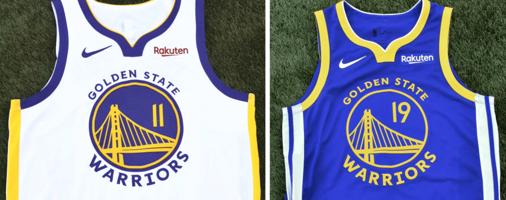
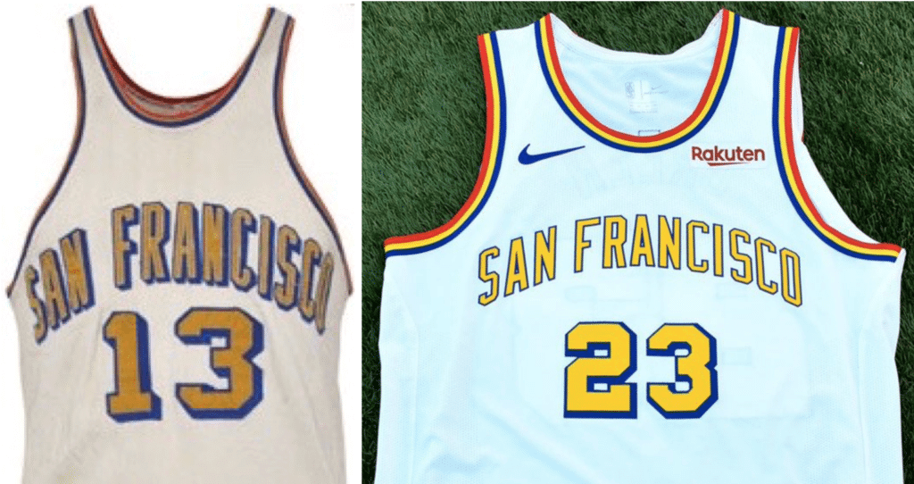
Let’s start with the primary white and blue designs (shown above). These are essentially the same as last season’s, except that the bridge design has been tweaked, the type is now rendered in a new font, and the shade of blue is slightly darker. Those changes to the team’s logo had already been announced back in June.
Another tweak can be found on the team’s “The Town” alternate, which is based on the graphics found on Oakland street signs (and which they’re keeping despite having moved from Oakland to San Francisco):
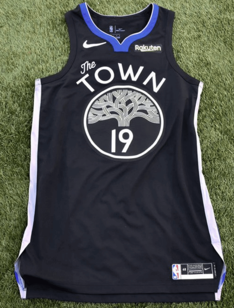
This is almost identical to last season’s version. The only changes are the collar color and a new (and much improved) typeface. You can see the differences in this SportsLogos.net comparison graphic.
The one truly new design is a yellow alternate with “The Bay” (this will be the “Statement” alternate, a term I hope to use as infrequently as possible):
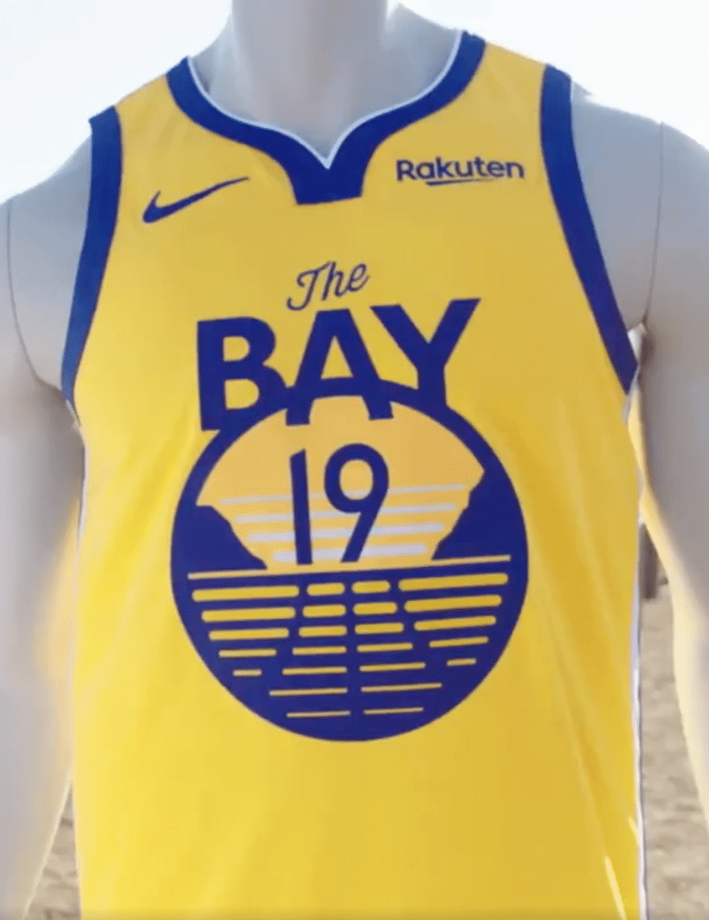
According to the team, the logo shows a “landscape of seaside cliffs overlooking water accompanied by an overhead fog, a scene reminiscent of the Golden Gate prior to construction of the Golden Gate Bridge.” I wish it didn’t have the three lines that make it look like a basketball. Makes the whole thing feel way too boilerplate.
In an unusual development, there will also be two throwbacks, which seems like overkill, even though I like both designs:
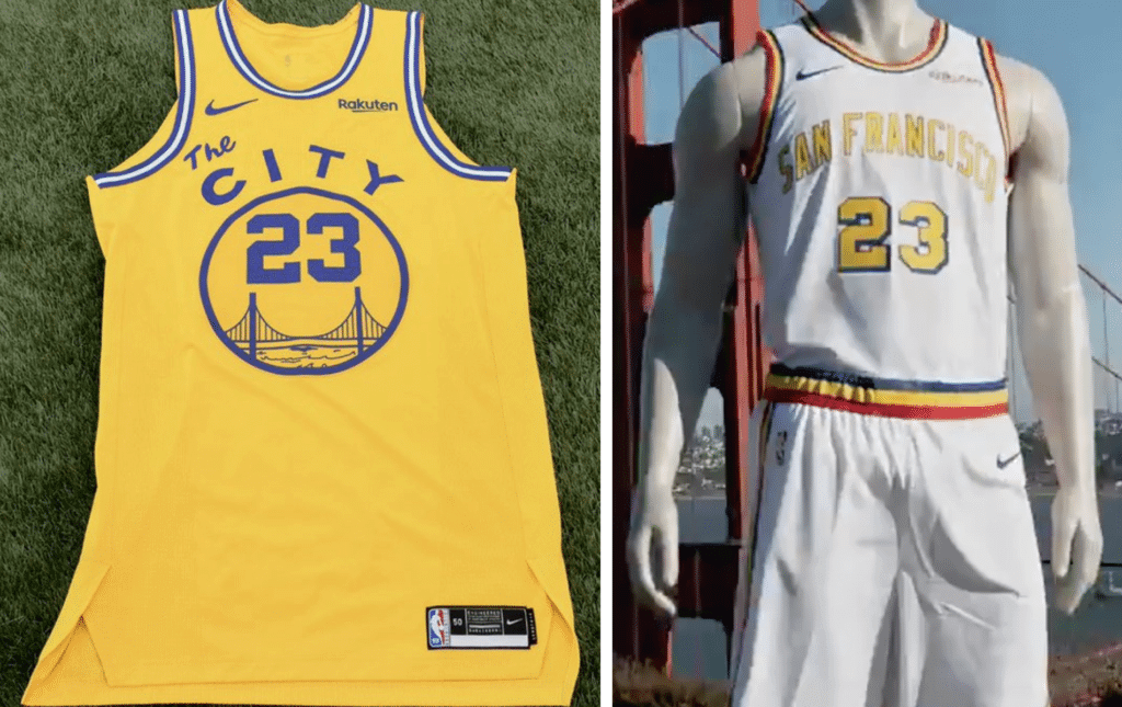
“The City,” of course, is the greatest uniform in NBA history. Still, the Warriors have worn this throwback several times before, so there’s nothing new here (and it seems a bit ridiculous that the team will be wearing The Town, The Bay, and The City all in the same season).
The other throwback design is from 1962, the team’s first year in San Francisco after relocating from Philadelphia. The Warriors have previously worn the gold road version of this design as a throwback, but to my knowledge this is the first time they’ve worn the white home version. It’s a nice uniform, although they appear to have taken some liberties with the typography and colors — original version on left, throwback on right:
It remains to be seen when these uniforms will be worn, and how many of them will be paired with their own distinct court designs.
Click to enlarge
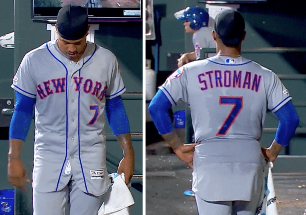
Tuck you: I finished watching last night’s installment of PBS’s eight-part country music documentary just in time to switch over to the Mets/Rockies game and see Mets starting pitcher Marcus Stroman going untucked in the dugout during the top of the sixth. Normally, this might suggest that his night was over, but instead he tucked his jersey back in and went out to pitch the next two innings.
The broadcasters implied, but did not outright state, that he routinely untucks his jersey between innings. I’ve never heard of a player doing that, so I did some quick photo research. I couldn’t find any shots of Stroman going untucked in the dugout, but I did find an untucked photo of him walking to the dugout after having been removed from a game on July 24 of this year, and another untucked shot of him walking in from the bullpen prior to the start of the game on July 4:
I’ve never seen a player doing those things either. Marcus Stroman: King of the untucked jersey (which is a pretty dubious title to have).
(Also: SNY reported Steve Gelbs reported during last night’s game that Stroman Velcros his pant cuffs to his shoes. Yeesh.)
Premier League Uni Roundup — Week 5 (Sept. 14–16)
By Josh Hinton
Liverpool (red) 3-1 Newcastle (white/black)
Liverpool look excellent in that lovely home strip, but Newcastle’s awful look kills this matchup. 3/10
———
Brighton (blue/white) 1-1 Burnley (claret)
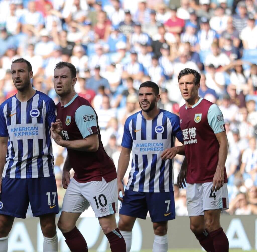
I don’t mind this Burnley home kit, but Brighton’s busy kit — striped, with two shade of blue, and paired with out-of-place gold — ruins this matchup. 3/10
———
Manchester United (red) 1-0 Leicester (blue)
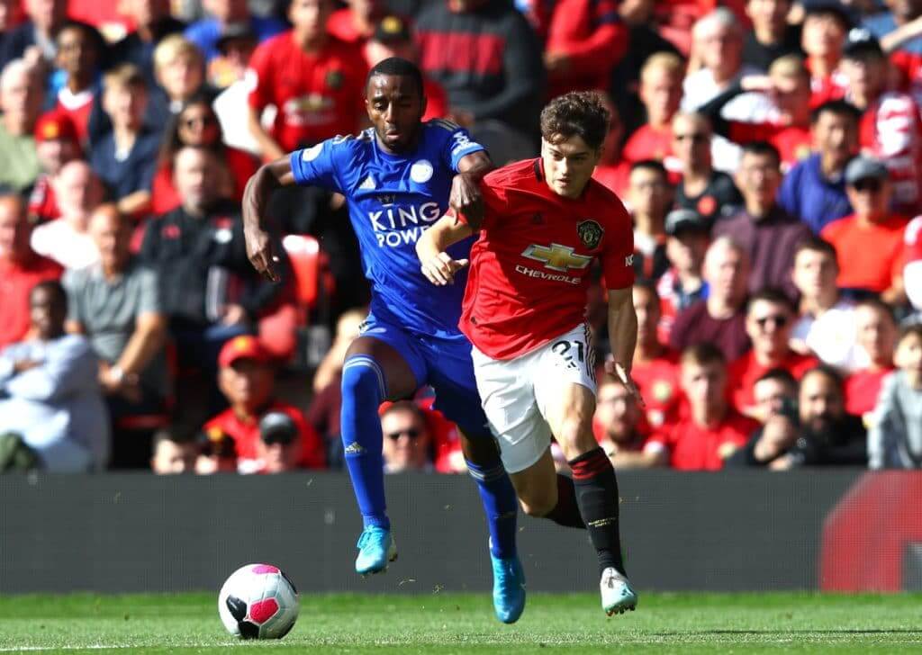
Royal blue and red, when paired properly as seen here, is absolutely beautiful! 8.5/10
———
Sheffield United (red/white) 1-0 Southampton (grey)
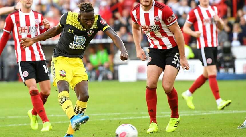
This is going to go down as one of the worst matchups of the year. Sheffield United have the worst striped kit in the league, and that awful Southampton third strip needs to go. 1/10
———
Tottenham (white) 4-0 Crystal Palace (red/blue)
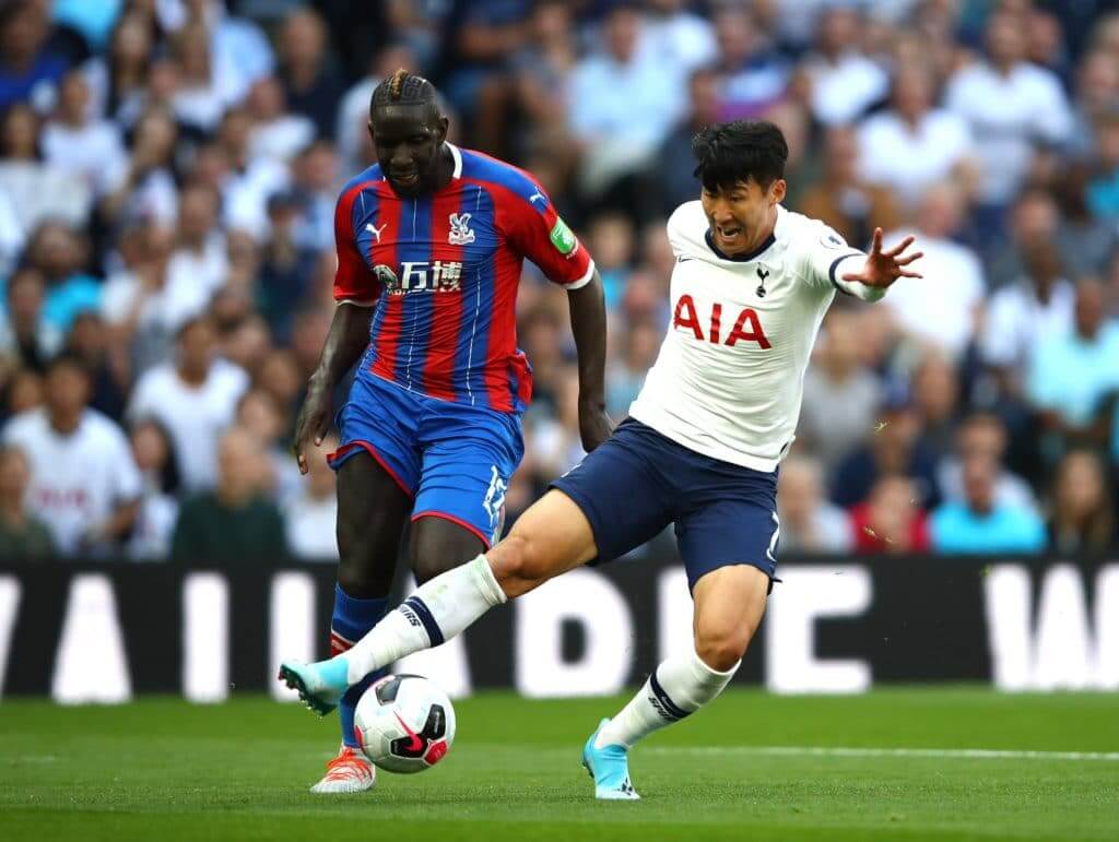
Yet another lovely matchup this week, involving some of the best home strips in the league. Would be perfect if not for Palace’s green sleeve ad. 9/10
———
Wolves (old gold) 2-5 Chelsea (white)
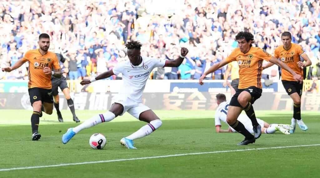
This game loses points for the Wolves’ Tiro19 template and Chelsea unnecessarily sporting their change kit, but gains points for the lovely contrast and the fact that said change kit is probably the best in the league. 8/10
———
Norwich (yellow/green) 3-2 Manchester City (black)
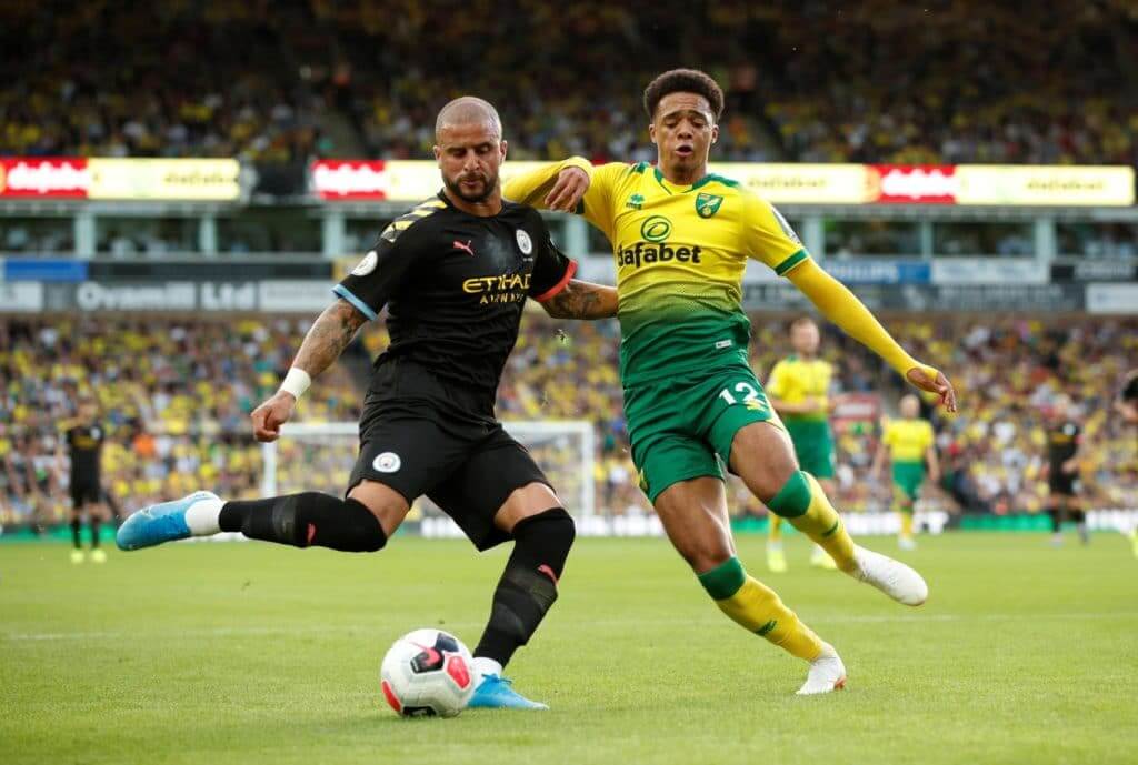
While my beloved Manchester City was embarrassed in this game, Norwich’s home kit is stunning. Would be perfect if City had worn their home strip. 8/10
———
Bournemouth (red/white) 3-1 Everton (blue)
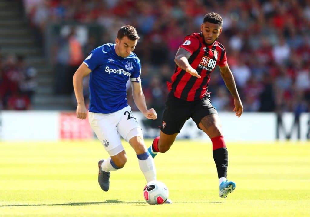
See Man United vs. Leicester — stunning. Love it when these two sides play each other in their respective home strips. 9/10
———
Watford (black/yellow) 2-2 Arsenal (red)
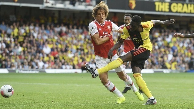
I’ve never been a fan of the increased use of red and black in Watford’s home strip. But as seen in 2016-17, yellow, when done right, works. As for Arsenal, their home strip is one of the best in the league, but the whole matchup looked off due to the black half of the Hornets’ home kit. 4/10
———
Aston Villa (claret) 0-0 West Ham (navy)
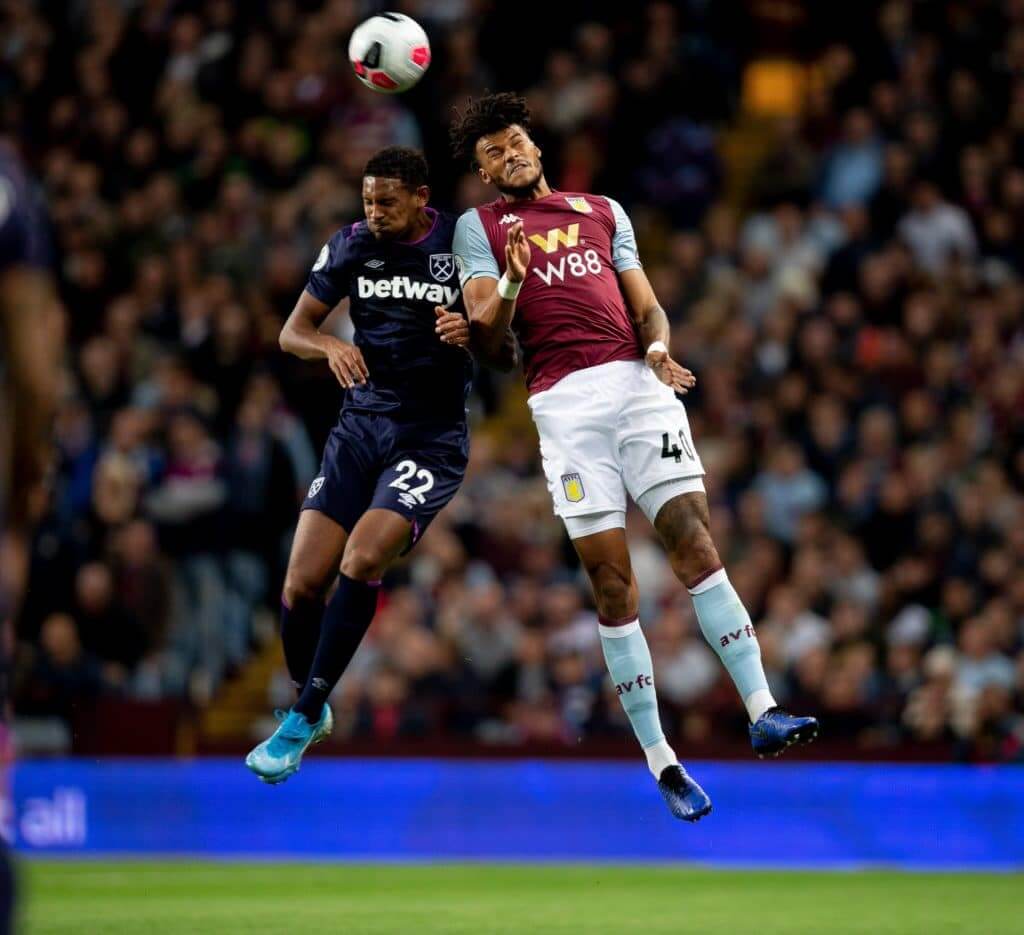
Villa are excellent in their Kappa claret kit, and West Ham sport a classy Umbro third kit. Nothing exceptional, but a solid matchup to close out the week. 7/10
Click to enlarge
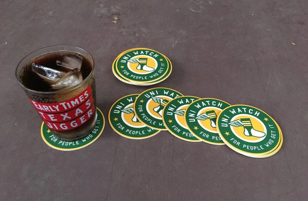
Almost sold out already: As of this morning, I have only two remaining sets of Uni Watch coasters. If you want one of them, it’s three coasters for 10 bucks (or 12 bucks for non-USA orders).
To order, send me the appropriate amount via Venmo (use @Paul-Lukas-2 as the payee) or Zelle (plukas64@gmail.com). If you want to use Apple Pay or a paper check or well-concealed cash, or if you’re not in the USA and can only use PayPal, get in touch and I’ll give you the appropriate info.
One order per person. After paying, email me with your shipping info. Thanks!
Coasters are now SOLD OUT. I can order more, but they will be more expensive (because I had a special deal on this first set) — probably more like $12-$14 for a set of three. If that interests you, please email me. If there’s enough demand, I’ll go ahead and get more. Thanks!


Raffle reminder: In case you missed it on Tuesday, an anonymous reader has 10 pairs of old stirrups and has generously offered to raffle them off to Uni Watch readers. You can see all 10 pairs here. Note that each pair is numbered.
To enter this raffle, Send an email to the raffle address by 10pm Eastern this Thursday, Sept. 19. In the body of the email, please indicate (a) your name and shipping address and (b) your preferred stirrup choices, in order of preference, by number. If you’re only interested in one pair, just list that pair’s number; if you want to list more than one, you can do that too, all the way up to 10 choices. I’ll do my best to accommodate all the winners’ preferences.
One email per person. I’ll announce the winners on Friday. Please join me in thanking our anonymous benefactor for doing this!
The Ticker
By Lloyd Alaban

Baseball News: The Brewers wore their Cerveceros jerseys for Hispanic Heritage Night on Monday (from Mike Chamernik). … A sportswriter has an unusual request for the Twins: Make every night “Obscure Twins Jersey Night” (from Margaret Zverinova).

NFL News: The Jets are the latest pro sports team to commission a bunch of cool-looking gameday posters. Note that one of the upcoming ones will be by longtime Uni Watch ally Todd Radom. … Speaking of the Jets, it would be fair to say that radio talker Mike Francesa is not a fan of their new uniforms.
College Football News: Here’s what the ACC wore in Week One (from ACC Tracker). … BYU will wear throwbacks this week (from multiple readers). … Fox Sports tweeted a graphic using Ohio State’s old logo — a logo they haven’t used since 2012. Here’s a side-by-side of their old and current logos (from College Sport Design). … SMU gave Dallas mayor Eric Johnson a “Dallas” jersey and helmet (from Sam McKinley). … The latest helmet collection from Blaise D’Sylva is of Virginia Tech. … New interlocking “TU” helmet logo for Tulane (from Clint Richardson).

Hockey News: The Canucks have revealed a new arena banner featuring many of their uniforms from team history (from @waffleboard). … The Sabres could possibly have a new wordmark (from multiple readers). … Canada’s National Junior A Championship has dropped its corporate advertiser and reverted back to its original name, the Centennial Cup (from Jim Wooley). … Last night’s Sens/Leafs preseason game had blue goalposts. That’s because the game was played at the ECHL’s Newfoundland Growlers’ rink. The ECHL uses the blue pipes (from @RyanDrifting).

Soccer News: From Josh Hinton : It’s the first group stage matchday for the 2019-20 UEFA Champions League, so defending Champions League winners Liverpool debuted the customary winners’ badge on their sleeve yesterday. … Interesting note regarding Liverpool’s UEFA competition font: When a player, like F Mo Salah, has their first initial on the NOB, the period is raised (right photo), whereas the standard Premier League font (left photo) has it in a more standard position. Our own Jamie Rathjen says it’s a practice that dates back at least to last season. … Two Chelsea UCL notes from yesterday: They are wearing the 2018-19 UEFA Europa League Winners patch on their sleeves and the Plan International charity’s logo on the back of their shirts, as they often do in European competition. … Borussia Dortmund wore their NOBs at the top of their shirts yesterday. In the Bundesliga this season, their NOBs have been at the bottom (from Eric Wilson). … Both Paris Saint-Germain and Real Madrid will wear their third kits when they face off today. … For more kit-related news, including more news from yesterday’s Champions League matchday, check out Josh‘s Twitter feed. … A graphic designer has made soccer shirts to honor typefaces (from Justin, who didn’t give his last name). … New third kit for AS Roma (from Ed Zelaski).

Grab Bag: The Scotland men’s national rugby team is in Japan for the upcoming Rugby World Cup. They’re seen here wearing kilts in a tartan designed to honor the Japanese city of Nagasaki. The pattern is based on the regular Scottish Rugby Union tartan, but the green and purple is effectively reversed. … This panda is the new mascot for the 2022 Winter Olympics in Beijing, and this lantern child is the mascot for the 2022 Winter Paralympics, also in Beijing (from Jeremy Brahm).
Correction (error probably my fault in the first place!): The Astonishingly Shiny Cup of All Cups is the trophy for an intrastate derby between two Wisconsin teams, not for the USL League One.
This is the trophy for USL League One: link
So Paul would you recommend the Country Music doc? Seems like a major commitment but super interesting.
Channel surfing between innings of Phils/Braves (yeah, yeah I know) when I come across the AAA Title Game and the first thing I see is the advert patch on a batter’s uniform. Not which team is at bat only the patch drew my attention. Ugh.
Be careful saying that out loud — that’s exactly what the advertisers want to hear. (Other than the “Ugh” part.)
Here’s where I mention that Tottenham are one of the few remaining teams in the Premier League without an ugly sleeve advertisement. I’m happy for it to stay that way as long as possible.
Worth noting that I’ve heard some Spurs fans complain about this, as they believe the extra revenue generated from a sleeve ad is worth defiling the jersey if it helps the team spend money on players. I don’t follow that logic at all.
Josh, awesome job on the PL write-up, as always!
“Color vs. color for the Chicago Sky and Las Vegas Aces in the WNBA Playoffs (from Loren Richmond Jr)”
Huh? Every game is color vs. color in the WNBA, and that was Las Vegas vs. Washington.
Thanks. Removed from Ticker.
The “San Francisco” on the new white Warriors throwback doesn’t have the 3D appearance of the old jerseys. In fact, it seems like they have lifted the lettering from their new neighbors the San Francisco Giants and simply recolored it.
Except the Giants have radial arched letters and this Warriors throwback has vertical arched letters. They’re not as close as you think. Look again.
When Stroman was with the Blue Jays you would often see him untucked in the dugout.
Wasn’t aware of the Velcro but I had a feeling that he had some sort of custom tailoring going on because the bottom of his trousers is always very neatly lined up with the sole of his cleats.
Although I’m not a huge fan of the full length trouser atleast his appear to fit quite well unlike the unlightly pyjamas look lots of other players go with.
Another thing about the Senators/Maple Leafs preseason game in St. John’s.
They did have the Maple Leafs logo at centre ice.
There were no ads on the ice surface.
Hey Paul,
Loved your Irish travelogue!
I too have been favouring the Country Music doc on PBS over sports programming!Last nights episode even had some Uni related content regarding the very colorful cowboy outfits worn by some of the early artists and the two people who created most of them.
Paul, I don’t intend this to be a negative/snarky comment, but I can’t think of a softer way of phrasing this question:
Your quote from yesterday about why you decided to offer Uni-Watch coasters surprised me, “A coaster manufacturer was offering an introductory deal, so I thought sure, why not?”. Seems a bit careless compared to your normal way of doing things. If Nike went to a sports team and said, “Hey, We’ll give you a 7th alternate jersey for a cheap price” and the sports team said, “Yeah, why not”, wouldn’t you call that team out for just trying to sell more merch? I would enjoy hearing more about your viewpoint on this.
“Sure, why not?” referred to my choosing to have them made. I had never thought about doing coasters before, but when the introductory offer came across my radar, I thought, “Hmmm, that could be fun. Sure, why not give it a try?”
Once I received them, I thought they looked awesome, so I decided to offer them for sale (at a very low/fair price). If I hadn’t been happy with the quality, I would have just kept them and you would never have known about them — just as you’ve never known about other products I’ve experimented with but opted not to sell for various reasons.
any reason you chose lots of three? four seems like a more natural set
I agonized a bit over three vs. four. The offer was for 50 coasters. and I wanted to keep a few for myself. If I’d done sets of four, there would be only 11 sets available for 11 readers/customers. By knocking it down to three coasters, that allowed 15 readers/customers to get in on the fun. (The revenue would have been the same, because I would have charged more for four coasters, but I wanted to be able to include more readers. That’s also why I limited it to one set per person.)
Also: A fourth coaster would have pushed the envelope weight above 1 ounce.
Also-also: I like odd/prime numbers!
Thanks for the insight, Paul.
Another huge difference is that the coaster manufacturer didn’t plaster their logos all over them in the hopes that it would get noticed and drive business.
Nike makes jerseys to put their logo and brand out there.
Wow, Josh, you really don’t like Newcastle’s kits…
I guess especially that one is a mishmash of colors, because there’s black, white, red numbers, a blue ad, and a white/purple PL patch. That’s not even including the Puma logos, which are actually white this season instead of gold.
Also, since I’m mentioned in the Liverpool item, they’re using the same font for a second season in a row, which is what I meant when I said it’s the same as last season. I think Salah is the only player there that has a period in his NOB.
Jamie, I absolutely cannot stand those Newcastle kits. Juventus are the gold standard with black/white kits (this year, obviously, notwithstanding) and Newcastle just haven’t figured it out. Past three seasons since they’ve returned to the Prem have not been good …
Of all the things for Francesa to criticize about the Jets uniforms, why he’d pick on the shade of green is unfathomable. Personally I think it’s a gorgeous shade of green, but either way that color is not the problem. Odd that Francesa would focus on that instead of the needless BFBS.
As I’ve said before, the new unis aren’t half-bad, but they are a downgrade, and as it turns out the “shoulder wings” don’t look as good on the field as they might have in concept; they’re curvy and inconsistent.
Again, what the Jets should have done was keep the old template with the new shade of green and the updated logo.
Is it possible that he thought that the black was actually a really dark shade of green? His comments would make more sense that way….
Yeah, that’s what I thought too.
Yeah, because he never once said the word “black”.
We need more kilts! That Scottish Rugby Union picture from Japan is awesome!
Not gonna lie: On this site I misread the word as kits and was surprised when it was kilts.
The kilts are boffo!
The Warriors “The Town” uniforms also dropped the yellow for blue, so the typeface isnt the “only” change.
True. Fixed.
Paul, the Warriors also changed the collar on their The Town jersey. Went from gold to blue.
Ah, good point. Will add that to the text. Thanks!
I love game day posters. I know the cowboys make a cool retro college-esqe t shirt for every home game idk if other teams do this, but the few other NFL games I’ve been to outside Jerry world I haven’t seen them.
The gray/highlighter yellow kit is Southampton’s official away kit, not the third. The Saints’ third (which is better looking) is white with navy and red accents.
I need more MrYuk treatments. All the soccer kits are garbage. Put him on everything.
0/10.
“All the soccer kits are garbage.”
Care to elaborate on this? Is it because of the ads? If so, All uniforms in 20 years will feature ads on them — NBA already does, MLB will do, NFL and NHL are almost certainly to follow. If you count maker’s marks, then every team in the nation has ads on them.
1) Josh, it is not at all clear that all uniforms will have ads within 20 years.
2) For the sake of argument, let’s say that your assertion is accurate: That does not refute Phillip’s assessment — it may simply mean that *all* uniforms in 20 years will be garbage.
If you want to defend uniform ads, defend them on the merits, not simply on the basis of presumed future ubiquity.
To be clear, I am not defending ads on uniforms. Rather, I am dismissing the notion that all soccer uniforms are inherently bad because there is an ad on them. Are all NBA uniforms exponentially worse now than they were in 2016, even though only one or two teams underwent a design change? Are all college football uniforms of teams playing in sponsored bowl games and wearing the subsequent bowl game patch exponentially worse in said bowl game than in the regular season? If someone dismisses all soccer uniforms simply because of ads, I can respect that, but only if they apply this same logic to all sports. (For clarity, I want to state that I have no reason to believe, nor do I believe, that Philip is okay with NBA or future MLB ads; but I wanted to specify my opinion.)
In any case, I would argue that all uniforms *already* have ads — maker’s marks are ads of corporations who have no allegiance to any team apart from making money.
Are all NBA uniforms exponentially worse now than they were in 2016, even though only one or two teams underwent a design change?
Yes.
Are all college football uniforms of teams playing in sponsored bowl games and wearing the subsequent bowl game patch exponentially worse in said bowl game than in the regular season?
Yes.
I would argue that all uniforms *already* have ads — maker’s marks…
As I have been writing for longer than you’ve been alive, maker’s marks suck, and detract from every uniform component on which they appear. They do at least have a connection to the uniform, while a third-party ad does not. The fact that one type of ad is worse than the other does not excuse either of them or change the fact that uniforms would be better off without either of them. Similarly, the fact that soccer kits have larger, more obtrusive ads than the ones on NBA uniforms does not excuse either of them or change the fact that both sports would be better off ad-free. But larger, more obtrusive ads on soccer kits may explain why Phillip (and others, myself included) have a hard time taking the sport’s uniforms seriously.
I agree with everything you said in that final paragraph, Paul.
I mentioned this on the FB page yesterday…
I hadn’t thought about it before, but it’s funny that Francesa’s logo has him wearing earbuds and not headphones (aka cans).
I long ago gave up watching his simulacast so not sure when he switched from one to the other.
He’s been wearing that style for many, many years, dating back to the Mad Dog days.
I don’t really follow the NBA at all. But I must say that the Warriors have some really great jerseys, across the board.
While I really appreciate what Josh Hinton has done with the Premier League roundup, at a certain point the match-ups may feel somewhat repetitive as none of the clubs have seven different kits (unlike the Warriors). I’d suggest rotating through leagues such as the Championship, League One, Serie A, Bundesliga, etc., or rotating through competitions like the FA Cup, Champions League, etc. to give the readership a view of what things are like throughout Europe. Heck, the roundup could even be expanded to leagues and competitions around the world.
I know that this must be an extremely time consuming endeavor, so many thanks to Josh in any event.
Chris, appreciate the kind words! One of the good things about the Prem is that each matchup only occurs twice a year, which I hope will avoid repetition. The Champ, Bundesliga, Serie A, etc. are all very good ideas that I haven’t yet thought of doing. I couldn’t do any more leagues than I currently do (my twitter account, @clash_kit, also has the UCL) but I would certainly love reading a kit roundup for other leagues!
Another team moving out of Oakland ?What the hell is going on out there?!
Why doesn’t Golden State just change their name to San Francisco the city they now play in? Isn’t golden state just a region like New England???
I can see New England’s reason for their name because they are the only team representing that region whereas Golden State is representing the whole state of California, there are other teams in that state that play the same sport. weird.
Actually, Golden State is, you know, a *state,* not a region. Like the Minnesota Vikings, the Florida Panthers, etc.
Over on twitter, Tom O’Grady just suggested that they should be the Golden GATE Warriors, which isn’t a bad idea.
I’m surprised the A’s aren’t working harder on relocation.
Golden Gate Warriors…I like it!
I kind of like “Golden Gate”, since it does describe something that people associate with this area. Might need to put on the Golden Gate Bridge instead of the Bay Bridge on their uniforms. I have mixed feelings about “Golden State”. They aren’t named after the state, or they’d be the California Warriors. And they don’t represent the entire state. The Angels were “California” when they moved from Los Angeles, and the reason given was that there wasn’t another American League team in California at the time. However IMHO still a weak reason. I understand why the Warriors don’t want to give up their history of being Golden State, but why were they named that in the first place? It would make sense to be named after the region, like New England, Carolina, and Tampa Bay. However there really isn’t a good team name for this region. What I think this area is best known as is “Bay Area”, but I can’t see naming a team that. Also “Northern California” Warriors doesn’t work either. The bay is actually called the “San Francisco Bay”, but that’s way to long and they might as well just call themselves San Francisco. So I can see why they just keep “Golden State”.
On the Warriors’ Statement uni:
I am not a copyright lawyer, but it wouldn’t shock me if they added those three lines to convey a basketball to make a distinction between it and the old logo for the Epcot attraction Horizons in Walt Disney World (closed in 1999, replaced by Mission: Space).
link
Disney still uses it on a lot of retro-inspired merchandise. I am particularly interested in this possibility because I have the logo tattooed on my arm.
I know this is a day late and will probably be missed, but I thought the same thing RE: the Horizons logo. Nice to see another Disney parks fan in the UW family. Love the tattoo BTW. I’ve toyed with adding the original EPCOT (oh I would would love an “I still call it EPCOT CENTER” tee shirt) logo or Figment tattoo to the ever-growing collection on my arms.
I wouldn’t be surprised if the designer who created the “The Bay” logo drew some inspiration from the CA State Seal: link
It’s never been confirmed, but there has been conjecture that the water depicted in the seal is the SF Bay, and that the hills in the distance are those of the Golden Gate.
I can’t even take the NBA serious anymore with those stupid ad patches. I am a stranger to how the advertising works on anything, where in a stadium, jersey or commercials. I don’t think I have ever been inclined to buy something because of a tie in or a promotion. So please forgive me if I don’t get the whole point of it. I don’t even know what Rakuten even is. I don’t care much for the NBA anyway so the ads don’t really matter to me. My opinion is the makers mark should be the only one showing, BUT, I don’t like the NIKE swoosh on the jerseys or shorts. College is different, but the basketball teams with the logos on the jersey are a completely overkill. The logo on the shorts was enough. I am hoping but I know it will probably happen, is MLB allowing the swoosh on the front. Baseball is is different it to me. Baseball ad patches to me are sacrilegious, and should never be allowed, but money talks. Anyways, I hate ad patches too!
I like the multiple unis representing different parts of the Bay. It’s a diverse area with diverse cities, and the team is embracing (and pandering) to that representation. Heck, I’d support one off jerseys for places like “San Jose,” “Fremont,” or “Marin.”
That sabre on the Buffalo cap reminds me of the tiny cocktail swords they use to skewer olives.
Sorry if this was missed somewhere, but The Town Jersey’s seem to be more BFBS than slate or gray like they were.
Or am I alone in that assumption?
As much of an improvement as that new Warriors number font is, I really hate the recent trend (in all sports) to kern the digits closer together. It makes the number 11 look really bad.