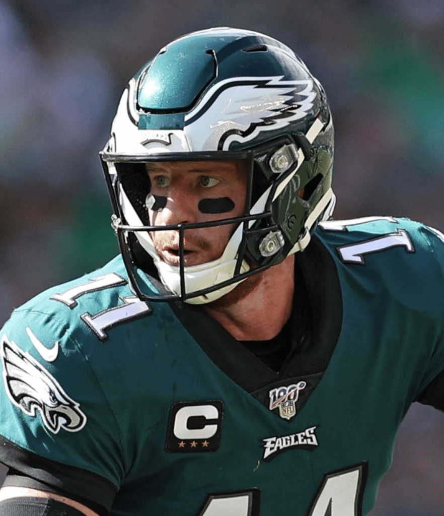
Click to enlarge
Welcome to the first MMUW of the 2019 season, where we’ll lead off with something nobody saw coming: NFL captaincy patches appear to have changed from the old version (which had four stars, with the number of gold stars indicating the number of years that the player has been a captain for that team) to the Thursday-night/Color Rash style, which just has one, two, three, or four gold stars centered under the C.
The latter style was introduced a few years ago for Color Rash games and was only used on Thursday nights until last season, when a few teams began mixing/matching. Now the entire league appears to be going with the Thursday-night style, as seen above on Eagles quarterback Carson Wentz (lots of additional examples from yesterday’s games here). Of course, it looks the same as before for players with four stars, but you can see the difference for everyone else.
This patch style switcheroo wasn’t apparent during the preseason (because nobody bothers with captaincy patches for preseason games) or in Thursday night’s Packers/Bears season opener (because those two teams don’t wear captaincy patches during the regular season), and the NFL didn’t make any announcement that I’m aware of. Interesting.
Two other notes regarding captain’s patches: First, the Falcons wore the patches yesterday. I’m told — although I haven’t confirmed this — that this is the first time they’ve ever worn them during the regular season.
And second, Washington quarterback Case Keenum had two stars, even though it’s his first year with the team:
How Case Keenum have 2 stars on his Captain patch when it’s his first year with Washington? He was a captain last year with Denver but it would be weird to roll over with a new team. @UniWatch pic.twitter.com/YtONqIzP8R
— Colin (@colmiller45) September 8, 2019
The original idea was that the gold stars would indicate how many years the player had been a captain with that team (that’s why Brett Favre only wore one gold star with the Jets, for example), but they seem to be getting sloppy about that. There were a few examples similar to Keenum last year. Really, this confusion just highlights the fact that the captaincy patches are silly and should just be scrapped.
In other news from around the league yesterday:
• The Giants wore their white pants on the road in Dallas. In recent years, they’ve always worn their grey pants on the road, even when wearing their blue jerseys. The protocol was white pants at home, grey pants on the road, irrespective of the jersey being worn. It remains to be seen whether the grey pants have been retired altogether or if they’re just freestyling now.
• This is odd: The Panthers’ “What we’re wearing today” tweet referred to “Fresh unis” but used old photos from last season, showing the old Reebok template/fabric (plus the regular NFL logo on the collar, no 25th-season patch, wrong pant design, etc). I realize the main point was to show that they’re wearing white over white, but come on — is it that hard to get some current photos, especially when they wore white over white for all four of their preseason games?
Fresh unis for gameday 👌 pic.twitter.com/BGkubIEFeG
— Carolina Panthers (@Panthers) September 8, 2019
• Patriots quarterback Tom Brady appeared to be wearing an older jersey template. The difference is most apparent in the collar — here’s Brady’s collar on the left and the collar everyone else was wearing on the right (click to enlarge):
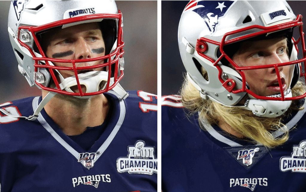
Brady wore the newer template during the preseason (and last year, for that matter), so it’s odd that he switched back last night.
Meanwhile, as you can see in those photos, the Pats wore their championship patch. That was only for last night’s game — it will not be worn for the rest of the season.
• Speaking of Pats collars, reader Kyle Shephard noticed that placekicker Stephen Gostkowski had the standard NFL logo on his collar, instead of the NFL 100 mark:
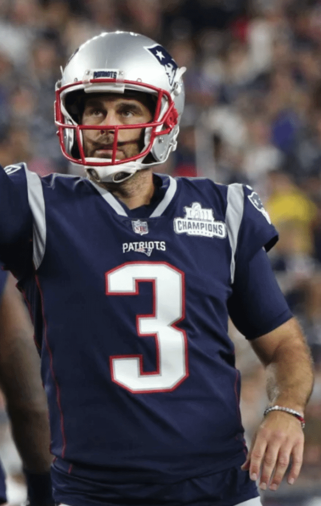
Gostkowski did have the NFL 100 mark in the Pats’ last preseason game. Hmmmm.
• Still more Pats: Our own Anthony Emerson noticed that wideout Phillip Dorsett is going RNOB this season.
Patriots wideout Philip Dorsett going with “Dorsett II” as NOB, which I think is new this season. @UniWatch @PhilHecken pic.twitter.com/xBDbr6pMpW
— Anthony Matthew Emerson🌹 (@AnthonyEmerso14) September 9, 2019
• Seahawks wide receiver DK Metcalf wore a mouthguard that looked like a baby’s pacifier:
Pacifier mouth guard for Metcalf? @UniWatch @PhilHecken pic.twitter.com/sTrYkbrDo3
— bryanwdc (@bryanwdc) September 8, 2019
• Browns wide received Odell Beckham Jr. played while wearing a very expensive wristwatch from some fancy designer I’ve never heard of (click to enlarge):
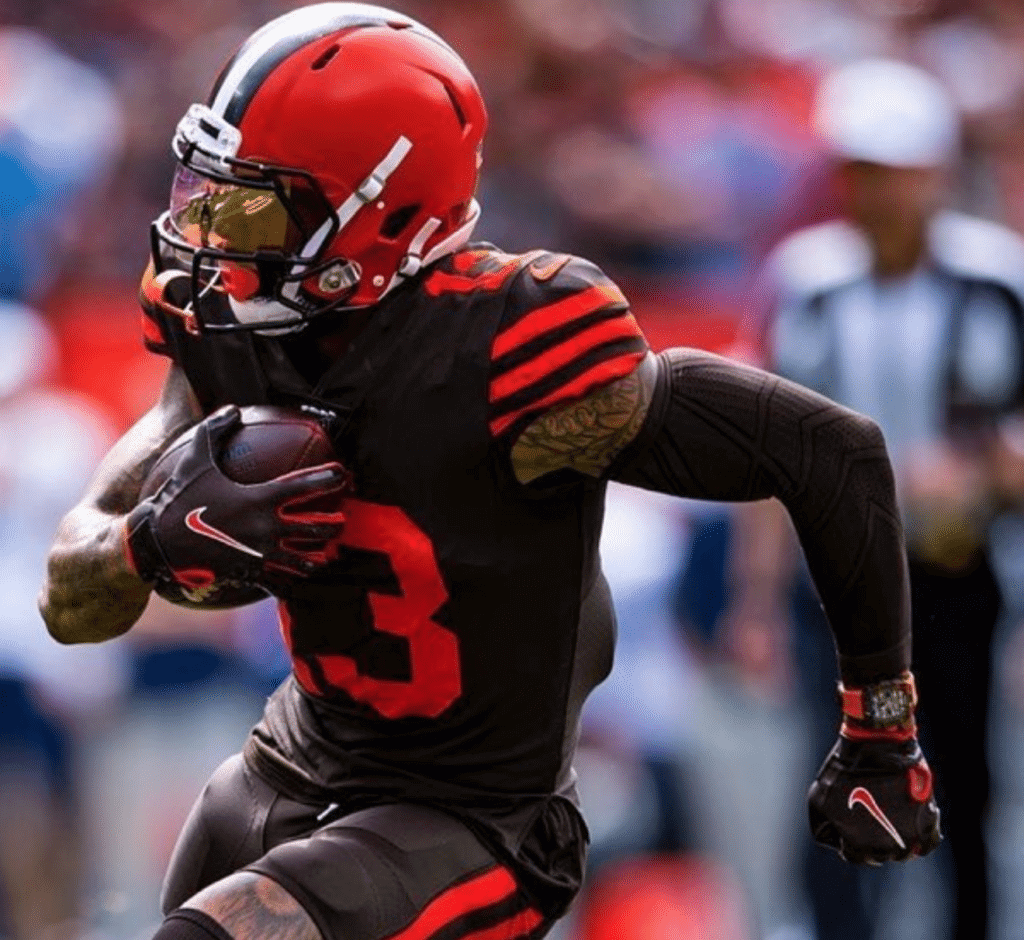
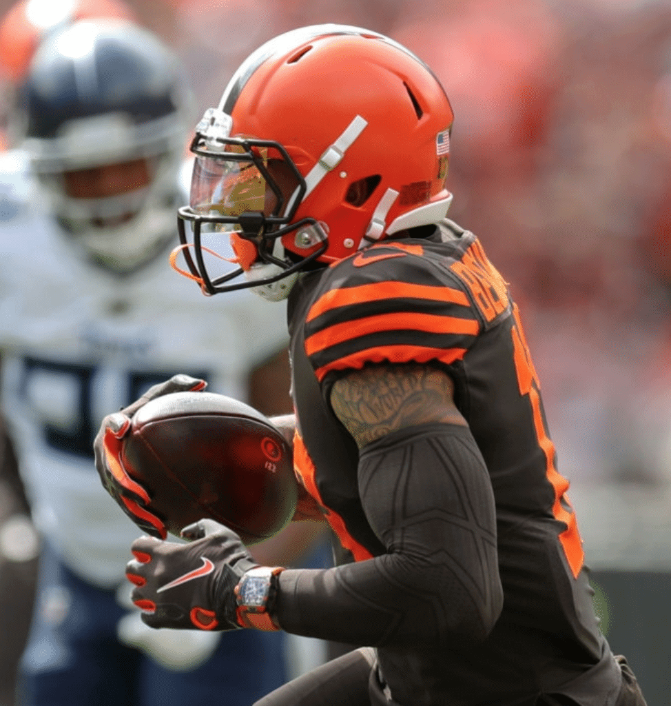
I got all sorts of breathless tweets from people asking, “Isn’t that against the rules?” and “Will he be fined?” and so on. Honestly, who cares? It’s just corporate theater combined with “Look at me” bullshit — a lose-lose. More info here, if you insist. (Of course, longtime NFL punter Reggie Roby routinely wore a watch as well, which I’m pretty sure he got for two bucks on Canal St.)
• Five teams wore white at home: the Jaguars (who as you can see also wore solid-white socks, as is allowed under the league’s new hosiery rules), Chargers (they always wear white for their home opener, at least for the last several seasons), Dolphins, Panthers, and, of course, the Cowboys.
———
The would normally be the end of MMUW. But this year, starting today, we have a new feature: I’m picking the best- and worst-looking games of the week as part of Sports Illustrated’s Monday-morning NFL coverage. You can check that out here.
Click to enlarge
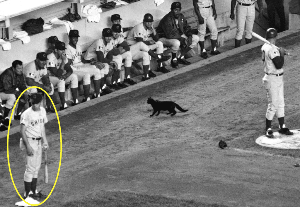
Black cat reminder: Today is the 50th anniversary of the famous Black Cat Incident, when a black kitty jinxed the 1969 Cubs by appearing in front of their dugout during a game against the Mets at Shea Stadium. In case you missed it last Friday, I’ve written an article about this incident as seen through the eyes of the Cubs’ batboy, whose story has never been told until now. It was a blast to work on, and I hope you’ll check it out here.

ITEM! Free stirrups: Want a pair of youth-size stirrups like the ones shown above? Reader Chris Burke has 14 pairs of them that he’s looking to give away, gratis (except for shipping).
If you’re interested, contact Chris directly. Thanks.
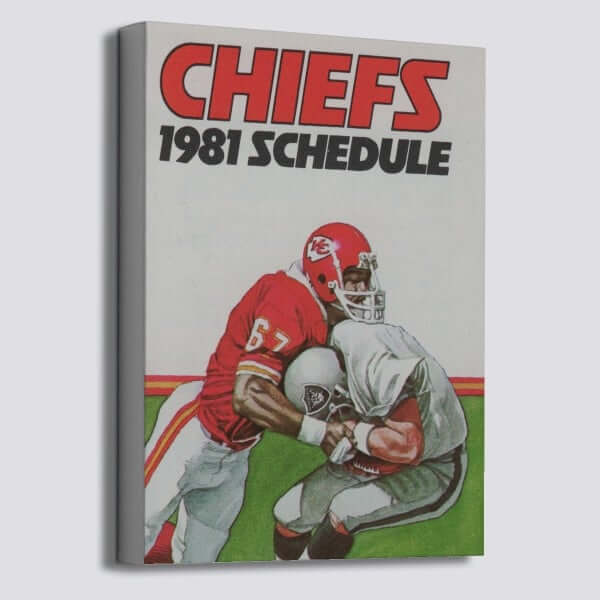
ITEM! Another Vintage Brand raffle: The folks at our longtime advertiser Vintage Brand are generously running another raffle. The lucky winner will get to choose any product from the VB website (like the Chiefs schedule canvas shown above).
To enter this raffle, send an email to the raffle address by 7pm Eastern this Thursday, Sept. 12. One entry per person. I’ll announce the winner on Friday.
In addition, Vintage Brand is currently giving away a $100 gift card every day to a random person on their mailing list. To sign up for their list and be eligible for this daily giveaway, look here.

Click to enlarge
And the purple just makes it worse: I’ve grudgingly accepted the sad reality that most businesses don’t understand the different between “login” (a noun) and “log in” (a verb). But my new health insurer seems to be unusually confused about this, coming up with three different ways to style this term. (Somehow they didn’t use the intercapped version — LogIn — but I’m sure that’s coming.)
Click to enlarge
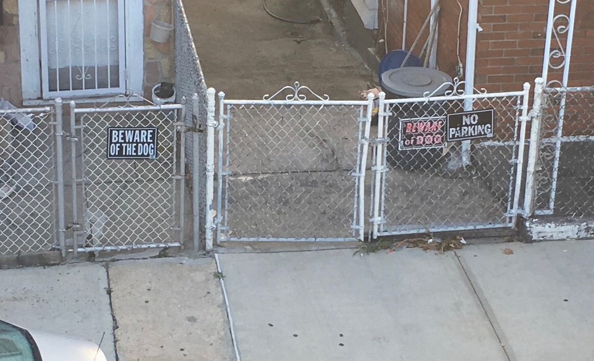
Signs of the times: When I was kid, the wording was always “Beware of Dog” (not just in real life but also in cartoons, which is probably what really reinforced that wording in my mind). But at some point they began adding the definite article — “Beware of THE Dog.” For some reason, this still seems like a seismic shift, and it throws me every time I see it. Spotted both versions side-by-side while walking through Brooklyn’s Brighton Beach neighborhood on Saturday.
The Ticker
By Jamie Rathjen

Baseball News: The Reds wore their latest throwbacks yesterday. This design was from 1995. You can get a good sense of how they looked on the field by watching the video at the top of this page. Looks like the NOB lettering was larger than it was back in 1995 (from Christopher Schlueter).

Football News: The Browns still have beer cups with their previous logo, presumably because they haven’t run out yet (from Jonathan Dies). … Florida State added captaincy patches this weekend after not having them last weekend (from @justbroc_). … Purdue added “Forever Our Captain” on their helmet stripe for Tyler Trent, a Purdue student and superfan who passed away from cancer earlier this year (from Blaise D’Sylva). … Looks like California LB Evan Weaver had a covered-up college CFB150 patch (from John Furstenthal). … You can see some Canadian college uni-tracking from Wade Heidt in yesterday’s comments.

Hockey News: Multiple readers told us that the Flyers now have one large center-ice logo, instead of two small ones, for the first time in team history. This means the practice of double center-ice logos is now no more in the NHL. … Lots of new themed jerseys for the SPHL’s Peoria Rivermen (from Mike Lucia).

Basketball News: 76ers PF Mike Scott is reportedly saying that the NBA has banned the “Ninja”-style headband (from Aaron Pinto). … During Saturday’s Iowa/Rutgers football game, it was mentioned that Iowa’s No. 22, which is retired for G Bill Seaberg, will be worn by freshman PF Patrick McCaffery — it’s a number significant to McCaffery — with Seaberg’s permission.

Soccer News: There were some outstanding kits in the lower levels of CONCACAF’s Nations League this weekend, including Anguilla’s (in orange) shirt with numbers surrounded by dolphins, like in their crest — note also the manufacturer-mismatched blue Adidas socks — and Bonaire’s orange and blue diagonal halves. … Tanzania played a World Cup qualifier against Burundi yesterday. Some players wore TNOB and some wore NNOB (from Brennan Casey). … The next three are from Josh Hinton: Portugal now have a winners patch for UEFA’s Nations League. … There are new kits for the unofficial Catalonian national team, which plays infrequently (only five times since the end of 2011). … Peru’s Alianza Lima released a purple third kit. Germán Cabrejo tells us that Alianza’s colors change from blue and white to purple and white in October as a homage to Lima’s Señor de los Milagros. … You can see more on Josh’s Twitter feed. … Reader Chuck Nolan, Jr. asks us if any teams have multi-colored stripes like Botswana, while referring to Catalonia’s kits above. If we’re counting Catalonia’s gradient stripes, then yes, most teams with stripes or hoops have added gradients, even faint ones, or some other pattern to their stripes at some point. Stripes that are truly more than one color are rarer, but can be seen, for example, on Crystal Palace’s sash shirts and a few others. … New third kit for Inter Milan. “The design was inspired by Pirelli’s logo and involvement in racing, as they have been a longtime advertiser for the club,” says Josh Hinton.

Grab Bag: A Tennessee fan at a Florida elementary school wanted to participate in his school’s college colors day, but didn’t have a Tennessee shirt, so he attached a hand-drawn “U. of T.” to the front of an orange shirt. After he was bullied for his efforts, the university now is going to sell a reproduction of his shirt (from Bryan Martin Firvida and Kary Klismet). … While Odell Beckham wearing a watch yesterday piqued a lot of readers’ interest, it is relatively common in field hockey. Clear examples just in NCAA games this weekend included players on UMass Lowell, La Salle, Appalachian State, and Monmouth and Villanova. … Canada’s rugby union team changed to black in a Rugby World Cup warm-up game against the U.S., probably to show it off at home, as it was unnecessary becuase white is first choice for the Americans (from Wade Heidt). … Speaking of rugby union: New kits for Italian side Zebre (from Ed Zelaski).

Click to enlarge

What Paul did last night yesterday: If you think I’m spending a gorgeous September Sunday watching football (or baseball, for that matter), you’re out of your freaking gourd. Instead, the Tugboat Captain and I gathered our friends Chris and Cheryl and headed off to our favorite waterside seafood joint for some oysters, crabs, calamari, and more, followed by drinks at a nearby marina bar:
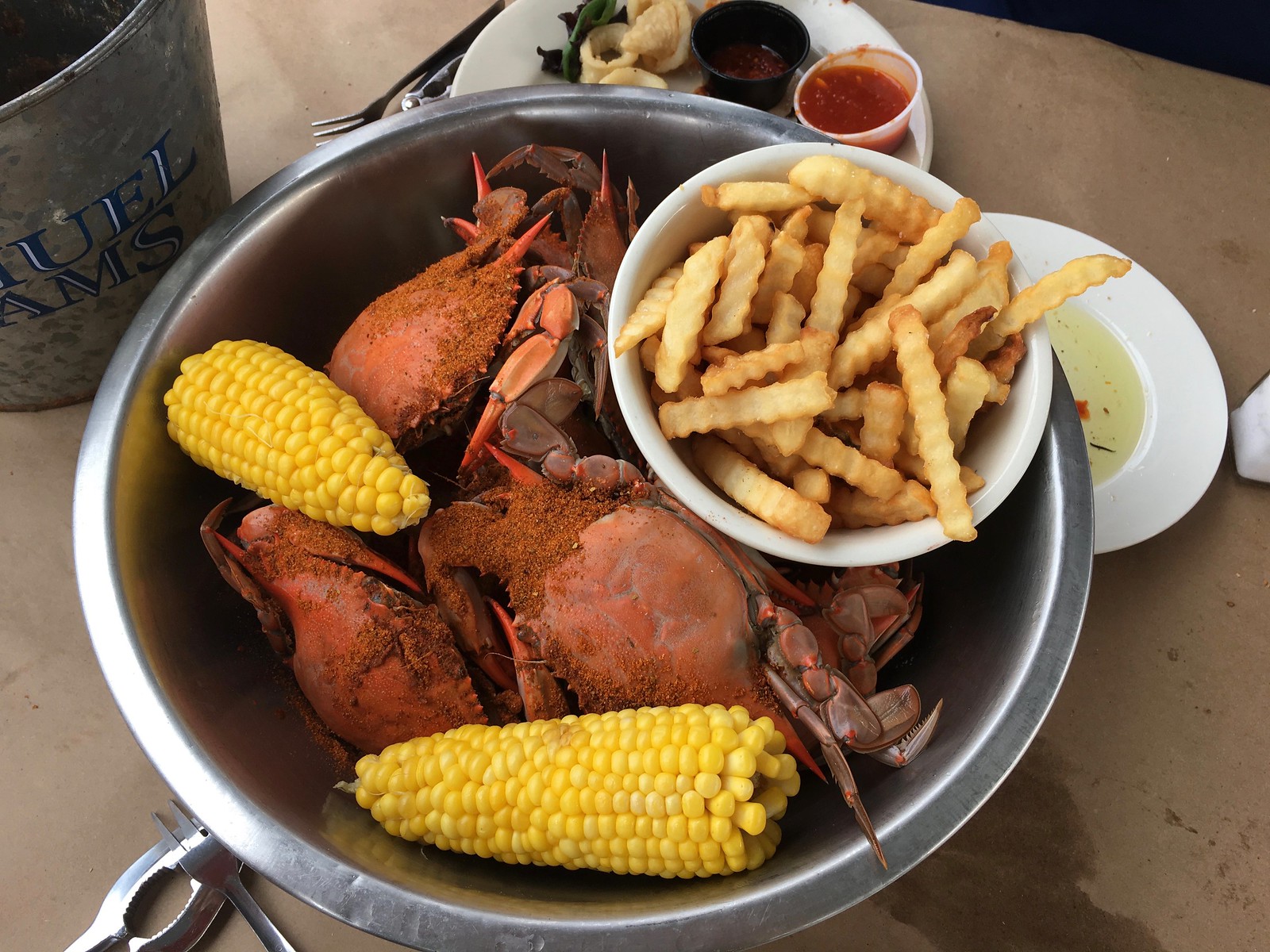
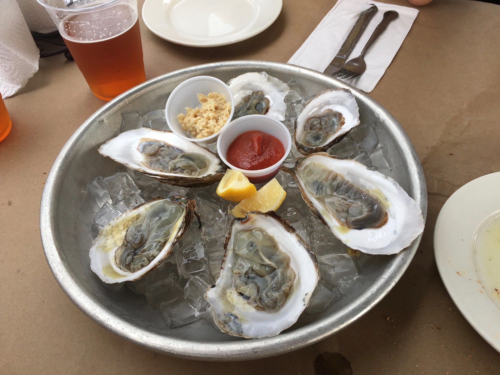


Now, the sad truth of the matter is that the restaurant we went to has been going downhill in recent years, and this was confirmed by our meal. The crabs were watery, the calamari rubbery. Still, there’s something so nice about eating alongside the water (two egrets came by and perched on the nearby dock!), and there aren’t many places in NYC where you can do that. Throw in some good company and a few pitchers of beer and you have an excellent afternoon, even with the substandard chow. Hope your Sunday was a good one as well!
the cowboys wearing white at home doesn’t count in the list of teams wearing white at home anymore?
Oops — rusty. Will fix!
Also seems like the Bengals wore solid white socks too.
I don’t remember if the Reds jerseys from 1995 had such large NOB lettering as depicted in their throwbacks this weekend. Also seemed like several players wore their usual red undershirts and not the ones with the wishbone C.
Looks like the original NOB lettering was large, but not as large as yesterday’s throwback NOBs:
link
I’ll add that to the Ticker item.
Paul, when would you estimate the start of baseball’s baggy pants era to be? 1999? 2000? And who do you think pioneered this style?
It came to mind when I saw the item about the Reds’ ‘95 throwbacks. They’re the first ones this season that come from the low pants/no stirrups era, but before pants got really baggy. Which made me then realize that the current style has been around for (gulp) 20 years!
I think of Manny Ramirez of the true *baggy* pioneer (but not the low-cuff/pajama pioneer).
I seem to racall the MLB actually fining Derek Bell – then of Houston – for wearing what was then thought of as extremely low, baggy pants.
So if my memory is correct, no one else was as draggy & baggy as him at the time.
Actually, I recall this happening when Bell was with the Mets, late in the 2000 season. He said it was his “hip-hop look.” I don’t recall him being fined — just told to stop.
But I still thought Manny did it first.
Update: It appears it was actually *early* in the 2000 season. No mention of a fine, at least that I can find — just a prohibition.
Couldn’t find a full-body photo, but I believe this is the baggy jersey:
link
I recall Bell pointing out he wore a jersey two sizes too big to get that look. The pants just followed suit.
In our CT home (which includes one Worcester-raised wife) they’ve been called “Manny jammies” ever since.
Beckham’s watch looks similar to the one Nadal was wearing last night at the US Open…no big deal, just a $725K Richard Mille Watch
link
Yeah, Richard Milles seem to be especially popular with the pro athlete set. Nadal’s worn one while playing for a while.
I am not sure if you have covered this, and sorry if it is a repeat, but Nike has announced the jerseys esports LPL, League of Legends Pro League, in China. There will be 16 teams wearing the Nike sponsored jerseys.
link
Brady is definitely wearing an older jersey. The TV numbers are considerably larger than the ones on the new template.
End of an era. I miss the double-centre ice logos in the NHL, but have excepted its drawn-out demise. So generic now. Was more fun when there was a little more variety for logos on the ice sufaces, like in the 1970s and 1980s.
Philly is my team, and scrolling through Flyers Twitter yesterday, so many people seem to think the giant logo at centre ice is the bee’s knees. Personally, I think it looks terrible. Why does the logo have to be bisected? NFL teams don’t ruin their midfield logos by running the midfield stripe through them! You’d think referees could eyeball where to drop the puck at centre ice without the dot actually being there.
Brain-fart moment – I guess the line is still needed for icing calls, but it’s not very aesthetically pleasing, when it chops a logo in half!
I didn’t think the double-logo style looked great for teams with circular logos, but it looked awesome for the Habs and Flyers with their more elongated logos. I specifically would like the Habs to go back to 2x logos.
Minnesota and Nashville would also benefit from the double-logo treatment. Nothing can help Anaheim’s gross logo even though it is rectangular-ish.
Speaking of circular logos, remember how the Edmonton Oilers had it in the 1980s? Was unique. The 2 logos outside of the faceoff circle. Can be seen here around the minute and 30-sec mark:
link
The design at the old Northlands Coliseum always stood out. As a Flyers fan coming of age in the 1980s, I associate that unique design with bad memories of Stanley Cup Finals losses.
Hi Paul,
I’m pretty sure the Panthers wore white at home as well.
All the best!
You’re right! Will fix.
IIRC, Reggie Roby wore the watch so he could keep track of the opposing punter’s hang time.
tiny tv numbers on McCaffrey’s jersey not a great look: link
Great story about the boy’s self-made Tennessee shirt!
Most of the field hockey players appear to be wearing smartwatches of one kind or another. I wonder if there’s some purpose to that (communicating, keeping track of distance travelled and speed, etc.?)
I actually don’t know. It could also be to keep track of the match time in the absence of a scoreboard that does so.
I just assumed the “Beware of the Dog” sign was used because the dog’s owner is an OSU (Columbus) fan!
COTD.
…or a Hound Dog Taylor fan — link
No joke: I was playing Hound Dog on the turntable just yesterday!
Portugal also changed their Euro 2016 winners chest patch to a new sleeve variant (a little like UEFA Champions League winners get a different sleeve patch from the usual starball
Old: link
New: link
Hey Paul, I noticed an ordinal/anniversary error in your SI story. The line is “with the NFL kicking off its 100th-anniversary season,” but this year is the NFL’s 100th season. The league was founded in 1920, so next year is the anniversary.
Ah, good catch! It’s a little after the fact, since the article came out almost a week ago, but I’ll see if I can get my editor to change it.
I meant the recap that came out today. There’s still time!! Haha
Oh — yes, now I see. OK, will try to address!
I’ve grudgingly accepted the sad reality that most businesses don’t understand the different between “login” (a noun) and “log in” (a verb).
Tangent: I’m trying to make peace with the many businesses whose “E-mail us” page doesn’t have an email address, but a box where you put in your message.
PS The Anguilla dolphin jersey is great!
Often alternate spellings on a webpage are intentional so that someone searching for either term find the page. It’s a search engine optimization trick.
Hey, Paul. How can you pick best/worst of week before week is up?
Linguistic license. It’s true that the Monday-night games are excluded (just like they’re excluded from all the other weekly roundups that are appearing today). Such is life.
What the Flyers center ice logo needs are a row of Grittys in the red line in place of the middle line.
Not noted here, but a pretty significant tradition in the NFL was upended on this past Sunday when the Buccaneers wore their ‘dark’ jersey option in their home opener.
The last time they made such a choice was on Sept 4, 1988, meaning that for 30 straight seasons, Tampa Bay wore white in their home opener.
Anyone heard anything as why they made this decision?
Lee
Oooh, that’s good, Lee — thanks for noting that!
I’ve asked the Bucs about it. Will advise.
I thought nothing could top the Browns’ ugly ass unis … until I saw their end zones. Oy.
I actually think certain aspects of the Browns normal brown, orange and white jerseys look decent. And the unis from the late 70s early 80s with the orange pants.
But my goodness, those duds they wore yesterday may be the worst NFL uniform of all time. Horrible.
I noticed the Reds pitchers were allowed to work wearing (mostly) white hats. Would it have been all that big a deal during the Players’ Weekend games? Oh right, I just remembered those uniforms were garbage anyway.
The Chargers would look better with gold socks to match the gold facemasks when they go white on white. The navy socks looked out of place, in my opinion.
The Jets appear to have taken the initiative and introduced Gotham Green into their color scheme. It’s close enough to the Eagles’ old livery as to make watching my boys continue to wear their incredibility boring Mrs. Lurie Green uniforms a nearly Herculean task. Please…sometime before I put my cue back in the rack…go back to your true colors.
Per the NFL rules, “all players must be in the same stocking style and color in any particular game.”
The Dallas Cowboys seemed to be all over the map on Sunday. Some were wearing solid white others sold blue and some had the usual white with blue tops.
The Jaguars wearing white socks/stockings, wasn’t that part of their alternate all white Color Rush jerseys? Last year they did the same with the all blacks in London vs Philadelphia.
I don’t know how you do it Paul, with all the varieties of socks and leggings contrary to the official but unenforced rules. I’ve been reading for years. Keep it going :)
The Jaguars wearing white socks/stockings, wasn’t that part of their alternate all white Color Rush jerseys?
You mean their Color Rush UNIFORMS, don’t you? (It confounds me that so many people now say “jersey” when referring to the full uniform.)
Anyway: As noted in my NFL Season Preview, sock rule has been changed. Teams can now wear solid-colored-stockings whenever they like.
My mistake on the jersey/uniform thing. I should be more specific with wording. It must bug you to high heaven.
Ditto on the Saints tonight. Entire team wearing black leggings, no white on the legs at all as far as I can see.
I’m thinking the Saints have new turf, it doesn’t look so bad tonight.
In addition, I’ve always thought the stands look very dark in the Superdome, giving it a somewhat disquieting/impersonal look to the the place. ESPN seems to be making a conscious effort to dispel that, showing the stands from many angles
I kind of liked Cleveland Browns end zone. The Jets shade of green, didn’t look that unique, it basically looks similar to Celtic green.