In a move that had been teased, hinted at, and widely expected, the Browns announced yesterday that the NFL had granted their request to wear their Color Rash uni as their primary colored look this season.
A few thoughts on this:
• The Browns originally asked the league about this way back in April. Did the league really wait until the opening week of the season to get back to them? Or have the Browns known about this for several months and waited until now to tell us about it? (I asked a Browns spokesman about the status of the request two weeks ago, when I was working on my NFL preview, but got no response.) Whatever the answer is, I’m sure it has nothing whatsoever to do with the team’s desire to sell a few more months’ worth of the remaining stock of the original primary brown jersey, which is now obsolete.
• I totally get why Browns fans like the Rash jersey better than a jersey with high school-style chest lettering and embarrassing top-stitching that supposedly represented Cleveland’s blue collar work ethic (or whatever the tortured rationale supposedly was). Similarly, I can also understand why Browns fans — or any sentient human — would prefer the Rash pants over pants with a big, honking wordmark on the side.
That said, however, I do not understand the apparent affection for the full-on Rash uni. Part of it is that I don’t care for mono-color football uniforms, but the bigger part is the brown-on-brown looks awful and a half. Mono-turd? Honestly, I think I’d rather see the Rash jersey with the regular white pants, big honking wordmark and all.
• Speaking of which: When they wear the non-Rash white jersey, will they pair it with the Rash pants? That would definitely be an improvement over this.
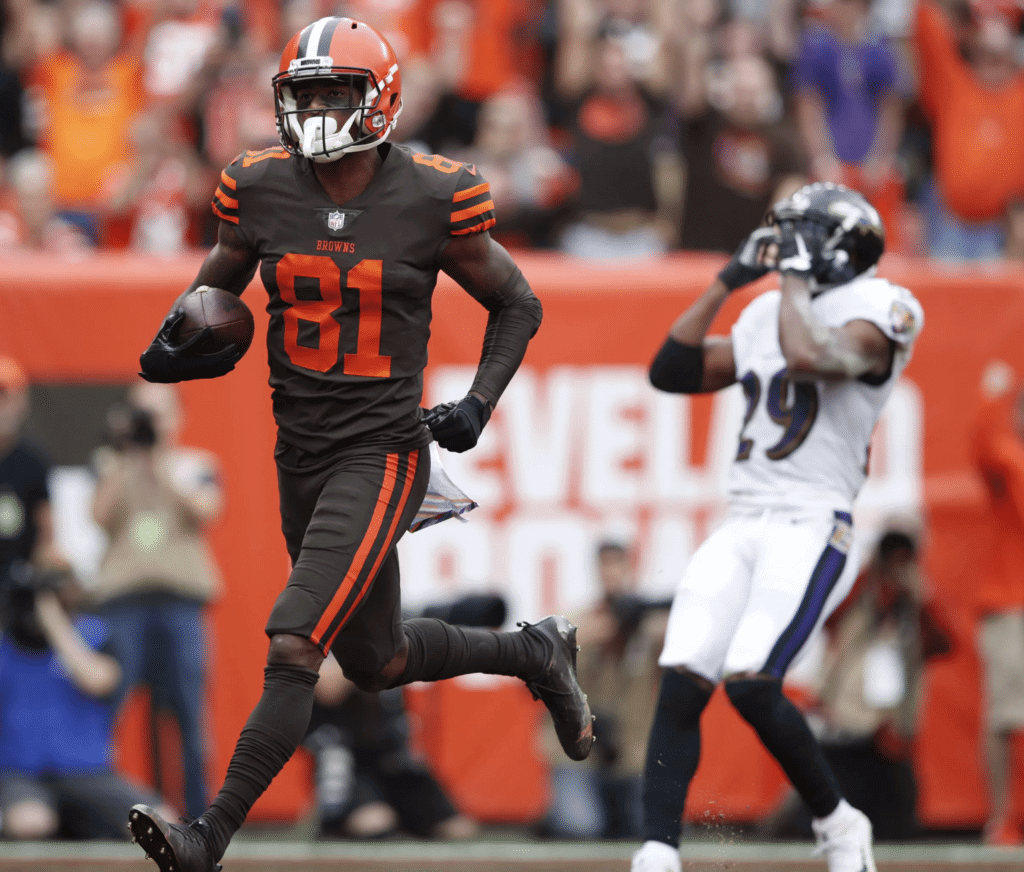
• It’s also worth noting that the Browns won’t necessarily wear brown socks with the brown jerseys and pants — they might wear orange socks (or, conceivably, white). Or at least that’s the possibility suggested by this photo that they posted yesterday:
The orange hose help to mitigate the full-on turd effect, but it’s still too much brown for my tastes.
• Let’s take a moment to appreciate the genuinely amazing announcement of all this on the Browns’ website, written by one Andrew Gribble, Senior Writer. It’s so good, I have to share the entire piece with you, including the headline:
From Color Rush to Primary Colors, Browns to regularly wear popular uniforms in 2019
Some of the Browns’ best moments from the 2018 season came when the team donned its popular Color Rush uniforms. That wasn’t lost on Browns players, coaches or the thousands of fans who scooped them up whenever and wherever they became available.
In 2019, Color Rush is no more. Instead, the popular uniform that features brown jerseys with orange numbers and orange stripes and brown pants with those same orange stripes will be the Browns’ Primary Colors presented by Sherwin-Williams.
After petitioning the NFL, the Browns have been granted approval to switch their Color Rush designated uniforms to primary uniforms. To kick things off the right way, the Browns will wear their Primary Colors on Sunday in the season opener against the Tennessee Titans.
Stay tuned for a full, week-by-week breakdown of when and where the Browns will wear their Primary Colors in 2019.
Gee, ya think Andrew mentioned “Primary Colors” often enough? But tsk-tsk — only one mention of the full “Primary Colors Presented by Sherwin-Williams.” S-W’s not gonna like that.
Can you believe this shit?
Click to enlarge
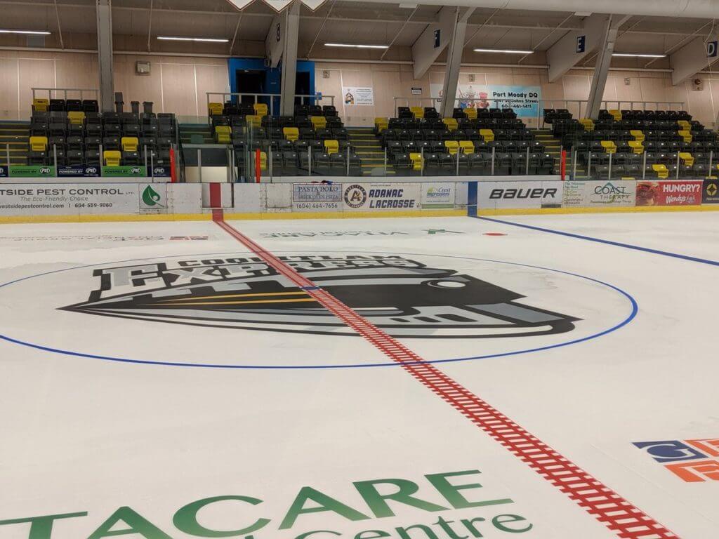
Track marks: There are so many custom-designed red lines in hockey nowadays, but I don’t think I’ve seen one as good as the railroad track pattern being used by the BCHL’s Coquitlam Express, a Junior “A” team in British Columbia. So simple, so good!
(Big thanks to Jim Wooley for this one.)
Click to enlarge
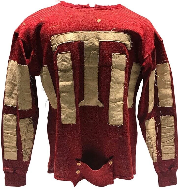
Object lessons: Oh man, how great is that jersey? It’s an Ironton Tanks jersey from 1920, and it’s part of a slideshow of artifacts from the Pro Football Hall of Fame that help tell the story of the NFL’s first hundred years. You can see the whole slideshow here (WaPo link) — recommended.
Click to enlarge
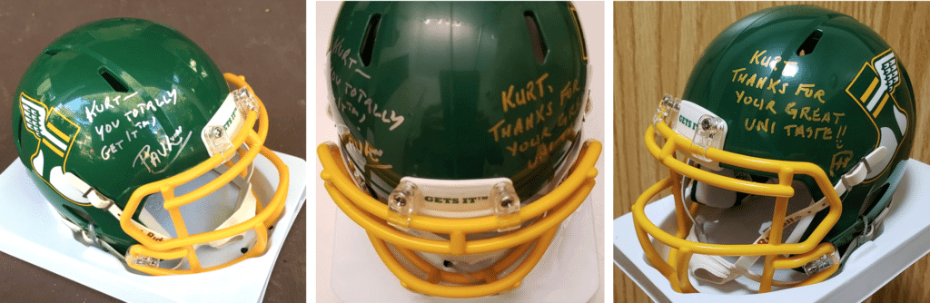
Mini-helmet update: Phil has now added his signature to reader Kurt Sutton’s helmet, which I had signed the day before. Kurt’s helmet is now on his way to him — enjoy!
You can get your own mini-helmet — with or without our signatures — here.
The Ticker
By Paul

’Skins Watch: An Ohio high school whose sports teams are called the Redskins was vandalized by people who apparently want the team name to be changed (from David Sonny).
.

Baseball News: The Braves will wear red “Los Bravos” jerseys tomorrow night (from Austin Perry). … Mets reliever Seth Lugo pitched a full inning with his jock tag exposed the other night.
.

Pro Football News: Here’s something that wasn’t covered in my NFL Season Preview: The Chiefs have now decided to wear their 60th-season logo as a helmet decal. A team spokesman had told me last week that this was possible but not yet definite. … Here’s the logo for the Super Bowl LV host committee (from @Balden303). … I still call it Mile High. … Bills DL Ed Oliver wore a T-shirt with “Chip” printed on the shoulder, I guess to show how badass he is or something simlarly eye-roll-y. I’ll give a dollar to whoever sneaks up behind him with a Sharpie and writes “Chocolate” or “Micro” or “Abandon” on there (blame @MrMichael21). … The Antonio Brown helmet soap opera appears to have finally reached a conclusion, but I suspect we may see reruns in syndication. … Noah Sidel reports that the CFL’s Montreal Alouettes have been promoting green throwback jerseys for the past week, although it’s unclear whether they actually plan to wear them tomorrow.
College Football News: This guide to college football fight songs is pretty great (from The Tugboat Captain). … Interesting article about USC’s use of the same uni numbers by multiple players (from Rick Loomis). … Here’s a bunch of new info on South Carolina’s “Black Magic” alternate. … Here are this week’s uniforms for Nevada, Washington State, Vanderbilt, and Virginia. Note that the UVA tweet refers to a “jersey combo,” which is an oxymoron (from Zach Simms, our own Jamie Rathjen, and Phil). … Penn State will wear “Thon” stickers decals to support pediatric cancer awareness this weekend (thanks, Phil).

Hockey News: The AHL’s Colorado Eagles will unveil a new alternate jersey on Sept. 23 (from Zeke Perez). … Here are some thoughts on what a new Penguins alternate uni should look like. … If you’ve been waiting for a limited-edition Alex Ovechkin breakfast cereal, today’s your lucky day (from Max Weintraub). … Here’s a nice case of a facility reverting to a non-corporate name: The Prospera Centre in Chilliwack, British Columbia, which is home to the BCHL’s Chilliwack Chiefs, will now be called the Chilliwack Coliseum (from Jim Wooley).

NBA News: Good: With the Warriors decamping for San Francisco, Oracle Arena is is going back to being Oakland Arena (rare non-UNC item from James Gilbert). … Here’s a good look at what appears to be the Warriors’ new throwback.

College Hoops News: New yellow uniforms for South Dakota State (from Nick Hartness). … New uniforms for Notre Dame women’s. “They’re using campus imagery for their shorts design this year,” notes Julie Streeter.

Soccer News: New 150th-anniversary kit for Scottish club Kilmarnock (from Denis Hurley). … Two items from our own Jamie Rathjen, both concerning English women’s teams: Tottenham released their player numbers for this season, and new second-tier team London City Lionesses’ first-ever kit is mono-white and appears to be ad-free. “Haven’t seen pictures of the second kit except in black and white (it’s dark-colored, probably dark blue), but it would only be needed against one other team in the league,” says Jamie. … As usual, you can keep up on additional soccer uni developments by checking out Josh Hinton’s Twitter feed.

Grab Bag: An internet conspiracy theory posits that New York Gov. Andrew Cuomo rigged the vote (NYT link) to select the state’s new license plate design. … Tennis pro Mike Bryan was fined $10K for pretending to shoot a U.S. Open line judge with his racket (from @wahlbergLines). … Interesting look at the history of American prison uniforms. … Here’s a piece on the history of BMW’s logo. … We’ve seen lots of logo mash-ups for all of a city’s teams, but how about a mash-up tattoo? (From Ryan Redbeard.)
Friendly reminder: I’m still accepting questions for the next round of Question Time, the AMA-style segment where you get to submit questions to me and I do my best to answer. If you’d like to submit a question, send it here One question per person, on any topic. Thanks.
The Browns now have the best uniforms in the NFL. Fight me.
The affinity for the Browns’ Color Rash Art is mostly a case of “mediocre is better than awful”. So it is a step in the right direction, only because what they had was just awful. A perfect solution would have included non-brown pants (white or orange, your pick) and some white stripes on the sleeves but if the choices are the CR jersey or the previous primaries, I’m more OK with the CR as it is.
*Color Rash set… stupid autocorrect
Browns fan – can confirm you’re 100% spot on.
the affinity for the color rush is that it was the jersey they wore when they broke their winless streak and that they are a cleaner look than current set
Good point.
I don’t understand why the Brown haven’t made an attempt to fix the pants. The Rams made an adjustment to their pants prior to next year’s new unis, but the Browns, despite apparently having the ability to make this change, continue to stick with these embarrassing pants.
That’s what I don’t get either. The white pants would be much improved by removing the BROWNS and extending the stripe to the knee. Why wouldn’t this change be allowed? Even if the Browns did make that change, I can’t imagine it would reset the 5 year clock before a team can get new jerseys.
Yeah, I was thinking the same thing. The 5 year rule apparently only applies to the jersey, so no reason they couldn’t roll out new white pants to pair with their alternate brown jersey that is now the primary. Simple solution for next year is go back to the traditional set (wasn’t broke, so don’t fix it). If you change anything just put the player numbers on the helmet.
Yep, I agree. Go back to the original uniforms and keep the color rash as is. Everyone is happy.
I’m not a fan of the color rash crap, but it’s popular, so let that stay.
Teams need to stop making changes for the sake of making change. Jaguars, Vikings, Falcons, Rams, Browns, Buccaneers, Dolphins, Bengals, and Cardinals all need to go to their previous (or before their previous) uniform sets. No improvement in any of these current iterations.
The Vikings current jersey isn’t too bad, other than the numbers, but it’s not nearly as nice as the two styles they wore prior to 2006.
God forbid they ever wear the Adrian Peterson era monstrosities again.
also Seahawks, Eagles, Lions. but no one more urgently than the Falcons. that clown suit has to go!
Cardinals too.
I’d say the Bucs are worse than the Falcons.
The train track red line is awesome!
It is totally illegal though since the edges are not continuous, but I imagine at that level they might not care.
Not been an issue with the league. Coquitlam Express have been using the train track red line for a number of years. I went out to the ‘burbs for an Express game a few years back and it was on the ice. I too thought it was clever the way it ties in with the team logo and identity.
I was thinking this. What constitutes the edge of the line in the case of an icing call?
Looks like that should be Archbold Stadium, rather than Archibold. Talk about naming wrongs!
Ay yi yi — you’re right! Will fix.
As a die hard Browns fan I wholeheartedly support the move to go full mono-turd this year- even though I typically CANNOT STAND monocolored uniforms AT ALL.
This case though, is a lesser of two evils situation. As Paul pointed out, the high school, cross stitching, and BROWNS down the pants leg is just too much shitty uniform for me to take.
I liked Paul’s suggestion of rash jersey with white pants, but again, our pants are so freakin’ ridiculous that I cannot support that- unless they break out some white version of the color rash brown pants.
Either way, Thank GOD that this is the last year until Nike (probably fucks it up again) changes our unis for 2020.
I know Browns fans are somewhat divided on this subject, but the alt uni would look so much better with orange pants w brown stripes, or solid orange. I hate mono unis, but BROWN mono unis are puke-central.
came here to note the Archbold gaffe, but Gordon Blau already got to that, but…
I’ll stay to note that the piece on the college fight songs is my favorite thing to discover on the net in years. I might not get any work today — sorry, boss!
Re: fight songs.
Evidently, the writer never heard of Harvard:
Fight fiercely, Harvard
fight, fight, fight!
Demonstrate to them our skill
Albeit they possess the might
Nonetheless we have the will
How we shall celebrate our victory
We shall invite the whole team up for tea
(How jolly!)
Hurl that spheroid down the field, and
Fight, fight, fight!
Another thing: a lot of the Ivy League schools have more than one fight song. Harvard keeps about 11 or 12 in rotation depending on the year.
Looks like the FCS as a whole didn’t make the website. I was a little sad when I made that discovery.
Browns fan here – I actually like the Color Rush set. Nobody else in the league wears brown, and this combo looks good together. It’s a simple, classic design.
(But I understand people that don’t like all the brown. I just disagree with them.)
Regarding the Twitter posting from the Alouettes. The coaches, players and sideline staff for all CFL teams are wearing retro caps and shirts this week. They did so for last week as well.
link
Alouettes likely just promoting the gear as they are wearing the “French Horn” logo on the sidelines this week. They wore the green jerseys back when they wore this logo. So there will be a little bit of green on the sidelines but the primary colours for caps and shirt still blue and red.
Last week, though the teams wore throwback sideline gear, not all teams wore matching throwback on the field. I would be surprised to see the Alouettes wear the green jersey, as CFL is one-shell now and the Als have a navy helmet. Just would not work.
Much like the Jaguars original unis, the Browns should have never messed with a classic. The same basic set they used from decades was perfect. Although, I did never like the orange pants, brown were always better. This is a small upgrade over their current set, it just needs white pants for some contrast, maybe a white outline of the numbers or just white numbers in general, a white stripe between the orange sleeve stripes, and some striped white socks…….oh wait…..that’s just their old uniforms. So go back to those.
< 5 and done, how fitting. White pants with traditional stripes, and the revised look would be good.
Is it *truly* monochrome if the helmet is a different color? And socks? In the lead picture – the Ravens are wearing all white – is that so bad too?
Also, why is it only football uniforms that are criticized for being “monochrome”. Basketball uniforms all have the same colored tops & bottoms – same with MLB and a lot of NHL uniforms. Just seems like an arbitrary and tired argument to keep making over and over and over again…
Different sports have different cultures, histories, traditions, and norms. A red football jersey with white pants tends to look good to us; a red basketball jersey with white shorts does not. Wouldn’t you agree?
If you *don’t* agree, that’s fine, but I’d say that makes you an outlier. Now, there’s nothing wrong with being an outlier, but it does mean you have to accept that most other people will feel differently, even if you find their reasoning “arbitrary and tired.” Instead of lobbing blanket insults like that, and instead of making apples/oranges comparisons between disparate sports that have nothing in common, I suggest either (a) making a more rational, well-reasoned argument in support of your position, or (b) accepting the fact that you are an outlier.
Of course I know that traditions, cultures, etc. influence our preferences, but there is no reason for me to believe that a red basketball jersey with white shorts inherently looks bad. Just because that’s not typically what we see? That’s a relatively closed-minded approach – I’d have to see the jersey and shorts in question before I blindly assume anything.
Of course everyone has their preferences, but I think to assume I’m an outlier is an unfounded conclusion. You have no concrete proof that I’m an outlier in this argument just like I have no proof that you’re an outlier. But I’d argue that even if you’re speaking anecdotally (or even if you poll your followers), you’ve likely heard more people opposed to “monochrome” uniforms because you’re drawing heavily from a sample of like-minded uniform aficionados who are disproportionately in favor of traditionalist designs. Again, I’ll admit that’s pure speculation, so I guess we’ll never know until we survey every single person who watched an NFL game where they saw an equal amount of “monochrome” and “traditional” uniform combos….
And for the record – I am one of those traditionalists – I just think that it’s an interesting phenomenon that there isn’t a common thread between sports and the only answer to it is essentially “well, that’s the way it’s always been, so that’s what looks best!”
Also since when is “arbitrary and tired” an insult? Seems more to me like a criticism, but I apologize if that offended you…
Forgive me for mistaking a criticism for an insult. I’ll certainly never make that mistake again.
Anyhoo, back here on planet Earth, most people understand that trying to compare a basketball uniform to a football uniform, or trying to base an argument on that comparison, doesn’t make much sense, just like comparing a man’s suit to a woman’s dress doesn’t make much sense. That’s the primary point I was trying to make.
Getting back to the issue at hand: I think pairing a brown football jersey with brown pants, irrespective of the helmet or sock colors, looks like crap (semi-literally). I also tend to dislike solid-colored football uniforms in general — not for “tired” or “arbitrary” reasons but because, as I have explained many times over many years, they tend to look more like one-piece superhero costumes, an effect that’s accentuated by the shoulder pads and the helmet, neither of which is found in other sports. Which reinforces the point of why it makes no sense to compare one sport’s uniforms to another.
I hope this explains my point of view more clearly. I also hope we can now put this ridiculous discussion to bed. Let’s please move on. Thanks.
You mean a more rational, well reasoned argument than “this looks like a turd”?
In any case if you have some non-anecodtal evidence that there is some majority of people don’t like monochrome football unis, I’d like to see that.
Here’s one for ya:
White baseball jersey with red pants is gorgeous.
Red baseball jersey with white pants is an abomination.
I’m still trying to figure that one out.
Here’s another. Pinstripes, on jerseys and matching pants look great in baseball. Pinstripes on baseball hats are a bad idea. They’re not used at all in football or hockey And have never looked good in basketball. Different sports, different aesthetics.
Good point by Paul, one I hadn’t thought of before (that this might be unique to football). For me, the only sport I dislike seeing mono-color jersey/pant combos is football for some reason. For me, it doesn’t matter if the helmet is same or different colored. I still dislike it.
As a Browns fan, the color rush (or what not) jerseys mean more than the normal jerseys. Not because they look better by default, but because they wore those jerseys when 1) they snapped their loosing streak and beat the Jets and 2) it heralded the arrival of Baker Mayfield as their franchise QB. By Browns standards, those were ‘historical’ events. You also combine that with the Browns painting the end zones in old-school style brown and orange stripes and their new head coach saying, “if you don’t wear brown and orange, you don’t matter” and BOOM – that’s a perfect storm.
now this guy GETS IT!
Funny how that works… The Colorado Rockies wore their hideous black vests on a magical run to the World Series in 2007… Easily their worst uniform look ever. But because of that connection, they can never be tossed in the trash bin of history.
look at the Pats.. they have won all those games in that hideous set and because of it they probably wont change for a long time
that and Cowboys.. because of tradition they wont fix all the flaws in their unis
Paul, bad news. It appears Scott Fliegel of Hebrew Nationals softball uniforms passed away. I was alerted by a friend of mine used to live in the ABQ and played in that softball league (but not for that team).
link
Oh no — that’s terrible. Thanks for letting me know, Richard.
Wow, the article even mentions his uniform adventures. Truly someone who Gets It.
Thanks for sharing that. That’s awful news. I loved the story about Scott and I’m sorry to hear of his passing.
I still call it “Invesco Field at Mile High,” I guess… The current Broncos stadium was never called “Mile High Stadium” so Invesco is the old school name. Fun fact: The RTD light rail stop still calls it “Sports Authority Field at Mile High” on the signage and the announcements on the train. Wonder how long it will take to update it since that name is over a year out of date. I shall monitor this impending change on my commute.
Ramblin’ Wreck from Georgia Tech is my new favorite song.
Browns’ fan here. All the above comments from my fellow fans are on the money. I do particularly like the Color Rash jerseys, though. They say: We’re Brown and Orange and proud of it! They just have an old-school but modern edge and did seemingly usher in a new era (hopefully) for the Browns.
Would love to see orange socks.
ALSO have NEVER understood why the didn’t fix the current pants and just remove “BROWNS”. Ugh. So embarrassing.
Am I the only one bothered that the Browns color rash jerseys have three orange stripes on the sleeves/sleeve caps, but only two orange stripes going down the leg?
Now that you pointed it out you’re not the only one who is bothered by it.
I was still too bothered by the awful ugliness of the total uniforms to notice the stripe number difference.
Dark brown is a good trim color but horrible as a dominant color.
I’m more bothered by the helmet still having the white center stripe when they wear the color rush set.
I am sure the Browns knew about this a while back. Why would they have OBJ do all those photoshoots when he first got here in the rush unis? Sure, they could have done it without knowing that they’d get the OK but I feel that they knew, which is why they opted to go that route.
Ironically, neither brown nor orange are primary colors. Orange is secondary and brown is tertiary.
Wish I’d thought to say that. Well done!
Living in Ohio I don’t see nearly as much of the current Browns like I did the classic ones. Sure the team has struggled but I know guys with closets full of expansion era draft bust jerseys so I don’t think it’s a cost thing but a general dislike of the current set. While ownership says the helmet won’t be changing in the new set coming next year, I don’t have confidence that they and Nike won’t blow it again. The Sipe/Kosar era look was perfect.
Heard you on Dan Patrick this morning on my way to work! Awesome stuff!
Thanks!
Tomato Tamato but the jock tag on Lugo’s Jersey is the way MLB authenticates it’s game worn jerseys. There’s a hologram sticker and a code on that tag.
Yes, and that tag is called a jock tag, and it’s not normally exposed like Lugo’s was. Is there some other point you’re making that I’m not understanding?
The only improvement I see in wearing the Rash uniform is the return of proper number font. Matching pants and jerseys should always be lighter in color than the helmet. They still look like clowns. Pants should be orange to match the helmet or white. You either get it or you don’t.
I have zero issues with most “color rash” combinations across any/all sports. There’s certain ones that I’m not partial too, but overall I’ve liked a lot of single color uniforms.
I am primarily a soccer-person, but have played basketball and baseball. I never minded it. But, I’ve always been extremely OCD about having a uniform that can be used with multiple tops/bottoms/socks. When it’s not symmetrical, that’s when I have a little issue, and many times non-“color rash” isn’t symmetrical.
That’s just me though. If I could, I’d be wearing black all the time because I like it the most. Thanks Johnny Cash.
Do you wear the black for the poor and the beaten down, livin’ in the hopeless, hungry side of town?
Do you wear it for the prisoner who has long paid for his crime, but is there because he’s a victim of the times?
Or just because, ya know, you like it?
I am a huge Johnny Cash fan!
FYI: The linked story for the Mike Bryan item says the fine was $10K, not $50K. A fairly significant difference.
Fixed.
Great job on the Dan Patrick Show today!!! Hearing uni-related content on the air waves was a very welcome treat. Ever think about doing a short podcast once a month? I’d love to listen to any interviews, thoughts, or other related items. THANKS FOR ALL THAT YOU DO! -S
Washington State alum, here.
I’ll have to look at my sheet music when I get home from work to see what it actually says, but we never, absolutely never, played it at 80beats per minute. Even on High School band day when we had to slow it down a bit for the kids, we didn’t get that slow.
I’m generally not a fan of mono-colored football uniforms (although some of the mono-white combos seen in recent years look OK to me), but one of the positives that could possibly come out of Color Rash is if some (or even all) of the jerseys that teams have come up with would be worn as alternate jerseys, but with contrasting pants, as Paul alluded to with the Browns’ Color Rash jerseys and their white pants. I’ve been saying this since the Color Rash sets first debuted, and I will be pleasantly surprised if it ever happens.
Hopefully some of the teams take notice and wear different colored socks with their mono color rash uniforms. My Cowboys would look extra amazing in Navy socks with their white set. Pretty much all of the teams with white color rush sets would look great with colored contrasting socks even with the mono-white look (which is more standard) and teams like the Patriots and Texans would look great with red socks instead of mono-blue. I hope this sets a trend, particularly with the new NFL hosiery rules.
They don’t need to wear contrasting socks, but if they do wear white socks, they should have stripes. THAT would look amazing.
Heads up for uni watching tomorrow. Tigers and Athletics playing a double header in Oakland with game 1 being a continuation of a suspended game in Detroit from earlier this season. Interesting to see if the teams will wear different unis for each game. My guess is no. Why make Detroit pack a uni for only a few innings? Bonus interesting note: the Tiger player who was at bat (Harrison?) has been traded so it will be curious as to how that will be handled.