By John Ekdahl
As reported yesterday, the Dodgers tried to petition the league into allowing them to opt out of the Players Weekend uniform mess for one of their three games against the Yankees.
To that end, according to two sources, the Dodgers asked MLB for permission to have both teams wear their traditional uniforms for at least one of the three games. They could have loopholed it for Sunday when the Yankees and Dodgers play the nationally televised night game and the weekend would be about over anyway. They were denied.
I really don’t understand this at all. MLB is taking it on the chin from just about every angle over these uniforms. I get sticking to your guns, but opting out of one game, the nationally televised one on Sunday night, would at least avoid a full broadcast of people dumping on them to a huge audience. I doubt it would be looked at as admitting a mistake.
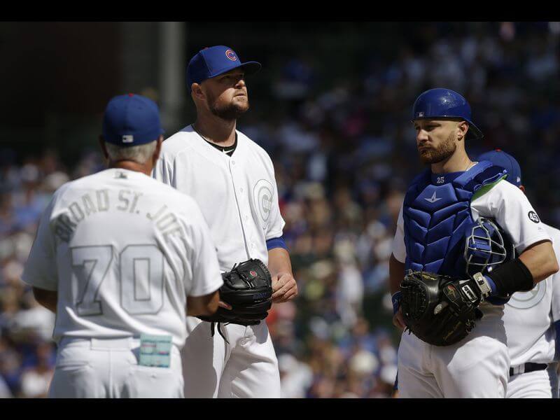
After the Cubs kicked off the weekend’s uni schedule on Friday with blue caps instead of white, Major League Baseball responded.
Asked if MLB was giving teams some leeway, Maddon laughed. “No, as we found out, we don’t,” Maddon said.
After the Cubs went rogue in the only afternoon game, several other teams around baseball did likewise Friday night, opting to have all their players wear non-sanctioned hats. A major-league source said MLB sent an edict Saturday instructing teams to follow the rules.
“Let the kids play”, indeed.
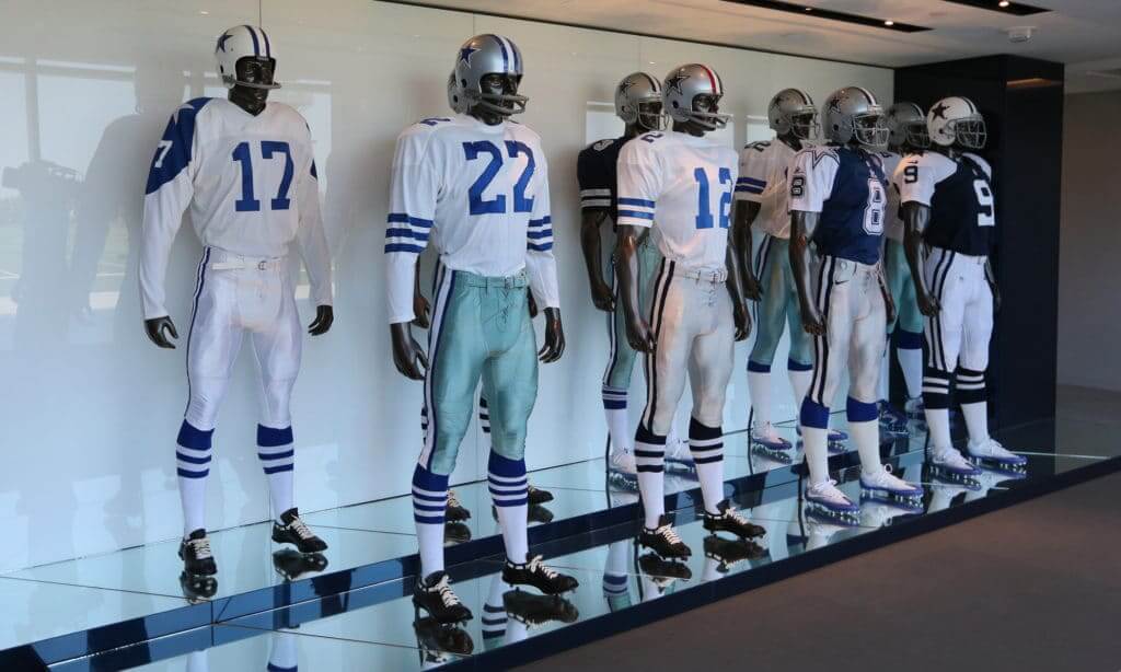
As reported a couple days ago, Dallas is breaking with tradition and will wear their blue jerseys at home this season.
The Dallas Cowboys are not exactly known for change when it comes to their uniforms. Thanks to a 1964 decision by former General Manager Tex Schramm, Dallas fans have been able to take comfort that if the Cowboys were playing a home game, it would be in their classic white. At the time, it was to give the hometown crowd a glimpse at the array of colors displayed through the league. Despite the advent of NFL Sunday Ticket, the internet, and all the ways people are able to watch football on Sundays, the Cowboys have stuck to their guns.
Hit the link for the full Cowboys uniform schedule.
Why is MLB allowing the umpires to wear black during this weekend? Shouldn’t they be required to wear their blue tops?
Somehow the @mlb #PlayersWeekend unis are even worse in person than on TV. At the @Pirates – @Reds game and it looks like there are 7 umpires on the infield. Reds all-white unis (road team in white? Ok..) look like they have nothing on front or back. Awful. @PhilHecken pic.twitter.com/LymXVYzDGS
— Pete Richards (@producer_pete) August 24, 2019
We got our first look at the Jets’ green jerseys on the field this season.
Money.#NOvsNYJ | #TakeFlight pic.twitter.com/c6sZCSd7QO
— New York Jets (@nyjets) August 25, 2019
Nice catch from Jakob here.
@UniWatch @PhilHecken the @SFGiants player's weekend helmets have the nicknames on the back instead of the standard last name, nice touch pic.twitter.com/mSAgUm9MgX
— Jakob Fox (@JakobLFox) August 25, 2019
Montana completed their new floor for the upcoming season.
What a difference a week makes!#GrizHoops #GoGriz pic.twitter.com/O6a3BqP2mq
— Montana Griz BB (@MontanaGrizBB) August 23, 2019
Anyone know the answer to this? The game was in Orlando, not Gainesville, so they had to haul them down there, too.
@PhilHecken @UniWatch why does Florida have their alt white helmets available on sideline? #floridavsmiami pic.twitter.com/TOcCSTMpaT
— Brian Davis (@doremaniac) August 25, 2019
I don’t think I ever thought about the fact that the Cowboys wear royal blue on the home whites, but navy on the road blues.
I always thought their old royal blue jerseys looked great, and had a really classic-looking blocky number font that just said “Dallas” to me. Bring ’em back.
Start with the helmet. Match the pants to that metallic silver blue on the helmet. Then take the blue on the helmet (not a navy blue but a darker shade of royal) and use that on the jersey. Add the 60s Western-style number font. Done.
Brilliant
A thousand times yes. I’m not a fan of wearing road unis at home, but anything’s better than those seafoam green pants.
Agreed except for the number font. Leave it alone, that’s way too hokey.
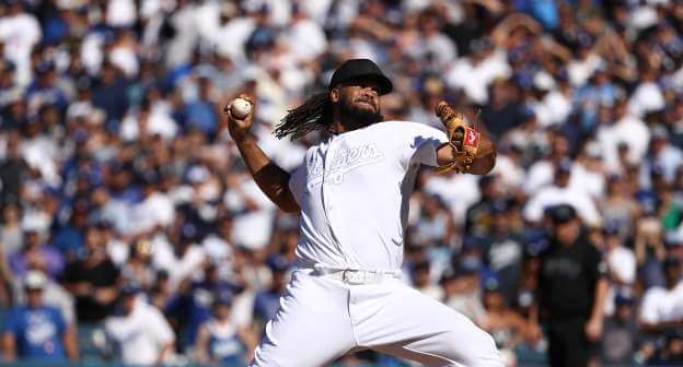
Suzyn Waldman, Yankee color analyst, even complained yesterday that she had no idea who was warming up for the Dodgers because of the white numbers on the white jerseys.
All they had to do was use the single predominant team color for numbers, names, and emblems and those unis would have looked like a decent alternative and sold pretty well in stores.
Wouldn’t be a bit surprised if that’s next year’s idea. An all-Navy Yankee team with gray trim vs all-white Dodgers with royal trim would look a bit more palatable than this dreck. Then the white-clad team’s pitcher could wear a team-colored hat.
That looks good until the Cubs play the Mets or Twins play the Yankees or Giants play the Orioles, etc.
All MLB had to do was watch a game on a black-and-white TV, and the resulting look would have been better than what we saw. Make the Cubs’ blue into black, but keep the same uniform design. Have the Yankees wear a black version of their almost-1973 road uniforms. Make Cardinals red into black. And so forth.
Oh Hell Yeah! Time once again for some college football uni tracking – Canadian rules style.
U Sports Canadian university football season kicking off this weekend. Three of the four conferences in action. We will focus on the three games from Friday and Saturday in the Quebec and Atlantic conferences.
-In Montreal, the home Concordia Stingers have some new yellow pants. Went burgundy over yellow. Visiting Montreal Carabins went mono-white. The have some new pants too. Striping looking like the Carolina Panthers:
link
– St. Francis Xavier X-Men went mono-navy at home in Antigonish, NS. Mount Allison Mounties went white over gold. Fairly standard looks for these schools:
link
– Acadia Axemen went red over dark grey at their home opener in Wolfville, NS. Visiting Bishop’s Gaiters went white over white:
link
That’s a Miami player on the Florida sideline and the white helmets look like the Miami helmets. Maybe they are the Hurricane’s?
Funny thing, from a huge Cowboy fan perspective, there are only 2 blue home games. This article made it seem like life was changing big time. The color rush jerseys are still white, and most of the blue dates are road games, which I think this article might have wrong because some of those teams that have the Cowboys wearing navy against have NEVER worn white at home (Bears).
It’s still 2 games too many.
Bears will be wearing their new white throwbacks against the Cowboys.
I forgot that throwback was white. Still, at Jets, Saints and Lions all seem suspect. Of course Washington, I get that one. Maybe it’s correct, just seems odd. I am in the no blue at home group for the Cowboys. I don’t hate the blue ones, but they do t need to come out for home games and I like the season much better if they stay away all season. I hope it’s just a 100th season thing.
Having now seen the green-over-white on the field, I reiterate: The Jets’ new unis aren’t half-bad. They’re not an improvement (except for the coloration), but they’re not half-bad.
That said, why couldn’t they just keep the old template, use this shade of green, update the logo, and leave it at that?
I suspect (and stop me if I’ve written this before) that it has to do with the shoulder/sleeve design being just ill-suited to modern NFL jersey tailoring, and Nike not wanting to have to deal with it anymore. Coloration issues aside, although Nike did a better job with the shoulder/sleeve treatment than Reebok ever did, the effect was still muddled and uneven. In addition, and no one’s really pointed this out that I can recall, the retail jerseys were just utterly horrible; elbow-length white sleeves (green on the white jerseys) with the numeral all the way at the bottom, looking nothing like the on-field product and just terrible in general.
Why Nike couldn’t produce a decent-looking retail jersey for the Jets (not to mention the correct shade of green) is a mystery, but I think the difficulty in rendering the classic 1960s shoulder/sleeve treatment on a modern jersey (both on-field and retail) had both Nike and the Jets clamoring for a change.
Note how many teams have shifted their TV numerals from sleeves to shoulders in the last 20-30 years (e.g., Bengals, Vikings, Giants, Chiefs, Bears); in fact I think the Raiders, Colts and Washington are the only teams left with TV numerals on the sleeves (plus the Rams’ blue throwbacks). The Jets are the only team I can think of that has ever done the opposite, viz., the 1998 redesign.
Speaking of the Rams, I think this trend does not augur well for a return of the throwbacks full-time; again, the shoulder/sleeve treatment doesn’t come out well.
And the Texans.
But why once again does the jersey green not match the helmet green for the jets? I get that you can’t match it perfectly, shimmer, different materials but this happens all the time. Another example, the Minnesota vikings.
Why create a color scheme that you can’t at least almost match helmet to jersey?
How come this post is tagged College Baseball? Players Weekend unis?
Meant to be College Basketball. Fixed, thanks.
The white vs black player weekend uniforms has to be the most idiot idea (and there have been many) MLB has had. Yankees vs Dodgers may be the most iconic and simply gorgeous uniform matchup in all of sports. For MLB to bastardize that to sell a few of those atrocious hats is sacrilege.
Eh, the Dodgers and Yankees wouldn’t even be playing in August if not for the idiot idea of interleague play. Sure, it’s a gorgeous uniform matchup, but one that should only be taking place in the Fall Classic.
How are the Cowboys switching to wearing blue at home when the majority of their home games are still in white? Did I miss something?
Good point. It looks like they’re only wearing blue at home for two games (and color rush for one).
I’m sure there’s an explanation about the Florida alternate helmets being in Orlando, but I’m wondering if it’s something they routinely do (bring both road and alternate uniforms) when they travel? Although, they wore their home uniforms last night, so who knows? Have they ever worn their white alt helmets with their blue uniforms? Seems like they have, but maybe not.
Wait.. Dodgers are playing baseball.. and on TV?
Here’s hoping the Saints stick with the gold pants throughout the season. The black pants are absolutely egregious.
I would like to know who proposed and who OK’d the decision to have black vs. white uniforms for MLB’s Players’ Weekend. From what I have read, the players had absolutely no input on these uniforms and have universally panned them. So much for “Players” weekend.
Players becoming fashion designers for their own jerseys would be an even scarier proposition. Just look at the inspiration they gave to the Diamondbacks uniform overhaul.
I don’t know, I hate the Diamondbacks uniforms, but I’d much prefer something absurd or overwrought in actual team colors to these monstrosities. At this point, my bar is so low for special event jerseys that I just want them to be rooted in actual team colors rather than pink or light blue or black. In 1987, I could watch my brother playing Baseball on Nintendo and know which teams were playing based on color alone. I’d like that level of identification here, in real life, in 2019. I don’t think it’s that much to ask.
Why not go color rush style instead? Yankees in all black with grey or white numbers and names and the Dodgers go all royal blue with white numbers and names…every team has a 2nd color to fall back on if two teams play each other that normally wear the same color such as the Reds wear red and St Louis could wear Lt Blue, Mets wear orange while the Royals wear blue or Lt Blue
It would also add to all the funky colors the players used for their cleats
Didn’t they have a secondary thinner or smaller NOB font for earlier Players Weekend jerseys? Maddon’s jersey looks pretty horrible with the long nickname and the number pushed downward.
Not sure how much charitable work will be supported by these uniforms or sales of the hats and other merch.
Every game I watched over the weekend had the announcers saying things like “I can’t tell you who’s warming up because I can’t read the jersey”.
Seems like Derek Jeter and those hideous, unreadable things the Marlins wear had a say in this…
Player’s weekend was the worst uniform experiment ever. Any sport. Ever.
My idea. Don’t ever do it again.
My second idea: let players really choose. It can be like an all-star game. Each player can wear the jersey of any player on any team, present or past (or, hell, future) of their choosing. It’ll look like an all-star game on steroids (whoops, too soon). Home team wears white home versions and away team wears grey, blue, or whatever version. The NOB could be of the chosen player or replaced with the wearer’s nickname. That would be fun visually, would really let the players have some fun, would still look like a major league baseball game and not some pretentious performance art piece.
The display of uniforms at the Cowboys’ HQ has always bothered me. Bob Hayes (22) never wore the green pants—they were more charcoal. The 76 unis (with the red stripe) didn’t have the light silver pants; they were darker and more blue.
I understand if they couldn’t find the actual pants but c’mon, they’re a multi billion dollar franchise.