By John Ekdahl
We were dreading it, and yesterday began this year’s edition of “Players’ Weekend” in Major League Baseball. While we knew what to expect, it’s difficult to put into words just how awful it actually looked when the players finally took the field. You couldn’t read the team names, you had difficulty making out the numbers and you couldn’t read the nicknames. Wasn’t that half the point of this exercise, to let players highlight their nicknames?
In Chicago, the Cubs all wore blue hats instead of white. This was reportedly because Jon Lester didn’t like the black hat pitchers were forced to wear due to the difficulty in picking up the baseball for hitters. If pitchers are going to wear a different cap than the rest of the team, why not just go all-out soccer goalie and have them wear full neon green?
Yankees vs. Dodgers: two iconic sports franchises with two absolutely classic uniforms. Two teams who rarely get the opportunity to play each other, and the entire weekend will be lost to these eyesores. What a complete waste.
The fans hated it. The managers hated it. The broadcasters hated it. Just an absolutely baffling decision by Major League Baseball.
The Players Weekend uniforms pic.twitter.com/q7inonUt34
— Jenn (@baseballnchill) August 23, 2019
This was driving me crazy last night.
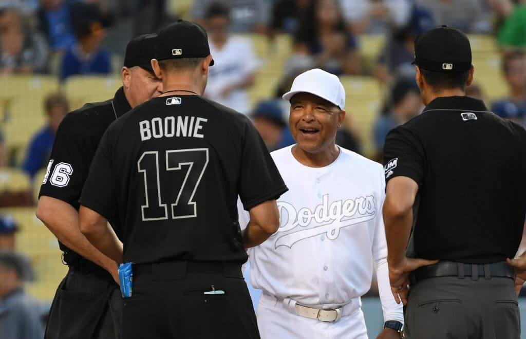
Thought this was a weird shift until I realized those black uniforms make the umpires look like players @UniWatch pic.twitter.com/Uem5ak3Fnb
— Jake Yergs (@headwhop26) August 24, 2019
Aaron Judge is wearing cleats signed by every kid who played in the Little League World Series.
For MLB Players Weekend, Aaron @TheJudge44 had his cleats signed by all 217 players in the Little League World Series. pic.twitter.com/EXKrwmnLht
— FOX Sports: MLB (@MLBONFOX) August 23, 2019
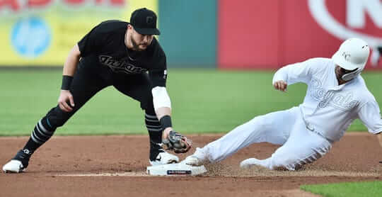
There were inconsistencies all over the place yesterday, including some Sox players wearing their regular batting helmets.
Hey @UniWatch @PhilHecken some Red Sox wearing their regular blue helmets while some are wearing the black players weekend helmets. pic.twitter.com/OT8nPNwwL4
— Eric Kohli (@EKohli) August 24, 2019
White helmets + pine tar = not a great look.
@UniWatch @PhilHecken ¡KIKÉ LOVES PINE TAR! pic.twitter.com/DmBaCAnZub
— Jakob Fox (@JakobLFox) August 24, 2019
How curious.
Isn't it interesting how most of the typography and graphics are illegible, but the New Era maker's mark is plain as day? pic.twitter.com/ovkxM0tLXH
— Paul Lukas (@UniWatch) August 24, 2019
Jack Flaherty is honoring Tyler Skaggs with his cleats this weekend.
Tonight was for you, Ty. pic.twitter.com/7nIohv8wwG
— St. Louis Cardinals (@Cardinals) August 24, 2019
Miami has revealed what unis they’ll be wearing against Florida tonight.
Classic threads. #BeatUF pic.twitter.com/wWVu3NIufQ
— Canes Football (@CanesFootball) August 23, 2019
These Player Weekend uniforms are the hottest garbage that I have ever seen in my 54 years on the planet…I hope MLB corrects this by letting the teams wear their regular uniforms for the remainder of the weekend, but you know that isn’t going to happen.
This fellow 54-year-old concurs.
Why didn’t Mlb stick with the uniforms from last year?
Doesn’t matter what game you watch, they all look the same.
Dear MLB,
WTF?
Love,
The Fans
yesterday on the way home from work i stopped at the combo biker bar/chinese takeout joint (great place btw). the mets/braves game was on one tv and exhibition football of tampa/cleveland on the other. major eyesores each. quite a bit of banter with other customers about the players weekend. vigorous unanimous disapproval of it
MLB took a great idea (NNOB for everyone) and ruined it with those uniforms. I loved that Dodger player covered his helmet with pine tar. I would love to see players get creative with items in the dugout to decorate their uniforms.
Kiké does the pine tar helmet all the time. It was even on his bobble head that was just given out
,
These uniforms are a disgrace, especially for a rare Yankees-Dodgers series. I saw a good suggestion for those teams – wear your classic uniforms, pay a fine and match the fine with a charitable contribution:
link
I thought the players’ weekend was going to be more of what the Cubs and Pirates wore in the little league classic last week?
Why is this even referred to as ‘Players Weekend’? It is pretty obvious the players have NOTHING to do with it except being forced to make up weak, banal nicknames that likely aren’t ever used outside of ‘Players Weekend’. Suggestion: have ‘Players Weekend’ on a Monday in April when most teams have the day off.
I hope your question is not rhetorical, because I really want to know…
What exactly is “Players Weekend”? Why is it called that?
They say it’s to promote individuality among the players. The uniforms were made as plain as possible so that guys’ unique, custom accessories would stand out more.
So it’s an ‘anti-uniform’ holiday.
Has there ever been a uni-related thing more universally disliked (other than ad related stuff)? I literally couldn’t one person who thought this was a good idea. If MLB was smart, they’d abandon the gimmick today, and have a good laugh at themselves…
insert the word “find” at the appropriate place
Someone mentioned it before but it is worth revisiting.
Appears MLB uniform choice may be influenced by the Canadian cult classic movie Strange Brew.
link
If someone sets or breaks a statistical record-whether it be a career or single game, team or personal-and they have these beauties to see forever….
The Mercury Mets uniform now have company along with the rest of mlb; May we never see the likes of these hideous uniforms again.
This is probably a dumb question, but did the players have any input? I would be interested to see what the players would wear if they had ultimate freedom to choose.
MLB wouldn’t profit from it. No merch.
My opinion hasn’t changed. It’s still better than the little league suits.
I guess I’m a little surprised that the head-to-toe black look isn’t intriguing enough for one of us to stop bitching about this, and say that some team should try it on a regular basis (with markings, of course). It kinda has an 1890s/early 20th century vibe.
I’m ‘meh’ on the whole nicknames thing.
I was thinking the same thing about the all-black uniforms. Lots of teams wore that in the era you mention — link. High-cuffed pants and distinctive socks would really pop with an all-black uniform, and it’s one of the first things you notice when you look at those throwbacks.
All dark blue looks pretty good too: the Cubs had it in (link and then link) and that throwback looked awesome. (This Cubs uniform is my favorite in baseball history, BTW.) Cincinnati threw back to it this year and look how great they looked (thought I’d make the number red).
I can’t find a picture of the Cubs’ (then the Colts) black road uniforms that they wore in the 1880s-90s, but they did switch from dark blue to black for a while. Put them back in those, with numbers on the back in the Shepard font (which isn anachronistic, a little, but it still looks good). What a great throwback that would make.
Imagine wearing thick, black woolen uniforms in the hot sun! Yikes!
Maybe instead of using the days of the week when deciding when to wear alternate uniforms, they could have “summer” and “spring/autumn” alternates, and wear the black in April and September. Then they could even bring back the long, sometimes detachable, sleeves that many teams had a century ago.
Lots of things are intriguing ideas, but if the idea is executed this badly in practice, the people who value the idea in theory will always be the loudest voices bitching against the execution. Should more teams wear darker road uniforms than the off-white most teams currently wear? Absolutely! Should any team wear “ghosted” lettering on the front or back of any uniform of any color? Absolutely not! If anything, the disastrous execution of these mono-black uniforms will likely make it less likely, not more, than any team will consider mono-dark road uniforms. Just as the D-Backs probably did the same when they took the very good idea of dark-gray road uniforms and so botched the execution as to make the ugliness of their road uniforms a league-wide laughingstock.
I know that the schedule is a complex thing to arrange, but why did they have to schedule Yankees-Dodgers for this weekend? They should’ve had the Diamondbacks playing an interleague series instead of the Dodgers.
When I turned on Cardinals vs Rockies, my initial impression was actually positive. I thought the white uniform had a vintage feel for the (usual) Red Birds and black already exists in Colorado’s palette.
Watching highlights was almost impossible. I found myself spending my time trying to identify one of the two teams based on their stadium instead of watching the play.
Identifying players by their cleats was non-starter.
Rigth? I just said the same basic thing below…. That look could totally be tweaked for Colroado and be an upgrade to the Ace Frehly vests.
Right!
Joe, do yo live near near Denver? We need to catch a game!
Actually, I was tuning in for the Cardinals and live in Southern California. Denver has been on my bucket list for a while. I should really get on that.
Pretty simple decision for me. I won’t be watching any baseball or baseball-related highlights this weekend.
Wierdly enough, I actually sort of like how the Rockies looked in all black. Considering they wear already black jerseys regularly, but the ones they currently wear are hideous, I thought this was kind of an upgrade. Make the team name, NOB and numbers legible, restore the proper logo coloring to the hat, and I could be on board with this look. But just for one team. Nobody else.
Also, the all white uniforms looked like cricket uni.
MLB could have been a lot more creative with this. They could have done a color swap.
Put LA in white unis with navy pins that have an interlocking LA on the chest. Put the Yankees in Dodger blue away unis with New York in script on the chest in the Dodger font (I might buy that)
Put Atlanta in Mets blue tops with Atlanta spelled out in the Mets away font with the orange highlights. The Mets could be in red on white with “Mets” in the style of “Braves” on their home unis.
They’d certainly sell a lot more of those than the all white messes.
The turn ahead the clock unis were weird, kitschy fun. Throwbacks (and faux backs in some cases) are a great way to acknowledge the history of the game. Even the little league style unis from the past two interactions of this weekend is a fun idea. I don’t mind an alternate. Point is I’m not as traditionalist as a lot of other folks here tend to be.
That having been said, the Players Weekend uniforms this year are terrible. Bad concept, bad execution. Whoever thought of this and whoever approved it should lose their jobs
Iterations not interactions.
Baseball made me sad today.
I recognize that I benefit from tremendous privilege such that I can get angry about baseball uniforms, and not have to worry about my health, or finding enough food for my family, etc. That being said, what an absolute abomination. I’m a Dodger fan, and the fact that what should be a classic Dodgers-Yankees series featuring the two best teams in baseball will forever be marred by these uniforms is shameful.
Honestly, everyone hates these. MLB should just admit their mistake and tell everyone to go back to their regular uniforms today. Why can’t players express their individuality with shoes, bats, accessories, etc. paired with normal uniforms?
Not sure if this will make any difference, but I sent an email to link telling them how awful this is. Supposedly these uniforms are a joint project of MLB and the players association, and there’s no easy way to email MLB, so let the MLBPA know how we feel about this.
I agree with everything you’ve expressed. One thing I’ve noted is so many lamenting that a great uni matchup, Yanks and Dodgers , speaks to our affection for the great traditions of baseball. However, inter league play isn’t one of those great traditions and should go by the wayside, as should Players Weekend.
I like them! As a one-off. Lettering and logos disappearing into background is the whole point. The blank-palette stormtrooper uni is waaaay better than the goofy Little League unis last year.
Greetings fellow traveler! The spirit of ‘trying something new’ is just about dead in the field of uniform design. If someone would take a chance and try an all-black uni, this fun little ‘project’ might not have been in vain.
And I’d like to shake your hand for saying it’s better than the infantile togs of years past.
To me, the ugliness of the uniforms is exacerbated by how boring/lazy the entire concept is this year. They could’ve kept the black vs. white general idea, but at the very least had the logos, names, & numbers outlined in a color from each team’s palette. They could’ve gone color rash – or even modified color rash with one team in white vs. one team in a solid color from their palette. They could’ve put everyone in throwbacks for the weekend, or everyone in turn-ahead concept unis. So many ways to go with this weekend. If you’re gonna do it, be creative & swing for the fences.
I know it’s not truly a 5+1 weekend but the Villanova at Colgate game looks great. Wildcats double blue against the Colgate toothpaste red is certainly pleasing to the eye. Bonus for Colgate using a lower case script g to mark the goal line.
Make this weekend a 0 + 30…This players weekend stuff is hideous. The least they could have done on the white unis is accent in black, not grey, so you could actually SEE the team names, numbers and logos.
0+30…
i wish to subscribe to your newsletter!
How about inverting each team’s uniform colors? As an example – the Yankees wear navy uniforms with white pinstripes.
Or – they keep their current uniform format, but with past colors – as another example, the White Sox could have their alternate jersey, but in navy and red instead of black.
Basically – anything would be better than this.
I went up to Vancouver and walked around Grantville Island last night. Peered into a steakhouse with a game on. Wondered if it was cricket… nope. “Blue” Jays were the home team.
SilvaWil, betting you must have been peering into The Keg Steakhouse and Bar while walking around Granville Island.
Though the Blue Jays were in white, they were on the road in Seattle last night.
This is of course the weekend of the Great Northern Invasion at Seattle’s ballpark with the Blue Jays being there this weekend. Mariners fans have to content with large numbers of Blue Jays fans crossing the border. Really too bad for the fans that went down that they will have to see the Blue Jays in these uniforms during this weekend.
I kind of like the simplified mono black vs. mono white look as a novelty thing, and understand the idea of creating a blank slate to allow the players to express themselves through custom cleats and accessories. But the ghosted names and numbers take things too far, and the white hats are a bad idea since the pitchers can’t wear them. I thought the Cubs’ look with the blue hats wasn’t bad.
I could have lived with the spy vs spy unis if the letters, numbers, and logos had a trim that made them readable. Otherwise this is the worst idea since Cleveland had all maroon and Baltimore had mono orange in the 70s.
Nothing wrong in principle with mono-white or mono-black uniforms, but rendering all the text elements in matching white or black so as to make them literally unreadable is a crime against the sport and its fans. (This goes for the several teams that have everyday alternate jerseys with ghosted lettering.) We can’t blame Majestic/New Era for the absurd sight of black-clad teams fielding 13 men thanks to the umpires. If the league, or even the umpire’s union, knew that every game would feature an all-black team, and they did, then the league or the umpires ought to have decreed that umps wear visibly contrasting shirts. This didn’t have to be the worst uniform disaster in the history of professional baseball.
MLB has included so many “gimmicks” that it seems that they are desperate to get attention and/or “invent” $cheme$ ONLY to leech more money from the gullible.
This weekend was just another one of these.
Actually, for us REAL fans, nothing gets our attention like a really well played game.
Speaking of ads, did anybody else who tuned in to the Miami vs. Florida game last night find it nearly unwatchable due to the huge “CAMPING WORLD” logos on the field? I can handle a corporate logo at the 50 yard line as part of the game’s logo, but were two more huge logos really necessary?
I attended the Toronto-Seattle game yesterday and a couple times I forgot we were black and was cheering for white