[Editor’s Note: Paul is on his annual August break from site. Deputy editor Phil Hecken is in charge from now through the end of the month, although Paul may be popping up here occasionally.]

By Phil Hecken, with Bud Parks
Follow @PhilHecken
You guys know I love uniform concepts, tweaks and redesigns, so when reader Bud Parks told me he’d come up with tweaks for all 30 MLB teams, I couldn’t wait to see what he’d created. Turns out he’s got some minor tweaks — but some of these really seem to work (others, maybe not so much), but each of them are well thought out and certainly worth consideration. We’ll tackle the American League today, and the National League another time. Here’s Bud:
American League Uniform and Cap Concepts
By Bud Parks
Disclaimers:
***all credit goes to Chris Creamer of sportslogos.net for the creation of the uniform templates and some logo templates I used. Thanks Chris!
***the top row is what the team currently uses as their set. The bottom row are my edits. A number of teams have made changes to their repertoire since I worked on them, so the top row may be outdated every so often. Sorry!
***alternates labeled “weekend” = Friday and Saturday, but not Sunday. Alternates worn on Saturday and/or Sunday are labelled accordingly
***”Whenever” means exactly that. sometimes ‘whenever’ means pretty often, like the Pirates black alternate, other times whenever can mean 2 or 3 times a season
***Contrary to what this site usually preaches, I really appreciate color on the diamond so every team has at least one alternate jersey. Even the Yankees!
AMERICAN LEAGUE EAST

Baltimore Orioles
As primarily an O’s fan myself, I’ve been relatively pleased with all of the incremental changes the team has made of the past 10 or so years; making the sleeve trim a bit more interesting, adding a killer sleeve patch, adding and then fixing the Baltimore script, etc. So maybe I got a little carried away with this one, but I think the results turned out well. First off, I’ve always preferred the older Orioles script from the early 90s, I think it has more character and fits in just fine with the current Baltimore script. Secondly, the road jersey could benefit from a little bit of a darker tone, so the lettering colors get flipped from what they currently are (I’ve also designed a black version of the sleeve patch to better match). The orange alt I think suffers quite a bit from the sleeve trim not matching the lettering colors, so that gets updated and my new alt sleeve patch is added as well. The black alt gets updated from saying Orioles to Baltimore, since that’s what it should’ve been all along, but especially now that more and more teams are wearing alternate jerseys at home with the city or state name and the world hasn’t ended. And finally, the hats. This is not a vendetta against the cartoon bird, in fact I like him just fine. He just ended up being the odd logo out; I’ve always preferred the O’s hat logo and have always wanted them to have a B hat of some kind, which works great as a road hat. The O’s logo I’ve created matches the older script, with the apostrophe sort of being carved out of the larger swoop the O had back then.

Boston Red Sox
When the Red Sox won the the World Series in 2004, they had only two jerseys; one of them had ONLY placket trim, and the other had ONLY sleeve trim. I thought that was kind of a fun, unique quirk for them so I decided to bring it back and preserve the idea on their current red and navy alts as well. Add the sleeve patch from the road jersey to the other three, introduce a red hat to wear on weekends, and there’s your set.

New York Yankees
As very much NOT a Yankees fan, it took every ounce of me not to screw with their home pins just out of spite. But their road jersey has always felt kinda blah to me. I guess it’s unique, but it’s never been well designed enough to be interesting. A gray, pinless version of their home whites similar to the throwback they wore a few years ago seems like the right call to me; still instantly recognizable, different enough to stand out, but much more within their overall aesthetic. Add in a gray brimmed cap for fun, and a navy alt to wear admittedly sparingly, which is basically their current BP threads.

Tampa Bay Rays
My instinct told me to scrap their set altogether and just bring back their previous green look with a few minor adjustments, but if they’re gonna stay with the navy/baby blue look, there are definite improvements to be made. When I was working on these, the stingray sleeve patch was still missing from their alt softball tops, so I’m at least glad they made that change on their own this season. They experiment so often with baby blue caps in Spring Training that adding a baby-brimmed cap seems like they should’ve done something like it years ago. And finally, they have a pretty good Tampa Bay script in their style guide but it’s not used anywhere on their uniform. Switch out their gray and navy jerseys to utilize it, and the result I think is pretty dramatic.

Toronto Blue Jays
The Blue Jays are mostly perfect, but I’ve always preferred the original Jays logo with the lighter blues and the baseball behind it. Updating the current Jays logo to these specifications is pretty easy, and the result I think looks pretty great. Replace the Jays logo on the lower half of the jersey with numbers, add a sleeve patch of their current primary logo with the team name and ball, and a red-brimmed hat for home Sundays, and that’s all that needs to be done in my opinion.
AMERICAN LEAGUE CENTRAL

Chicago White Sox
The current Sox logo has always been interesting to me, but it’s unbalanced/doesn’t fit very well on a hat. The old Black Sox logo, however, has always been gorgeous to me. The introduction of their batterman for Spring Training in their current colors I think has also worked really well and deserves the promotion to an official alternate hat. The socks look a bit like football socks, but I tried to come up with something that splits up the top of the sock and the bottom of the pant and still look ok while keeping most of the sock, you know, white. Added the Northwestern stripe as a nod to their University neighbor.

Cleveland Indians
A frequent hot-button topic, the Indians were my first team in tee-ball and my grandparents from Erie are huge Tribe fans, so the controversy around Wahoo has always made me a bit sad. I understand both sides of the argument, but I think there’s a compromise to be made, and one that does not involve the super-horrible block C, which I think is the most boring, uninspired logo in all of sports. A few people have tried their hand at the Caveman C with a feather, so this is my attempt; but not only do I bring back the C, but the Caveman script onto the jerseys as well. Also making a return is the triple color trim from the early 90s, as well as the silver outlining that was used in the mid-00s which I always had a major soft spot for and was very sad to see them retreat away from them in the early 2010s. The primary logo crest finds its way onto the uniform as a sleeve patch, and is one of my creations during this project I’m most proud of.

Detroit Tigers
You’d think the two different Ds from a couple years ago would set off all sorts of alarms within my OCD, but in reality I loved that quirk about them, and the current D is too thin when blown up to the proportions needed on their jerseys today. So not only should they bring it back on their home jersey, but all their other jersey(s) as well! I still like and preserved the orange/white double-outline their current road gray uses on the wordmark, and the occasional navy alt at home and orange alt on the road would be a good way to get the attention of some fans who might be otherwise bored with what they’re currently trotting out day-in and day-out.

Kansas City Royals
It’s easy to see why the Royals took their World Series championship celebratory gold jerseys and decided to make them a permanent alt, but there’s not really a good reason why they need both it and their regular home jersey. The solution to me is to combine aspects of both jerseys into a single home offering, and mimic some of its qualities on a royal blue alt. A distinct lack of gold trim on the road jersey is intentional, not because it wouldn’t work, but because sometimes it’s ok to have a somewhat distinct look between home and road duds, a la Montreal Canadiens. I suspect a lot of people will mourn the loss of the baby blue alt, since the Royals were a main player in making that 80s trend so popular, but to me, the gold is a better secondary/trim color for them, and they don’t need two. And of course, I think it goes without saying that their BP cap from a few years ago needs to be their everyday look.

Minnesota Twins
All of the gold the Twins have added in the past few years, however, makes no sense to me and doesn’t work for them at all. Having two almost-identical hats where one logo is outlined in gold and the other has no outline is the definition of overkill (the Twins just this year have started wearing their all-navy, outline-less hat for road games instead of their basically defunct red-brimmed road cap), so it’s best to just eliminate the gold altogether, clean some trim up, and simplify all available options. I hated the lowercase M cap from the 90s when it was around, but now that it’s gone I realize just how much I miss it. Bring it back as the road cap, please and thank you.
AMERICAN LEAGUE WEST

Houston Astros
I actually really liked their previous black-ish/brick red from their NL days, but now that they have a championship to celebrate in their current colors, I’m sure they are mostly here to stay. That doesn’t mean they couldn’t improve upon what they have though. The most pressing issue: the squatchee doesn’t match the brim of their current-road hat. I own a lot of hats (over 400), but I have specifically avoided buying hats that have this exact issue; it drives me bonkers. The next thing needing fixed is to give the wordmark some pizzazz, a name like Astros deserves to have a little flare, so I tried to create and homage to their original shooting star jersey but tried to make it a little more visually balanced. Swap the home and road hat uses, nix the orange jersey altogether, make the tequila sunrise motif a little more subdued on the navy alt (which I will concede is kind of the opposite of the point of the tequila sunrise in the first place), and suddenly they’re a lot more interesting looking without compromising their current overall aesthetic.

LA Angels (of Anaheim)
A more involved tweak, I really like the current A logo but it’s used way too much on too many places on their uniform. It’s also bothered me that the Angels’ primary color for so long has been the color of what most would consider to be the opposite of angels. A more involved use of navy blue like from their California Angels days would go a long way in fixing things, as well as a commitment to silver for a trim color. I decided to create a secondary logo that can be used as their cap logo and added into their left sleeve patch, so the primary A logo can still be a part of their chest wordmark and not be repeated anywhere else on the jersey. Why replace their current A on the hat? So they can finally bring a long-overdue return to the cap-top halo from their earliest years. A piece of uniform innovation that is so unique to them and can’t possibly be copied by anyone else, they deserve to showcase it every game possible; and also a feature that exempts them from my prior gripe about squatchees not matching brims. I know that they’ve recently dropped the “of Anaheim” in their official name, but I also kind of like that their road uniform has both “LA” and “Anaheim” on different parts of it.

Oakland Athletics
So I think we can all agree that Oakland’s current alt kelly green threads are exponentially better than their darker green options, yes? So then let’s just make it permanent. I like that it’s sort of unique to them that they present their logo two completely different ways on their home and road hat, but I still think the home hat could benefit from a little yellow to drive home the idea, so they should use their current road hat logo styling on the home hat with white outlined in yellow, and flip it on the road hat so it’s yellow outlined in white. Their BFBS attempts from the early 00s were on the right track, but they never quite got the lettering colors to be what they should’ve been the first time around. The final change is returning the sleeve patch to the proper white elephant instead of their current green, since his color is the entire point of why he became their mascot in the first place.

Seattle Mariners
I have a confession: the Mariners’ compass logo, by itself, is my favorite logo in all of sports. I own just about every hat they’ve ever come out with that has it, and have pined for years for them to make an on-field offering of it ever since their silver-brimmed beauties from the mid-90s. Nothing against their current S logo, but this is my project and I get to do what I want. I have a few compass hats where it has a thin white outline, and I think that really helps sharpen the edges and make the shape pop. Add in some sleeve trim, update the colors of the lettering/numbers of the teal alt, fix the number font on the navy alt, drop the fauxback, and you have maybe my favorite uniform set in all of baseball.

Texas Rangers
It’s been said many times on this site that the Rangers can’t decide if they’re a primarily blue or primarily red team, and indeed they’ve swayed back and forth between the two over the course of their history, with today’s team seemingly waffling the most. But I say that maybe it’s time to lean into this indecision, and own both colors as equally and garishly as possible. I like the idea of returning to a vest option for them for a couple reasons; the first being that vests were a pretty common sartorial choice of ACTUAL Texas Rangers, and the second that it allows the team to move their Texas flag sleeve patch to their chest (albeit in a slightly smaller form). Why over their chests? Because they’re deep in the HEART of Texas, don’cha know! Cheesy? Probably. But somehow I feel it’d be a detail that Texans might just absolutely love. (And no, I’m not advocating that the team wear different-colored sleeves on the home and road jerseys, only illustrating thru the template that they could wear one color OR the other at different times).
Thanks, Bud! Well readers, what’s your verdict on Bud’s tweaks?


Guess The Game…
from the scoreboard
The game has returned! At least for a trial basis, but I got a lot of positive response to its return, so we’ll see how long we keep this one going.
Today’s scoreboard comes from reader “ojai67”.
The premise of the game (GTGFTS) is simple: I’ll post a scoreboard and you guys simply identify the game depicted. In the past, I don’t know if I’ve ever completely stumped you (some are easier than others).
Pretty cool one today — it’s a shutout but it’s not a no hitter. So how will this game end up? And when did it take place?
Here’s the Scoreboard. In the comments below, try to identify the game (date & location, as well as final score). If anything noteworthy occurred during the game, please add that in (and if you were AT the game, well bonus points for you!):

If you guys like this, please continue sending these in! You’re welcome to send me any scoreboard photos (with answers please), and I’ll keep running them.
And now our daily check-in from Paul: Hi again. Some quick reminders and announcements:
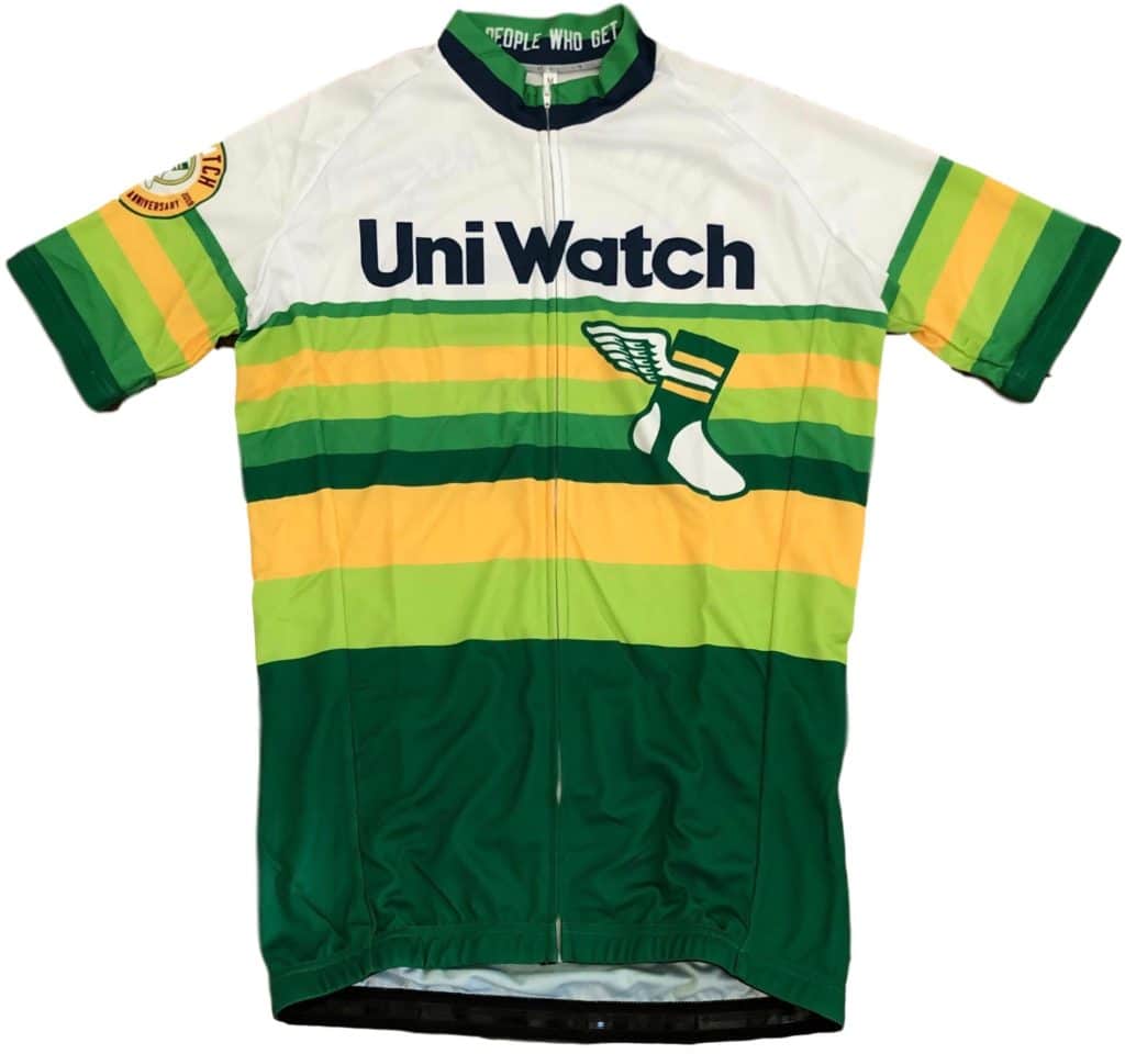
1. Cycling jersey reminder: In case you missed it yesterday, we’re now taking pre-orders on the first-ever Uni Watch cycling jersey, which you can get with your choice of number and NOB. Full details here.
2. Anniversary patch price drop reminder: In case you missed it yesterday, the Uni Watch 20th-Anniversary Patch, which was originally priced at $9.99, can now be yours for only $6.99. Full ordering details here.

3. HQ Sports reminder: I’m going to be appearing on the app-driven live sports trivia show HQ Sports (part of the larger HQ Trivia empire) next Wednesday, Aug. 21, 8pm Eastern. It’s going to be a uniform-themed game, and I’ve been involved in writing the questions. Should be fun!
4. Raffle results: Our latest raffle winner is Ted Lieberman, who’s won himself an item of his choice from the Vintage Brand website. Congrats to him, and thanks to VB for once again sponsoring a raffle.
5. ITEM! New shirt launch: I’ve been wanting to do a camouflage Uni Watch shirt for years, and Teespring’s new sublimation capabilities have finally made that possible. Check this out (click to enlarge):
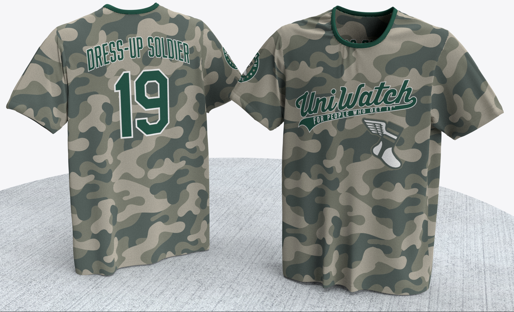
Not bad, right? It’s hard to see in that mock-up, but there’s a custom sleeve-patch graphic on the right sleeve:

I’m proud to announce that 100% of Uni Watch’s profits on this shirt will be donated to the Peace Corps. Big thanks to Jimmy Nutini and Bryan Molloy for their assistance with the design.
Just for efficiency’s sake, let’s nip a few issues in the bud:
This shirt is disrespectful to the military!
Actually, no, it’s not. You know what’s disrespectful to the military? Dressing able-bodied young athletes in camouflage clown costumes in a cynical attempt to sell merchandise. This shirt takes aim at that practice (just like our BFBS shirt is a critique of black alternate uniforms and our flag-themed “Pandering” shirt is a critique of stars/stripes uniforms).
But the phrase “G.I. Joke” on the sleeve patch makes fun of the military!
No it doesn’t. I’ve called camouflage sports uniforms “G.I. Joke” for many years now. The term refers to the camo clown costumes, not to the military.
Yeah, but not everybody knows that. If I wear this shirt out and about, people who don’t know about Uni Watch might see it and get pissed off about it.
If someone says something to you about the shirt and you end up having a conversation about it, that doesn’t strike me as such a bad thing. But if you want to avoid that, no problemo — don’t buy the shirt.
You’d probably sell a lot more of them if you toned down the message.
Maybe. But maxing out the sales numbers isn’t my goal here. My goal, as usual, is to have a satisfying creative project that expresses a point of view. This shirt says exactly what I want to say, in exactly the way I want to say it. If it sells a lot, that’s great; if not, that’s fine too. Either way, I’m pleased with it.
That’s it for today. Again, I’m not reading the comments this month, so if you have a question about any of this, feel free to email me.
Now back to Phil with the rest of today’s content.
Final Griffins Jersey Design Contest Reminder
LAST DAY TO ENTER THE CONTEST!!!
Deadline 11:00 pm (EDT) TONIGHT
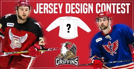
In case you missed it, Uni Watch is again partnering with the Grand Rapids Griffins to allow readers to design an alternate jersey to be worn this upcoming season.
As before, the winner will receive a personalized jersey, tickets to the game when the jerseys will be worn (February 22, 2020), and public recognition at the game.
The jersey is going to be worn on the Griffins’ 90’s Night (with either red or black pants and red gloves/helmets), so for this contest, the team is looking for a “90’s inspired jersey.”
The deadline for submissions for this contest is TODAY Friday, August 16th, 2019, 11:00 pm EDT.
All the details are spelled out in detail here, so be sure to read that.
Good luck to all who submit!
The Ticker
By Anthony Emerson

’Skins Watch: Here’s a good article about the use of Native mascots in Oklahoma (from Justin C. Cliburn and Paul Deaver).
.
.

Baseball News: A collection of jerseys worn in films and TV series like The Natural, Major League, Moneyball and The Bronx is Burning among other are up for auction right now. If one of you even THINKS about bidding for that Hatteberg jersey, so help me! (thanks, Paul). … Cubs P Cole Hamels did not have permission to wear David Montgomery’s memorial patch, saying “I’ll take the fine. I don’t care. David meant a lot to me.” (from Michael Paolucci). … Speaking of, the Cubs wore royal blue on the road against the Phillies’ powder blue throwbacks (from multiple readers). … Dodgers RF Cody Bellinger went high-cuffed for perhaps the first time in his career last night — and so did a lot of other Dodgers. … The Greensboro GrassHoppers, Class-A affiliate of the Pirates, wore “Woodstock” jerseys last night (from Scott M. Trembly). … Damon Hirschensohn came across this awesome Rawlings MLB golf ball set on eBay, giving me another thing to bid on. … During last evening’s Mets/Braves game, a throw from Amed Rosario broke the leather and went through Pete Alonzo’s glove (from Mike Chamernik).

NFL News: The Texans have added their logo to the back of their jersey (from Jason Triplett). … Pats CB Stephon Gilmore always wears long sleeves, no matter the weather (from Timothy Medeiros). … Everyone knows Joe Thiesmann is allowing Dwayne Haskins to wear no. 7 for Washington. But did you know that when the season kicks off, Haskins will join Theismann as the only no. 7s to ever play for Washington, an 87-year-old franchise? (from @ThatreOfMySoul). … Scott Mitchell, the former Lions and Dolphins QB, has a somewhat odd personal logo. … Looks like the Packers are using lower case letters on their jerseys (from Don Schauf).
College/High School Football News: West Virginia displayed four potential uni combos yesterday, including one with the old white jersey. … The Frisco Bowl has a, ahem, delicious new corporate sponsor (from Andrew Cosentino). … Also from Andrew, Virginia Tech will have orange cleats and jerseys this year. … UNC’s Equipment Twitter account gave us a sneak peek of the CFB150 patch on the Heels’ unis (from James Gilbert). … So has Iowa (from @libertyhawkeye).

Hockey News: The Sabres will unveil their 50th anniversary logo today, and the royal blue unis will make their return in the 2020-21 season (from multiple readers). … The Hurricanes appear to be teasing a new sweater with this brief Twitter video (from Scott M. Trembly and Christopher Kirby). … A trademark filing has given the indication that Seattle’s AHL affiliate will be named the Palm Springs Firebirds (from Nicklaus Wallmeyer). … We might’ve seen this before, but here are a selection of some rejected inaugural season logos for the Avalanche (from Jeff Brown). … The Blackhawks will wear their 2019 Winter Classic unis three times in the forthcoming season (from @2ndCityHockey). … Cincinnati’s arena is getting a new corporate sponsor because the old corporate sponsor isn’t renewing its naming rights deal (thanks, Alex).

NBA News: Someone ran into Larry Brown at the airport, and the legendary coach is still using his mid-aughts Pistons NBA Finals luggage tag (from Adam Vitcavage).
.

College/High School Hoops News: New court for Pitt (from Gabriel Doman). … Loyola Marymount has a new court.
.

Soccer News: The Scottish Professional Football League is looking for a new corporate title sponsor (thanks, Jamie). … Club América’s Israel García wore no. 187 during a match against Atlanta United in the Campeones Cup on Thursday (from Jeremy Brahm). … Speaking of the Club América/Atlanta match: frankenjerseys have made it to soccer. Great (from Michael Zoid). … More Liga MX: here’s how amazing Liga MX kits would look without ads (from Ed Żelaski). … One more from Ed: Omaha’s USL team has more names under consideration. … Manchester United’s season started last Sunday, but David De Gea and Adidas are still revealing his keeper kits (from Griffin T. Smith).

Grab Bag: Duluth, Mn., has a new flag (from Brian Kerhin and Mike Menner). … Both England and Australia wore red numbers and NOBs during their Ashes test match in support of a charity started by a former England player (thanks, Jamie). … The kits referees will wear at next month’s Rugby World Cup have been revealed (from Eric Bangerman). … Here’s a fun little article about slightly fixing college sports logos, with GIFs comparing them before and after (from @doncheech). … UNC’s field hockey goalies have black/anthracite uniforms (from James Gilbert).
Bud’s tweaks to the Rangers are brilliant. I’ve always thought that the team’s balancing of red and blue was a virtue, not a fault, and these tweaks emphasize that. Nicely done!
Agreed. Plus, we need more vests in the league so that’s a major plus.
Only thing is that now that the idea has been planted in my head I think they definitely should have one red sleeve and one blue and then pair them with one red and one blue sock in a harlequin style with right sleeve matching left sock and vice versa.
100% agree! I like that they mix it up and think the tweaks are great!
But don’t rule out multi-color sleeves from the team that gave us this:
link
Maybe because I’ve never seen the Athletics in kelly green jerseys regularly, but I actually prefer their forest green and gold look. I found myself nodding along and liking most of your tweaks Bud, but the Athletics was the lone example I disagree with.
Other quick thoughts:
* I love the compass logo for the Mariners too! I think it can definitely be bigger on the hat.
* I definitely prefer the halos on the hats for the Angels, and LA on there as well. I know the halo wouldn’t pop on a red hat, but I would prefer them keep the red hat. Otherwise, I like all the tweats there.
* I love the Ray’s stingray logo, would love to see them wear it more often. Glad to see it’s there for everyday use.
It’s tough because I love the gold and forest green look and think the A’s have the nicest uniforms in the league, but that Kelly green is also amazing. Honestly don’t know which route they should go but I guess it’s a good problem to have when either way you’re gonna have some great uniforms.
I’ll say it…I hate the halo hat.
Always have. Always will.
While the Angels should have never broken away from the navy blue (or the ‘California’ for that matter), there’s simply too much use of that color already in the AL…sticking with the red sets them apart from the crowd.
Came here to day I prefer the other green too.
“Say” obviously.
I have a sentimental attachment to the darker green because I’ve been an A’s fan since childhood and the A’s have worn that uniform/color for the entirety of my life.
I think I objectively like the kelly green a bit better, but I don’t like a lot about how they’re currently using it. They seem to downplay the gold in the color scheme when using kelly green and I think it makes the team feel more bland even though the base color is brighter.
I don’t mind the tweaks proposed for the A’s, but I would definitely not want them to mess with the color balance of the home cap. Green (of whatever shade), with the white A’s emblem and gold brim is and has always been a perfect balance. The gold trim on the logo feels superfluous here.
I don’t care what they do with their road cap, since I wish they didn’t have one in the first place. If anything, I’d much prefer they use your proposed home cap as a road cap, since that way they could at least keep the gold bill, which balances out the uniform perfectly.
Scoreboard from July 30, 1961 at Tiger Stadium. Final Minnesota 4, Detroit 0.
Bud Parks, where do I sign? LONG SLOW CLAP. Bravo.
I agree completely with the Twins unis. The use of gold is tacky and gimmicky on the home sets. Adding a uniform accent based on your stadium that’s less than 10 years old seems awful desperate. Bring back the pinstripes at home or completely redo the jerseys. I’ve always thought it looks like they ran out of ideas or time at the end and said “just use the same script but invert the colors”.
They won their only 2 World Series in the M caps and mothballing them for a logo largely associated with losing was a bad move. The M on the road makes perfect sense for a place to use it and would make a lot of fans very happy.
The Twins are a mess, and I agree that Bud’s changes would make for a slight improvement. But it’s still a muddled identity. The modern-script Twins at home, a completely unrelated old-style hand-drawn Minnesota on the road, and no element of either script matches any element of either the TC or the M cap that Bud puts with it.
The TC cap logo is simply not well designed, given how little dark/bright contrast there is between red thread and navy fabric. In most lighting, it’s a white T with a faint purplish blur around it. The mustard outline significantly improves the visibility of the logo on the navy cap. So if the Twins are to keep the TC caps, then they either need a third accent color like the mustard or they need to render the TC in one color, or in one color with a second-color outline like the M logo. Or, better yet, re-adopt the 1986 uniform set but with the updated Twins script, with its improved serifs on the S.
The Astros’ current colors are also pretty much their original (and rightful) colors. The RGB values are slightly different, but otherwise, they went back to their roots. That fact, more than the championship, is the reason the Astros’ current colors need to be here to stay.
The Astros did win in a pennant in black and red, and, yet, as a lifelong fan born in the 1970s, I’ve never felt more disconnected to the franchise than in the red-and-black years.
Seems like a lot of repeats of recent Ticker items in today’s ticker.
Redskins #7s.
Packers deBeers font/case
Fixing NCAA logos (that was just yesterday!)
Well it is summer after all. Time for reruns.
Great work Bud! There are some that are definitely upgrades, and some not so much. Either way, love the time and effort you put into each team.
Texas, Oakland (minus the BFBS), and Minnesota are huge improvements over their current sets.
On the other hand, Baltimore and Toronto are slight downgrades (Toronto is perfect as is) and Kansas City is a big downgrade.
As a Yankees fan I like the current set and do not want an alternative top or cap. That said, if they ever update their road uni or add an alternative uni, that NY road jersey would look good.
100% agree on those Cleveland pants. They need to bring those back.
Blue Jays are pretty perfect as they are…except they need to wear the alternate white front panel cap as the permanent home cap.
I’m in agreement on the Jays design with Bud (lighten the light blue for added contrast; TO has ALWAYS been Double Blue
), Mike (leave the logo on the front of the jersey), AND Wade (bring back the white, front panel cap with the white home togs).
A couple of thoughts on the tweaks.
*I’m thinking I like basic utilitarian design more than Bud in that I don’t find the Yankees current road or the Indians block C boring. I find them clean. The Indians current hats, especially, remind me of the old felt on wool hats design you’d see in earlier times, and I like that. It looks like baseball to me. And the Yankees should never have an alt jersey.
*I do agree on the Astros, as they always should’ve had the shooting star logo.
* The Tigers current roads are actually pretty nice. That orange alt? I don’t know, man.
I’m digging the White Sox concept and the use of that old logo. May work best with just full white socks. There is no silver/grey in the white or alternate jersey, so having it just in the socks to me seems out of place.
The old logo belongs with throwbacks only. The Old English S-O-X was used during the Go-Go Sox era of the 50s, into the 60s, and now since the 90s (with the first World Series win in 88 years).
Agree on plain white socks.
Yeah, I don’t understand his dislike of the Old English SOX. I consider it one of the best in MLB. I’ve never liked “batterman”; it looks like something a European baseball team might wear, lol.
I do agree with him that the “Bold English ‘D'” looks better on the Tigers jerseys, and I’m surprised I like it on the roads, too.
Well done Bud on the tweaks. Baltimore and Oakland especially. Always preferred that older, smaller Orioles script, and the road color reversal for the O’s is long-overdue. Love the Oakland BFBS sock/stirrup combo. Good work!
Lot of content to digest today, love uni concepts. These are all great but please get rid of the white outline on the Tigers roads. It makes my eye twitch! Can’t wait to see the Nat’l League! Hope there’s a St. Louis script road uni for the Cardinals.
Agreed on the Tigers’ road unis; the best thing they could do is a hybrid of the 50s-60s era jerseys – midnight blue script Detroit, with orange outline, across the front, matching (midnight blue w/ orange outline) block numbers on left sleeve and back, with single color name.
And forget the orange brim on the caps; if you must have an alternate cap, go with the monster D that graced the mid-70s road togs.
I’m going to be a bit negative with my critique here…
These re-designs that are posted here rarely take into account the purpose of the elements, and never explain the purpose of the elements altered beyond “I think this looks cool” which can be fine, but I always thought Uni-Watch deserved more in-depth reasoning.
At the end of the day, though, doesn’t everybody’s opinions on uniforms come down to “I think this looks cool?”
Now, I get that some people, especially those trained/experienced in graphic design, will take a more technical approach to things, perhaps pointing out the proper amount of negative space or discussing the symmetry of a logo or the lack thereof. But even then, sometimes design elements of logos/uniforms that may not be technically correct will be seen as “quirks” and become beloved by many fans.
As the saying goes, Beauty is in the eye of the beerholder. :)
I absolutely love these tweaks. Especially adding the “Anaheim”, “Tampa Bay”, and “Rangers” to those jerseys because I hate when teams have the same thing across all of their jerseys. That being said the only things I don’t like are:
-As an Orioles fan as well I love the tweaks and I’d love to add a hat with a B on it but I wouldn’t get rid of the oriole bird since literally every team but Toronto and Baltimore have a logo with a letter/letters and I think it’s boring (Which is why I love adding the compass to the Mariners hats)
-Detroit also doesn’t need an orange jersey because I think they use just enough as is and plus I also would love to see at least one jersey say Tigers and/or Detroit (for the same reasons stated in the beginning)
-Also would rather see the gold jersey stay rather than add a black jersey but I can see how the kelly green wouldn’t go with a gold jersey
Love the Detroit and Kansas City uniforms and can’t believe that Astros haven’t come up with those socks yet. Found the July 30, 1961 for Tiger game…didn’t realize someone else already had it. Fun figuring it out though.
Another Oriole fan here agreeing strongly with Bud’s tweaks to the Birds’ jerseys but I have to disagree with his Oriole cap designs. They have to keep the cartoon bird on the cap, but drop the white panel. Also I would prefer orange stirrups/socks for the home uniform.
I love a lot of these tweaks. Especially the Angels. They are too red-centric right now.
Speaking of red, has there ever been a post here about the Red Sox switching the undershirts from navy to red in the early 2000s? I understand wanting to have red socks, and have the sleeves match, but I’ve always felt the red sleeves are too loud. Going back to the 60s style with blue sleeves and the red, white, and blue striped stirrups would be so much more aesthetically pleasing.
The new ownership in the early 2000’s wanted to re-emphasize the “Red” in Red Sox, so red was made the dominant color in the logo lettering, undershirts, team apparel, catcher’s gear, new alternate jersey, etc…
Basically, it was a re-branding effort by the new guys who wanted to make their mark on the franchise. You could argue that, prior to the changes, the Red Sox were kind of stuck in that Rangers-like limbo between red and blue. They were a blue team with red trim, except the logos, which were red with blue trim. And the team name, obviously.
Thanks for the info. I understand the logic behind it, just think the undershirts look garish
I agree that the Red Sox looked better with navy undershirts.
Bud’s tweaks are mostly horrible, especially these:
–Athletics BFBS? Are you nuts? Lay off the crack pipe.
–White Sox still wearing that ugly black? Blue and white should be the team’s colors. Black glorifies the cheating Eight Men Out.
–Orioles dropping the cartoon bird? Frank Robinson and Earl Weaver should return from the grave and kick your butt.
–Twins keeping the current script on the home unis? Hell no. Too played out. Go back to the classic script.
FYI, the Royals never wear their current royal blue alts at home.
Yeah… well, you know, that’s just, like, your opinion, man.
White Sox still wearing that ugly black? Blue and white should be the team’s colors. Black glorifies the cheating Eight Men Out.
The Go-Go Sox also wore black, with red trim. I think any exclusive association with the Black Sox has been burned away. I do have a soft spot for the navy and white of Bill Veeck’s second go-around, though.
It’s the GI Joke crap that makes me not like this site.
I was thinking the same thing. You can post answers to your questions all day long that “Oh these are not offensive to the military or respectful” but I am pretty sure that that many would disagree. It comes across as mocking and IMO does lack respect regardless of the argument it does not.
As his hypothetical question realizes, wearing this out and about – I would NEVER do that – is going to make the wearer look like a jerk because the general public is not going to associate it with a personal vendetta by a website that most people do not read – sorry, but not everyone is a uniform junkie like those of us that read UniWatch. And even if the shirt does manage to start a conversation as opposed to an argument, I think this campaign against military theme unis to honor the military is going to ring hollow with a supporter of the military and only resonate with those who already harbor a dislike for the military.
I debated this issue with Paul in the comments before and we do not see it eye to eye. But believe that his opposition is not disrespect for the military. However, this shirt is a hamhanded way to make that point, with few prospects of winning converts, all while crossing a link that I feel many will find mocking to the military. If this is the attitude of the owner, it makes me want to get my uni news elsewhere.
Sorry but absolutely hate the “Anaheim” on the Angels road uniform. Why not put the suburb name of every other team that doesn’t happen to play in the actual city that their name is? Also the “LA” on their hat would be unbelievably unpopular with their actual fanbase in Orange County. When the Angels moved to the OC they changed from Los Angeles to California since they were the only American League team in California. When Disney bought them they changed their name to Anaheim to promote the city where Disneyland is located. Now with Arte Moreno owning the team, he wants to benefit from representing the entire Los Angeles basin area. However the OC residents don’t want to be associated with LA. What they should do is name it after the region, calling it the “Southern California Angels”. A “SC” logo on the hat would look great.
The Rangers concept unis ROCK! They must change the goofy out of proportion Lone Star flag!
As a returned Peace Corps volunteer, I don’t feel that the message of the Uni Watch camouflage jersey is consistent with the mission and aims of the Peace Corps. Instead, I would prefer that 100% of the proceeds from the sale of the camouflage jerseys went for another purpose, such as to organizations that serve the needs of veterans. That might allow any conversation the jersey provokes to be focused on how we can find better ways to respect the contribution and sacrifice of women and men who serve in the armed forces.
On a uni-related note, Peace Corps are volunteers are commonly instructed in pre-service training to avoid wearing clothing that has militaristic elements or insignia, including clothing with camouflage, so that they are not mistaken for active members of the United States Armed Forces. Many Peace Corps volunteers would not feel comfortable wearing this camouflage jersey in the actual communities they serve in, an ironic twist considering how proceeds from the sale of this jersey benefit their agency.
Readers can learn more about the mission of Peace Corps here: link
I’m a longtime Uni Watch reader. Thanks for letting me share my personal view on this matter. I should acknowledge that other returned Peace Corps volunteers may feel differently than I do.
Kind regards,
Brian
Tampa Bay Rays-
“My instinct told me to scrap their set altogether and just bring back their previous green look with a few minor adjustments,…”
Trust your instincts, Bud ;)
I dug the green unis. They were unique to MLB. If they would have just scaled back the black they’d have been even better IMO.
Thanks for all the great feedback, folks! Even the few disagreements there have been, it’s very interesting to see what other people’s preferences are for certain things and where those might lead if a tweak was made towards them. If any of you ever have time to create a mock-up of what’s been described, I’d love to see it!
Looking forward to showing you the NL later this month!
In MLS Wednesday night, Portland Timbers w.re white at home against Chicago Fire.
“Invisible” would be another good NOB for the camo shirt, since you’re not supposed to be able to see camouflage.
I liked all the tweaks mostly. My team is the Rangers so I didn’t like the two color sleeve aspect until I read it’s either or. The flag should stay on the sleeve though. And I know it flips everyone out, but everyone I know loves that they have Texas across every uniform. It’s just how we are. IF they ever went back to Rangers across the chest, it should be the Nolan Ryan era script.
Also I was glad to see the angels back in blue caps. A red logo on a ref hat is beyond insipid. Same with the numbers. Tampa would look better as well. Contrast people!
Paul, I support your brave stance against camouflage uniforms. I was surprised donations are going to the Peace Corp. A government institution that perpetuates the white savior complex and provides “ins” for international corporations to hire people locals trust to in turn entrap them in corporate debt schemes.
Please define what’s “brave” about this?
Seriously.
Nothing brave. Just a political statement of dislike for the Military.
You couldn’t be more wrong. I agree with Paul and definitely do not dislike the military. I would say MLB, NFL, etc.. are the ones that do not like the military by continuing to do what they do. Disrespect it.
I just asked why is this “brave”.
This is not an action that would be defined as such.
I have my take on this, but that is for me
I believe him when he says he does not dislike the military. But when using “phrases” like GI Joke that crosses a line and makes me wonder what his true feelings are. I can appreciate that some have legitimate principled opposite to military appreciation uniforms – I do not and I truly see them as honoring the military – but the language is IMO very disrespectful and it detracts from whatever that principled opposition may be. The question comes down to whatever audience encounters the shirts and their take – perception is reality and if he is willing to risk his brand over his point of view that is his choice to make.
Paul is not saying the military in general is a joke, nor its current service members or veterans. Rather, he is saying that this manner of “honoring” them is a joke, as it’s more of a merchandising scheme than a true expression of gratitude.
I like the “B” cap for the O’s. Every team should have a cap representing their hometown or state. It would really look better with a white outline. Also, like the White Sox cap in all black but not the 2 tone. They should bring back the 1959 Sox cap in block letters. IMO the best cap they ever had
No. It doesn’t match the jersey monogram. And with modern embroidery allowing us to accurately put the jersey logo on the cap, it would be stupid to do otherwise.
As a Lions fan, Scott Mitchell’s personal logo makes perfect sense to me.
The sideways S reminds me of him on the turf after a sack. :-D
Get rid of your BFBS for the Oakland A’s and replace with the classic all yellows with green accents (basically the 1969 Uniform)
link
Oh and go back to the White Hats with Green for the Coaches.
I love the idea of having the Angels move away from the devil-ish red but I hate that there is the combination of LA and Anaheim. Although the Angels still somehow think that they are from Los Angeles (from their old PCL days) they ARE NOT. The road “Anaheim” jerseys are great and I do agree that there are too many “A” s on their uniforms but being the Anaheim Angels (which they should be) would do that. I also love the halo on top of the hat.
With the Texas Rangers, I like the addition of the flag flowing and also the vest style jersey. If the players have to wear undershirts with them then I think one sleeve color should be chosen, maybe decide Red = home and Blue = away or vice-versa but decide and stick with it.
I like the current white text with gold trim on the Kelly Green A’s uniforms and still prefer those to say “Oakland” – keep those as is but wear them on the road too. I would nix the BFBS A’s and reintroduce the gold with the A’s on the chest that were taken out this season. Love the kelly green change overall as well as the gold sanys, although it could clash with their white cleats.
Other small notes, I would keep the S on some of the Mariners uniforms and am a big fan of the White Sox logo change as well as those socks. I am not sure if the Yankees would wear the navy jersey EVER unless the MLB made them, just like I would never see the Dodgers go with a royal blue unless the same thing. If the Yankees were to wear the navy, I would only expect that to be a few times on the road. Glad you kept the iconic pinstripes intact.
Wow – that G I Joke shirt is jacked up. How could a soldier take that as anything but an insult? I don’t think you’re going to start a conversation, I’d say you’re going to get punched wearing that.
Great Blog!
As long as Moreno owns the Angels, there is no chance that Anaheim will make an appearance on the uniform (unless it’s a one-time retro day thing). As the 1961-65 cap is the Angels one I wear the most (and the current one I rarely wear, as I’m not a fan of red caps—not a political thing, it predates MAGA caps), I would rather use that template (different lettering from the one used here) for the cap and uniform lettering, and use the interlocking LA as the team identifier on the road uniform.
Other thoughts:
Orioles—Keep the bird (either the cartoon version or the ornithologicaly correct version).
Yankees—Add pinstripes to the road uniform—have thought that the road uniform (and yes, I know they haven’t changed in the last 90 years—it still looks like a 1980’s generic beer or the cover of PIL’s Album/Cassette/Compact Disc).
A’s—No to the BFBS uniform. To be a bit radical, I’d use a blue color template as a nod to the team’s Philadelphia roots, and that can be used for Father’s Day, 4th of July, Let’s Sell Uniforms To Suckers To Support Fake Charities, etc.
Bud, cool stuff. Looking forward to seeing what you do with the National League. I wonder if I know your grandparents! Pirates fan here, Erie is quite split these days on Pittsburgh vs. Cleveland.