Welcome to the latest installment of the Okkonen files, as we continue to examine the work and legacy of pioneering baseball uniform researcher Marc Okkonen, who died in late May.
We have Okkonen-related items today from three people, beginning with Uni Watch reader Ethan Lewis, who writes:
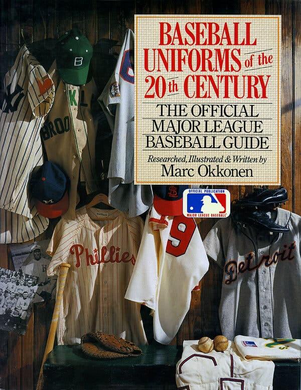
I bought a copy of Okkonen’s Baseball Uniforms of the 20th Century book in 1991 and immediately wrote to him with comments about quibbles I had regarding the Phillies’ and Red Sox’s uniforms. Mostly I pointed out that the picture of the Boston road uniforms for 1991 incorrectly showed a headspoon, and also that the 1970s Phillies uniforms did not have piping in the belt loop area (it was only added in 1983), but it’s obscured by the cartoon figure’s hand. I also mentioned the Phillies’ centennial sleeve patch from 1983.
Ethan received a postcard from Okkonen, rendered in Marc’s now-familiar precision all-caps handwriting, a few weeks later. And although Ethan didn’t mention this in his email to me, Okkonen’s response indicates that Ethan also must have asked why the book didn’t include rear-view uniform illustrations or Negro Leagues uniforms. Check this out (click to enlarge)

I love that note toward the end: “As for showing the backs, Ethan, please give me a break!” Too funny.
It’s pretty amazing that Okkonen took the time to respond to people like this. I feel like we’re slowly but surely filling in the picture of who he was: generally gracious, occasionally cranky, but always — more than anything else — thorough.
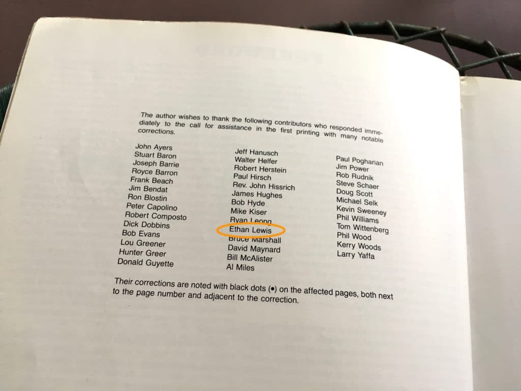
And sure enough, Ethan’s name is listed in the book’s second edition, along with the names of other readers who submitted helpful corrections to the first edition:
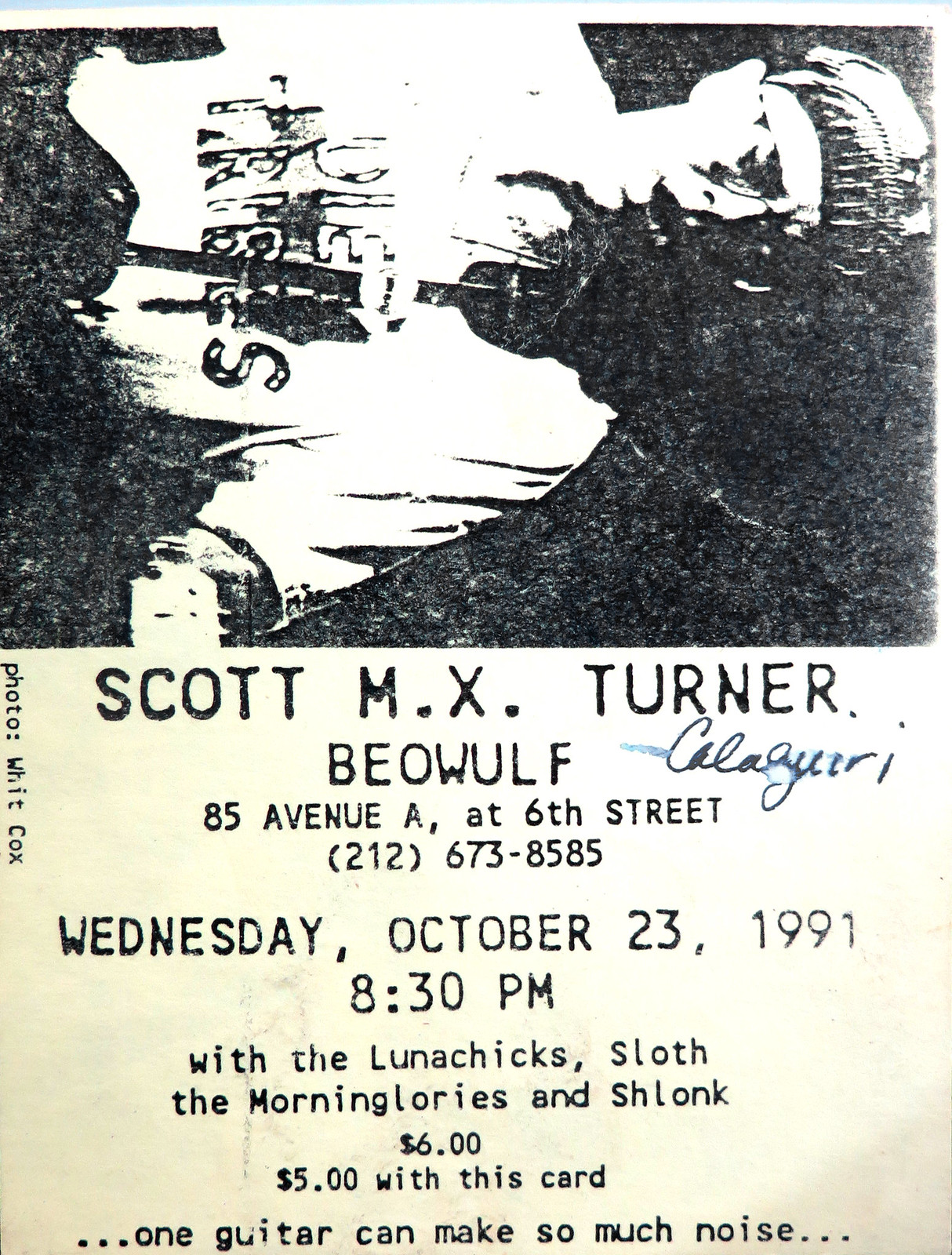
Next up is our own Scott M.X. Turner, who designs our membership cards. Scott is also a musician, and in 1991, when the first edition of Okkonen’s book came out, Scott grabbed a promo postcard for one of his recent gigs and listed a bunch of corrections on the back. He then tucked the card into the book, so he’s still able to share it with us today (click to enlarge):

I asked Scott why he wrote these notes on a gig postcard, of all things, and whether he ever spelled out the correx in a more formal letter to Okkonen. He replied:
I have always had an active, undulating desk (what others call “messy”), and the card was the first thing I found that had a blank side to write on. I didn’t write it in my notebook because I wanted something I could place inside the book.
I never sent these corrections to Okkonen. I don’t know why I wasn’t more motivated to do so. I guess I believed that if I was spotting those things, others would too. Clearly a good thing those others didn’t pass the buck the way I did. Also, my suggested corrections might not be so correct — pre-internet era and so on. Even so, I remember being proud of my nerdiness to even spot these mistakes. Obsessive obsession and all that.
One note: I meant “all-red crown” (not “all-red cap”) for the 1975 Red Sox notation.
I love this. I wonder how many other people have similar cards or sheets of paper tucked into their copies of Okkonen’s book.
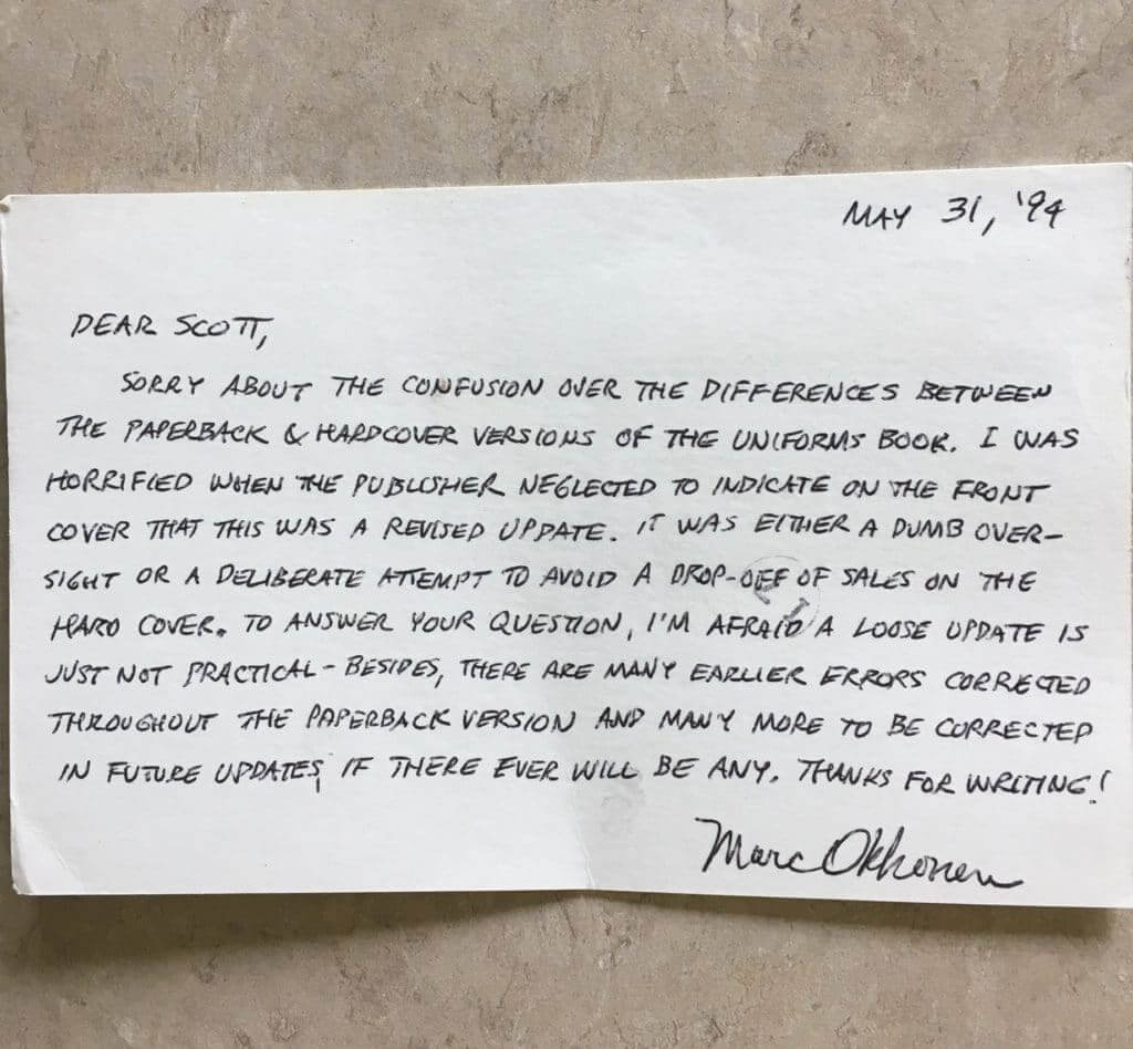
Next up is a card that Uni Watch reader Scott Hassan received from Okkonen in 1994. Hassan had sent Okkonen a letter asking if a separate update to the book’s first edition, covering just 1992 and ’93, might be available. That way, he wouldn’t have to buy the entire second edition just to get two seasons’ worth of additional coverage. Here’s the reply he received:
Finally, remember how current Hall of Fame curator Tom Shieber told me that he first encountered Okkonen’s uniform drawings during a 1989 trip to Cooperstown, years before he started working at the Hall (and also before Okkonen’s book was published)? Uni Watch reader Will Shoken says he had a similar experience in 1989, when he did a cross-country road trip that included a stop in Cooperstown. He kept a journal during the trip, and here’s his entry for Thursday, June 29:

In case you have a hard time reading that, here’s a transcription:
After lunch we visited the Baseball Library — they let us look at the graphics for a book on uniform changes of every team through the 20th century. It was wonderful — unfortunately it hasn’t been published. I would love to have a copy one day (at any price within reason).
“When I found out the book had been published in 1991, I immediately bought a copy,” says Will. “I still have it today.”
And that, ladies and gents, wraps up the Okkonen Files, at least for now. I’ll gladly continue this series if any additional content comes my way, so let me know if you had any dealings or communications with Marc Okkonen that you’d like to share. Meanwhile, you can see all of the installments in the series here.
Collector’s Corner

The Baltimore Orioles didn’t win the American League pennant in 1964, (Yankees, yawn) but this record album captures the excitement the city experienced as the baseball season progressed. Wikipedia says the O’s spent 92 days in first place but they lost the lead on the 18th of September and ended up in third place with 97 wins on the year, behind the White Sox with 98 wins and the Yankees with 99 victories. (Back then, and I didn’t realize this, the AL was just one big division!)
Kruk N Kuip Update
Back on June 11, we mentioned one of my eBay Holy Grails, the original 2003 Kruk N Kuip bobblehead set. I’m happy to say that I was able to get my new 2019 KNK gnome set autographed by the two Giants announcers! Thanks to Larry and Kelsey for making this happen!

And now for the rest of the week here at Collector’s Corner:
• Saints fans! Grab this 1970s bicycle plate for your 10-speed! (The seller also has other teams and leagues available.)
• These 1970s New York Yankees batting helmet banks are still sealed in their bags.
• Pro Sports Marketing was the supplier for this 1970s Cowboys helmet bank with a “Staubach facemask.”
• Fleer used a drawing of the image of Pete Rose sliding into home for this 1970s Padres Big Sign.
• Here’s a matchbook for the Evansville, Indiana restaurant named after Don Mattingly. Even has the NY logo on his cap.
• “Frann & Mick’s Lounge” put out these 1970s Steelers cups that included a drawing of Terry Bradshaw. Or at least a drawing of a quarterback wearing #12! Wonder if he got any compensation for this one?
• Really nice (guessing 1990s) white long sleeve Dolphins polo here, made by Champion.
• Mobil Oil was the sponsor for this set of seven Bucco Bruce glasses.
• Check out this 1970s Eagles bobblehead with the generic headline “Your Favorite Football Team” on the box.
• This 1970s New York Islanders poster is absolutely terrific looking. The seller has others available too.
Seen an item on eBay that would be good for Collector’s Corner? Send any submissions here.
The Ticker
By Anthony Emerson

Baseball News: New Mets P Marcus Stroman will wear no. 7. … Jennifer Lopez presented Alex Rodriguez with a Yankees jersey-themed cake for his birthday, but it featured a NOB! Come on, JLo! (from Justin Barrientos). … The Corpus Christi Hooks, Double-A affiliates of the Astros, have unveiled their absolutely gorgeous Dia De Los Hooks unis, to be worn this weekend (from Ignacio Salazar and Marcos). … The Potomac Nationals, Class-A Advanced affiliates of the, ahem, Nationals, will wear Ray Finkle football-esque unis on August 9 for Ace Ventura night. … Keeping up with the Class-A Advanced teams having promotional nights inspired by 90s comedy movies theme, the Daytona Tortugas, affiliates of the Reds, will wear Dumb and Dumber-inspired unis on August 2. … No image, but a press release sent to the official Uni Watch email account confirms the Charleston RiverDogs, Class-A affiliates of the Yankees, will rebrand as the Charleston Boiled Peanuts next Saturday. They had a similar promotion last year. … The Lakewood BlueClaws, Class-A affiliates of the Phillies, will wear Irish Heritage unis on August 10 (from John Cerone). … The Spokane Indians, Class-A Short Season affiliates of the Rangers, wore special unis for their “Hawaii and Harley Day” (from Wade Heidt).

NFL News: It appears the Panthers have dropped the logo on their pants (from @throw210). … New Era’s NFL sideline caps won’t have a league-wide template — or at least, not all teams will have the same template. The templates are based off when the teams were founded. The caps will also be different for home games and road games. I like the different templates for different eras thing, but the different caps for home and away games is clearly just an effort to sell more hats (from Nicklaus Wallmeyer). … Here’s the Bears uni schedule for home games (from Kenny Saidah). … Saints QB Drew Brees wore Louis Vuitton cleats to practice on Sunday (from Kary Klismet). … The Athletic went pretty deep (paywall) on Browns GM John Dorsey’s sweatshirt (thanks, Alex). … Not sure what team this is, but they might have done just enough to prevent the Eagles from accusing them of trademark infringement (from John P. Skudris).
College/High School Football News: Absolutely gorgeous unis for Bemidji State in 1945. Look at those yoke stripes! (from Kary Klismet). … South Carolina’s official team store pulled down a replica throwback jersey from their website, leading Patrick T. Walsh to believe that they might be worn this year. … Louisville is going mono-black for week one against Notre Dame (from Josh Hinton). … The Vols posted a somewhat abbreviated helmet history graphic on their Twitter page (from Derek Brownlee). … Here’s our first look at Virginia Tech’s CFB150 patch (from Andrew Cosentino). … And here’s our best look yet at Northwestern’s CFB150 patch (from Ella Brockway). … And here’s a very not-great look at UCF’s CFB150 patch (from Jerell Little). … New turf at Autzen Stadium (from @samuel101ts). … New unis for Father Judge (Pa.) High (from Christopher Hickey).

Hockey News: Arizona State’s hockey team is in China, and not only is the team name in Chinese on their sweaters, but so are the players’ NOBs! More pics here (from @OlegKvasha). … The Peoria Rivermen of the SPHL are getting new unis, and will wear their dark-colored jersey at home instead of on the road, as is practice in the SPHL (from John Cerone).

NBA News: Clippers owner Steve Ballmer has tossed around the idea of completely rebranding the team when they move into their new arena, including potentially dropping the Clippers’ name (from @HouPacers). … Celtics G Carsen Edwards will wear no. 4 (from Etienne Catalan). … Also from Etienne, Wizards PF/C Moritz Wagner will wear no. 21.

Soccer News: Jamie points out that two of the teams that went “ad free” still have uni ads, just not on the front of their shirts — Huddersfield has an ad on the shorts and Motherwell on the back of the shirt with a charity logo on the shorts. … Here’s our first look at Everton’s new stadium. Still images here (from Kary Klismet). … New third kits for League Two side Mansfield Town (from Ed Żelaski). … You can catch Josh Hinton’s daily download on his Twitter account, including Real Madrid’s finally-released third kits and Udinese’s new third kits. … Argentine giants Boca Juniors have moved to Adidas (from Germán Cabrejo).

Grab Bag: Here’s a great read on the designs and materials — including recycled electronics — being used in the Tokyo Olympics’ medals (from John Cerone). … Test cricket is adding NOBs for the first time in its 146-year history (from @jehawks). … Here’s a great article on the company that helped the Army redesign the World War II-era “pink and green” dress uniforms for the modern era (thanks, Alex).
ASU is going to China not japan
Also fixed.
Also, that sweater might just be a sample (looks like it, given the number 19), but it has the Chinese words for “Sun Devils” in the NOB position, not the name of a player. Will every player have that above his number, or will they actually convert the player names into Chinese?
The NY Islanders poster link in Collectors Corner is broken.
Fixed.
Looking at the team shop, it seems like the NFL hats are not locked in to one design. I see Browns hats in the 40’s, 70’s, and 90’s designs.
Same for the Patriots. Seems that each of the teams have from all the eras they existed (IE there are 70s and 90s Oats hats in addition to their official 60s ones, but no 20s or 40s era ones) My guess is that the “official” ones the team wears will be from their founding era (Pats Wil wear 60s styled ones for example) but the others will be available as retail merch.
The different caps for a team home and road are not new. New Era did this last year, too.
That Eagles bobblehead has the worst graphics treatment I have ever seen. A DIY special?
Re: Okkonen Files
I’m loving these stories, they’re a great look at someone who did a task that would have been a hundred times easier today with the Internet. To think of all he had to do to would blow the mind of young Millenials.
That looks like more like Chinese on the Arizona State jerseys. Also, Chinese flag on right shoulder patch.
I would be for the Clippers changing their logo. However, they should not even consider a name change. I am so against that idea. Keep the blue and red.
I’ve seen some great concept logos for the Clippers that would work better than the current logo.
I would be all for going back to the old logo too.
link
I’m with you. The name “Clippers” to me has a very specific San Diego nautical connotation, and shouldn’t have traveled – although that’s not the worst case of that (I’m looking at you, Jazz).
Lakers?
That Eagles head/dog head logo mashup might be connected with the dog mask phenomenon from the Eagles’ Super Bowl run. If I’m right there might be a slightly stronger copyright infringement claim on the Eagles’ part.
Not liking the Jets’ home sideline cap; looks like the one link wore in the mid-’80s.
Joe wasn’t so bad, especially compared to Rich Uptight….I mean, Kotite: link
“(Back then, and I didn’t realize this, the AL was just one big division!)”
Read that and didn’t know whether to laugh or cry. Yes Brinke, until 1969 baseball didn’t have “playoffs” — the regular season ended and about two days later the league winners met in the World Series. Which was played in the daytime, in warm weather.
Sorry if that came across as a dig at Brinke, I didn’t mean it that way. I realize this is a uniform site, not a sports-history site, although sometimes I forget this, since generally there seems to be a pretty big overlap between uni-geeks and history geeks.
I was also surprised…shocked, actually…that Brinke didn’t know that.
Actually it wouldn’t be one big division…it would be
an undivisionone big league.The Lunachicks were a very cool band. I wish that I could have seen Mr. Turner’s band and those other acts in action.
Robert,
The Lunachicks were great. It was an interesting time for the New York rawk scene — every genre pressing together on bills all across the city.
Here’s “Mr. Turner”‘s efforts from the mid ’00s to last year:
link
hotsummer.bandcamp.com
link
I would be OK with the Clippers changing their name, but only if this meant a future San Diego NBA team could reclaim it for themselves, similar to how Charlotte reacquired the Hornets name.
I also sense a future Uni Watch contest: redesign/rename the Clippers!
I’m a Clippers fan, always have been (in case someone wants to accuse of jumping on the bandwagon). And although the name isn’t great I’ve become attached to it, I would be against any change. Plus I KNOW it’ll probably end up being some stupid singular plural nickname eg Thunder, Magic, Spirit or something even more ridiculous. Please, please don’t change the name.
I was a Clippers fan during the 80s and 90s, so no bandwagoner here, either. But if any team can use a rebrand it’s this one. Although in these days of uni ads and other nonsense, I’m afraid they could end up being Red Bull Los Angeles…
Assuming that they keep the Clippers nickname, why not bring back the Clipper Ship “sails” logo from the 1970s/ It is modern looking and truly captures a relation to the actual nickname, which is somewhat hard to do in any athletic context. Just about ANYTHING would be better than the Initials-within-Initials “Practice Jersey” template they have used in recent years. Yuk. I wonder whose slow nephew made $75,000 “designing” that concept ….
Great lede! Regarding the 1964 Orioles–I have a number of tickets printed by the Orioles for the 1964 World Series that were not distributed. They tried to keep them from getting out as they hoped that the team would continue to do well and that they could use the same design in the future. As it turns out, they were able to use a very similar design for the 1966 World Series tickets.
Brees’ cleats are a Louis Vuitton x Supreme collaboration and not just LV. I know there will be many people here that don’t care but I just thought the reporting in the tweets in the article should have been more thorough.
You’re in the wrong place if you think people don’t care about something like this…the ticker is where this site post what is reported and generally how it’s reported by readers, I’m sure whoever submitted it said the cleats were LV.
NFL New Era caps would be terrific if they would get rid of the side panel writing/numbering. It’s a distraction. Less is more!
“Jamie points out that two of the teams that went “ad free” still have uni ads, just not on the front of their shirts — Huddersfield has an ad on the shorts and Motherwell on the back of the shirt with a charity logo on the shorts.”
Considering the not particularly nice private scolding Paul gave me for suggesting that you might be considered a mark if you believed this campaign was changing anything it’s safe to say I feel somewhat vindicated by this. If any proof were needed that this was just a malicious con to get a corporation free gonzo advertising by inserting itself as the supposed literal saviour of soccer shirts and thereby turning anybody engaging in the discourse around soccer kit culture into a de facto billboard for their brand then this is surely it.
Motherwell in particular have been really patting themselves on the back for their “sponsorless shirts” — that describes the ones you can buy, but that seems to be it — so to see not only ads on the back, but also the addition of a shorts ad, was actually incredible.
Let’s hope the Panthers really are dropping the logos from the hip sections of their pants (you can never be quite sure based on what they’re wearing at practice), that would be a big improvement. No need to have the same logo appear six times on a uniform.
I totally agree with you, kris Jenkins and a couple of linemen did it in the early 2000’s. I noticed it playing madden, they even have both sets for an option now (logo & non-logo). I don’t trust madden %100 (look at the bears orange pants in years past) but the did get the black pants correct. Which got me to look into it.
The sideline caps are okay, but the Titans (That old oil rig logo was a classic), Jets, and Chiefs should have had a version with their original names and logos, particularly since the caps also display the origin year. I’m a sixties kid though, probably doesn’t mean as much to the marketing department at New Era.
The best look yet at Northwestern’s 150 patch doesn’t actually link to anything. Perhaps a bit of meta-commentary? B^)
Those New Era NFL sidelines caps are just awful! Each design is uglier than the next.
I am proud to say my name appears on the “Thank You” page of Mark Okkonen’s book, but I’m having a devil of a time scaring up the postcard he sent to me. I’ll send a scan of it when I find it. My issues were pretty much of the ilk that have been gone over on these pages, though I also brought up the Astros only had one set of uniforms when they wore the rainbow guts.