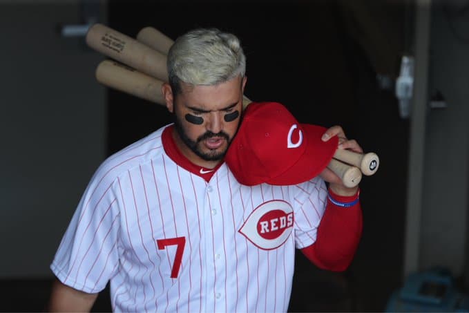
Reds 1967 Throwbacks
By Alex Hider
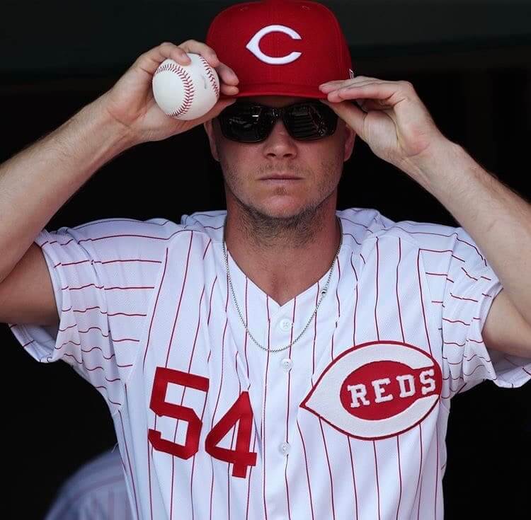
The Reds dressed in their 10th throwback uniform of the season yesterday — the 1967 pinstriped home set.
The 1967 uniforms marked a return of sleeves after a decade of vests, so there were no sleeve shenanigans on Sunday —much to the chagrin of Yasiel Puig, Michael Lorenzen and Derek Dietrich.
Before we get started, here’s what the uniform “unveiling” looked like in a local newspaper.
https://twitter.com/cammillerfilms/status/1155555229833801728
The ’67 jerseys had an element that has not yet appeared on any other Reds throwbacks so far this year — NOBs. 1967 marked the first time Cincinnati included names on jerseys above the numbers, and it introduced the large block lettering that would become a staple for the team for decades.
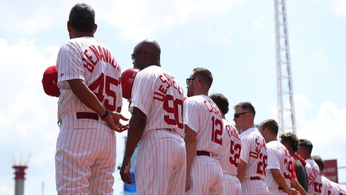
Luckily for the Reds equipment staff, no one on the roster has a last name longer than 10 characters, so they didn’t need to get creative a la Dave Concepcion.

Michael Lorenzen and Tucker Barnhart have among the longest names on the team, here’s how their NOBs looked.
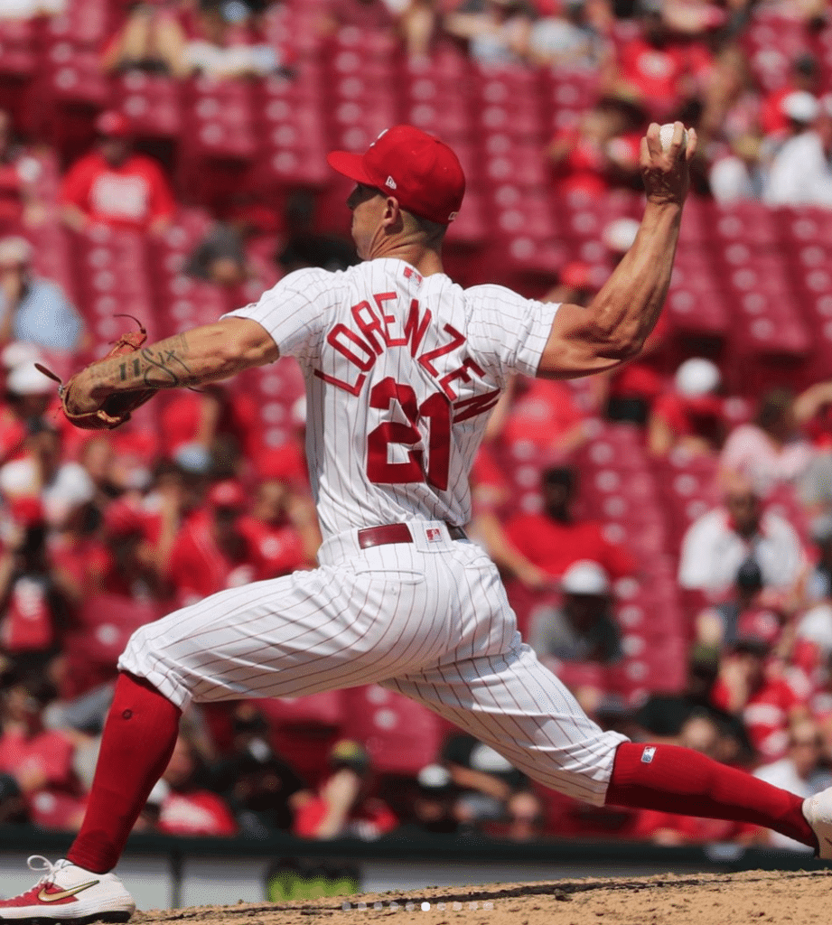
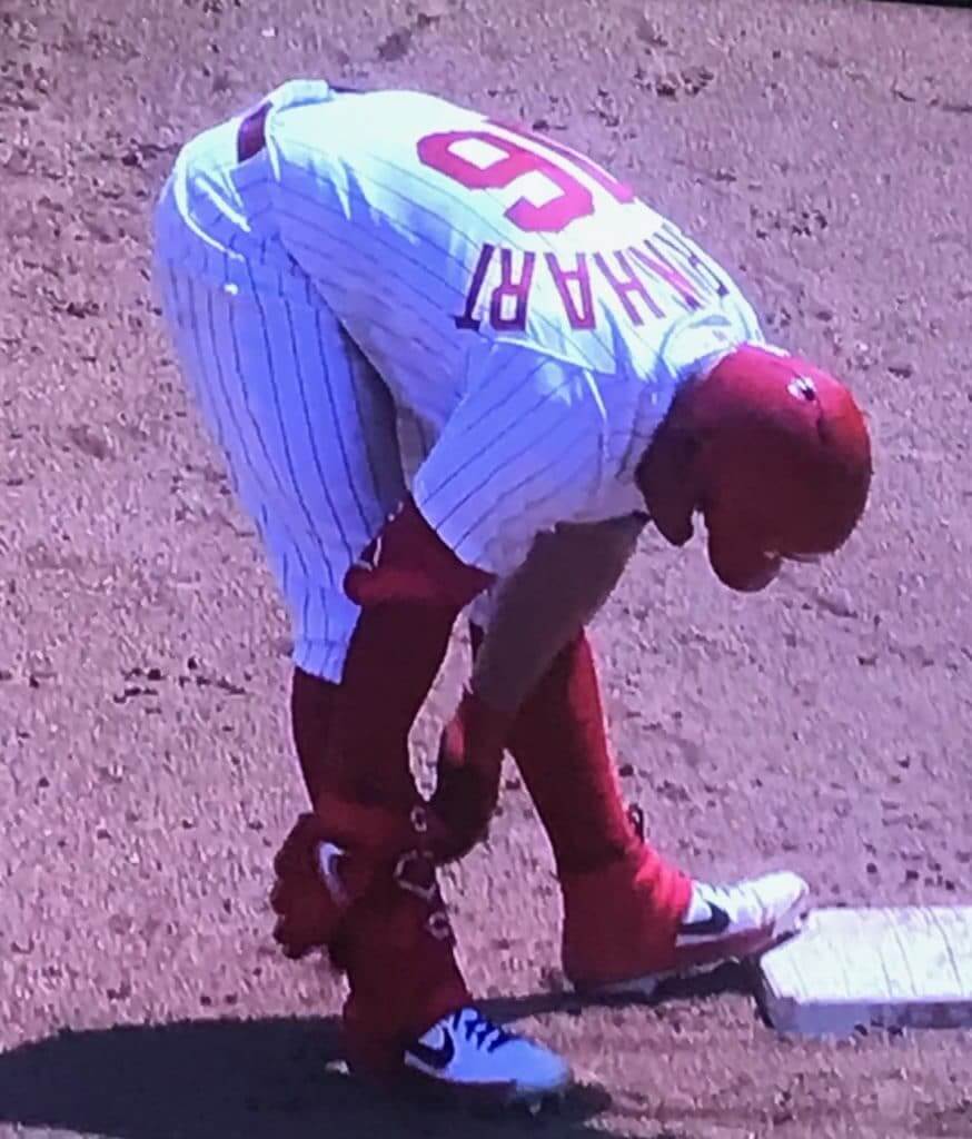
The Reds did include an accent mark on Eugenio Suárez’s NOB — something that was not afforded to relief pitcher Pedro Borbón in the 1970s.

The chain-stitched wishbone-C logo on the jerseys really popped against those pinstripes.
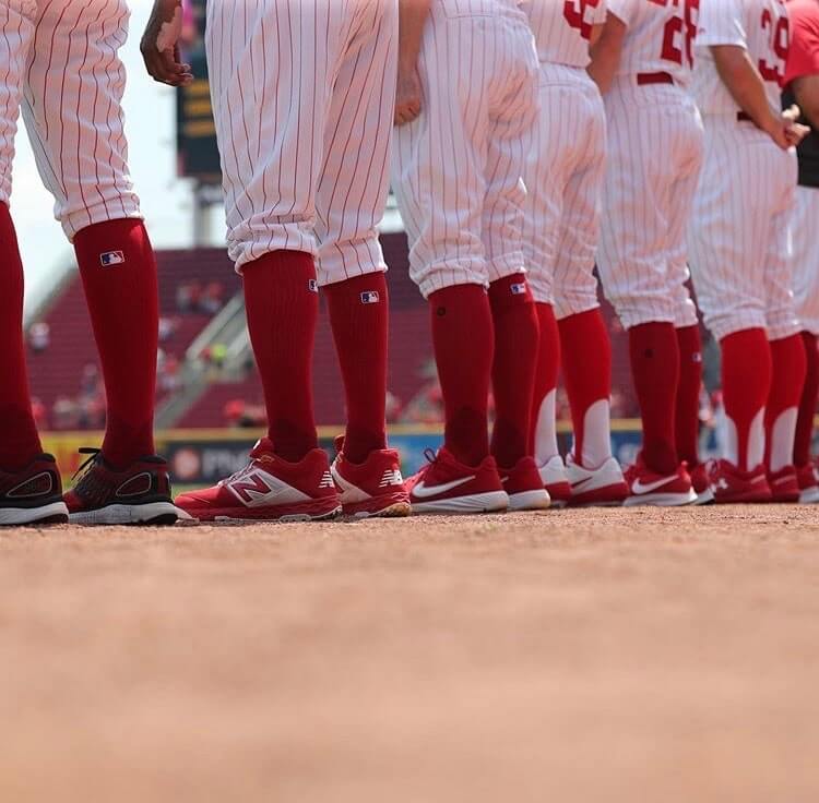
As has been the case with every throwback game so far, all player went high-hosed on Sunday. But while past throwbacks came with a specific sock, there was a wide variety in legwear on Sunday.
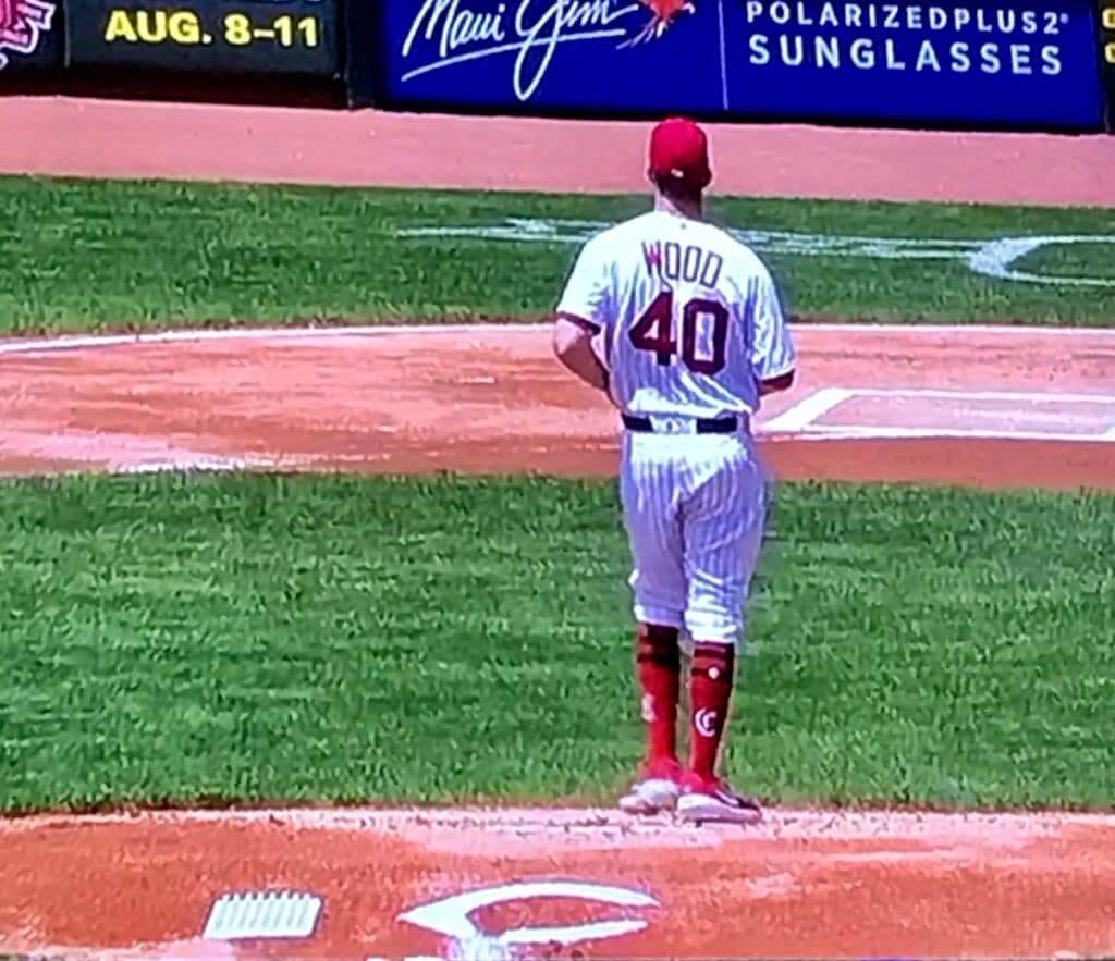
SP Alex Wood wore Stance throwback logo socks — but the logo wasn’t era-appropriate.
Relief pitcher Michael Lorenzen likes to wear his sleeves tight. But yesterday, it appeared that only one of his sleeves had been cuffed tighter — the other one appeared to hang lower and looser.
@UniWatch @PhilHecken Looks like one of Lorensen’s right sleeve is cuffed higher than his left. I think you can see the tailoring in the photo on the left. pic.twitter.com/sBk9PRcBrE
— Alex Hider (@alexhider) July 28, 2019
It may be due to modern manufacturing processes, but the wishbone-C on the cap was wider and bolder than the version the team wore on the caps in ’67.

Get used to these caps — they’ll be wearing them for the next three throwback games.
Up next on the throwback schedule are my personal favorites: The 1969 white home uniforms on Aug. 11.


The Ticker
By Jamie Rathjen

Baseball News: On Saturday, the Double-A Hartford Yard Goats wore literal goat-themed jerseys. Yesterday, there was a vintage base ball game before their game (from Mike Lucia and Joe Milone). … Mets P Jason Vargas is missing the mesh side panels on his jersey (from @brianspeaksnow). … Cubs SS Addison Russell was sent to Triple-A Iowa and didn’t play in what was supposed to be his first game yesterday because his equipment didn’t arrive in time (from Mike Chamernik).

Football News: Reader Graham Duvall sent us this article about Topps football cards that mentions matter-of-factly that early-’70s Rams helmets were white with blue horns, which as far as we know is a mistake, and then doubles down on it by saying that the helmets were airbrushed to be plain white for the Topps cards.

Hockey News: Reprinted from yesterday’s comments: the AHL’s Lehigh Valley Phantoms advertised on a Cup Series car and a truck at this weekend’s NASCAR races at Pocono Raceway (from commenter ChrisH). … Mixed martial artist Cris Cyborg wore a Wayne Gretzky Oilers jersey at this weekend’s UFC 240 in Edmonton (from Wade Heidt).

Basketball News: A game-worn high school jersey belonging to Barack Obama is up for auction (WaPo link). The jersey is from Obama’s time on the 1978-79 Punahou (Hawaii) HS state championship team (from Tom Turner). … These light blue uniforms for Tulane’s women aren’t new, but they turn what would be a standard Nike gradient pattern on the shorts into a wave (from @Starkman55). … Two items from The Basketball Tournament from Jakob Fox: Andrew White III, who was on the Syracuse alumni team Boeheim’s Army, had a different NOB style, while one player on their opponents, Brotherly Love, was possibly wearing a No. 32 NNOB blood jersey, because there isn’t a No. 32 on the team.

Soccer News: Preseason kit shenanigans: Chelsea wore last season’s yellow third kit against Reading because they haven’t revealed this season’s yet. The number font was also at least slightly different from last season (from Josh Hinton). … Also from Josh: Dutch team Groningen revealed their kits, while teams revealing third shirts included English Championship team Barnsley — which is a loose throwback to 1989-90 — and Portuguese team Sporting CP. … You can see more soccer items on Josh’s Twitter feed. …. There’s also new kits for English clubs Bournemouth (from Richard Hindle) and Coventry United, whose second-tier women’s team is much more prominent than its men’s team. … Reprinted from yesterday’s comments: in MLS, both the San Jose Earthquakes and Houston Dynamo changed at home (from Brian Henke).

Grab Bag: Colombian cyclist Egan Bernal’s Tour de France victory was the fifth in a row and the seventh in the past eight for his Team Ineos, so usually the team does something uni-notable for the last stage. This year, all the Ineos riders received a kit with yellow accents, Bernal received a solid yellow bike, and even the team cars were black and yellow. The winners of the green and polka-dot jerseys, Bora-Hansgrohe’s Peter Sagan and AG2R’s Romain Bardet, also received bikes painted like their jerseys. … Trinidadian cricketer Dwayne Bravo, who is playing for the Winnipeg Hawks in Canada’s Global T20 tournament, has “Champion” as his NOB, which is the name of a song he released in 2016 (from Peter Della Penna). … Cross-posted from hockey: the AHL’s Lehigh Valley Phantoms advertised on a Cup Series car and a truck at this weekend’s NASCAR races at Pocono Raceway at Pocono Raceway (from commenter ChrisH). … Also cross-posted from hockey: mixed martial artist Cris Cyborg wore a Wayne Gretzky Oilers jersey at this weekend’s UFC 240 in Edmonton (from Wade Heidt). … A historian in Spokane, Wash., convinced the city police department to fix a long-standing error on its badges, which had an incorrect department founding date (from Kary Klismet).


“1967 marked the first time Cincinnati included names on jerseys, and it introduced the large block lettering that would become a staple for the team for decades.”
In fact, the Reds had the names arched below the number on the vests in 1965 and 1966.
I’ll give him the benefit of the doubt. He did say “Large Block NOB” which is true.
Here’s a comparison between the 1965 and 1971 sets.
link
Even as a Lightning fan, I wouldn’t have minded rocking that Wayne Gretzky jersey like Cris Cyborg did in Edmonton. That’s how much respect I have for Gretzky’s playing career.
What do you mean 1967 marked the first time the Reds had NOB?…their previous set had the infamous names below the numbers.
Thank you. Came here to say it.
You’re right! Mistake on my part. I made an edit, thanks for pointing it out.
I’d never be able to source it, but I read/heard that David Concepcion was given #13 so he could have a skinny one digit to fit his last name around it. Similarly, the current long names have #21 and #16, so similar problem averted. Though Coach DeShields’s #90 looks pretty wonky!
Reds had a standard numbering system in the 60’s and early 70s when Concepcion came up — catchers single digits, infielders 10-19, outfielders 20-29, pitchers 30s and 40s. There were exceptions, and players kept the same number when they changed positions, but most player numbers fit into the system. So as a shortstop, Concepcion having a number in the teens was totally standard.
Okay, I tried posting this once and it didn’t work, so I’ll try again.
Concepcion’s #13 doesn’t need that explanation; the Reds had a standard numbering system by position in those days — catchers and coaches single digits, infielders 10-19, outfielders 20-29, pitchers 30s and 40s. There were some exceptions and players didn’t change numbers if they changed positions, but most numbers fit the system.
Speaking of Topps airbrushing the Rams helmets, some of the weirdest was in 1980 and ’81 when they airbrushed PART of the logo from the helmet.
link
Love the strange airbrushing on cards. Mel Bridgman’s silver helmet with the New Jersey Devils comes to mind.
link
I like this Reds uniform. I would be all for this becoming their regular uniform again. Clean look and I would prefer the Reds to get rid of black as a trim colour.
I don’t know what it is, but I’m a fan of just about every iteration of the Reds uniforms. Red and white with no accents, with the navy accents (my favorite), and with black accents; vests, pinstripes, sleeves….it all looks incredible in my opinion.
Jason Vargas’ jersey with no mesh side panels looks much better than the usual jersey. Mesh is especially hideous looking on pinstriped jerseys. They should get rid of the stupid panel on the jersey bottom as well.
Why did the Reds drop pinstripes after one season? Too much like the Phillies?
The Reds had been wearing pinstripes since 1958…maybe it was just time for a switch.
Like the Phillies, those ’67 Reds uniforms take on a pinkish hue in my eyes.
I have gotten confirmation from the Mets that Vargas is wearing the old double knit material this season. Thus the lack of mesh panels on his uniform.
While the size might be overkill. Isn’t the idea to be able to read NOBs, team names, numbers at a distance? Let’s make the all legible and visible. No more dark on dark or light or light. May be very sharp up-close, but nearly invisible from far away. Let’s have contrast, shall we? Rant over.