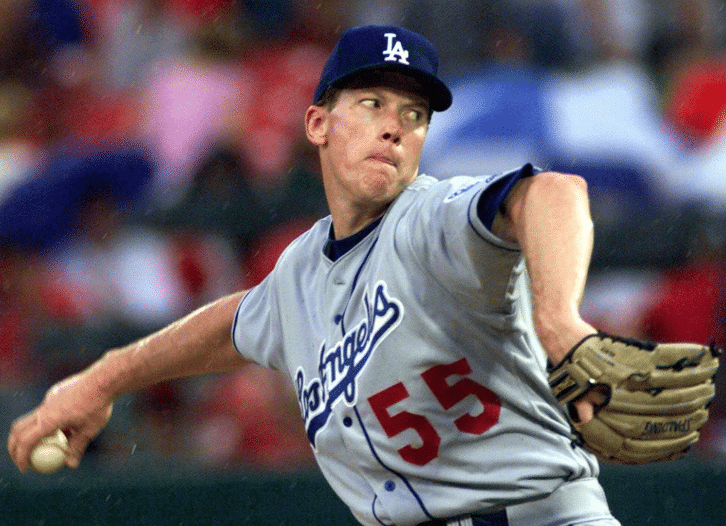
Reader JaceSon P. Barrus recently brought to my attention a discussion that took place in the Dodgers broadcast booth on July 6 between play-by-play man Joe Davis and color analyst Orel Hershiser (shown above during his final MLB season, 2000). Here’s the transcript:
Joe Davis: Did you ever deal with tipping [your pitches]?
Orel Hershiser: Oh yeah, I tipped some pitches. I had to invent the piece of leather that goes on the outside part of the glove that covers your index finger. If you’re one of those people who like to have a finger out on the glove, that piece of leather did not exist in my day, and I knew I wiggled my finger a little bit when I got my curveball grip. So [after] seeing that on video, I had to have the glove company create that piece of leather on the outside to guard my finger.
Davis: Guard your pitches.
Hershiser: Yeah. My whole career! There are inventions like that going on in baseball all the time. They start out for individuals and you have enough power when you’re in the big leagues to ask for the custom-made part, and later on they make their way into all the gloves that are made, or spikes, or any of the different things, from bat wraps to whatever they use to make the bat feel sticky to all different things that guys have come up with. Manufacturers, when they’re giving you the free equipment, maybe even paying you to use the equipment, they also ask, “How can we make the equipment better?”
This story about Hershiser having invented the finger sheath sounded vaguely familiar, but I couldn’t be sure if I’d heard it before. I did remember, however, that Uni Watch then-intern Mike Chamernik had written a blog entry back in 2014 about players who stick a finger out of their glove, so I looked up that piece, and sure enough, it credits Hershiser with the finger sheath. Mike’s piece also linked to this 2012 article by ESPN writer Tim Kurkjian, which includes the following passage:
“Do you see that little flap on the outside of the pitcher’s glove? I invented that,” Orel Hershiser told a writer as the two watched a game on TV. “Sometimes, when I would throw a breaking ball, my [left] index finger [the one that he kept on the outside of his glove] would wiggle. And the hitter could see it, and would know a curveball was coming. So I had the glove company build a little flap on the outside of the glove so I could keep my finger outside my glove, but the hitter couldn’t see my finger.”
So Hershiser has been telling this story for a while. But at what point in his career did he come up with this innovation? Based on some impromptu photo research, it appears that he added the leather sheath in the middle of the 1996 season, when he was pitching for Cleveland. Here’s a shot from May 17 of that year, with his finger uncovered:
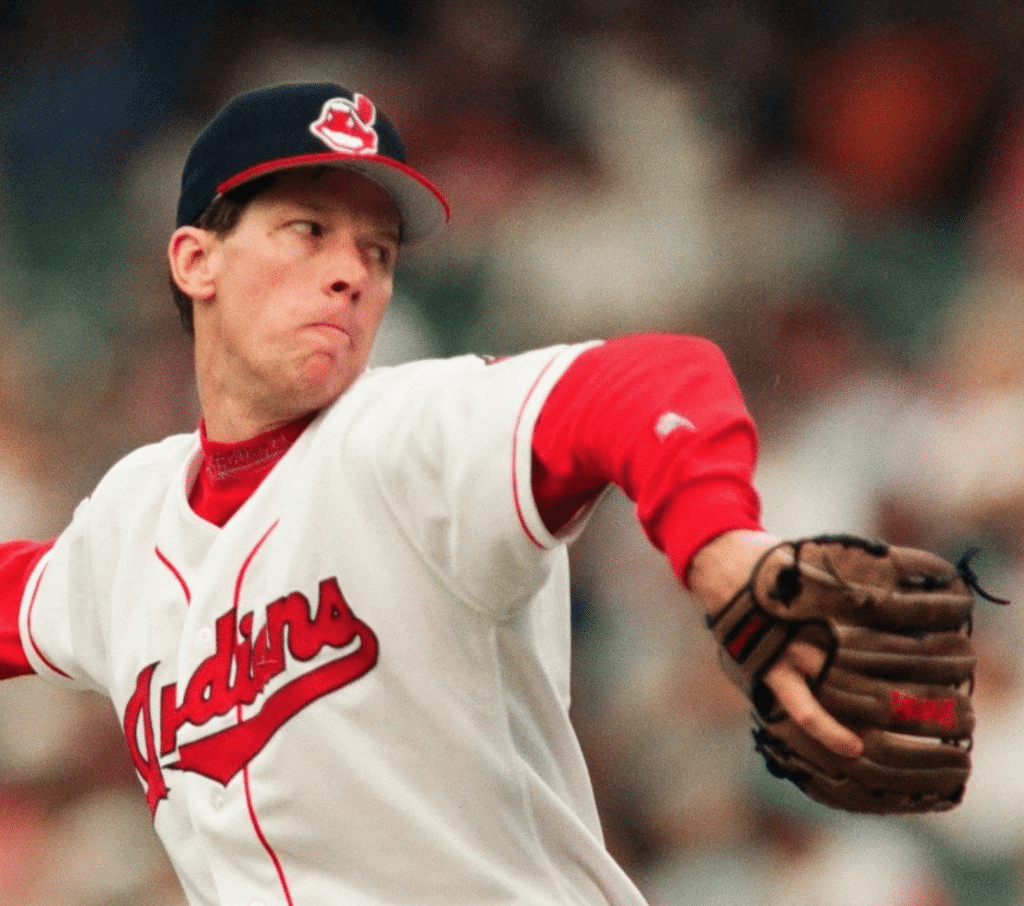
And here’s a shot from later in that season, with the leather sheath now in place (click to enlarge):

His finger remained covered for the rest of his career.
It’s hard to tell from the photos, but I’m pretty sure his glove manufacturer at the time was Louisville Slugger — yes, they make gloves as well as bats — so that’s apparently the company that worked with him to pioneer the finger sheath. (Update: Several readers/commenters say it’s actually a Spalding glove.)
Meanwhile, if you look again at those two photos, you can see another interesting difference in Hershiser’s gear: In the first photo he has a grey underbrim; in the second photo, it’s black. During this period, all MLB teams had grey underbrims, but a source at New Era once told me that Hershiser always asked for black because he felt it helped him focus better. And sure enough, you can see him wearing black throughout his career, even going back to his glory days in the late 1980s. Photos of him wearing a grey-underbilled cap are rare.
Today, of course, all MLB underbrims are black. That move began in 1998, when Angels GM Bill Bavasi switched the Halos from grey to black as an anti-glare move (sort of like eye black). Bavasi then moved on to the Mariners and got them to change from grey to black as well. Other teams eventually followed, and black became the MLB-wide standard sometime in the late 2000s (I forget the exact year, but I know it was after 2006).
Back in the day, of course, underbrims were green. And occasionally they still are! The best thing about this year’s stars/stripes caps, for example, was that they had green underbrims:
Finally, let’s get back to Hershiser’s point about players who, like himself, pioneered equipment innovations that eventually spread throughout the sport. I can think of two good examples, both involving catchers: Steve Yeager created the protective throat flap and Charlie O’Brien came up with the hockey-style mask. I’m sure there are other pioneers I’m overlooking — feel free to post them in today’s comments. (And just to keep things focused, let’s not include the first player to wear this or that, or a player who became the guinea pig for an equipment manager’s innovation. Let’s keep the discussion to players who came up with the innovations themselves. Thanks!)
(Big thanks to JaceSon P. Barrus for sending me down this rabbit hole.)

Very Meta: Scottish Club Celebrates Uniform Anniversary
By Jamie Rathjen
Earlier this week, Scottish Championship team Dundee United began celebrating a uni-related milestone: the 50th anniversary of adding orange to their color scheme.
The team’s use of orange originated from two summer moves to Dallas — the first in 1967, when they became the United Soccer Association’s Dallas Tornado, and the second in 1969, when they reprised their alternate American identity as part of the first season of the NASL.
Wondering how a Scottish team ended up in Dallas? The teams in the United Soccer Association were all teams from other countries — Brazil, England, Ireland, Italy, the Netherlands, Northern Ireland, Scotland, and Uruguay — that moved to North American cities for the summer. They received alternate identities with mostly American-style team names and logos.
Dundee United, as the Tornado, received a color scheme of orange and light blue and also wore the league’s characteristic football-style large numbers on the front of the shirt. After the league ended, they reverted to their previous white and black color scheme for the next Scottish season.
It was only after Dundee United returned for part of the first season of the NASL in 1969, again as the Tornado, that they made orange and black their primary colors, which provides the occasion for the current 50th-anniversary campaign. The club’s story is that the wife of the then-manager made the suggestion to change colors.
In recent times, a white and black combo has periodically reappeared as Dundee United’s second or third choice, including on short notice in two preseason games over the past few weeks.
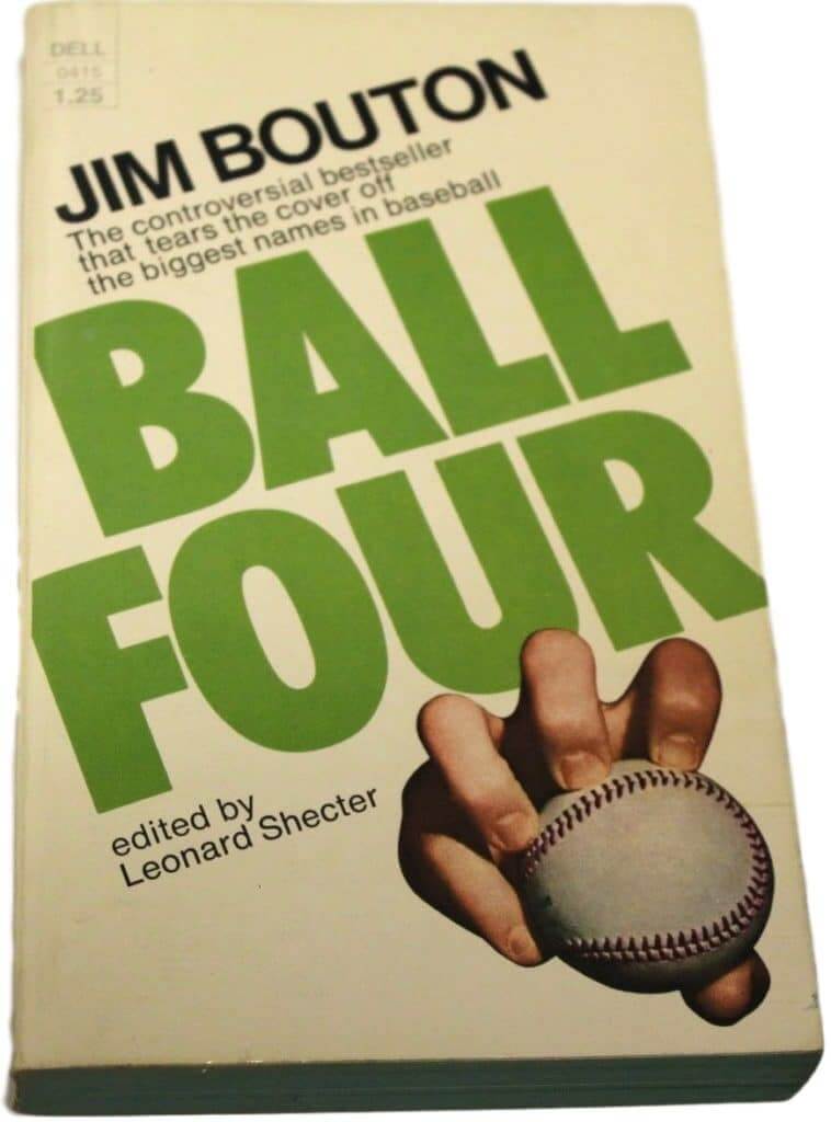
Ball Four follow-up: Several readers got in touch to ask how I was able to put together all those uni-related quotes from Ball Four in yesterday’s Jim Bouton obituary. Like, had I memorized the book so thoroughly that I knew where to look for each of those quotes? Or maybe I had all the uni-related passages bookmarked with Post-its or something like that?
Here’s the deal: I spent most of Wednesday visiting my mom. It’s a two-hour drive in both directions, so I was pretty wiped when I got back to Uni Watch HQ at 8:30pm. I exchanged “How was your day?” pleasantries with the Tugboat Captain, decompressed for a bit, and then sat down at about 9:15pm to catch up on email and such. At the time, I was planning to use an evergreen post (i.e., something already prewritten and not time-sensitive) for Thursday’s lede.
Then I opened my laptop and learned that Bouton had died. So much for the evergreen — I knew right away that I’d have to write an obit for Thursday’s lede. I also knew I wanted to include the Ball Four passages about Frank Robinson’s stirrups and Rico Carty’s wallet.
The Robinson passage was easy enough — I’ve quoted it countless times over the years, so I could just look up one of my previous mentions of it and copy/paste. But the Carty bit was trickier. I wasn’t sure exactly where it appeared in the book, so hunting for it might have taken a while.
Then I remembered that Amazon’s listing for Ball Four had once included a functionality that made it possible to keyword-search the entire book. Was that still the case? Yes!
That made it easy to locate the Carty passage. Then I thought to myself, “Hmmm, why not quote all of the other uni-related passages from the book and make that the theme of the obit?” I’ve read and reread the book many times, so I was able to think of several uni-related passages off the top of my head (the bit about wearing No. 56, the bit about Don Mincher’s earflap, the comparison of the Pilots’ uniforms to the Yankees’ uniforms, etc.). After I located those, I simply searched on “uniform” and “hat” and “cap,” which resulted in a few additional passages I’d forgotten about.
I still had to transcribe all of the passages, find photos, and cobble together the obit, all of which took several hours, but it was fun, obsessive work. I wrapped up shortly after midnight, by which time the Tugboat Captain had long since gone to bed. The things I do for you people!

ITEM! Teespring weekend sale: Teespring is running a site-wide sale this weekend. All day on Saturday and Sunday, you can get 10% off by using the checkout code SUMMER.
So if you’ve been thinking of getting something from the Uni Watch shop or the Naming Wrongs shop, this weekend would be a good time to do it!
For those of you who have the code for the 15% Uni Watch membership discount, I think you can combine both discounts this weekend, although I’m not 100% sure of that. Give it a shot!

LAST CALL for the Bengals contest: Today’s the last day to enter the Bengals-redesign contest that I’m running in conjunction with Sports Illustrated. Full details here.

Uni-versary patch reminder: In case you haven’t seen, the Uni Watch 20th-anniversary logo is now available as an embroidered patch. The patch was made for us by Stitches, the same shop that does all the sewing for the Mets, Yankees, and Islanders. It measures four inches across and is suitable for sewing onto a jersey or jacket, or just for displaying.
The price is $9.99, plus $1 for shipping (or $2 for shipping outside the USA). To order, send payment to me via Venmo (use @Paul-Lukas-2 as the payee), Zelle (plukas64@gmail.com), or Cash App (plukas64@gmail.com). If you want to use Apple Pay or a paper check, or if you’re outside the USA and can only use PayPal, shoot me a note and I’ll fill you in.
Once you send payment, be sure to send me your shipping address so I can send the patch on its way to you. Thanks!
The Ticker
By Anthony Emerson

Baseball News: The Louisville Bats’ 1990s Louisville RiverBats throwbacks are in. … Triple-digit uni number alert! That’s from the Japanese minor league All-Star Game (from Jeremy Brahm). … Today in late capitalism: New Era is selling caps with World Series logo patches made from Swarovski Crystal. Many are anachronistic (from Ignacio Salazar). … Musician Jack White wore a “We Are Family”-era Pirates-inspired outfit for a charity ballgame (from @dmoon).

NFL News: Here’s a very satisfying video of a sugar cookie shaped like a football helmet being decorated to look like a Cowboys helmet (from Brice Wallace). … This mural for the Madden 99 Club features three different uniform templates (great spot by Matt Haggen). … If Uni Watch ever goes to South Carolina, we’re going to have to go to Aunt Chilada’s for their display of retro NFL helmets!
College Football News: You can see Arizona State’s new unis in this video clip posted on Twitter (from Ricky Aponte). … New away jersey for Marshall — no more green sleeve caps (from Michael Berry). … A car at the Kentucky Motor Speedway will have Jared Lorenzen Memorial Fund livery. Lorenzen, a QB at Kentucky and briefly in the NFL, died on July 3 at the age of 38 (from Josh Hinton). … Here’s how the CFB 150 patch looks on a Miami jersey (from Peter Mitchell).

Hockey News: The Blackhawks’ youth jersey has been slightly altered, leading Marc-Louis Paprzyca to believe there might be some validity to the rumors of the Hawks’ real unis undergoing some slight changes. … The University of North Dakota’s championship banners have been redesigned and moved to a new location at the school’s arena (from Eric Fiala).

NBA News: During a Summer League game, the Lakers’ Nick Perkins ripped off the Knicks’ Mitchell Robinson’s headband and threw it at him. Perkins was ejected (from Mike Chamernik). … Also from Mike, the Pistons are auctioning off stuff from the old Palace of Auburn Hills (also from Michael McBain). … DeMarcus Cousins will wear No. 15 with the Lakers (from Josh Hinton). … More of the NBA’s new number assignments can be seen by checking out Etienne Catalan’s Twitter account. … Merissa Homer was in a meeting with Jazz President Steve Starks, and Starks confirmed that a purple mountain throwback jersey is in the works.

College/High School Hoops News: Kentucky has revealed their uni numbers for the 2019-20 season (from Josh Hinton). … New court design for George Washington University (from Kevin Burke).

Soccer News: USL League One team Richmond Kickers has some (pretty ugly!) military appreciation warm-up kits for Saturday’s match (from @spiralJ). … Scottish team Aberdeen has added a small back-of-shirt advertisement for the charity Grassroot Soccer (thanks, Jamie). … The following are all from Ed Żelaski: New home and away kits for Mexican side Xolos. … Hungarian team Ferencváros has a new home kit. … New home kit for Spanish side Deportivo La Coruña. … Many other new kits can be found on Josh Hinton’s Twitter page, including the similarities between Barcelona’s new away kit and Crystal Palace’s 2016-17 away kit, and leaks Atlético Madrid’s new away kit and Juventus’s new away kit. … Also from Josh: the Austrian national teams will have a new badge. … The new Pokémon game is UK-based and has its characters in soccer kits. Players can pick their own three-number combination (from @Cintronz).

Grab Bag: Here’s Ireland’s kit for the Rugby World Cup (from Charlie Kranz and Mike Tilley). … Tim Dunn has sent along this weekend’s Indy Car Spotter guide. … Someone on Twitter was asking if putting trophies underneath a highway overpass, like this in Cambridge, Mass., was a thing that people do. I’ve never seen that before. Has anyone else? (from Lance Harris).
Our latest raffle winner is Marc Bronitt, who’s won an item of his choice from Vintage Brand. Congrats to him, and thanks to all who entered. We’ll have more raffles soon. — Paul
today marks the 40th anniversary of the notable Disco Demolition Night at Comiskey Park
Black underbrims became standard during the 2006 World Series (Cardinals / Tigers). The move to black underbrims coincided with New Era going from wool caps to polyester – tested in the 2006 Series and standard for all teams from 2007 on.
Good info, Scott. Thanks!
I remember the Mets went from green to gray to start the 1986 World Series. Don’t remember the reason or if it became a standard league wide.
You have Tim Kurkjian listed as Tim Jurkjian in the first paragraph after the Dodgers broadcast transcript.
Thanks. Fixed.
I zoomed in on the second Orel Hershiser picture, and it’s clearly a Spalding glove.
Equipment innovations made by players (coincidentally, catchers):
Yogi Berra is credited as the first to poke his index finger out of the glove. Was more comfortable while nursing a broken finger. Now, even closed back gloves and mitts have a finger hole.
I think Sandy Alomar Jr helped make Ali-Med, those hamstring cushions that strap on to the shin guard straps and cushion the crouch.
It always struck me as strange that 1 finger was outside the glove. It seems to indicate an inherent design flaw. Paul’s article made me wonder when this started. I’m sure there would be photographic evidence if someone did it before Yogi.
Google provided an article about why players do it -https://www.bnd.com/living/liv-columns-blogs/answer-man/article103390172.html and the Onion’s humorous take -https://sports.theonion.com/baseball-players-hold-annual-meeting-to-discuss-benefit-1819571947
Agreed. That is definitely a Spalding glove in all three photos. If it was a Louisville Slugger glove it would have an “L” not an “S” in the makers label near the thumb (as shown in the third photo).
Here’s a link to more info on the trophies under the bridge: link
I’d never heard of this ‘United Soccer Association’ and digging around its Wiki page helped me stumble upon this gorgeous crest for their San Francisco Golden Gate Gales (a bit of a mouthful) – link
The Gales logo is great, but I think the Jacksonville Tea Men of the same era in US pro soccer might be my all-time favorite sports team logo: link
As a NASL fan and New Englander, I wanted to add: You might wonder where the Tea Men name came from. The team was originally in New England, playing in Foxborough and also Nickerson Field, and it’s a nod to olde-time sail-era shipping and, literally, Lipton, who owned them.
(Disclaimer: My wife is worried that I may remember too much about the NASL.)
Paul – Also…I believe Orel’s last name is spelt “Hershiser” not “Hersheiser”. There is an extra “e” in there.
Ay yi yi — that’s a bad one. Fixed throughout!
Also I believe spelled is spelled spelled.
How long have you had that at the ready, just waiting for an opportunity to use it? Ha ha…
link
Actually “spelt” is used as past tense for spell in British and Commonwealth English. “Spelled” is the American Common Engish spelling. Both are correct as long as their writing stays consistent throughout their entire entry. It would be incorrect to mix the two Englishes together.
*My favourite player’s name was spelled wrong, but their uniform colours are correct. (This is wrong because I mixed Commonwealth and American spellings in the same sentence.)
I am an American, but I taught Commonwealth English for five years in Hong Kong. At times, I still slip in a British spelling in my work.
Barcelona have used that away kit design many times before. First in the 70s, iirc
Was there any particular reason why green was the color of choice for underbrims before the switch?
Classically, as a story of human evolution, green is often assumed to be a background color. Grass is green, trees have green leaves…focus too much on the green, and you’ll miss out on either an attacking predator or potential prey—none of which is typically green. So that makes sense, don’t focus on your green underbrim of your hat, focus on the ball.
It went to gray after an army study suggested light gray could be less distracting, then black on another scientific study and/or more convenient polyester fabrics and/or New Era needing a different visual feature to increase sales.
Maybe I’ve spent too long looking at Amazon pages to see them with new eyes, but I can’t find that intra-book keyword search.
If you click on the “Look Inside” link, you can search from there.
Thanks for the great obit on Jim Bouton (and the great Uni research). I discovered Ball Four around the same age as when you did (12-13). As someone who loved baseball, it rocked my world.. This stuff really went on! Wow. It is such an influential sports book I still don’t think it gets the credit it deserves. Every athlete that writes tell all sports book owes its gratitude to Bouton.
I am quite surprised that since his passing there have not been many athletes (retired or current) paying tribute to Bouton. Especially baseball players. It makes me wonder if he was still frowned upon in baseball circles because he shared too much personal information about ballplayers. And that thought was passed down to each generation of ballplayers.
The amount of sweat that flies off that headband in the ticker might be the grossest thing I’ve ever seen.
Marshall’s sleeve caps were black not green, not sure why I remembered it wrong?
I remember the Tornado when I was a kid, but only thanks to the internet, much later, about their link to Dundee U.
Have we ever had a story here on Toronto Metros-Croatia?
I use my ball glove with my index finger out, playing 3rd base and catching a ball that is hit on a line this lessens the sting. I feel I have more control with the glove as well but I don’t like how the glove looks with the Hershiser finger sheath.
I never knew who invented this and the actual reason it was invented, thank you Uni Watch!!
I used to wear my glove the same way when I played. At first I did it because I was an impressionable 10 year old, and saw the big leaguers doing it on TV! But I soon discovered the advantages that you mentioned. I would think that the finger sheath takes away the control advantage. Since the finger sheath really only serves a functional purpose for pitchers, do any non-pitchers wear gloves with the finger sheath?
Kudos to North Dakota on the period-accurate banners. My college updated the logo and made all new banners – even the ones which didn’t use the new logo when they won the titles. And it bugs me every game.
Jamie, interesting piece on the Dundee U kits — saw the 2019/20 home kit release And it looks beautiful. Granted, I played on a youth team who sported orange kits, so I may be a tad biased.
link
When it comes to orange kits and NASL, love the old Edmonton Drillers kit.
link
Wondering why MLB catchers can’t paint full face masks like hockey goalie masks?
Comment
I’m not sure if the rule book prohibits this or not, but I am glad that hockey-type ornamentation isn’t commonplace, as I find many customized goalie masks these days to be overly-designed eyesores.
Re: new court for George Washington— note the three stripes in each end zone corner. The school switched from Nike to Adidas on July 1. Ugh.
Okay, I never knew Hershiser went back to the Dodgers.
I didn’t know he ever even played for the Dodgers!
In a strange coincidence on twitter I just saw Dwight Gooden was arrested again and the picture they used was from his time with the Indians!
Nice to see come of the classic Indians jerseys today for sure.
I believe Yankee catcher Elston Howard was the inventor of the weighted “doughnut” which batters once attached to their bats while in the on-deck circle.
link
Poor Brad Miller. That picture of him with the Phillies Independence Day cap makes it look like his ears are holding his cap up.
Which makes me think about cap wearing etiquette…
link
Do you wear your cap over your ears
link
Or above your ears
link
If that youth jersey is a sign of things to come for the Blackhawks, then… well, that collar is becoming slightly less hideous, but it’s still fucking hideous.
I just don’t get what the “performance” aspect of Adidas’ collar design is.