Although I bike for at least an hour almost every day (I like to say that it’s my gym and my shrink rolled into one), I’m not really a biker guy — I’m just a guy who bikes. I’ve never owned a pair of biker shorts, I don’t have the funny shoes that snap into the funny little pedals, and I don’t know anything about the Tour de France except that this year’s edition gets underway on Saturday (and frankly, I wouldn’t even have known that unless a few readers had recently brought it to my attention).
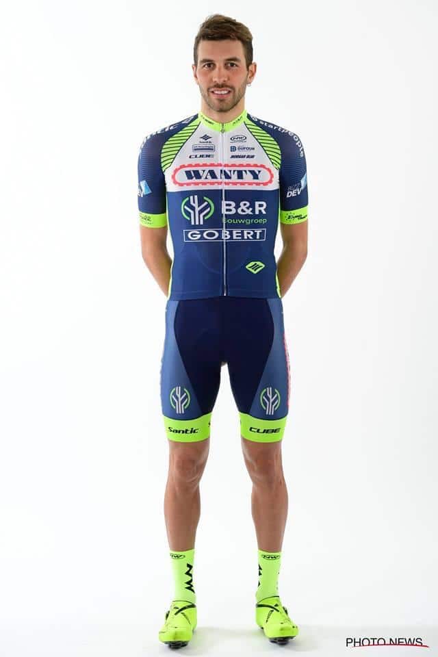
Fortunately, Andrew Schmidt knows a lot more about cycling than I do, and he’s put together a kit-by-kit review of this year’s Tour de France attire. Ready? Here we go (for most of the photos, you can click to enlarge).
2019 Tour de France Preview
By Andrew Schmidt
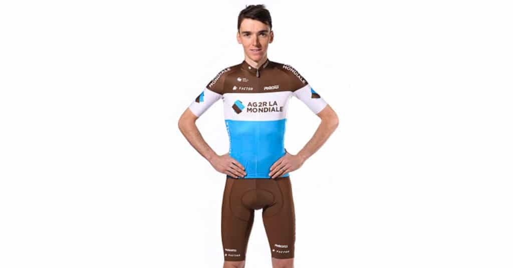
AG2R La Mondiale
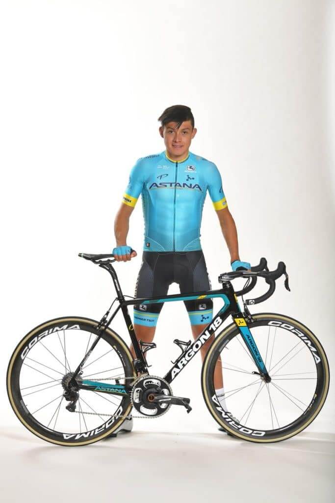
Astana Pro Team
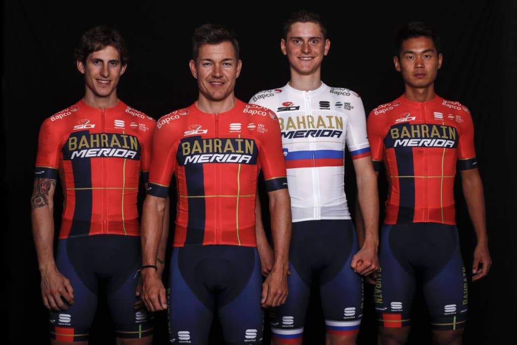
Bahrain Merida
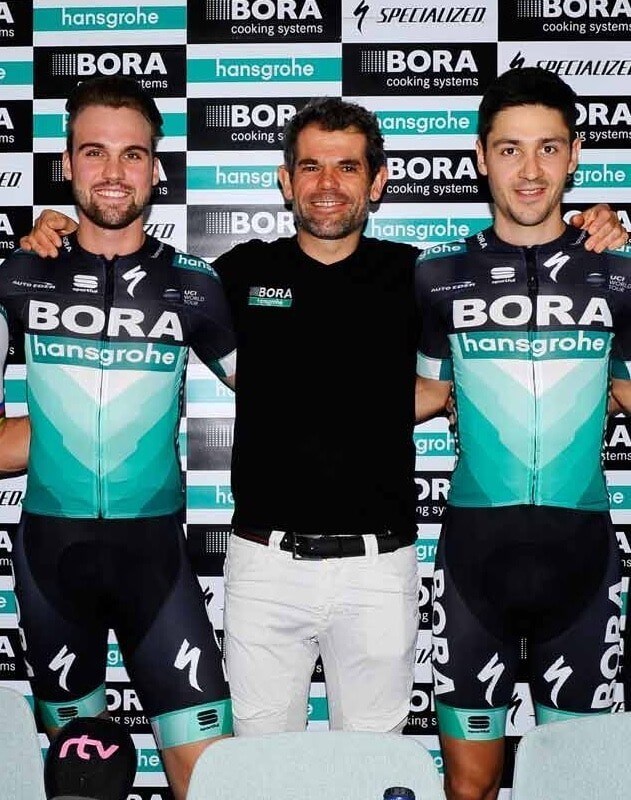
Bora-Hansgrohe
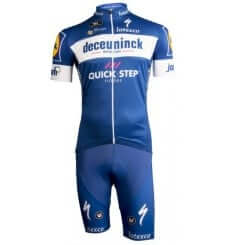
Deceuninck-Quick Step
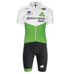
Dimension Data
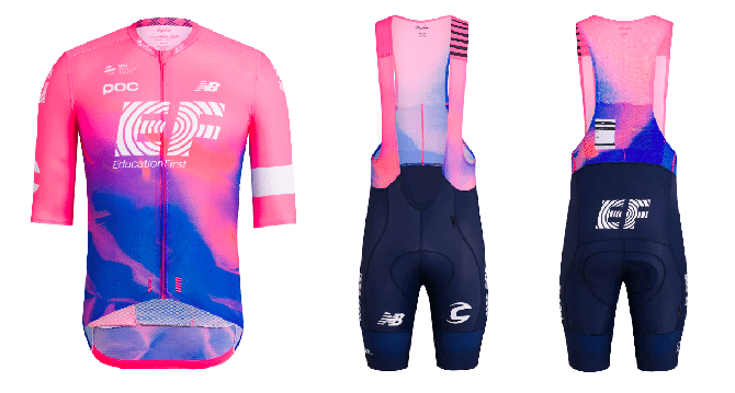
EF Education First
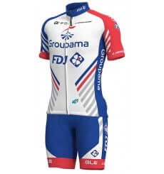
Groupama FDJ
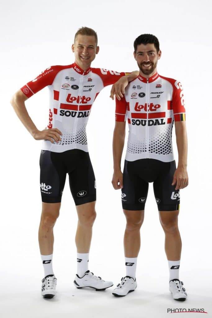
Lotto Soudal
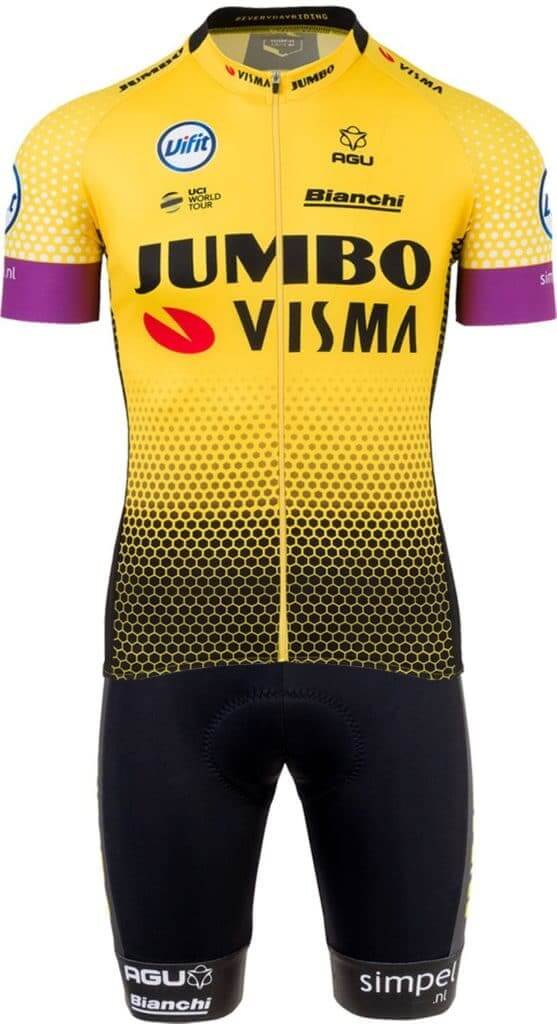
Jumbo Visma
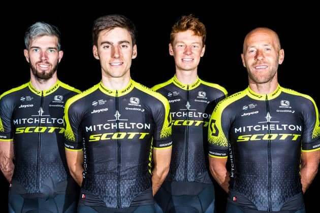
Michelton Scott
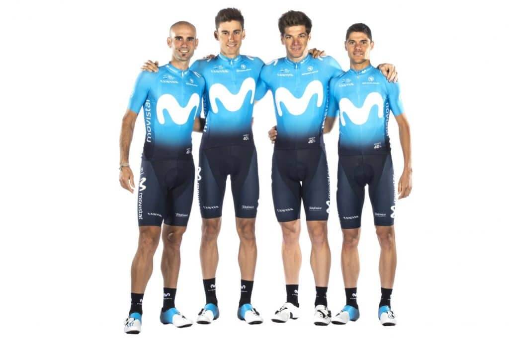
Movistar Team
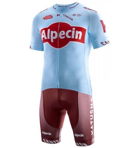
Team Katusha-Alpecin
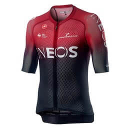
Team Ineos
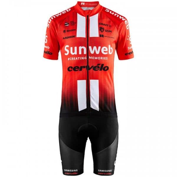
Team Sunweb
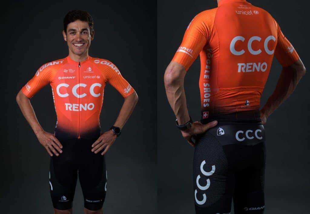
Team CCC
Trek Segafredo

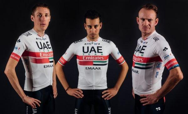
UAE Team Emirates
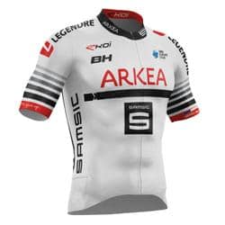
Arkea Samsic
Cofidis Solution Credits

Total Direct Energie
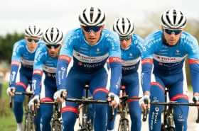
Wanty Gobert Cycling Team

Remembering Tyler: Lots of memorials last night for Angels pitcher Tyler Skaggs, who died earlier this week. The Angels added a “45” chest patch and hung Skaggs’s jersey in their dugout. Starter Jose Suarez had two inscriptions on his cap — “RIP 45” with a cross on one side and Skaggs’s initials on the other side.
The Angels were playing last night in Texas, where the Rangers put No. 45 behind the mound in the Angels’ number font — a very nice gesture.
As for other teams:
• Nationals pitcher Patrick Corbin, who originally came up through the Angels’ farm system with Skaggs and remained a close friend of his, changed his uni number from 46 to 45 and inscribed Skaggs’s uni number on the mound.
• Corbin’s teammate Adam Eaton wrote Skaggs’s uniform number on his cleats.
• Cleveland starter Trevor Bauer wrote “TS45” on his cap.
• Rays pitcher Jose Alvarado, who wrote “T.S. RIP” on his cap on Monday, still had the memorial inscription yesterday.
I’m sure there were other Skaggs memorials that I missed. Feel free to post them in today’s comments.

By Lloyd Alaban

Baseball News: The A’s wore their regular (not Kelly) green jerseys at home for the first time this season last night against the Twins (from Jakob Fox). … The Potomac Nationals, Single-A affiliate of the Nationals, will wear these jerseys for their upcoming Ghostbusters Night this weekend. … Red Sox C Christian Vazquez had a weird white splotch on his batting helmet last night. Probably rosin (from Abe Gobel). … Padres 1B Eric Hosmer wore the wrong cap (note the MLB 150 patch) last night (from David Perlberg). … Orioles P Asher Wojciechowski started last night. His 13-letter NOB is the longest in Orioles history (from Will Shoken). … Rapper and Cleveland native Kid Cudi helped design a special-edition Indians cap for this year’s All-Star Game (from Jason Hillyer). … The Fresno Grizzlies will wear these uniforms for Independence Day (from Joe Giza). … The Thunder Bay Border Cats of the Northwoods League wore these white uniforms on Canada Day (from Will Scheibler). … The White Sox apologized after including a photo of Emmett Till, a boy who was lynched in Mississippi in 1955, in a video montage of “famous Chicagoans” (from Denver Gregg). … We recently held a contest to redesign the Portland Pickles of the West Coast League. Here’s Kevin McLaughlin’s winning jersey in real life.

Football News: Check out this detail-heavy map of the college football world from 1939 (from @asgardpress). … The Bears have announced this season’s bobblehead giveaways (from Griffin Smith). … Here are the jersey numbers issued to this season’s Auburn freshmen (from Clint Richardson). … Here’s what the CFB 150 patch looks like on Southern Illinois’s home jerseys (from @mrmichael21). … Former WR and Canadian Football Hall of Famer Milt Stegall played his entire CFL career with the Winnipeg Blue Bombers. He is now a TSN analyst for CFL telecasts. During a weather delay yesterday, Stegall put on the jersey of Winnipeg’s arch-rival, the Saskatchewan Roughriders. … UNC will have Carolina blue 22-yard line hash marks on their field next season to honor College Football Hall of Famer Charlie Justice, who wore No. 22 when he played for the Tar Heels (from James Gilbert). … The Pro Football Hall of Fame will give a gold jacket and ring to the family of late Denver Broncos owner Pat Bowlen. Bowlen had been elected but not yet inducted at the time of his death last month (from Kary Klismet). … Here’s an inside look at last night’s Adidas/Huskies uniform cruise (from @thA_Pandabear).

Hockey News: New Rangers F Artemi Panarin will wear No. 10 with the club (from Alan Kreit). … From that same Rangers press conference: F Amanda Kessel from the Metropolitan Riveters of the National Women’s Hockey League was named an official ambassador to the newly-created Junior Rangers Girls Hockey program. She was given a custom Rangers sweater to mark the event. Notice the difference between Panarin’s and Kessel’s NOBs: Panarin’s is vertically arched (like the Rangers’ actual sweaters) while Kessel’s is radially arched (from Brandon Weir).

Basketball News: Looks like the NBA may be making some super-subtle tweaks to its logo. … A few items from Etienne Catalan: C Mitchell Robinson will wear No. 23 with the Knicks. … A couple of Pistons have new jersey numbers. SG Deividas Sirvydis will wear No. 37 with the club, and Louis King will wear No. 12. … F Al-Farouq Aminu will wear No. 2 with the Magic. … SG Adam Mokoka will wear No. 20 with the Bulls. … Magic SF/SG Terrence Ross will switch from No. 31 to No. 8. … The Pacers are keeping their arena’s corporate-advertised name even though the advertiser’s naming-rights deal has expired (from James Gilbert). … In this photo at least, it looks like the Lakers’ Summer League jerseys don’t have advertisers on them (from @HitTheGlass). … Here are Kentucky men’s numbers for the upcoming season (from Josh Hinton).

Soccer News: The US women’s national team wore blue socks instead of red with their red strip yesterday against England (from multiple readers). … A Mexican player in last night’s Gold Cup semifinal got a cut on his scalp, so he put on a swimming cap. … A few items from @clash_kit (aka Josh Hinton): The Mexico men’s national team wore white kits against Haiti in their CONCACAF Gold Cup match last night. … New kits for English side Bristol City. … New third shirts for English club AFC Wimbledon. … New kits for English club York City. … New home kits for Northern Irish side Linfield. … New home shirt and second shirt for English club Stevenage. … New Aston Villa kits and training shirts. … New shirts for Bologna FC 1909 in Italy. … New kits Blackburn Rovers. … New kits for Welsh side Swansea City AFC. … New shirts for UD Las Palmas of Spain. … New kits for French side Guingamp. … AS Monaco had their new home shirt leak. … New home (navy), second (white), and third (red) shirts for French club Bordeaux. … New kits for German club SV Darmstadt 98 (in white). … Their league-mates, Hamburger SV, have had additional photos of their new home shirt leaked. … New home and second kits for Valencia. … New kits for Spartak Moscow. … New shirts for Australian club Melbourne Victory. … New uniforms for Japanese club Gamba Osaka. … Items from Ed Zelaski: New kits for Standard Liege of Belgium … Celtic’s kits didn’t make it through customs, so they’re wearing an unusual uni combo for their match against St. Gallen. … New kits for Hajduk Split. … New kits for Bordeaux. … Here’s a teaser of Germany’s BSG Chemie Leipzig’s new home shirt. … New training tops for Manchester United. … From our own Jamie Rathjen: “Scottish team Livingston have silently switched to Nike from a company called FBT. As far as I’m aware, nothing has been said or revealed, but they’ve been wearing Nike stuff at their preseason camp for the past week.”

Grab Bag: New uniforms for Dayton women’s volleyball (from Eric Farrell).
Kid Cudi did the impossible-he found a way to make the dull Indians block C logo look worse. It looks like it’s bleeding.
I actually like Cleveland’s block C (I own a hat) but I agree that this one looks like it’s bleeding. If not that, what is the actual intent?
A belated happy 20th anniversary, Paul. Here’s to 20 more!
My guess is that it is supposed to represent a sort of “graffiti” look with the “C” having been spray-painted along with the tell-tale drip.
But yeah, it looks like it’s off a horror movie poster instead.
that or it’s melting from heat and humidity
Nah, it’s drippin lol. I wouldn’t expect too many others on this site to get it but it’s cool.
link
Jack Flaherty and Skaggs worked out together. Skaggs was four or five years older than Flaherty and somewhat of a mentor to him.
#45 on the jumbotron
link
The USWNT red kit is supposed to have blue socks. That’s how it was revealed, and I don’t think they have red socks.
Celtic’s combo yesterday was training shirts with their second kit’s shorts and socks. No idea what they mean with the customs thing. They may have been joking.
To the numbnuts who put together the White Sox scoreboard display:
Unlike Pat Sajak, Emmett Till would happily NOT be considered a Chicago celebrity, given the choice.
My God…
Nestor,
Yeah, seriously.
How someone could be that tone deaf to history, and to the context of the others on the list, is stupefying.
We’ve all committed faux pas, but on this one, it’s amazing he wasn’t shown the door.
-C.
On the other hand, I don’t think we should come down too hard on somebody who clearly had good intentions but failed to recognize how to handle a sensitive subject properly.
The White Sox admitted the mistake, apologized for it, and hopefully learned from it. Nothing is gained by piling on.
“Piling on”? I’d say the use of that phrase is almost as egregious as the tone-deaf scoreboard move itself.
Expecting some measure of personal/organizational accountability and responsibility is not “piling on.” It’s a simple acknowledgment that actions have consequences. When you say “piling on,” you make it sound like the person who committed this mistake is somehow a victim. That is false.
You know who’s been “piled on”? The Till family, the African American community, the civil rights community, etc. This was just the latest in a long line of physical and emotional denigrations they’ve had to deal with.
“Good intentions” come in many forms. So do bad intentions. Thoughtlessness and cluelessness, while not intentional, are still things we’re responsible for.
I’m not advocating for or against the White Sox employee’s dismissal, but your rush to defend him, and your use of “piling on,” is certainly an eyebrow-raiser.
Hold on, Paul. I’m not at all saying that whomever designed/approved that scoreboard display is a victim, but rather that once the organization and presumably the individuals responsible have acknowledged the mistake and apologized for it, there is no point in continuing to shame them. So what I meant by “piling on” is that more good will come from this being a learning experience for the organization/people involved rather than overdoing the punishment which may end up resulting in resentment.
As MLK famously said, “An eye for an eye leaves everybody blind…”
Fair enough, Dan. But I’d feel a lot better about this being a teachable moment or “learning experience” if the team actually took the opportunity to teach people about Emmett Till, instead of just saying, “Oops, our bad.”
Actually, Paul, the more I think about it…yeah, the case could be made that the employee responsible should be fired not so much as punishment but rather because he’s clearly not competent for the job if he doesn’t realize that “fame” is something that people are celebrated for, and nobody wants to be celebrated for being a murder victim.
So I don’t know if the guy responsible deserves any more public shaming but he probably should not be in that job going forward…
Very good point, however I hope the White Sox look at the total body of work by this individual before making a decision for dismissal. I believe we have all made very bad decisions, where most of ours aren’t out in the public. I do like Paul’s idea of the White Sox doing an education piece on Emmett Till.
I love how that one fan put on Milt Stegall’s blazer with no shirt on underneath while Milt was putting on the jersey.
Interesting sidenote, Milt put on a #7 Willie Jefferson Roughriders jersey. Jefferson switched teams this year as a free agent and now plays for the Winnipeg Blue Bombers.
Good to see you finally come over to the right side Milt!
FYI, ASO has changed the Tour de France logo to delete the “Le”. Check their website. Love the jersey review.
Re: AG2R La Mondiale
Yep truly horrible, I think – but could not find – there’s some obscure college football team that also wears those colors
I must be an odd one, I’ve always kind of liked ag2r, or at least I like brown and that shade of blue together.
Any other uni-watchers who cycle/race? Ive always wanted to review amateur club kits, my club makes some sharp ones, whereas a former club redesigned their kit and it’s really poorly executed, and really unflattering to any figure, esp heavier riders.
I love AG2R’s brown/blue colors (by the company marketing fluff, intended to represent earth/sky, but whatever), but then again, I’m of the opinion that the current peloton looks way too corporate and cycling jerseys are at their best when they’re loud and wacky looking (basically, Mapei)
I loved Mapei.
I feel that the change in kit design has links to the retail market.
I worked in cycle retail for approx 10 years. Pre US Postal I hardly remember selling many pro kits when the US Postal kits came out especially with the Champs Elysees editions we could hardly keep them in stock. By the time I left the trade we would often sell a full Pro team kit with a bike used by that team.
I therefore suspect that the kits have been changed to appeal to the retail market rather than being purely to grab the most attention possible during the race as per the original focus of the TDF.
Brown and blue…that’s the best uni on this list! The 70s looking one is the second best.
Yup – I like the brown and blue uni too.
Agreed. Best by far.
I agree with you completely. I love AG2R’s colours.
I race (mostly triathlon, not pure cycle) and have a few club jerseys. They’re all hideous, in an awesome way. Honestly though, I try to avoid club jerseys because we usually buy cheap-ass ones and I end up chafed and bleeding.
Can never go wrong with the La Vie Claire jersey of mid-80s with the Mondrian-inspired motif. My all-time favorite.
I found it – Tufts university
link
A few interesting trends in cycling sponsorship in the last few years-
Though it peaked a few years ago, there’s still quite a few teams (Bahrain-Merida, Trek-Segafredo, Mitchelton-Scott) sponsored by bike companies, though Trek is the only pure factory team, after BMC became CCC. Way, way back in the day, almost *all* cycling teams were factory teams run by bike companies (winning the biggest race in France is a great way to sell your bikes).
Quite a few teams engaging in “sportwashing”, aka being owned/sponsored by a country with a poor human-rights record in an attempt to improve the country’s image. Astana date back a while, but Bahrain-Merida and UAE are fairly new.
Mitchelton-Scott is sponsored by an Australian winery, which technically is against French regulations on alcohol sponsorship- however they get around this by successfully claiming that Mitchelton is not just a winery but a hotel and resort at the winery, and that they aren’t advertising the wine itself, which, sure, let’s go with that.
> AS Monaco, also from France
AS Monaco plays in the French league, but they’re from Monaco, not France.
Fixed.
I’ve always been fascinated how people that watch sports mourn harder over an athlete than some random person in their community that was the same age. Not saying it’s right or wrong. Both are tragedies but I never hear people mentioning the latter in conversations.
I haven’t laughed as hard at a uniform description as I did the A+/F- kit one from today in quite a while. Well done all around.
I’m so happy cycling is being featured! I have a few thoughts on these kits:
1. I’m very torn on the Bahrain-Merida kit. It’s a great looking kit. But the owner (a Bahrainian prince) has been implicated in all sorts of human rights violations. I’ll root for a nice kit, but that situation makes this particular one a no-go.
2. I like EF’s crazy pink and blue jersey. It works distinctly well as a pro bike jersey; easily visible on TV, creates the illusion of motion blur. But I miss their old argyle motif. It was so distinct and part of their visual identity. Now it’s almost invisible.
3. Jumbo Visma’s yellow jerseys are paired with light blue bikes (Bianchi’s signature bike color is “Celeste”). Another commentator said this previously, but the combination shouldn’t work, and yet somehow it does.
4. Bora-Hansgrohe’s somewhat dull jersey never used to be an issue. Their star, Peter Sagan, one of the biggest names in cycling, won the world champion’s rainbow jersey three straight years, and wore the Slovakian champion jersey after that. Finally, this year, he’s neither the world nor national champion, which should make him harder to spot in the peloton.
Related to the Skaggs story, and meaning no disrespect to the overall message or honoring his memory, I thought I remember MLB outlawing the inscriptions on hats some years ago? I feel like we used to see it all the time and then it stopped until picking back up recently. I might be misremembering, and my googling didn’t return much.
Yes, back in the late 1990s or early 2000s, when cap inscriptions were getting out of hand (often for injured teammates, not just for deaths), MLB banned the practice. In recent years they’ve been more lenient about inscriptions for player deaths.
Thanks, Paul!
A big thanks to Paul for putting this out. Thank you to everyone else who commented on it as well. I was kind of expecting to get a little more flack in the comment section, but I’m more than happy with the feedback everyone provided.
I don’t think much of Team CCC, but that may be influenced by my mourning for the strong red and and black of BMC.
It’s reminiscent of Euskaltel-Euskadi orange kits, but a bland version of it.
Max Scherzer warming up in Expos uniform. Sort of a sneak preview of the Nationals as Expos game:
link
Artemi and Amanda Rangers’ Jerseys,
Panarin’s looks like a name plate while Kessel’s looks direct sewn.
I think the Indians cap is ok but would look so much better if it was outlined in white.