For all photos, click to enlarge
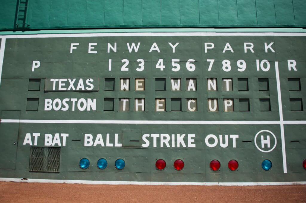
With the deciding game of the Stanley Cup Final(s) taking place in Boston last night, it turned out to be a very good day for cross-sport promotions, beginning with the scoreboard on Fenway Park’s Green Monster (shown above), which spelled out a nice “We Want the Cup” message prior to yesterday’s Rangers/Bosox game.
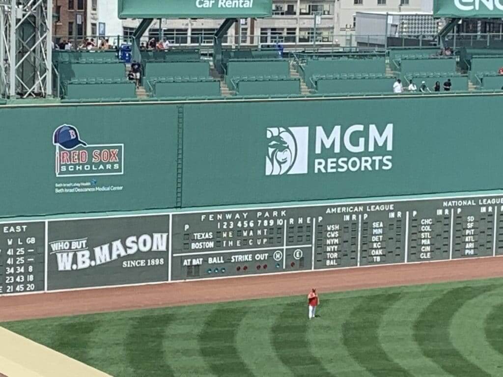
Here’s how it looked from a greater distance:
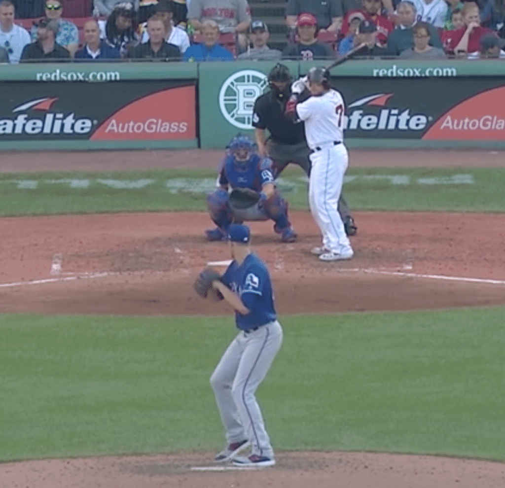
For good measure, the Sox also put the Bruins logo behind home plate:
Over at the Bruins’ arena, New England Patriots wideout Julian Edelman and Olympic gymnast Aly Raisman, who’s from a Boston suburb, whipped up the crowd while wearing Red Sox jerseys with No. 34 — number of former Sox star David Ortiz, who was injured in a shooting earlier this week:
Tonight's honorary flag captains Liam Fitzgerald, @Aly_Raisman, and @Edelman11 have Boston ready to go. pic.twitter.com/uTrz9KLufw
— #StanleyCup Game 7 on NBC (@NHLonNBCSports) June 13, 2019
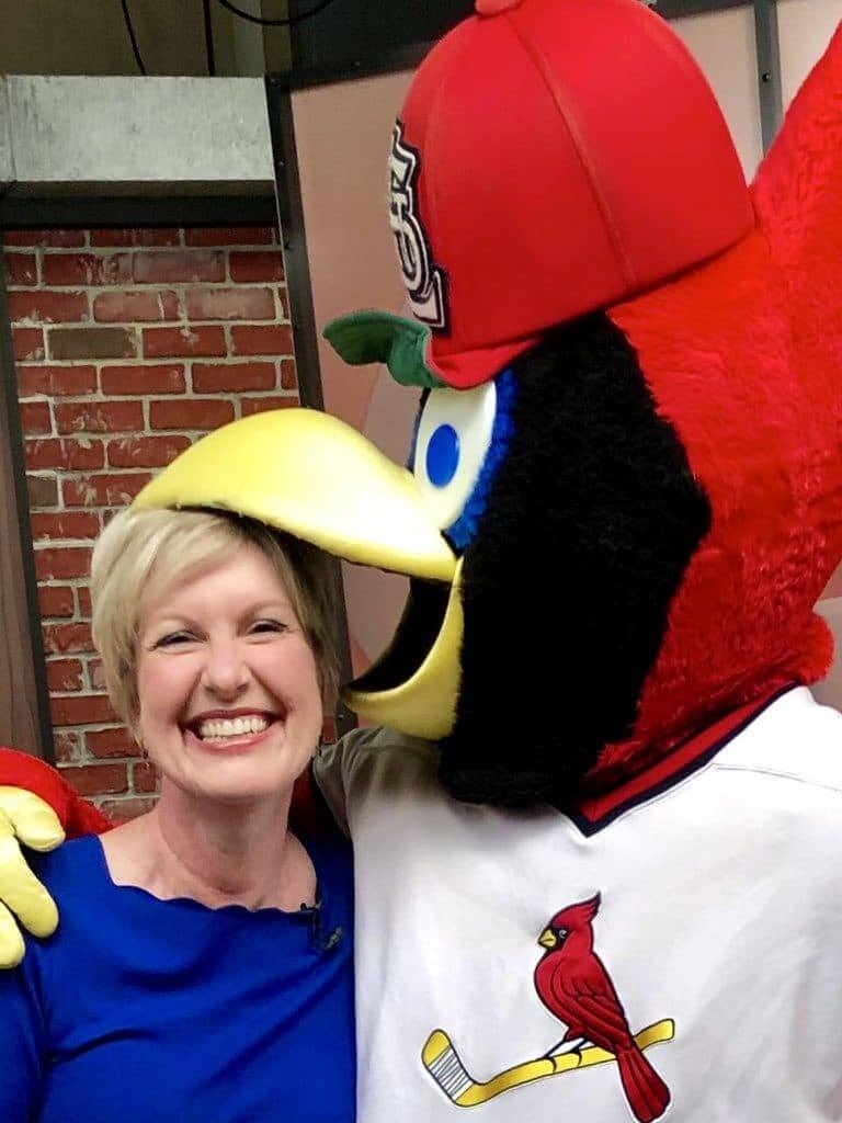
But the cross-sport gestures weren’t limited to Boston. Back in St. Louis, the Cardinals’ costumed mascot, Fredbird, supported the Blues by wearing a jersey with the Cards’ namesake bird perched on a hockey stick instead of a bat. I really love this:
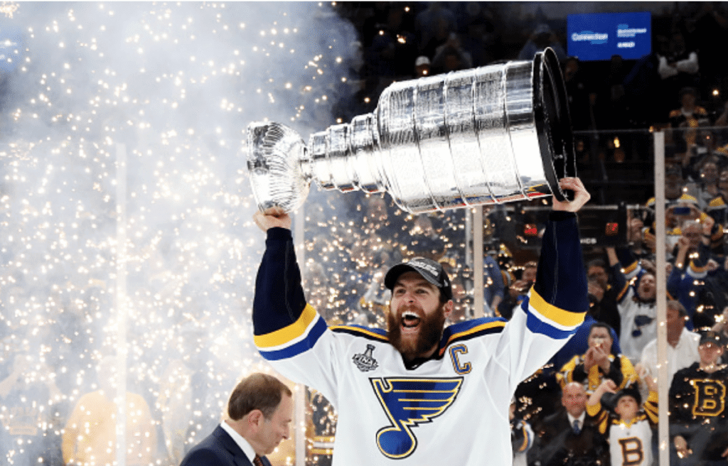
As for the game’s outcome, let history record that the first St. Louis Blue ever to lift the Stanley Cup in triumph was captain Alex Pietrangelo:
Congrats to the Blues and their fans. Just don’t ever try that color guard nonsense again, okay?
(My thanks to Mark LaFountain, @ohhhsourry, Corbin Ceeds, James Beattie, and Phil for their contributions to this section.)
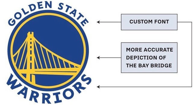
Dubs come clean on new logo: A few days after SportsLogos.net broke the news about trademark filings indicating some upcoming logo tweaks for the Warriors, the team officially acknowledged those changes yesterday.
In addition to the adjustments shown above to their primary logo, the team also distributed a list of additional press notes, which includes the news that the team’s shade of blue will be slightly darker. The color change, along with the other adjustments to the primary logo, is evident side-by-side comparison — outgoing logo on the left, new logo on the right:
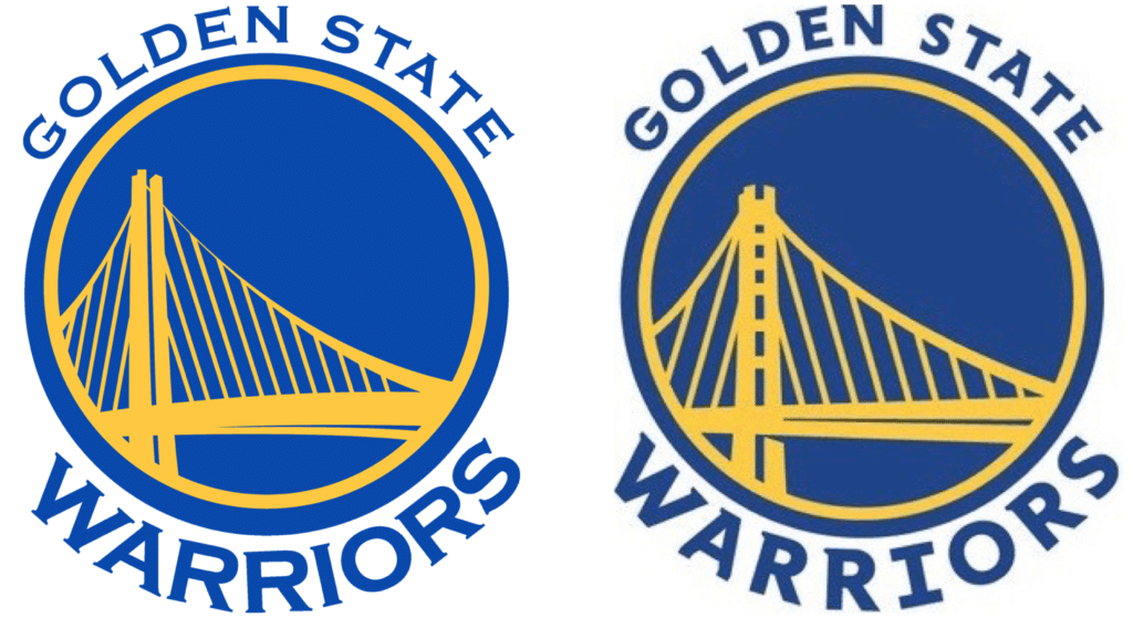
Ditching the Copperplate Gothic font is clearly a plus. The new custom font is nothing special, but at least it passes the “First, do no harm” test. I’m agnostic about the tweaks to the bridge and the new shade of blue (which seems to have been accompanied by a new shade of yellow, although the team didn’t specifically announce that).
The one thing I’m really disappointed by is that the yellow circle is now centered within the blue circle. It used to be slightly north of centered, a nice bit of off-registration that I really enjoyed. Ah well.
(My thanks to Ryan Leong for the press notes.)
Click to enlarge
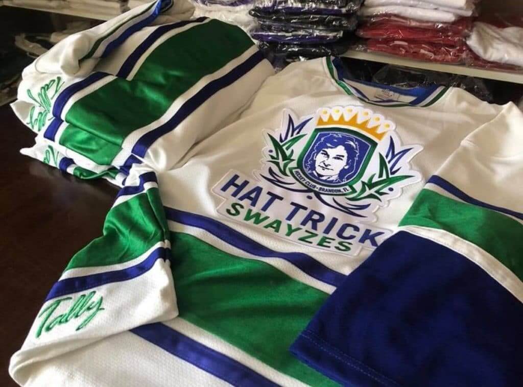
Is the green for St. Hat Trick’s Day? : So this is pretty great: There’s a hockey team in Brandon, Fla., called the Hat Trick Swayzes.
Actually, upon further inspection, there are apparently a lot of teams with that name, so maybe it’s one of those hockey clichés that I just missed the boat on. I still like it!
Now we just need a Star Trek-themed hockey team (the Hat Trick Stewarts), a The Prisoner-themed hockey team (the Hat Trick McGoohans), and a basketball-themed hockey team (the Hat Trick Ewings).
(Thanks to Jon Campbell for letting me know about this one.)
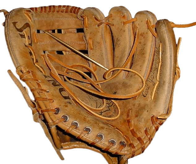
LAST CALL for the glove-repair auction: Today’s the last day for this auction. In case you missed it earlier in the week, Jimmy Lonetti of D&J Glove Repair is generously auctioning off a full glove re-lacing and reconditioning, plus a glove-leather wallet, with the proceeds going to Uni Watch.
This is a $150-$175 value, with the bidding starting at just $75 — perfect for Father’s Day. Bids must be entered by 7pm Eastern tonight.
For full details, look here.
The Ticker
By Paul

Baseball News: Good story on why baseball stadiums are all a little bit different (from Andrew Cosentino). … Here are this year’s Little League World Series uniforms. … As part of “What Could Have Been Night,” the Holly Springs Salamanders will become the Hushpuppies on Saturday (from Scott Turney). … Hmmm, anyone ever seen these Astros jerseys before? (From Kenneth Turner.) … The bank that uses the name of the Braves’ stadium as a giant advertisement has merged with another bank, and now the new/combined bank has a new name, which will presumably have implications for the ballpark (from Mike Chamernik). … Negro Leagues throwbacks upcoming for the West Michigan Whitecaps, who’ll dress up as the Grand Rapids Black Sox on June 25 (from @packjowers). … The Lehigh Valley IronPigs will become the Jawn on July 7. … Yankees OF Clint Frazier likes turning his sneakers into cleats (thanks, Phil). … If there’s one thing I like, it’s a ballclub with “Fruit Bowl of the Nation” on the back of their jerseys. That’s an American Legion team from Yakima, Wash., in 1950 (from Greg Mays). … Pirates C Elías Díaz wore the wrong cap last night. Of course, it would only be visible when he removed his mask, but still.

Football News: The Titans will retire Steve McNair’s No. 9 and Eddie George’s No. 27 at their Sept. 15 home opener (thanks, Phil). … The Broncos have a new 60th-season logo, but a team spokesman tells me that it will only be used for promotion and marketing — not as a jersey patch or helmet decal. (Note that there was a slightly different (and definitely worse) version of this logo circulating yesterday. That version is not the version that the team is using.) … Here’s a shot of Bills RB Joe Cribbs wearing a grey facemask in the 1981 playoffs. The team had blue masks at that time (good spot by Johnny Garfield). … Looks like Toledo has new uniforms. “Different striping,” notes @msocka29.

NBA News: The Warriors’ rally towels for Game Six of the NBA Finals will include a shout-out to injured teammate Kevin Durant (thanks, Brinke).

Soccer News: Queens Park Rangers’ stadium is getting a new name, but not because they’ve sold the name to a corporation. Instead, they’ve given away the name to a charity (from James Gilbert). … The daily download from Josh Hinton: New leaks for Schalke and Real Sociedad; legit releases from Villarreal Western United FC and Grimsby Town; new sleeve badges for Copa America; and a Thai shoe brand has copied Adidas’s Predator Mania 2002 World Cup boots. … Idiocracy writ large, part 37,264: Thanks to a naming rights deal, France’s Ligue 1 will be known as Ligue 1 Uber Eats. Yes, really (from rileycakes08). … Here’s a thread that provides a detailed critique of Real Madrid’s new number font (from @jason3thousand).

Grab Bag: There’s a new song about the Astrodome — called, appropriately, “Astrodome” — and its video features all sorts of cool vintage footage from the onetime Eighth Wonder — baseball, football, rodeo, and a lot more. Recommended (from Dave Landesberg). … Good story on Tiger Woods’s famous tiger headcover (thanks, Brinke). … New logo for the University of Manitoba. … Amusing article about how men at gyms wear towels over their crotches while working out. … President Trump has said he wants to change the paint scheme of Air Force One, but a Congressional committee may block his ability to do that. … New rugby league jersey for New Zealand (from E.P. Conrad). … Strong piece of media criticism and analysis from Deadspin’s Tom Ley, who wrote about how The Ringer further blurred the increasingly fuzzy line between advertising and editorial content by “integrating” State Farm ads into its NBA Draft package. The jaw-dropper, at least for me, is that State Farm “sponsored” the assists statistic for every player listed. Recommended reading (from Ryan Atkinson).
Our latest raffle winner is Richard Hill, who’s won himself a Uni Watch TATC shirt. Congrats to him, and my repeated thanks to Jerry Kulig for sponsoring this raffle.
Way to go, Blues! Agree on the Warriors logo changes. I felt like the off centered circle aided the bridge perspective as if you were looking up at it.
I second all of that!
IIRC the Broncos only wore jersey patches to commemorate the 25th and 50th anniversaries, so it makes sense there wouldn’t be one for 60th. Perhaps there’ll be one for diamond anniversary in 2034.
Air Force On s/b Air Force One
Already fixed.
The Western United FC jersey is a concept design, not a leak. The western Melbourne club, which is playing in it’s inaugural season this year, has already announced it will wear green & black stripes.
Golden State cleaning up their logo is nice, but why do teams when they change shades ALWAYS go darker? It never fails. Also, the word “Warriors” at the bottom of both has never looked right and actually looks worse with the new font. I think it’s the double “RR” portion of the text and the fact it is a different font size than the “Golden State” portion.
Yeah not a fan of going darker, but at last they didn’t change to navy blue. Of course one example of going lighter is the University of Pittsburgh going back to royal from navy.
I think it’s the I. The giant serifs 1) don’t really look like they belong with the rest of the font and 2) make the I look like it doesn’t quite sit on the same arc as the rest of the letters, since it has such a long, flat top and bottom that doesn’t follow the curve.
I’m with Paul on the off-center circle. The false register-key-error thing was my favorite bit of the old logo, and my policy was never to say anything about it out loud in hopes that the team would just sort of not notice and “fix” it. The misalignment gave the old logo a much more dynamic feel than just a bridge in a circle. There’s a sense of movement implied in the old logo, and it reinforces the hint of looking-up perspective in the bridge illustration.
I’m not sure they actually did go darker. It could just be correcting an error; many teams use lighter shades link, than those link. We’ll see if the color of the Warriors’ uni changes at all.
And in any case, this is still a lot brighter than link.
I remember really liking the inclusion of international orange on those jerseys.
Regarding the LLWS uniforms: a bit of a step down. One, the jerseys are now all pretty much the same template. Last year, there were a pair of Rainbow Guts and a pair of Beach Blankets.
I also find it interesting that Oregon gets its own uniform. But I’m guessing it’s Senior LL, where the host state/territory forms its own team to play against everyone else.
re: Hat Trick Sweyzes. That is the beauty of Adult hockey and some youth house programs ~ freedom to create unique team names. The major difference is the adult league teams have the chance to make jerseys.
i knew a guy whose team was supposed to be “WTFIT” as in “wtf is this”, but he ended up making the jerseys as “WTFTI” – fittingly enough
Can we get a race-car themed hockey team called the “Danica Hat Tricks”? They could have a slogan of “We never win, but we look good doing it”
She did win one Indy car race, so technically it would have to be NASCAR themed for your slogan to work.
I’m not sure if you were following Indycar at the time, but that win she had in 2008 was not without controversy. Helio Castroneves was told to let her go by late in the race, and he figured he was letting a lapped car go by. Given how much Roger Penske cherishes winning races, there were a lot of conspiracy theories flying around that she was gifted the victory as a way of drawing attention away from the last ever Champ Car race that was also being run that weekend, as the two leagues had already agreed to merge.
I’m an Astros fan, and I’ll repeat what I said last year when I saw those blue Astros jerseys for the first time. Those are better than the blue jerseys with the rainbow side panels. I wish the Astros would ditch those and wear the blue jerseys with the orange headspoon.
I think the uniforms would look better without piping/headspoon. I don’t think the Astros used the headspoon until 1995. For me, piping is a distraction.
I still wish they would’ve gone with the Joe Morgan era shooting star logo
Regarding the Astrodome video, there are at least four shots in the video that are NOT from the Astrodome. Three of the shots (1:15, 2:07, 2:30) seem to be from a Selena concert (a Selena sign is shown on the facade of one of the sections of whatever building the scene was actually taken), and one has Carlos Correa crossing the plate at Minute Maid Park (2:29). The three shots outside of the Correa shot seems to be taken from the Alamodome in San Antonio. And they don’t seem to have anything to do with the song so it appears it’s some really sloppy research work done.
I’d love to embrace this video and say it’s pretty cool because I have so many fond childhood memories of being in the Dome. But the sloppy research and lack of attention to detail won’t allow me to appreciate it.
I notice one bit ( around 2:55) where logos were blurred out.
wonder what they were. and why?
Agreed. I’m glad I wasn’t the only one who saw those shots of the Alamodome. Kind of took something away from the video as a whole.
Same. Kind of a bummer.
Yeah. It totally ruins it for any real Houstonian.
I had to turn it off.
Paul – you had me with “Hat Trick McGoohans”. Be seeing you.
The one bank that only has its name on the MLB stadium is merging with the other bank that has its name on SIX! 2.5 of them are the same name. (link)
I think it’s overkill that since 2013/14, there have been 21 logo changes in the NBA
Is there a significance to the number (0202401) that appears on the raffle ticket graphic used on this site? I recall that the seat numbers used on the “Rain Check” print all had significance, so I was wondering if the same was true for the raffle ticket graphic.
Honestly: Not sure! The ticket graphic was designed many years ago by reader Ben Thoma, who I haven’t heard from in ages. Not sure if he hid any easter eggs in there.
i think it means uniwatch = heaven
link
Oh, wow — what a find! Thank you for decoding that!
Is this a standard thing that everyone knows? How did you know?
“The bank that uses the name of the Braves’ stadium as a giant advertisement has merged with another bank, and now the new/combined bank has a new name, which will presumably have implications for the ballpark (from Mike Chamernik).”
Or the Braves could do the right thing and name their stadium Hank Aaron Park. I know it’s never going to happen. There is far too much money involved. I’m just not ready to stop beating this drum.
Far too late for the Braves to do the right thing, since they sold off the rights to the bank (which was the *wrong* thing). It’s not up to them anymore; it’s up to the bank.
That new book by Paul Goldberger is on my reading list. Good stuff.
Barcelona (Unicef) and QPR are the only two soccer teams I know of which have put a charity in place of a commercial advertiser. Are there others?
The Jazz did with the patch on their jersey.
The ones I can think of are Heart of Midlothian (since 2015-16) and Aston Villa (from 2008-10), though a few more teams in the UK do it occasionally or at least once a season.
I’m starting to wonder if I should change my name to Hat Trick.
I do like the upgrade for the Warriors but I wish they’d go back to being the San Francisco Warriors. Golden State just sounds too minor league to me. Of course I’d prefer the Clippers move back to San Diego in my perfect world as well.
I agree that moving back to San Francisco should change them to the San Francisco.
The Warriors should also go back to The City uniforms from the mid 60s. This is one of the greatest uniforms in NBA history.
Of course I’d prefer the Clippers move back to Buffalo in my perfect world as well.
(fixed that for you)
Looks as though the Swayzes are from Brandon, FL, not Bradenton, per the jersey.
Thanks. Fixed.
There are a few modern fonts that have that super-annoying serifed “I”, where none of the other letters in the alphabet have serifs. Maybe you could get a way with a serif on the “I” if it was SLIGHT but this one is so egregious. And yeah, always a DARKER shade when it’s a color change. BAH!!!
-Jet
I meant this reply to be in the thread about the Warriors but somehow it ended up on it’s own, so that’s what it’s referring to.
Extremely happy that the run of sports championships is over in Boston.
Nice to see two new teams (e.g., never won the cup before) on the cup over the past 2 years (Washington, St. Louis).
This isn’t the record, though. Between 2004 and 2007 you had 3 teams in a row win the cup who had never won it before (Tampa Bay, Carolina, Anaheim). An asterisk on this one, though as one of these 4 years the Cup wasn’t contested due to the NHL Lockout season of 2005.
Also relevant to today’s lede, the Cardinals made about 25,000 seats available at Busch Stadium (the team was in Miami) to watch the game after the watch party at (I’m-still-calling-it-)Kiel Center sold out.
Oh, interesting — hadn’t heard that!
The Warriors new “custom font” looks a lot like the Arizona Cardinals font, just stretched.
To further Ryan M.’s comment, that watch party was born from an existing collaboration between the Cardinals and Blues called “One Nation”. They have sponsored cross-sport events in the past, such as when the Blues played in the Winter Classic at Busch Stadium—
link
Here are the details of the watch party—
link
It sounds like all proceeds from these events benefit Blues for Kids youth hockey efforts and Cardinals Care.
Oh and one final cross-sport gesture for STL—
These collabs between our teams and immense show of support by our fans are in direct contradiction to Kroenke’s assertion that STL doesn’t support it’s teams. Out with the old Stan in the with the new Stan(ley)! LGB!