Click to enlarge
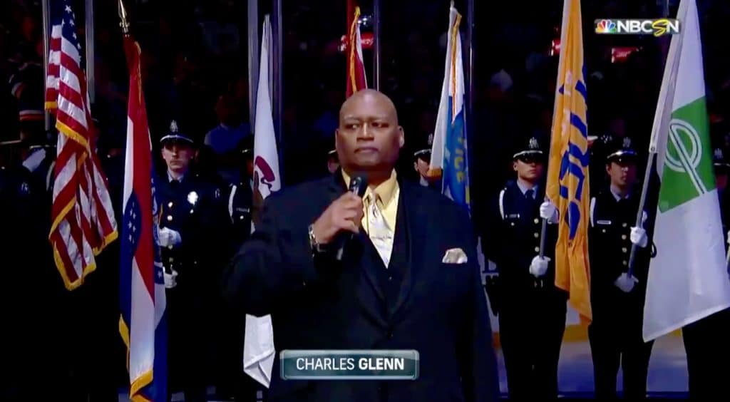
We have a lot of content today, kids, beginning with a nauseating spectacle that took place in St. Louis prior to Game Three of the Stanley Cup Final(s) on Saturday night (I didn’t learn about it until Sunday, which is why I’m writing about it today), as singer Charles Glenn performed the national anthem while standing in front of a color guard that included an Enterprise Rent-A-Car flag.
It’s hard to express how gross and tone-deaf this is. Frankly, I don’t see why color guards should be part of sporting events to begin with (interestingly, the Blues use them as a way to pimp group ticket sales, which is something I’ve never seen before — do other teams do this?). But if we’re going to have color guards, it would be nice if they could stick to, you know, the colors. Speaking of which, the team flag next to the Enterprise flag doesn’t belong there either.
The people holding the flags appear to be St. Louis police officers. The sight of a public officer of the law — on duty and in full uniform — being used as a vehicle for advertising a private corporation is scandalous. Or at least it should be.
As you probably know, Enterprise is the same company that has turned the name of the Blues’ arena into an advertisement. So this is yet another problem that can be laid at the feet of naming rights, because once you allow the advertising contagion to infect your building name, it spreads to other areas, and before you know it you’ve got a color guard shilling for a car rental company during the national anthem. (And yes, I’m aware that Enterprise is St. Looey-based, their owner is a strong booster of the community, blah-blah-blah. None of that is relevant, because an advertisement shouldn’t be part of a color guard or the national anthem, period.)
As I’ve said for years now, I’m not opposed to advertising per se, but I’m strongly opposed to its encroachment into areas where it doesn’t belong. I’d like to think we can all agree that this qualifies as “where it doesn’t belong.” The only way to stop this shit from getting worse, or at least slow it down, is to make it clear that it’s not acceptable, so feel free to tell the Blues and tell Enterprise what you think of this disgrace. I suggest using the hashtag #NoAnthemAds.
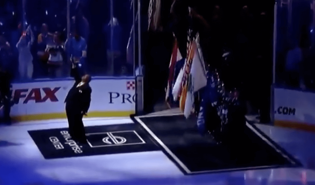
Oh, speaking of which: For good measure, the anthem singer was performing while standing on another Enterprise ad:
(My thanks to @DDapsis for bringing this to my attention, and to James Gilbert for pointing out that the Blues use color guards as a way to sell tickets.)
Click to enlarge
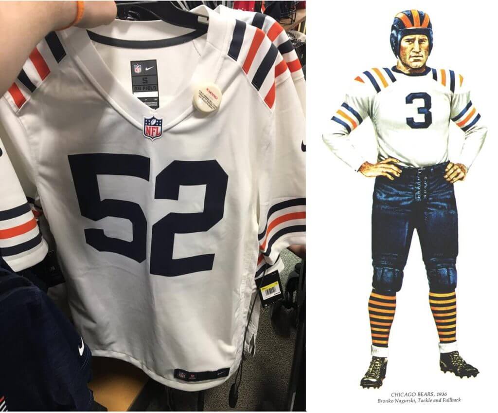
Bears throwback leak update: In case you missed it over the weekend, retail versions of what appeared to be a 1936 Bears throwback jersey showed up at several Dick’s outlets in Illinois on Saturday (the photo shown above is just one of many that were circulating that afternoon). We already knew the Bears were preparing to release a throwback of some sort this Friday, so this seemed to fit the bill. Moreover, when The Chicago Sun-Times asked the Bears about the retail leaks, the team had no comment, which would seem to be a tacit acknowledgment that this is indeed the throwback they’ll be unveiling later this week. Phil had more on all of this in yesterday’s post.
Retail leaks have proven to be very, very reliable over the past few years, and I corresponded with a few of the people who took these retail photos, so I feel good about the sourcing. An additional data point came yesterday in the form of this tweet:
So bummed I’m at Dick’s in Niles now and they took them off the floor! Manager just told me they had to pull them or they’d get fined.
— Marc Walker (@detroitmarc) June 2, 2019
That seals it for me. This is the uniform that the Bears will be unveiling on Friday.
And I for one can’t wait to see it on the field. The shoulder stripes, the socks — it should look great. They can even simulate the look of the leatherhead helmet without violating the one-shell rule.
As it turns out, reader Joshua Escobar did a spectacular concept of precisely this uniform five years ago, and Phil even ran it here on the site. Check this out:
I remember sending you this concept 5 years ago and you had it on your Uni Concepts segments. @UniWatch pic.twitter.com/HwMmalpcIK
— Joshua Escobar (@JoshuaEscobar23) June 2, 2019
If the Bears look even half that good in this new throwback, I’ll be pretty happy.
Click to enlarge
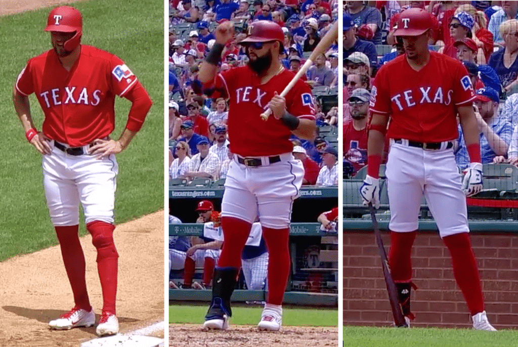
How low high can you go?: Some serious hosiery hijinks yesterday in Arlington, as at least three Rangers players — Hunter Pence (left), Rougned Odor (center), and Ronald Guzmán — all wore their pants above the knee. Those three screen shots are all from the bottom of the second inning, which was a real hosiery hoedown!
Pence, of course, has been sporting this style for years; the other two are more recent converts. Odor’s look (which I’m told lasted only for his first at-bat — he went back down below the knee after that) is definitely the most extreme high-cuffery I’ve ever seen.
This raises the inevitable question: If forced to choose, would you prefer to see players going above the knee or pajama-rama? Obviously, neither style is ideal — personally, though, I’ll take too much sock over too little. How about you?
[totalpoll id=”112049″]
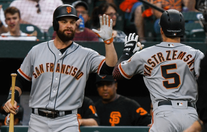
Gee, I wonder what he’ll wear for Player’s Weekend: With Carl Yastrzemski’s grandson, Mike, now in the bigs with the Giants, reader Will Shoken points out that the storied Yastrzemski surname has finally appeared for the first time on an MLB jersey (and helmet, as you can see above!). The elder Yaz played exclusively in the Red Sox’s NNOB era, so he never got to wear his name on his back. Reader Randall Sanders points out that the name still hasn’t appeared on a home jersey, because the Giants are NNOB at home.
Only question now is how long it takes before the younger Yaz gets saddled with an NOB typo.
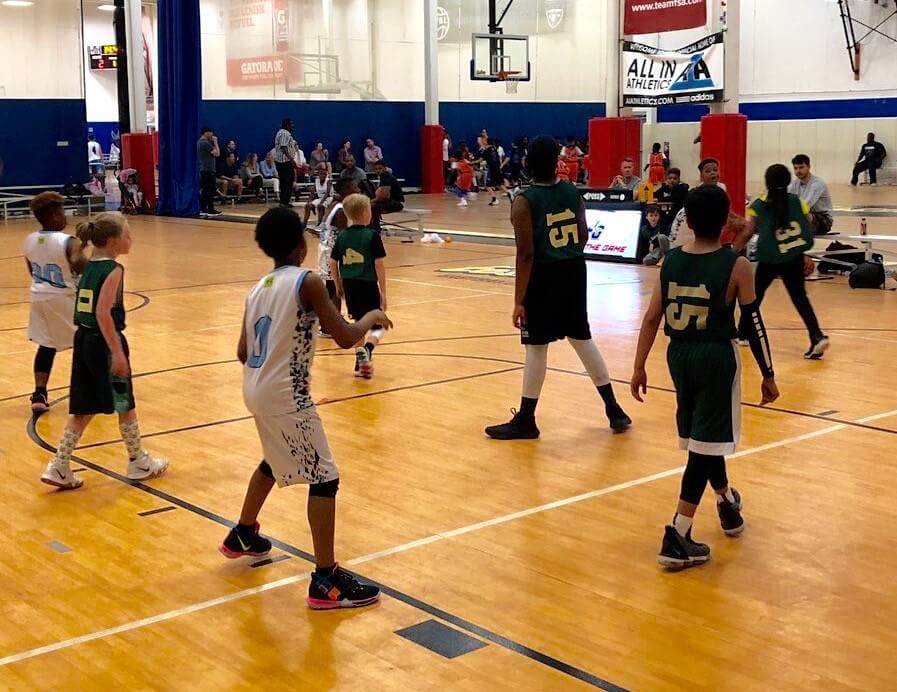
Photo by @NSSW_JG; click to enlarge
Sideways glance: I’ve seen a lot of uniforms over the years, but I don’t think I’ve ever seen sideways numbers until now. That’s a youth team at the Joy of the Game Sports Center in Deerfield, Ill. Weird!
And yes, I see that there are two kids on the same team with the same number, and a kid in long pants, and so on. But really, all of that pales compared to the sideways numbers. Here’s one possible explanation that was offered on Twitter:
It is used with some young AAU/CYO teams so ref can see number better when jersey is tucked in.
— eli the actor (@theauthenticEli) June 3, 2019
Seems like a better solution might be to, you know, have jerseys that actually fit properly, so the numbers don’t end up disappearing when the jerseys are tucked in, but I guess it’s tricky with youth teams. You learn something new every day and all that.
(My thanks to Evan Barnes for bringing this one to my attention.)
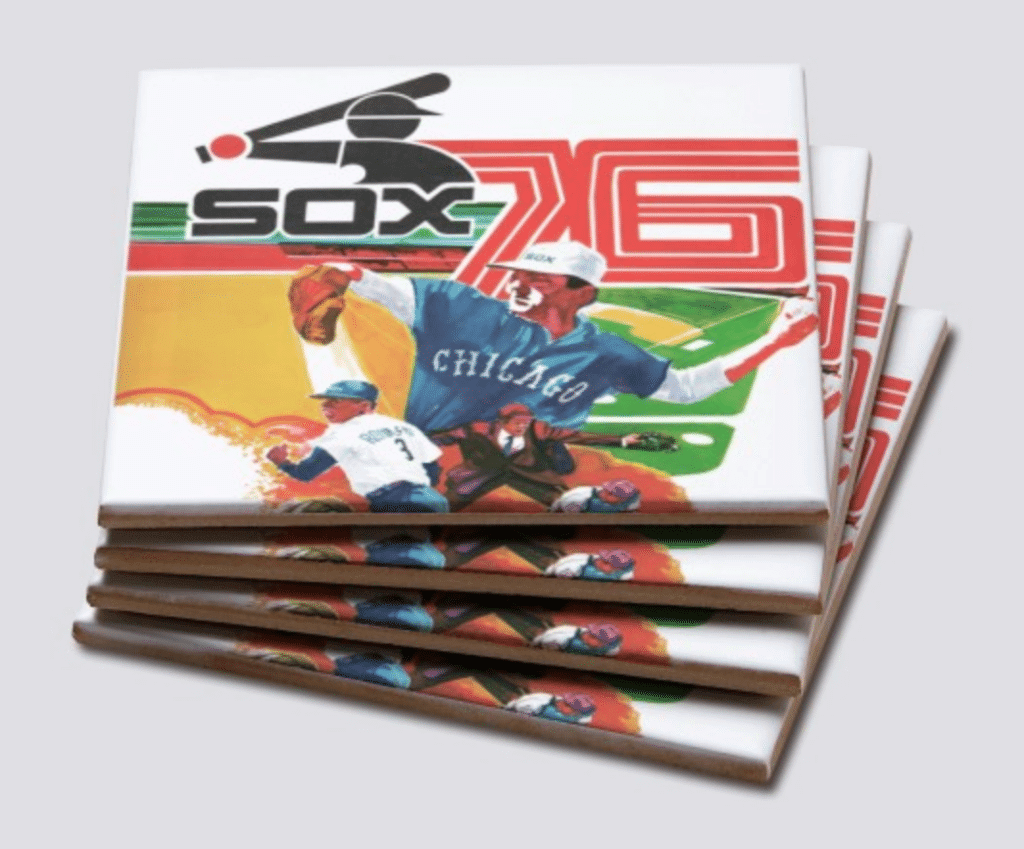

ITEM! Father’s Day raffle and sale: With Father’s Day right around the corner, our longtime advertiser Vintage Brand is running another raffle. The lucky winner will be able to choose any item from the Vintage Brand website (like the groovy White Sox coaster set shown above).
To enter, send an email to the raffle address by this Thursday, June 6, 7pm Eastern. One entry per person. I’ll announce the winner on Friday.
In addition, Vintage Brand is currently running a site-wide 20% sale. No need to enter any discount code — when you get to the checkout page, you’ll automatically get 20% off. Not bad!

Membership update: A new batch of designs has been added to the membership card gallery. Most of them include some purple, including Leo Mikula’s card, shown at right (or above, if you’re reading this on your phone), which is based on the Benetton B186 F1 car — a really interesting request! Great job by card designer Scott M.X. Turner to capture the feel of the design.
We have a bunch of additional purple designs still to go, and we’ll be getting to those in the next week or so.
Ordering a membership card is a good way to support Uni Watch (which, quite frankly, could use your support these days). And remember, a Uni Watch membership card entitles you to a 15% discount on any of the merchandise in our Teespring shop and our Naming Wrongs shop. (If you’re an existing member and would like to have the discount code, email me.) As always, you can sign up for your own custom-designed card here, you can see all the cards we’ve designed so far here, and you can see how we produce the cards here.
ITEM! Uni-versary party update: On Friday I mentioned that reader JohnMark Fisher had generously volunteered to be our Uni-versary Satellite Party Coordinator. This is for the parties that will be taking place in various cities on the same date as our Uni Watch 20th-anniversary party here in Brooklyn on June 29.
JohnMark has now created a spreadsheet showing all the gatherings that have been set up so far (including one in Paris and another in Barbados!). He’s also keeping a list of cities where readers who’ve expressed interest in attending a gathering, although no organizer has yet stepped up.
So:
• If you want to host a Uni Watch satellite party in your city on June 29 and have an idea of where you’ll be doing it, email JohnMark and give him the details.
• If you want to attend a Uni Watch party in your city on June 29, assuming someone else organizes one, email JohnMark, so we can have a sense of how much interest there is in a given area. (If a bunch of people in a given city are interested in attending but nobody has stepped up to organize a gathering, JohnMark may write back to you all to say, “People — come on, one of you step up and organize something!”)
Attending a Uni Watch gathering is a great way to meet your fellow uniform obsessives who Get It™, and it’ll be fun to know we’re all doing it simultaneously on June 29. Here’s hoping we can get a big network of parties set up!
And speaking of the uni-versary: In case you missed it on Friday, 2019 isn’t just the 20th anniversary of Uni Watch — it’s also the 20th anniversary of MLB’s infamous “Turn Ahead the Clock” futuristic uniforms. So we’re marking that dual uni-versary with a special new Uni Watch TATC shirt (click to enlarge):
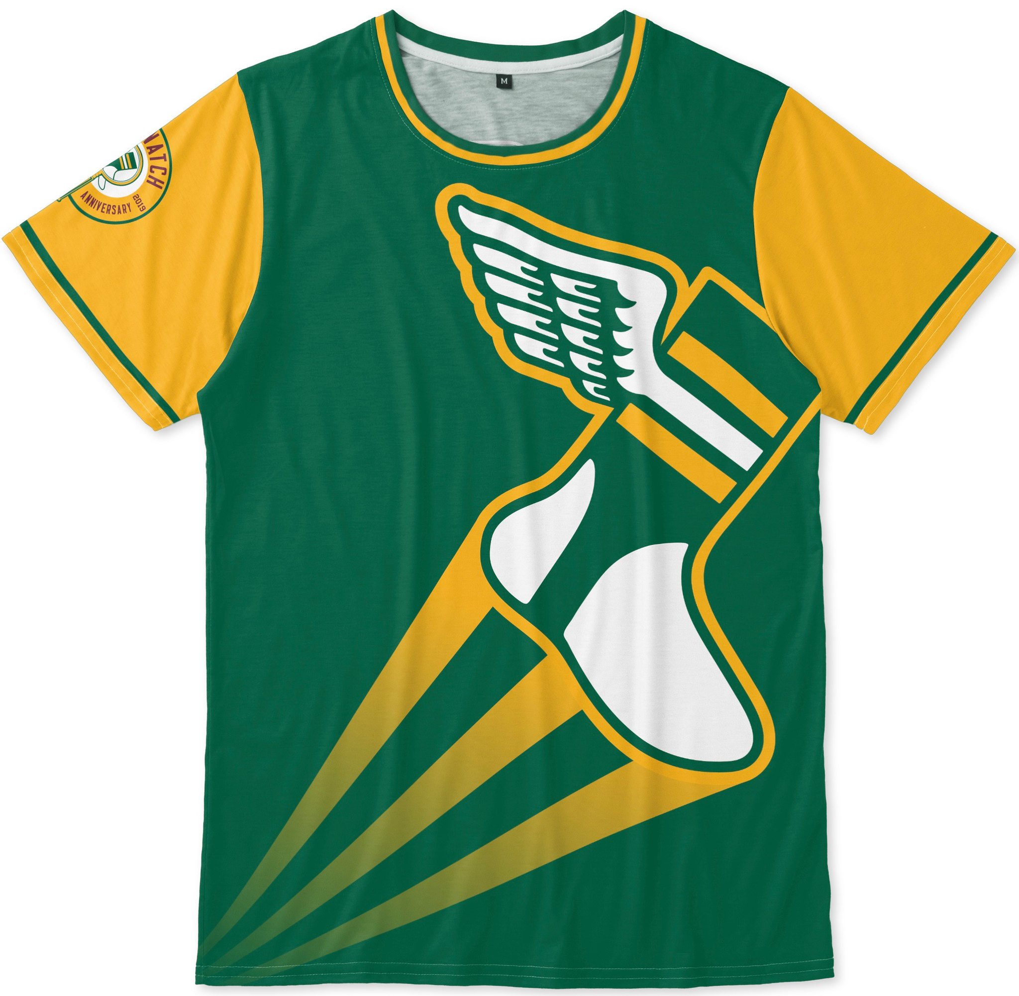

Pretty good, right? Note the 20th-anniversary logo serving as a sleeve patch, too. You can order this shirt here.
In addition, our 20th-anniversary logo is now available as a high-quality vinyl sticker and is also featured on a new line of T-shirts (click to enlarge):
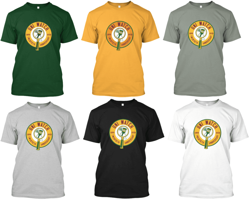
All of these are also available as long-sleeve tees and as hoodies. Here’s where you can order the green version, the gold version, and the various shades of grey, black, and white.
And hey, while we’re at it, Canada Day and Independence Day are coming sooner than you think. So it’s time to dust off the listings for our two national holiday shirts:
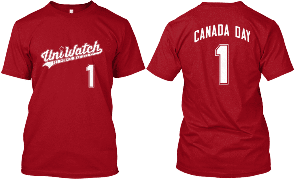
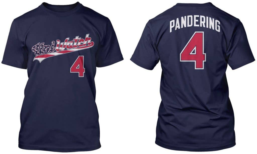
Here’s where you can order the Canada Day and the stars and stripes (which is also available as a tank top).
My thanks, as always, for considering our products.
The Ticker
By Jamie Rathjen

Baseball News: Here’s a good look at the design process for this year’s Reds throwback program. Speaking of which, they wore 1919 World Series throwbacks yesterday — lot of pics here. … The Cardinals had decals on the bases yesterday for for the wrong date (from multiple readers). … Hunter Hook sent us pictures of some game-worn caps from his father, former Mets and Reds P Jay Hook, who was also traded to the Milwaukee Braves in 1964 but never appeared for them. … One of the pictures in this article shows the Double-A Albuquerque Dodgers wearing what were supposed to be baseball-cenntenial throwbacks in 1969, except somehow the year on the front was 1859 instead of 1869 (from Alan Filipczak). … Mississippi State wore mono-BFBS last night (from Adam Vitcavage). … Nebraska INF Alex Henwood wore a football-style mouthguard yesterday after getting hit in the mouth while fielding (from Brett Baker). … Michigan wore beautiful 1962 throwbacks yesterday, honoring their ’62 CWS title team (from Steve Ceruolo). … Musician Paul McCartney’s website is selling a Rangers-themed McCartney baseball jersey ahead of his appearance at the Rangers’ ballpark later this month (from Jerad Castillo).

Football News: The Pro Football Hall of Fame now has a mascot. It’s a goat — or, if you prefer, a G.O.A.T. — named Goldy (from Jim Vilk). … A Colorado company that has made the plastic patches for the Super Bowl and the World Series in recent years was recently sold (from Joseph Giordano). … Since the CFL preseason is starting, we can see changes to pants, which weren’t included in the recent change-of-manufacturer unveiling. For example, the Ottawa Redblacks still have a pants wordmark, but it’s no longer a hashtag, and the bottom red stripe no longer wraps around. “I’m thinking the new white road pants will have similar changes,” adds Wade Heidt. … Former NFL WR Terrell Owens hosted a charity basketball game with both teams in white jerseys, but one in trimmed in red and the other trimmed in blue. That’s Owens shooting the ball in the photo (from Preston Penn).

Hockey News: Inspired by the beer Stanley Cup in yesterday’s Ticker, Graham Montrose sent us a photo of his homemade Cup from the Bruins’ previous win in 2011. … The ECHL made a new version of its championship trophy, the Kelly Cup, for this year, because it claimed the current title holders, the Colorado Eagles, wouldn’t give the old one back. Meanwhile, the Eagles said they tried to return the trophy but had some sort of miscommunication or dispute with the league.

Basketball News: A Redditor finished building the Warriors’ arena out of Legos just in time for the end of their final season there (thanks, Lloyd). … Cross-listed from the football section: Former NFL WR Terrell Owens hosted a charity game with both teams in white jerseys, but one in trimmed in red and the other trimmed in blue. That’s Owens shooting the ball in the photo (from Preston Penn).

Soccer News: Japan’s women’s team played against Spain yesterday and every player wore NNOB and a different number than the one they’ve been given for the Women’s World Cup — with at least one exception, striker Kumi Yokoyama, who kept No. 20 — ostensibly to confuse scouts. South Korea’s men’s coach did something similar last year to confuse a scout he believed wouldn’t be able to tell the players by their faces. … The next two are from the Champions League final: some, but not all, Liverpool players appeared to be wearing leftover Premier League shirts with sleeve ads covered with tape, which we noticed last week but didn’t realize what it was (from Josh Hinton). … Tottenham Hotspur had the entire 23-man roster pose for the team photo instead of just the starting lineup. … Also from Josh: Here are the shirts worn by the previous 30 European champions. … Chelsea third-choice goalie Rob Green lifted the Europa League trophy in full kit, even though he wasn’t on the bench for the game or, apparently, any other game this season. … The NWSL’s Houston Dash posted a picture of players wearing rainbow numbers this week, but they didn’t actually wear them this weekend, while Minnesota United did. … New shirts for English League One team Shrewsbury Town (first on right) and League Two’s Swindon Town.

Grab Bag: Gross: NBC’s French Open coverage has superimposed baseline ads (thanks, Brinke). … Box lacrosse goalie Frankie Scigliano is playing for the Western Lacrosse Association’s Maple Ridge Burrards while still wearing the mask and pads from his other team, the NLL’s San Diego Seals (from Wade Heidt). … A golf fan simply known as Tiger Hat Guy has begun popping up at tournaments again, following Tiger Woods’s recent comeback (from Jason Hillyer). … Staying in golf, it was mentioned during yesterday’s U.S. Women’s Open broadcast that the tournament’s winner, Lee Jeong-eun, adds a 6 to her last name — Lee6 — because five other players with her exact name also played on the Korean LPGA Tour. Further info here (from Matt Rashford and Mike Chamernik). … Two Minnesota cities, Rochester and Duluth, are attempting to replace their flags (from Mike Menner). … South Africa’s cricket team changed to yellow against Bangladesh at the Cricket World Cup, which was interesting because they were the designated home team and doubly interesting because Bangladesh had a red clash shirt of their own. … A horse racing track in Illinois is holding a “design your own silks” contest for local kids. Three winners will receive their own self-designed silks plus a jockey will wear the silks in an actual race (from Kenneth Traisman).
Signal flare: Back in late March, a reader whose name I can’t recall (although I think his first name was two initials, like C.J. or D.W.) joined me for the “Catch Around the Block” in Brooklyn. If that reader is reading this, please get in touch. Thanks.
I almost want to hit myself for noticing this but I have to give Nike credit for trying to make the UM 1962 throwbacks authentic (minus the swoosh, natch), including stirrups with THREE STRIPES (gasp!). This is what it has come to, people.
……
Excellent essay on the douchification of the color guard at the Stanley Cup Final last night. Separating, for a moment, the notion that we don’t need the pomp and circumstance of the colors and the anthems before sporting events, the fact is that they are a part of sports as we play them today. That said, tacking on team and arena naming rights holder flags to the anthem portion of the night is gauche beyond words. If Gary Bettman had any stones, he would stop this. Adam Silver called Drake on the carpet to stop being so douchey, Bettman can do the same. But he won’t. And it will get worse.
Speaking of UM, I’ve never seen another team (college or pro) wear their play-call, positioning “cheat sheets,” or whatever they are, on their belt buckles like UM does. It looks like a freakin’ iPad on there. I love what UM is doing with throwbacks, and getting the entire team to buy into stirrup-ness. But those belt-buckle “cheat sheets” are hideous.
you dont think Enterprise and their schmaltzy logo belong with the colors of our military personnel??? Think again, Mr Luckas and read on!
In May 1983, Jack Taylor’s Enterprise Army of Northern Missouri scored a smashing victory over the Hertz Army of Arnold Palmer and OJ Simpson. Brimming with confidence, Taylor decided to go on the offensive and invade the North Missouri territory for a second time (the first invasion had ended at Kansas City the previous fall). In addition to bringing the conflict out of Missouri and diverting northern rental agents from St Louis, where the Hertz agents were under siege, Taylor hoped to gain recognition of the travel agency world and strengthen the cause of northern travelrs who favored free mileage and more trunk space.
Lukas*
Perfect, They’ll pick you up, too.
To quote Roman Grimsley III on Twitter:
“I think the facility and the team have the choice to do what they want to do at their own venue.”
I replied: “It doesn’t bother me one bit. If it’s not illegal then they can do what they like within reason.
If you don’t like it then boycott it. If you don’t like it then don’t watch it no more.”
“Take it or leave it” (i.e., boycott or STFU, which is essentially what you’re saying) is almost always a false choice, and it surely is in this case.
While “take it” and “leave it” are two of the available choices here, they are not the only choices. Here’s another choice: expressing outrage and mockery in an attempt to rally others so that the team is shamed into not doing this in the future. That’s how social protest works.
The notion that we’re not allowed to express an opinion on something as long is it’s legal is self-evidently absurd. You’ve violated that standard yourself, in fact: Today’s blog post was legal — and yet you felt the need to express an opinion on it. Shouldn’t you just boycott instead? (As an aside, I’m not so sure a police officer shilling for a corporation is legal. Since the phony name you’re hiding behind is “Mr. Tax Payer,” shouldn’t that concern you?)
Think harder.
“…If it’s not illegal then they can do what they like within reason…”
This statement is a negation of itself. First you say if it’s not illegal feel free to do it. But then you follow up by saying “within reason” which implies there is some prudent thought put into the process, so it’s easy to say what the Blues did was not within reason.
I agree there is nothing illegal about what the Blues did. At the same time, there is the matter of taste and respect. Admittedly I didn’t notice it at the time but would say this went beyond the pail.
The irony is that, if anything, I think this actually causes more damage to the brand – for both the Blues and Enterprise. Has it gotten to the point where you put yourselves on equal footing with the state and national flags? Would you interpret this as a sign of arrogance? And where does it stop?
I’ve complained in other spaces about ESPN sponsoring these little segments like ‘Closing Number’, where the ad takes as much time as the actual content. That pisses me off; it will not break ESPN to have a 15 second segment go unsponsored. As bad as that is; this goes above and beyond that. There are some things you just don’t do.
BTW if you do choose to speak out you don’t have to be an asshat to make your point. Simply call out Enterprise and/or the Blues and say ‘Would it kill you to not have an Enterprise flag while presenting the colors? Does Enterprise not have enough presence in the arena as it is? How much is too much?’ Keep it respectful, do it tongue in cheek if you like. If you go in with guns blazing, you will be ignored.
And if you’re fine with it; that’s OK too. That’s what America is all about. I only speak for myself.
I guess Rougned Odor of the Texas Rangers was trying to pay homage to times when the Chicago White Sox wore shorts. I despise pyjama pants but I may take those over the pants being turned into shorts as Odor did. Pants need to go down to the knee.
As gross as all the advertising is in the St. Louis pics, and it is, I can’t help but wonder how many other teams in how many other leagues will see the attention it’s getting and wonder “Why didn’t I think of that?” I really hope this ad guard doesn’t become a thing.
“The sight of a public officer of the law — on duty and in full uniform — being used as a vehicle for advertising a private corporation is scandalous. Or at least it should be.” puts me in mind of the fellow who famously asked “have you no sense of decency, sir? at long last have you no sense of decency?” except that it’s the whole damn society that’s long ago lost any sense of decency
Lots of corporations have their flag along with the US and State flags at their world headquarters and prominent facilities.
And frankly, I’d have never noticed it had it not been pointed out.
That’s tasteless, but it’s not the same as a color guard during the national anthem. If you choose to decorate your building that way, that’s up to you — it’s your building. But a color guard is comprised of public service officers (usually either military or police) who should never be shilling for private businesses. And the national anthem is, you know, the national anthem.
As an avid Uniwatcher, and a relatively new, but no less rabid, STFO listener, it is fantastic to realize you are also a Uniwatcher, Brent.
Wow… that’s awesome. Thanks!
Having scrolled through many more replies to your tweet about the color guard that a sane person should have, it struck me that I would love to know roughly where the intersection between “the enterprise flag is ok because $” and “you can’t kneel during the anthem because you have $” (positions condensed for effect) lies.
Not that it truly matters, but these people have to realize how truly absurd they sound, right?
Perhaps not.
Aside, I know it has been mentioned, but the gold team names/logos during the NBA Finals presented by youtubetv TM is extremely offputting. I’m not sure why, but it just seems overly obnoxious.
Ok, that’s all. I’m gonna go drink some electrolytes now.
Well, gold has been a part of the finals branding especially the last couple years, so it makes sense (whether or not it looks good) to incorporate gold into the score bug.
And also, I could be wrong, but did someone mention the Akron Wingfoots during the little Goodyear ads while showing footage from the blimp?
“these people have to realize how truly absurd they sound”
I just wanted to echo that
Hi Rodney :)
TK!
Is it just me or does that Bears jersey look like a teeny-tiny one being held up by someone who got their thumb in the photo?
As a Tottenham fan, I love that the whole team posed for the pre-game photo on Saturday. Love display of unity. Of course, I wish the team were wearing a less-horrible jersey for their first cup final in a number of years, but what can you do. Tottenham also wore their (rumored) 2019-2020 warm up jackets for pre-game on Saturday: link — look at that glorious purple!
The Enterprise flag in the color guard is just so tacky. Gross.
Surely the TATC shirt should have a faux-fortieth or fiftieth anniversary patch instead of the twentieth, to better fit with the spirit of the design, no?
Thought about that. And maybe we’ll swap that in after this calendar year. But I wanted this to be a shirt that honors both Uni Watch’s and TATC’s 20th anni. Hence the patch, hence the No. 20 on the back.
I know this probably isn’t a popular thing to say, but I wonder if it was done with police in the honor guard instead of military because of regulations.
A military color guard’s actions and ops are dictated by regulations (or instructions, depending on the service) that prohibit any other flags (Blues or Rent-a-Car or whatever) being held and displayed in a formation. I would be interested in knowing if they tried with a military formation and failed.
My guess is you’re probably right. Just a guess. The military is supposed to take this stuff seriously (though they’ve been in hot water with some *political* advertising on uniforms, etc.)
It probably depends on the individual police department’s regulations. Whereas the military (or at least each branch of the military) has common regulations for the whole branch, different police departments have different regulations. Apparently, St. Louis must allow this to happen. In my neck of the woods, these color guards usually display the US flag, state flag, a department flag if they have one, and possibly the National Law Enforcement Officers’ Memorial flag. That’s it. I can’t believe they would have had advertising success with either military or police color guards many other places.
What shocks me now that I see this “ad guard” BS… I don’t think even NASCAR has ever done this. I’m a big NASCAR fan, but I shy away from the jingoism and the over-abundance of advertising.
For us NASCAR fans, this gets filed under “don’t give the Frances any ideas.”
There’s very little that takes place at the track and on the TV coverage that isn’t ‘sponsored’ these days, but the sanctioning body would be wise not to try something as distasteful as what the Blues did on Saturday.
1) Too bad the police officer refused to hold it. It would be interesting to get his point of view. 2) America’s obsession with pre-game color guards, anthems and militarism is comical when compared to pre-game European soccer where anthems and flags usually only happen between international teams.
Paul, I don’t know what it is about your Tweets, but you attract some ABSURD responses. It’s just thoroughly baffling to me how many people apparently follow you (I think?) and would respond to your criticisms of the Enterprise flag situation with a “So what, why do you care?”
Not only is the whole thing just obviously, patently gross and weird and wrong… but how do you seriously follow Paul and wonder why he cares? The politics of the situation aside, observation is what he does. How could you not understand that?
Twitter gonna Twitter. Nature of the beast. The good news is that my original tweet about this yesterday prompted a big response — nearly 500 RTs, over 1.5K likes. That’s a lot, at least by @uniwatch standards. So a lot of people Get It™. Try not to let the few idiots out there ruin your day.
Let everyone else rage about the Enterprise ad, I’m SWOONING over those caps that Jay Hook’s son posted!!!
-Jet
Does anyone know what the blue flag at the far right was? That couldn’t be a promo for the NBC ‘Songland’ show, could it?!?! Please tell me I’m wrong. link
I was curious what happened with the “catch around the block”. I wasn’t able to make it and I never saw pics or heard anything about it after the fact. Was it a success?
Yes! Details tomorrow.
Did that high school in California ever get back with you with a design winner or is that still ongoing?
Someone hasn’t been reading the site lately!
link
Wearing baseball pants above the knee looks nothing short of ridiculous. Although I don’t like pants down to the shoetops either, it at least doesn’t look absurd.
Enterprise is probably thrilled with this kind of attention
Not sure if you’re being sarcastic or not. In any case, “There’s no such thing as bad publicity” is demonstrably false (lots of cases of companies whose business tanked after bad publicity). And what is the alternative — to remain silent and let this disgrace pass without comment, thereby giving it our tacit approval? No way.
“Musician” Paul McCartney? Please.
When he was alive,…. maybe.
jersey # should have been 28IF
And what gets lost in all this is the gentleman singing the anthem is retiring after this season because of the effects of Multiple Sclerosis.
link
Two items from the Rugby Premiership over the weekend (Exeter Chiefs vs Saracens).
1. Native American imagery on the jersey of the Exeter Chiefs.
2. Large amount of corporate logos on the jerseys.
3. Visually very easy to watch. Saracens, all red. Chiefs, all black.
link
link
Hunter Hook sent us pictures of some game-worn caps from his father, former Mets and Reds P Jay Hook
Whoa. Are those really <a href="link;?all game worn Mets caps? I’m used to some logo variation as the teams changed suppliers, but he played two seasons for the Mets and I’m seeing what appears to be four different styles of the “NY”.
And that one in the upper left corner is downright freaky.
Haha, I’d love to see how popular the “pandering” shirts are.
Have sold several hundred of them since 2015.
Is that design the only one available as a tank top?
I did that one as a tank because a few people asked. Generally speaking, though, we can do almost any of our screen-printed shirts as tanks (or as women’s tees or V-necks, for that matter). If there are any in particular that you’re interested in, let me know and I’ll set up the listings for you.
That also applies to the Naming Wrongs shirts, not just the Uni Watch shirts.
Auburn baseball honored their long-time broadcaster with a helmet decal and also wore it on the camo (gross) hats, which was odd.
link
This may have already been discussed, but your use of “an” before NOB in the Yaz story has me wondering how everyone reads/pronounces those. I myself just say the acronym, but it seems that some might spell it out, like en-oh-bee.
I actually thought about that as I did it!
I say “en-oh-bee” for the basic NOB — but for all the others (FNOB, nickNOB, etc.), I say “knob.” Makes no sense, I know, except in some weird corner of my brain!
“That seals it for me. This is the uniform that the Bears will be unveiling on Friday.”
All we’ve seen evidence of is the jersey, and as we all know, there is more to a uniform than just the part that’s intended for retail. I agree, it’s likely that the full uniform unveiled Friday will be the 1936 uniform, but shouldn’t the wording above be “This is the jersey that the Bears will be unveiling on Friday.”?
I agree with Paul that the whole idea of having a color guard to introduce a hockey game is a bit absurd, and it’s precisely for that reason that the advertising doesn’t really bother me. It’s hard for me to get upset over the fact that the Blues managed to make a stupid spectacle slightly more stupid.
Received my 2019 purp walk shirt today. Just in time for my wedding on Friday. Plus it will match my wife’s hair. Nah, she’s not going for that.
No Enterprise flag tonight. Thank God. Noticed it then, and it looked bad.
I didn’t get a great look, but it appeared that there was not an enterprise nor Blues flag during tonight’s anthem.
I’ve been watching a lot of Mexican league baseball lately ($30 for a year of streaming!!) and the pants jacked up over the knee with over-the-knee socks and/or a team-colored base layer of tights seems to be a pretty common style, in among the ridiculous amount of logos on their uniform.