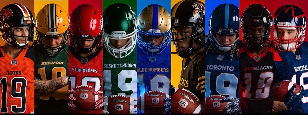
Click to enlarge
The CFL finally unveiled its new uniforms yesterday. This is the first set made by the league’s new outfitter, New Era Cap. What you see above are the nine home designs on top, followed by the nine white road designs. You can see better views of all 18 designs in this Flickr set.
Now, I don’t follow the CFL, so I’ll leave it to others to assess the designs (the majority of which, I gather, are largely unchanged from last season). But I do have a few observations:
• CFL uniforms usually have advertising patches. But no ads were shown on any of the uni photos that were released yesterday (or at least not on any of the photos I saw), so these photos don’t really reflect how the uniforms will look on the field.
• I’m assuming that the new CFL uniforms include pants and socks. But you wouldn’t know it from the photos that the league released yesterday, all of which showed players from the waist up. I’m sure that’s just a coincidence and has nothing to do with the fact that jerseys are sold at retail while pants and socks are not.
• I’ll give the CFL kudos on this point: They put the maker’s mark on the back of the jersey:

That’s not as good has having no maker’s mark at all, but at least it’s not front-facing.
• And speaking of that maker’s mark: New Era Cap is making full uniforms! As you may be aware, New Era Cap is called New Era Cap because it’s mostly known for making, you know, caps (well, for that and also for closing its hometown factory so it can outsource its operations to cheap, non-union labor), so it’s interesting to see the company branching out into football uniforms.
And that leads me to something I’ve been pondering: Every time there’s a new football uniform unveiling these days, we always hear about how the space-age lightweight fabric was cooked up in the manufacturer’s high-tech lab, and how the innovative tailoring will enable the players to achieve a new level of performance, blah-blah-blah. Interestingly, yesterday’s CFL press release doesn’t mention any of that, which I guess isn’t surprising, since New Era Cap presumably doesn’t have any high-tech uniform labs for cooking up new space-age uniform fabrics, what with New Era Cap being, you know, a cap company and all.
All of which means one of two things: Either the CFL has opted to outfit its players in substandard, low-tech uniforms, or all the hoopla we’ve been hearing for years about high-tech this and space-age that is a bunch of bullshit. Hmmmm.
The CFL also posted this article on its website yesterday. It includes the following passage:
[New Era Cap] is best known for its hat deal with Major League Baseball that extends back to 1934. They only started to show branding on the outside of the hat in 2017. That led to more exposure, [New Era exec Rick] Baetz said, and discussion in the company’s Buffalo, N.Y. headquarters of how to get more of it.
Leaving aside the factual inaccuracy there (the New Era maker’s mark began appearing on MLB caps during the 2016 postseason, not in 2017), I suppose it’s nice that the New Era folks are honest enough to say that their uni deal with the CFL is not about making a great product, or serving the interests of their client, or working with athletes to create a better uniform, or anything like that — no, it’s strictly about brand exposure. This statement pretty well encapsulates New Era’s transition from a sportswear outfitter to a lifestyle brand. Gross.
MLB/Memorial Day update: In case you missed it yesterday, I had an extensive interview with Nick Francona, a former U.S. Marine who’s also worked in the front offices of three MLB teams, all of which gives him a unique perspective on MLB’s handling of Memorial Day — a topic he has very strong feelings about. If you haven’t read it already, I urge you to do so now — it’s powerful stuff.
One follow-up: If you read the entry yesterday, you’ll recall that one of Nick’s biggest concerns is that MLB has never spelled out how much money from the sale of a cap or jersey actually goes to charity. Reader Warren Junium points out that MLB’s lack of transparency isn’t just frustrating — it also directly contradicts the standards set out by the Better Business Bureau. According to the BBB’s charity accountability standards, an organization should:
Clearly disclose how the charity benefits from the sale of products or services (i.e., cause-related marketing) that state or imply that a charity will benefit from a consumer sale or transaction. Such promotions should disclose, at the point of solicitation, the actual or anticipated portion of the purchase price that will benefit the charity (e.g., 5 cents will be contributed to abc charity for every xyz company product sold).
This puts MLB’s lack of transparency in greater perspective, and makes it even more obvious that they’re not operating in good faith with these holiday merch programs.
I was really gratified by the response to yesterday’s entry, with many readers saying it was among the best things that’s ever run on the site. Big thanks to everyone for the feedback, and doubleplusthanks to Nick for sharing his time and thoughts with me — good stuff all around.
If you appreciate this type of content, and if you have the means, please consider supporting Uni Watch with a merch purch, a donation, or a membership enrollment. Thanks.
And hey, speaking of memberships, that leads us to …
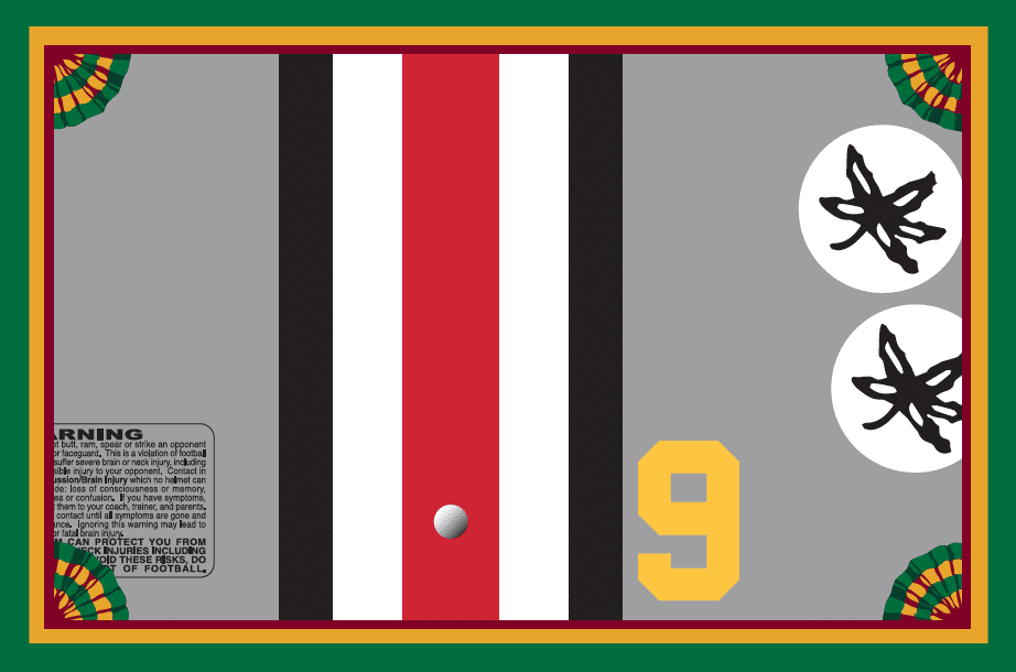
Membership update: A bunch of new designs — most but not all of them purple-themed — have been added to the membership card gallery, including Patrick Faherty’s card, shown at right, which is based on the back of the 1968 Ohio State helmet. I confess that until Patrick ordered this card, I didn’t know that the Buckeyes had used yellow numerals on their helmets back in the day — interesting!
Ordering a membership card is a good way to support Uni Watch (which, quite frankly, could use your support these days). And remember, a Uni Watch membership card entitles you to a 15% discount on any of the merchandise in our Teespring shop and our Naming Wrongs shop. (If you’re an existing member and would like to have the discount code, email me.) As always, you can sign up for your own custom-designed card here, you can see all the cards we’ve designed so far here, and you can see how we produce the cards here.

ITEM! Final anniversary countdown: We are now just two days away — two days! — from Sunday, May 26, which will be 20 years to the day from the date when the very first Uni Watch column was published in The Village Voice.
Although Phil usually handles the weekend, I’ll be writing Sunday’s post, which will feature some thoughts about two decades of obsessing over athletics aesthetics. I’ll also unveil our new 20th-anniversary logo and will show you a very special anniversary commemoration that a longtime reader has arranged.
Obviously, the timing isn’t ideal, since site traffic will no doubt be light during the holiday weekend. But I’ll have plenty of time over the next few months to harp on the anniversary, so don’t worry if you miss Sunday’s post — I’ll make sure to circle back to it in the days and weeks to come.
The Ticker
By Anthony Emerson

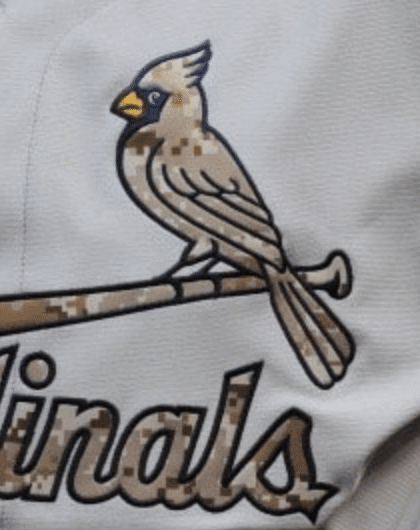
Baseball News: A lot of people sent us stuff about the comedy band Lonely Island sending up the Bash Brothers of the late-1980s Oakland A’s. The members of the band — Akiva Schaffer and Andy Samberg — wore custom A’s-inspired “Bash Brothers” unis in promotional images. The videos are supposed to be from 1989, so the unis from the “Uniform On” video (warning: extremely profane) are anachronistic, with the performers wearing post-1993 A’s unis instead of 1989 — note the serifed “A” on the “Athletics” script and the “swooshed” O on the “Oakland” script. They also wore the 1972-80 green pullover, which neither Mark McGwire nor Jose Canseco wore. The caps worn in most of the videos are wrong, featuring a yellow “A’s” logo, instead of white (anachronism notes from Richard Paloma, with thanks to everyone else who sent this our way). … According to Mets radio guy Howie Rose on yesterday’s broadcast, new Met Carlos Gómez is wearing No. 91 as a reference to Psalm 91. Also, he lost his cleat while running the bases yesterday (from Sam Brochin). … The White Sox will be giving away these T-shirts on June 13 to celebrate the 40th anniversary of Disco Demolition Night (from Jeff Ash). … @labflyer found the smallest registered trademark sign ever on a Cubs T-shirt on sale at O’Hare. … Also posted in the NFL section: Jaguars QB Nick Foles wore a Jacksonville Jumbo Shrimp cap during for a post-practice interview (from Matt Straus). … The Tulsa Drillers, Double-A affiliate of the Dodgers, are wearing these jerseys today to honor the Muscogee (Creek) Nation. More info here (from @kyle47). … Nothing says “military appreciation” like incorporating your logo into service stripes! (from Landry E. Heaton). … You have to watch closely to see it, but Twins OF Max Kepler’s cap brim bent backwards when he bumped into the wall last night.

Football News: You wanna feel old? Joe Horn’s son, Joe Horn Jr., is in the NFL now, wearing his dad’s No. 87 for the Ravens (from Andrew Cosentino). … Patriots rookies don’t have their uni numbers yet, but their veteran free agent signings do. Inexplicably, LB Jamie Collins is listed as wearing No. 8 (from @PeskysPole). … It appears Jets WR Quincy Enunwa has switched from a Riddell Speed helmet to a Schutt Air XP, but this might just be a thing he does for practices and preseason workouts, and we just hadn’t noticed (from Jack Dorfsman). … An MS-13 gang member was convicted of murdering a man for wearing a Peyton Manning jersey (thanks, Phil). … Cross-listed from the MLB section: Jaguars QB Nick Foles wore a Jacksonville Jumbo Shrimp cap during for a post-practice interview (from Matt Straus). … Butler teased new unis in a Tweet yesterday (from Jamey Deckard). … Court papers show that the new XFL, which is slated to launch next year, is trying to obtain a bunch of helmets and equipment from the now-defunct AAF (from Phil).

Hockey News: Oh my god, check out these Whalers sweaters given to Gordie, Mark, and Marty — and Colleen! — Howe at their Whalers introductory presser. Look at the logo! Look at the first name on the front of the sweater! (many thanks to Jerry Wolper for sending this our way). … Another blood jersey at the IIHF World Championships, this time for Switzerland’s Tristan Scherwey. It appears every team’s blood jersey is No. 53, as every team that’s needed one has had that number (from Jakob Fox). … The Bruins wore their practice jerseys for a public scrimmage to warm up for the Stanley Cup Finals (from @yancy60).

Hoops News: New court design for West Virginia (from Bryan Wilson and @cDubya). … Igor Coehlo made minimalist mini NBA jerseys and stuck them in cheeseburger sliders to celebrate his 32nd birthday. Great job Igor!

Soccer News: Italian team SSC Napoli’s new fashion line includes a baseball jersey and a basketball jersey (from Mike D). … Japanese side Shimizu S-Pulse have launched a special kit to celebrate the 120th anniversary of the Port of Shimizu (from Jeremy Brahm). … Bulgaria’s CSKA Sofia have released their new kits (link in Bulgarian, from Ed Żelaski). … The following are all from Josh Hinton: the kits referees will wear during UEFA Champions League competition will be manufactured by Macron, ending years of Adidas production. … French side Stade Rennais has launched their new kit. … All of Cagliari’s kits were revealed yesterday. …

Grab Bag: Esports team CLG’s new jersey will be released sometime today (from Charles B). … The Mercedes F1 team’s engine cowling will have a single red star in memory of Niki Lauda for Sunday’s Monaco Grand Prix (from Jack Wade).
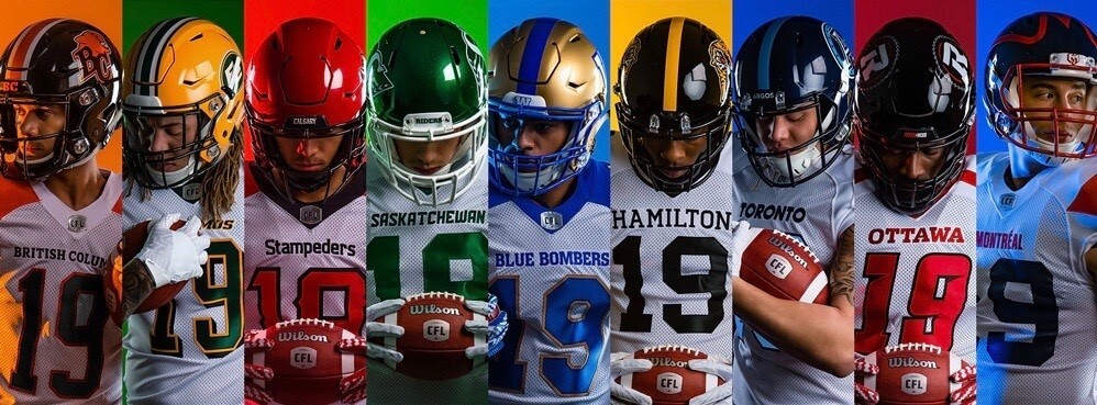
I like the font on the Stampeders jersey. Also I think “Riders” would have been better than “Saskatchewan” (and probably cheaper, too)
I can say that the uniform materials over the years have gotten lighter and have some tech advances.. especially over uniforms up until the late 90s/early 2000s.. just not sure how much of a difference it all makes sometimes. If you can play you can play.
Really not happy we did not see the CFL uniforms from the waist down because I think there have been some changes.
We did get to see a full uniform for the BC Lions from their website. This video taken during a photo shoot for TSN.
Traditional style pant striping. Rather surprising they are wearing orange jerseys over orange pants. Is this their new primary combination? We would have expected black pants at home and the orange pants on the road.
link
Those Lions unis look mighty good to me. I can live with mono pants when they have prominent stripes to negate the sickly leotard effect.
Check to see if Powers is behind these uniforms. As I understand it, they produce most of the uniforms that are branded Nike and UnderArmor for the high school and small college market. I would think New Era is just branding uniforms manufactured by a third party. Is there any evidence they have opened a New Era uniform factory somewhere?
link
New Era has been supplying basketball uniforms too. They have the contract for the Canadian Elite Basketball League (CEBL) which is currently playing its first season.
link
New Era is also the full kit supplier for Celtic
link
New Balance and not New Era is Celtic’s kit supplier.
New Balance is the Celtic supplier, not New Era
I think you mean New Balance not New Era.
I bet Keith Hernandez never lost one of his Brooks cleats while running the bases.
George: Elaine, I bought you this Cubs T-shirt!
Elaine: Get Out! That is so nice of you Georgie! What’s this blue dot??
The jerseys are made by Ripon in Berlin Wisconsin which also made the previous Adidas and Reebok branded game jerseys. Only change is the template for the seams has changed. Still a holey mesh for bottom with the thicker fabric for shoulders and sleeves.
Placement of sleeve logos seemed to have changed a bit compared to the adidas model. Teams like the Roughriders, Redblacks and Stampeders had the logos more on the point of the shoulder with the adidas model. Also notable is the sleeve striping for the Eskimos is back on the sleeve. With the adidas model, the striping went more over the point of the shoulder.
link
This appeared to be a reason why these teams discarded TV numbers on the shoulders. Now it looks like the logo is placed more on the sleeve, which I would hope will persuade teams decide to reintroduce TV numbers when we are bound to see a few redesigns in 2020.
The White Sox are giving away disco demolition tee shirts. What’s next? Cleveland 10 cent beer night shirts? Atlanta Braves wet t-shirt night shirts? Damn, I miss the 70s ; )
I already own the 10-cent beer night shirt. Homage.com sells them.
Wait. Wet T-shirt night in hotlanta?
5/20/77, Braves vs. Cubs at Fulton County Stadium.
You wanna feel old? Joe Horn’s son, Joe Horn Jr., is in the NFL now…
Vladimir Guerrero Jr. already did that for me!
–
I’m a bit disappointed that the Alouettes gave up their jersey look.
I like the new logo but may miss the old one. Does this leave Louisville as the only North American team to have a bird-with-teeth logo?
The Salt Lake Bees thing, that’s not service stripes. That’s a rank insignia, specifically for sergeant first class. Service stripes are straight diagonal slashes that denote years of service, whereas chevrons indicate rank.
Or, maybe Canadian consumers aren’t suckers for that sort of thing.
the answer is a) the CFL is a cheap ass outfir….
have you seen our PM? this is the land of suckers dude!
I’m not even going to.
A lot of these CFL uniforms are carryover from adidas’ template. The one team that had a real complete overhaul was the Alouettes.
I really look forward to many redesigns we would expect to see in 2020. Optimistic based on the Alouettes’ redesign. No truncated stripes on pants, no random piping, no side panel, no ugly number font of a manufacturer trying too hard. If this first sample is any indication, New Era redesigns in 2020 may end up being honest to goodness professional and proper looking uniforms.
———–
For this year, a minus:
-Not happy about the Argonauts getting rid of the sleeve stripes. That old jersey was great and the stripes on the white jerseys were a throwback to the early 1970s model.
Some pluses:
-Like the Argos number colour change, going with primarily Cambridge blue number. A throwback nod on the white jersey to the Argos of the late 1970s and early 1980s.
-Tiger-Cats going back to the single colour number. A throwback nod as well. Last wore just the single colour numbers like this in 1988.
-BC Lions re-introducing black into their road uniforms. Keeps their look consistent compared to the lack of black in just the road uniforms the past 3 years.
-Happy with the elimination for some teams of the separate home and road helmets. One shell rule can be good if it allows the black Stampeders helmet to vanish forever.
I’m usually mostly initially disappointed with CFL redesigns because at first I’m unreasonably hoping for, but not expecting, something based upon the best of what was and some of what could be – not basing it upon changes or not from the immediately previous uniforms.
At first glance of what is pictured I can say what isn’t needed is the city or team name above the front number of every uniform. I accepted it as an interesting quirk for one team (Alouettes) and only one team.
This is really a reply to yesterday’s installment, but it was a busy day and I didn’t get to post. Just want to congratulate Paul on all the recent national exposure that Uni Watch has gotten. You don’t strike me as a publicity whore, but I think it’s safe to say that most of us like it when our work attracts positive, unsolicited attention. Kudos to you for all the hard work you put into this great community that brings so much enjoyment to so many of us.
Thanks, Joe. It’s been a unexpected but very enjoyable little media blitz — all the more fun because it’s coinciding with the upcoming 20th anniversary.
This is an annoying, nitpicky note regarding the Ohio State helmet card, but the Buckeye decals would be completely filled on the left side before appearing on the right side.
I’m sorry but these CFL uniforms look terrible. Not necessarily from a design standpoint, though the lack of stripes on the Argos is a shame.
The fabric and jersey cuts are inconsistent and shabby looking. Honestly they look like knock-offs. The Roughriders, Red Blacks, and Stampeders all have significant shifts from one jersey to another and it really doesn’t look good.
I should be an Alouettes fan by default, from my McGill time, but I never quite caught the CFL bug. That being said, the new helmet is cool, and the jerseys look like unlicensed Houston Texans jerseys, which is a HUGE IMPROVEMENT! Hated the old stuff. The logo was a bad joke from the 90s, and with all the random blocks of red/blue/white/silver all over the place among the helmets, jerseys, and pants…holy shit it never looked good when I lived there. Faint praise? Yes/oui.
I agree with everything you’ve said, it’s going to be interesting (but I suspect unlikely), when the Als line up for a play, whether it will look like a flock of birds.
I haven’t figured this out yet, I’m not a fan of the Texans uniform, always seemed boring, to go along with a boring team, that whenever they make the Play-offs, they always seemed destined to play the Saturday 4:00 pm game (lack of national interest), yet I like the Als uni. I think it’s the helmet, just giving the right amount of pizazz.
And being a fan of both leagues, I don’t think I remember a jersey coming as close to an NFL uniform in look. Edmonton has always had gold numbers, that sufficiently differentiates themselves from the Packers. Some Argos/Titans looks have come close, but I don’t think as close as this
When I think of CFL and NFL jerseys being close, I think of the Philadelphia Eagles and Saskatchewan Roughriders at two different periods in their histories.
Late 1960s, the Eagles and the Roughriders basically wore the same jersey. Eagles did change jerseys by 1970. Riders continued to wear this jersey with same striping up to 1984:
link
link
When the Roughriders updated their jerseys in 1990, dropping the sleeve striping and changing where the black trim was located on the numbers, the jerseys were pretty much the same as the Eagles. Except for the collar and the differing logos on the sleeves:
link
link
Not only did Carlos lose his cleat, but he got laughed at for wearing pajama pants!
Joe Horn was also my dad’s name. He came to Winnipeg from Germany when he was 26 in 1956. He quickly became a fan of Canadian and American football due to Bud Grant’s Blue Bombers dynasty which began in 1957.
Dad would have gotten a big kick out of a player sharing his name but he passed away long before Joe Horn played. Dad did enjoy Don Horn’s small window of success as a Packers QB in 1968 and 69.
I think part of the joke on the Bash Brothers thing is that it is kind of half-assed and they just don’t care about anachronisms. In the middle, they use a smart phone audio assistant to look up the plural of Goliath. (though that may be a 4th-wall breaking scene of Lonely Island looking it up, not Canseco and McGwire looking it up). Also not the correct 1989 Jumbotron. And worst of all: 2-in-1 socks! (not anachronistic, but inaccurate, and unforgivable)