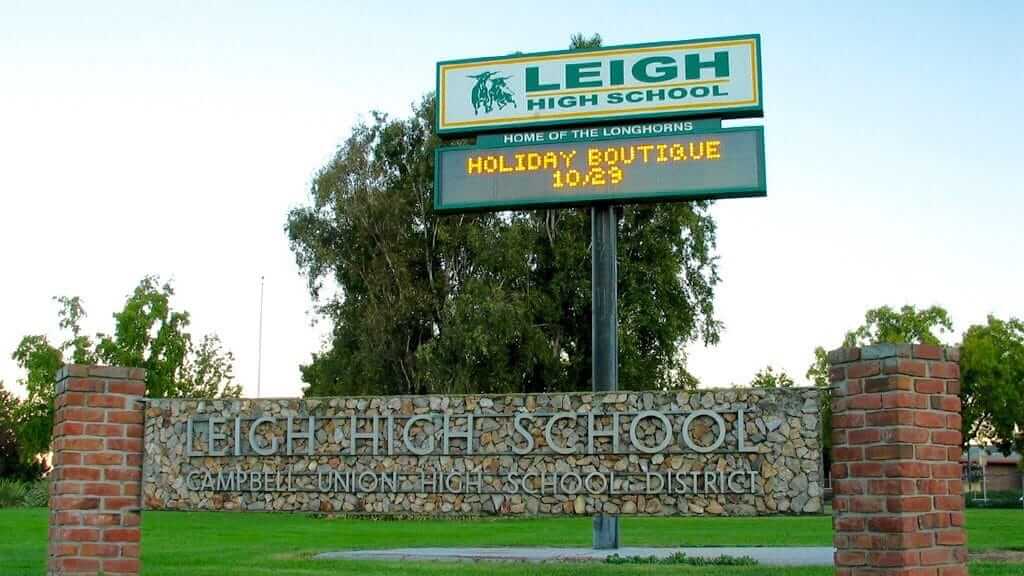
Last month we partnered with the Portland Pickles for a design contest with a cash prize (we’ll be announcing the winner of that contest shortly). And now, thanks to Uni Watch reader Bobby Williams, who coaches the girls’ varsity basketball team at Leigh High School in San Jose, we have another contest, again with a cash prize for the winner.
Here’s the deal:
• Bobby wants three uniforms for his team — home, road, and alternate.
• Here are the team’s current uniforms. “They were designed by someone looking to be cutting-edge and modern but are starting to feel a little bit dated,” says Bobby. He adds:
My goal is to have three different sets in our school colors — forest green, gold, and white. Something clean and classic, something that is minimalist in design but will still look and feel fresh in 5-10 years. As painful as it is for me to admit as a Lakers fan, I appreciate the aesthetics of the Boston Celtics’ uniforms. I don’t want the uniforms to be a straight copy of the Celtics, but something that has that vintage yet still current feel to them.
Our team is called the Longhorns. We used to use the longhorn logo associated with the University of Texas but had to stop due to legal issues. It would be nice to have an actual longhorn head that we could use again.
• Take a look at these three graphics. You don’t necessarily have to include any of them in their uniform designs, but your designs should have a similar feel that would mesh well with those graphics.
• If you use the team’s name, go with “Longhorns” — not “Lady Longhorns.”
• Deadline: Send your completed designs directly to Bobby Williams by next Friday, May 17.
• If you have any additional questions, feel free to contact Bobby.
• The judging will be done by Bobby, not by Uni Watch.
• The winning designer will receive $375.
———
And there you have it. Naturally, I approve of the school’s colors, so I’m assuming all of the entries will be beeYOOteeful, right? Right! Now get crackin’.
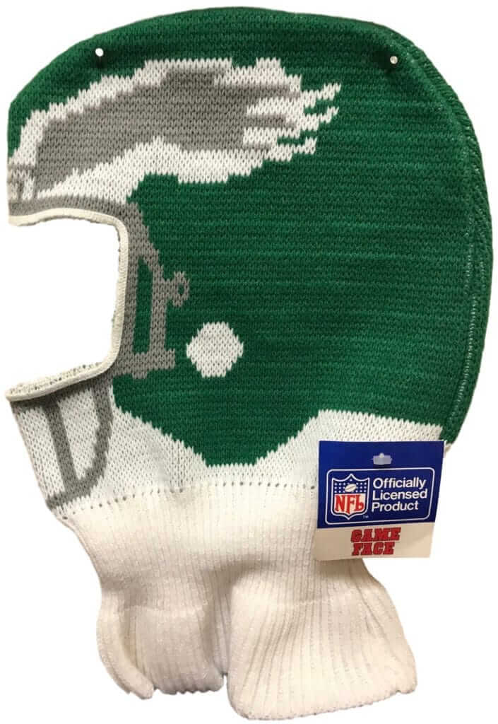
Game Face reminder/update: In case you missed it yesterday, I have a new Sports Illustrated piece that tells the previously untold story behind the creation of Game Face, a short-lived early-1990s line of ski masks that looked like NFL helmets. If you haven’t already read the SI piece, go ahead and check it out — it’s a fun story.
If you enjoyed the story and want some more, here are some additional bits from my interview with Game Face inventor Drew Siegel that didn’t make it into the SI piece:
Uni Watch: Was Game Face your initial name for it, right from the start, or did you go through some other names before you arrived at that one?
Drew Siegel: We didn’t really have a name for it at first. I think Jerry Jones may have been at a press conference and said something like “I’m going to put my game face on,” and it struck us that that was a perfect name. It just happened.
UW: After the NFL granted you a license, how did you get the hats made?
DS: They sent us to a guy named Steve Ross, who had a knitting mill in North Carolina. He was basically in the NFL Properties Hall of Fame. I can’t remember the name of his company. And he had a guy working for him named Barry Markowitz. So the NFL arranged for us to meet with him. And I’m a lawyer, and we’re bigshots because we’re working with the NFL, so we walked in with a non-disclosure agreement. And he was this old dude, and he looks at us and says, “I don’t have time for non-disclosure agreements. If you want to show me your product, fine. If not, I’ve got 100 other things to do.”
So we said fine, and we showed it to him, and he showed us around the mill. He showed us how your normal knit hat is made on a circular machine, but that wouldn’t work for our product because it didn’t look the same all the way around. So it had to be made like a sweater and then sewn together.
UW: So the mill created the knitting patterns?
DS: No, I actually designed all of the hat patterns myself, by hand. This was before computers were commonplace, and I would do it on a sheet of graph paper. It was a real labor of love.
UW: I’ve seen NHL Game Faces, too. When did that happen?
DS: Around the same time as the NFL ones. It’s funny, I forgot about that. We had a license from the NHL. We also had one from the NCAA, and from Notre Dame, which back then was the hardest license to get.
The hockey ones didn’t sell very well. You’d think they would [because hockey is popular in cold-weather regions]. We thought the kids would wear ’em when they played.
UW: Well, a hockey helmet isn’t as iconic a visual symbol as a football helmet. And even a goalie’s mask is more of a personal thing, not a team thing.
DS: That’s true.
UW: Overall, did you make money or lose money on the project?
DS: I only had about $1,000 in it. I’m a lawyer, and I bill by the hour, so the only thing I really lost was my time. Significant amounts of my time. But it was awesome — we went to trade shows, I met people like Tom Landry and Gale Sayers. It was a big thrill, just the whole thing. Most lawyers want to get the hell out of practicing law anyway. It was a labor of love and it was a ton of fun.
UW: Have you come up with any other product ideas over the years?
DS: No. Game Face was a fun, valuable lesson that I should stick to practicing law.
———
And there’s more. After yesterday’s article ran, I heard from a guy named Isaac Shaffer, who’s based in northern Michigan and runs a website called GameFace Vintage, where he sells dead-stock Game Face hats. I wish I’d known about his site earlier — I would have mentioned and linked to it in my SI story.
Shaffer says he purchased a big stash of dead-stock Game Faces about 10 years ago from an upstate New York operation called Ark Wholesale and still has about 300 of them left (but only for the Oilers, Raiders, and Giants). “I could always tell when they got some airtime during a televised game,” he says. “They’d zoom in on a fan wearing a Game Face mask, and then my orders would spike during the game.”
Shaffer asked if I could put him in touch with Siegel, the Game Face inventor, which I happily did. Maybe they can cook up a scheme to get Game Face back into production. Eh, okay, probably not. But it’s still fun to think about!
Click to enlarge
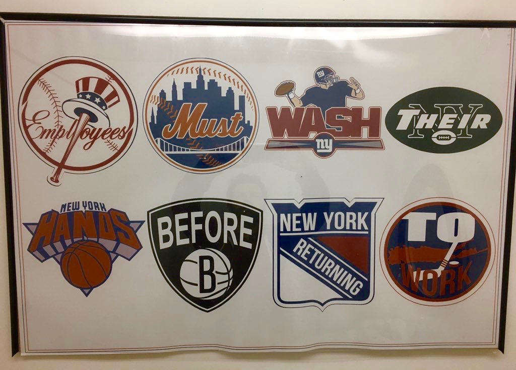
Logo-riffic: Reader Chris Bandera was eating last night at a Filipino restaurant in Queens called Ihawan and noticed that someone had based the restroom’s employee hand-washing notice on a variety of NYC team logos. Some are definitely better than others, but the cumulative effect is very nice — I like!
Click to enlarge
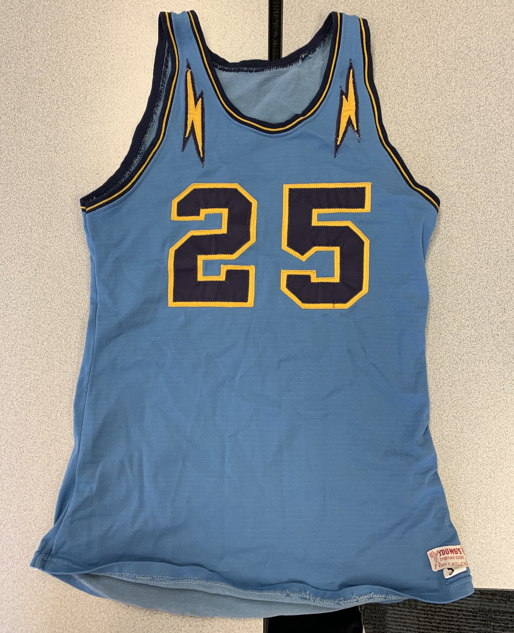
Powder blue? Check. Lightning bolts? Double-check!: The teams at Paxton High School in Nebraska are called the Tigers. But somebody there must have been a Chargers fan, because they wore this magnificent bolt-trimmed uniform in 1961-62. What a beauty!
Even better, take a closer look at that jock tag design:

(Big thanks to Greg Mays for this one.)

ITEM! Anniversary update: We are now just 16 days away from May 26, which will be 20 years to the day since the very first Uni Watch column was published. As I mentioned last week, that will kick off a 20th-anniversary celebration that I hope to keep going, in various ways, throughout the rest of this calendar year.
One component of that celebration will be a Uni Watch party here in Brooklyn, and I’m happy to report that I’ve now chosen the date and venue for it. The gathering will take place from 2-6pm on Saturday, June 22 at the 773 Lounge in Brooklyn. I’m hoping to have some special guests from Uni Watch’s past and present on hand. It’s gonna be epic! Or at least epic-ish.
Some people have talked about wanting to come in from out of town for this event. With that in mind, I’m going to try to reserve a small block of discounted rooms at a local HIex. I expect to have more info on that next week — stay tuned.
The Ticker
By Anthony Emerson

Baseball News: WAMU reporter Ally Schweitzer quizzed Nationals fans outside Nats Park on the team’s curly-W logo vs. Walgreens’ curly-W logo. Highly, highly recommended (from many, many readers). … Kris Bryant changed to an ax-handle bat mid-AB, and now he can’t stop raking (from Mike Chamernik). … Robert Brashear found two dozen of these misprinted Pirates caps at the Pirates official team store yesterday. … We saw the Traverse City PitSpitters’ inaugural home and road unis yesterday, now here’s their alternate uni (from Jordan Owens). … The Red Sox gave Donald Trump a home jersey with an NOB, matching what they did twice with George W. Bush and Barack Obama. Interestingly, they gave Bush No. 43 — the first time — and Obama No. 44, but gave Trump No. 18. This probably has something to do with No. 45 being retired for Pedro Martínez (from @The_Maddin). … In a related item, the White House previewed the Red Sox’s visit by misspelling the team’s name as “Red Socks.” … Yankees OF Cameron Maybin has been drawing small crosses with his eye black (thanks, Paul). … On a similar note, many Auburn softball players have been drawing dirt crosses on their pant legs this season (from Clint Richardson). … Both teams wore white for a high school playoff game in New Mexico (from Julian Avila). … Two lowercase letters made their MLB NOB debuts last night: Pirates P Montana DuRapau has a lowercase u, and Dodgers C Travis d’Arnaud has a lowercase d (Brian Cox and Robert Chavez). … MLB will apparently not penalize Mariners P Yusei Kikuchi for having a foreign substance on his cap the other day.

Football News: The Bills’ rookies have got their numbers (from Andrew Cosentino and @bonesj0nes). … So have the Broncos’ rookies (from Jonah DiGiacomo). … As have the Titans’ rooks (thanks, Phil). … Browns blog Factory of Sadness has some new uni rumors (thanks, Phil). … More Browns uni stuff in this video (from Craig Ackers). … The Eagles are keeping the corporate name on their stadium for another 13 years (from Blake Fox). … Speaking of the Eagles, they had a handful of uni number changes yesterday (from Sam McKinley). … It’s a little early, but Ball State has already announced their uni combo for their game on September 14.

Hockey News: Twitter’s image for last night’s Eastern Conference Final game came from the throwback game between the two played at the Garden, with the Canes in green Hartford Whalers unis and the Bruins in their road whites at home (from James Beattie).

Hoops News: 76ers G/F Ben Simmons wore above-the-knee tights during last night’s game. He usually wears three-quarter-length tights. Seeing as they blew the brakes off of the Raptors, maybe it helped (from Jeremy Richardson). … Great gesture from Langara College in Vancouver, which is on the traditional territory of the Musqueam people: they’re wearing the school’s Musqueam name, snəw̓eyəɬ leləm̓, which literally means “House of Teachings” on an alternate basketball jersey. Very cool.

Soccer News: Wolverhampton Wanderers, who are finishing up one of their best seasons in the Premier League, are being sued by a retiree who claims to have designed their crest while he was a boy in the 1960s. More details here (from Griffin T. Smith and @The_Boot_Room). … Lazio will have a special kit for the Coppa Italia final (from @hlodwig). … Rangers will not be allowed to use next season’s kits in UEFA competition, because they feature embossed crests on the front. According to UEFA rules, teams are only allowed one team crest on the front of their kits (from Ed Żelaski). … Also from Ed: Aston Villa are switching their kit provider from LUKE to Kappa. … The following are all from Josh Hinton: Juventus’s keeper kit has been leaked. … PSV Eindhoven will wear a special kit for their final match of this season to, get this, “thank EnergieDirect.NL for three years as their main [advertiser]”. … Olympique Lyon’s new home kit has been leaked. … Liverpool’s new away kit may have leaked.

Grab Bag: Yesterday’s Illinois-shaped pothole reminded Austin Gillis of a rock he found atop Long’s Peak in Colorado, shaped like the state of Georgia. … IBM has built a blue cricket field on its campus in Silicon Valley (from Jim Vilk). … Ohioans can vote on the state’s new “I Voted” sticker design (from Jason Hillyer). … Lots of coverage yesterday on Nike’s new app that will let you use your phone’s camera to measure your shoe size, but what we at Uni Watch are most concerned about is what this will mean for Paul’s beloved Brannock Device (from Tom Wannamaker).
Yikes. that Lazio jersey looks more like NASCAR what with being so cluttered
Re. Rangers kits. The linked article actually says that although the kits do not conform to UEFA rules they likely will be allowed to wear them.
There is actually a further article in UEFA’s kit rules (Article 18) that allows “one type of team identification” to be embossed like that with no restrictions on amount or size, so it shouldn’t be a problem at all.
No idea how FH overlooked that.
Irony of ironies: I live in DC, but I’m gonna be in NYC that 6/22 day; however, it’s my own bachelor party, so I don’t think I can swing by. I’ll be thinking of you though! Here’s to another 20 years!
Congrats on the upcoming wedding, Mike!
I am all for getting the details right in life and in athletics aesthetics. I love that people with more than one capital letter in their last name go the extra mile using lowercase a/e/i/o/u for their NOB, and I like the trend toward using diacritics where appropriate. So why does the lowercase d look so… not right, for lack of a better term? Maybe it’s me, but a leading lowercase letter, followed by a NOB in all-caps, just doesn’t look right. Travis d’Arnaud can do as he pleases, that one is just jarring, in a way that Jacob deGrom’s NOB isn’t.
I think it’s because with NOBs being in all capitals, we expect to see a small capital there, not a lowercase letter. The “d” should also have a tiny notch in the middle; I think the Mets just take a capital P and flip it around.
Hoping for a little help from the members of this site. I live in Canada and am looking for baseball stirrups from a vendor in Canada. The choices are minimal, to say the least. Anyone have any suggestions for vendors that ship within Canada? Looking for orange/black stirrups. Need to be the style bearer for my softball team. THANKS!
Finally got around to reading yesterday’s SI article. A well told story! And I really don’t understand why they didn’t catch on, and why they’re not still a thing. So many young kids today play touch instead of contact football, so they don’t wear helmets, but I know my touch-playing nephew would absolutely wear a helmet-looking ski cap. Not just on the field, but he would wear that all the time. Especially if it was thinner, like the under-helmet hoodie thing NFL players often wear. And imagine your favorite QB or WR coming off to the sidelines and taking off his helmet only to reveal a hoodie that looks just like the helmet!
I briefly had a Steelers one. Wasn’t the most comfortable material, plus the single stitch made it look and feel a little awkward. With newer softer material and perhaps sewing three pieces with two seams, it would be much better.
And get some throwbacks! Probably the only way I’d wear one now is if they had the ’72 Oilers or USFL teams. Maybe CFL.
They are some CFL ones floating around out there.
link
link
That Stamps one is a winner. Now how about an early 80s Argos?
Definitely a winner done in the stretchy material used for facemask/scarf things they make today…
So apparently the “Red Socks” are the “World Cup Series Champions”.
Real sports fans in that Trump White House.
Did they wear their championship belts, or medals?
Low hanging fruit, but it has to be done: I’m upset that I don’t get an “I voted!” sticker for voting on the new design of the “I voted!” sticker.
the “I voted” sticker for this week’s municipal elections inexplicably had four variants of the word “vote” on it, so there’s a shortage
I hope someone incorporates a true “Longhorn” in their entry for the Leigh Longhorns uniform design contest.
link…9615.9615..10557…0.0..0.109.109.0j1……0….1..gws-wiz-img.jjfBs0TMPvU
Heard a bit on the radio this morning about that new Nike app. Still doesn’t address one problem I have with Nike, the fact that they don’t make enough 4E widths.
First paragraph, I think you mean ‘contest’ vs. ‘content’
Thanks. Fixed.
Got to say, Ive been an avid reader of the blog for almost 15 years now and some of my favorite entries have been written since the end at ESPN. The A’s hot dog god and the game face ones just goes to show there is still a ton of material out there for Paul to mine and he is only getting better at doing so. Kudos !
Thanks, Ronald — greatly appreciated.
Instantly recognized that marquee sign in the lede. Used to pass it whenever I went to the mall near there. Don’t know how Leigh is right now, but when I was in high school, they had a ridiculously good music program and football program. Some of the teachers I used to work with told me if you went to one of the three “L” schools in San Jose (Lynbrook, Leigh, or Leyland), chances are you’d turn out pretty well post-high school lol
My brother in law from San Jose is visiting this week. He was surprised to see me reading about the school he bikes past on a regular basis.
In fact, he’s the reason I found my ticker contribution. I was watching a cricket video yesterday when he walked by and he started telling me how folks in the Bay Area are trying to grow the sport there. As he talked I searched for some articles and found the one about the field…and another by Lloyd Alaban!
link
Have read Uni Watch for years. But, kinda weird seeing my high school, class of ’96, as the first image this morning. Definitely going to have to show this to my son who’s currently a sophomore and on the JV baseball team as well, which actually had to change the design of their Longhorn recently after a letter from those other Longhorns from Texas.
Oh man, this L.A. boy will be in NYC that week in June, it has to be a sign, I will definitely try to make it out.
It would be great to meet you, Pedro!
As a Uni Watch reader and very occasional commenter, I hereby endorse sticker #2 in the Ohio “I Voted” sticker contest.
Fellow Ohioan here. That was my choice as well.
I humbly disagree and make an opposing endorsement for #1
LOVE that “returning to work” poster. Although they should have given the word “to” to the Devils.
Fun fact – I was invited by a coworker to Leigh’s senior prom in 1991. I turned her down because I was in love with her friend we were going to be doubling with.
Those Browns concepts look great! I like the cream/white one with the drop-shadowed number on it — were the Browns inspired by their link when they put those shadows on?