[Editor’s Note: Today we have a guest entry from longtime reader Daniel Tarrant, who’s going to talk about some uni-notable posters from the 1980s. Enjoy. — PL]
By Daniel Tarrant
If you grew up a sports fan during the 1980s like I did, there’s a good chance that at some point your bedroom walls were adorned with what we might call “high-concept” posters featuring the top players of the era. Instead of action shots from games, these posters would usually play off an athlete’s nickname (or at times assign him a new one) and have him pose “in character” in front of something akin to a movie set, with props in hand to complete the image. Sometimes anonymous vanquished opponents would appear face-down in the background to further illustrate the star’s dominance.
Perhaps the most well-known poster of the time featured the “Bash Brothers” — Oakland A’s sluggers Jose Canseco and Mark McGuire — dressed in Blues Brothers-style suits, fedoras, and sunglasses and posing with oversized bats and a police cruiser.
These posters were the epitome of 1980s awesomeness. But of course, what is considered awesome in one era may be perceived as goofy or even inappropriate a few decades later (a number of the posters, for example, employ gun-related themes or what could be deemed cultural insensitivity). Today, many of the posters seem kitschy at best and cringeworthy at worst, although many of the images had a self-aware tongue-in-cheek element that remains endearing today — a reminder of a time when sports weren’t taken quite as seriously as they are now.
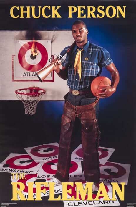
From a uni-watcher’s viewpoint, it appears that the various poster companies did not always have the proper licenses in place to show the proper logos and uniforms. Much of the time, they got around this by simply having the player dress in a costume that fit in with the poster’s theme or the player’s nickname. But at times, the stars were given generic or even somewhat surrealist uniforms that would never be seen in game action or found for sale at your local mall.
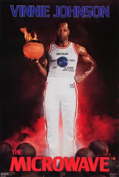
One favorite of mine is the getup worn by an obviously embarrassed Vinnie “The Microwave” Johnson. Instead of his Detriot Pistons jersey, he wore a tank top with a Spinal Tap-like dial indicating that “Vinnie Johnson” is one setting above “High”:
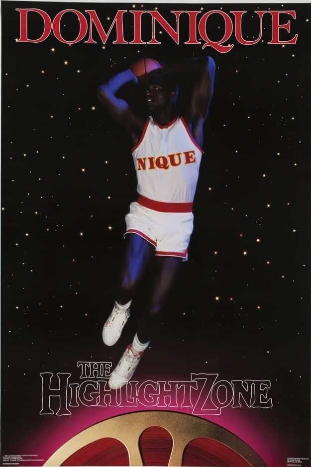
Dominique “The Highlight Zone” Wilkins was featured in a personalized jersey that got his Atlanta Hawks colors correct but for some reason didn’t include his number 21:
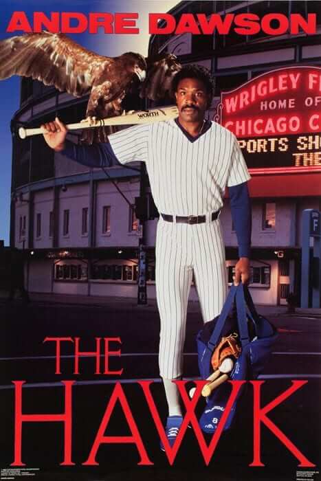
A number of posters simply attempt to put the player in a generic replica of his actual uniform, without the trademarked team names and logos. Note that in this poster of Andre “The Hawk” Dawson, not only does he have a black Cubs uniform, but the photo is framed so that the Wrigley Field marquee in the background just barely leaves the word “Cubs” out of the shot:
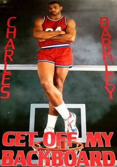
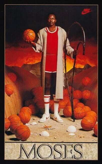
Charles Barkley and Moses Malone were also both given blank versions of the Sixers jerseys of the era:
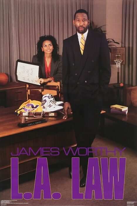
One of the better ways of working around the licensing problem is shown in this poster of James “L.A. Law” Worthy, who wore a business suit while a Lakers game jersey was folded on a nearby desk to reveal only the number. Bonus points for the color-coordinated law books, but minus a point for the blatant product placement:
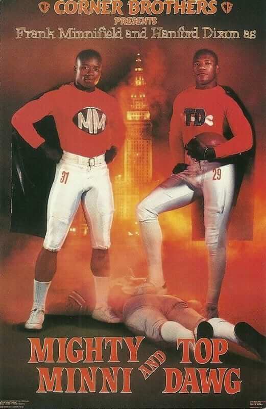
I chuckled a bit at this faux-movie poster showing two Cleveland Browns defensive backs, wearing hybrid football/superhero uniforms, star in a motion picture presented by “Corner Brothers”:
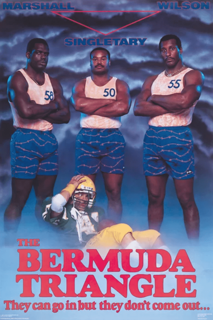
In one of the stranger examples, three Chicago Bears linebackers posed as lifeguards, looming over a player in a generic uniform obviously meant to represent the Green Bay Packers. It’s not clear if they just pulled him out of the water or manhandled him on the beach:
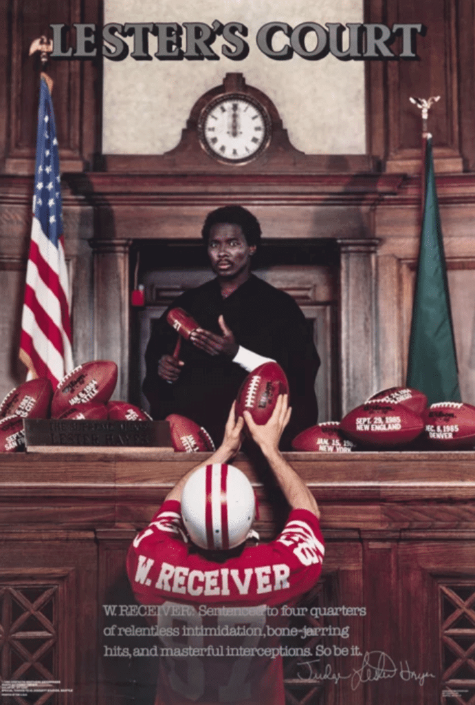
Another creative design features Raiders defensive back Lester Hayes as a judge, presiding over a hapless defendant in a generic (Patriots?) uniform whose nameplate simply reads “W. RECEIVER”:
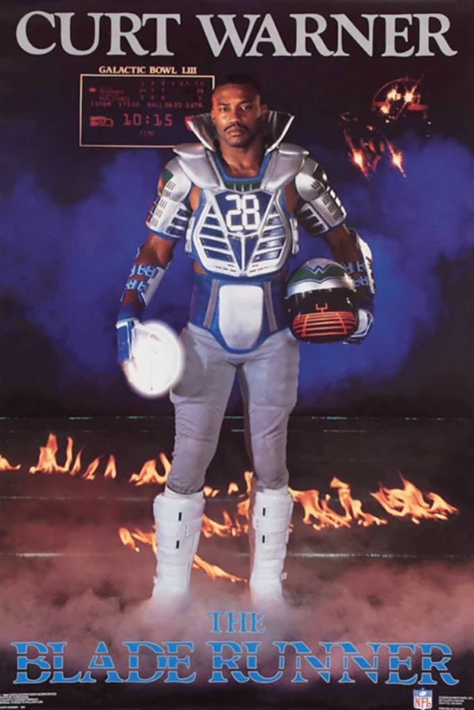
Finishing things up, I don’t recall Seattle Seahawks running back Curt Warner ever being known as “The Blade Runner,” but that didn’t stop him from being depicted in a futuristic football uniform while participating in “Galactic Bowl LIII.” I couldn’t help but notice that the logo on his helmet calls to mind that of the rock band Weezer, and that apparently in the future, scoreboards will revert back to ’80s display technology.
I hope you enjoyed this trip down memory lane. To see more posters from the era, a couple of pretty good galleries can be found here and here.
Click to enlarge
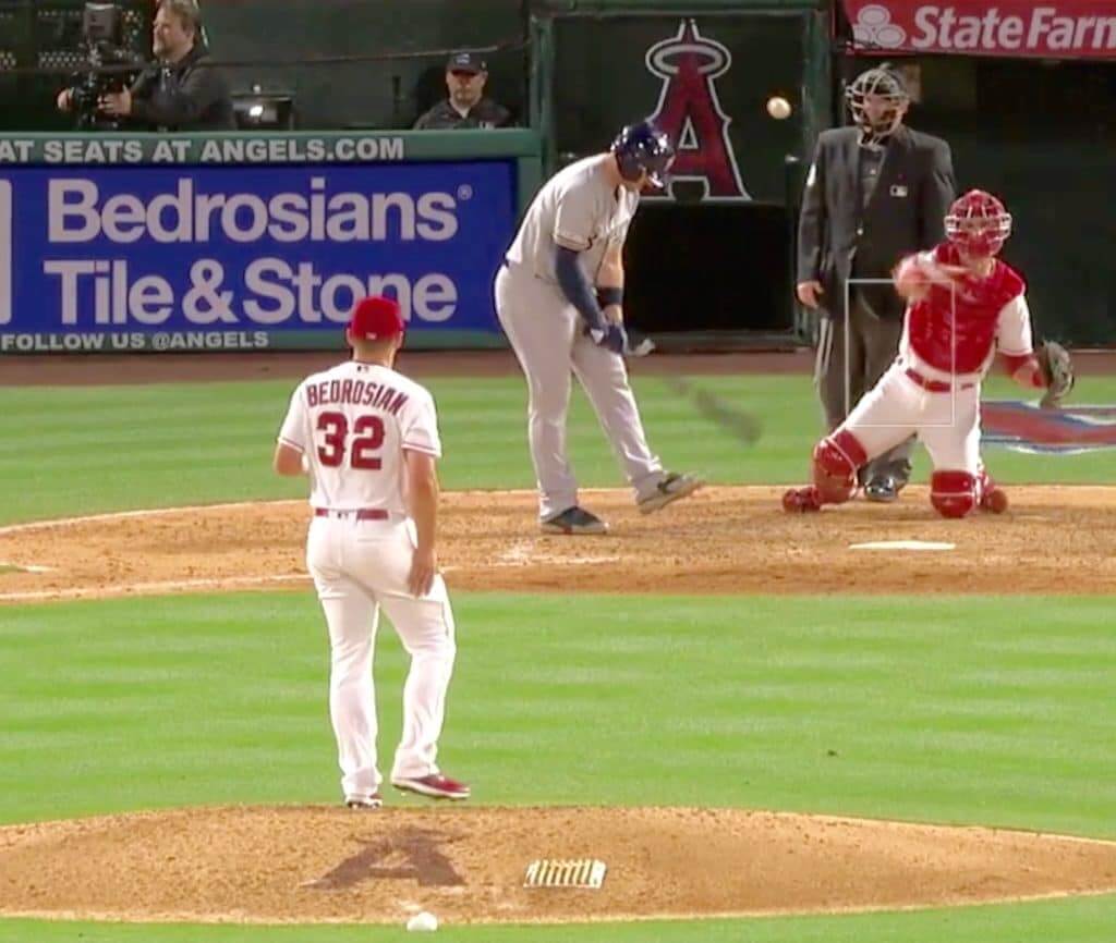
Double vsion: Angels reliever Cam Bedrosian entered last night’s game against the Brewers in the top of the seventh inning. And lo and behold, an ad for a company that shares his name appeared behind home plate. Coincidence, or player-specific ad campaign?
Bedrosian had pitched in two other home games this season — on April 4 and April 7. As you can see in those photo links, the ads on display during his appearances in those two games bore no resemblance to his name. So maybe last night’s ad really was a coincidence — or maybe the company just struck the ad deal a few days ago. Something to watch for the next time Bedrosian appears in a home game.
(My thanks to Brendan Mongey, Mike Monaghan, and @JennieOhMy for bringing this one to my attention.)

ITEM! Uni Watch on the air: I’ll be appearing on the Buffalo radio show One Bills Live today at 1pm Eastern. I’m told that we’ll be discussing NFL uniforms in general and the Jets’ new set in particular. I believe you can listen to the live stream here, and I’ll post a link to the archived audio tomorrow.
One of the hosts of the show is former Bills player Steve Tasker. Maybe I’ll bring up his onetime teammate Mark Kelso’s ProCap.
ITEM! Incredibly inspiring cap update: Even since I announced the recent unpleasantness, the Uni Watch community has been pretty amazing at rallying to support the site (and, by extension, me). We’ve had a big spike in membership sign-ups, plus many people have donated cash or purchased memberships or merchandise for me to raffle off. It’s all been pretty amazing to see. And now one of our readers has really gone above and beyond.
Here’s the deal: As you may recall, last Friday I mentioned that Ebbets Field Flannels will no longer be selling the Uni Watch Classic Cap (although they’ll still be manufacturing it), and that I was going to take over the sales and shipping myself. At the time, I wrote, “I’ll have to stock up on cardboard mailers, buy some storage bins for the various cap sizes, and figure out where I’m going to keep all of that stuff in a small NYC apartment. Plus I’ll have to start making a lot more trips to the post office.”
Later that day, I got an email from card-carrying reader/member Mark LaFountain. He said (I’m paraphrasing here), “I live in a big house, I have a reasonably clean basement, and I’m semi-retired, so I have plenty of time. Want me to handle the packing and shipping for you?”
Is that incredible or what? An extraordinarily generous offer! After a bit of back-and-forthing, I’ve decided to take him up on it. So our inventory of caps, which Ebbets was going to send to me, is instead on its way to Mark. I’ve also purchased storage bins, a return-address rubber stamp, a postal scale, and everything else Mark will need to get started in his new role as Uni Watch Cap Fulfillment Manager.
And it gets better: Yet another generous reader, who works in the corrugated box biz (and prefers to be anonymous, so I won’t name him here), is creating some mailer boxes for us, gratis. He’ll be sending those to Mark shortly.
The upshot of all this is that caps should once again be available for ordering, in all sizes from 7 through 8 (plus adjustable), by the middle of next week. I’ll let you know when we’re open for business. I’m not yet sure what the price will be, but it’ll likely be less than the $49 that Ebbets was charging.
I can’t even begin to express how grateful I am for this assistance and support. You people — all of you people — are the best.
Click to enlarge
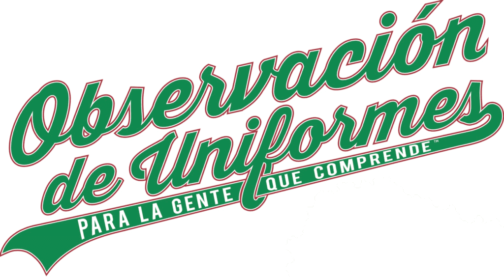
ITEM! ’Tis the season: Don’t look now, but Cinco de Mayo is just a few weeks away, which means it’s the perfect time for our Uni Watch Spanish-language T-shirt, available in a wide range of colors (click to enlarge):
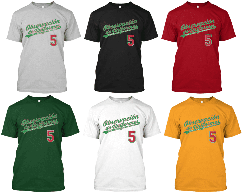
You can order it here.
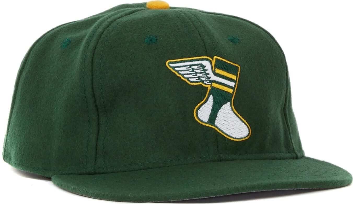
While we’re at it: In case you missed it on Monday, we have a new pair of T-shirts, rendered in the classic Goodyear type font called Wingfoot Sans, and featuring our own winged stirrup instead of Goodyear’s winged foot (click to enlarge):
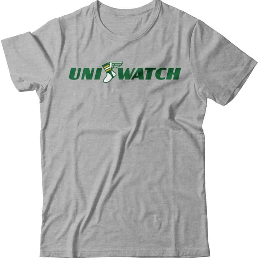
Here’s where you can order the green one and the grey one. My thanks, as always, for considering our products.
The Ticker
By Lloyd Alaban

Baseball News: Looks like the Astros have gone to a 3D helmet logo for 2019 (from Noel Tovar). … The Red Sox wore gold-trimmed uniforms and a championship sleeve patch (but not MLB 150 patch) for yesterday’s home opener. … Speaking of the Sox, here are the rings they received prior to yesterday’s game. More details here (from multiple readers). … Trophy Brewing in Raleigh, N.C., has released a beer with a package design imploring MLB to bring a team to Raleigh (from Will Gad). … MLB is selling a tote in the style of the Phillies’ 1974-86 uniforms (from John Cerone). … Color vs. color for Florida and Florida State yesterday (from @fifthquartercfb). … No photos yet, but the Jupiter Hammerheads, Single-A affiliate of the Marlins, will be wearing themed jerseys for Star Wars Night on April 13. … Pitt State and Northeastern State both wore black unis on Sunday for Jake Clark Melanoma Awareness Day. Clark, who was on Pitt State’s baseball team, died from melanoma last season. Both teams also wore memorial shirts featuring Clark’s No. 10 during warmups (from Ryan Atkinson). … The Avon Police Department in Avon, Ill., is using a logo similar to the logos the Astros wore from 1994-99 (from @johnfauxremus). … Speaking of the Astros, a woman who was hit by a T-shirt cannon while attending an Astros game is suing the team.

Football News: Yesterday, we reported that Ravens CB Marlon Humphrey would be changing numbers, but didn’t have word on what the new number would be. We now know that Humphrey will wear No. 44 after giving up his No. 29 to new teammate FS Earl Thomas. Humphrey chose 44 to honor his father Bobby Humphrey, who wore that number with the Dolphins (from multiple readers). … Here’s some of the NFL apparel they’re selling in Wales (from Sonny Lee Smith). … The Chiefs announced their preseason schedule with a graphic featuring old-school helmet artwork (from Matt, who didn’t give his last name). … Last year, a website called FanJuicer.com ranked every NFL logo based on a marketing research technique called MaxDiff. Now the website’s founder is on Reddit asking users to do the same with the league’s home uniforms. … Here’s a vintage Thanksgiving- and football-themed Saturday Evening Post cover from 1928 (from Rex Henry). … Air Force is running their own bracket to let fans decide their best helmet. … Here’s a photo of Clemson’s first football team. They’ve done pretty well for themselves since then (from Scott Rhymer).

Hockey News: Blues G Jordan Binnington received some custom goalie pads from hockey equipment brand CCM in the Blues’ alternate colors (from Derrick, who didn’t give his last name). … Mike, who didn’t give his last name, found these Atlanta Thrashers sticks at a Dollarama in Hamilton, Ont.

Basketball News: With Mavs PF Dirk Nowitzki playing his last home game last night, fans were given a Nowitzki shirt and mask. A commemorative ticket was also available (from multiple readers). … Cavaliers SF/SG Cedi Osman accidentally lost his mouth guard during a free throw attempt last night (from Mike Chamernik). … Pelicans PF/C Anthony Davis, who has been rumored to be leaving the club and has had his name thrown around for Space Jam 2 wore a shirt that read, “That’s all folks!” for last night’s game, which will presumably be his last home game with the team. … PG Jonathan Gibson will wear No. 8 with the Celtics (from Etienne Catalan). … The Timberwolves are prepping for Sunday’s Game of Thrones season premiere by releasing GOT-themed merchandise and renaming their Twitter page after an animal from the show (from multiple readers). … The Sixers are bringing back their Phila Unite campaign for the playoffs. The campaign features the Sixers’ “severed snake” alternate logo, stadium branding, and apparel (from Michael Barkann). … The Phoenix Mercury of the WNBA are holding tryouts for their all-male practice squad. Here are the jerseys the men will wear. If you’re curious on what a male practice squad on a women’s team entails, here’s more information (from Andrew Joe Potter). … Yesterday we showed you the WNBA’s new logo. Here’s what their new draft logo looks like (from @TheSkyShowCHI). … BHeat SG Dwyane Wade received this jersey commemorating his final home game in Miami (from James Gilbert). … Here’s the final March Madness uniform bracket (from Brandon Wright-Rowan). … And here’s the final March Madness uniform bracket by color (from Alex Gerwitz).

Soccer News: Here’s Brazil men’s away kit for the Copa America tournament (from Conrad Burry). … Italian soccer club AC ChievoVerona have tweaked their home shirts numerous times this season: Everything from alternating the position of buttons, badges (including a double-badged version), and advertisers (from Alvin Nguyen).

Grab Bag: Syracuse men’s lacrosse wore throwbacks last night (from Michael Barkann). … Here’s what Army men’s lacrosse will wear against Navy on Saturday (from @LaxSportsNet). … Here’s what golfer Tiger Woods is wearing at the Masters Tournament this week, along with a clip of him explaining his choice to wear mock turtlenecks (from multiple readers). … In addition, people are apparently freaking out over Woods’s new shirt logo (from Douglas Ford). … Here’s golf journalist Ron Sirak‘s 30-year collection of press credentials issued to him at the Masters. … Here is Australia’s Cricket World Cup uniform. … Here’s a USA Today article on the stories behind America’s corporate logos. … This Instagram account calls out celebrity pastors for their pricey sneakers (from Jason Eudaley Brown). … The US Marine Corps is debating on whether or not to allow Marines to use umbrellas with their uniforms, among other uniform additions. … Univision sold a bunch of websites to a private equity firm earlier this week. One of those websites is Clickhole, so a Clickhole writer let Univision have it regarding their logo (from Jason Hillyer). … New Anzac Day uniform for the Aussie football team Collingwood (from Jeremy Brahm).
Congrats to our latest membership raffle winner, reader Blair Hough, and big thanks to reader Judy Adams for purchasing and donating this membership.
Bobby Humphrey didn’t wear 44 with the Broncos. No one has since Floyd Little. Bobby wore link
Text adjusted.
Good Morning! Red Sox Gold Trim link isn’t working
Fixed.
according to wikipedia, cam bedrosians middle name is “Rock.” and his fathers nickname was “bedrock.”
I’m unable to confirm if there is any familial relation to the company though.
There was a very short “documentary” about the Costacos Brothers posters a few years ago. link
There was also a really in-depth article about them a few years ago that I can’t find.
The link for “anonymous vanquished opponents” isn’t working.
Also, if you look at the poster for Curt Warner you can see what appears to be a psudeo-Seahawks logo on the scoreboard.
That link works fine for me.
On review, it’s one of those links that you can’t click on directly, you have to copy and paste in.
That poster was not what I was expecting!
I can’t get this one to work either.
I downloaded the image, uploaded it to our site, and changed the link. Try it now.
I love the lede. My favorite of those posters was always the George Gervin “Iceman” poster where he wore a track suit while sitting on a throne of ice.
link
I also remember there being some great Karl Malone “Mailman” posters
I had Don Mattingly “Hitman” poster in my room.
link
Nostalgia overload! My favorite was my Bobby Jones “Secretary of Defense” poster (Tar Heel, Sixer, now Hall of Famer!!). Looking back, they’re cheesy as hell by current standards but so kitschy now. Great article!
The Iceman poster was produced by Nike as were Dr Dunkenstein (Darrell Griffith), Moses (pictured in the lede) and some group posters (the Supreme Court, the Boardroom, Air Force 1). I believe these were what inspired the Costacos brothers.
Was going to mention the Iceman poster. ANd the Samurai Mike Singletary one.
Re: fan suing Astros for t-shirt cannon injury. I may sound like a “get off my lawn” guy but these t-shirt and hot dog cannons, etc should be discontinued. I was at a Flyers game a few years ago and watched as an adult fan fell over two rows of seats and nearly squished a kid to get a t-shirt (which probably wouldn’t fit him anyway). Seen fans at Phillies games topple over each other for the same or hot dogs. For all the “good will” teams try to extend with this gimmick, stop the madness before someone gets really hurt.
Especially at Dollar Dog Night at CBP.
The Simpsons were ahead of the curve on the t-shirt cannon issue. RIP Maude Flanders.
link
I was at a Florida Everblades (minor league hockey) game and they used that clip to introduce the t-shirt cannon, cutting it off as she goes off the ledge. My brother and I both looked at each other confused as to why they would want to promote it that way.
We need a like or +1 button here. Those footlongs make me feel uncomfortable too.
In Aussie football for ANZAC Day the opponent of Collingwood, featured in the Ticker today, is Essendon. Here is their uni set for match. link
but wait, there’s more! ANZAC eve uni set from Richmond Tigers in Aussie football. link
Seems like every AFL team should have one, no?
Re: the Bedrosian ad, have seen quite a few times while watching Scottish soccer team Aberdeen ads for a law firm called Aberdein Considine, the name of which, besides a variation of the team name, contains the same last name as one of their players.
I think it’s shown up both at home and away games. No idea if there’s any intent.
They should and probably will release them over the course of the coming days. Also the NRL in Aussie has them. Add in the indigenous rounds for AFL and NRL too for special jerseys.
Traditionally, Collingwood and Essendon are the only teams who play on ANZAC day
Both teams did their guernseys with such taste, I wish clubs in North America would take the hint that you can do a patriotic tribute with subtlety and taste.
“The Red Sox wore gold-trimmed uniforms and a championship sleeve patch (but not MLB 150 patch) ”
That MLB patch sure looks gold-trimmed to me. I even noticed as i happened to be watching the end of that game at a bar yesterday.
No no no — not talking about the MLB patch on the cap or jersey. I’m talking about the MLB 150 patch, which all teams are wearing on their right sleeves this season. The Sox did not have that patch (gold-trimmed or otherwise) yesterday.
Got it.
Curt Warner had Buccaneer style number on his uniform in his poster LOL
Great lede today, Daniel.
How about some 1980s bizzaro uniforms TV add – CFL style!
1986 Saskatchewan Roughriders Rambo-themed add promoting a game against Ottawa. Battle of the Riders! Including an appearance by Roughriders equipment manager Norm Fong.
link
Thanks…yeah that CFL video was quite a find.
I remember a Jeff George Colts’ poster titled “the Sheriff” – Funny how that it ended up being Peyton Manning’s actual nickname.
re: the NFL apparel for sale in Wales. The jock tag shows the NFC logo (which makes sense for the 3 teams shown), but the words beside the logo appear to say “National Football League”. Do the AFC teams also say “National Football League”? So many questions…
Wouldn’t the AFC teams have the “A and 4 stars” and National Football League on tag.
I want to believe!
“MLB is selling a tote in the style of the Phillies’ 1974-86 uniforms”
Except the Phillies wore zipper fronts during that time.
As someone who regularly listens to One Bills Live while working, it’s exciting to hear that you’ll be a guest.
I love these posters. There was a Walter Payton one with him in a cut off t-shirt/spandex running up a hill that say “Payton’s Place” which hung on the wall of my room for probably 15 years. I have yet to find an image of it on the internet.
Here you go
link
yes, thank you!
A (nerdy) minor correction for the lede’s headline. It should be “Bizarro” not “Bizzaro”
The Buffalo Bills had a TON of goofy posters back in the day… “Machine Gun Kelly”, “Kelly’s Heroes”, “Thurmanator”, Bruce Smith as the “Bill Collector” and a bunch of others I can’t remember right now.
The Trophy Brewing Company’s Brewmaster in chief and a not too shabby artist in his own right, happens to be my nephew Les Stewart. Not too shabby at all for an Eastern North Carolina man!
On the list of must haves in ones family is a Brewmaster, I place it right up there with oxygen! Holidays and parties are always delicious, that I can tell you.
On a sad note, Wilbers’ Barbecue – a Goldsboro NC all time porkopolista’s favorite has link. They blame its’ demise on a recently completed bypass for the loss of business traffic.
In the 90’s I did the link
President Clinton wore one whilst jogging around the capitol in the days when politicians wandered outside the white house without fear of unpleasantness.
Here’s one of my favorite 80’s sports posters, the Chicago Bears offensive line as the Black ‘N’ Blues Brothers.
link
That poster hung in my family’s garage for YEARS.
A classic. It was displayed next to the pool table in my parents’ basement for many years.
link
Great article on the Costacos Brothers…. they are still in Seattle and would be a great interview.
Pretty unfortunate to give so much play to these posters and not give credit to the Costacos brothers, who if I’m not mistaken produced most, if not all, of the images referenced. In addition to the interviews others have linked, they just put out a coffee table book that details the stories behind the company and images and includes some amazing content from the athletes themselves. It’s called “Walls of Fame” and is a great read for anyone interested in this topic.
I actually know the person laying on the ground in the Minnifield/Dixon poster, a friend of the Costacos brothers. It would be great to do a more thorough lede on the poster ideation and executions because the stories are even better than the guesses thrown out in this lede. I don’t want to sound too critical since someone took the time to share something they love, but this one basically shrugs off the real stories for conjecture and doesn’t pay respect to the guys that essentially created the sports poster industry as we know it now.
That’s a fair enough critique, I guess my defense here would be that the history/execution of the posters simply wasn’t within the scope of what I was writing about and I wanted to feature as many posters as possible with odd uniform elements while staying within the column length that Paul specified.
I maybe should have at least mentioned the Costaco brothers as the main creative force behind the posters, but it was difficult to know which ones featured were their creations specifically. You are right that I was just assuming that the lack of actual uniforms here was due to a lack of the proper licensing agreement, but it seems like a safe assumption, especially since a number of posters produced did have actual team logos/unis.
Definitely a fair critique, and I blame myself for not asking Dan for more info on the posters’ background while I was editing the piece. My fault, not his.
No worries on either of your parts. Since I know them and a bit more of the history I love seeing the images shared again.
They did not have licensing agreements initially and worked directly with the athletes. That was actually a driving force for the creative, nickname based designs (if I understand correctly). A poster just showing the athlete without their real uniform nor an action shot would be boring, so these concepts were borne out of necessity. The sets were truly DIY – like that Minnifield/Dixon one where my friend actually helped make the superhero costumes, and is wearing an Ohio State jersey and borrowed pads as the “vanquished opponent.”
The book highlights how that evolved over time as leagues (and brands like Nike) recognized the reach of their posters, and is a great story in both uniforms and sports licensing.
Mark LaFountain is a good man.
Another cool thing about the Worthy poster is the woman appearing with him was his wife. She was a cheerleader at Carolina when he played for the Heels.
And Eltee of DC – I proudly wear your Wilber’s logo t-shirt!
The ads at Angels Stadium behind home plate, as is the case with every major league stadium, have rotating ad displays behind home plate, so while the first two images do not show the Bedrosian ad, they could still have been shown, just not at the same moment the photos were taken. Also, as is the case with most major league stadiums, the ad can also rotate to a green screen, allowing an ad to be digitally inserted in the broadcast. Typically, you can notice this when you see an ad when the game is being shown from the typical centerfield cam, but when a closeup of the batter is shown, you just see the green screen. The green screen also affords the out of town broadcasts the ability to show market specific advertising.
Yes, I understand how it works. For those two games on 4/4 and 4/7, I watched the entire inning that he pitched. No name-matching ad.
I wonder if the A’s green uniforms cause issues with this…
The Lester Hayes poster would have been infinitely better if they’d used his other nickname, Lester the Molester.
In case anyone was wondering, that Saturday Evening Post cover was not by Norman Rockwell, but by J. C. Leyendecker.
On the Astros’ 3-D helmet logo, I really wish they had made the logo itself 3-D. The logo depicts a star in front of the letter H. It would look so much better if their helmet logo actually had the star protruding out further than the H.
I know that Bedrosian’s advertises a lot with the Angels. They also have other rotating ads at Angel Stadium this year, and have in years past. I remember hearing the broadcasters talk about it and Cam Bedrosian, but I forget what the story was. It might just be cleverly targeted advertising, like all of the ads for Japanese companies that have sprung up since Ohtani.
I LOVE the Spanish language shirts. Any chance of French with a hockey theme?
Well, we do have this:
link
Not sure if this one counts since it seems to be a Converse ad (though the one I had in bedroom as a kid definitely didn’t have any type of converse branding) but I always loved this image of Mattingly as the Hit Man, specifically the pinstriped suit.
link
I used to LOVE those posters as a kid. I’d go into the various sporting goods stores and shuffle through all of them and admire them. I had a few, and I still actually do – all rolled up in my garage.
The link giving the details of the Phoenix Mercury Male Practice Squad dates to 2017. Are they still doing this?
So I love championship rings and all the cool little details about them – but good lord did the red sox stretch to justify the number or stones in their rings “21 custom cut rubies represents 4 world series titles in 17 years of ownership” Huh?
Had this Ray Bourque poster when I was a kid. Thought it was the coolest thing.
link
Hey Paul, I may have spotted another giant “Natinals”/”Angees”-level spelling error on a game uniform.
Check out this 1996 Rudy Jaramillo #8 Texas “Rangeas” jersey, which appears to be game-used: link
It could have been altered, of course, but the tagging seems OK. And with Jaramillo being a coach, he could have had his jacket on in the dugout and nobody would ever have noticed.
Thoughts?
I don’t mean to be a Scrooge, but I’ll believe it was worn in a game when I see an in-game photo of it.
Well, it’s not often you get photos of a hitting coach, which would be why the Rangers didn’t bother to fix it!
My theory is that the person sewing the letters got “RANGERS” and “TEXAS” confused midway through and just finished up with “…AS” unthinkingly.
Let’s hope it’s real!
“In addition, people are apparently freaking out over Woods’s new shirt logo”
I’m not sure if this is click bait or if people are actually freaking out. If it’s click bait then articles like this are why people think journalism is a dying breed. If people are freaking out then it adds to my notion that the Internet has made the world much dumber.
I love Uni-Watch but this shit gets me down. Who cares about a logo on a golfers shirt.
OK, I’m going to go freak out now.
Trying to decide if not including George Gervins “The Iceman” poster is a jailable offense?
I have to keep certain details obscure, but I played on the male practice squad that worked against a multiple-nat’l championship-winning college women’s team when I was a graduate student. Those women were more physical and mean than any men’s team I’ve ever played against (and I’ve played in some rough industrial leagues). It was a lot of fun, and I basically got to play up a position or two, as I’m 5’10” which makes me a guard in men’s play, but I got to work some at both the 3 and 4 against the women’s team, sometimes.