Click to enlarge
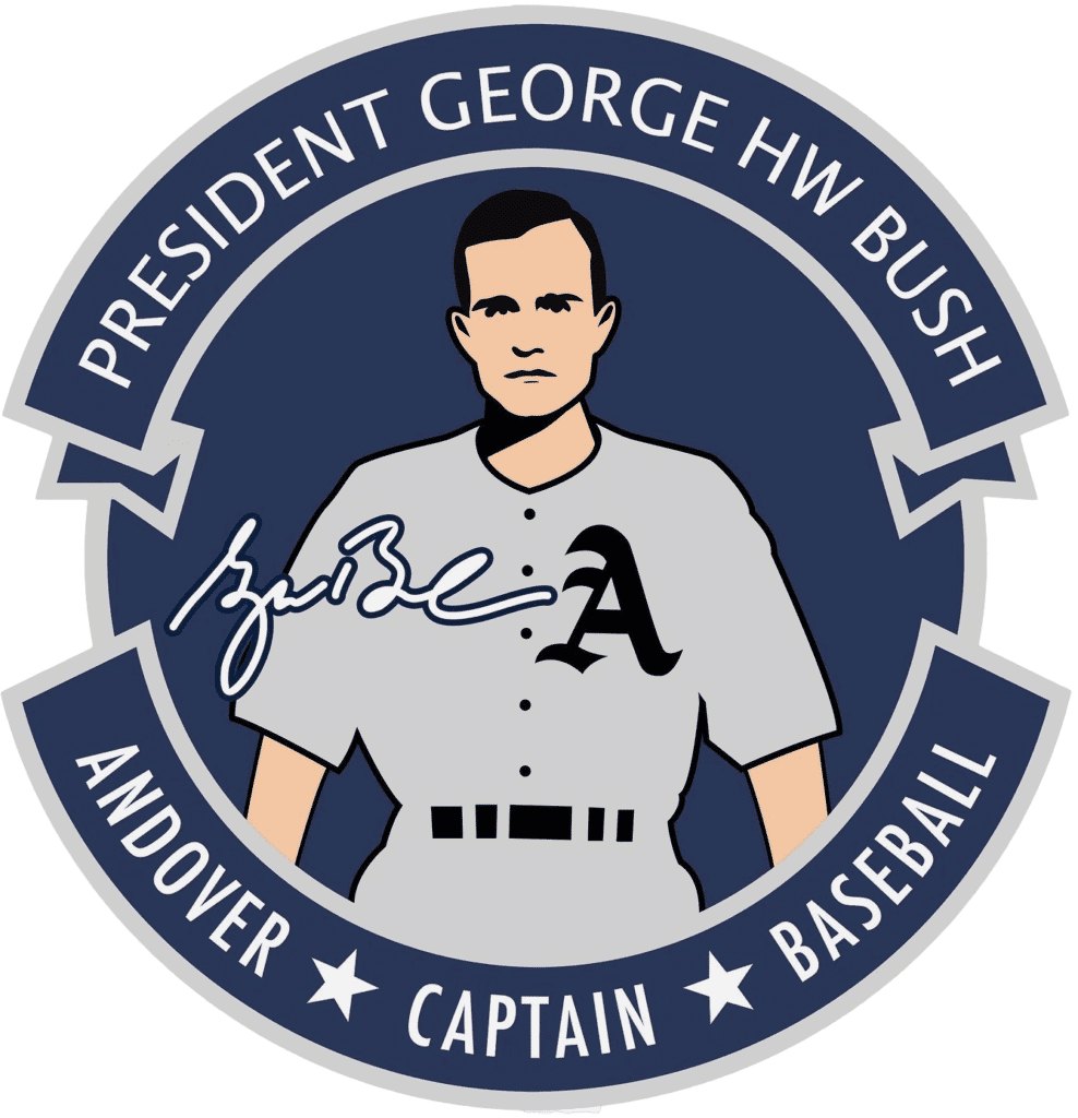
In Saturday’s Ticker, we had an item about how Phillips Academy Andover, the prep school where the 41st president, George H.W. Bush, was captain of the baseball team, is adding a memorial patch in Bush’s honor. The school showed a digital rendering of the patch design on various social media channels, along with a video showing the actual patch on the team’s jersey sleeve:
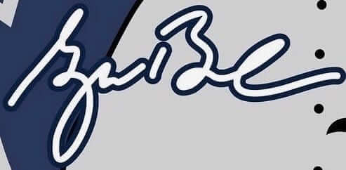
But two eagle-eyed Uni Watch readers — Jacob Ventura and Grant Young — noticed a serious flaw in the design. To wit: The signature shown on the patch is not Bush’s. It’s the signature of his son, George W. Bush, the 43rd president. Here’s a comparison of their two signatures, as shown on their respective Wikipedia pages — 41 first, 43 second, and then a close-up of the patch signature:


Oopsie.
That is some seriously heroic uni-watching by Jacob and Grant. How did they even notice that? Jacob told me, “I just know 43’s signature for some reason, and it looked familiar on the patch. I wasn’t as sure about 41’s signature.” As for Grant, here’s what he had to say:
Noticed right away. I’m from Iowa and work in politics. My first job was the 1999 Bush [43] campaign for the caucuses, and then I worked through the general, the recount, and the inaugural. Also worked in Iowa for the re-elect in ’04. I have a bunch of items signed by [43]. His signature was also on a lot of mailers and handouts we would use.
And there’s more. I didn’t notice this at first, but while working on this piece I realized that although the patch depicts Bush in his Andover baseball uniform, it appears to be based on a photo of him in his Yale baseball uniform. Check out this comparison (click to enlarge):
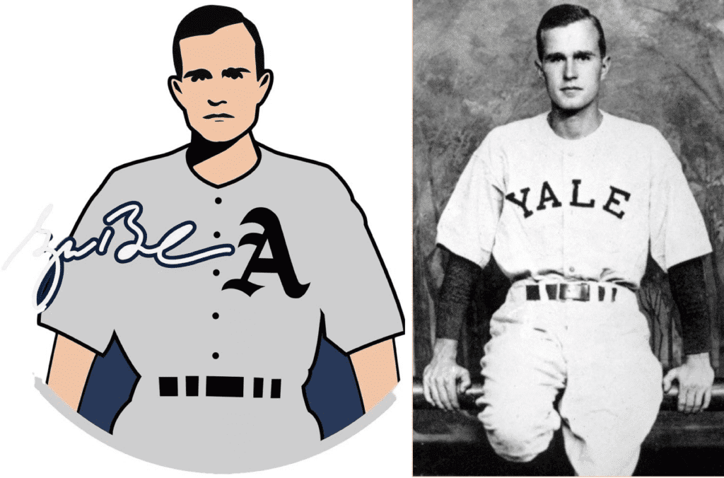
It’s possible, of course, that Bush struck similar poses at Andover and Yale. But look at the sleeve cuffs, the little bump where the left sleeve connects to the jersey shoulder, the shadow under the chin — the patch design is clearly based on the Yale photo. So in addition to using the wrong signature, they used a non-Andover photo to show Bush in an Andover uni.
I emailed Andover baseball coach Kevin Graber yesterday and asked him about all of this. I didn’t expect to hear back from him on a Sunday, but he wrote back almost immediately. Turns out he’s a longtime Uni Watch reader (a quick search reveals that he contributed a Ticker item to this 2015 blog post) and was excited to hear from me — but less excited about the reason I was getting in touch, obviously. He gave me this statement:
Thank you so much for pointing out the signature error on the commemorative sleeve patch. My first reaction when you contacted me about it was, “Oh no!” — because I honestly thought I’d used the right signature. But I’m glad you took the time to alert me. The intent is to honor President Bush’s baseball legacy at our school, and we certainly want to get it right. I did the artwork myself, with no budget, and the patches are strictly for use on our baseball jersey as a means of honoring President Bush. Again, we definitely want to get it right, so we’re removing the patches from the jerseys and ordering a new batch with the accurate signature (or I might just leave the signature off).
Regarding the patch’s artistic rendering of President Bush, what I hoped to capture was not so much the presidential Bush the world came to know so well, but the boyish, baseball-playing Bush. I think he would’ve really enjoyed that. Having met President Bush as inspiration, I drew from a number of images and personal experiences, including the Yale photo you pointed out.
So there you go. I also spoke with Kevin on on the phone — seems like a really good guy. I’m sure this isn’t how he wanted to be featured on Uni Watch, but he handled the situation with a lot of class. Good for him, and doubleplusgood for Jacob Ventura and Grant Young for catching the signature error.
Click to enlarge
USWNT NOB Report
By Jamie Rathjen
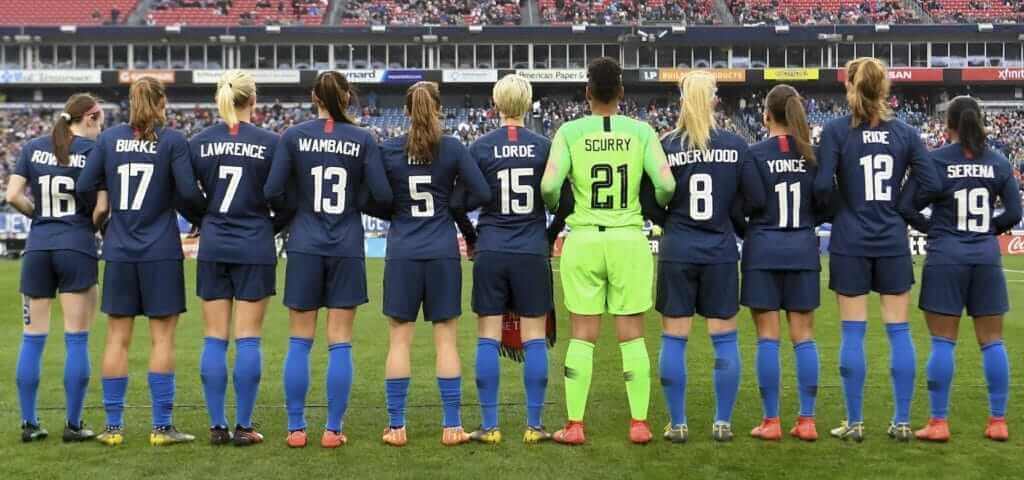
The above picture shows the U.S. Women’s National Team’s starting 11 from Saturday’s SheBelieves Cup game against England. If the NOBs seem a bit odd — “Serena” and “Yoncé” certainly jump out — that’s because the team was conducting an interesting NOB-related experiment, with each player wearing the name of a prominent woman she considered “inspirational” while still keeping the number she was given for the tournament.
Roughly half of the team chose somebody in sports or sports media, with the rest mostly spread out between musicians and past or current women’s-rights activists.
Two players chose athletes currently active in other sports: full-backs Crystal Dunn and Emily Fox chose Serena Williams and WNBA star Elena Delle Donne, respectively.
Four others chose former USWNT players, resurrecting their NOBs — if not their old numbers — for one game. One such player was striker Alex Morgan (No. 13), who chose her fellow striker Abby Wambach. Wambach was well associated with No. 20 for both club and country, so it was odd to see her last name appearing with a different number. Similarly, goalie Adrianna Franch (No. 21) chose fellow goalie Briana Scurry, who wore No. 1 at every major tournament in which she participated for the U.S.
Full-back Kelley O’Hara (No. 5) chose still-active North Carolina Courage winger Heather O’Reilly, who retired from the USWNT in 2016. O’Hara wore O’Reilly’s nickname, “HAO.”
Some players chose figures from the world of pop culture. Winger Mallory Pugh chose Beyoncé, which was shortened to “Yoncé” on her NOB; midfielder Julie Ertz went with “Underwood,” for Carrie Underwood; and midfielder Rose Lavelle’s choice of J.K. Rowling was appropriate for a game against England, as Rowling, who was born in England, lives in Scotland and is a fan of their national teams.
Other players chose civic and political heroes. Midfielder Carli Lloyd chose Nobel Peace Prize winner Malala Yousafzai; center-back Becky Sauerbrunn wore “RBG” for Supreme Court justice Ruth Bader Ginsburg; striker Christen Press wore “S. Truth,” for abolitionist and women’s rights activist Sojourner Truth; and winger Megan Rapinoe, the captain for the day, chose poet and feminist activist Audre Lorde.
Unfortunately, not everyone could play in the game, but the U.S. Soccer Federation’s website had the remaining players’ NOBs, as well as the explanations behind everyone’s choices.
Another uni-related note from the game is that both teams usually wear white as first choice, but both changed: the U.S. to blue and England to red/white/red.
Click to enlarge
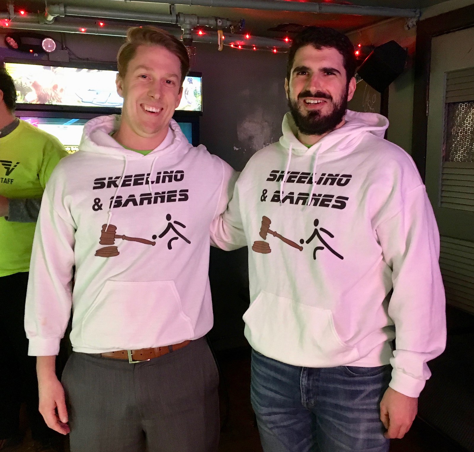
Uniforms in the Wild: A few nights ago I was out at a bar that has a skee-ball league. One of the teams was called Skeelino & Barnes — that’s a play on Cellino and Barnes, a local ambulance-chaser law firm that advertises heavily in the NYC market.
Fun idea! But here’s the thing: As anyone who’s ever heard a Cellino and Barnes commercial can tell you, their phone number is, rather famously, 800-888-8888. So you’d think everyone on the Skeelino & Barnes skee-ball team would be No. 8, right?
Nope:

Gah! Such a huge missed opportunity!! I tried to explain this to the skee-ballers, and they registered a dull thud of recognition, but they were a few too many beers past the point of caring. Ah, well.

Click to enlarge
An embarrassment of meaty riches: Thanks to a story I’m working on for The Wall Street Journal, I recently received an insane amount of pepperoni and salami. (The baseball is there for scale.) I only asked for a couple of samples, but they went a bit overboard.
Anyway, speaking of pepperoni, there are two primary kinds: flat and cupped. Here’s a visual comparison — flat on the left, cupped on the right (click to enlarge):
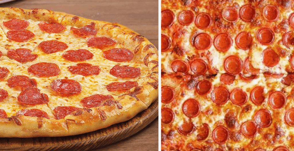
The cupped style has long been common in Buffalo, Detroit, and parts of the midwest, and it’s now becoming a trend here in New York.
There are lots of people who loved cupped pepperoni. But people who dislike the cupped style and prefer flat pepperoni seem to be harder to come by. If you’re one of those people, I’d like to hear from you (via that email link, please, not in the comments). Thanks in advance.
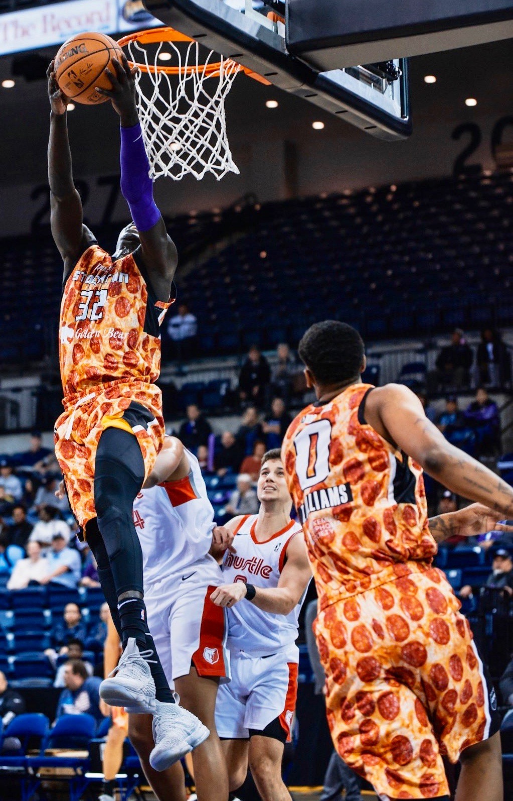
By fairly amazing uni-related coincidence, the NBA D League’s Stockton Kings wore pizza-themed uniforms yesterday, and the unis clearly showed flat, non-cupped pepperoni (click to enlarge):

Culinary Corner: There’s something very satisfying about rolling something up. So when the Tugboat Captain and I were tasked with making hors d’oeuvres for a neighborhood pot luck dinner on Saturday night, we both chose to make things that involved rolling.
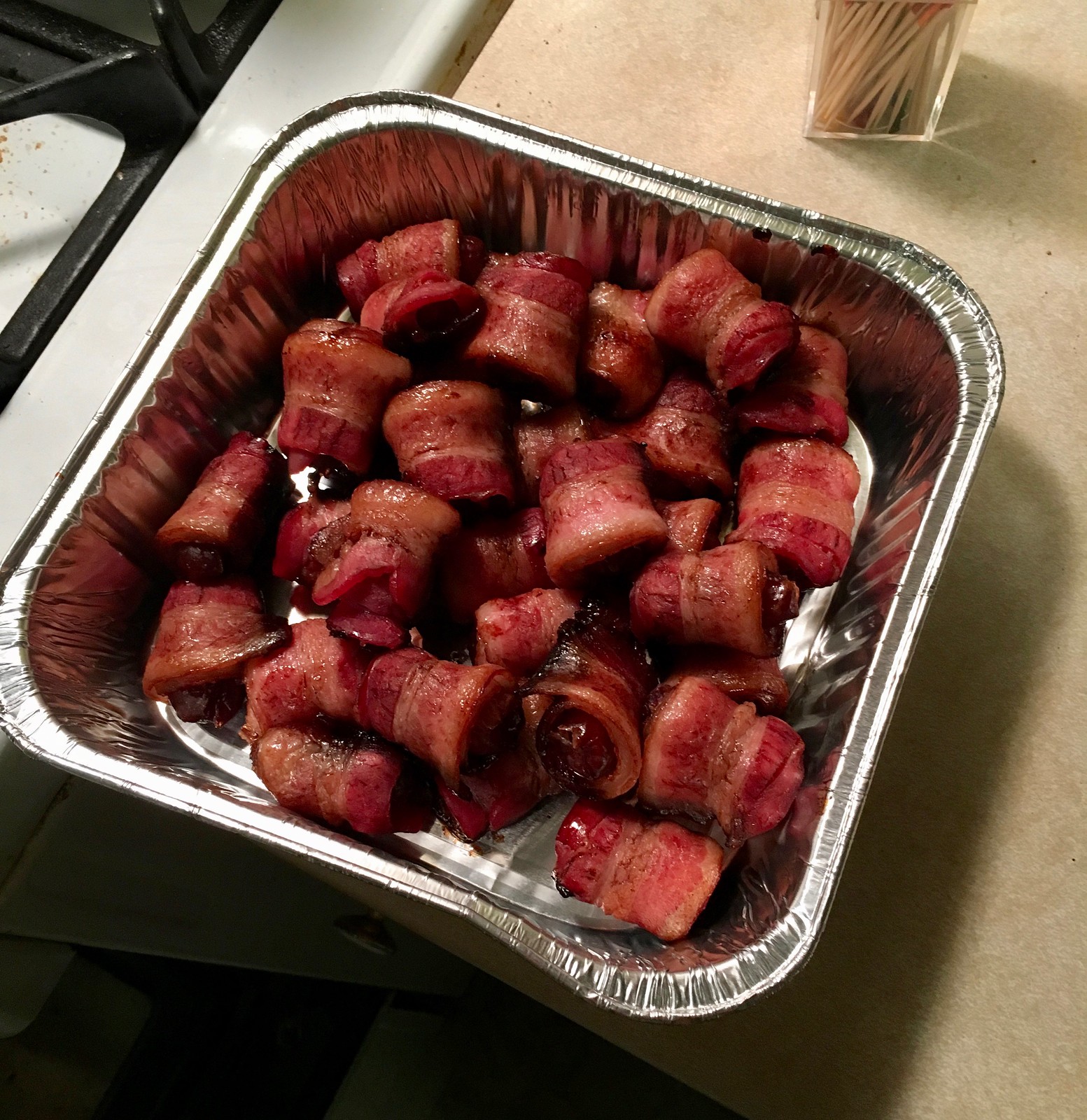
I made bacon-wrapped dates, one of my go-to appetizers. Unfortunately, I didn’t document the entire process, but it’s pretty simple: You get a container of pitted dates (about 12 ounces should be enough) and a one-pound package of bacon. Slice the bacon cross-wise down the center while it’s still in the package, so now you have a bunch of half-length bacon slices. Roll up a date in each half-slice and put them on a baking pan or a baking dish, like this (for all photos, you can click to enlarge):

Doesn’t that look great? All those little fat/lean stripes look kinda uniform-y, no? And the rolling process is fun.
After I’ve used up all the bacon, I drizzle everything with balsamic vinegar and then pop it in a 400º oven for about 20 minutes, and then transfer them to a platter or tray. Voila:
Looks good, right? Tastes even better, believe me.
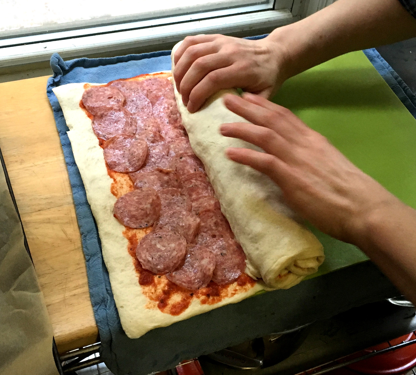
As for the Captain, I mentioned that we currently have a lot of pepperoni and salami in the house, so she decided to make strombolis. She got some store-bought pizza dough, brushed it with some tomato sauce, set up alternating rows of meat and mozzarella, then rolled everything up, creating a log (and then she repeated the whole thing):

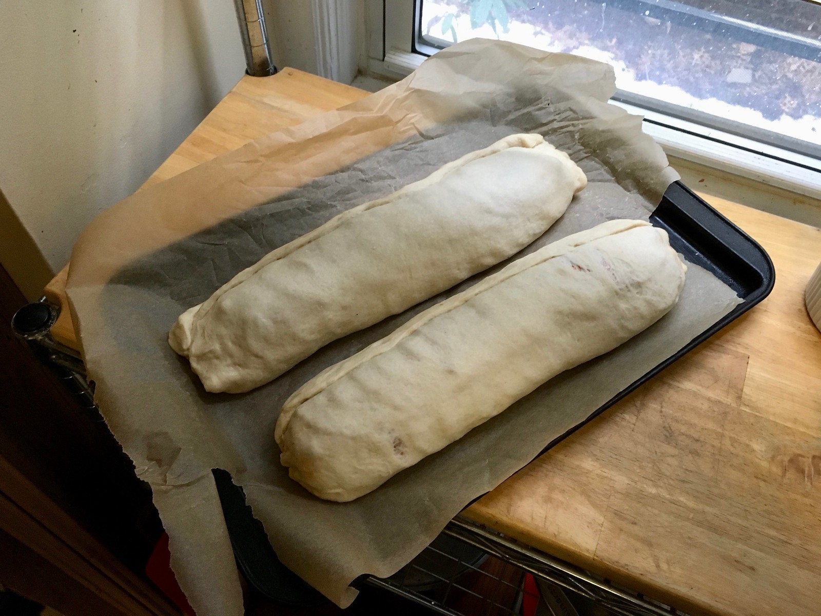
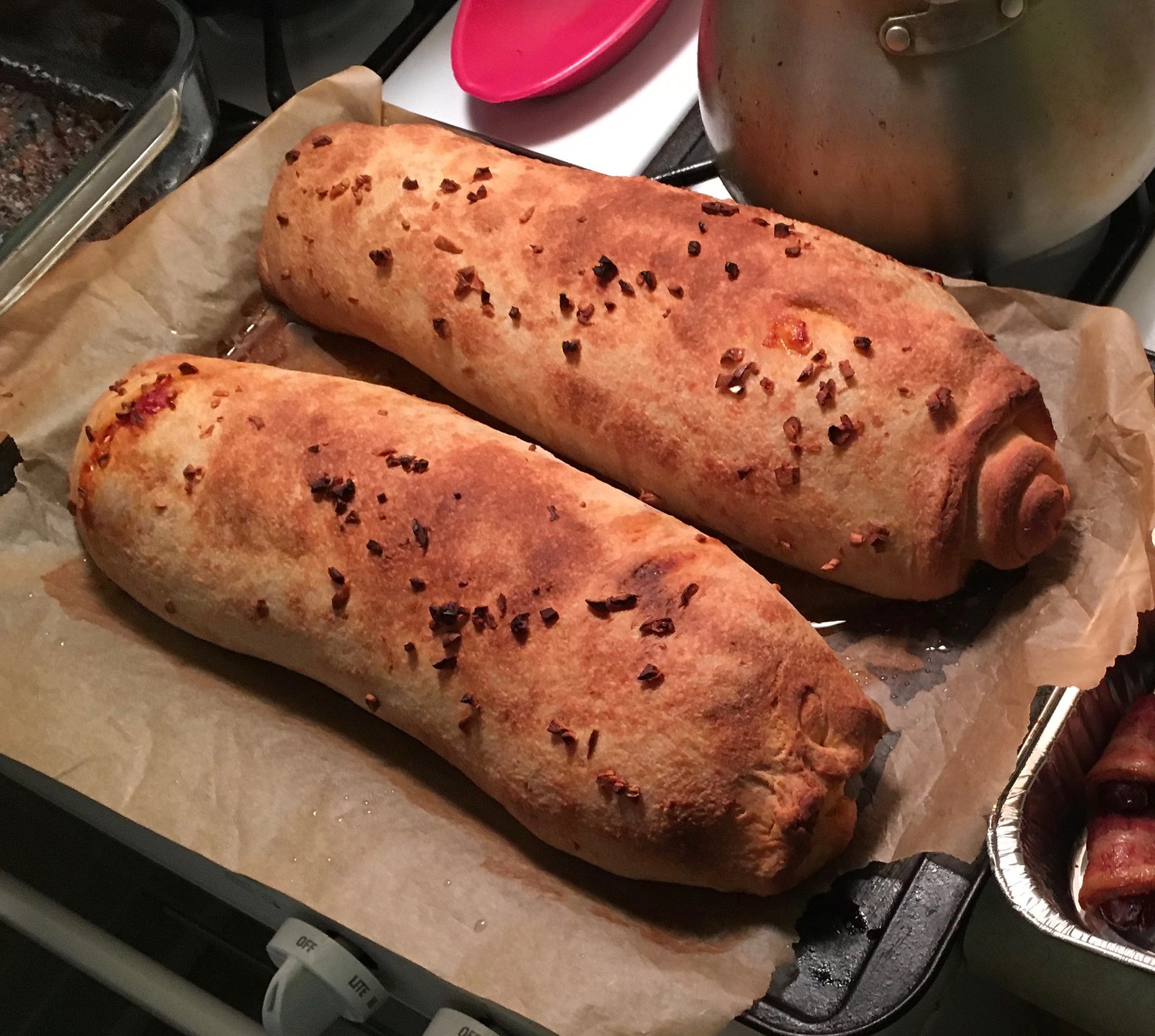
The captain added some chopped garlic to the logs and then put them in the oven along with the bacon-wrapped dates. After about 25 minutes, they were golden brown:
We took everything to the party and sliced up the strombolis there. I want to show you a cross-section shot, but the lighting was awful, so I have two less-than-ideal photos — one taken with flash, and one flashless with the levels punched up:
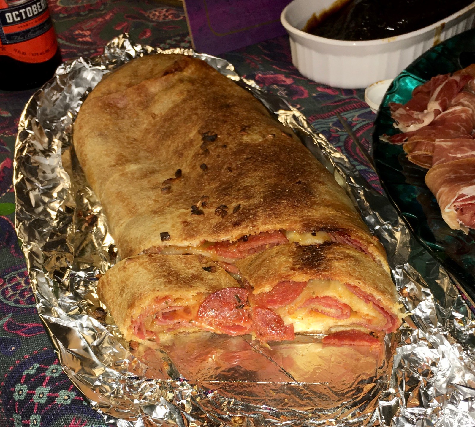

Our contributions were the hit of the party, and I have to say the stromboli was the single best thing I’ve eaten in the past week or two.

Click to enlarge
Climb to the Top update: On Friday I told you about Uni Watch reader Jon McCue, who was the defending champion of Climb to the Top, a 5K race up 66 flights of stairs to raise funds for fighting MS, and was planning to wear a Uni Watch T-shirt when defending his title on Sunday.
The bad news is that Jon did not win Sunday’s event. The good news is that he came in second place (by only three seconds!), so he was the runner-up — quite literally, given the race’s format! The photo above shows Jon with his trophy and his mom, who is afflicted with MS and is, I’m sure, very proud of him.
The best part is that Jon raised over $3,400 (his goal was $3,000), some of which was pledged by Uni Watch readers. It’s all so great that I don’t even mind that his T-shirt was mostly obscured by the trophy. Congrats to Jon, and good job by everyone who contributed.
Long-shot request: I’m a big fan of the indie-rocker Mike Krol, whose new album, Power Chords, is hot stuff. I saw him play back in 2015, and that was even hotter stuff, so I was looking forward to seeing him play tomorrow night at Rough Trade in Brooklyn — but I didn’t get tix in advance and now the show has sold out, which I didn’t expect to happen. Dang.
So: In the highly unlikely case that anyone reading this has an extra ticket to tomorrow night’s Mike Krol show — or, even better, two tickets — please give a shout in my general direction. I can’t afford to pay much more than face value (as most of you know, I’m losing my job), but I can sweeten the deal with a fair amount of pepperoni, if that helps. Thanks.
The Ticker
By Jamie Rathjen

Baseball News: Last year, Cardinals P Daniel Poncedeleon said he planned to legally change his surname to Ponce de Leon. He’s now done that, and his NOB has been changed accordingly, complete with a lowercase “de” (from Jeff Scott). … Reader John Gagosian points out that Bryce Harper’s personal logo incorporates No. 34, meaning Harper will need a new logo now that he’s wearing No. 3 with the Phillies. … Nebraska wore very bold “U of N” throwbacks over the weekend (from multiple readers). … The Dodgers donated old equipment to Uganda’s baseball federation for them to start an academy (from Mike Chamernik). … Sohail Jouya is trying to find out more about this cap on his friend’s father.

Football News: Reader Ben Conover tells us that this video appears to show the footballs used at the NFL combine have the 100th anniversary logo on them instead of the NFL shield. … The Panthers appear to be teasing a uniform update (from Nicholas Cottrill).

Hockey News: The Flames retired No. 12 for Jarome Iginla and wore patches, as well as other touches including similar logos on the boards and ice and everyone wearing No. 12 for warmups (from multiple readers). … Colin MacIntyre points out that Iginla played for the Flames long enough to have worn almost all their uniforms. The two exceptions seem to be the original white one and the 2013-16 script alternate. … In a 1979 game, the Islanders wore blue helmets at home against the Atlanta Flames because the visitors complained that goalie Billy Smith was wearing a blue mask while everyone else wore white. … Michael Bialas found a vintage hockey-themed ad, or box cover, for a company called Knitters Limited.

NBA News: Warriors C DeMarcus Cousins memorialized Stephon Clark, an unarmed black man recently killed by Sacramento police, on his shoes (from Mike Chamernik). … New Bucks C Pau Gasol is wearing No. 17 (from Etienne Catalan and Mike again). … Here are some of the logos that were originally proposed for the Heat (from Adam Vitcavage).

College Hoops News: Louisville wore red at home against Notre Dame, who wore blue (from Josh Hinton). … Illinois/Northwestern was also color vs. color (from Dylan Richardson). … Pitt and Louisville’s women wore pink and black/pink yesterday (from Jerry Wolper).

Soccer News: Loudoun United, the new USL Championship team in Northern Virginia, revealed their first two shirts (from Josh Hinton and my brother Nate Rathjen). … Also from Josh: it appears Brazil may have a white shirt for this summer’s Copa América, which the national team wore until abruptly stopping after being upset by Uruguay in the 1950 World Cup’s final round. … FC Cincinnati’s captain’s armband is the city flag; however, they’re not the only team in MLS that has gone that route (from multiple readers). … An orange version of the MLS ball appeared for Saturday’s Colorado/Portland game, which was progressively snowier as it went on. … Tottenham Hotspur wore warm-up shirts commemorating the 100th anniversary of their advertiser. … Scottish Championship team Dundee United are switching from Nike to Macron (from Ed Żelaski). … French team Paris Saint-Germain — one of the richest teams in the world — wants a naming-rights advertiser for the Parc des Princes. … New home shirt for the USL Championship’s Tulsa Roughnecks FC (from Josh Hinton).

Grab Bag: North Carolina and Denver men’s lacrosse played color vs. color; lacrosse is normally a white-at-home sport (from James Gilbert). … The uniforms for all the teams at the Brier and the Tournament of Hearts, the Canadian men’s and women’s curling championships, were redesigned for this year. Additionally, Manitoba’s shirt and cap are distinctly bison-themed instead of the same design as all the other provinces. The designing company, Dynasty Curling, is owned by the lead of the rink representing Manitoba, Colin Hodgson (from Adam Peleshaty). … The Manitoba rink has won all 15 games they’ve played when two specific members of the team wear the hats (from Wade Heidt). … The NLL’s Colorado Mammoth have a new version of their state-flag jersey (from Zeke Perez Jr.). … We had NASCAR driver Brad Keselowski’s throwback helmet for this weekend in the Ticker a few days ago, but here it is next to the original. Keselowski recently passed Mark Donohue, the wearer of the original who participated in various series including NASCAR and Formula One, as the all-time winningest driver in Team Penske history (from Kyle Dawson). … Here are the stories behind the team names and logos for the new Premier Lacrosse League. ” If people don’t know, all teams are traveling and owned by the league, not assigned to one city,” explains @PhillyPartTwo.
I was really looking forward to watching the USWNT game against England, but turned it off as soon as I saw the ridiculous name thing. That organization keeps getting more and more unlikable by the day.
I guess it is a notch above the MLB nickname weekend, but not by much.
Mind elaborating? It was well received by everyone I saw that had an opinion.
Personally, I record soccer so that I can have a way to put myself to sleep at night. Can’t say that I pay attention to their uniforms.
I think it was a poorly executed idea. As someone who isn’t very familiar with most of the US players I found it confusing. Viewers were constantly reminded by the commentators and on-screen graphics as well. A better option would have been to embroider the name on the front under the crest with the match details.
You turned it off because of the names on the back of their shirts? How often can you even see the names on their shirts? Did you also tell anyone to get off your lawn yesterday?
In their own words, the SheBelieves Cup (which is just a gloried set of friendlies), has always had “the goal encouraging the female leaders of tomorrow to chase their dreams.”
I’m a little sore that Ashlyn Harris chose Cardi B. **looks out window, yells at cloud** but who am I to judge.
What is the deadline for our emails for the great Uni Watch pepperoni and salami giveaway?
Gah. Those pizza themed unis make the players look as if they’re covered in sores.
They’re really, really embarrassing and pretty hard to look at too. I thought the Spongebob uniforms were the G-League’s rock bottom, but apparently not.
These aren’t mom & pop indy franchises, they’re run by NBA parent clubs. They can’t possibly be this hard up for local endorsements.
Hmm, I prefer the look of the larger, flat pepperoni on pizza, but I can’t say I actually dislike the cupped kind. I don’t notice any difference in taste.
Jets have posted link on Facebook.
Obviously not much to see there; it’s in grayscale and silhouette, although there’s something on the shoulder that could be either numerals or stripes, and the helmet appears to be dark and stripeless. Not a good sign. Clearly the tapering “contrail” stripe is going to be a major part of the new look.
At this point I’ll settle for numerals fashioned after the link on link. I’m not expecting much.
I think it’s fair to say that there is literally no chance that anything the Jets come up with is going to be received well, at least at first.
I’m willing to give it a chance, so long as it passes my first binary test: Is it a football uniform, or a clown suit?
Paul – Last year when you were exploring the idea of paywalling Uni Watch, I seem to recall you mentioning the launch of a comprehensive NBA uniform site. Did that get announced and I missed it or is it still TBD? Thanks.
Still TBD.
How would it differ from what Conrad does?
What does Conrad do?
Doesn’t SportsLogos.net basically host a historical record of unis and logos for all sports?
Logos, yes. But their uni documentation is spotty and not always accurate.
The tiny cupped pepperoni collects way more grease than its traditional cousin, which is a tipping point for me. Literally. I shouldn’t be having to turn my pizza slice to a 60-degree angle to drain it before taking my first bite. Big is beautiful!
It’s the same amount of grease. With the cupped style, it’s localized in the cups; with the flat style, it spreads out onto the rest of the slice.
Yes, and I much prefer that grease be dispersed into a nigh-undetectable sheen than gush through bites.
I was just about to comment and say exactly this. The pools of grease in cupped pepperoni slices have always been a turnoff for me.
Was about to say the same thing. I hate having too much grease on pizza and often blot it off with a napkin first. I suppose the cupped pepperoni actually makes it easier to do this, though I’ve always been a flat pepperoni supporter because you can *see* the pools of oil in the cupped pepperoni.
The patch at the top has no undersleeve, yet the one on the uniforms does, like the yale picture
More on the Dynasty Curling uniform agreement. Extends to the 2021-22 curling season. Includes making uniforms for Team Canada for all world championship events.
link
It is worth noting about that UNC-Denver lacrosse game was the first game at the Soccer – Lacrosse stadium in almost two years because of renovations (including the removal of the track that used to go around the field). There was a women’s game immediately following the men’s game.
So, Jon McCue went for the “silver medal”. Gold is tacky, silver is classy. Very Uni Watch!
Sounds like a great event and a great cause. Congrats to Jon and everyone who participated!
Those other “HEAT” logos in the contest were clearly jokes made up to warm everyone to the league-approved design, which was vastly superior even way back then. That this was considered a “competition” is comical.
This sorta reminds me of when the team ran a “contest” to rename the Washington Bullets with all sorts of outlandish options like Sea Dogs and Dragons before the final results (never published) landed on “Wizards”.
link
Wizards wasn’t even well regarded among locals then (still isn’t 20+ years later) and the farce of a contest made it even more obvious that this rename was about selling gear to tweens (via a clumsy alliteration and then-trendy color scheme) than the team’s stated intent (not glorifying violence).
Despite the statement about Bullets being violent, the team continued (and still does) to sell Bullets throwback gear and have “throwback nights” in which the name is used ad nauseum. The sole championship banner in the rafters also bears the name. So what was the point? You still have people who call them the Bullets (if they mention them at all) and the name “Wizards” is still comically bad, plus has zero local relevance.
Paul, might this (team rigging their own logo/name contests) be a possible story idea?
I dunno, the NBA was pushing ‘Dragons” pretty hard in the 90s… It was one of the suggested names for both the Raptors and Grizzlies, and then there was the whole “New Jersey Swamp Dragons” debacle.
Personally, I never bought that the name change was due to gun violence. The Bullets had terrible merch sales the whole decade, the unis & logo were uninspired. I always saw it as a blatant cash-grab dressed up as a socially conscious move.
I think it’s interesting that the NBA uses the “nearby ammunition factory” version of the origin for the old (1944-54) Baltimore Bullets (which, in turn, spurred the name of the 1963-73 team that moved to Washington DC and became (after a stint as the Capital Bullets) the Washington Bullets: link
there’s no real support for that version of the name’s origin
on the other hand, an article in the Oct. 31, 1944 editions of the Baltimore Sun, which announced the fledgling American League team’s nickname, explained it this way:
“The club will be known as the Bullets, which is hoped to be significant of their explosive talents and speed in humbling the opposition.” (see, link)
Because this is Uni-Watch, it’s worth noting that the articled continued to explain, “President Stan Behrend announced that the team’s colors will be maroon and gold, in which they will don white jerseys with maroon numbers and gold pants for home appearance, and maroon jerseys and white numerals on the road.”
My best guess for Sohail Jouya is former minor league team the Hollywood Stars.
The best pepperoni is the kind that gets the crisp edges when you bake it. Some places call it “Old World” pepperoni. It uses it’s natural casing and is so much better and more flavorful than the American “classic” pepperoni (the blander, flat, floppy stuff) which was created for commercial aesthetics and is very mild in taste.
This is true.
The stromboli looks delicious, but must have been made so much better by the Sam Adams Octoberfest in the first pic. My favorite. Can’t wait until fall.
Yeah, they had like a case of that at the party (along with some other beers). I was very happy to consume more than my share of it!
Though the Andover baseball uniforms may not have numbers on the front of their uniforms, wouldn’t it have been fun to put a #41 on the George HW Bush patch?
Ha — good call!
Great column top to bottom today! Regarding the pepperoni, I found it interesting that Buffalo, NY was mentioned as one of the hot-spots for the cupped pepperoni (I’ve also seen it called old fashioned pepperoni). I live just up the Thruway in Rochester, and have only noticed this style of pepperoni around here in the last 3-5 years. Several of our local pizza places offer both kinds, while I know of at least one that ONLY offers the cupped variety. I like both, sometimes even on the same pizza!!! And I know I’m not alone. My office mates and I used to order a sheet pizza on Thursdays, we would get half of the sheet with both kinds of pepperoni (the other half was sausage and banana peppers, just for the record!), and the two styles complemented each other nicely. I find the cupped variety to be a little spicier than the flat, at least the respective varieties used by most pizza shops around here.
Paul – the bacon wrapped dates are my wife’s go to appetizer when we are hosting or guests.
Only difference is she stuffs each date with a salted almond.
the added salt from the almond plus the crunch is a treat.
I used to add almonds, but I found (a) sometimes the almond would be too wide and rip open the date when I inserted it, and (b) the hard almond would cause problems for people who liked to use toothpicks. (Also: I’m lazy, and stuffing all the almonds makes the task considerably more labor-intensive!)
i’m partial to the similar, though less sweet, prosciutto-wrapped figs stuffed with chevre
My go-to stuffing for bacon wrapped dates is bleu cheese. Devils on Horseback I believe is the traditional name.
The Jerome Iginla number retirement was kind of lame in that the aesthetics of the whole thing was based on the team’s OLD, throwback color scheme. However, Iginla is basically the poster boy for the 90’s color scheme and would have only worn the throwbacks as an alternate jersey.
I think the Flames could have tried a little harder for the best player in the franchise’s history. How about breaking out the silly horse head jersey for the game?
But at least the team always had red and gold, and the same logo (albeit different colorings). Definitely not as weird as the Philly 76ers giving Iverson a red/white/blue banner, or the Brooklyn Nets turning all their banners black and white!
Had the same sort of strange aesthetics situation here recently in Vancouver when the Canucks retired Pavel Bure’s number. Team wore the blue and green Bure jerseys in warm-ups. He never wore these colours.
link
Of the retired numbers in the rafters, none of those players spent the close to the majority of their careers wearing blue and green, if they even wore those colours at all:
link
Totally agree…I thought I was the only one who thought it was lame that they used the throwbacks, when he wore the current jersey a lot more. I think I’m the only Flames fan who hates the red throwbacks. And I also thought it would have been cool to wear the black horse head jersey.
Chuck, I’m not a Flames fan so I don’t fully meet your criteria, but I do find their throwbacks pretty repellent. I didn’t like them when they came around the first time, and nostalgia hasn’t really softened my opinion any. The problem is that they’re just too bright. I know we’re all against BFBS around these parts, but that is a jersey that could use a bit of black trim, just to give it some balance.
Agree that they’re way too bright. I don’t like that shade of red with the white numbers.
No discussion of pepperoni is complete without “diced.” Under-appreciated and yet quite popular on tavern style pizza at places like Pizza King, Sir Pizza and Arni’s: link
I did not think I would see an Arni’s shout out on Uni-Watch this morning. I agree with you that diced is underappreciated, though I think it’s much more common in the middle of the country, and Indiana specifically, than it is elsewhere. I certainly haven’t seen it since I moved to Colorado and then California
RE: Brad Keselowski’s tribute helmet:
“Mark” wasn’t Donohue’s nickname or a shortened version of his full name, so it’s strange (at least to me) to see his name given the quotation marks treatment.
I tried to explain this to the skee-ballers, and they registered a dull thud of recognition.
This calls for an obligatory uni-reference to Andy Messersmith, who would have been “Channel 17” for the Braves, if Ted Turner had his way with the NL.
I prefer cupped pepperoni. I think it’s more spicy than flat
Also, Paul, if you wondered how other Uni-Watchers came to know of Mike Krol, my path was thru his guest spot on Steven Universe.
It’s a hoot when two unrelated avocations of mine link.
I prefer the cupped because I think it gets a little crisper than its flat cousin.
On the Andover patch, using the wrong President George Bush’s signature: A Very Big Deal and a uni-mistake of the first order. Easy to understand how the mistake could be made, but an unacceptable error and good on the coach for taking responsibility and correcting the patch.
But basing the Andover patch on a Yale photo? Not even a minor foul. The date of the photo only differs by a couple of years from Bush’s time at Andover. I can find only three photos of Bush the Elder in an Andove uniform, and far more photos of Bush the Elder in a Yale uniform. The only potential uni foul on the image is that it uses a modern script A instead of the block A or block Andover lettering that would have been used in Bush’s time at the school. But that’s small beans, as an 80-year-old jersey letter might be confusing to students and parents of today, so depicting Bush in a modern Andover jersey might be the clearest tribute. The intent of the jersey patch is to communicate tribute and respect, not to engage in documentary photo-realism.
The Indian cricket team wore their mothers names on the shirts a few years ago. link
My father worked his entire adult life for a company that specialized in dry sausage–salami, pepperoni, etc. They produced pepperoni for many pizza companies. Many of their clients specified flat. The quality control was very strict–I heard about it all the time from him because he was a supervisor in quality control. His plant actually had a huge restaurant quality oven installed so they could run tests on product. I’m pretty sure the oven they obtained an oven that was same one used by their biggest client. Every once in awhile a batch would get jacked up some how and we would end up with several sticks of pepperoni at home. That is probably why I prefer cheese pizza now.
I think the NFL’s New York Jets are teasing a new visual identity to be unveiled on April 4. link
wigs attached to the helmets, eh? ;-)
It’s a patch on a high school uniform. If I was the coach I would have responded…”my bad”, and then do nothing.
Anyone know what’s with all of the white in futbol (soccer)? Most of the MLS teams now have bland white secondaries and now Brazil? I assume they’ll pair it with white shorts, which isn’t a Brazil look at all.
Is all this white supposed to highlight the shoes?
+1; I, too, don’t care for so many teams doing it all at once. The pale grey sometimes mixed in is confusing also. At “pitch length” will the grey and white just blend together?
Brazil used to wear white until a WC loss at home in 1950 to Uruguay. Then they changed to yellow.
For the Sohail Jouya cap, this isn’t much help and maybe this was already obvious, but it is almost certainly a cap for a Little League All-Star team. The stars on either side of the town or region initial used to be a pretty standard template and is still used in some places. He might have been a coach. I would look for towns in his history that start with an H.
Given a choice between the regular (flat) pepperoni and the “old world” style (cupped), I’d definitely take the old world style, though really, if given the chance, I’ll take both!
Amusingly, there’s one local pizzeria (which I happen to frequent when I lived in Westland, and I’ll still stop by every now and then) called Slice of the 80’s (and yes, the name is indicative of the theme of the place), and it offers a “New Yorker” pizza, which is a 14″ pie cut to only six giant slices, loaded with cheese, and using the old world style pepperoni. So, learning that that particular style of pepperoni has not been a common thing in New York surprised me a bit. Then again, I’ve never been to NYC, and given my situation, I don’t expect to for the foreseeable future (though someday…),
“Pizza the Hutt” themed uniforms from Spaceballs!
I thought you were going to do a MASH reference since those two guys had 4077 as their combined #’s.
Re: Bacon wrapped dates
My wife have done those dozens of times. A couple of variations to consider: use prosciutto instead of bacon, stuff with goat cheese or cream cheese.
I’m late to the party, but Serious Eats did an incredibly deep dive on the science behind curling pepperoni a few years back. link