Click to enlarge
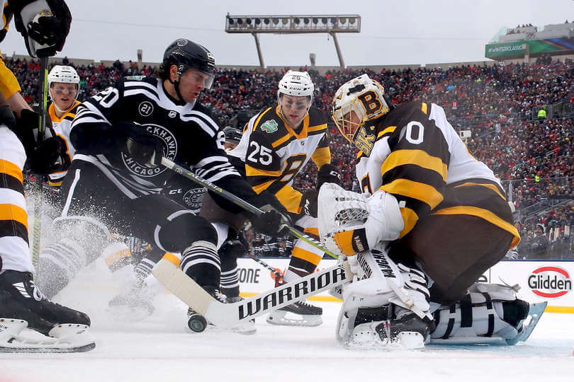
Players in eye black, goalies wearing toques, coaches in varsity-style jackets, players wearing retro-style menswear before and after the game — all telltale signs of the NHL’s annual New Year’s Day extravaganza, the Winter Classic, which took place yesterday at Notre Dame Stadium.
I chose the shot shown above as today’s splash image because it provides a good view of the stadium backdrop, which I think is always a key visual component of the Winter Classic. Here’s a shot that provides a better view of both uniforms (click to enlarge):
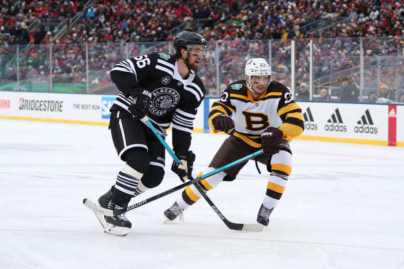
I thought the Bruins looked awesome. I was less enthusiastic about the Blackhawks — the black/white look was too stark, too limited, especially for a team whose standard uniforms feature such a wide array of colors.
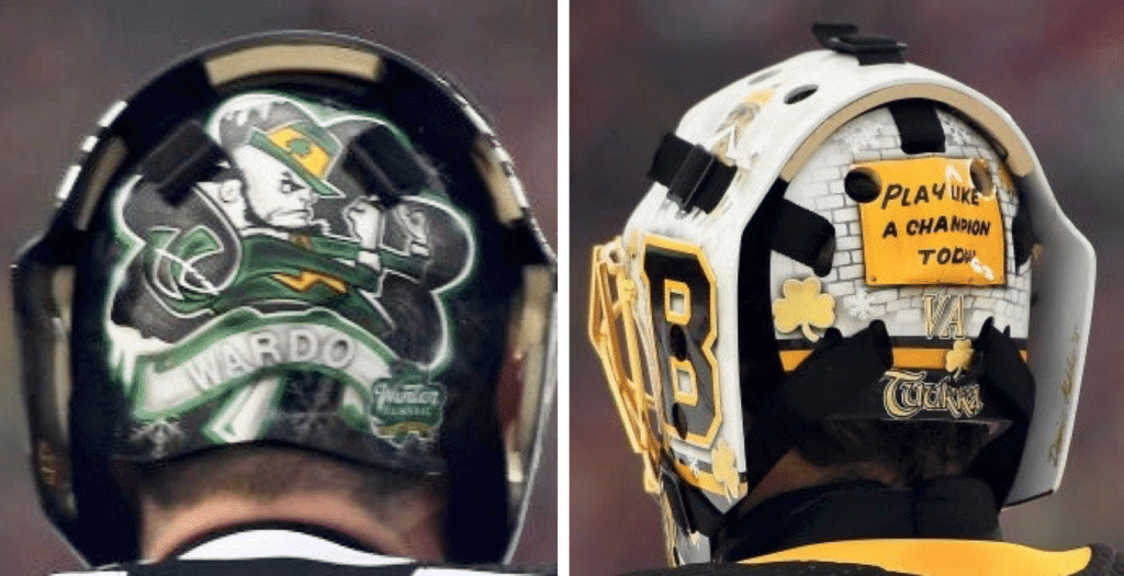
Both goalies wore Notre Dame references on their masks’ backplates: the fighting leprechaun logo for Chicago netminder Cam Ward and the Irish’s inspirational slogan for Boston goaltender Tuukka Rask (click to enlarge):
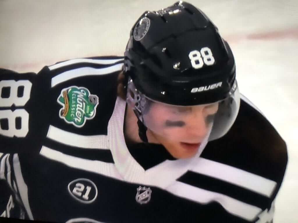
In an absolutely world-class catch, reader Charles Noerenberg noticed that one of Blackhawks right wing Patrick Kane’s helmet numerals was upside-down:
There are literally hundreds of additional game photos here and here.
Click to enlarge
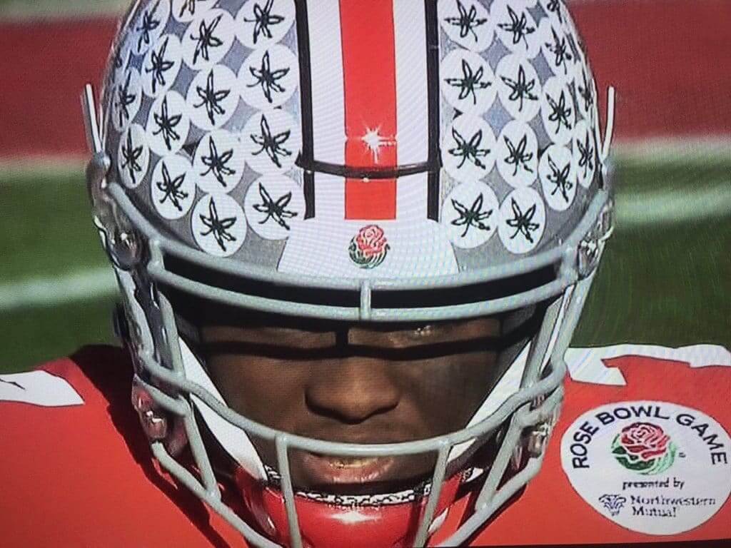
Nose bumper? No, rose bumper: Nice move yesterday by Ohio State, which replaced its usual B1G nose bumpers with Rose Bowl bumpers. And although you can’t really see it in that screen shot shown above, the rose logos were raised (click to enlarge):
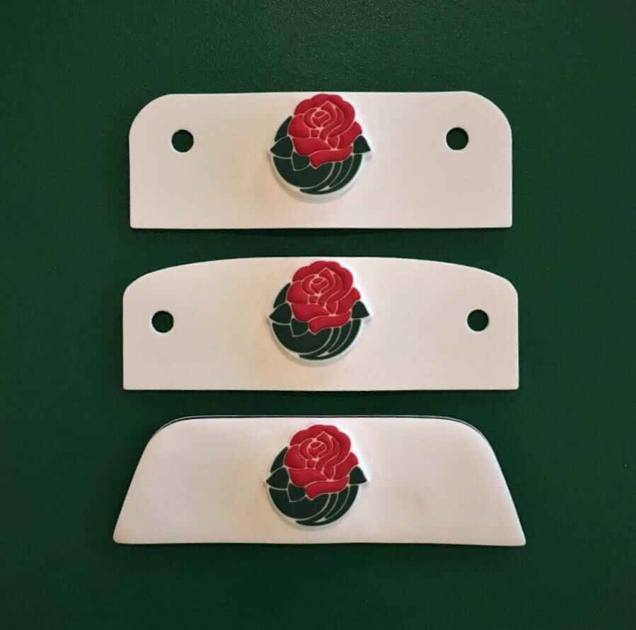
It’s a nice, simple way of acknowledging the game. I actually prefer it to some of the flashier rose-themed uniform accents from years past.
While we’re at it: Ohio State tight end Luke Farrell had a bit of a malfunction with his Rose Bowl jersey patch:
— Ƒunhouse (@BackAftaThis) January 2, 2019
Click to enlarge
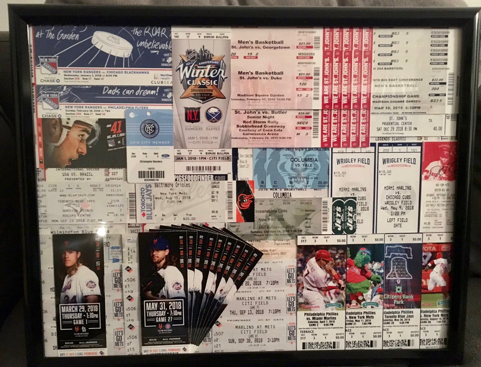
A year in stubs: Cool move by Twitter-er @BandaBear15, who took all of his ticket stubs from 2018 and framed them. Obviously, this is harder to do nowadays, as more and more tickets are electronic, but I still love me a good stub. Nicely done!

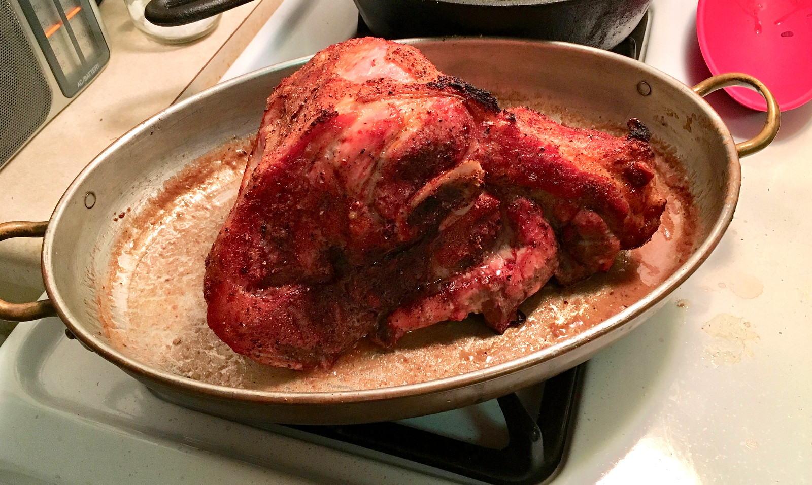
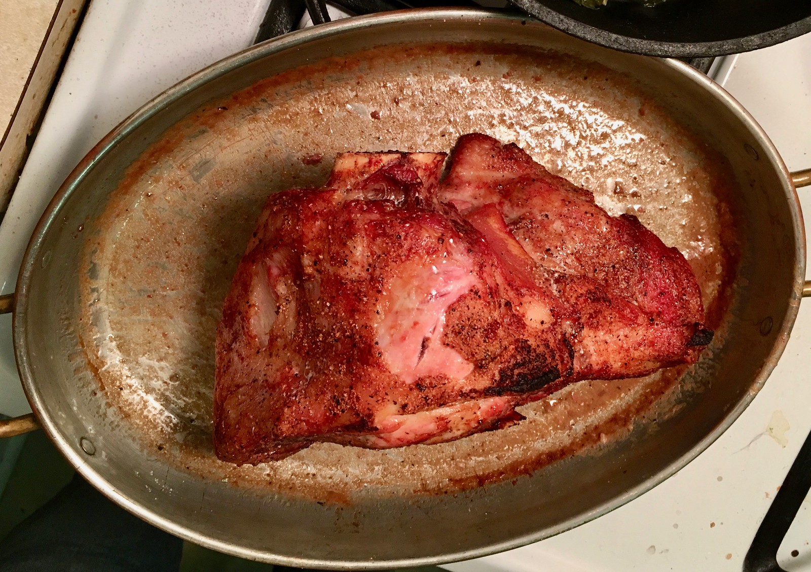
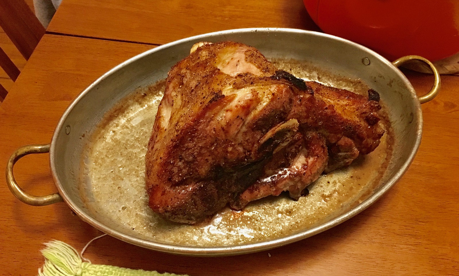
Culinary Corner: The Tugboat Captain and I didn’t have any New Year’s Day plans, so we decided to ring in 2019 by roasting a pork shoulder. In the past, we’ve chosen shoulder recipes that can take up to eight hours, but we didn’t want to spend that much time on it today, so we decided to go with a half-shoulder (also known as a picnic roast) — about five pounds — which doesn’t take as long.
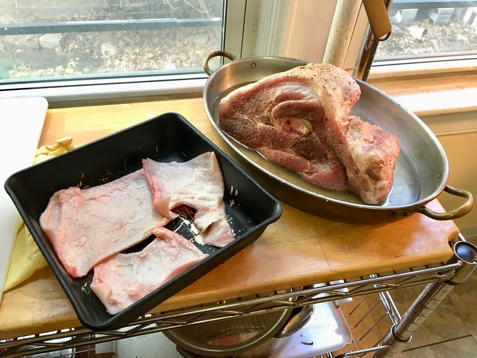
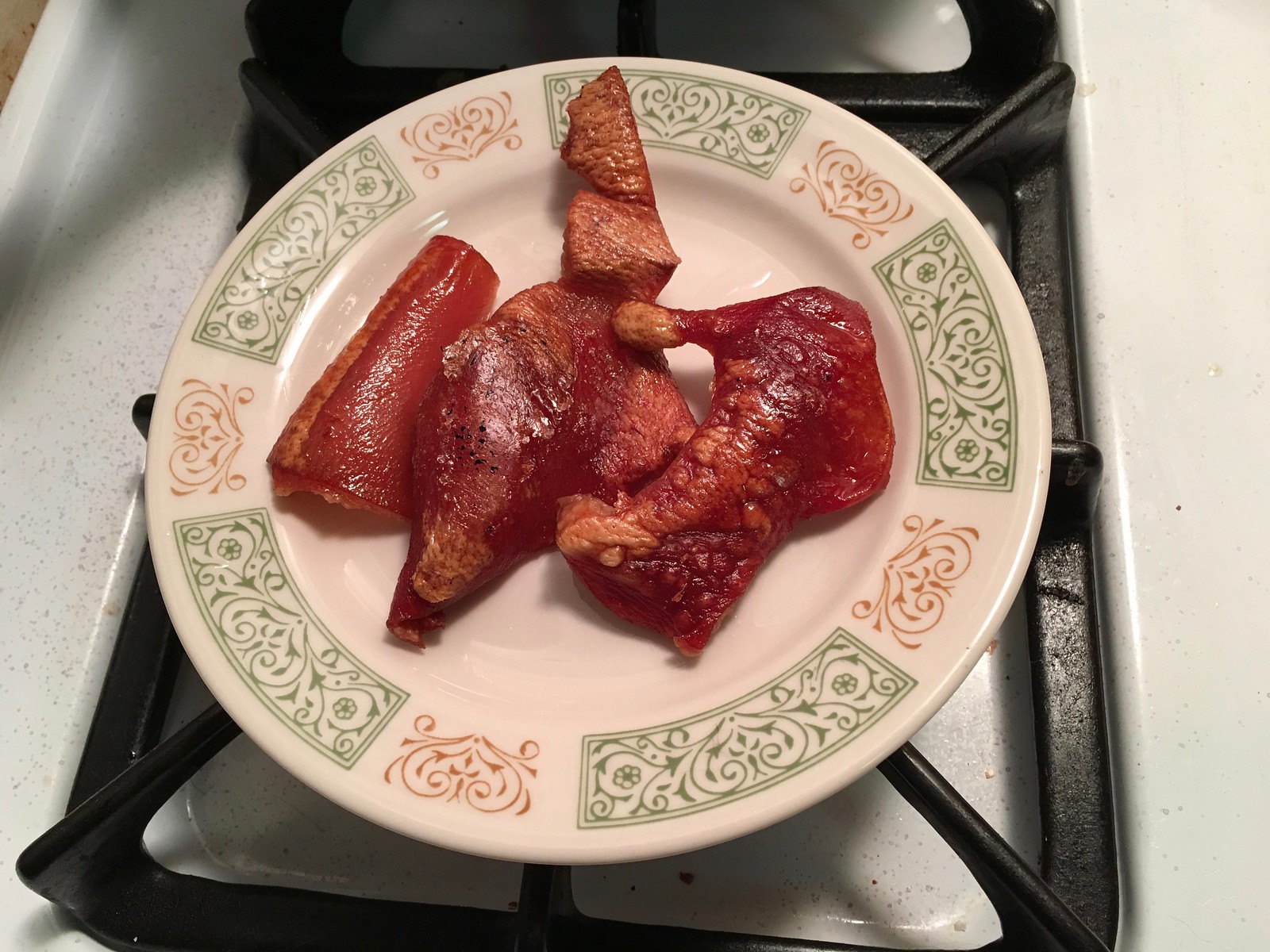
We seasoned the meat very simply — just salt, pepper, and garlic powder. In the past, we’ve left the skin on, but this time we decided to remove it and roast it separately for cracklins (for all of these photos, you can click to enlarge):
We put the meat and the skin into a 300º oven. After about 90 minutes, the cracklins were ready:
After another hour or so, I took the meat out of the oven, let it rest for half an hour, and raised the oven temperature to 475º. Then I put the meat back in for another 15 minutes, after which it was perfect:
The Tugboat Captain made some collard greens with bacon, along with some gravy, which made for a very nice dinner:
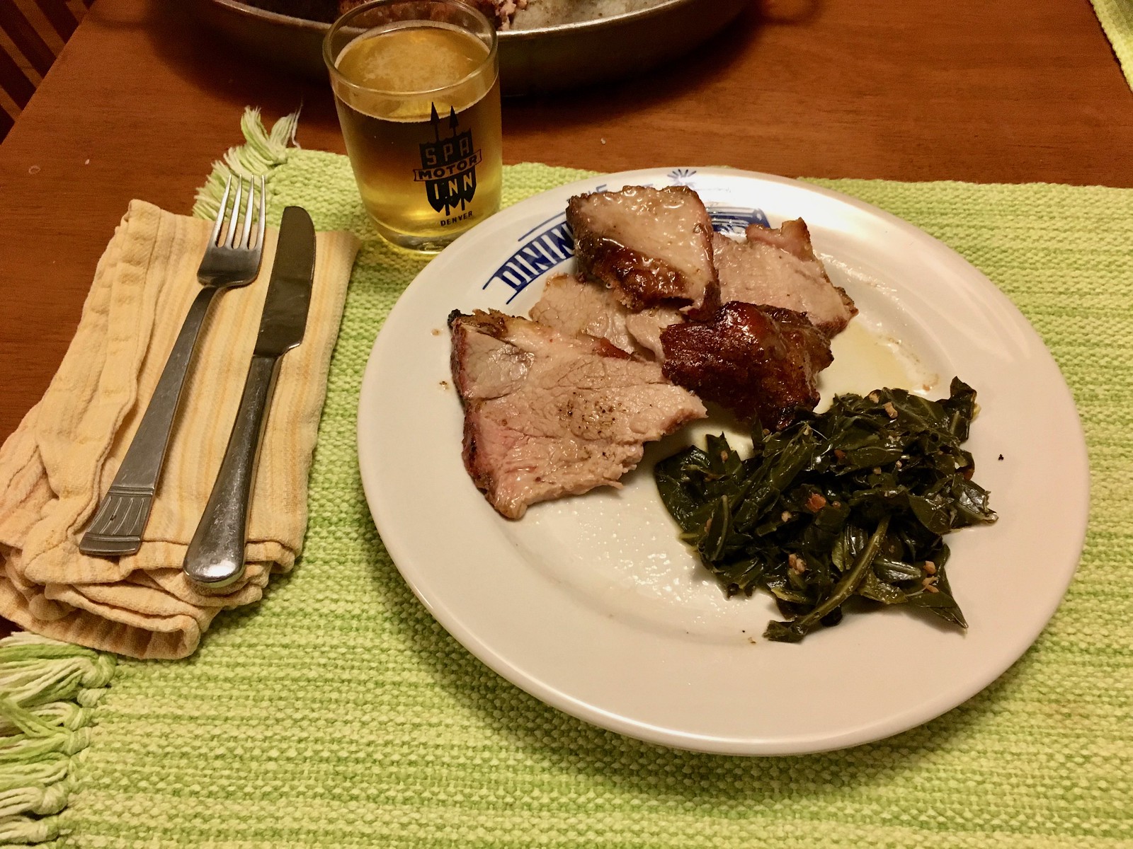

Sooooo good! Hope your first dinner of the year was just as good.

Catching up: I know many of you may not have been reading the site as frequently as usual during the holidays, so here’s a quick recap of some stuff you may have missed:
• We had a really nice Uni Watch gathering in Cincinnati a few days ago. Full details here.
• The 40 winners of our annual year-end raffle were announced on Christmas Day. All of the prizes originating from me have been mailed out, and I think most of the ones originating from third parties have shipped out as well.
• The Christmas Day post also had some thoughts about the recent unpleasantness, which people seemed to like. You can check out the full post here.
• If you don’t know what I’m talking about when I refer to “the recent unpleasantness,” you’ll want to check out this post from two weeks ago.
• In response to the aforementioned unpleasantness, many readers have very generously asked how they can help support the site. The answer to that question can be found here.
Okay, now you’re all caught up!
The Ticker
By Paul

Baseball News: Man, back in 1973, the Reds’ costumed Mr. Red mascot looked seriously creepy (from Cincinnati’s own Patrick O’Neill, one of the many fine people I was happy to meet at our recent Cincy meet-up).

Football News: Whoa, check out the serious spacing issue on former Rams RB Willie McGee’s McNOB. … In the Holiday Bowl, Northwestern joined Utah in wearing a memorial decal for Lauren McCluskey, the Utah track athlete who was murdered earlier in 2018 (from Steve Johnston). … The 2019 All-American Bowl — a high school all-star game — will take place this Saturday, with both teams wearing a new Adidas uniform template. The design is supposedly influenced by “videogame glitches, TV screen color bars, broadcast static and other irregularities that people might see while playing a videogame or watching an incredible play on television.” … Kentucky RB Benny Snell Jr.’s dreadlocks were sticking out of his helmet vents yesterday. He also wore Elton John-themed cleats (from Kary Klismet). … No photo, but according to this article, Iowa WR Nick Easley “nearly ran out from under his helmet” during a touchdown reception in yesterday’s bowl game. “I had a little bit of a malfunction with my helmet strap — a little piece broke the play before,” he said. “As I was running, it started coming off a little bit. Thankfully I was able to pull it back on and continue to run.” … At the Sugar Bowl, the lettering in Georgia’s end zone was off-center (nice catch by Connor Long).

Hockey News: Lots of announcements yesterday regarding next season’s NHL special-event games: The Blues will host the All-Star Game; the Stars will host the Winter Classic at Cotton Bowl Stadium; the Flames and Jets will play the Heritage Classic at Mosaic Stadium in Regina, Saskatchewan; and the Avalanche will host a Stadium Series game at the Air Force Academy’s Falcon Stadium in Colorado Springs. … New 25th-anniversary jerseys for the Chicago Wolves (from Griffin Smith). … Good article on the secret set tags on the Blue Jackets’ game-used jerseys (paywalled link) (from Kellen Dargle). … Did you know there’s such a thing as a Trinidad and Tobago hockey jersey? There is! (From @workthecycle.)

Basketball News: A Chinese pro league added a New Year’s Day logo to the court (from Will Scott). … Oh baby, check out this 1942 shot of Bemidji State player Arnie Johnson in his All-American uniform (great find by Doug Brei). … Check this out: 1940s player Bones McKinney achieved the rare distinction of wearing sleeved jerseys for NC State< and for UNC (from James Gilbert). … Virginia Tech went BFBS yesterday, with visiting Notre Dame wearing white on the road. Also, in that last photo, note the grad patch on Justin Robinson’s jersey (from Andrew Cosentino).

Soccer News: New secondary jersey for the New England Revolution (from Ed Zelaski). … Arsenal and Fulham wore black armbands yesterday in memory of Arsenal chairman Peter Hill-Wood, who died last week. “Arsenal and Liverpool wore armbands last week as well,” notes Josh Hinton.

Grab Bag: A Tesla Model 3 suffered a window crack that eerily matched the shape of the Tesla logo. … The medals at the 2020 Tokyo Olympics will reportedly be made from recycled electronics (from James Gilbert). … Tracking children’s whereabouts will be easier in China thanks to a new set of “smart” school uniforms. … West County Lanes in Ballwin, Mo., has some great old lockers in Uni Watch colors (big thanks to @HighSockSundays).
It seems wrong that the Cotton Bowl will be available for a hockey game on New Year’s Day. (Yes, I know the bowl game is in Jerryworld now.)
As a Blackhawks’ fan, I absolutely loved what they wore yesterday. I’ve always been curious how those 1920’s – early 1930’s uniforms would look in colour, since we only have B&W photos to work from, and it was totally something unique for the ‘Hawks. Also loved the sleeve and sock stripes. Great as a one-off or alternate uniform and a nice nod to their history. Just a different perspective.
I agree. When placed in the context of the event theming (1930s Art Deco to match the time period when Notre Dame Stadium opened and the decor of the stadium since the renovation), both the Bruins and the Blackhawks wore period-evoking uniforms (the Hawks did not wear exact replicas).
Besides, wasn’t it a week or so ago when the site ran an article wondering why no one had thrown back to the Art Deco style? That’s precisely what the Blackhawks did.
Also loved the Blackhawks uniforms. I think they would be great full time, perhaps with a colorized version of the logo? Either way they look great in solid black.
If yet another team decides to go with the all black look full time I’m going to puke, I know I’m a minority, but I like color!, not one team wearing mono black against the other wearing mono slate gray!!
I’m definitely against BFBS and excessive mono black in sports. But since the team is called the Blackhawks, I think black should be their primary color. And I really liked the black set they had on yesterday.
The Golden Knights being a gray team the Blackhawks being a red team just doesn’t work for me, even if their respective gray and red uniforms do look good.
As a full-time uniform, I’d disagree. The current uniform is the best in the league; no need to drop it (maybe add a tie-down collar; Black on both sweaters and thicker trim on the back numbers). But it’s nice for a one-off or as the basis for other merchandise. Can you imagine a real knit sweater with the authentic Art Deco striping?
You can’t change current primary Blackhawks uniforms, except for the collar.
Though one think that may be an improvement. Change the gloves. Drop the full black gloves and go back to the tri-colour gloves worn during Bobby Hull days, like this:
link
It looked to me like the LA Kings were playing.
The Trinidad and Tobago hockey jersey is from The Mighty Ducks 2. Not sure if it’s also a real team but that is the jersey they wear.
We also went with pork, but in a crock with sauerkraut. It’s a tradition where my wife is from — I call it “Pennsylvania Dutch soul food.”
Dear Paul,
I would like to subscribe to your mail order cracklin-delivery service, please and thank you.
Can’t tell you how many times I open up this site in the morning, see Paul’s delicious meals, and think I should have waited to read it until closer to lunch time, because now I am hungry the rest of the morning.
You should do a redesign for the Chicago Wolves. They have not changed their main uniform in 25 years. The jersey is so dated looking very much like something from the ‘90’s. And the giant puck behind the wolf head has always been weird. link
I have always enjoyed the Wolves’ logo, but I agree, the puck is strange. The head minus the hockey stick and puck would look nice. I do like the maroon and yellow uniforms though.
Anyone know what material the nose bumpers are made of?
Rubber.
-Man, Bruins looked great with the brown. Awesome outdoor game fro a uniforms perspective.
-I am shocked, but quote delighted, about the announcement that the Heritage Classic will be played in Regina. Saskatchewan produces a lot of pro hockey players per capita but too small a market to have an NHL team. Time for the province to have a moment to shine and get to host a huge game like this. Will be a good mix of Flames and Jets fans at the game.
Here is a link to the story in Regina’s newspaper:
link
#BringBackTheBrownBruins
Paul, the Sugar Bowl ticker item is in the college basketball section.
Got it. Thanks, Jim!
With the Bruins uniform, I found it hard to tell what was Brown and what was Black, with the exception of the pants, which were clearly Brown.
I agree the colors would have popped more if the teams stuck closer to their current looks, throwing back to the Espo vs. Espo era (early 70’s) would have been outstanding. But the Blackhawks uni wasn’t bad plus they’ve played in so many of these games they’re running out of options to throw back to.
Is it me or the colors really pop on the grey overcast backdrop.?
Was Bobby Orr suppose to be introduced as one of the legends? If so, did they every say why he wasn’t?
The league showed both it’s growing confidence but still some insecurity in announcing the Cotton Bowl as the next host (confident) but not announcing an opponent (yikes we might not sell out). I’m guessing the league would love it to be Nashville, likely a good travelling team, but it’s just not sure it sells.
The drinking glass in one of your Culinary Corner photos caught my eye and I internet-searched the name and came across a 2016 Denver Post article about the Spa Motor Inn. The title, “An old motel offers 30 homeless families a new beginning,” sums up nicely the more recent activity at the inn/motel. In case you hadn’t already read the article I thought I’d pass it along.
Interesting! That glass was a gift. One of my favorites!
Marchand wore his normal black gloves instead of the brown ones that matched the uni.
link
link
Pretty sure the Trinidad and Tobago hockey sweater is from Mighty Ducks 2.
It is. What’s also interesting to note is that none of the teams in the movie wear uniforms that resemble what their real-life counterparts wear. For instance, Team USA wears a design no actual team ever wore; it might explain why they changed their uniforms for the third period of the championship game.
link
They changed jerseys to bring back the Duck magic. Major plot point. There’s no rule that says you can’t change jerseys!
A few days late, but Alex, where did you get the Deion Sanders jerseys you wore to the Cincinnati UW gathering? I’ve always enjoyed the uniqueness of those jerseys, but I’ve never seen one available for purchase.
… At the Sugar Bowl, the lettering in Georgia’s end zone was off-center
Great googly moogly…
Proofreading:
Extra character here: sleeved jerseys for NC State<
Mr. Red puts me in mind of Glenn Quagmire