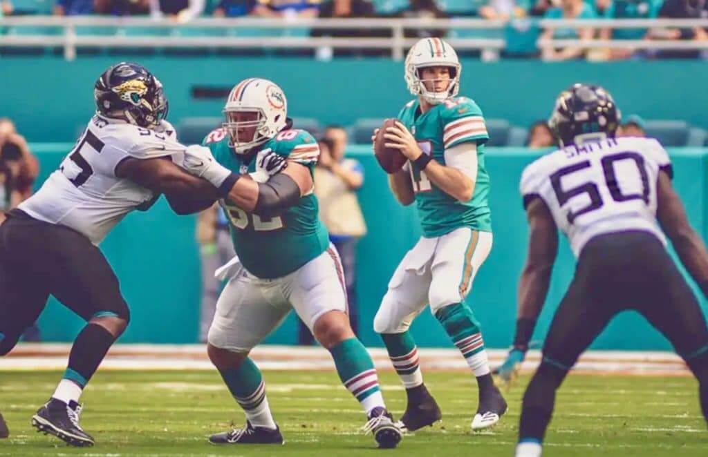
For all photos, click to enlarge
Good-looking game yesterday in Miami, as the Dolphins wore their throwbacks for the third time in four weeks. Lots of additional photos here and here.
In other news from around the league yesterday:
• The Cardinals went full-bloodclot:
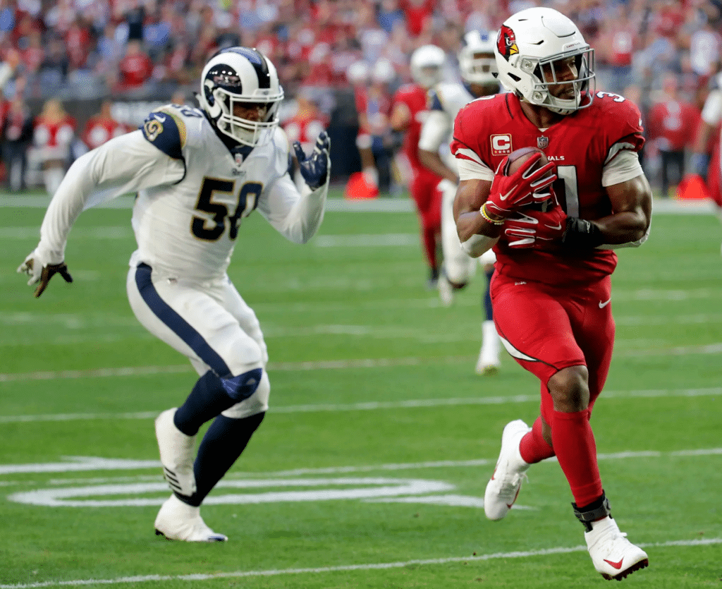
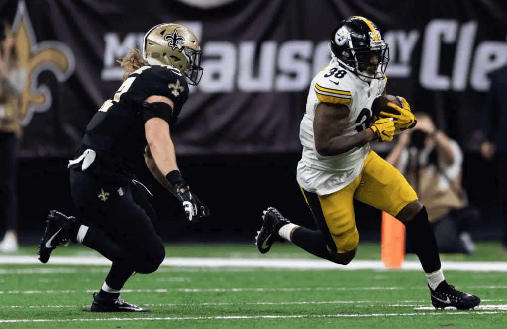
• I reeeeeeaaallly don’t like it when the Saints go mono-black:
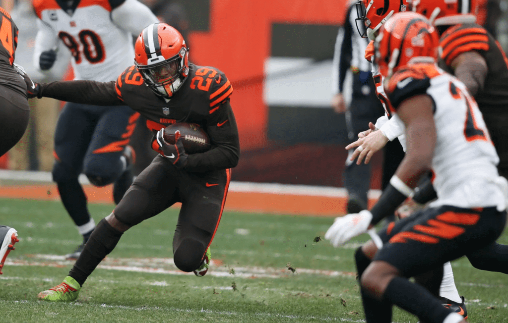
• The Browns brought out the mono-brown Rash:
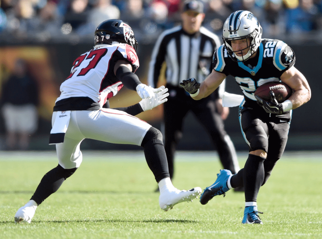
• The Panthers once again went mono-black with black socks:
• It looks like Lions offensive lineman Frank Ragnow had the sole of his cleats come loose from the rest of the shoe:
Blew a tire @UniWatch @PhilHecken pic.twitter.com/QYJJcvondx
— Bendy (@bendertm) December 23, 2018
• With the Giants wearing their red-trimmed road uniforms against the blue-themed Colts, CBS’s score bug showed the Giants in red:
@UniWatch Ever seen the Giants with a red score badge? pic.twitter.com/ocfRAEHYJs
— Nick Kramarich (@nkramarich) December 23, 2018
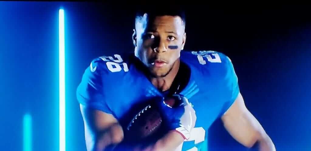
• Speaking of the Giants: At one point during the broadcast they showed a little prerecorded “Merry Christmas” message from running back Saquon Barkley, who was shown wearing a blue jersey with the old Nikelace collar — something the Giants haven’t worn since 2016, when Barkley was still a junior at Penn State:

After I mentioned that on Twitter, someone pointed out that Barkley also inexplicably wears the Nikelace in the Sunday Night Football open:
• We already knew that the Jets will have new uniforms next year, but it’s interesting that they made specific reference to that for yesterday’s home finale:
@UniWatch @UNISWAG picture taken at the Jets game today. pic.twitter.com/Rb910z6DIq
— chrisfitzgerald (@chrisfitzgerald) December 24, 2018
• Bills linebacker Lorenzo Alexander sustained a shoulder pad malfunction:
@PhilHecken @UniWatch Part of Lorenzo Alexander's shoulder pad has come apart. Hanging outside of his jersey. pic.twitter.com/YIiNomAGRY
— Patches O'Houlihan (@The_Amazin_Mets) December 23, 2018
• One team wore white at home: the Cowboys, of course.
(Big thanks to Pro Football Journal and Nick Angel for the Barkley screen shots.)
Click to enlarge
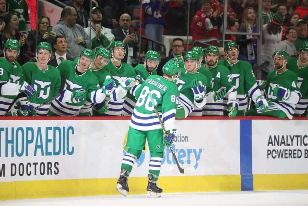
Sharknado? No, Whalercane!: The Hurricanes dressed up as their franchise’s previous incarnation by wearing Hartford Whalers throwbacks for yesterday’s game in Raleigh against the Bruins. They’ll do the same for another game against the Bruins on March 5 — in Boston.
Here’s a video clip so you can see the uniforms in action:
Meanwhile, here’s an interesting side note: Hurricanes defenseman Dougie Hamilton wears No. 19, and he wore it in yesterday’s throwback game — even though that number had been retired by the Hartford Whalers for John McKenzie. As it happens, McKenzie’s number retirement was more of a PR gimmick than a legitimate honor, but it raises the question of how to handle number retirements when a team wears another team’s throwbacks. In Major League Baseball, for example, if the Nationals (or any other team) ever chose to wear Expos throwbacks, what if they already had players who wore Nos. 8, 10, or 30, all of which had been retired by Montreal?
Speaking of the Nats, they’ve sometimes worn Senators throwbacks, but this issue didn’t come up because the Sens never had any retired numbers. Similarly, the NBA’s Miami Heat have dressed up as the ABA’s Miami Floridians, who never had any retired numbers. There are several similar examples like that. Can anyone come up with a situation like yesterday’s ’Canes/Whalers situation, where Team A was dressing up as Team B, and Team B did have retired numbers to consider?
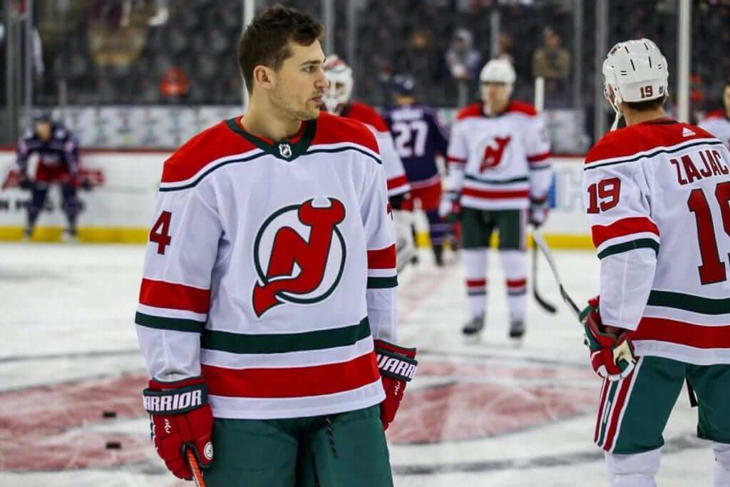
Meanwhile, in further NHL retro news, the Devils wore their green-trimmed throwbacks:
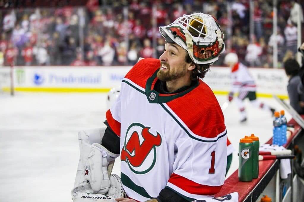
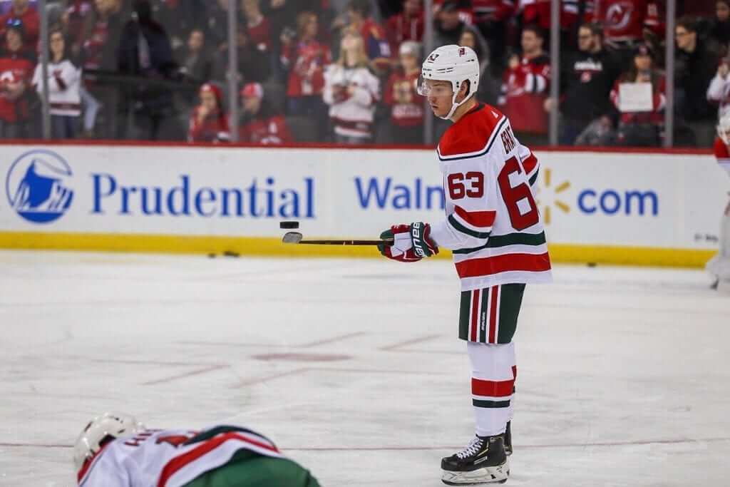
(My thanks to our own Jamie Rathjen for bringing the number retirement issue to my attention.)
All is not as it seems, Part One: Last month, as you may recall, it was officially announced that the Padres’ new Double-A affiliate in Amarillo, Texas, will be called the Sod Poodles (slang for Prairie Dogs), a moniker that was reportedly chosen as the result of a month-long “name the team” contest that prompted over 3,000 entries.
But the reality is turning out to be a bit more complicated. For starters, it appears that nobody actually submitted the name “Sod Poodles.” At least one person (and possibly several) did submit “Prairie Dogs,” but the team’s management group and the design firm Brandiose decided to change it to Sod Poodles. In other words, the process was rigged.
This has led to some resentment in Amarillo, where at least some fans feel the team name is juvenile and portrays the community as bumpkins. One such fan, a guy named Dusty Green, noticed that the team hadn’t trademarked the Sod Poodles name, so he went ahead and trademarked it himself. Now he’s refusing to give up the trademark and is also selling his own Sod Poodles merch, with 100% of the proceeds going to local charities.
That’s the short version. For a slightly more detailed version, check out this Twitter thread from Green’s cousin. And for a much longer version, there’s this Facebook manifesto from Green himself. There’s also additional media coverage here and here.
However this ends up playing out, the Brandiose-ization of minor league baseball (Sod Poodles, Trash Pandas, Rumble Ponies, etc.) long ago became tiresome. At this point, it’s not a design style; it’s just a formula.
(My thanks to John Lafreniere for bringing this situation to my attention.)
Photos by Jens Mortensen; click to enlarge
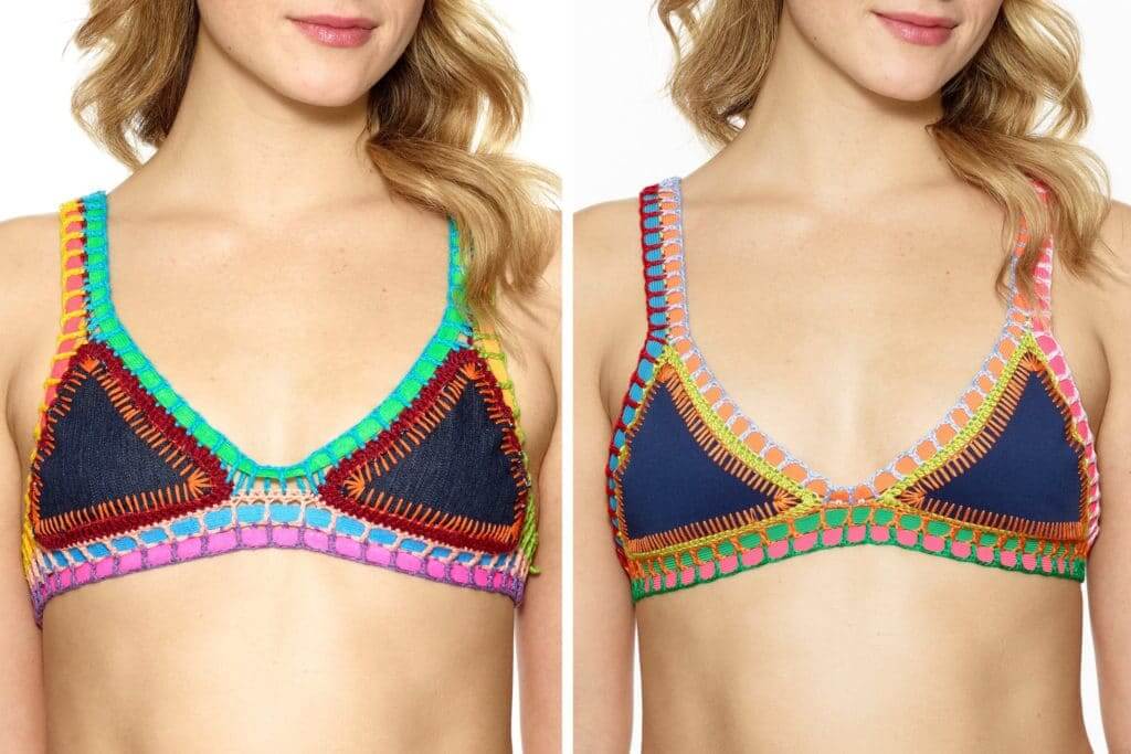
All is not as it seems, Part Two: By far the best thing I read over the weekend was a faaaaascinating New York Times story about a designer who created a retail sensation by marketing a distinctive-looking bikini (above right) and then sued copycat brands that made knockoffs of her design — even though, as it turns out, she appears to have copied her design from a craft artist who sells essentially the same bikinis for a few bucks apiece on the beach in Brazil (above left). It’s a really great piece of business journalism, with all sorts of uni-adjacent intellectual property considerations, as well as a revealing portrait of a very specific kind of jet-set douchebag culture. I can’t recommend it highly enough — check it out here.
Click to enlarge
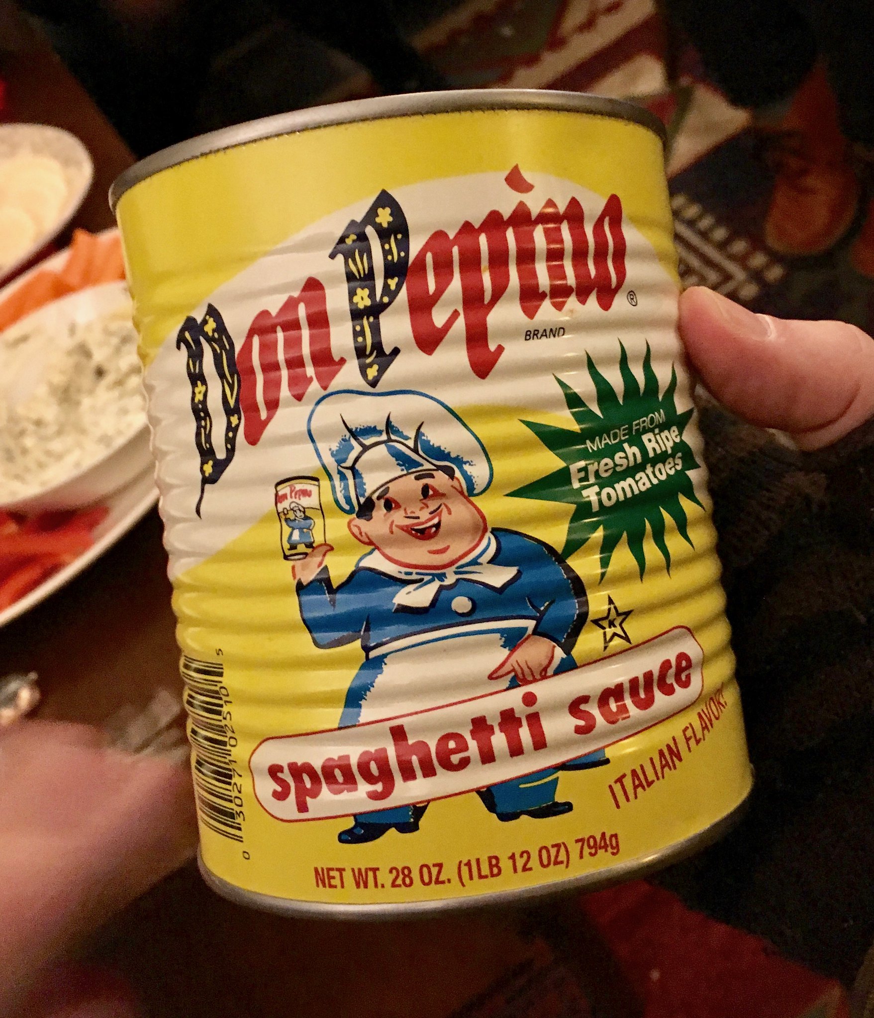
Everyone loves an infinite regression: I was at my friends Gabrielle and Scotty’s house for dinner on Saturday, and Gabrielle thought I’d enjoy the look of this spaghetti sauce can. She was right — it’s a fun design — but what puts it over the top is the infinite regression. How great is that? Are you listening, Miami Dolphins?
Cincy reminder: Just a few days until I hop on a plane and head to Cincinnati, where I’ll be spending the last weekend of the year and convening a Uni Watch gathering at the Mt Adams Bar & Grill on Sunday, Dec. 30, at 3:45pm. We’ll be there at least until 6pm, and maybe a bit longer.
Uni Watch Ticker assistant Alex Hider, who produces the Tickers that appear on Tuesdays, will be on hand (I’m looking forward to meeting him in person for the first time), as well several other longtime Cincy-based readers like David Sonny, Patrick O’Neill, and Frank Bitzer. Come on down and join us, won’t you?
The Ticker
By Jamie Rathjen

Baseball News: Our own Alex Hider found this 1965 Cincinnati Enquirer article speculating about a replacement for Crosley Field, including word that the proposed stadium would have a dome.

NFL News: Reader Joseph Bailey was at the Browns game yesterday, where one of the stadium’s bars features a beer can display with a B made out of brown/dark-colored cans, surrounded by white cans. … Panthers C Ryan Kalil has been wearing his socks the wrong way for his entire 12-year NFL career (from James Gilbert). … As noted in the Ticker last week, Eagles players have been wearing ski masks to symbolize that they have to steal their way into the postseason. Now the Saints are claiming that the Philly players stole the ski mask idea from them (from Rob Walker).
College Football News: Several readers sent in this shot of TCU’s ridiculously large bowl patch, which must be close to setting some kind of record. … Virginia’s bowl-game combo will be mono-blue.

Hockey News: About two-thirds of the way down this interview, Golden Knights owner Bill Foley says the team is designing an alternate uniform that will “stand out,” but he wouldn’t say that it would be gold (from Thomas Roddy). … The Glasgow Clan of the UK’s Elite Ice Hockey League wore mono-white Christmas sweater-themed uniforms. … Fun fact: In the Avalanche’s first season, 1995-96, they wore black helmets with their home white jerseys during the preseason and during their first few regular season home games, before later switching to the more familiar white.

Basketball News: New Wizards G Ron Baker is wearing No. 84, which apparently makes him the second NBA player ever to do so (from Etienne Catalan). … Iowa wore yellow at home for the second time this season, creating a color-vs.-color game with Savannah State.

Soccer News: Premier League Fulham’s second-choice red kit from 2016-17 appeared for the second time this season Saturday, meaning they’ve worn it one more time than this season’s second kit. … In Saturday’s Ticker we had Bundesliga team Borussia Dortmund’s coal-miner tribute. Goalie Roman Bürki wore a solid maroon shirt for the tribute instead of one of his usual shirts, which is maroon and mustard and is technically Dortmund’s third shirt for this season (from @arnuccio4). … Leeds United striker Kemar Roofe scored the winning goal in yesterday’s English Championship game against Aston Villa wearing a shirt with no NOB/number, which I can only guess was a blood shirt (from @nsalas02). … Polish team Wisła Kraków gave a debut to 17-year-old midfielder Maciej Śliwa, but he (No. 70) couldn’t wear the team’s betting ad because he’s not 18 (from Ed Żelaski). … MLS is to have sleeve ads starting in 2020 (from Josh Hinton). … Australia national team goalie Lydia Williams got a commemorative shirt for making 100 apperances in Australia’s W-League. The achievement was made more significant because it took Williams 10 years, as she also plays in the NWSL for Seattle.

Grab Bag: Somewhere, there is a house with a ton of University of Kentucky-themed Christmas decorations (from Josh Hinton). … Here is a visualization of most of the spacesuits ever made (from James Gilbert). … Product design problem: Many Hershey’s Kisses are arriving at stores without their tips (thanks, Paul).
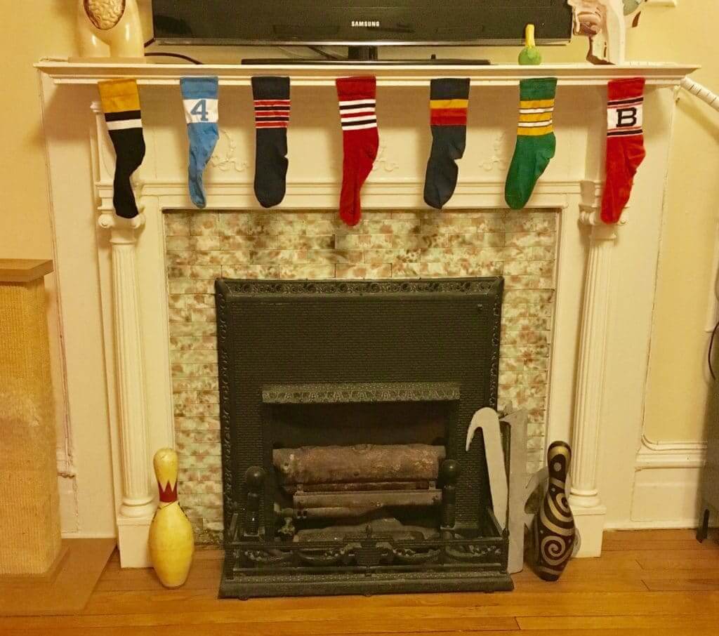
Meanwhile, here at Uni Watch HQ, the stockings have been hung by the chimney with care and the Irish cream is ready to go. (It’s actually Scottish cream this year, because we didn’t have any Irish whisky in the house but had plenty of Scotch — works just as well.) Tomorrow I’ll have the results of the annual year-end raffle. Until then, everyone have a great Christmas Eve. Peace. — Paul
Up incredibly early on the West Coast. Merry Christmas Eve to all!
Titans wore white at home Saturday for some reason.
Merry Christmas to all!
Noticed the Dolphins this week had truer throwback socks that match the sleeve striping. Different than the socks worn on Dec 2 and Dec 9 featuring aqua stripe in the middle.
link
Seems that resulted in sock inconsistencies this week. Appears QB Ryan Tannehill had one of each on yesterday. Charles Harris was wearing the sock striping of the ones from Dec 2 and 9.
While neither incarnations of the Washington Senators never retired a number, Frank Howard’s #33 was “retired” in 1993.
At a 1993 ceremony before a cancelled Yankees vs. Mets exhibition game at RFK Stadium (Hondo was a Yankees coach), there was a ceremony of Howard getting his number retired. It was going to go up in the rafters at RFK, but never did. From 2012: link. That was the first time the Nats issued #33.
Fascinating issue with numbers retired by defunct teams. As far as I can tell, no Negro League team ever retired a number, which probably saves some headaches for MLB.
Whalers (Hurricanes) vs. Bruins was televised coast to coast in Canada on Rogers Sportsnet 1. Took time to watch the game I otherwise would not have so I could see the Whalers in action once again. Mascot Pucky the Whale came back. I always found it strange that their mascot is a happy whale, yet whalers hunt whales.
That full kelly green uniform just looked great on the ice. Were you paying attention Seattle? We need another team back in the NHL wearing kelly green from head to toe, not anymore red and black.
If you love green, yesterday was a good day in the NHL with the Whalers and Devils throwbacks.
The Whalers breeders weren’t very accurate beyond the colors. The blue stripes were waaay too thin.
If you are referring to the pants, it is more like the 2 outside white stripes were too thin as opposed the the blue stripes. Original had 3 white stripes of the same width.
Yesterday:
link
The pant stripe back in the day:
link
If the Canes REALLY wanted to go all the way, they would have had the Canes dress in Cooperalls. Now THAT would have been impressive.
The NHL banned Cooperalls back in the ’80s. That’s why Hartford and Philly stopped wearing them. My understanding is that they caused players to slide too much when they got knocked to the ice.
Describing Brandiose’s “design” process as a “formula” is incredibly apropos. So many of their logos look very similar, featuring some snarling animal or object (with teeth showing, of course) and always showing someone or something swinging a bat. It’s become very redundant and tiresome and I eye roll anytime I read that a minor league team worked with Brandiose on a new logo.
I came here to basically say the same thing. You forgot “ridiculously thick boarders/outlines.” Brandiose has become one of the worst things to happen to minor league baseball. It’s tiresome, as soon as a team “announces” a new stupid name and post the post the logo along with whatever dumbass back story they created you can tell instantly who created it. Cookie cutter stadiums have led to cookie cutter logos.
Hell, look at the Pensacola, Biloxi and Jacksonville in the southern league. The 3 teams are almost indistinguishable from each other.
Indeed, here in New Orleans they did a “choose the name contest” and Baby Cakes won. Somehow, because I have never heard anyone use that term in reference to a king cake baby, and I am born and raised here. Brandise really is the worst, all the designs look alike.
I remember all-too-well the fiasco that was the Gwinnett Braves rebranding. We went from 6 top submissions (all stupid and nonsensical), with one – the “Big Mouths” – being in the top 3. But none of the top 3 were chosen. Ah, Brandoise didn’t like the “Big Mouth” but did like “Stripers” better (which, on all my devices, autocorrected to ‘Strippers’. It also smelled like it was rigged.The Gwinnett community still can’t understand why the renaming, or warm up to the Stripers name, and rewarded the team with the worst overall attendance in Triple-A last year.
The “B” made out of old beer cans is made for local chef Michael Symon’s B spot restaurants. (link) There’s one in each of the locations. When they remodeled Cleveland stadium, the team made it a point to incorporate local breweries and chefs, along with a lot of local imagery around the concourses.
The “color rash” might be an annoyance, but as a fan in the stands the simple color scheme is infinitely easier to read than the stupid up shadow they have with the current uni set. I think the fan sentiment is that these alts are overwhelmingly better than the garbage we have now. In fact, stores are completely sold out of the brown alts.
On another note, I have made Paul’s Irish cream recipe and it’s really amazing.
Happy holidays all.
No love for the beautiful retro and painted Super Bowl VIII/XVI/XiX font in the Dolphins end zones?
Browns were 3-0 in the rash this year.
Re: Sod Poodles
You may be familiar with Paul Caputo—he writes for Creamer’s site and did the “Story Behind the Name” series and book. A few years ago, he mentioned how it was an open secret that fan voting and name-the-team contests were a sham. I emailed him for more info and he said several teams have told him that, and it’s been standard practice for at least ten years. Teams do it for the publicity.
Many may chalk it up to an innocent white lie, but it sure is insulting to make fans feel that they have a say in the process. I appreciate the new identities (often Studio Simon) that are released to the world fully formed—the Hillsboro Hops, Daytona Tortugas, Las Vegas Aviators, etc. There’s no need for the dog and pony show.
(Side note: I was disgusted with Brandiose after the Akron rebrand in 2013, but now that they’ve done so many teams, I just have to laugh at it. Many/most of these Brandiose brands will be extinct in 10-20 years, and some day everyone will look back with nostalgia at the wacky teams from the twenty-teens)
We’ve been making our “Irish Cream” the last few years with pretty much any “brown liquor” that we find on sale after my wife said it was stupid to waste the good Bushmill’s. “Scottish”, “Kentucky”, “Tennessee” Cream, is now just our “Holiday Hooch”, and nobody’s the wiser.
I doubt if the Ravens would ever dress up as the Browns, but I’d they did they shouldn’t let anyone wear 32.
They also wouldn’t be allowed to, since they’re (for legal and statistical purposes) a separate franchise. The “new” Browns are legally and statistically the “old” Browns, and maintain the “old” Browns’ retired numbers.
That is correct. That was a huge thing when Art Modell announced the move. The NFL, to their credit, very quickly made it clear that the Browns colors and history would remain in Cleveland and the Baltimore team would be a de facto expansion team. It was the first arrangement of its kind, I believe, and led the way to other similar arrangements in other sports, i.e., the New Orleans Pelicans allowing the Charlotte Hornets (nee Bobcats) to reclaim their history from 1988-2002.
I’m hoping that the NBA would be as smart if the Suns were stupidly moved say to Seattle or Las Vegas by their terrible owner. I would assume any team in Seattle should go back to the Sonics, or SuperSonics, but I could see this idiot Sarver wanting to keep the Suns name if they moved to Las Vegas.
Only HALF of that Dolphins/Jags game looked good. Seriously, the Jags can’t get a uniform right. Their first set is still their best one. This one looks like a generic, default team uniform from a bad video game. Jacksonville should have changed their name from the Jaguars to “Team Name”
Wholeheartedly agree. Jags redesign was an improvement but those unis are simply not good at all. Both redesigns were bad (Tennessee is now one of the worst looking teams in the league) but this is easily fixable. Way too generic! Where is the teal!?!
The Jags could definitely stand to improve their uniforms with just a little tweaking.
Of course, I’d still prefer a return to the 2009-2012 helmet paint job, but that’s just me.
So is it fair to say at this point that the Panthers’ black-on-black is now their “standard” dark jersey combination? IIRC, they did not wear the silver pants at all during the regular season. Which is a shame, as the black pants were cool as an alternate look but pretty quickly got stale, IMO.
I was also a little surprised that with all the different combos they used this year that they didn’t try the silver pants with the white jerseys at least once. Would have looked pretty good I think.
Another example of the defunct team retired numbers thing that came to mind for me was the 2009 AFL 50th anniversary, when the Titans wore Oilers throwbacks, the Jets wore Titans of NY throwbacks and the Chiefs wore Dallas Texans throwbacks. Not sure if any of those teams other than the Oilers would’ve retired numbers though since they weren’t around long.
The Titans maintained the Oilers’ retired numbers.
The Jets (1) and Chiefs (2) each have retired numbers corresponding to a player who did play for the earlier incarnation, but who played for the team as they are currently known. The numbers obviously would have been retired after the change in team identity.
I wouldn’t really consider the Jets to be in the same boat as the others, since they’ve always been in the New York market, whereas the others actually moved into different markets.
Etienne Catalan is really on top of jersey numbers!
Indeed! And he’s a college student in France!
Have discovered that if (whisper it) the Avalanche were to wear Nordiques throwbacks, the exact same situation would happen as with the Hurricanes, as defenseman Nikita Zadorov wears No. 16, which was retired by the Nordiques.
If you hadn’t said so, I would have assumed “sod poodle” to be cowboy slang for a pile of bison turd. As in something like, “Careful, pardner, don’t step on the li’l sod poodle there!” I never would have made a connection to prairie dog, because I can’t think of any reason a normal human being wouldn’t just say “prairie dog.”
There is a gentleman in my hometown whose house is covered, floor to ceiling pretty much, with Kentucky memorabilia.
I may be wrong here but isn’t it called “infinite recursion” (as opposed to “regression”)?
Never mind I should have googled it before commenting oops
Speaking of scoring bugs, was anyone else annoyed that CBS had Pittsburgh in yellow? I kept thing there was a flag every time they had the ball.
Minor template issues aside (mainly the curved hemline and the collar), the Whalers unis look great. Same for the Devils (though I think the shoulder piping is a bit thin – I’ve had the same issue with the Sabres and Oilers going back to when they first went retro on the Edge template – the yoke piping is just not as thick as it was in the classic era).
Very pleased to see the Hurricanes with the Whalers throwbacks. The new ownership realizes that the Whalers are enjoying an afterlife few teams have – indeed, they’re as popular now as they ever were when they played – and it is gratifying to see them reach out to us.
Hartford desperately needs a new arena; but once one is built the Canes need to play one game a year there. Opponent doesn’t matter; date doesn’t matter. They’ll sell the joint out, it will be a huge event, and maybe – just maybe – the Canes will establish a fan base here in Connecticut. And let’s face it, they could use all the fans they could get.
As far as the throwbacks. Close enough for bank work. Keep in mind that if they still existed the Whalers would likely have made small tweaks to the uniform as well.
Isn’t the bigger question “why is Dougie Hamilton wearing a number the franchise retired”? Carolina isn’t a new team – the franchise moved there from Hartford, along with all the players, the coaches, the management, the records, etc. If the Whalers had retired numbers, then they should still be retired.
I’m back here to celebrate Festivus and if I can begin with my airing of grievances.
I got a lot of problems with you NFL teams that wear mono-colour dark jerseys and pants with a different colour helmet. Guilty this week were the Chargers, Cardinals, Saints, Panthers and Browns. Other teams have been guilty of this during the past year.
I have no problem with seeing in this in college football – either US or Canadian schools. That is where it should stay. These guilty ones are doggone professional football teams wanting to dress like college teams. It does not look good compared to your primary uniform options. Have some respect for your uniform.
Found this vintage flannel little league uniform in Pagosa Springs , Colorado
Regarding the ticker item on the Avalanche, they wore black helmets in preseason and first few games, and were then preserved to wear white by the league. The NHL rule book states that no part of the uniform, other than the short pants, shall be in common between the home and road unis. So swearing black helmets on both ran afoul of the rules. I covered them during that season and if I remember right, the white helmets debuted right around the start of November.
Has anyone else noticed the Dolphins throwbacks have two different sock stripe styles?
Don’t hold me to this, but I am pretty sure I’ve seen the Giants scorebug in red more than once when they’re randomly on CBS, especially when playing another predominately blue team. That doesn’t seem new to me. Fox will usually keep them in blue for most things, on the other hand.
And the Don Pepino cans are fun and certainly retro, but they do have one modern add to them: the Jersey Fresh logo to promote Jersey agriculture, which did not come into existence until 1984.