It’s that time of year again — the time when I give something back to you folks, literally. Or, if you prefer to be more cynical about it, the time when I clear out all the freebies that have accumulated in my apartment over the past year (along with some things that readers and advertisers have generously donated). Either way, it’s the day I run a big raffle that all of you can enter.
As in past years, some of you may recognize a few of these items as gifts that you thoughtfully sent my way over the past 12 months. I realize regifting may be frowned upon, but sometimes I have duplicates on certain things, or I don’t have room for everything, or something is too big or too small for me to wear, or I’ve gotten some enjoyment out of an item and am now ready to let someone else enjoy it. No offense intended, and I hope none taken. Thanks for understanding.
For shirts and jerseys, you’ll see a size followed by a measurement (L, 21″, for example). In each case, that’s the tagged size, assuming there is one, followed by the pit-to-pit measurement across the chest. All shirts and jerseys are blank on the back unless otherwise indicated.
Ready? Here we go:
1. A complimentary Uni Watch membership card.
2. A reproduction 1958 Army football helmet, autographed by Heisman winner Pete Dawkins, courtesy of Gridiron Memories. (As you may recall, we also gave away one of these last year. Let’s have a standing O for Gridiron Memories for providing us with another one.)
3, 4, and 5. A 2019 calendar of your choice from Asgard Press. They’re giving away three calendars, and each one is a separate prize.
6. An amazing Uni Watch hockey jersey made by DIY genius Wafflebored speficially for this raffle. No. 7 on the back. 24″.
7. A Delaware 87ers T-shirt. L, 20″.
8. A Trey Mancini giveaway bobblehead. New in box!
9. A Fort Dodge Gypsum Eaters cap. Adjustable leather strap.
10. A print of your choice from artist Dan Duffy’s “Art of Words” site.
11. A navy blue duffel bag with red/white UCLA-style striping. Additional photos and product details here.
12. A 2018 Yankees yearbook.
13. A vintage short-sleeved Pendleton wool shirt. Color is more olive and less brown than it appears in the photo. I ordered this last month from a vintage clothing shop, but they listed the measurements incorrectly and it’s way too big for me. When I contacted them to arrange a return, they said, “We’ll issue you a refund, but just keep the shirt and give it to someone else who’ll enjoy it.” How nice is that? So I’m paying it forward. L, 23″.
14. An Orioles snapback cap. DAP ad on side.
15. An Orioles bucket cap. Miller Lite ad on the back. No size listed, but I’d say it’s about the equivalent of a 7-1/2. Includes strap to keep it in place.
16. An Orioles American flag-themed T-shirt. M, 19-1/2″.
17. A set of Orioles stickers. The 2015 schedule probably won’t be of much interest to anyone, but the logos are still good.
18. An Akron Wingfoots promotional jersey. “Lukas / 18” on the back. 25″.
19. A Jacob deGrom ugly sweater-style shirt. Blank on the back, except for the decorative trim, which wraps around. M, 21″.
20. A Noah Syndergaard T-shirt. M, 20″.
21. A SUNY-Binghamton Bearcats T-shirt. M, 20″.
22. A SUNY-Binghamton Bearcats ugly sweater-style shirt. Blank on back except for the lower trim, which wraps around. M, 21″.
23. A Fordham Rams jersey-style shirt. 23-1/2″.
24. An “Omaha Metro Area” T-shirt patterned after the Mets’ logo. M, 20″.
25. A Uni Watch 2018 Purple Amnesty Day snapback cap. Includes hang tag that doubles as a sticker.
26. A New York Rangers authentic jersey. “Uni Watch / 7” on the back. 50, 23″.
27. A Puppy Bowl XIV T-shirt. Animal Planet logo on the back. L, 20″.
28. An authentic Syracuse Devices cap, which I wore while throwing out the first pitch at the Syracuse Chiefs’ Brannock Device Night promotion on May 31. 7-3/8.
29. A Syracuse Chiefs-branded Brannock Device, one of eight such devices that were manufactured and given away at the Syracuse Chiefs’ Brannock Device Night promotion on May 31.
30. A game-worn Syracuse Devices jersey from the Syracuse Chiefs’ Brannock Device Night promotion on May 31. Worn in the game by left fielder Yadiel Hernandez, who went one-for-four with an RBI. The back has No. 5 and Hernandez’s autograph. 46, 24″.
31. A Carolina Hurricanes “Canes” T-shirt. L, 21″.
32. A Puppy Bowl XIV strapback cap. Animal Planet logo on the back.
33. A 3-D “HC” batting helmet logo for Holy Cross High School in Queens, N.Y. Perfect if your name is, say, Hank Conway or Chris Henderson.
34. A Uni Watch tequila sunrise T-shirt. “Tequila Sunrise / 15” on the back. This is the last one I have from the original polyester/sublimated batch that we sold in November of 2015. (The ones we now sell on Teespring are cotton and the graphics don’t wrap all the way around.) A true Uni Watch collector’s item! 22-1/2″.
35. A “Cycling Stars” card game. Additional product info/details here.
36. A Curler’s Crying Towel. 15-1/2″ x 27″.
37. A champagne cork and a few pieces of confetti. The cork was scooped up off the floor of the Mets’ clubhouse by a sportswriter friend of mine during the team’s celebration for winning the 2000 National League Championship Series on Oct. 16, 2000. The writer then gave it to me. The confetti was gathered off the ground at the conclusion of Super Bowl XLII on Feb. 3, 2008, by New York Giants equipment director Joe Skiba, who then sent it to me.
38 (left) and 39 (right). Two Uni Watch Alternate Cap prototypes, which were prepared when we were getting that cap design ready for its launch. Uni Watch script on the back. Each cap is a separate raffle item. Although they look similar, they have different shades of green, different shades of gold, different eyelet colors on the crown, and different script sizes on the back — look at the photos closely for more details. Both caps are flex-fit. I’d say the one on the left (raffle item No. 38) is something like a 7-1/4 or 7-3/8, while the one on the right (No. 39) is a bit bigger, like a 7-1/2. One of these — I think No. 39, but I’m not positive — was worn by the Tugboat Captain for the Brannock-themed event in Syracuse. The final cap we ended up manufacturing was slightly different from both of these, so these are both one-of-a-kind.
40. A copy of We Want Fish Sticks: The Bizarre and Infamous Rebranding of the New York Islanders, by Nicholas Hirshon. 312 pages. Includes a promotional blurb from a certain uniform columnist on the back jacket.
———
And there we are. Here’s how to enter the raffle:
1) Send an email to the raffle address. If you’re having any trouble with that link, it’s uniwatchraffle at gmail dot com.
2) In the body of the email, please indicate (a) your name and shipping address and (b) your top 10 prize choices, in order of preference, by number. If you’re only interested in, say, seven items, then just list your top seven choices; if you want to list more than 10, you can do that too, but I don’t expect anyone to go that far. I’ll do my best to accommodate all the winners’ choices.
3) One email per person. Overseas readers are welcome to enter, although I may ask you to chip in on the shipping charges if you win something heavy. Entry deadline is next Thursday, Dec. 20, 7pm Eastern. The winners will be announced on Christmas Day.
Please join me in thanking the people who generously contributed some of the items for this raffle, including Dan Duffy, Mike Engle, Tim Flattery, Keith Goggin, Grant Hewit, Andy Hyman, Jerry Kulig, Jim Misudek, Wafflebored, Matt Weidner, and Curtis Worrell. You guys are all aces.
I’d also like to thank all the rest of you who contribute in various ways to Uni Watch. I wish I could provide gifts for all of you — honest.
Click to enlarge
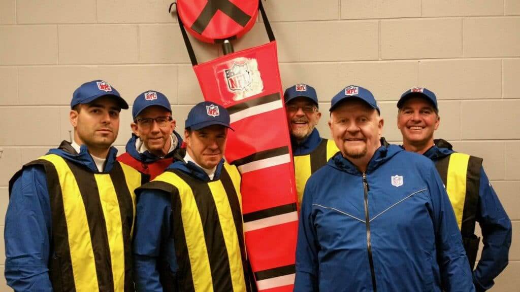
Chain crew reminder: In case you missed it yesterday, my latest ESPN piece is a deep-dive interview with Tom Quinn, who’s the head of the Giants’ chain crew. Check it out here.
Click to enlarge
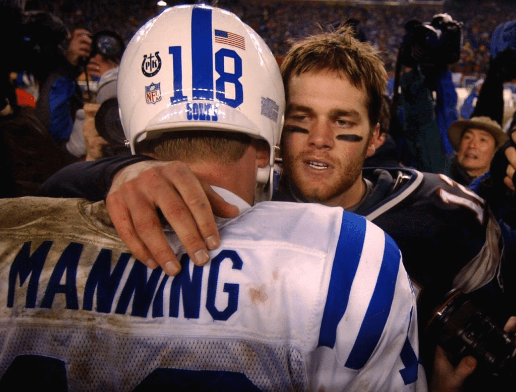
ITEM! New research discovery: See that logo on the back of Peyton Manning’s helmet as he shared a bro-ment with Tom Brady at the conclusion of the 2004 AFC Championship Game? That’s a memorial decal for the Colts’ team chaplain, Fr. Patrick Kelly, who died on Dec. 30, 2003. Turns out the Colts wore that decal throughout the 2004 posteason — in the Wild Card game against the Broncos on Jan. 4, in the Divisional Round game against the Chiefs on Jan. 11, and then in that conference championship game against the Pats. So we can add this to our list of religious symbols on team uniforms.
I didn’t know any of this until reader Chris Hickey brought it to my attention yesterday. Even the mighty Gridiron Uniform Database doesn’t have this one listed in its extensive list of commemorative helmet decals (although GUD co-honcho Bill Schaefer tells me he was aware of it, and even has that same photo of Manning and Brady, but the decal listing “must have slipped through the cracks”). Just another reminder that research and documentation are always ongoing processes, and that there are probably more gaps left to fill in than we realize.
U.S. Military Honors Sacrifices Of NFL Players By Wearing Jerseys Throughout December https://t.co/0GYlzI7T95 pic.twitter.com/AJPZadDa4e
— The Onion (@TheOnion) December 13, 2018
Speaks for itself: I’m just gonna leave this here.

Click to enlarge
Egg-cellent: It’s funny how some items are typically sold by the dozen — donuts, bagels, oysters, roses, golf balls. (And then there’s beer, which is sold in 12-packs, but somehow the term 12-pack feels different than a dozen, no?) And for some of those items, of course, you often get one extra: the baker’s dozen.
I’ve never seen a baker’s dozen for eggs — until now. The clever design is the result of a partnership between a husband-and-wife NYC design firm and a Nebraska egg farmer. As explained here:
Early on, a few large egg producers had expressed interest in our new 13-egg carton, but their egg-packing machinery was only designed to pack eggs in pairs. They could only handle even numbers like, 6, 12 or 18 eggs. To pack an oddnumber like 13 eggs, they would need to make a major retooling investment.
This meant that, for the time being, our cartons would only be practical for small egg-producers who would be packing their eggs by hand (farm-stands, farmer’s markets and the like).
Faaaascinating. That last page I linked to is worth exploring, and there’s more info here.
Now we need to come up with the baker’s dozen for all the other sold-by-the-dozen items. For oysters, I propose that we call it the shucker’s dozen. That’s what we’ll be calling it at my seafood restaurant, if I ever open one. Which I probably won’t. But it might be worth doing it just to offer the shucker’s dozen!
(Big thanks to my pal Rob Walker for letting me know about this one.)
The Ticker
By Yianni Varonis

Baseball News: We’ve seen this before, but once more won’t hurt: Here’s a photo of Hall of Fame manager Dick Williams in a Yankees uniform. In 1973, he was set to manage the team before his old boss, A’s owner Charlie Finley, sued and Williams and the Yankees parted ways before the regular season began. More information here (NYT link).

NFL News: The Chiefs went mono-red for last night’s game against the Chargers. They also enshrined Tony Gonzalez’s No. 88 in their ring of honor. … In that same game, Chargers RB Justin Jackson suffered a torn lightning bolt decal. … A Packers fan who owns Bears season tickets has been denied his request to wear green and yellow on the sidelines of this week’s game between the two teams (from Mike Chamernik). … The Green Bay Gamblers of the United States Hockey League, will wear Packers-inspired sweaters for “celebrate Wisconsin” weekend before auctioning them off (from Ray Barrington). … A couple years ago, Paul wrote about the unique dilemma equipment managers face when applying helmet stripes on Riddell SpeedFlex helmets. Reader Paul Weisner pointed out that while the Steelers cut through the gap on both their helmet stripes and numbers, QB Ben Roethlisberger does not.
College Football News: Reader Mike Selock was watching a rainy Pitt/Penn State game from 1976, and they showed a guy on the sideline drying the footballs in some sort of device. “The announcers said it turned like a rotisserie,” says Mike. The guy’s jacket appears to read, “Got wet balls? Kermie cures ’em.” … For its bowl game, Tulane will wear a “clean” version of its cartoon angry-wave helmet (from @BabyCastle75 and Ryan Doyle). … Here’s Utah State’s uniform for the New Mexico Bowl (from @akaggie).

Hockey News: It looks like the Senators will be getting a new logo, but not until 2021 at the earliest. … According to this reporter, the Hurricanes’ owner isn’t a fan of the team’s white sweaters, which is why the team wore red on its recent road trip. Last night, at the request of the ’Canes, the Canadiens wore white at home (from multiple readers). … Also in the NFL section: The Green Bay Gamblers, of the United States Hockey League, will wear Packers-inspired sweaters for “celebrate Wisconsin” weekend before auctioning them off (from Ray Barrington). … The National Women’s Hockey League unveiled this season’s all-star jerseys. … Check out this old box of Bauer skates with NHL team logos on the box. … Paul’s “Puck Soup” podcast session with Greg “Puck Daddy” Wyshynski is available here.

NBA News: Here’s a good behind-the-scenes look at how the Heat designed their “Miami Vice” uniforms. The article features this nugget: “The Heat looked over Nike’s [city edition] proposals, which included one jersey featuring a palm tree print, and politely sent them back. They had a plan, and they weren’t deviating.” A good reminder that teams ultimately call the shots on this stuff, not outfitters.

Soccer News: The Los Angeles Galaxy’s stadium has a new naming rights advertiser (from Josh Hinton). … A few items from our own Jamie Rathjen: Austrian club Red Bull Salzburg is required to have an ad-free team name for European competitions, so in such cases it is referred to as “FC Salzburg,” or just “Salzburg,” and wears a different crest; Spanish club Sevilla wears a gold version of the Europa League sleeve patch because it’s won the competition and its predecessor, the UEFA Cup, five times; and English club Chelsea wore an extra ad for a children’s-rights charity called Plan International, though it would also be appropriate for the team to wear an extra ad that would help combat this type of behavior. … This is the new third jersey for Mexican club Tijuana (from Ed Zelaski) … Soccer badge or fashion logo? Take the quiz!

Grab Bag: From Phil: Oregon has signed a deal with Fanatics to produce hundreds of school products and manage its relationship with other licensees. The partnership won’t affect Oregon’s relationship with Nike, however. … Speaking of Fanatics, they’re cutting short their NASCAR trackside deal that was supposed to run through 2024 (from David Firestone). … A Utah state legislator is drafting legislation that would create a commission to edit the state flag, which violates the five basic principles of vexillology (from Brice Wallace). … This article lists the year’s best kids’ picture books “centered on cities, architecture, and design.” … A New Jersey ice cream shop that caused controversy last year for its sexy female cow logo shuttered its doors this week. The owner blames the controversy for the closure. … Here’s a good article about a female video game designer who is trying to change the culture of women avatars often wearing skimpy garments known as “boob armor.” … Here’s a great shot of 1960s track and field star Tommie Smith wearing an awesome San Jose State uniform (from Pro Football Journal).
That Onion piece is spot on stupid, if you know what I mean. Hilarious stuff.
Beautifully so.
Aw brilliant as the headline is, it’s the photo that sells the absurdity.
Cpl. David L. Katzenbogen was decades ahead of the game with his link.
I call Bazooka’s jersey a “knock-off” because the 14 is blue instead of the proper white, and the Pats didn’t have contrasting collars until the current navy/silver set debuted in 2000. But otherwise, it’d work as a 1976-83 Grogan jersey. Amusingly, this figure debuted in 1985, by which time the Pats had gone back to over-the-shoulder loops and Grogan had been relegated to backing up Tony Eason.
Ohmaha s/b Omaha. I have a similar problem with Wi(t)chita
Fixed.
“Thanks, Ohmaha!”
Number 9 should say Fort Dodge, not Wayne.
Thanks. Fixed.
2018 is going to be my Uni Watch raffle year!
Me too!! (I hope.)
Just read the chain gang interview – great job. I loved how open he was in his answers. I’d be interested in seeing all the gear that his crew and the officials wear for cold & wet games. How do they deal with rain when they are logging penalties?
He has a clipboard with a little hood, which helps during the rain. I probably should have included that — the interview was very long and I had to make some tough decisions on what to cut.
I’m going to express an unpopular opinion here, which is that while I adore the idea behind the “Vice uniforms” and a lot of elements associated with them (especially the unapologetic usage of pink!) I don’t think they made the right choice by ultimately settling on the old Miami Arena wordmark. Something about it feels off to me, and ironically, weirdly generic, when it said in the ESPN piece that that was what they were trying to avoid.
I think the pink is the only part I do like. I’d like to see them try full Art Deco for a future design.
I had been saying since last year that they should’ve used the Broadway font for the numbers, but after reading the article and seeing that they didn’t want to get too on the nose regarding the TV show, I’m willing to back off that point now.
Interesting news about Carolina’s road whites. I haven’t been a fan of them either since they changed them in ’13. That re-design was awful. Bring back the storm flag stripes like they did on the reds
And get rid of that giant red shoulder yoke.
Paul – in your experience/based on your information, how many teams actually care enough and have opinions to call the shots on uniforms (like the Heat did in the story there) and how many just go with whatever the apparel company decides?
It varies. Even if the outfitter provides several options to choose from, the team still makes the final call.
Paul, what vendor did you end up using for the alt hat? It has quickly become my favorite hat and was looking to see what else they had in that fit/style. Thanks.
So glad you like it! I got it made through Golden Sombrero, but it was a custom build via one of their Chinese suppliers, not a stock item.
In the ticker the Chargers play at Stubhub Center too…remember it’s not only the Galaxy stadium
It’s the Galaxy’s stadium and the Chargers are merely tenants until 2020.
We could cross-list the StubHub/Galaxy news in the NFL section as well. And on that subject, I feel like “Los Angeles” Chargers has been the hardest name change to adjust to, which is weird because at least that was their original name. Second would be “Arizona” Coyotes … still doesn’t seem right either, and I never find myself thinking of the “Phoenix” Cardinals. Any other contenders? Perhaps St. Louis to Phoenix for the Cardinals was difficult, due to the shared name with the MLB team, but that was before my time.
On another topic, I remember seeing somewhere that only the Packers and Panthers have yet to play in England, and reading here that they are the last two teams still using the Reebok jersey template, which of course had its distinctive Union Jack logo back in the day. If they ever have a head-to-head matchup in England, Nike should let them break out the retro Reebox mark instead of the swoosh.
edit: “retro Reebok mark” in last section.
I still unconsciously call them San Diego. Though perhaps it is because it was such an ill conceived moved (evidenced by their lack of fan support and incredibly lowered revenue projections going forward) to move to LA and become the third pro football team in a market that is notorious for being fair weather and fickle.
I still call the Coyotes Phoenix and the Angels Anaheim, though those those aren’t as unconsciously as with the Chargers.
As wrong as it may be, I still find myself referring the MLB team playing in Anaheim as the California Angels.
As they are my favorite MLB team, I detest the LAAofA nonsense but I have always begrudgingly accepted the name changes. For a team that’s stayed in the same spot (since they actually were LA, I mean), its unacceptable. Would be interested to do a poll of non-sports fans what they think the designation is, as sports fans here have said both. I’d wager California, for longevity and its association with “Angels in the Outfield.” Crap, now that I think about it, my hockey team, the no longer “Mighty” Ducks, probably has the same fractured association.
Since my support of the NFL has dropped drastically since the end of 2015, out of sheer burn-out and fatigue of the constant problems with the league (and the fact that my team literally cannot do anything right come December), I constantly forget the name changed. Inadvertently, when referring to the Rams and Chargers, I always use “St Louis” and “San Diego”.
I still say California Angels.
On the one hand, I say “Los Angeles Angels.” On the other hand, no power on Earth will ever make me say “Los Angeles Angels of Anaheim” or anything similarly awkward.
Love that video on the five principles that make up a good flag. As a NJ resident I have always hated our flag and been jealous of the great flags in places like Arizona, Colorado, New Mexico, etc. Given the nature of NJ and its divisions between North Jersey(part of NYC metro) and South Jersey (part of Philly metro) an appropriate design would be a two colored flag (green and yellow would be my choice) split diagonal from the top left down to the bottom right. This would reflex North and South Jersey, and then contrasting colored stars in the top right and bottom left corners, referencing the two major metro areas that are cultural hubs of the states. It would be simple, distinctive, and have some meaning behind the design.
Listening to your Puck Daddy appearance now, Paul. Digging it! Perhaps Uni-Watch needs a podcast…