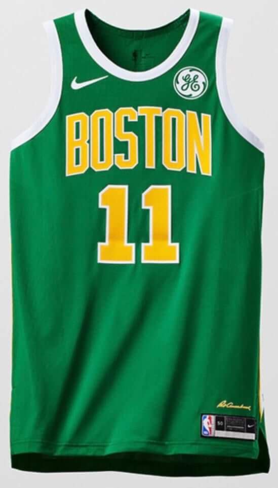
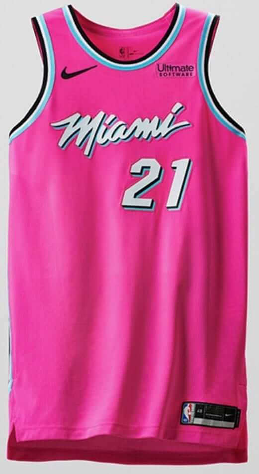
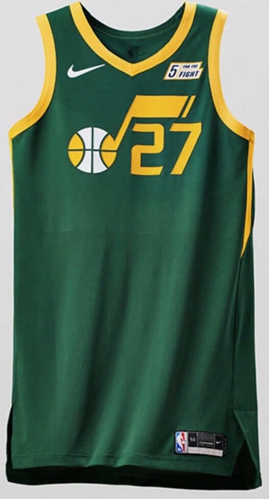
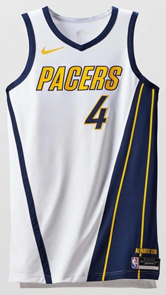
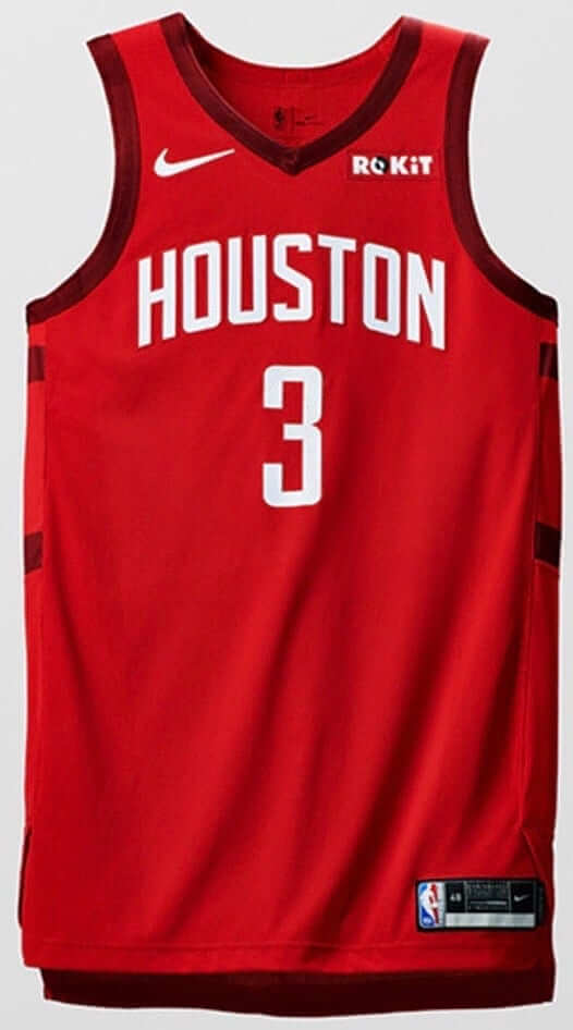
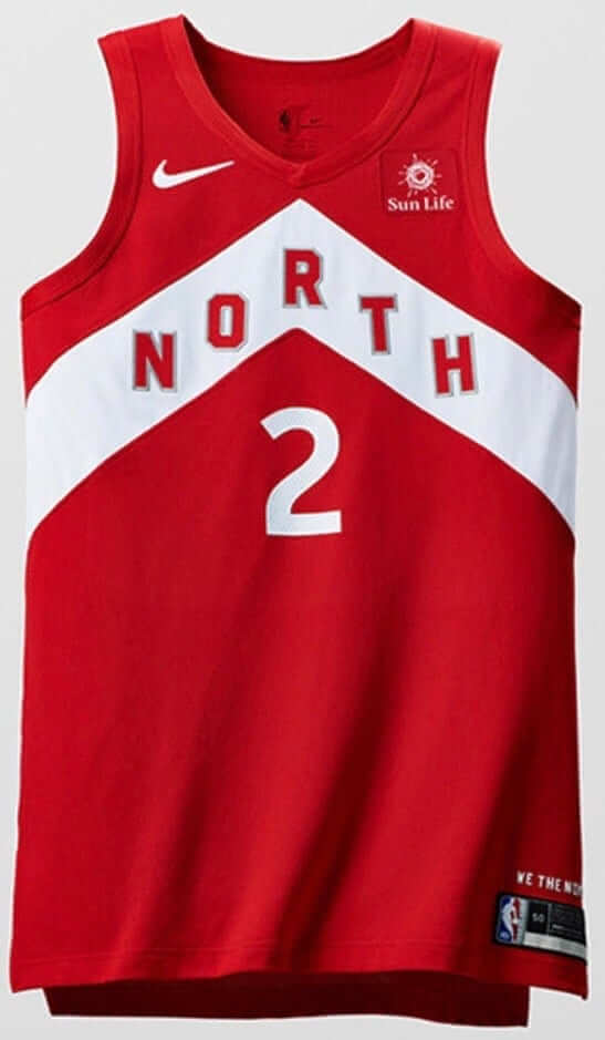
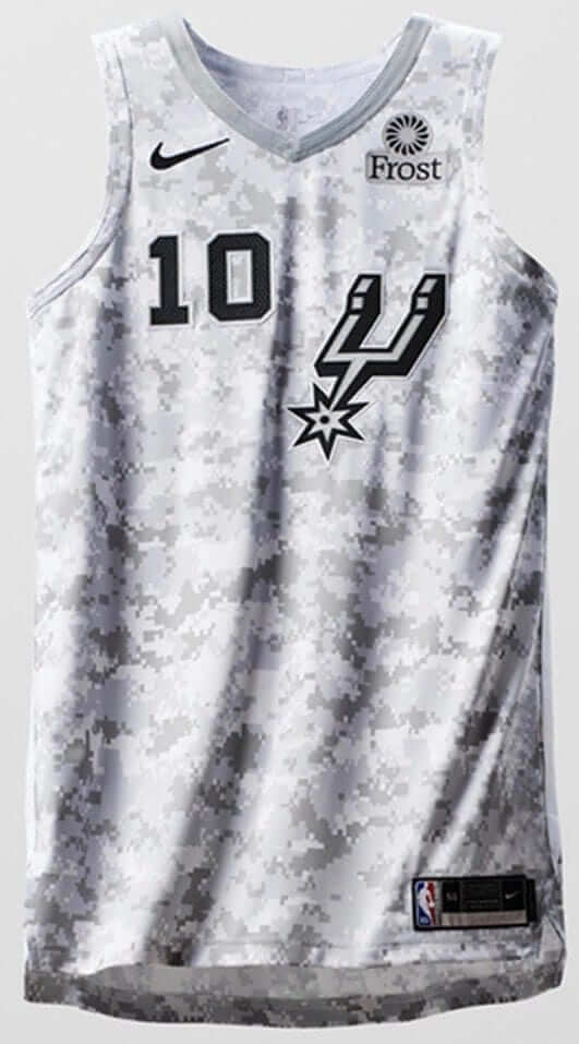
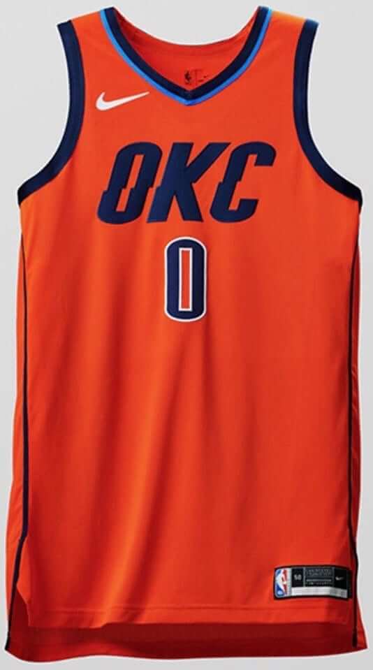
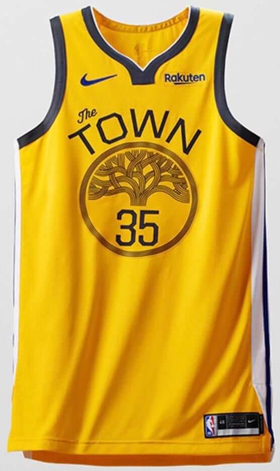
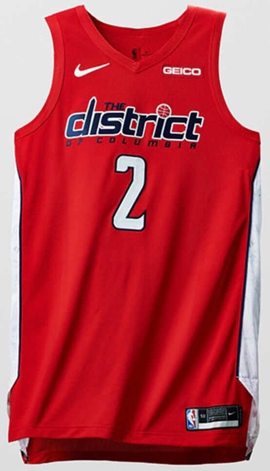
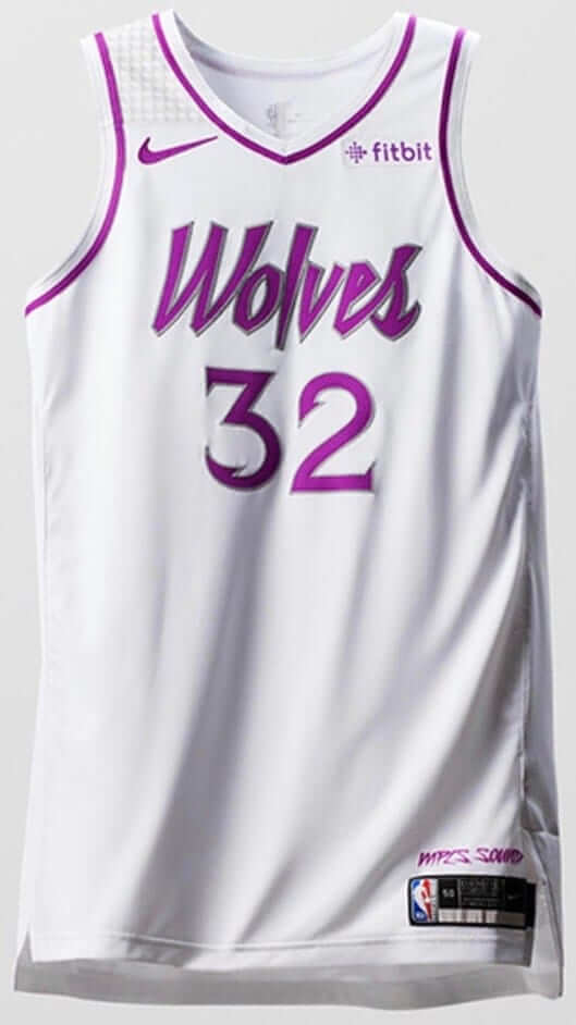
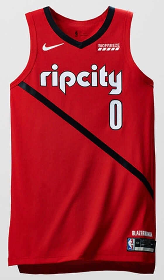
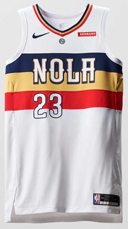
Amidst an increasing torrent of leaks, the NBA went ahead and made it official yesterday by releasing the cringe-inducingly named “Earned” uniforms — the ones that will be worn by the 16 teams that qualified for last season’s playoffs, beginning on Christmas Day.
The premise of this set has always been laughable, given that more than half the league qualifies for the postseason (boy, good thing the Wizards “earned” a new uniform by finishing four games over .500 and then being eliminated in the first round!), and now it turns out that the designs aren’t even new designs. Most of them are just color-shifted versions of the slightly less cringe-inducingly named City alternates (except for the Jazz, Thunder, and Rockets designs, which are color-shifted versions of those teams’ very cringe-inducingly named Statement alternates). Or to put it another way, the Spurs now have yet another camouflage uniform — their fourth in five years by my count.
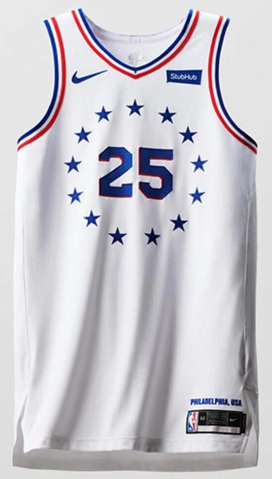
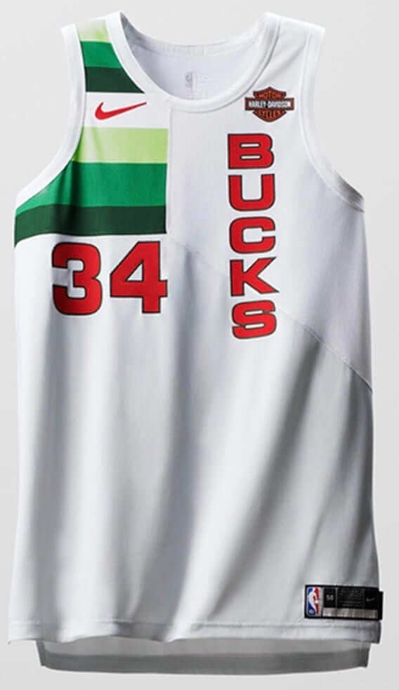
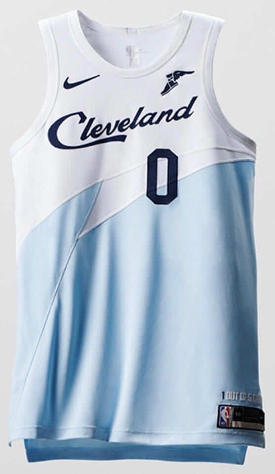
Anyway: Some of these color-shifted versions are much better than the City versions on which they’re based (Pacers, Sixers), others are worse (Pelicans, Bucks), and others fall into the “The other design had no compelling reason to exist, and neither does this one” category (Cavs, Rockets, Thunder). Here’s the whole batch of jerseys (click to enlarge, and my apologies for the staggered image pairings):
In addition, 11 of the 16 teams have put additional info and photos on their websites, so we can see more than just the front of the jerseys. Those teams are the Bucks, Cavs, Heat, Jazz, Pacers, Pelicans, Sixers, Trail Blazers, Timberwolves, Warriors, and Wizards. (Many of those web pages have headlines that say, “New Earned Jersey,” even though the photos show more than just the jersey. Sigh.)
Obligatory joke: If the 16 playoff teams are getting Earned uniforms, shouldn’t the other 14 get Spurned uniforms?
As I’ve mentioned before, it’s hard to see how all of this is sustainable. The plan is to keep coming up with new City alternates (and presumably corresponding Participation Trophy alternates) every season, and at some point they’ll want to do a new round of Statement alternates as well. But at some point the Spurs will run out of camouflage options and the Timberwolves will run out of ways to reference Prince, no?
Meanwhile, as long as we’re talking about the NBA, here’s a pair of tidbits that a source passed along to me yesterday:
• You know how the Thunder currently have their team name on the white uni and their city name on the blue uni? They’re planning to flip that next season.
• Orlando’s primary colored uniform (i.e., Icon) is currently blue. Next season it will be black.
Finally, I leave you with this (which would look better without Twitter’s auto-cropping, but you get the idea):
I like the Cavs fresh color scheme pic.twitter.com/FnHCN7C4wP
— McNeil (@Reflog_18) December 12, 2018
(My thanks to @bignatsnut for bringing that last tweet to my attention.)
Click to enlarge
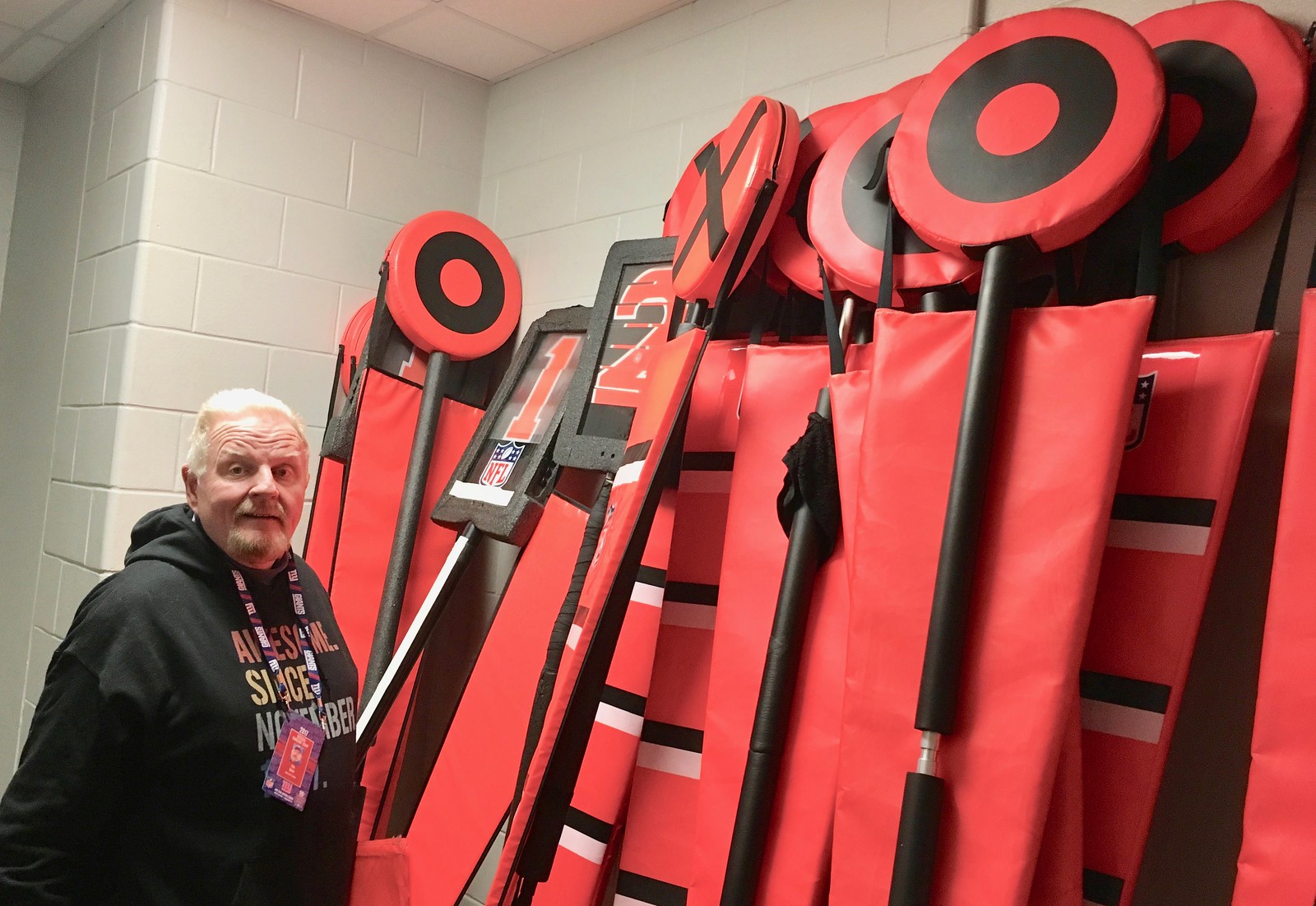
In the sticks: Who’s that with all the first down markers? None other than New York Giants chain crew chief Tom Quinn, who I recently interviewed out at the Meadowlands for a new ESPN piece that I think you’ll enjoy. Check it out here.
Also: Tom is looking for an old-school 1940s or ’50s down indicator, like these. If anyone has a line on where to find one of those, please drop me a line. Thanks.
Click to enlarge
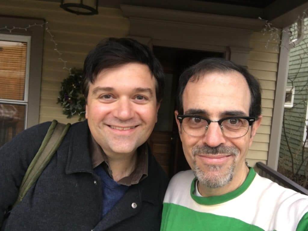
Puck me: Who was that posing for an awkward selfie with me on the porch of Uni Watch HQ yesterday? None other than my ESPN.com colleague Greg “Puck Daddy” Wyshynski, who stopped by to interview me for a new segment of his Puck Soup podcast. Super-impressive that he made the trip so we could talk in person instead of just doing it over the phone.
We talked about NHL uniforms and a bunch of other things. I really enjoyed it — Greg’s a great guy and a fun interviewer. I believe the podcast segment will be posted today, so I’ll post the link here once it’s available.
ITEM! Queen City party details: I mentioned a few weeks ago that I’ll be in Cincinnati during the last few days of the year and that I wanted to convene a Uni Watch party while I was there. After extensive consultations with some of our Cincy-based readers, I’m happy to announce that we’ll be gathering at the Mt Adams Bar & Grill on Sunday, Dec. 30, at 3:45pm. We’ll be there until at least 6pm, and maybe a bit longer. They have food as well as drinks, so feel free to come hungry.
I’m looking forward to meeting all of you Cincinnati folks, as well as anyone who wants to make the trip from Louisville, Lexington, Columbus, and Indianapolis (all less than two hours away). See you soon!
The Ticker
By Lloyd Alaban

Baseball News: Here’s a behind-the-scenes look at the wonderfully wacky world of minor league mascots (from Jason Hillyer). … MLB blog Cut4 did an absolutely horrendous job photoshopping P Charlie Morton into his new Rays uniform (from Andrew Cosentino). … This sportswriter thinks the Red Sox need new alternate uniforms (from our own Phil Hecken).

NFL News: The Broncos will wear their navy alternates this Saturday against the Browns (from our own Phil Hecken). … The Chiefs will go mono-red tonight against the Chargers (from multiple readers). … There will be neutral end zones for the Jets and Giants this weekend at MetLife Stadium. Jets play the late game on Saturday, Giants have the early game on Sunday, and rain is in the forecast, so there will be no end zone changeover (from Alan Kreit). … Tim Holleran was watching highlights of a 1977 Falcons/Giants game and noticed that Falcons WR Alfred Jenkins was missing his nameplate. “At first I thought maybe Jenkins was a new addition to the team that week and therefore the team hadn’t had time to create his nameplate,” says Holleran, “but it turns out he had actually been on the team since 1975.” … Odd choice of jersey for Washington QB Josh Johnson for his NFL and Pro Football Reference photos. Johnson has never played for a team that wears a blue jersey (from Jon Solomonson). … Multiple readers sent us these NFL City Edition jersey concepts.
College Football News: Here’s how the Sugar Bowl patch will look on Texas’s whites (from Joey Breeland). … Here’s the Frisco Bowl patch on Ohio’s BFBS jersey (from Ed Zelaski). … North Texas will be going chrome green/green/white in the New Mexico Bowl versus Utah State (from Robert Botts). … It looks like — at least from this video — Fresno State will wear their blue alternates for the first time all year and the first time in the last two years. They play Arizona State in the Las Vegas Bowl on Saturday (from Josh Bryant). … For some reason this Belk Bowl announcement has South Carolina’s block “C” logo turned backwards (from Josh Callahan). … Neither we nor Sam McKinley have seen a Nike-branded Heisman jacket before, but here’s one on 2018 winner QB Kyler Murray. … Meet the man who has created Mizzou’s football uniform frenzy (paywalled link) (from Trent Guyer). … K-State head coach Chris Klieman has some thoughts on his team’s uniforms (from Blake Cripps).

Hockey News: Former Blues G Chad Johnson was picked up by the Ducks earlier this week. He made his Anaheim debut last night but was still wearing his Blues mask (from Rick Ho). … This rec league goalie is wearing an NES-themed Duck Hunt uniform, complete with themed pads and masks! (from John Roushkolb).

NBA News: This on-screen graphic shows a Pistons logo that matches their “Motor City” alternates (from Dan Kennedy). … The Sixers’ practice court has integrated special markings — including a four-point line — to enhance their offensive and defensive strategies (from Kurt Esposito). … Here’s a good analysis of how companies like Puma and New Balance are challenging Nike’s dominance (NYT link) in the NBA footwear market (from Tom Turner). … Celtics F Marcus Morris and Wizards F Markieff Morris are twins, but they don’t have matching NOBs.

College Hoops News: South Dakota State men’s went GFGS on Tuesday and dropped 90 points in the first half (from Steve White). … Evansville men’s will wear sleeved jerseys against Jacksonville on Saturday (from Bob Pristash).

Soccer News: In honor of its 10th anniversary, the Philadelphia Union will feature fan-chosen back tags that will be emblazoned below the neckline on the back of each shirt. Local Philly athletes and celebrities had input on what the tags would look like, and fans will choose their favorite tag to be featured on Union’s shirts (from Ryan Schwepfinger). … A teaser photo for the Timbers’ new home shirts has leaked (from Josh Hinton). … Also from Josh: New logo for kit maker Macron. … Chelsea F Michy Batshuayi is wearing some very appropriate Batman-themed boots (from Mark Coale).

Grab Bag: Grand Valley State will change its mascot name from “Lakers” to “Sawyers” for one day in February (from multiple readers). … Here’s a look at the Buffalo Bandits’ helmets of the National Lacrosse League (from Willie Stew). … A sportswriter has shared what he thinks are 21 uniforms “that should have stayed in the locker room,” but be warned — it’s a pretty ridiculous list (from our own Phil Hecken). … Here are some fantastic colorized photos of WWI troops from the Canadian War Museum (from Ted Arnold). … Following Tuesday’s meeting with President Trump, House minority leader Nancy Pelosi exited the White House wearing a red coat, which one writer has interpreted as “a subtle power move” (from Jason Hillyer). … Yesterday we ran an item about how the Holland Tunnel in New York and New Jersey was decorated so carelessly for the holidays. A Budweiser brewery in Newark, N.J., has taken a stab at the tunnel’s decorating (from Tom Turner).
Josh Johnson played for the Giants in 2016, so I’m guessing his photo from Pro Football Reference was a photo back from his Giants days.
I was surprised by that ticker item. That was a weirdly specific thing to call out, when if you go to the linked Pro Football Reference page it shows that he was a member of the Giants active roster in 2016.
And the Colts in 2015 as seen on the ESPN page linked to.
edit: er NFL page
Typo – it’s Grand Valley State. A mix wordup.
Fixed.
Wonder if neutral endzones at the Meadowlands means blank endzones, old fashioned diagonal white stripes, or just New York in white? I think plain New York in white would be great year round (even though they play in NJ).
They play in the New York metropolitan area, why does nearly everyone forget this? (I talking to the NYers and NJers.)
because they play in new jersey
It is just their particular situation. They play in the New York City metro area, but in a different state than the city they use as their name. It is different than say the Lions playing in Pontiac. It would be similar to say a Cincinnati team playing right across the river in Kentucky, or a Philadelphia team right across the river in NJ. Still the same metro area obviously, but you are no longer in the same state you claim to call home. Plus with New York it is also the same name as the state.
Only similar situation I can think of is the 49ers now. Still going by San Francisco, might still be in the same combined statistical area, but really are now in the San Jose metro area.
Usual example is the Redskins who currently play in Maryland and practice in Virginia. No time in the city itself.
Just have one Giants end zone, one Jets end zone, and leave it like that for as long as they share the stadium. It’s nice to share.
Better yet. How about they each get their own stadium already.
That would be a waste. Each team only uses it, what, 10-12 times a year?
Share.
The earned jerseys remind me of the early ea sports nba games on the Sega genesis that only had the playoff teams. Which is also weird in hindsight.
I had one of those games: “Lakers vs. Celtics and the NBA playoffs”. Crude by today’s standards, but man, cutting edge back in the day!
A lot of the old Japanese video baseball games were deisgned around the 12 teams in the two Japanese major leagues, so when they got translated and ported over, they could only have 12 teams. I think RBI Baseball picked only some recent division winners plus an all-star team full of players from not-included teams.
Josh Johnson was on the Giants in 2016 (though he didn’t get in a regular season game) which would explain the blue jersey with the Nikelace.
He actually was on a number of teams that wear blue (Colts, Bills) but has played sparingly.
I think he was only on those teams during the pre-season and never officially made their rosters.
He was active for two games during the 2016 season as the backup for the Giants.
quick wikipedia search shows that he was on the active roster for the Giants
“I love that it’s nearly impossible to locate a difference between the home and away uniforms the Red Sox, Celtics or Bruins wear today and the ones they wore 20 years ago.”
Boy, she’s reaching way back there, isn’t she? She’s basically saying:
“I’m so happy the Sox look exactly the same as when Nomar was there.”
No covering of the Uni-Ads???? I’m surprised!
As has been explained here many times before, Paul only covers up the ads when it is an announcement of a new advertiser, not for every subsequent time an NBA jersey is shown.
Yes, but what about the green dots on NFL helmets? What’s up with those?
/sarcasm
Re: Batshuayi.
Yes, his name contains the word “bat,” but he also plays for Valencia (on loan from Chelsea; the text just says Chelsea), whose crest contains a bat that is similar to the Batman bat. So are his boots referring to himself, the team, or both?
I think both, as I looked yesterday and it doesn’t look like he wore similar boots for his other teams, including Chelsea.
I don’t know if this is really unsustainable, every major soccer team seems to get a new design for home and clash shirts every year without much problem.
How many uniforms does each NBA team now have? Ten? Twelve? I’m serious. It’s sensory overload at this point. I know the plan is to sell as many of these as they can to the public, but at what point does it become a series of diminishing returns?
And someone should knock some of these knuckleheads in their heads and explain to them that it’s not a good idea for some franchises (Celtics and Lakers come to mind) to participate in all of this garbage because they don’t need it. If I can’t turn on a TV and figure out who’s playing (especially when the Celtics or Lakers are wearing BLACK), then you’re doing it wrong.
1. I don’t follow the NBA all that closely, so I don’t know if that OKC wordmark is new for this jersey or not (probably not, based on Paul’s comments about how most of these are variations of other jerseys). Either way, seeing it for the first time and that is just a hideous bit of design. It looks like it got cut in half and someone tried to hurriedly put it back together.
2. I subscribe to Puck Soup, and it usually shows up on my feed early Friday mornings, so I would be surprised if it showed up today.
I apparently don’t read all that closely either, as Paul specifically stated the Thunder’s version is a variation on another one. Mea culpa.
I was also wondering whether Nike plans to continue with new City and Earned uniforms every year, and if so, how horribly lackluster their designs will be in another year or two. Switching the colors on some of these has truly made them worse than the original. The first Prince tribute set was fun, but the white version is just a downer after seeing the purple one. Removing the sweatshirt fabric from the Sixes uniform is an improvement in my mind (though the general populace might disagree as the grey one is apparently the best-selling of the current City sets), but their normal white uniform is also better. And Washington’s design was kind of bland when it was first unveiled last year, but now they’ve done it in two more colors? Blah. I’m expecting them to use it again next year, maybe in navy.
Really not a fan of more NBA uniforms like this. Special thumbs down to the Spurs. Camouflage uniforms are so minor league.
Cut4 is making the endearingly bad MS Paint uniform changes. On purpose. They’re just dumb fun.
Tanner-for-Tanner link
Andrew McCutchen (video)
link
Funny how, at least in the Cavs’ case, a majority of the integral players who “earned” the unis are no longer with the team.
Unless I’m wrong, it sounds like you’re telling us the Thunder and Magic both have long overdue rebrands next season.
All I’m telling you is those two tidbits. I don’t know anything more than that. (And in any case, those would be redesigns, not rebrands.)
I still think Miami’s “Vice” jerseys should’ve incorporated the Broadway font for the numbers instead of using their regular oblique block numbers. If they’re going to embrace Miami Vice, they should go all-in with that Art Deco-style font.
Personally, I am of the mind that the Heat should fully embrace the Miami Vice theme, and switch to the pink and blue full time. It is fun, it is festive, and the Heat need to be doing something different in life, anyways. Let DWade cap off the red and black era and then turn over a new leaf full time.
I’ll continue to die on this hill: the Red Sox should reintroduce the red caps for Sunday home games. And maybe this one for Sunday road games:
link
I’m definitely not opposed to the periodic use of a red hat by the Red Sox.
I absolutely agree, the Red Caps from the 70’s were some of the best hats in the history of the game.
As “someone who gets it”, it’s great that the NBA is giving us so much material to judge and discuss, the problem is the NBA is giving us so much material to judge and discuss. Did someone miss the marketing lecture on “over-saturation”?
Chain crew story is up:
link
Never knew what the X and O stick were for. And I had no idea the X stick was retired this year. Thanks for yet another look at something sports fans take for granted, Paul!
Up and fantastic. What a great story. Tom Quinn seemed like a great character and the whole process was fascinating. Thanks for telling this otherwise untold story.
Fascinating story! Just a quick note, the special feature on Tom Quinn appears to have occurred in 2007 in Week 15. Todd Collins, the Washington teams QB and Clinton Portis, the RB, weren’t on the team in 2003.
link
link
Love that new “Rays alternate”…kind of fitting for a team that’s headed out of town in the next five years.
Those Dallas, Miami, and Philly city edition NFL jerseys…YIKES! My eyes!!
Maybe it’s just me but I have not one time cringed at the names Nike has given their uniforms. It’s been like a year and a half with them now and we’re still bitching about what their called? Seems like beating a dead horse to me at this point.
Hey, we all have different tolerance levels for corporate newspeak. Mine happens to be very low!
Also, the newest name — the one tied to the new uniforms we’re talking about today — has not been around for a year and a half. We just learned about it this fall.
The NBA has way too many uniforms, and the “earned” designation is incredibly stupid.
That aside, I love the Heat uniforms taking advantage of the criminally underutilized pink. In fact I wouln’t Mind if the “Vice” set repacked their drab red and black uniforms as their primary (or however close to primary a uniform even gets in the NBA at this point).
If I had my way, this would be the Heat’s primary:
link
I was just thinking that about the pink; it looks great (and I wish the Marlins would use it).
Something I’m noticing about Miami sports team uniforms, including this pink one: they like to have four layers for the numbers, something you almost never see. The original Heat home uniforms had a link multilayered thing, and the Marlins used to wear link, even for the NOBs, which looked really clunky.
And I can’t think of too many other examples of four-layer numbers. Three in Miami so far, though.
Grammar error in this sentence: “. . . anyone who wants to make the trip from Louisville, Lexington, Columbus, and Indianapolis.”
“Anyone who wants” is singular; thus the conjunction before Indianapolis should be “or” (unless you expect someone to come from all four cities at once).
Glad you identified which Queen City. There are multiple Queen Cities in North America, to include:
Buffalo, New York.
Charlotte, North Carolina.
Cincinnati, Ohio.
Regina, Saskatchewan.
Seattle, Washington.
Toronto, Ontario.
Springfield, Missouri.
Manchester, New Hampshire.
Nice creativity Nike wizards now have had 3 district uniforms that are cut and paste jobs with a different colour.
The premise of this set has always been laughable