For all photos and illustrations, click to enlarge
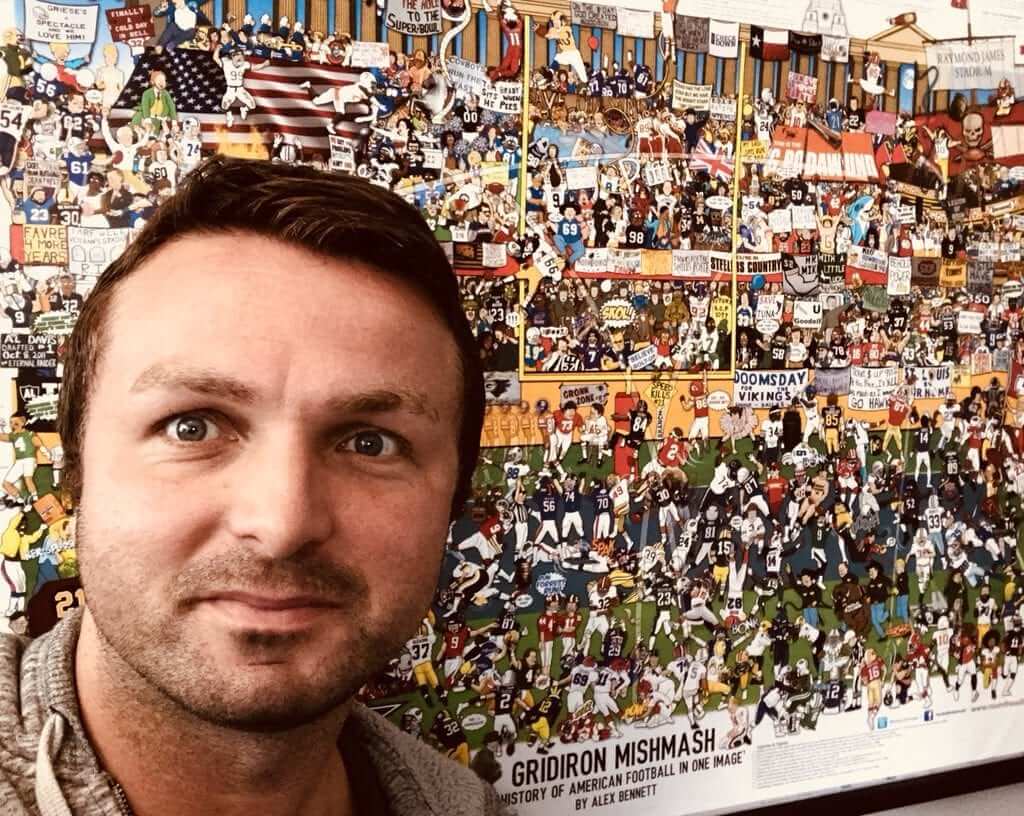
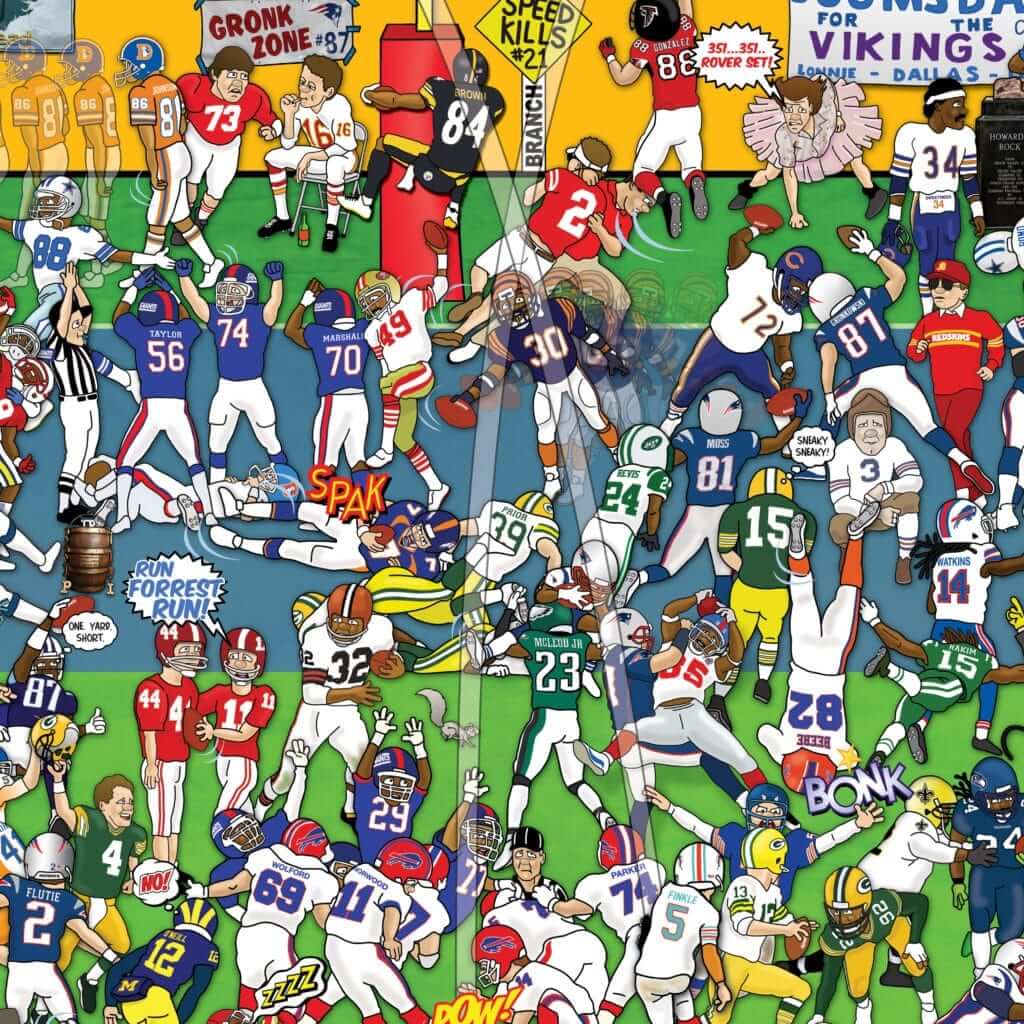
Earlier this year we Ticker-linked several times to British illustrator Alex Bennett and his various sports “mishmash” posters, each of which shows the history of a team or sport in one detail-crammed, information-overloaded, “Where’s Waldo?”-style image. We also raffled off two copies of his then-new Gridiron Mishmash poster, which charts the history of NFL and American football.
I thought an interview with Bennett, focusing on the Gridiron Mishmash poster, would be a good ESPN piece for that slow NFL period in between the draft and the start of training camps, so we did a Skype interview in early June and I delivered the piece to my ESPN editor. For various reasons, its pub date kept getting pushed back, and then it basically went down the memory hole, so now I’ve reclaimed it and am running it here on the blog. Here’s how our discussion went:
Uni Watch: How old are you, and where do you live?
Alex Bennett: I’m 37, and I live just outside of London.
UW: How and when did you get the idea to do these “mishmash” illustrations, and which one did you start with?
AB: I do a lot of illustration work for soccer clubs, in their match-day programs, so I started with the European soccer poster, in 2013. It took me nearly 14 months to do. I keep a clock on my desk, and I tap it every time I start working. For that one, it was nearly 1,800 hours. Quite a daunting number, really. But I was struggling to get work at the time, so I thought I needed something that would put me on the map.
UW: When you did that first one, were you thinking all along that you’d do a series of them for other sports? Or were you thinking, “Ugh, this is taking so long, I’m never doing this again.”
AB: The second answer! Especially since I had no idea whether the first one would be successful. You’re working on it and you’re not getting any revenue from it. It was all a gamble, a shot in the dark. But it went well, and now it’s like a hobby that’s gotten out of hand.
UW: How many have you done?
AB: Eight. After European soccer, there was pro wrestling and rugby. Then I did the soccer club I support, Watford, and then West Ham and Tottenham Hotspur. I did those clubs because I also do work for their programs.
UW: Regarding the new “Gridiron Mishmash” piece, do you actually follow American football, and American sports in general?
AB: I must admit, I struggle with baseball. But I do enjoy the NFL. I went to see the L.A. Rams playing the Cardinals in London last year. And when I’ve been to Florida, I’ve seen the Buccaneers play a couple of times.
UW: How did you get into American football?
AB: As a 10-year-old, I went to the 1991 World Bowl — the London Monarchs versus the Barcelona Dragons, at Wembley Stadium in London. The attraction there was William “The Fridge” Perry playing for the Monarchs. So that really gave me the bug.
UW: When you’re doing one of these mishmashes, do you aim to have a certain number of people in them, or to document a certain number of scenes or moments?
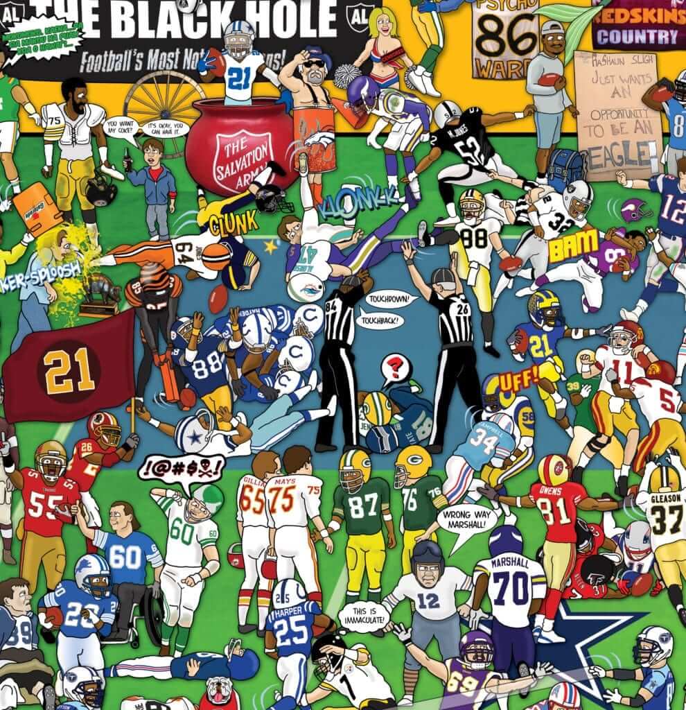
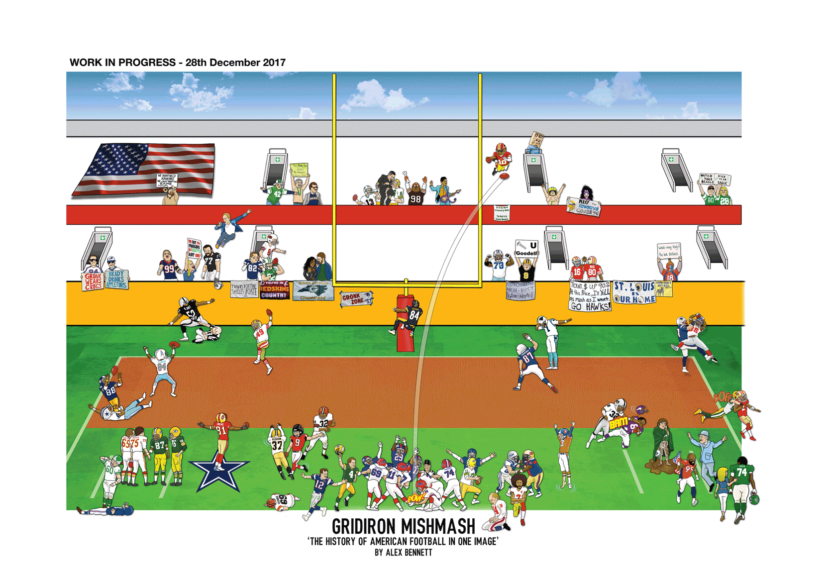
AB: It’s very tricky to describe how it works. I start off, obviously, with an empty canvas. I always ask people on the internet which scenes they’d like to see included, so you get a sense of how busy it’s going to be based on that. This new one has about 800 to 900 people in it. The soccer ones are probably about double that.
UW: You mentioned that the first soccer mishmash took you nearly 14 months to do. Have you gotten more efficient since then?
AB: Yes. This new one took about six months, and 1,300 hours. See, I do my paid work during the day, and then I work on the posters until about three in the morning every night. I try to do at least four scenes every night. If I keep up that pace, I can have a good sense of when I’ll finish it.
UW: What’s your typical working method? Obviously, a lot of these illustrations are based on photos, so do you scan in a photo and work from that, or what? Is any of the work done by hand, or is it all digital?
AB: It’s all hand-drawn. I haven’t really caught up with modern-day methods. I usually start with a photo, and then I have these little miniature mannequins and I’ll position them for the angle I’m trying to capture.
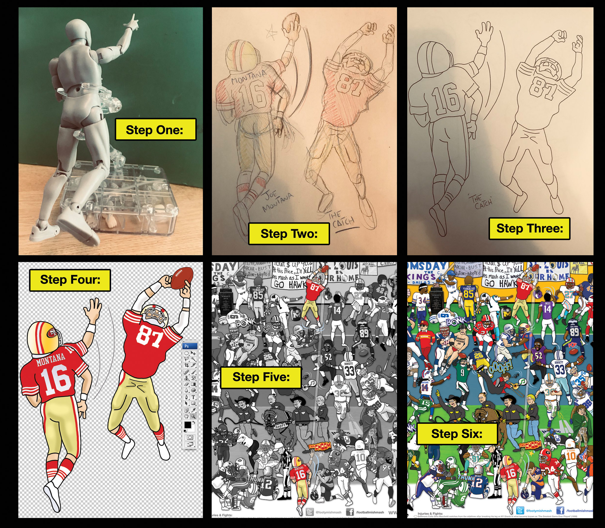
UW: So you have these little plastic figurines, and you pose them like they’re catching a football, or whatever?
AB: Yeah, exactly.
UW: I guess they look more like some body types than others. They don’t look much like the Fridge, for example.
AB: For people who are a bit on the chunkier side, I actually attach modeling clay to them. It makes them look a bit bulkier.
UW: So what happens after you do a sketch?
AB: I’ll ink the sketch, then I’ll scan it and take it into Photoshop and Illustrator to add the colors, the logos, and so on. Once that’s done and I’m happy with it, I’ll drag it into the main image. That’s when the real wild work starts — trying to find a place for each drawing.
UW: Is it hard to make everything fit, and do you often end up having to discard certain ideas or scenes as you go along, just because there’s no good spot for them?
AB: Yes, that is the problem. I try to put things where they really occurred on the field, but sometimes it isn’t possible. For “The Catch,” with Joe Montana and Dwight Clark, I put that right where they were on the field. But there’s other stuff that doesn’t make any sense. I’ve got guys celebrating touchdowns nowhere near the end zone, just because it fills a gap.
UW: The NFL will be celebrating its 100th anniversary next year, so you had a lot of history to potentially draw upon. Did you try to distribute the content evenly throughout the decades, or focus more on recent history, or what?
AB: I usually try to start at the beginning. So I’ve got the Canton Bulldogs, and then I move forward from there. But obviously there’s a lot more from the last few decades.
UW: Do you try to include as many teams as possible, so there’s something for everyone?
AB: I made sure to include every NFL team, definitely. And then for colleges — to be honest, I’m not sure I should have gone down that road, because there are so many schools. I could probably do a separate poster just for college football. I find the college game more interesting, honestly. There’s something about the crowds.
UW: Are there any cleverly hidden details or anything like that that you’re particularly pleased with?
AB: I always put my son in the picture. He’s nearly five years old now, and he’s been in all of them.
UW: Really! Where is he in the American football poster?
AB: I couldn’t even tell you, honestly. He’s in the crowd, somewhere. In the first poster, the soccer one, I showed myself taking him to his first game, when he was a baby. That was based on a photo that someone took. And after I included that in the first poster, I figured he may as well come on this journey with me.
UW: You’ve included scenes of some famous injuries, like Tim Krumrie’s and Joe Theismann’s broken legs, and Chuck Bednarik standing over Frank Gifford after delivering a big hit. Were you conflicted about including those?
AB: I think the key thing is that you don’t want to be disrespectful. So for Tim Krumrie, for example, I showed him slumped on the ground, just trying to capture the drama of the moment. Still, some people weren’t happy that I included that. But that’s what you’re going to get no matter what — some people will be unhappy with the choices you make, for various reasons.
UW: Did you consider even more gruesome injuries, like Jack Tatum’s hit that resulted in Darryl Stingley being paralyzed?
AB: Yeah, I didn’t want to include that. Not sure why I felt differently about that one — maybe because I’ve watched it so many times. It’s just so horrible, isn’t it? I don’t know. [Pauses.] You’ve got to draw a line somewhere, I suppose.
UW: Are there any issues regarding licensing? You’re basing most of your work on copyrighted photos, you’re showing various team uniforms — does that cause any problems?
AB: There’s no issue with the soccer clubs, because I work with them. But for this latest one for American football, I spoke with a guy from the NFL very early on. I basically wanted approval that what I was doing was OK, and he said to go for it. I was prepared to pay a fee or something like that, but it never materialized.
UW: The poster includes a legend, or captions, explaining all the moments that are included. It’s sort of like an answer key. Did you consider not including that, because it sort of spoils the fun of people figuring out each scene?
AB: You can’t win with something like that. Some people would prefer to have it and others wouldn’t. But I think I made the right decision to include it.
UW: I see that the captions refer to the “pitch,” rather than the field. Is that just for the UK version? Do you change it to “field” for American customers?
AB: I messed that up, actually. It’s so ingrained in the way we talk about sport, I just missed it. I should have thought of it, but I didn’t.
UW: What do you think about American football uniforms now that you’ve had to depict so many of them?
AB: I’ll be very happy to never draw a football helmet ever again. Each face mask is different, and you can’t really show the features of the players’ faces. With the European sports, you can show their faces.
———
Bennett is now working on a few more soccer club mishmashes, which will be followed by a hockey mishmash. His various posters are available here.
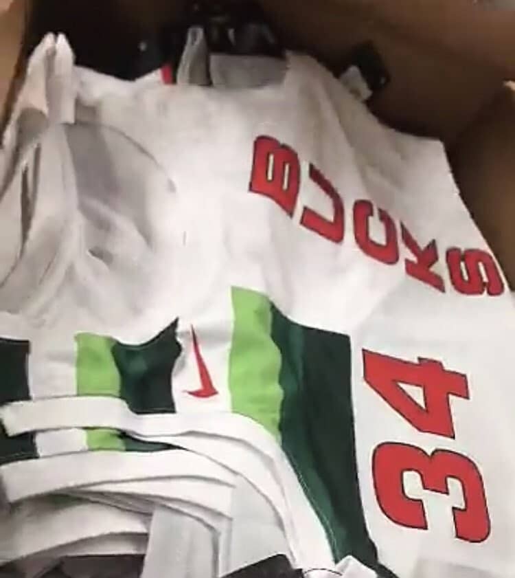
The latest NBA leak: A source indicates that this may be the Bucks’ new Earned uniform (aka the Participation Trophy uniform). On the other hand, LockerVision had previously indicated that that uniform would be grey, not white, so who knows. (Update: Upon closer inspection, the lower part of the jersey does appear to be grey, so there you go.)
I’ll say one thing for this latest round of NBA uniforms: They haven’t released them in time for the holiday shopping season, so at least we can’t say it’s all about retailing. Or maybe they’ve just had some production snafus and couldn’t get them done in time.
Click to enlarge
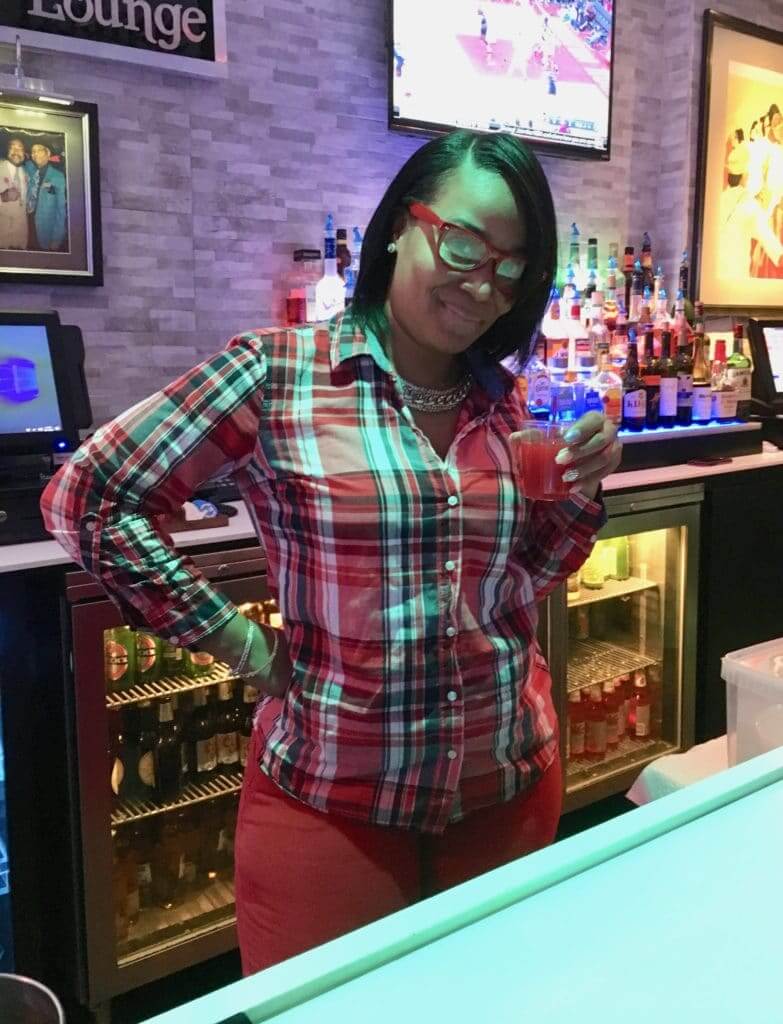
Welcome wagon: On the past four or five Tuesday evenings, the Tugboat Captain and I have walked about a half-hour to a bar where we are the only white people. One reason we’ve kept going back is that the bartender, whose name is Lily (or maybe Lilly, or Lili), made us feel welcome literally from the first moment we walked in the door — no small thing when you’re entering a place where you don’t necessarily belong, a place that other people call home. We’ve also made friends with some of the regulars, but Lily has been our ambassador, signaling to everyone that we’re okay.
Lily has a slight accent that suggests she’s from the Caribbean, or maybe Central America. (The bar’s owner is from Panama, so there might be a connection there.) She usually dresses very casually, but last night she wore red pants, a red plaid shirt, and red eyeglass frames, and even mixed herself a red drink! It was all so color-coordinated that I asked if she’d consent to a photo, which she readily did.
The guy next sitting two stools down from me said, “You’re lucky. She usually won’t let anyone photograph her.” He reached for his phone and turned to her: “Lily, how about a photo?” She laughed and walked away. I later learned that he’s the bar’s manager.

Click to enlarge
The new HQ, continued: I’ve never lived in a house or building that displayed Christmas lights. So it was a surprise to come home from the bar last night and discover that our landlord, Jeff, had given our house the full treatment. The Tugboat Captain, who had already lived here for eight or nine years before I moved in with her a few months ago, says Jeff has never done this before. Not sure what inspired him this time around, but it feels like yet another way in which the new digs have been a major upgrade. Ho-ho-ho!
The Ticker
By Lloyd Alaban

Baseball News: Lee Smith had a bit of a mishap when donning his Hall of Fame jersey yesterday. He buttoned his jersey incorrectly, leading to an awkward-looking photo-op (from Jeff Ash). … Here’s something you might not be aware of: Back in the late ’80s and ’90s, the Rangers had inconsistent batting helmet logos (from Chris Mycoskie). … Patrick Lavery owns a 1988 Starting Lineup figurine depicting OF Rickey Henderson during his days with the Yankees. Notice anything odd? Of course you do! Henderson’s figurine has an NOB, while actual Yankees jerseys do not. … The Las Vegas 51s, the Triple-A affiliate of the A’s, are now the Las Vegas Aviators (from Paul Szydelko).

NFL News: A bidder paid $36,150 for Chiefs QB Patrick Mahomes’s jersey from the epic MNF game that the Chiefs lost 54-51 to the Rams in LA. Proceeds from the sale are going to California Wild Fire Relief (from Mike Chamernik). … This Bengals promo photo features both old and new Nike templates (from Kristofer Terrell). … Josh Callahan has started a petition for the Buccaneers to bring back their creamsicle uniforms.
College Football News: Here’s how the Military Bowl patch will look on Virginia Tech’s uniforms (from Andrew Cosentino). … Top college recruit DB Chris Steele is in this photo that combines all five schools he’s considering a commitment to (from Jorge Cruz).

Hockey News: The NHL unveiled the logo for the 2019 draft, which will be held in Vancouver in June (from several readers). … A dwarfism advocacy group is pushing for Alberta hockey teams to remove the word “midget” from age categorizations and league names (from Mike Styczen). … Arizona State has new black sweaters and gold sticks.

Basketball News: What’s even better than the Bucks’ original mascot logo? Seeing that logo rendered in chain-stitching (from @BeautyOfAGame). … The Harlem Wizards have new uniforms, and they were designed by reader Brian Begley! … The Windy City Bulls will be wearing canine-themed jerseys for Dog Night on Friday. Proceeds from the jersey auction will be donated to Anderson Animal Shelter of Elgin (from Steve Johnson). … Fun fact: Back in the early 1950s, LSU had sleeved jerseys.

College Hoops News: Georgia Tech men’s will wear “Ramblin’ Wreck” jerseys against Georgia on Dec. 22 (from @sonnylax). … Former Louisville coach C.V. “Red” Money, who coached the team in the 1930s, once pulled his team from the court to protest the officiating, resulting in a 2-0 forfeit. Among his complaints were that the opposing team changed jerseys at halftime and used lots of uni numbers ending in 6 (from Jason Collins).

Soccer News: Tottenham Hotspur of the Premier League have released a retro shirt based on the yellow shirts they wore from 1988-91 (from Richard, who didn’t give his last name). … VfB Stuttgart have released a 125th-anniversary kit to be worn on Dec. 22 (from Gabriel Hurl). … The Indy Eleven of the USL have a new kit (from Josh Hinton). … Atlanta United won the MLS Cup on Saturday. On Monday, a few players brought the trophy to a prominent Atlanta strip club to celebrate (from @rbchoopmas).

Grab Bag: The National Lacrosse League announced an expansion franchise on Long Island that will begin play in 2019-20. You can help choose the team’s name here (from multiple readers). … If you were placing holiday decorations on the big sign at the entrance to the Holland Tunnel, where would you position each decorative item? It’s trickier than you might think (from multiple readers). … An artist who calls himself Tommervik has a vaguely Cubist painting style and has applied it to subect matter that includes baseball, basketball, tennis, boxing, and other sports. You can browse his full collection here.
I should’ve known I would see Georgia Tech have a uniform that was devoid of navy and had only Tech Gold and white, which are its only 2 official colors. I can’t wait to see how it looks in game action.
I wanted to bring back the new Phillies primary logo
does it bother anyone that the P encroaches on the h now? It bothers me.
link
Not exactly a new thing:
link
huh…so the logo was updated to match what is on the jersey. I had forgotten that it looked that way on the jersey…
Really dislike the new Phillies logo. It feel incredibly incomplete, and like change for the sake of change. The last logo was great and didn’t need to replaced. And if you were going to replace it it should have been with some entirely different, not a partial version of the existing logo.
The new Liberty Bell silhouette seems to match up better with the one at the ballpark:
link
Maybe it was tweaked for standardization purposes(as well as retail considerations)?
Could still keep the revised logo inside the baseball diamond. Just looks like a very unfinished design. I wondering who saw this and thought, “Yes, this is way better than our existing logo, make the switch.”
I wonder if someone wound casually say that a black person who was the only patron in a bar who wasn’t white “didn’t necessarily belong” there.
At some point we have to get past looking at the the color of people’s skin. Jeepers, Paul, this isn’t 1963 any more. Most of us have moved on.
As an African-American and avid uni-watcher it made me sad to read the line “signaling to everyone that we’re okay.”
Most places I shop, eat and travel to i find myself in the extreme minority and never felt anyone had to “signal” to anyone that I was “okay”.
I don’t believe your intent was to offend based on the body of work you have produced over the years but my lord, I still can’t believe I read that this morning.
We shall overcome, indeed.
Bars are not the same as other businesses. They are often insular social spaces — more akin to private clubs than public businesses — with unspoken codes and rituals. There are regulars, and there are outsiders. I’ve been in many bars where I “don’t belong” (not always for reasons of race) where my presence could have caused tension, but where a friendly regular essentially served as my sponsor or ambassador.
There’s also a big difference between being the only black person in a space and being the only white person in a space, especially in a city where gentrification is a huge issue.
Ultimately, though, this is not about race. It’s about being respectful of other people’s space and understanding that you’re a guest, an outsider.
Paul, if you have been there weekly for the past 4 to 5 weeks and making friends, you would be more of a regular now than an outsider.
Oh, for sure — we’re now on our way to being regulars. Or at least frequent guests. ;)
I always find it interesting when attractive, put-together people hate having their picture taken. It’s amazing how powerful our self images are…
What you said was the true way it is. We can all hope for something else, but reality is real. Thanks for putting your thoughts out there and thanks for opening new doors. We all need that.
While I realize that Paul was trying to pay an earnest compliment to the bar’s manager, if the establishment is open to the public, then it is their obligation to make sure that patrons all feel welcome and are treated well. You aren’t an “outsider”, you’re a customer.
In other words, you have a right to be there and a right to expect to be treated decently by both the establishment itself and the other customers. If they object to having an “outsider” in their midst, then they need to find a new place to drink, not you.
I’m sure there are plenty of people in biker bars (among lots of other places) who will be eager to discuss that with you, Dan. Please let us know how it goes when you tell them that they’re the ones who need to find a new place to drink. ;)
Got to back Paul on this. Some bars are wide open to whomever. They are the usually large and expensive ones. The local bar that is small and has a regular crowd can be quite its own culture. As Paul mentioned, biker bars for one example. In my home city, I know of a few that are mixed race, mixed gender, etc, but you had better be invited in by a regular or you won’t feel comfortable. One my dad used to go to and I went in on my own one night without anyone knowing who I was. Was wondering if I would get out in one piece until the bartender carded me, saw my name (I’m a Junior) and asked if that was my dad. Once I said yes, it was like the ice melted straightaway because I was my dad’s son and a legacy I guess. So Paul is correct. This isn’t about race or anything as much as it is about a neighborhood type bar with a culture to it. They are all over. Some will welcome you right off and some not so much until they get a read on you.
Well, one thing that’s interesting about North Carolina, and I’m guessing other states in the south, is that there technically is no such thing as a “bar” in the sense that exist in a place like NYC.
Any establishment that serves liquor-by-the-drink here is either a restaurant (and legally required to have a certain percentage of its revenue come from food sales) or a private club (legally required to have patrons fill out membership applications and pay dues).
So I doubt I’d ever have any reason to attempt to join a club that catered to “bikers”, but there is a Harley-Davidson themed restaurant near me that I’d expect to be treated just like any other customer.
Well, one thing that’s interesting about North Carolina, and I’m guessing other states in the south, is that there technically is no such thing as a “bar” in the sense that exist in a place like NYC.
With due respect, Dan, maybe that means you’re not really the right person to weigh in on this one.
(For what it’s worth, I’ve been in plenty of conventional taverns in Georgia, Alabama, Mississippi, Kentucky, Louisiana, and several other Southern states.)
What I wrote about North Carolina is factually correct, but I didn’t mean to imply that every other state in the south has the exact same setup.
link
I guess we can agree to disagree in the sense that I think if I go to a restaurant or other public accommodation I should not have to deal with being harassed or intimidated by other customers who feel some sort of entitlement to decide who can be at “their” place. And if I’m the lone white guy at a “black” establishment (which I have been since I love soul food), then I will still expect to be treated by the staff as a valued customer (which I’ve always found to be the case).
I do understand that NYC and Charlotte are different worlds with different cultural values, so our views can understandably differ.
As I’ve already indicated, bars are a different animal. Not the same as a restaurant, not the same as a store. Different scene, different culture, different protocols. Not saying whether that’s a good thing or a bad thing; just saying it’s a fact, because it is.
Sorry Paul, but you’re wrong here. If you had gone to the bar that you described above and had the manager ask you to leave because they don’t serve white people, your civil rights would have been violated. Legally, bars along with retail stores and restaurants are “public accommodations” and thus are subject to the laws that address how to deal with the public.
If an institution wants to keep its membership exclusive, then it should be a private club. But if it’s not a private club, then the other customers don’t have the right to harass and intimidate “outsiders”. Maybe as you say this is the culture at some places, but that doesn’t make it right.
Dan, you’re way out of bounds here. None of this is about being asked to leave or not being served. In fact, the only person who has said anything about anyone having to leave is *you,* when you said people who didn’t have the proper welcoming attitude need to find a new place to drink.
I never said or even suggested that anyone would literally turn me away. I said it’s about attitude, tone, respect, social protocols, etc., not about legalities.
You yourself have admitted that you don’t know what you’re talking about here because neighborhood bars don’t exist where you live. You would have been wise to leave it at that. You could also have written to me privately, as we’ve done in some previous discussions. Instead, you’re making a fool of yourself by carrying on about something you don’t understand.
In a previous comment I went out of my way to include “due respect.” You have now squandered that respect. Time for you to back off on this one.
It sounds like a black person(s) were nice to Paul & Mary & he just wanted to let us know.
very embarrassing today
So much to take in on that Gridiron Mismatch, like a Where’s Waldo for football fans. And great Christmas outfit by the bartender!
Great lede and interview today!
NLL expansion team on Long Island needs to consider bringing back their old NLL team name – New York Saints.
The Rangers helmet logo issue stemmed more from Rawlings getting into the helmet manufacturing game. They got a few teams to wear them, the Twins and A’s for sure. The helmet had a markedly different shape – the ear flap was flat (unlike the original ABC Helmets, with a more conical contour), and the brim was notably shorter. I think the Twins adopted them team-wide, so the logos all looked the same. Ditto the A’s. But if you look at the profile of the helmets with the larger T, they’re definitely Rawlings helmets. That said, I never noticed the differing logo size.
Great info — never knew that!
“ommervik has a vaguely Cubist painting style ….”
here is an odd sports one:
link
I like all the posters (especially the THFC one). Good interview.
Any further specifics on the hockey poster?
Alex says the hockey one is now on hold while he’s working on a few more soccer posters, but it’ll get there eventually. I’ll update the text accordingly.
The work done by the artist on the gridiron mishmash is tremendous. But every time I see it, I come away disappointed that there is no representation of the USFL (or, to a lesser degree, the WFL).
After years of following your site, Paul, I think it’s safe to say that many of the regular readers here had their interest in all things uniform fully piqued when the USFL came around. Speaking as a late 40-something fella, that league really did it for me as an impressionable kid in junior high back in the early ’80s.
I think future installments of the artist’s montage would benefit from having some USFL flavor injected into the mix.
Go Philly Stars!
-C.
The WFL—at least the latter day version—is represented. Two players blocking each other right below Dwight Clark. Looks like London Monarchs (maybe the Fridge) and Scottish Claymores.
That was the WLAF, not the WFL.
The only significant image I can think of to represent the USFL’s contribution to football history would be the $3.76 check.
I bought that same drawing figure a month ago… has great possibilities, but haven’t used it yet. I wanted it to help me with super strange angles for my football drawings, straight down shots, or ground view looking up, that you just can’t find in football photos.
I love that the captain’s patch on the Arizona State hockey jersey is in the shape of the state of Arizona.
I have the same Rickey Henderson Starting Lineup. Besides the NOB, it always bothered me that he was sliding feet first.
While the SL figures were great in that they were an option where there was none previously, they were terribly inaccurate early on.
It appears he may have slid feet first on a few link, but you’re right, he almost always slid head first.
I had the Ryne Sandberg figure, and not only did they include a NOB where there shouldn’t have been one, but they omitted the pinstripes from the Cubs’ uniform.
I always found the naming mechanisms for youth hockey totally bizarre, even when I was actually playing youth hockey. It seemed so strange to me that seemingly everyone everywhere agreed to those names.
For the unaware, the league I was in (and I think almost all leagues followed this) went like this, from youngest to oldest: Atoms, Squirts, Pee-Wees, Bantams, Midgets.
How in the world did that become standardized?
Bit different from when and where I played youth hockey (in Saskatchewan). Was Novice, Atom, Pee Wee, Bantam, Midget.
In the US we use (or used, when I played) Mite, Squirt, Peewee, Bantam, Midget. Funnily, I associated Midget with “huge” because just about anybody who played Midget hockey looked like a giant to kids in all the rungs below.
Of course, if you are an elite player, you can skip Midget altogether. Great 16 year old players make the jump from Tier 1 Bantam to Major Junior every year.
My absolute favorite thing about the mishmash on top is the inclusion of the Browns’ GPODAWUND poster. Awesome.
Note for the Indy Eleven kit—they will carry over the 2018 away kit (linked below) for the upcoming season.
link
Hey Paul, you can see the full Bucks “earned” jersey, as well as a bunch of others that may have not leaked yet here:
link
Yes, they’ve all been released over the past hour or so.
It seems like this was the classic idea of Nike wanting quantity over quality. Some of the designs are just so boring and the corporate-speak is even worse. Like come on, I could have designed half of the jerseys by myself. Cleveland’s explanation is insane. “The Cavaliers celebrate their location on the banks of Lake Erie with their Nike NBA Earned Edition uniform. The color palette nods to the icy weather that Cleveland fans brave to support their Cavs throughout winter.” Who designs a jersey to celebrate a lake and the weather? By that definition, shouldn’t Detroit, Chicago, and Toronto all get similar uniforms for being located near a Great Lake and having cold weather?
However; Miami, Washington, Toronto, Golden State, Utah, Philly, and Indiana all got uniforms that are upgrades over current uniforms.
Note for the Indy Eleven kit—the club will carry over their 2018 away kit (linked below) for the upcoming season.
link
Sort of an undersell of the new team name for the Las Vegas Aviators.
link
New PDC with the A’s, New Stadium in downtown Summerlin to be completed in the spring (to include time lapse construction cam!)
And in true corporate speak…
According to Weinreb, the name change pays homage to the company’s namesake, Howard R. Hughes, Jr., one of the twentieth century’s most successful businessmen whose passion for aviation and legacy of innovation includes significant aviation-related firsts and accomplishments. In the H-1 Racer, a plane he designed and built, Hughes set the land speed record of 352 miles per hour in 1935. Hughes went on to set other records, including the fastest coast-to-coast flight in 1937 and the fastest circumnavigation of the globe in 1938, then acquiring and successfully operating major airlines and aviation companies.