There’s a Uni Watch reader out there who does some uni-related work at the Bulls’ and Blackhawks’ arena in Chicago. He prefers to remain anonymous, so let’s call him Deep Dish — a reference to Watergate-era anonymous source Deep Throat and Chicago’s famous deep-dish pizza.
Deep Dish recently shared a bunch of uni-related info with me that I think you’ll find very interesting. One thing at a time:
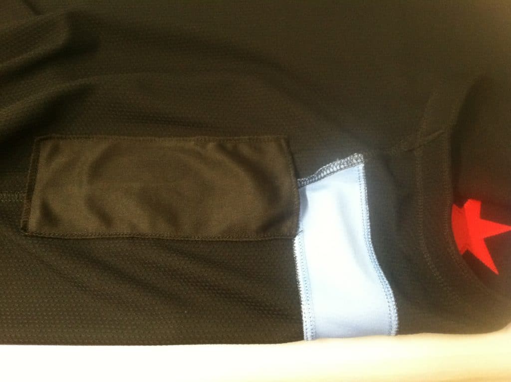
1. “I was tasked with lettering the City Edition jersey for the Bulls’ mascot, Benny,” says Deep Dish. “I noticed an extra piece of fabric added to the inside under the left arm. After turning it inside out, it seems to be a pocket — too small for a phone, but about right for perhaps two Sharpie markers for autographs or something. Isn’t that neat?” Indeed!
2. “Occasionally, the Blackhawks have a nice tribute to a former player, called ‘One More Shift,'” says Deep Dish. He continues:
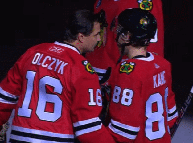
Basically the guy suits up and skates around the rink once while everybody applauds, and then they do a ceremonial puck drop and it’s over. A couple weeks ago, on a cancer awareness night, they honored cancer survivor Eddie Olczyk, and I ended up lettering the sweater for him.
For many years the team has always ordered its sweaters blank from the manufacturer — no numbers or NOBs —— and sent all the lettering orders to a small shop in the city’s southwest suburbs. But for Eddie’s sweater, they couldn’t get it there in time, so they asked me to heat-press it. That’s what I always do for customers, but it’s a far less professional and lower-quality presentation. And here’s a wrinkle: Here at United Center we’re in a weird limbo of changing suppliers, so I can’t always make everything a perfect match. It’s unfortunate and I feel terrible about it, but the 1s on Eddie’s sleeve had a prominent thick black border (this is correct, as they came from the little shop I mentioned), but the 6s had an incorrect thin border that’s barely visible.
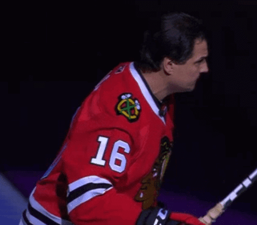
Also, the NOB letters had the twill going in different directions, so they reflected the light differently. The ‘O’ seemed to be brighter, for example.
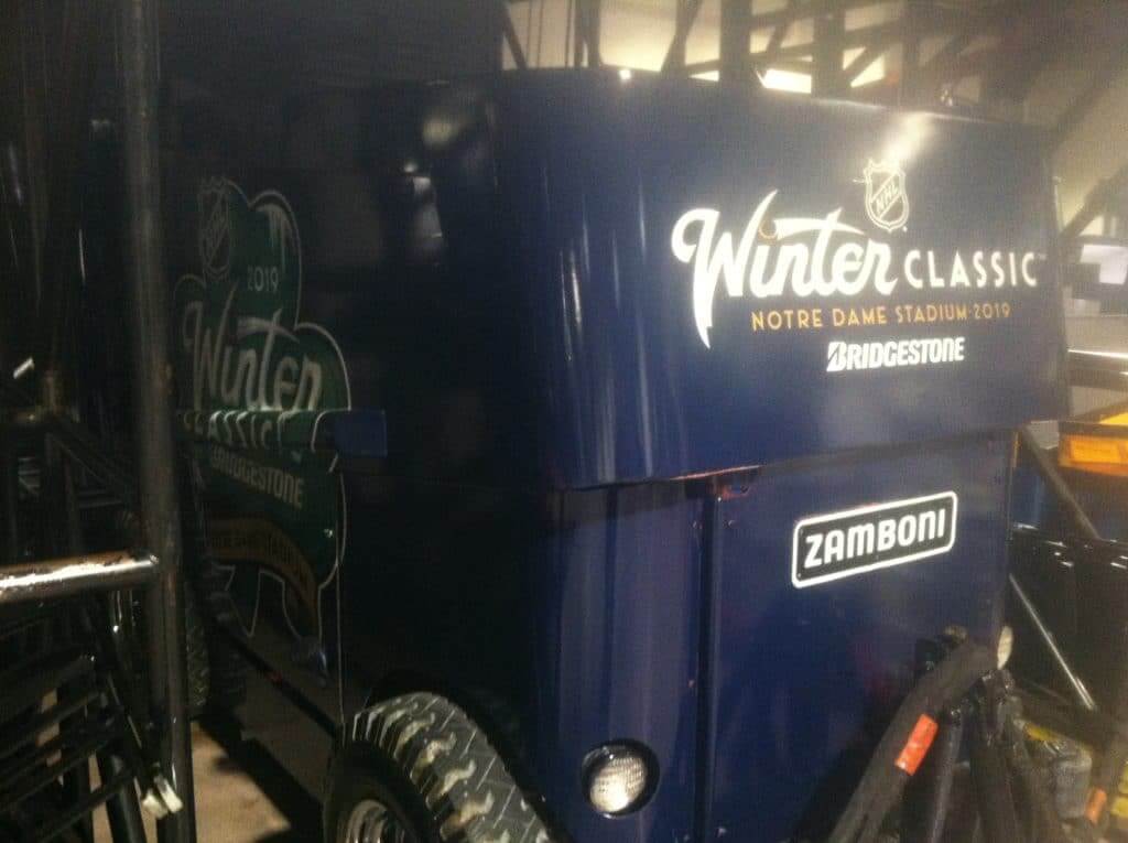
3. “A Winter Classic Zamboni has been lurking around the loading dock area here,” says Deep Dish. “In the photo it looks like it’s tucked away or hidden, but it’s really out there for many employees to walk by every day, so it must not be a great secret.”
4. “I know you don’t care so much about retail merchandise, but here’s piece of news that shows how the retail world can give indicators for upcoming changes,” says Deep Dish. He continues:
We are completely sold out of red Blackhawks replica jerseys in size large. This is probably the best-selling size/color/style jersey sold here, so it would make sense to order more, but the buyers aren’t ordering any more. When I asked why, the response was something about the collar being set to change. It stands to reason that this will be a significant enough change that they’re trying really hard to avoid having a bunch of “old” ones lying around after the new ones become a thing.
Of course this is mostly unsubstantiated, as I’ve seen nothing regarding new designs or anything, but I’m taking it as strong evidence for a new sweater tweak next season.
Let’s hope all the NHL teams are tweaking their collars, because most of those Adidas collars are brutal.
Anyway: Lots of fun good info there. Thanks, Deep Dish!
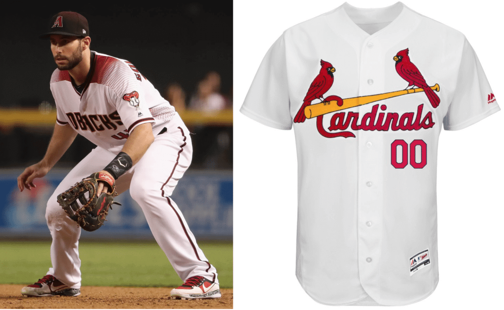
From the outhouse to the penthouse: Slugger Paul Goldschmidt got a major upgrade to his wardrobe yesterday, as the Diamondbacks traded him to the Cardinals. In uniform terms, that’s like going from a perennial cellar dweller to a championship dynasty.
What would the equivalents be in the other Big Four leagues? One observer’s opinion:
• NFL: Going from the Bucs to the Packers.
• NBA: From the Hawks to the Warriors (although you could argue that the Pacers and Thunder are really the best-looking NBA teams, because they’re still ad-free).
• NHL: From the Avs to the Habs.
Meanwhile, let’s have a moment of silence for Luke Weaver, Carson Kelly, and Andy Young — the three players who are going from the Cards to the D-backs in exchange for Goldschmidt. They have Uni Watch’s deepest sympathies.
Does Jim Bouton know about this? One of the designs featured in my Seattle/NHL design contest results — Dave Sizer’s Seattle Pilots concept — was featured for several minutes on a Boston sports talk radio show yesterday (see above). Pretty funny to see one of our contest designs get that much attention. Enjoy the clip, and please join me in congratulating Dave.
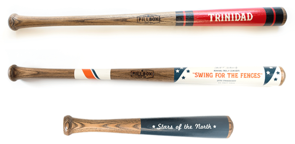
ITEM! Holiday discount: One of our longtime advertisers, the Pillbox Bat Co., which offers a cool line of custom-painted baseball bats, is currently offering a holiday discount. Use the checkout code uniwatch to get 20% off your order.
My thanks, as always, for considering our advertisers for your shopping needs.
The Ticker
By Lloyd Alaban

Baseball News: The York Revolution of the Atlantic League of Professional Baseball revealed their new alternate uniforms (from Paul Braverman). … The Gwinnett Stripers, the Triple-A affiliate of the Braves, are offering personalized smartphone wallpapers of their jerseys, complete with a number and NOB. Sounds like a familiar concept (from @freehawk). … Texas A&M’s grounds crew placed a large “41” in their outfield to honor the late President George H.W. Bush (from James Gilbert). … Wichita, Kansas, is getting a new Triple-A team in 2020. According to that article, once the team’s name is chosen, the logo will be designed by Todd Radom (from Trent Guyer).

Football News: Grainy picture, but it looks like RB Charcandrick West will be wearing No. 30 for his second stint with the Chiefs. He previously wore No. 35 (from @DrSoup_MD). … Titans QB Marcus Mariota will be wearing cleats to benefit the ALS Therapy Development Institute for tonight’s game against the Jaguars (from @jill777). … The new XFL, slated to begin play in early 2020, announced its eight cities and stadiums.
College Football News: Here’s how the Alamo Bowl patch looks on Iowa State’s jersey (from Sean Jankowski). … Here is the never-released Life cover featuring then-Navy QB Roger Staubach. The issue was never released due to the assassination of JFK (from All American Sports House). … Here’s the “participation pot” Utah State received ahead of their New Mexico Bowl matchup against North Texas (from @akaggie).

Hockey News: The Fayetteville Marksmen of the SPHL will wear these sweaters for Ugly Sweater Night on Saturday. … A Mesa, Ariz., barbershop is poaching the Kings’ logo (from Adam Vitcavage). … The Fairbanks Ice Dogs wore holiday-themed uniforms over the weekend. Here’s a closer look at the design (from Sue Valdrow, writing from “North Pole, Alaska,” which is a real town).

NBA News: The Northern Arizona Suns, the Suns’ D League affiliate, will become the Northern Arizona Rodeo Clowns for one game (from Brett Swartz). … The Blazers converted their pinwheel logo into a menorah to celebrate Hanukkah (from Casey Lute). … New Pelican SG Andrew Harrison will wear No. 1 with his new club (from Etienne Catalan). … Speaking of the Pelicans, down toward the bottom of this article is the news that F Julius Randle has been playing with more energy since he began wearing a headband a few days ago (from Rob Walker).

College and High School Hoops News: Ohio State didn’t expect SG Luther Muhammad to play last night against Illinois due to injury, so they didn’t bring his No. 1 jersey with them for last night’s game. However, team doctors cleared him, so the Buckeyes had to issue him a NNOB No. 12 jersey (from Erik Spoonmore). … Wyoming has released a teaser of their new alternate jerseys (from our own Phil Hecken). … Virginia Tech and VMI went grey vs. black last night (from Andrew Cosentino). … Nebraska wore warmup shirts that read “RIP TAYRA” to honor the mother of Minnesota G Dupree McBrayer, who passed away this week (from Steve Rausch). NC State named their basketball venue “James T. Valvano Arena” last night in honor of former head coach Jim Valvano, who led the men’s program to a 1983 national championship (from James Gilbert). … Missouri State is still wearing the sleeved Adidas jerseys that were in vogue a few years back (from Alex Pacheco).

Soccer News: Liverpool went grey/grey/red yesterday against Burnley (from Josh Billman). … Part of Tottenham Hotspur’s third shirt for next season has leaked (from Josh Hinton). … Also from Josh: Hartford, Conn., was set to get a USL expansion club for 2019, but stadium issues have plagued this to the point where the club may not happen, and almost certainly not for the upcoming 2019 season. The club had yet to release any details about the name (the colors were expected to be blue and green, à la the Hartford Whalers). However, this letter leaks the club name — Hartford City SC. … A Swindon Town supporter who has attended 2,000 consecutive matches since 1981 received a commemorative shirt from the club. He also has a collection of every program from every match since his streak started (from multiple readers). … Here are the new shirts of Lowcountry United, a team from the amateur United Premiere Soccer League (from @footballkitbox). … Wembley Stadium’s arch was lit up in rainbow colors on Tuesday in support of England and Scotland’s LGBT Rainbow Laces campaign (from our own Jamie Rathjen). … Target logo creep has made it to the hoodies of these Minnesota United players (from FK Yajj). … The Japanese J-League has asked its fans to donate old replica jerseys to be given to children in other countries to play sports. Since 2011, they have given over 5,000 to children in Asia, Oceania and Europe (from Jeremy Brahm).

Grab Bag: Here’s how NC State athletes in various sports got to choose their jersey numbers (from @ACC_Tracker). … The South Africa men’s rugby 7s team will wear these shirts in honor of the centennial of Nelson Mandela’s birth (from Jay Blake). … The International Association of Athletic Federations (IAAF) will now allow national track teams to display the logo of a sponsor advertiser on their kits at the IAAF World Championships (from Anthony Gonsalves). … Google Maps now displays brand logos on some businesses. Said Chris Mattox: “Now I can’t browse Maps without seeing their crap.” … Check out Chris Kennedy’s collection of sports legends Christmas tree ornaments! … Here’s how Pantone chose “living coral” to be the 2019 “Color of the Year” (NYT link). … Charles Harrison, an industrial designer who designed hundreds of consumer products, including the View-Master, has died (NYT link) (from Tom Turner).
Click to enlarge

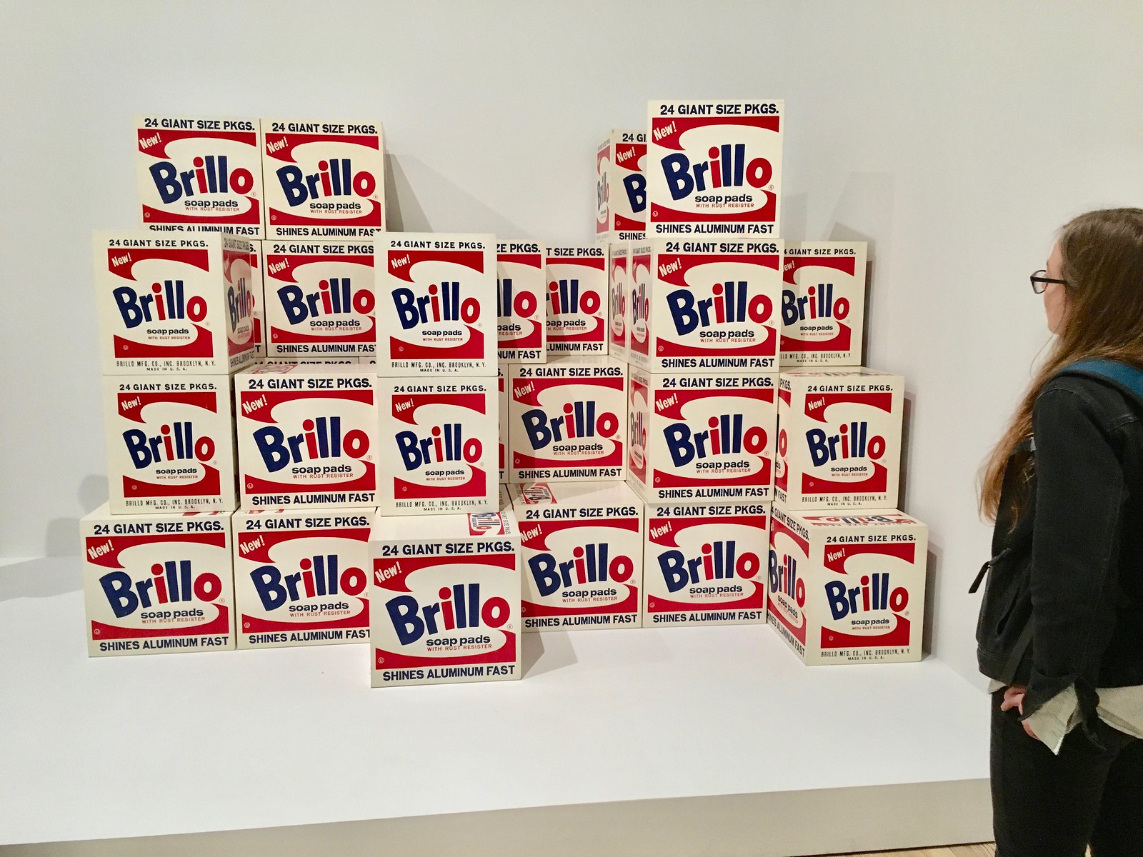
What Paul did last night four days ago: On Sunday the Tugboat Captain and I went to see the new Andy Warhol retrospective exhibit at the Whitney. I’ve seen a decent amount of Warhol’s work before, but never this much of it in one place. It was a lot to take in, and I’m still processing what I think of it.
Even if you don’t care about Warhol, or about modern art in general, his work touches up on issues that come up pretty regularly here on Uni Watch. Por ejemplo:
1. Warhol appreciated and championed graphic design. Sure, his famous appropriations of Brillo boxes, Campbell’s Soup cans, and Coke bottles were commentaries the state of various things (consumerism, capitalism, modern art, etc.), but they were also arguments for the value and beauty of graphic design, which up to that point had been treated as a poor stepchild of fine art. All contemporary graphic designers owe him a debt of gratitude.
2. All art is collectible, of course. But Warhol, with his tendency toward repetition and seriality, generated a real “Collect ’em all” feel with his work.
3. Warhol helped to create the concept of the celebrity-as-brand (a category in which he clearly included himself). Many of his subjects in this realm were pretty obvious — Elvis, Marilyn, Brando, Jackie O., etc. — but he also riffed on such unlikely figures as Mao Zedong, and even his anointing of various hangers-on at his studio (many of them talentless nobodies) as “superstars” speaks to his obsession with celebrity culture. I can’t say I’m nuts about this aspect of his legacy, but I can’t deny its influence. Every time we see an athlete with his own personal logo or even his own signature sneaker, that derives in part from Warhol.
My mom, who was an art major in college in the 1940s and might have had an art career, or at least a bohemian life, if she hadn’t instead met my father and moved to the suburbs, has always hated Warhol. She holds him responsible for what she calls “the death of aesthetics.” That’s because she thinks the function of art is to be beautiful, while I think the function of art is to make people think (although those two goals aren’t mutually exclusive, obviously).
Personally, I love Warhol’s work (Mom and I often disagree about art), but here’s a confession: If I had been around when Warhol came on the scene in the late 1950s and early ’60s, I think I might have hated him too, or at least dismissed him. I would probably have viewed his work strictly as an example of creeping consumerism and the plasticity of American culture, rather than as a commentary on those tropes. Even now, I wonder how much of my affection for Warhol is due to his connection to the Velvet Underground, the band he took under his wing and featured in his performance productions in the 1960s while also designing their first LP cover. (He also dressed them up in black clothing and sunglasses — a uniform!) Like many geeky male teens who were more into music than visual art, I had my first real exposure to Warhol via the Velvets, and it made him instantly cool to me, so I learned more about him, sought out some of his art, and so on. Without the Velvets connection, would I have embraced his work as readily as I did? I wonder.
Anyway: I really liked the exhibit, which included drawings, paintings, sculpture, and more. I took way too many photos and don’t have time to annotate them, but you can see a few dozen of them here. Enjoy — and if you’re in the NYC area, see the show while you can. It’s great!
Virginia Tech, not UVA.
Fixed.
I really like the York Revolution jerseys. don’t know about he word “REVS” but aesthetically it looks good.
Revs has been a shortened nickname for the club since the started.
Yes please please change those awful NHL collars!
I had read in another uni focused forum a few weeks ago that Chicago was changing their collars next season. Not sure if this is league wide or team specific. There have been an unusual number of sales on jerseys just released last season, so likely a league wide adjustment.
Those collars need to change. The off color neck spot make it look like they are wearing old school girls clothes.
Not only does Goldschmidt get upgraded to a better jersey, if he keeps #44, the #44 font will also be an upgrade (the closed 4 instead of the #44 that looks like two upside down h letters).
I really don’t understand how a whole group of people who made the decision thought that those D-Back jerseys look good. The whole lot of them are the worst set an MLB team has ever worn. Maybe that is what they were going for.
Well, Goldschmidt is probably upset about having to wear such traditional garb in St. Louis. When Arizona unveiled the uniforms, he said about them “It’s definitely exciting. They’re different, but I think it’s cool to be a part of something new and different and be the first team to kind of step out of the box.”
Yes, I’m sure Goldschmidt said that in complete 100% sincerity and not even a little bit because he was being a good company man.
Great stuff from Deep Dish, especially about the collar redesign.
Big shout out to Dave Sizer! That’s cool they talked about his great design that long.
Ah, must have had some interesting debates with your mom on the value of art as aesthetically pleasing vs thought provoking. By beautiful is she referring to art where the there is obviously tremendous skill in physical act of creating (say a portrait) in addition to the creative aspect in the mind, as opposed to more modern forms of art where there is less emphasis in accurately recreating people, landscapes, etc, and more on interpreting the image?
Mom’s fine with abstraction, as long it’s beautiful.
as an exceptionally smart fellow said a while back “docere et delectare”, to instruct and to delight
“something about the collar being set to change”
This is the only good news Blackhawks fans have had this season!
J-League is soccer for the donated uniforms. Didn’t have space in the tweet to mention soccer.
Fixed!
Might need to move it one more level. It is hoops now.
NOW fixed.
Interesting that of the two new upstart football leagues, the AAF has only two of its eight teams playing in current NFL cities (Phoenix and Atlanta), while the XFL has all but one of its eight teams in a current NFL city, and many of them are playing in the same stadium as the NFL team. The one exception is St. Louis, which had an NFL team until fairly f recently.
Wichita Wings – used by a MISL team and IIRC for a while by a previous AAA baseball team – is a great team name. Flying Monkeys would also work as a double entendre between the aerospace industry and Wizard of Oz
The Warhol art item suggests a possible UW post: Greatest sports artists. Who’d be in that group? LeRoy Neiman? Dave Boss? Willard Mullin? Bruce Bomberger? Graig Kreindler?
Don’t forget Dan Duffy!
link
I am partial to Otis Shepard.
Ooooh, yes — Otis for the win.
Agree, along with Robert Riger. . .
(Longtime reader, first-time commenter)
I’m a fan of horse racing art so I would include Edgar Degas and George Stubbs. I also have a soft spot for cartoonist Pierre “Peb” Bellocq whose work was featured in the Daily Racing Form, my periodical of choice during a misspent youth at Aqueduct.
“Now I can’t browse Maps without seeing their crap.”
True, but I recall reading that symbols such as logos or pictures might be slightly easier to comprehend than words. For a quick look at a map screen, that might be helpful.
That Life cover was too much. Negros demands?
It’s sad that even today, when a class of people simply want to be treated fairly, it’s looked on as they are making “demands”.
I’d be interested in reading that article though!
Lee
As a biased Avs fan, I reject the “Avs to Habs” statement haha. I think the Avs unis this year are very solid! (If they were still using the Reebok template, then absolutely. Those were terrible.)
For the Blazers link, is there an actual picture of their pinwheel menorah? Just text in a tweet? Thanks.
For the Blazers link, is there an actual picture of their pinwheel menorah? Just text in a tweet? Thanks.
link
In continuing with the uni-finds as it relates to President George H.W. Bush…..video of him playing in an old-timer’s game in Denver when he was VP…..love the Bears uni
link
The IAAF ads are particularly infuriating because athletes who depend on sponsors to reach that level of competition can’t advertise for their sponsors while the national teams can now force them to do so for potentially competitive products (you could argue they’ve been doing this for years with the manufacturers like Nike, Adidas, etc.)
Ohio State did not travel to Champaign. They played Illinois at the United Center in Chicago.
Fixed.
“cancer survivor Eddie Olcyk”
Missing a z in there…. Olczyk.
Got it.
The Hartford USL team already has a name, colors, head coach and badge. link
The updated stadium site’s sod was just laid down for the first time:
link
Is the team really in jeopardy?
Badge, etc was released this morning. Name is wrong, that’s my fault, but it’s very interesting that the letter dubbed the team “Hartford City”.
Team is indeed in jeopardy because they likely won’t have a stadium to play in, because Dillon looks set to be built but won’t have Hartford Athletic as the tenant because of unethical financial stuff.
Hartford City FC is the team that got pushed out of Dillon Stadium – believe they were looking to renovate it before the USL franchise. They play in the NPSL.
There’s an article in today’s Hartford Courant that talks about the plans the team has to kick off in spring 2019. Plus the website for the team has set ticket prices. No mention of the possibility the team may not play next season. There were some ‘surprises’ when it came to the renovation, but supposedly these have been addressed.
Link to the article: link
I pass Dillon every day on my way to work. It’s pretty impressive how much work they’ve done in a short time. It’s an odd place for a stadium; but the City already owns the land and there’s no zoning issues.
Best guess if worse came to worst – as it did with the Yard Goats In 2016 – they’d find an alternate site to play, like New Britain Stadium, or – how ironic would this be – Dunkin Field.
I believe the plan is that if dillion is not completed is to play at Uconn football stadium in East hartford.
I saw surprised to see the Hartford Athletic badge unveiling announced by the USL as I scrolled through Facebook immediately after reading today’s ticker.
I’m glad to see that the report of the team’s demise were greatly exaggerated!
*was
Paul, regarding Deep Dish, would you say he is an anomaly or does the uni watch readership (that you are aware of) include people in many sports organizations throughout the country?
And on that note, are you willing to (or have you in the past) share info on the size and demographics of your daily readership (to the degree that you know it)? I’ve had a few people say something when seeing my uniwatch cap, just curious of the odds of running into a fellow reader.
There are definitely people involved in the industry who read the site. Not sure if we’re talking about dozens or hundreds. Definitely not thousands.
According to Google Analytics, we had 134,000 unique readers over the past 30 days.
The Sharks wore white at home last night against the Hurricanes. The team said it was because the Hurricanes “asked to wear red,” and the Sharks obliged. Don’t recall hearing something like that before.
Look out for color on color red vs black Canes at Kings this road trip.
Correction: the Mandela rugby jersey is for the Blitzbokke, South Africa’s Rugby 7s squad, not the Springboks, the national team. So it will only be worn at 7s tournaments on the World Rugby 7s circuit.
Fixed.
I wonder if the jersey pocket isn’t for a mic pack.
I looked around and this is the player mic pack the NBA uses: link
But mascots don’t speak…
Or perhaps just an earpiece of some sort?
The New Mexico Bowl “participation pot” is the trophy for the game which is Zia Pueblo pottery (you can see a bit of Utah State’s opponent North Texas’ logo on the right). It’s a nice local take on a trophy for bowl games, which other than the top few have terrible trophy designs.
I’m still astounded the NHL jersey collars were approved to begin with. They’re almost universally terrible, and were met with near universal disdain. You would think that your major clubs might take a look at that and tell Adidas “No, fix that” before they ever made it on the ice, and yet there they are.
So now comes the obvious question. Did they know they were bad but released them anyway because they knew fans would buy them regardless, and they could just change them later and the fans would buy them yet again? Plausible.
The player getting traded from the Packers to the Redskins would be a Uni improvement or Giants to 49ers.
On a newer scale Houston to Tennessee. I’m liking the Titans uniforms a lot, a great improvement especially when they wear the double blue.
IMO, the Titans went from a solid middle-of-the-pack NFL uniform instantly to bottom 5, along with Bengals, Buccaneers, Cardinals & Browns.
I’ve tried to like them, but they are just an overdone mess.
Lee
I’d swap Cincinnati with Detroit, but I agree with your point about Tennessee wholeheartedly!
Ok sure, let’s assume going from the DBacks to the Cardinals is a uniform “outhouse to penthouse.” To riff on Steve Garvey commenting “I went from looking like an American flag to a taco,” do we have a good analogy?
What if a player weren’t traded, but their team simply reverted back to uni-correctness. A player who plays for the Cleveland Browns, San Diego Padres or Atlanta Hawks would all go from outhouse to penthouse if their teams simply brought back mid-80’s unis.
I couldn’t listen to those Boston blowhards for more than 6 seconds.
I’m a fan of Seattle Emeralds, but I don’t think they’re going to go with that.
I like the name Pilots but then would be the issue of licensing it from MLB. I also like the Metropolitans since it reaches back to Seattle’s hockey history but then you’d have fans calling them the Mets. May be problematic.
We’ll find out in 2021, I guess. Hopefully the Sonics will return as well.
Ah, (sports) talk radio at its most thought-provoking and intellectual level!
“Those suck!” “They’re gorgeous!” “THEY SUCK!” “You just don’t understand the history!” “THEY SUCK!!!”
Paul, have you been to the Andy Warhol museum in Pittsburgh yet?
Yes, in 2009:
link
I loved it!
Something else about that pic of Eddie O with Pat Kane…Eddie has a vector logo Reebok jersey which cannot be later than 2011 (don’t quite remember when the transition to spelled out word happened), but Kane has an Adidas jersey, which is obviously true to today. I’d love to relay a question to Deep Dish: just how much dead stock is floating around anyway?
Re: Big shout out to Dave Sizer! That’s cool they talked about his great design that long.
Agreed with respect to the Seattle “Pilots” home and away jerseys; the alternate, not at all. Red should be left as accent color. The only tweak would be to the home jersey logo…..rather than use a number, I would put “Pilots” in there.
And kudos also to Tom Bierbaum for his Pilots’ design and his clever use of the “L” in “Pilots” in the shape of a hockey stick ……that may even be the better logo on the white jersey.
Sadly, “Pilots” was not one of the names trademarked, apparently, by new Seattle ownership. I think “Totems” is the most popular of those registered. Too bad.
I believe MLB owns the Pilots trademark, that’s why you wouldn’t have seen it. If the team wanted to use the name they’d have to license it from MLB. I do know MLB, the Brewers and Mariners all but ignore the Pilots brief heritage but MLB will make money where it can.
Also possible that there will be other names but they haven’t been trademarked yet.
Thanks, Ted, for mentioning my Pilots design (I think I’m relieved mine wasn’t the one discussed on the Boston station, though congrats to Dave for the richly deserved praise from the smart member of that radio duo). As for my “Pilots” logo being on the white jersey, I keep absent-mindedly making my home-uniform NHL designs in white and the road uniforms in dark , still seems to me like “how it ought to be.” So yes, the “Pilots” with the hockey-stick “L” makes more sense on the light-blue jersey, and I didn’t draw it well, but the other logo is “Seattle” again with a hockey-stick “L,” and that would go on the white sweater.
There’s no way the new team in Wichita will be called the Flying Monkeys. No pun intended, that name would not fly. Whatever, it can’t be any worse than the Baby Cakes. Ye gads, I HATE that name and the logo.
IDK if the new owners are Sid and Marty Krofft fans but they could go with the Wichita Pufenstuf. Witchiepoos would not work; Pufenstuf (singular) totally would.
The correct spelling is Pufnstuf!!
;)
Oh Paul, clever name! It didn’t even need an explanation
Jaguars v. Titans still looks too much like an intersquad game…
Considering link is what I think of whenever I see the Blackhawks’ current collars, they definitely can’t change them fast enough!
NHL: Avs to Habs?
Nice Sens thirds notwithstanding, I don’t see how anyone can argue that the worst unis in the NHL are any team other than Ottawa or San Jose.