Click to enlarge
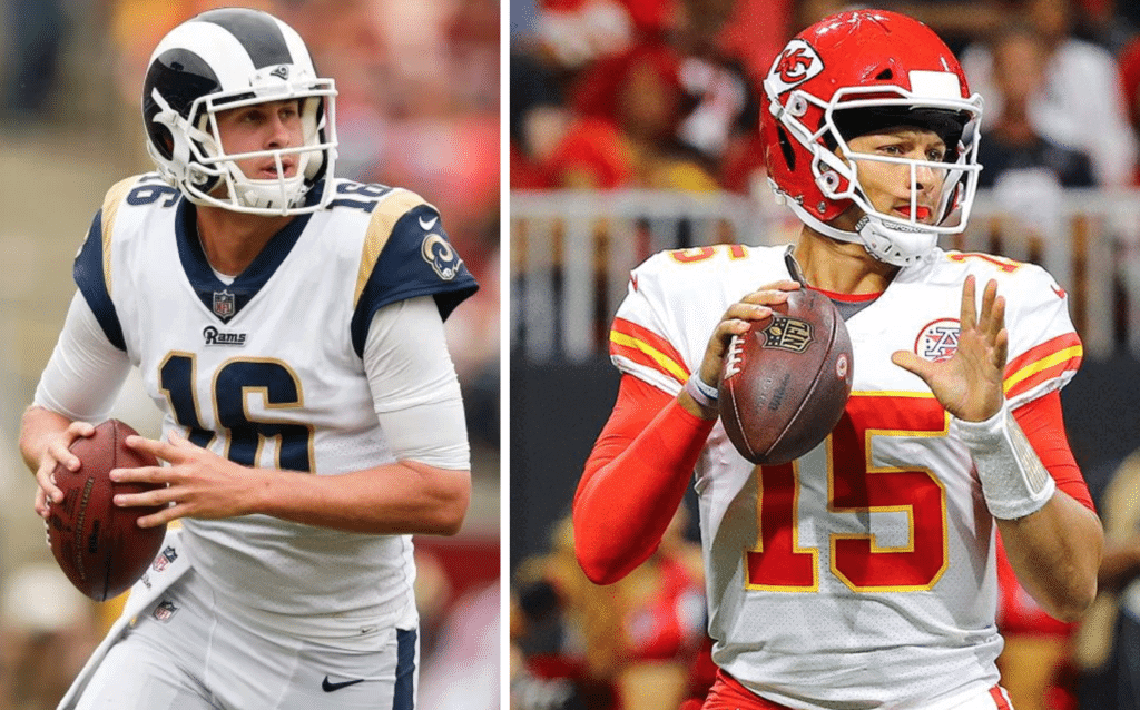
Reader Kyle Seely got in touch the other day to raise an interesting point. He noted that we all seem to agree that the Rams’ current uniform setup is a mess, thanks to the gold trim on the jersey but the absence of gold on the helmet. But then he pointed out that the Chiefs have a similar situation, with lots of yellow trim on their jersey (and pants, and socks) but not even a touch of yellow on their helmet. Both teams even have white facemasks. And yet most of us, myself included, have no problem with the Chiefs.
“Why do I get that fingernails-on-a-chalkboard feeling when I look at the Rams, but I see a harmonious symphony of design when I look at the Chiefs?” Kyle asked me. “Is it because the Chiefs have secretly snuck black into their helmets with the outline of the arrowhead and the lettering? Is there some other logical explanation?”
Good question! I’ve been puzzling over this one for a few days now. For whatever reason, the Rams situation bugs me but the Chiefs situation does not. Why is that?
Maybe it has to do with the colors involved. The Rams’ helmet shell is dark navy while the horn decals and facemask are white. So to me, it almost feels like the Rams’ helmet is appearing in black-and-white while the rest of the uni is in color. The Chiefs’ setup is different, because the shell is red.
Or maybe, as Kyle suggested, it has something to do with the use of black trim on the Chiefs’ helmet. Does that change the equation somehow?
One additional note: Yellow hasn’t always been quite so prominent on the Chiefs’ uniforms. If you look at large photos from Super Bowl I and Super Bowl IV, you’ll see that the yellow outlining on the jersey numbers was so thin as to be barely visible (although there was still plenty of yellow on the sleeve stripes, pants piping, and socks). According to the Gridiron Uniform Database, the outlining on the numbers was thickened in 1970 and has remained thick ever since. In any case, the assorted bits of yellow in KC’s uniform have never bothered me, even though they’re not repeated on the helmet.
Discuss!
(P.S. As long as we’re talking about the Chiefs, I’m going to refer you back to an entry I wrote back in 2014, about the great Chiefs logo-inconsistency mystery. If you didn’t read it back then, or if you just want a refresher, check it out — it’s pretty amazing.)
FC Cincinnati Gets New Badge and “New” Name
By Alex Hider
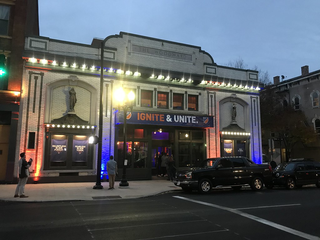
You never want to be the new kid on the block with old duds. So FC Cincinnati, poised to jump to MLS next season, held an event to unveil its new badge and branding last night.
The event took place at a theater-turned-concert venue about a half-mile from where the team’s new stadium will be built — and the club dressed it up in orange and blue, inside and out.
Still about 20 minutes out from the unveiling. @UniWatch @PhilHecken pic.twitter.com/kvj5FOmAr7
— Alex Hider (@alexhider) November 12, 2018
After introductions from some team officials, the team officially unveiled the badge in the video below.
Ignite the passion.
Unite the city.
We are FC Cincinnati. #IgniteUnite | #FCCincy pic.twitter.com/33eLpc5qjZ— FC Cincinnati (@fccincinnati) November 12, 2018
Notably, the new badge keeps the winged lion from the old logo, and adds a new color to the palette — navy.
Of course, this is modern sports branding we’re talking about, so there’s plenty of storytelling to go around. Some of it works — the “C” in the lion’s tail is clever and easily my favorite element of the logo. Other parts — not so much. As Adam Eargle pointed out to me on Twitter, the crown atop the male, maned lion represents the “Queen City,” which doesn’t quite make sense (click to enlarge):
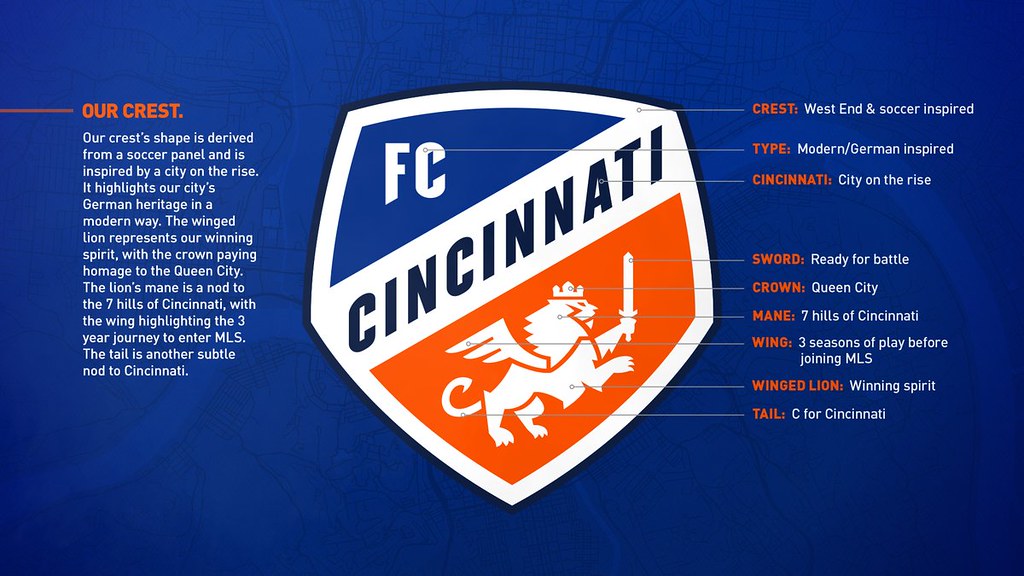
In addition to the new badge, the FCC also announced that it was changing its official name from Fútbol Club Cincinnati to Football Club Cincinnati, something that will probably go largely unnoticed, considering the team rarely refers to itself by its full name.
All in all, the new logo is a significant upgrade from the old crest. The new winged lion logo is active and dynamic (it always frustrated me that the old lion had his hands full), and the new badge eliminates the annoying floating chunk that hovered over the old badge.
My grade: A-
Fans react to the first look at the badge. @UniWatch @PhilHecken pic.twitter.com/fCYHx4EggK
— Alex Hider (@alexhider) November 12, 2018
Click to enlarge
Collector’s Corner
By Brinke Guthrie
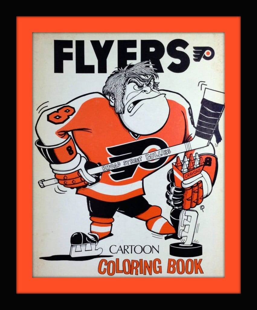
Flyers fans will want to have their box of Crayola crayons handy for this (probably) early-1970s Flyers coloring book. The seller says “This book includes Rick MacLeish, Bobby Clarke, Bernie Parent, and more. There is a word search, connect the dots and find the differences puzzle along with the coloring pages. This coloring book has been used. Not sure of the year, I’m guessing early 1970s. Includes Bernie Parent with the number #30 which he wore prior to being traded to Toronto. Also, includes Bill Flett, a player traded after the first Stanley Cup in 1974.”
Now for the rest of this week’s picks:
• Check out the jersey graphics on this 1970s “Islanders New York” button.
• This 1970s NHL thermal mug includes all the team logos of the period, including the ones for the Atlanta Flames, California Golden Seals, and Minnesota North Stars.
• The seller for this auction says this is a 1970 Cleveland Browns playbook binder for their offense. Just the binder by itself, as “the contents were donated to the football HOF.” It would still make a nice souvenir for that die-hard Browns fan (is there any other kind?) out there.
• Remember Nutmeg Mills? They had an NFL license for awhile and were the makers of this vibrant L.A. Rams sweatshirt. Seller says 1970s but I don’t believe that is correct. More like mid- to late 1980s.
• This is obviously a 1970s Atlanta Falcons jersey from Rawlings, though for some reason the seller doesn’t mention the team.
• Kellogg-Citizens National Bank gave away these 1960s plastic Packers mini-footballs, to “lighten your life and brighten your future.” Open up a new passbook savings account, and get a free toy football!
• Someone in Miami made up a batch of these “Zonk ’Em Dolphins” buttons in honor of running back Larry Csonka during his Dolphins heyday.
• Dig the artwork on the cover of this 1970s L.A. Dodgers yearbook!
• Staying in 1970 for some more great baseball cover artwork, this time for the Red Sox game program.
• Way back when, NFL team pennants just had a flat line drawing of a helmet, which was boring. Then cool “3-D” graphics came along, and pennants upped their game. This one is for the New York Football Giants.
Finally, a quick programming note: Collector’s Corner will air on the Uni Watch Facebook page next Tuesday, Nov. 20. Back here as usual after that.
Seen an item on eBay that would be good for Collector’s Corner? Send any submissions here.
Click to enlarge
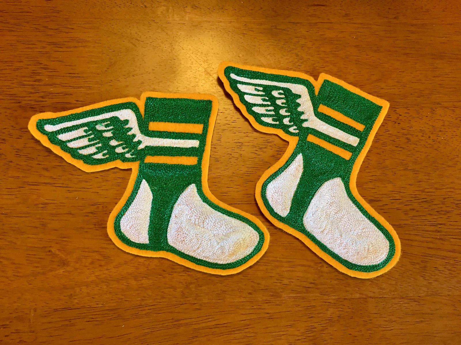
Chain-stitch update: I just received a couple more chain-stitched Uni Watch logo patches from master embroiderer Amy Bengtson (who I interviewed back in September). These patches will ship out today to the readers who ordered them.
If you want your own patch, the price is $35 apiece (80% of which goes to Amy). That includes shipping. They’re hand-embroidered, so no two are quite the same. If you’re interested, give me a shout and I’ll make the arrangements.
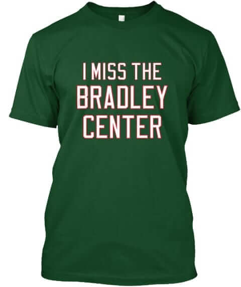
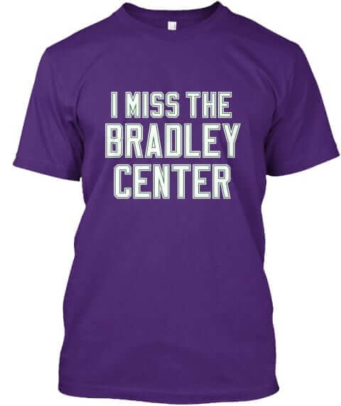
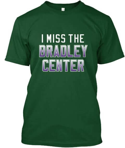
Naming Wrongs reminder: In case you missed it on Monday, we’ve added some new Naming Wrongs shirts for the Bradley Center. They’re available in green, purple, and green with purple lettering. We’ll be adding some Marquette-themed Bradley designs as well.
These shirts are now available in the Naming Wrongs shop. My thanks, as always, for considering our products.
Click to see the details — it’s worth it!
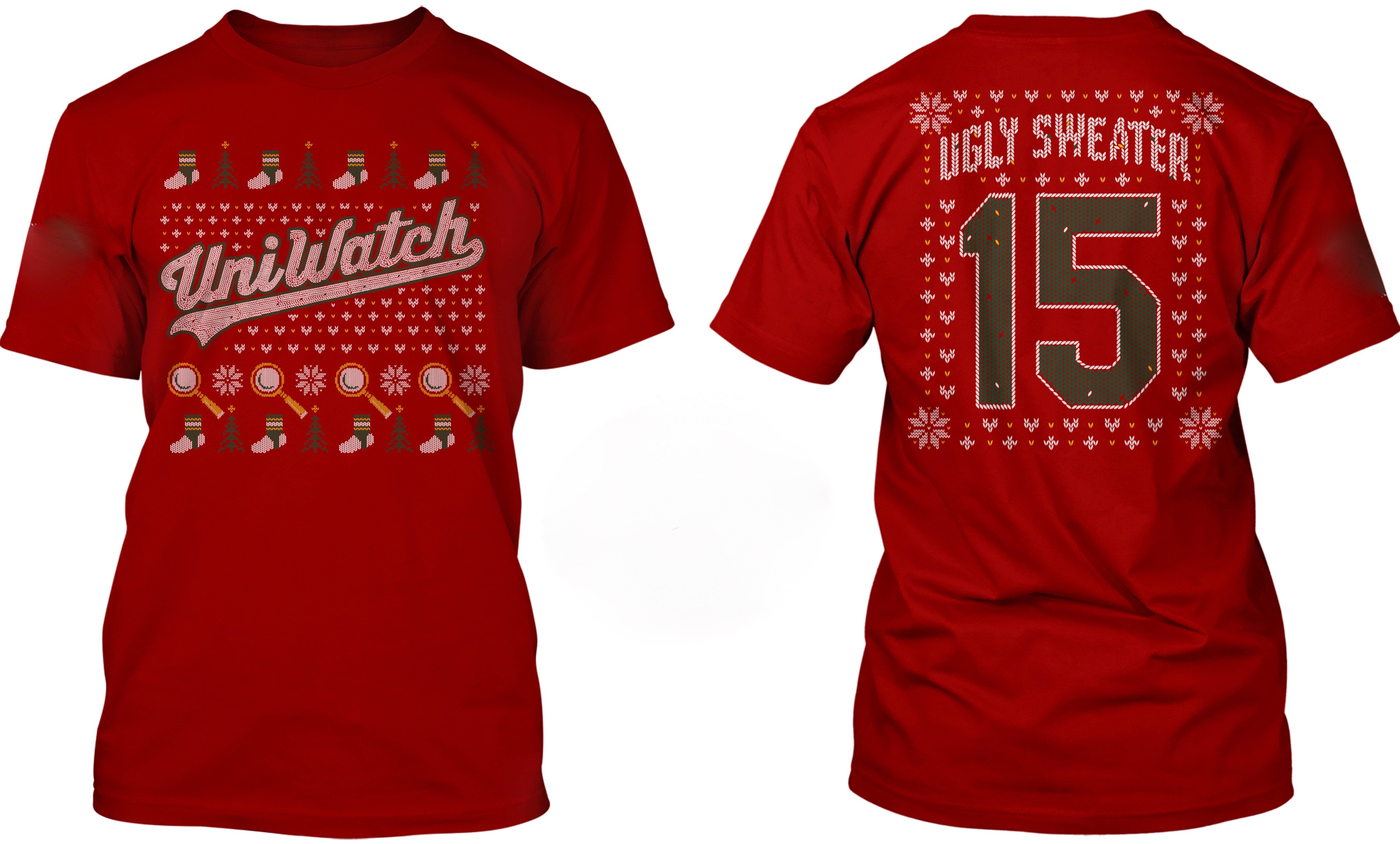
’Tis the season: Someone asked me the other day if we have a Uni Watch holiday sweater. No, I told him, but we do have the Uni Watch Ugly Sweater T-shirt (which is also available as a long-sleeve tee and a sweatshirt). Designed three years ago by Bryan Molloy, it’s still one of our best products. Perfect for you, or as a gift. Order it here.
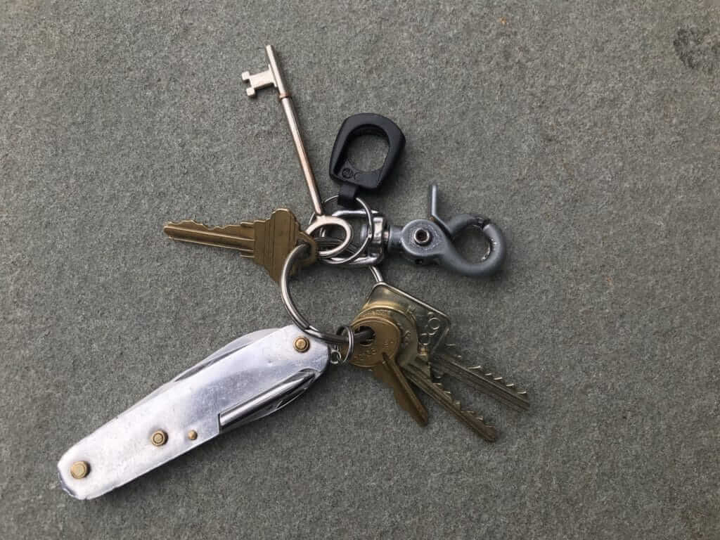
KRC update: The latest installment is about a Swiss Army Knife whose red outer casing has fallen away. Check it out here.
The Ticker
By Alex Hider

Baseball News: Seattle’s baseball stadium currently does not have a name, as workers have removed the “Safeco” lettering from the stadium’s facade (from Jay Danbom). … The Rockies gave away a bunch of stuff on Twitter yesterday, including champagne corks from postseason celebrations, bottles of Coke with player names on them, and a pack of special weekend uniform socks (from Rob Montoya). … The Green Bay Bullfrogs of the Northwoods League — a college summer league — will get a new nickname on Wednesday. The seven finalists for the new nickname: Booyah, Cheese Curds, Old Fashioneds, Supper Clubbers, Tailgaters, Under Dogs and Wurst (from Brian Kerhin).

Pro Football News: The Packers are wearing their all-white Color Rash uniforms this Thursday, and the team published a video of the equipment staff preparing the uniforms for the game (from Damon). … Thanks to a trademark filing, SportsLogos.net has all but confirmed what the Montreal Alouettes’ new logo will be (from Moe Khan).
College Football News: Florida State is wearing their alternate helmets, black jerseys and garnet pants this weekend against Boston College (from College Sports Design). … In an ESPN power rankings column, someone accidentally used Bemidji State’s logo instead of the University of Cincinnati C-Paw (from Joel Benjamin Clark). … The ACC Tracker has been updated for Week 11. … In this very short video clip, you can see Nebraska’s 1917 football team wearing their very stripe-centric uniforms as they march in support of America’s involvement in World War I (from Brian Hansen).

Hockey News: This season’s outdoor game between Notre Dame and Michigan at Notre Dame Stadium has its own logo (from Joseph Lombardo). … Friend of Uni Watch Rob Ullman has published the latest issue of his hockey comic zine, Old-Timey Hockey Tales. … The Penguins are selling the “Stronger Than Hate” patch that they wore on Oct. 30, with the proceeds going to the Jewish Federation of Greater Pittsburgh to benefit Tree of Life victims and families (from Jeffrey Jacobs).

NBA News: Sixers G JJ Reddick nailed a three while wearing only one shoe last night (from Mike Chamernik). … NBA Commissioner Adam Silver says he supports players who’ve been wearing the “Enough” T-shirts during warmups in response to the latest mass shooting in Thousand Oaks, California. … Not uni-related, but the Warriors will be selling a $100 monthly pass that will get you in the building but won’t get you a seat or even a view of the court. But you’ll be free to watch the game on TV in the arena’s bars and lounges. … The Wisconsin Herd of the D League will wear Native American Heritage jerseys on Friday and auction them off in support of a local Boys & Girls Club.

College Hoops News: Southern Illinois wore stars-and-stripes uniforms last night (from Eric McKay). … Ohio State will reportedly be wearing mid-’70s throwback uniforms on Nov. 23 against Cleveland State (from Ben Teaford). … UT Arlington has slightly updated its uniforms since Paul dropped his season preview — it appears they’ve eliminated any orange elements from the side panels.

Soccer News: Sporting Kansas City has a bunch of uniform displays representing notable years in its history throughout its stadium, Children’s Mercy Park (from @GuacBowlsForAll).

Grab Bag: The Pac-12 Conference has signed an apparel deal with Nike, meaning conference broadcasters, staff, and volunteers will wear Nike apparel at conference events. Seems like this will be awkward for the several Pac-12 schools that have apparel deals with non-Nike companies (from Griffin Smith). … On Veterans’ Day, it was reported that the U.S. Army is bringing back the old World War II-era “pinks and greens” uniform as its new service uniform (from Tim Dunn). … Police in Washington, D.C. are getting new uniforms (from Andrew Hoening).
God almighty, the Packers all white uniforms look great. I don’t know why but I love the look.
Imagine how much better they’d look if they paired them with socks that weren’t solid white! Even solid green or yellow would look great, but yellow socks with green/white/green striping to mimic the helmets would be incredible.
I can’t find any announcement from the Seahawks on what they will be wearing against the Packers, but I wouldn’t be surprised if it was the all neon green look.
That would ruin it. I’d even be okay with a pseudo-rash navy costume.
There’s not a ton of white on the Chiefs’ helmet, and so it looks a little more balanced.
ALSO, we’re all used to the Chiefs’ setup.
Came here for this. This is a recency bias. We are predisposed to dislike the rams uni set up because it was a lazy, half-assed change. The Chiefs have looked the same for decades.
But did the Chiefs look wrong the first time you saw it?
It’s a uniform/helmet quirk, similar to the Dallas Cowboys having black outlining on their sleeve stripe.
All I can say – is thank you KC for not using the black outlining on their helmet to introduced a whole lot more black into their uni (Calgary Flames and Atlanta Hawks (old days) should have taken note)
I never thought about the Chiefs being “wrong” (no black beyond the helmet, no gold on the helmet) and it’s all they’ve ever done. Like the Montana-era 49ers had black on the helmet logo but nowhere else, and it wasn’t a big deal. In my opinion, the Rams’ current look is jarring because they had a more cohesive look and then made partial changes for the worse. It was piecemeal, and the parts they kept don’t go with the changes they made.
I agree with the recency bias BUT it always bugged me. Being a Raider fan, we got to see the Chiefs a lot, and since I was a kid it looked wrong. But like it was previysyated, we’re used to it.
You mentioned that the yellow outlines on the Chiefs jerseys of the 60s were barely visible. This is because the Chiefs used white numbers (red on the road whites) and sewed them on with yellow thread – there was no yellow layer. Here is a picture of a game-worn Buck Buchanan jersey to illustrate this: link
The change to a bold yellow outline in 1970 coincided with the Chiefs moving to silk-screened numbers.
As far as the original question – I think it’s a matter of familiarity. The Chiefs have had their current look dating back to their days as the Dallas Texans. The Rams have had matching helmet and trim colors for their entire history until last season. If they give their current look five or ten years (which, thankfully, they won’t), we would perceive it more as a uniform quirk than a jarring inconsistency.
Agree with Scott. If the Chiefs had changed from a lid with only gold logo and gold face mask to their current look, we would have the same responses as to the Rams mismatch.
Interesting observation though about the Chiefs. Never noticed.
One side note about the Dallas Texans – the helmet decal from that era did have golden yellow in it, in the form of the star representing Dallas. It was an element that was lost in the switch to the KC arrowhead.
FC Cincinnati:
A few months ago we had in the Ticker that they were going to change the FC to “Fußball Club,” which seemed incredibly pointless, but it apparently is “Football Club” instead.
Now this from one of last night’s press releases.
“The much-speculated name Fussball Club Cincinnati – or Fußball Club Cincinnati using the German character – is the formal, legal name of the club and its business units. It is not to be used in any sporting references to the team, or in any public discussion.”
Uh…. what?
Well now, you just broke the law!
Throwing out a guess here — the MLS entity will be known as “Football Club” while the business entity will be known as “Fußball Club.” Two entirely different entities. Blame this on MLS and its single-entity structure.
If something happens to Football Club Cincinnati and its MLS commitment, Fußball Club Cincinnati will still remain. Very similar to what they did when playing in USL, they were Futbol Club Cincinnati.
FC Cincinnati will remain, just depends on what the “F” stands for. Protecting their own “identity.”
Rams-Chiefs theory: The gold shoulder stripe on the Rams jersey is more prominent than the yellow stripes on the Chiefs jersey (which are surrounded by red). Put your thumbs over the gold shoulder stripes on the Rams jersey and suddenly the gold trim on the numbers doesn’t look that bad.
I also agree with the theory about the red versus navy. Could someone reverse the colors on these same images so that the Chiefs are navy and gold, and the Rams are red and yellow? Would love to see that side-by-side to compare.
Totally agree with the stripe thing. Covered them up and suddenly I love the outfit. If only they went with that mixed with the blue and yellow…
Concur.
I think there are two big reasons why the Chiefs uniforms are more palatable than the Rams. The first is familiarity, as others have already mentioned. We’re used to seeing the Chiefs in that uniform set, whereas the Rams originally paired that jersey with pants and a helmet that both also included the gold. Their current uniform set is a known bridge between the old set and a new one, and it looks the part. The other reason is the pants and socks. Kansas City may not have any yellow on their helmet, but both their pants and socks do, whereas the Rams also lack the gold on those elements of their respective set.
Agreed. If the Rams kept gold in the pants and added gold stripes to the socks it would be much better.
The other issue at play is the horns on the helmet. There is a lot more white and less blue than it is for the Chiefs from white to red. I think if you had just a logo on the side for Rams it would be different.
As others have noted, I think it has to do with the design of the jersey. If you took out the gold sleeve/shoulder stripe, and just had gold trim around the the numbers it wouldn’t stick out as much.
I think the other aspect is that design of the Chiefs uniform makes the absence of yellow in the helmet acceptable, there isn’t a place for it. The Rams jersey has the ram logo with gold horns, which means the helmet should have the same gold horns, that clashes significantly. Similar to the shoulder stripe that is gold, these elements should match the helmet horns, but they don’t. Compare that to the Chiefs uniform, there isn’t really any element of the helmet that corresponds to the yellow parts of the jersey. If the Chiefs had helmet center stripes and they were just white and red, rather than matching the yellow and white of the jersey and pants stripes, that would be far more noticeable.
2.
I think the biggest abomination with the Rams is the inclusion of White facemasks. When you think of the Rams’ helmets, you think of the horns. The White facemasks intertwine with the White horns, and draw attention away from the decals. Should have stayed Navy.
I don’t know why they let “fans” decide these things.
It’s this. The white blends together. If they had the white ram as a logo rather than the pseudo horns, it would look good and much more like KC.
link
If the facemask+bumpers where another color, it would probably look better
also note that the sleeve logo for the rams isn’t this logo. It has gold horns. another unnecessary amount of gold on their uni
Rams/Chiefs:
Try hard to think of it this way when looking at the uniforms. Imagine these were an unveiling of two totally new franchises. How would we all feel then?
My gut is I am seeing the Rams mismash as a mismash of two totally separate uniforms I am used to… separately.
I think if both of these came out today:
1. Rams: we’d all say “meh.”
2. Chiefs: I think we’d say “a little better than ‘meh.'”
While I won’t claim to be much of a soccer fan, does anybody else find the whole trend of MLS teams adopting pseudo-European naming conventions like “FC” and “United” to be bit lame? Especially since we don’t refer to sport as “football” here?
Seems like MLS would have a better chance at becoming a true “Major League” here if it went with more the more tradionally American convention of having a city name and nickname that is related to the city/region.
I happen to disagree. I find it gives the teams a connection to the rest of the soccer world. Australian teams and some Mexican ones do it too. It’s just how people call their teams. However, I do prefer teams like Columbus and Orlando who went with SC (soccer club) instead of FC (football club).
There’s lots of examples of this in other non-European countries or ones whose professional leagues are relatively more recent, such as Japan, South Africa, Australia (as mentioned), and even South America, where there are teams named Arsenal (in Argentina) and Everton (in Chile).
I occasionally think MLS teams’ naming practices are silly, especially if they come off as branding exercises (such as Columbus adding SC and calling themselves “Crew SC”). They would be just fine with the city/nickname format, as some teams in the NWSL, Australia, and Japan do.
However, for better or worse, the language of soccer is defined by Europe and secondarily by South America; for example, every continent’s club championship is called the Champions League except in South America. MLS seems to see incorporating Europe as its way of assimilation into the sport’s culture.
And to add to that, the name of the game itself is European (English to be precise). Something I’ve always found interesting is that pretty much anywhere you go in the world the name of the sport is derived from “association football,” even if the words “foot” and “ball” in the native language are different (link). Even the word “soccer” is derived from the “association” in “association football.”
That said, I find the MLS’s naming conventions utterly maddening. I’d much prefer the [city name] FC/SC for MLS clubs. But instead we get a hodgepodge like Portland Timbers FC, Seattle Sounders FC, and Vancouver Whitecaps FC. Wouldn’t it make more sense to call these teams Portland FC (or SC, take your pick), Seattle FC/SC, and Vancouver FC/SC?
Yes! Especially the FC team names. It’s MLS not MLF. It should be SC Dallas,not FC. Teams named United don’t bother me as much. Be consistent.
” I am seeing the Rams mismash as a mismash of two totally separate uniforms ”
I agree 100%
I thought they were going to de-gold their unis, but seem to have gone gun-shy and couldn’t pull the trigger on no gold–ala the ’70’s.
The remnants of gold seem out of place to my eye.
Blue and gold, or Blue and white. Pick One.
The problem, as well-documented on this site – is that the Rams don’t want to commit to a jersey change (which has the 5-year freeze once it happens) until they actually move into their new stadium. Where they jumped the gun is their decision to de-gold the rest of the uniform now (helmets, pants, etc.), resulting in the current mish-mash.
is it just me or is the new Alouettes logo taking Native American imagery to another level, but actually using Native American images as a logo
You needed to pan back on the photos more to be fair…. the Chiefs have yellow throughout the uni… the Rams have none anywhere but the jersey. Also, we know that jersey… it came frome st. Louis… we know how it was supposed to look in terms of a whole uni. Thrown in with just navy and white on the rest of the uni, it becomes obvious the nfl botched with the rules when the Rams moved. They should have let them just drop the gold. Then they come out with the new set later when they move into the new stadium… sells more jerseys etc etc. That said, I think that’s what it’s going to be anyway when they move, just taking out the gold, so maybe they didn’t want to unveil right then. In the mesntime, we have a team that could potentially go to the superbowl, wearing a mismatched mess, and the footage will forever go down in history. Years from now, some will just look back and laugh at the Jags 2 tone helmet as a piece of weird history… but had they gone to the Superbowl in those, no one would ever be able to forget.
Sadly because the AFC is the designated home team in the Superbowl this year it wouldn’t even matter if the NFL granted the Rams a waver to continue to wear their blue and yellow throwbacks in the post season.
I’d even rather see the solid yellow color rash (if only they’d wear blue socks with it) over the mismatched white uniform. As others have noted, just cut out the gold stripes on the jersey and it is much more tolerable with just the gold number outlines.
The NFC is the designated Super Bowl home team this year. Last year it was the AFC, but the Pats chose to wear white because they’d won their last theee titles in white (XXXIX, XLIX, and LI) while having lost their last two appearances in blue (XLII and XLVI). That bit of superstition didn’t work for them unfortunately.
Well that is some good news! At least a chance that we get the blue and yellow throwbacks instead of the mismatched white set if the Rams make it.
Best thing about that FC Cincinnati logo: in an era where multiple layers of corporate reviews and test-marketing have made it almost extinct, the lion is left-handed! (Okay, left-front-pawed. Now let’s have some more lefty human beings appearing in logos!)
Good catch — seconded!
like many of said, familiarity plays a role. Also the Chefs’ colors are both vivid. The Rams’ vegas gold isn’t vivid and doesn’t stand up well to navy. (IMO even the navy/vegas gold combo they wore for a while in St. Louis wasn’t especially good looking for that reason)
I think this is the correct answer.
Vegas gold next to blue isn’t the same as yellow next to orange.
I wonder if the Rams would look better if the stripe was the yellow and not gold???
Another article on the Army pinks and greens actually showing a bit of the pinks. Interesting to note due to a National Defense Authorization Act rule, even if the Army adapted them now, there is a 3 year roll out. Defense Logistics Agency has to have the lead time apparently. Personally, as Uni-Watch has done with athletic teams, the uniform that says Army are the WW2 era I believe. It’s their best set. The dress blues are quite traditional as well but the WW2 set is best Army had.
Forgot link to Army story. link
If that Islanders pin is from the 1970s, it’s from the late 1970s, because the striping on that jersey graphic is the 1978-1995 version.
Cincinnati MLS team orange, blue and white? How Metsie!
I personally don’t get the love for the Chiefs ketchup and mustard look. Closest thing in the NFL to Ronald MacDonald’s outfit. Rams colors may not be visibly aesthetic but the shaping of the features is still pretty strong.
I’ve often wondered what the Chiefs’ uniform would look like today had Lamar Hunt held firm to his original color scheme for the franchise, Columbia blue and orange.
Or the Buccaneers whose original choice was light green and orange, it was rejected by the NFL for looking too similar to the Dolphins
You don’t happen to have/know the Pantone shades for the Buccaneers whose original choice was light green and orange?
I’d like to take a look.
“Light green” could be so many things.
Lee
It’s a question that has bothered me for 40+ years, I do not know the shade It was mentioned in a Sports Illustrated article back in the initial season of both the Bucs and Seahawks. If I remember correctly the article was more about the Seahawks than the Bucs.
I double checked the SI article. It’s from May 1976, Montreal Canadien Larry Robinson on the cover. The article says pale green as opposed to light green. I’ve always assumed the same orange shade as they used. But never seen an actual mockup.
A paragraph from the article
The list was reduced to seven names—Cascades, Evergreens, Mariners, Olympics, Pioneers, Sockeyes and Seahawks—and Seahawks was judged to be most suitable and to have the most graphic potential. The team colors also had to be approved by NFL Creative Services (Tampa’s first choice, orange and pale green, was discarded for being too similar to the Dolphins’ colors). Seattle settled on silver, blue and green, the last two representing the waters and the forests that surround Seattle. And Creative Services came up with a wonderfully fierce Seahawk logo. It is creative, indeed, because The National Audubon Society insists that the sea hawk is a thief, a skua or a jaeger that specializes in robbing other sea birds of their food. Thompson, however, claims his Seahawk is a dashing, handsome, graceful osprey that swoops from the sky to snatch fish from the sea.
McDonald’s or DHL…..
The FC Cincinnati logo looks like King Moonracer from the Island of Misfit Toys.
link
Paul, UT-Arlington’s colors are Blue and ORANGE, not red as indicated in the ticker.
Got it.
Why Do the Rams Look Bad but the Chiefs Look Okay? Because the KC inconsistency has been around before most of you guys were born and the Rams thing just happened recently. Also as this website is correctly sub-titled “The Obsessive Study of Athletics Aesthetics,” many of the people who follow this website are borderline OCD nutjobs who really do obsess over minor stuff like that. Please don’t fly off the handle, these comments are made tongue in cheek (for a laugh). Relax.
“… many of the people who follow this website are borderline OCD nutjobs who really do obsess over minor stuff like that.” About right. Watching the Rams game with my nephew and there was a sideline shot of the Rams bench and it appeared to me that one player’s numbers were a darker shade of yellow than the player he was talking with. I pointed this out to my nephew and he’s like “whaaat?”
Rams v. Chiefs:
I think it’s a matter of mental dissonance.
When we see a Rams helmet with white horns, we immediately conjure up a specific image of the Fearsome Foursome era uniforms, resplendent in clean blue and white. So when we see gold trim (or in the case of the blue jersey, gold numbers) it throws the picture off as much as if we were looking at a picture of Deacon Jones in 1969 holding a cell phone.
Add to that the fact that the Rams also opted for navy-white pants which leaves the jersey sticking out like a sore thumb.
The Chiefs by contrast have yellow trim on the jersey, pants, and socks and have had this pairing going back to Hank Stram. So not only does the uniform line up better but we’ve been accustomed to looking at it as the Chiefs for decades.
I’m going to say it’s because the Chiefs generally have a great uniform, whereas the Rams have a shitty uniform, so we want to say mean things about it.
This is pretty much the answer. The Chiefs look awesome. The Rams white or navy/gold unis look like shit. Keep the Rams in yellow and blue and they look fine.
Nice that the Buckeyes are wearing 70s throwbacks for the game against Cleveland State, since they’re also going to play that game in a throwback arena — back to St. John! Man I loved that place.
“and pants, and socks”
I think that’s a huge part of it. The yellow showing up in multiple places adds some balance. I also think though that the presence of a third color (black) does help with the helmet. Everything is three-toned, even if the tones are different.
I was thinking about this balance watching the Titans this weekend. The blue pants – and light blue is one of my favorite colors – were just too much. At this point, I actually think the Titans should minimize the light blue as much as possible, at least if they insist on incorporating grays into the theme. Make the pants gray (with light gray/dark blue for the stripes if they are married to those) as well as the outlines on the numbers. Relegate light blue to merely an accent color as they have done with red (though the red is still unnecessary IMO).
…assuming that someone hasn’t suggested and mocked this up already.
The Jags’ white jersey bugs me for a similar reason. Outside the patch, there’s no teal! They could wear them with red or blue or green pants and make about as much sense.
An A- is completely generous in the rating for FC Cincinnati.
That whole “explainer” is way over-the-top with it all too.
Unnecessary elements (well, an explainer is unnecessary to begin with):
— “soccer inspired” WHAT? Groundbreaking for a soccer crest to be soccer inspired!
— “modern/German inspired” not German at all, modern, maybe
— “ready for battle” okay?
— mane explainer is a stretch
— “3 seasons of play before joining MLS” absolute nonsense
— “winning spirit” for winged lion, really?
— “C for Cincinnati” because that’s needed when there’s Cincinnati spelled right above it?
Two shades of blue are unnecessary too. Overall, it is a dud.
Wholeheartedly agree, though I am biased as a Louisville City FC fan.
Corporate BS aside, I love the color scheme but everything else is so blah. The shape is uninspiring and with the color blocking it feels like three separate elements. I miss the crown they used on top of the badge in their original logo which if done right would have made an interesting shape. If they wanted to lean into the German heritage they should have used a diamond shape as an ode to Bavarian design (yes Vancouver uses a diamond but theirs is a pattern of three, a single diamond shape would have stood out).
Its funny that this is now coming up bc to be honest the lack of yellow on the Chiefs helmet has in fact bugged me for years. In general I like it when teams use all of their colors in each element of the uniform. Otherwise it looks unbalanced to me. I’m sure most will find this suggestion sacrilege, but I would like it if the Chiefs had a center stripe on the helmet to match those on its pants, or even a single yellow like the Steelers. *ducking*
Unsolicited announcement: I have one of the chain-stitched Uni Watch logo patches. It is beautifully constructed and looks and feels like it was made 50 years ago. An exception to “they don’t make ’em like they used to.”
I plan to use it on a letterman’s sweater.
Chiefs > Rams
Two reasons that others have mentioned.
1) Familiarity
2) Yellow throughout, including pants and socks.
I think for me the big problem with the Rams uniforms is that I know they have 2 elements of a mismatched set.
I see the helmet and know that’s supposed to go with a different jersey, and it looks weird
I see the jersey and know it originally went with a different helmet
So even if it may not be terrible in a vacuum my memory of those Jersey combos makes this seem very wrong
I love the Chiefs unis. The Rams is just a mishmash of different eras and nothing really matches. I’m also still baffled why the Rams need a new uniform when they finally start playing at their new stadium when the Eric Dickerson era unis are some of the best in football. Only slight niggle is the horns on the shoulders aren’t wide enough
You know, I’ve used “niggling” for years without realizing there was a noun form — “niggle”! Thanks for teaching me that!!
Ha ha, you’re very welcome Paul
My home computer does a “word of the day” thing when I turn it on. Today’s word, believe it or not, was “niggle.”
FC Cincinnati badge is definitely an improvement from the USL one, but there’s still a lot of room for improvement.
On an unrelated note, are there any USL fans out there? If so, what’s ur favorite crest in the league and what team do you support?
Judging by a lot of comments, I am in the minority, but I have always disliked the Chiefs uniforms. One of the reasons is I always found it odd that there wasn’t any gold on the helmet, and vice versa no black in the uniforms. The helmet and uniform just never jived. I like each separate, but together they don’t work for me. But again, I seem to be in the minority, as I know a lot of people think the Chiefs have one of the best looks in the NFL.
I made this comment back in 2014 on the Chiefs article that Paul wrote:
anthony | February 24, 2014 at 10:40 am |
In regards to Kansas City’s logo: To me, it’s not so much that the “c” doesn’t match. The issue I have is that there is NO color yellow anywhere on the helmet to match the uniform. It always looked weird and slightly off to me (same with Dallas’ blue not matching)
I would have thought the masks at Oakland were to protect the fans from the stench coming off the field.
I have a BIG problem with the Chiefs dumb, red pants. The stripe pattern on them doesn’t mimic the sleeves of either jersey, where as the stripes on their white pants, does. I feel like I’m beating a dead horse, but the addition of colored pants to offset the white/road jersey is such a cliche. White pants always looks cleaner. Always. For that, the RAMS all white look is better even if there is only a splash of gold on the jersey.
BTW, the idea the Rams could not have changed their jersey because of some rule is wrong. They’ve worn that exact jersey for more than the required time and could change whenever they want. This bad (navy/gold) uniform is self inflicted.
I agree 100% with you regarding the Chiefs red pants, in that the stripe pattern is wrong for them.
But I do like the idea of red pants for them, just wish they’d fix the stripes.
I feel like any color of pants that is the same as the helmet looks good with a white jersey.
Lee
The stripes on the red pants basically are the stripes on the white pants, just with thick white outer stripes added to separate the core red-yellow-red stripes from the main pant color.
It is not that the rule said they’d couldn’t change their jersey when they moved to LA in 2016, but rather that if they changed in 2016 they would not be able to change again until 2021. For some reason the Rams wanted new uniforms both when they moved to LA, and again when they move into their new stadium, which was originally scheduled for 2019, now 2020. So had they changed the jersey in 2016 (even if it only meant removing the gold elements like they did with the helmet and pants) that would have counted as a new jersey, and prevented them from being able to change again for the opening of the new stadium in 2019/2020.
So the obvious statement is, they wanted new uniforms when moving back to LA, but also wanted to coordinate that with the new stadium, which was impossible, so they half-assed it this time. Why they didn’t just go back to the old blue and yellow look, or simply take their St Louis design and switch the colors from navy/gold to blue/yellow when they first moved is beyond anyone. Let’s just hope these new uniforms set to come in 2020 are worth the nonsense they wear now.
The red pants stripe does match though, in a way. The white jerseys have red-gold-red stripes on a field of white. The pant stripe is a field of white with red-gold-red socks. Same with the socks. With this concept though, it could be argued that the white home pants should have red-white-gold-white-red stripes to mimic the home jersey and socks.
The Chiefs inconsistency has always bugged me, but I think at least part of it not being as jarring as the Rams is that the Chiefs have no helmet stripe. That is, the helmet and logo are almost entirely red/white, except for the thin black outline around the logo. If you had a white or yellow stripe on the helmet it would stand out more for me. That said, I routinely say to myself (and out loud to my wife’s chagrin) “the unis would be perfect if they just took out the black outline on the helmet logo.” Similar to my comment every Saturday when I see Auburn’s uniforms. If they’d just separate the pants stripes like the helmet and sleeves, the unis would be perfect.
The Chiefs’ un-uniformity has always bothered me. But what steps would you take to “fix” it?
Adding a white-yellow-white center stripe to the helmet would tie it in with the jersey and pants, but wouldn’t address the logo not following the same color scheme. Swapping out the yellow on the rest of the uniform for black to match the helmet would be a downgrade in my opinion and would just make them look like the Falcons and Cardinals.
The short and best answer in my opinion is this is one of the inconsistencies in the uni-verse that is endearing in its quirkinesses and best left alone.
I was thinking about this, and looking at the helmets, there’s one thing that stands out – the lack of any markings on the bumpers. They could just put the Chiefs wordmark on the bumpers, maybe include an outline on the letters so that they could use both red and gold.
I’m not a big soccer fan and scroll past a lot of the soccer content on Uni Watch. I looked at the FC Cincinnati section today and I have to say, I liked the floating pentagon above the old crest. It made the negative space around it look like a soccer ball. I think someone put a lot of thought into that and I love hidden design elements like that that you don’t necessarily see right away.
My theory about the Rams uni: it looks like they’re wearing part of their old uniform from the late 60s and part of their current navy and gold uniform. It’s all mismatched. Imagine if you took the Jets’ navy and gold Titans throwbacks and paired them with their current green helmet. They don’t go together. That’s how I feel when I look at the Rams’ gold trimmed jersey with their white-horned helmet. It’s like one part from Column A and one part from Column B.
I’m sure others have made this point, but because we’re used to seeing the Rams in only blue and white, as they wore in LA for 9 seasons (’64-’72), or navy and horns that match the trim (or horns, when they actually bothered with that element) on the sleeves, seeing a combo where one doesn’t match the other is jarring. So maybe it’s not so much that it’s an inherently flawed design, but that it doesn’t fit what we’ve seen color photos of basically forever.
It may also be a question of balance. The yellow in the Chiefs’ sleeves also shows up in their socks and pant stripes. But with the Rams’ home uniforms (white jerseys), because the gold is used so sparingly, it seems out of place.
All this begs another question: how is it their throwbacks are largely given a free pass, even though the helmet doesn’t match the jersey? Even two, three, four decades ago, the fabric elements were royal blue, while the helmet’s always been navy.
Rams vs Chiefs
There is a ton of talk about color and amount. Have we discussed pure form/shape?
Chiefs – classic sleeve stripe paired with a dimensional icon on helmet
Rams – sleeves almost appears like a blue triangle and a gold triangle if you look at a flat jersey. Pair that with a flat, no dimention circular form.
Chiefs forms work in concert like the throwback bills uniforms work better with the flat buffalo and the sleeve strip.
Rams have different design ideas that don’t support each other. It just looks disconnected. At the root, we can’t visually understand it even if we don’t know why.
Do agree that certain color updates could help but they really need to unify the design of the entire set.
Ps – just looked back at redesigns from the contest. There done if the winners posted on ESPN are seeing better results from cohesion of form/shape.
In my opinion what makes the Rams so jarring is how the shoulder color has always mimicked the horn color on their helmets. While the current white/blue/god doesn’t do the full horn look (like the throwback blue and yellow does), the feel is still there. The Ram logo on the sleeve has the gold horn on it as well. If the sleeve Ram has a gold horn, so should the helmet. Right?
I’m late to the party, and I’ve read zero comments. My apologies if I am regurgitating prior comments.
The Rams clearly have a jersey that is isolated from the production of the helmet and pants. The gold is a natural eyesore. And the number font does not fit the classic-ness of the helmet and pants.
The fact that the Chiefs have not included yellow on the helmet has baffled me for years. Years. It’s quite simply an easy fix. Make the “KC” yellow. In my youth, I demanded that they remove the black altogether and go with yellow trim. But I would be content with the black outline with a yellow “KC”. Similar to the Niners logo. A yellow facemask would be nuts, but certainly not out of the question with the current helmet.
But I digress.
That is clearly Tom Seaver on the 1970 Red Sox program. Fresh off the Mets’ World Series victory, Seaver was a hot commodity.
I know it’s late, but here’s my take:
I agree with the consensus here that the Chiefs’ uniform is something we’re all used to; it hasn’t changed in most of our lifetimes. The Rams we just instinctively know is a set of mismatched parts. because again, we’re used to the blue facemask and we’re used to the horns matching the trim color on the jersey.
Another factor, and this is kind of hard to explain so bear with me, is that the Chiefs’ logo decal is just that, a logo decal, something that appears on the side of the helmet because that’s where just about everyone puts a logo decal. Whereas the Ram horns are part of an overall design, not a logo per se; they seem like they’re part of the helmet shell, not an image slapped onto the side of it like every other team has.
Look at it this way: in the eras before and after their two-tone helmet debacle, the Jaguars had no gold on their jerseys, but the gold helmet logo wasn’t, and isn’t, so jarring. Neither was the Falcons’ 1990-2002 uniform, which had no red or gray on the helmet even though the uniforms had red or red-trimmed numerals, gray pants and red stripes.
Now imagine the Eagles’ current uniform with plain white wings on the helmet and white facemasks. It’d be just as jarring as the Rams’ look.
I hate to be this guy, but there’s a mistake in the basketball section of the ticker: It says “The Milwaukee Herd of the D League..” but the name of the team is actually the “WISCONSIN Herd” They’re based in Oshkosh I believe.
If the “D League” is there on purpose instead of “G” in protest/trollization the NBA’s corporate sponsorship and uni ads, then I’m all for it and apologize for being Sticker McGee.
Team name fixed. League name was done on purpose, as you surmised.
Thanks Paul! Again, sorry to be that guy. Only reason I remembered they’re “Wisconsin” is because I recall seeing that the Herd’s logo turned the Milwaukee buck neck “M” upside down. link
Thank you for reminding me the word “surmise” exists! I’m gonna try to shoehorn that in a convo today :)
Why do the Rams look bad but the Chiefs look ok?
Two reasons; first, the Rams sleeve has the gold touching the white which doesn’t allow the gold to pop – it’s a dull gold color at that. Second, the straight angles of the white facemask and white chin straps clash with the curved design of the horns as well as overpower the whole helmet with white.
The fix; scrap the gold on the sleeves and change the face mask color to grey (which I prefer as the facemask color for just about any football helmet).
The Chiefs, although not perfect, have avoided the issues outlined above.
On the Chiefs vs. Rams issue:
For those of us who watched the NFL in the 1960s or have seen a lot highlights of the NFL games of the 1960s, I think there may be an additional factor in play. Back in the 1960s and 1970s, the colors of helmets of several of the dark-helmeted teams such as the Rams and Vikings were not particularly good color matches for their dark jerseys. So I think some of use are somewhat used to the helmets not matching the jerseys and although the Chiefs helmet does not include the yellow in the rest of their uniform, at least the red helmet matched the jersey which is more than could be said for the Rams and the Vikings.
There was also at least one other team back in the 1960s in addition to the Chiefs who did not include their secondary color in their helmet: the Bears
link
Although the Bears would later add their secondary color orange to the C on their logo, I think even with their all-white C, their uniform did not look particularly “wrong” because at least the use of orange on the jersey matched up with the use of orange on the pants and socks, similar to the situation with the Chiefs.