The NBA’s drip-drip-drip of alternate uniform leaks became a tsunami yesterday, as a large number of jersey designs began circulating in advance of their official unveilings — with many of the new leaks coming from, of all places, Nike.
This all developed in a bit of a flurry yesterday afternoon and evening, so I’m not positive of the exact chronology, but here’s the sequence of how various things came across my radar yesterday:
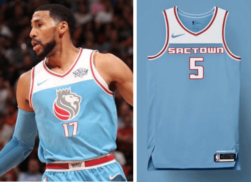
1. A Kings blogger Kevin Fippin somehow found Sacramento’s new City alternate on a Nike mobile app and promptly tweeted several photos. The design is similar to last year’s City alternate, as you can see in this side-by-side comparison — last season’s on the left, the new leaked design on the right:
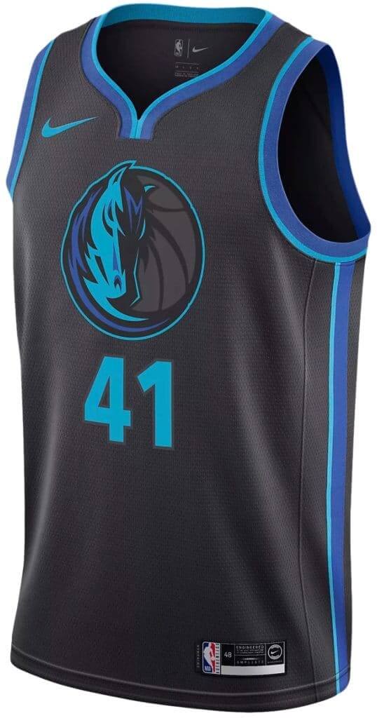
2. Just as I was becoming aware of that Kings design, a source provided me with a shot of what he said was the Mavericks’ new alternate:
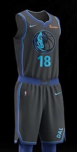
3. Just as I was trying to assess that leak’s legitimacy, someone on Twitter leaked different views of the same design, pretty much confirming my source’s veracity:
A couple of early looks at the Mavs City Uniforms! @conradburry @UniWatch @sportslogosnet (per @EsDeib) pic.twitter.com/nUprkz9ya0
— Landon Tabor (@ChildishLandino) November 7, 2018
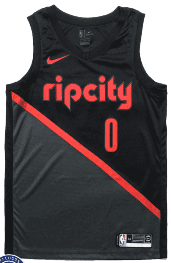
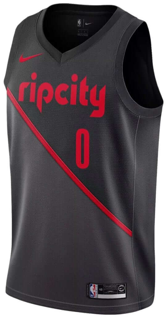
4. While all of this was unfolding, I was having an email conversation with SportsLogos.net poobah Chris Creamer, who told me he was about to publish a piece about four leaks — the just-leaked Mavs and Kings designs (which I knew about, obviously), the Clippers design that had leaked the night before (which I also knew about, and had covered in yesterday’s blog post), and this Trail Blazers design, which I hadn’t yet seen:
5. Just as I was processing that, two Twitter-ers — Niku Mistry (@MistryNBA) and Ivan W. (@idubb23) — informed me that a slew of City jerseys, including several that had not yet been released, were shown on Nike’s Canadian website. That link still worked as of this morning — but just in case it stops working, I took the liberty of downloading the jersey images for the designs that hadn’t yet been officially unveiled as of yesterday afternoon (for all of these, you can click to enlarge):
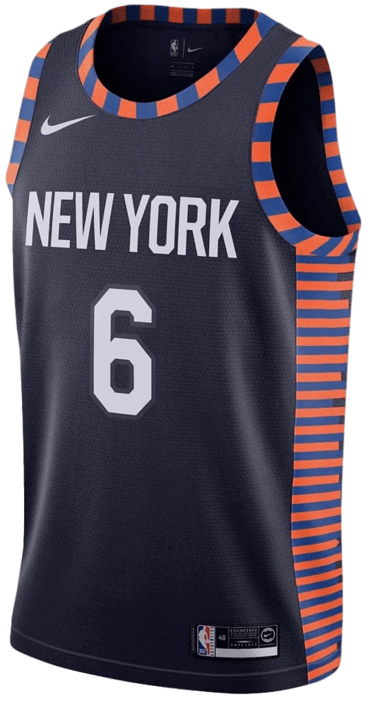
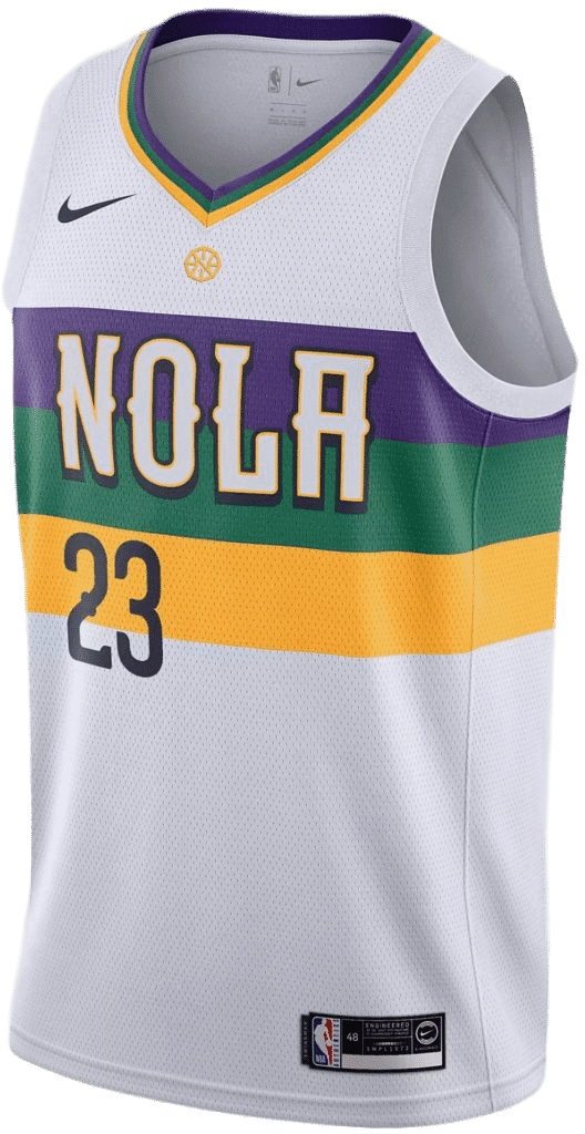
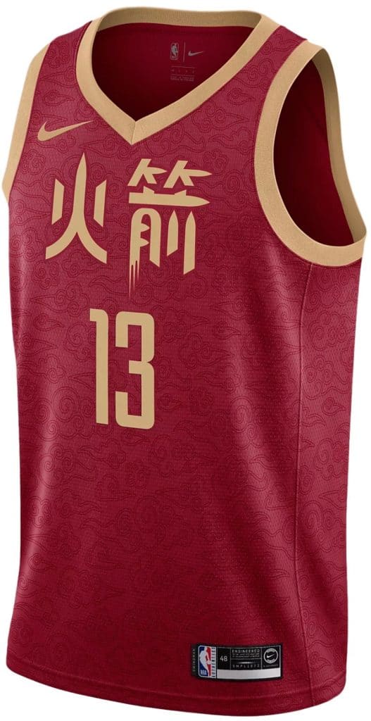
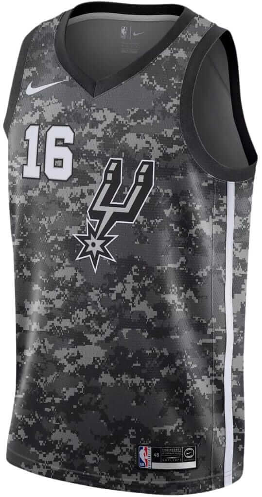
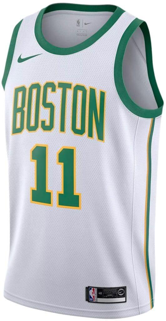

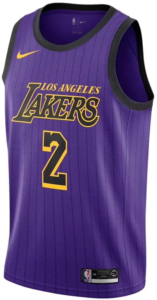
We had previously seen assorted leaks, many of them unconfirmed, for the first seven of those designs. (In case you’ve forgotten, here are those leaks for the Knicks, Pelicans, Rockets, Spurs, Celtics, Warriors, and Lakers.) And the last two, of course, are the Mavs and Blazers designs that were already covered earlier in this entry. So we now have confirmation on all of these.
6. While I was working on this entry, the Spurs officially announced their disappointing camouflage design, so we can move that one out of the “leaked” column and into the “unveiled” column.
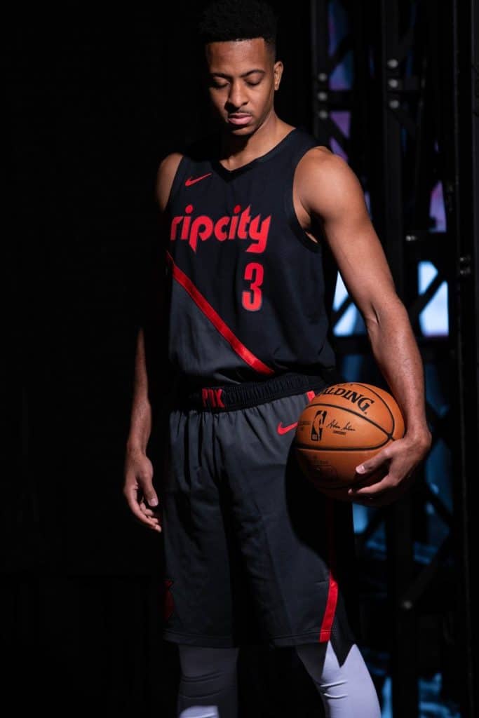
7. Shortly after that, the Trail Blazers also made their leaked design official (click to enlarge; additional photos and info here):
8. Shortly after that, the Grizzlies unveiled their City alternate (click to enlarge):
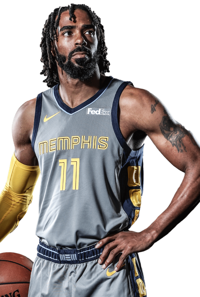
According to this page (which also has a bunch more photos), the uniform is a salute to Memphis’s old pro wrestling days. As it happens, my buddy Sherman loves Memphis wrasslin’ so much that he made a documentary about it, so I asked him what he thought of this uniform. Here’s his response:
They’ve been playing up the wrasslin’ stuff — doing some cool once-a-year promos. Brought in Ric Flair two years ago and that was pretty cool. [Jerry] Lawler is there a bit, doing some goofy routines too. I think it’s mainly that the promo team is big wrasslin’ fans and one of the in-house interview guys is an actual wrestler part-time. So, in a word, Memphis def knows about the wrasslin’ because of the history and seems to love it [when the team refers to it].
As for the actual uniform, it’s hard to tell what the tribute is in the video except the elbow pads, which are a great homage. I wouldn’t have known it was a wrasslin’ tribute if you hadn’t told me, though, so I guess that says it all.
9. Shortly after I went to bed last night, the Rockets’ design became official:
#Rockets “Auspicious Clouds” City Edition jerseys. pic.twitter.com/sHaghoDCBm
— Kelly Iko (@KellyIkoNBA) November 8, 2018
———
It was, in short, a dizzying stretch of hours. For all I know, more stuff may have been leaked and/or unveiled and I just missed it. By my count, 17 of this season’s 29 City alternates have now been officially unveiled (the Jazz are sticking with last season’s design), and another 10 have leaked, leaving the Cavs as the only team whose design has been kept completely under wraps. Or at least I think that’s the case — everything’s been in so much flux that it’s been hard to keep track. In any case, there’ll be a flurry of additional unveilings in the next 36 hours or so, because it’s my understanding that all of these will be officially released by the end of Friday.
There’s been so much quantity that I’ve barely had time to assess the quality, but it seems like a pretty mixed bag. There are definitely some winners (Warriors, Celtics, Pelicans), but they seem outweighed by the stinkers. The whole idea of having a new set of these every season is nuts.
Meanwhile, we’ll get to do this whole dance over again in a few weeks, when the “Earned” designs start circulating, wheeeee!
Click to enlarge
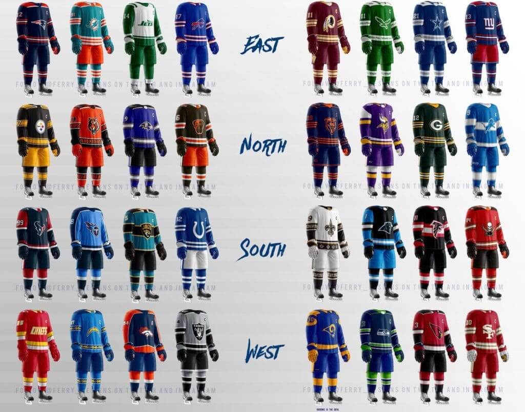
He shoots, he scores (again): The same designer who recently reimagined MLB teams in hockey uniforms has now done the same for NFL teams. Honestly, this kind of concept-y stuff does very little for me, but I can appreciate the work that went into it, and know lots of you get a kick out of it, so enjoy.
(Kudos to @Ferry_Designs for the designs, and thanks to @lhcountryboy for letting me know about them.)

Gift guide request: I’m currently working on my annual Uni Watch Holiday Gift Guide, which will run on ESPN.com in a few weeks. If you know if any cool uni-related items that might be good for me to include (aside from the usual mass-market retail slop, of course), please feel free to send tips my way. Self-promotion is fine, so if you have an awesome product or project that might make the grade, don’t be shy about telling me.
Also: Next month I’ll be doing my annual year-end raffle, where I give away the freebies I’ve accumulated during the year. If you have any goodies that you’d like to contribute to the raffle (one reader has already offered to donate what looks to be a stupendous item), get in touch and we’ll discuss. Thanks.
The Ticker
By Paul

’Skins Watch: Not sure why they chose to publish this now (if there’s a news hook, I missed it), but here’s a slideshow of New Jersey high school teams from schools with Native American team names and/or mascots.

Baseball News: The Milwaukee County Transit System has renamed its No. 22 bus line in honor of Brewers OF Christian Yelich, who wears No. 22. The name will last through Nov. 15, when the National League’s 2018 MVP — widely expected to be Yelich — is named (from Mike Chamernik). … Major public service by Edward Kendrick, who has provided full 2018 uni-tracking data for the Diamondbacks, Red Sox, Nationals, Orioles, and Giants.

Pro Football News: The Steelers-themed “Stronger Than Hate” logo that’s been circulating since the domestic terrorist attack on the Tree of Life synagogue showed up on some “I Voted” stickers on Tuesday (from @walberglines). … The Bills will wear mono-white for this Sunday’s game on the road against the Jets (from @manecci). … Pats players apparently liked their team-issued grey shorts so much that they were taking them home and keeping them, so the team has switched to ugly orange shorts to discourage pilfering (from Jeff Ash). … The CFL’s Hamilton TigerCats are asking fans to wear black for Sunday’s playoff game (from Wade Heidt).
College and High School Football News: Flag-desecration helmets this weekend for Iowa (thanks, Jamie). … Georgia might wear black jerseys this weekend — or might not. … High school teams competing for the South Dakota state championship will wear helmet decals honoring the USS South Dakota battleship. … New embarrassingly named uni combo this week for North Texas. … Penn State’s annual THON game, which raises money to fight pediatric cancer, is this Saturday. This year, for the first time, the team will wear “THON” helmet decals for the occasion. … Here’s this week’s uni combo for Virginia Tech (from, of course, Andrew Cosentino).

Hockey News: Caps C Nicklas Backstrom will wear lavender skate blades for tomorrow night’s pregame skate as part of the Hockey Fights Cancer initiative. … Remembrance Day jerseys this Sunday for the Brampton Beast (from Steve Johnston). … The Blackhawks and Bruins will unveil their Winter Classic uniforms today. … Hockey players don’t often engage in postgame jersey swaps, but here’s a great shot of Hockey Hall of Famers Yvan Cournoyer and Alexander Yakushev wearing each other’s jerseys following a Team Canada vs. Russia game (from Moe Khan).

NBA News: New logo for the WNBA’s Chicago Sky. Further info here (from many readers). … The Jazz wore their purple throwbacks last night.

College Hoops News: New purple uniforms for Niagara (from Jack Goods). … Some Bucknell players last night were still wearing the NCAA patches from last season’s NCAA tourney (from Matthew Wilson and Greg Stevenson). … Syracuse players have received Carmelo Anthony sneakers marking the 15th anniversary of the school’s 2003 national championship (from Mike McLaughlin).

Soccer News: Stoke City winger James McLean’s refusal to wear the poppy has made him the most hated man in English soccer (from Griffin Smith). … No photos yet, but Leicester City will wear jerseys with the name of owner Khun Vichai, who was recently killed in a helicopter crash, for the first half of this weekend’s game against Burnley and then switch to poppy-clad jerseys for the second half (thanks, Jamie).

Grab Bag: The Girl Scouts are suing the Boy Scouts for trademark infringement after Boy Scouts said they plan to drop the word “Boy” from their name and welcome girls to their ranks. … Five team logos from the esports Overwatch League have leaked. … Bryan West-Whitman’s wife, Reagan, is a talented knitter and made him a pair of very handsome Pittsburgh-themed socks. “I love the choice of natural white,” says Bryan. “It looks so good with the black and gold.” … The New Zealand All Blacks rugby union team will wear poppies this weekend. … UCLA is involved in a trademark kerfuffle with a pro-Palestinian student group. … This is very cool: A bunch of old neon signs have been restored and installed in a park in downtown Boston (big thanks to Shane Losi). … New clash guernsey for the Aussie rules football team Carlton Blues. And speaking of Carlton Blues, one of their 100-year-old uniforms is currently up for auction (both from William Pike). … The fan with the best beard in curling is back after being sidelined with an illness (from Ted Arnold). … The World Wildlife Fund sometimes omits its logo from certain promotional campaigns to make them more inclusive.
Hockey and the NHL. So the question remains: who own da Chiefs?
OWNS.
OWNSSSSSSS.
I hate it here, my hallergies make me want to puke.
Eagles look are the best with that retro logo and Kelly Green,
with Chiefs look a notch behind….a combo of Atlanta Flames and Slapshot ! The rest are all blahh !!!
The Chiefs one is the last WHA Minnesota Fighting Saints uni.
link
wow, some awful city edition unis. The Kings’ one was better without the “sactown”. Looked really good on court. BFBS!!!! Uggh, tired of it although the Blazers looks pretty good probably because it’s not all black. I have no idea what the Lakers are going for, just stop it already. I find myself disliking more and more uniforms that come out.
Also, black is one of Portland’s main colors so it seems less gratuitous.
Portland “I love it when a plan comes together” Trailblazers!
I like it a lot.
Agreed on the Kings.
Big downgrade from the previous ‘City alternate’.
New one is as enjoyable as a hard kick in “sactown”
Typo in the ticker alert: “Pats players were apparently like their team-issued grey shorts so much that they were taking them home and keeping them, so the team has switched to ugly orange shorts to discourage pilfering”
Fixed.
I checked Lockervision and the Rockets are scheduled to wear their association (white) uniforms vs the Spurs on Saturday when the Spurs are wearing their city uniforms. I don’t know how that will work but it will be one ugly game
I’m not sure what the problem is with the Rockets wearing white. The Spurs’ camo uniforms look plenty dark enough to provide contrast with white.
The article just updated so that the Spurs camo uniforms are black. Earlier the article had a white camo uniform so that’s why I thought it would be a problem
That Canada/Russia jersey swap was certainly not from ‘72’s Summit Series. I believe it may be from a 20th anniversary game or something.
The graphics are all wrong; and there weren’t any ‘smiley, happy’ post-game pics during that series!!!
You’re right and those were not the jerseys designs worn in ’72 Summit Series. Things were not all that friendly at Summit Series.
From some googling, the photo is from a 1987 “reunion”. There were games in Montreal, Ottawa & Hamilton.
link
Weirdly. I was living near Hamilton at the time, this is absolutely the sort of thing I would have gone to with my Dad, but I have no recollection whatsoever of this event.
I for one love the “City Edition” program (if not the individual quality of every uniform lol). Obviously it’s a brilliant marketing ploy to sell more jerseys, BUT it also gives teams the opportunity to take some risks without having to be locked into a crappy rebrand for years (see 2012-18 Marlins, 00’s Blue Jays, Clippers etc.). Also gives teams the ability to try something different without sacrificing the identity they’ve built up (like the Heat who’ve crushed it with the Vice set, but who’s overall red/black/yellow look is 30 years old with 3 titles behind it).
Bad alternate? No problem, next year is a clean slate.
I feel the same way! There are a lot of duds for sure–but I like that the NBA is approaching uniforms a little more like European soccer teams do, where the alternates have a new look every year or two. Keeps things interesting!
Of course, it would be better if some of the designs didn’t come across as so lazy (Ahem–Clippers), but all in all, it’s an interesting program.
Huh. I approach things very differently, as I care more if things are recognizable and uniform than if they’re “interesting” –(I believe mileage may vary on just how interesting a new uniform might be, as I think it varies with the uniform in question).
My basic requirement for a uniform is that I can quickly look at my TV screen and know who’s playing without having to look at the score ticker. A lot of these new alternates fail that particular benchmark test.
“There’s been so much quantity that I’ve barely had time to assess the quality, but it seems like a pretty mixed bag. There are definitely some winners… but they seem outweighed by the stinkers. The whole idea of having a new set of these every season is nuts.”
Congratulations, Paul, basketball has successfully introduced you to how insane the soccer-kit universe is.
I’m going to go out on a limb here and state that the NBA’s never-ending flood of alternative jerseys is actually a worse development in the “ugly-fication” of the NBA than the ad patches. At least the ads are not really visible except for close-up shots of the players…
At least maybe go back to the days when an alternative jersey was just the road jersey rendered in a team’s secondary color.
Lavender blade steels for the cancer auction? Cool. Now that I’m thinking about it, if Gretzky on the Oilers can do royal blade holders, then I should be surprised we haven’t seen lavender holders, unless there is a “team color” mandate…lavender is nobody’s color. Though I’ll admit that steels are easier to swap out in favor of neutral.
Paul, the “Auspicious Cloud” nickname for the Rockets’ Chinese-themed jersey is not cringe-inducing at all: it is a reference to link.
Thanks for the clarification, Mark. Will adjust text.
Real minor typo correction needed in CFL ticker item. The Hamilton CFL team is Tiger-Cats. Team nickname has the hyphen in there.
Represents that it is the amalgamation of 2 Hamilton teams back in the day, the Tigers and the Flying Wildcats. Kind of like how Card-Pitt had the hyphen back in ’44.
Sad to see the NBA turning into college football with all of these alternate jerseys. I can appreciate and enjoy an occasional “special” jersey, as they did in the past with the hardwood classics throwbacks, but this is just an annoying money grab. Teams don’t have a consistent look and there is nothing at all special about this program. Adam Silver may have passed Gary Bettman as the worst commissioner with all of his uniform shenanigans.
Literally nothing Silver does will make him worst then Bettman
Question that has undoubtedly been answered already:
The Riddell VSR-4 has been deemed ineffective as per new standards.
All position players that have previously worn them have switched to accepted helmets, mostly the Riddell Speedflex. ie Drew Brees, Tom Brady.
Stephen Gostkowski is still wearing the VSR-4. Is there a reason beyond him being a kicker and typically not being involved in contatct?
NFL has three levels of helmets: acceptable, to be phased out after a one year grace period, and banned. I never would have remembered the name; but Brady and Brees were using helmets that will be banned next year, so they’re getting used to an imminent change now.
I have a rant (sort of) about the Naming Wrongs line of t-shirts.
First off: I Miss RFK and I Miss the Vet.
These are referring to RFK Stadium in Washington DC former home of the Redskins, Senators, Diplomats, Generals, DC United and a bunch of concerts, but NOT The Beatles. They performed down the street at the DC Armory.
And to Veterans Stadium in Philadelphia, former home of The Eagles, the Phillies, Temple and oh who cares.
Here’s the thing, RFK isn’t gone, it’s still there, but it’s a dump. It was a dump back in the 1980’s when I attended two Redskins games and a dump in the 1990’s when I attended a bunch of concerts there. It smelled of piss, stale beer and rotting cotton candy and rotting popcorn. It was in a neighborhood which was, I don’t know, ‘dicy, at best’ is probably the best way to describe it. Granted FedEx Field is in the middle of nowhere and you can’t get there from anywhere, but RFK was NEVER some shining jewel.
And it’s still there. you can still drive on over and park in the parking lot or take the Metro to the Stadium/Armory exit and walk up and actually touch the goddamn thing though god knows why you would want to.
As for Veterans Stadium, seriously, “I Miss The Vet”? Seriously??!
NO ONE misses the Vet.
It’s the ONLY stadium perhaps in the entire world that had a judge and actual jail located inside, due to the absolute shitbag behavior of the patrons/fans. And I’m supposed to miss that?!
Fuck you.
It had the worst playing surface in the NFL, leading to several preseason games being canceled, and yes I know, they were preseason games, no one cares. Except, you know the players who are the ones who have to go out and play on the surface and potentially rip both of their knees to shreds.
It had the infamous 700 level where numerous fans from opposing teams including several children were savagely beaten simply because they weren’t wearing Eagles themed clothing.
NO ONE MISSES THE VET.
NO ONE.
But then there are the I Still Call It/I’m Calling It (insert ‘original’ stadium name) shirts, like I’m calling it the Jake or I’m calling it Comiskey, which are fine.
But then there’s I Still Call IT Shea/I’m Calling It Shea, which is a reference to Shea Stadium where the Mets played, except the Mets now play in Citi Field.
Now, the slogan would be fine and not at all moronic and stupid if Citi Field had originally been named Shea Stadium, like the new Comiskey Park was.
But it never was.
It has always been called Citi Field. I have never read or heard that there were any plans to call Citi Field Shea Stadium and if so I’d really like to see some documentation.
Looking back over this, I wasn’t nearly as unhinged a rant as I wanted it to be, which possibly is a good thing. I semi-eagerly await your response Lukas.
Here, read this:
link
Settle down, Francis.
I miss The Vet. Saw my first baseball game there – Nolan Ryan versus Steve Carlton. Saw my first football game there. Saw concerts there. It is a big part of my childhood. Thousands of people agree with me. Who are you to speak for anybody and presume what others feel?
link
This is a good rant!
Lee
Decaf dude, decaf.
Frankly, I wonder if there are many Redskins fans at all who don’t miss RFK? Don’t they all pretty much universally hate FedEx Field?
I’ve never been anywhere near D.C. but a buddy and I were just saying the other day how much we miss George Allen’s Redskins’ late season 4:00 TV games at RFK against the Cowboys, Don Coryell’s Cardinals, and the 1975 classic against the Vikings. The sun was setting, the dust was flying, the stands were shaking and Pat Summerall was doing the play by play with Tom Brookshier providing the color.
It was what the NFL was all about when the league was still playing football the way it was meant to be played.
It’s funny how sometimes different people can have similar opinions, but different feelings about those opinions. I recall the old Chicago Stadium smelling like urine, and having to use bathroom stalls with no doors. It wasn’t kept up, and it showed. But God, what a place to see a hockey or basketball game. The United Center is ok. It fills the need to see a game. I would still love to have a place like the Stadium, though. Even with its foul smell and cramped space. Neither of us is wrong in our opinions. Just thought it was interesting that we see the same thing in different views.
Decide for yourself how uni relevant it is, but one of the small logos on the bottom of the Pittsburgh voted sticker is for Allied Label, showing that it’s a union printed sticker.
link
Also, in the Battle for the Bricks, THE Ohio University and Miami University both went GFGS last night.
link
DIdn’t the Raptors’ city jerseys leak during media day. I recall seeing a photo of Kawhi in a jersey similar to last years design (the black with north on the front), but in white instead.
Yes! And I updated that sentence before publishing today’s post — or at least I thought I did. But I guess I didn’t. Until now!
Anyone catch Miami University’s grey-for-grey’s-sake uni’s last night vs. Ohio? Brutal stuff
Too much monochrome going on with the NFL hockey uniforms but hey at least the Browns finally won something! Their’s is my favorite of the lot
Cavs leaked a couple weeks ago. Guessing it wasn’t caught after the “completely under wraps” comment above.
link
“…Cleveland’s tourism script featured on the waistband, the 1990s wave design and the Cavs’ 1980s color royal blue and orange color scheme.”
And there it is, folks…
link
A couple of those ad patches slipped through. (specifically for SAC and MEM) Can we get them Mr. Yuck-ed?
As I have explained many, many times (but will apparently have to keep explaining forever), we only impose the ad-blocker when a new uniform advertiser is being announced, not for subsequent appearances of the ad.
Cavs have officially shared theirs.
link
Those NFL as NHL designs showcase something that I have noticed since the switch to Adidas last year. Is it me, or do the logos sit way too low on the torso? They’re practically across the belly rather than the chest. Have logos always been that low historically? I swear they used to ride higher.
The logos are a bit lower. Even on NHL 19, the Addias jerseys logos sit lower than the CCM (Reebok) jerseys.
It must be said – I don’t like it.
“Is it me, or do the logos sit way too low on the torso? They’re practically across the belly rather than the chest.”
In recent years every element on every uniform seems to be moving lower. This is me single least favorite uniform trend; it might even be worse than advertising.
Look at the numbers on the fronts of the New York Giants’ jerseys today compared to in the ’80s. In baseball, the Cardinals’ famous birds-and-bat logo started moving downwards in the ’90s. The <a href="link Astros coach had to dig his jersey out of his pants just so that the number didn't get swallowed up; it was that low.
Here is link, with the number perfectly positioned and link. (link)
Look at the backs of hockey sweaters, where there is a gigantic gap between the collar and the NOB and then the number. Teams with shoulder yokes often even put both od those elements below the different-colored yoke rather than inside it, as the Sabres once did.
It’s a total scourge. About the only justificaiton I can think of is that the designers use the biggest, tallest, most behemoth-like players as the default, and anyone smaller than them end up with low-riding numbers and logos.
Oops, I botched the HTML. The mid-2000s Astros uniform photo is link.
I don’t know, I kind of like the old Chicago Sky logo better. With the clouds, you had some sort of resemblance to, you know, the sky. The new one is just a ball, a net, and the building.
I agree with you. You had some distinctive buildings from the actual Chicago skyline in the old logo, now it’s just the Sears Tower and you’ve added bfbs.
Not a fan.
Sactown? Sounds like a euphemism for kicking someone in the nuts. As in “that guy wanted to take me on, so I went to Sactown on him!”
How much for a pair of those socks from Bryan’s wife?
Re: neon in Boston.
I’m surprised they haven’t erected the six-story neon cactus from the Hilltop Steakhouse. Or the big pizza place which looked like the Leaning Tower of Pisa. I thought a lot of those old kitchy places had undergone the wrecking ball, no?
Seeing these NHL/NFL concepts… almost across the board, far more visually interesting than football uniforms are. Most of that’s because you’ve got this giant number on your front, back, and shoulders. I’m assuming they have all those numbers so that officials anywhere on the field can more readily tell who’s lined up where. But, correct me if I’m wrong, the only reason they’d need to know that is because of the rule regarding which #s are eligible for each position. And the reason for that rule is…?
While the numbering requirements for many football positions seem superfluous (indeed, while uni numbers themselves often seem superfluous), the most basic rules of football distinguish between eligible and ineligible receivers. So some numbering regulations are required for that.
I guess that’s part of my question, too… I think the way the rule is written, you have to have at minimum 7 players lined up on the line of scrimmage, and only the 2 on either end are eligible (thereby ruling out some wonky formation where you have a center flanked by 2 linemen and 7 players lined up out wide, with only 5 of them eligible). I could definitely see how, prior to the advent of instant replay, it would be hard to keep track of who’s eligible and who isn’t, so it’s easier just to rule out certain #s. But now that there’s the possibility of an official watching upstairs or at the league office or on his couch in Poughkeepsie easily being able to contact the referee to inform him player x shouldn’t have caught the pass, in the event someone does try to get sneaky, or accidentally grounds a ball too near one such player. Then you wouldn’t need giant uni #s on the fronts of jerseys, and you could have larger team logos, same as any other sport (except soccer, but obviously that’s a whole other matter). If I’m remembering correctly, Michigan had a throwback (fauxback?) like that a few years ago.
Grab Bag: The Girl Scouts are suing the Boy Scouts for trademark infringement after Boy Scouts said they plan to drop the word “Boy” from their name and welcome girls to their ranks.
I’m particularly interested in this one (even if it seems nobody else is). The BSA and GSUSA get to share an exclusive trademark on the otherwise-generic term “Scout”, thanks to an act of Congress. In the past, they were content to share because they weren’t in direct competition for members. Now they are, or kinda are. No surprise that we’re seeing friction.
Maybe it’s time to revoke that special trademark and let all would-be Scouting organizations use the term.
The girl scouts are suing for one reason.
Money. They’re afraid of losing revenue related to their cookie franchise.
I was really hoping that the Grizzlies would bring back that black/teal MLK-Lorainne-Motel inspired alternate they had two years ago, only without the sleeves. (And maybe they will eventually, since it seems we’re going to get “new” ones every year.) That would be really sharp.
This version, even though it’s GFGS, has actually been growing on me since I first saw it today. I think the back-story tying it to wrestling is a bit of a stretch, but the mimicking of a title belt on the side panels with the GNG (Grit ‘n’ Grind) hat-tip is actually pretty slick. The pop of gold is something they’re desperately missing in the rest of their unis, IMHO.
You kind of have to be a native to truly understand what pro wrestling meant to Memphis over the years. I’m sure it seems like an odd choice to an outsider as a uniform inspiration, but the locals will understand. Because until the Grizzlies arrived nearly 20 years ago, pro wrestling WAS our “pro” team in Memphis. Monday nights at the Ellis Auditorium, and later at the Mid-South Coliseum were the stuff of legend around here for many years.
Will a Very Merry Vilkmas be running again this year?
Let’s not forget, the Bills already did inspire a hockey jersey….
link…27030.64790..65687…0.0..1.478.6973.7j43j1j1j1……0….1………0j0i13j0i7i30j0i67j33i299j30i10j33i10.I7MGShKquqM&ei=wPPkW8CUDu62jgSA0biIBA&client=safari#imgrc=ilMi6G0WOuT-SM
Did you just open the lede with a Dave Chappelle/R Kelly reference?
No.
Hahaha. I didn’t think you did. You can’t deny, though, that that song was an absolute banger back in 2003 when I was a junior in college.
Chappelle #metoo’d that scumbag years before hashtags were even a thing.
I miss the Vet and proudly wear my Kelly green shirt saying so. At least for football. Was it a dump? Of course it was. No one is arguing that. Was the 700 level insane and out of control at times? Yes. But it in large part was because the city owned the stadium. The city controlled security. They didn’t put any money into security. Hence the mayhem.
I would not want to go back, but it still has nostalgia for me.
Thanks for posting my socks in grab bag. My wife loved it! She deserved a little press for her hard work.