Click to enlarge
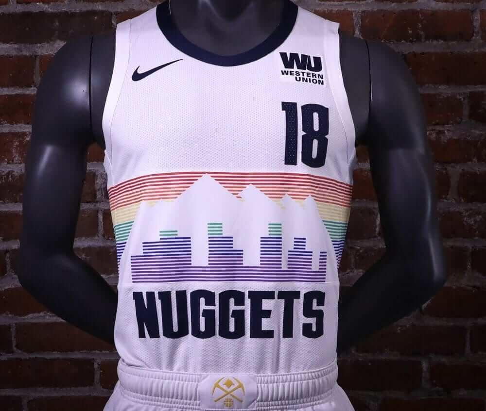
After weeks of leaks (a term Nike should consider trademarking, no?), NBA teams will finally start unveiling their City alternates today. The Nuggets got things started just after midnight, when they released a new rainbow-themed uniform. I have a feeling that the bands of color may look faded or washed-out on the court, but overall it’s a very nice design. Additional info and photos here.
In addition, the Bulls will be unveiling their new Chicago flag-based design at some point today, and Pistons apparently have a new BFBS design set to unveil at 9am Eastern. It’s not clear whether all the other City alternates will also be unveiled today, but we’ll find out soon enough.
Updates: The Hornets, Pistons, Thunder, Bulls, Magic, and Timberwolves have unveiled their new alternates:
Breaking: Hornets unveil new City Uniforms: “City of Flight” pic.twitter.com/E3ta5PT7hx
— Dylan Jackson ⚡️ (@JaxonNBA) November 1, 2018
Our city. #MotorCity
Our new black City Edition jerseys are based on inspiration from automotive culture and the hard-nosed mentality of Detroit.
On-court debut November 23! #DetroitBasketball pic.twitter.com/1xRuSpEddS
— Detroit Pistons (@DetroitPistons) November 1, 2018
More than just a uniform – we’re excited to honor Oklahoma’s Native American heritage. pic.twitter.com/Pi9eenoASj
— OKC THUNDER (@okcthunder) November 1, 2018
Chicago is OUR CITY.
City Edition jerseys are here! pic.twitter.com/JjwGiqoryP
— Chicago Bulls (@chicagobulls) November 1, 2018
Magic x @nike x City
On Sale at Orlando Magic Team Shop: Nov. 9 🔥 On Court: Nov. 14 vs. @sixers pic.twitter.com/o64Y6vQfQP— Orlando Magic (@OrlandoMagic) November 1, 2018
Good look at Timberwolves new Prince-themed alternate uni. pic.twitter.com/oDmzcsRC3p
— Paul Lukas (@UniWatch) November 1, 2018
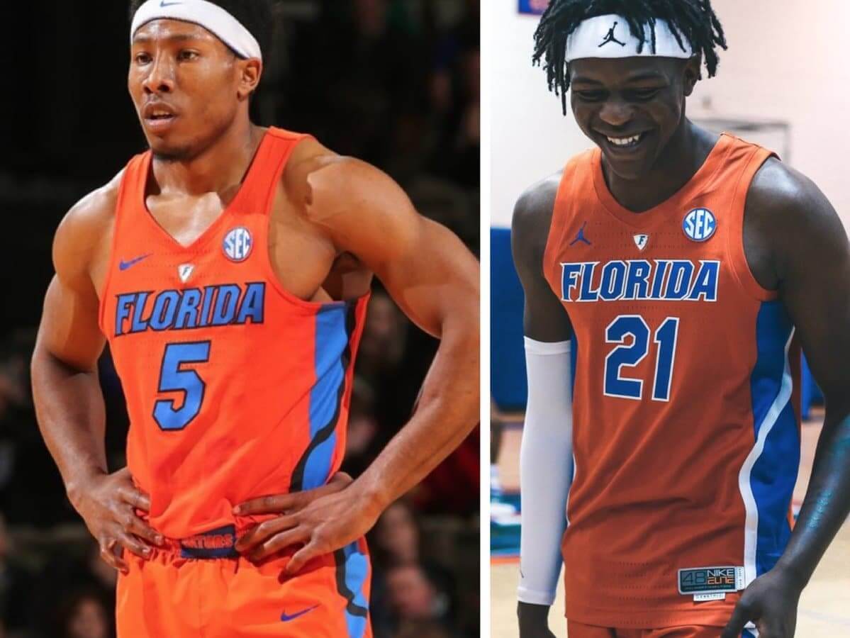
College Hoops Season Preview: Don’t look now, but the college basketball season tips off on Tuesday, which means it’s time for my annual Uni Watch College Hoops Season Preview — a massive undertaking with coverage of well over 100 teams (including Florida, whose old Nike design and new Jordan design are shown above). Check it out here.
Click to enlarge
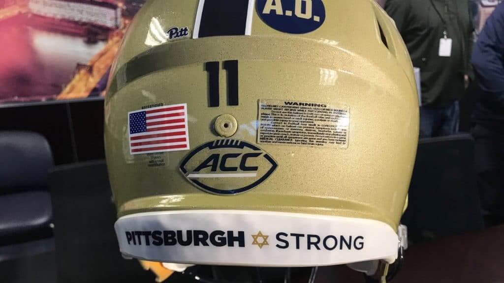
Pittsburgh massacre tributes, continued: The Pitt football team yesterday announced that it will wear a “Pittsburgh ✡ Strong” message on its neck bumpers for tomorrow night’s game at Virginia, making the Panthers the latest team to wear the Star of David (a topic I explored in greater depth yesterday). It’s not yet clear, at least to me, whether Virginia will wear anything similar.
Nothing yet from the Steelers, but I’m fairly certain they’ll wear some sort of memorial gesture this Sunday.
Speaking of which: Back on Monday, which I suggested that the Steelers wear this symbol on the left side of their helmets, longtime reader/commenter Dan Tarrant had an interesting, thoughtful response that I’d like to revisit. Here’s what he wrote:
While I know it Paul’s suggestion that the Steelers swap out their usual logo for the “Stronger Than Hate” version was made with the best of intentions, I can’t help but think that would be a can of worms that the team would rather not open.
A few reasons:
– The Star of David is both a religious and political symbol, and some players will no doubt object to wearing it for those reasons.
– Imagine if the tragic mass murder in Pittsburgh involved a mosque being targeted instead of a synagogue. Is there any way in hades that a team would ask their players to wear a logo with a star and crescent moon?
– there have been 98 homicides in Pittsburgh this year. 68 of those victims were black. At some point, somebody is going to ask why those victims are not worthy of mentioning but the Jewish victims are.
Probably best if the Steelers stick with a more neutral/traditional way of memorializing the attack. One idea might be to remove the gold stripe across the helmets and replace it with a black one.
Granted, it’s only been a few days, but we now have three teams wearing the Star of David (Penguins, Islanders, Pitt), and Dan’s first and third predictions — that players would object on political grounds and that social critics would compare the massacre victims to other Pittsburgh murder victims — have so far not come to pass. I’m more intrigued, though by his second point, in which he said there’s no way a team would wear a Muslim symbol in response to an attack on a mosque.
I respectfully but strongly disagree with this assessment. While I fervently hope we never have to find out, I fully believe that if 11 worshipping Muslims were gunned down at an American mosque in an act of domestic terrorism, the response by the local sports teams would be similar to what we’ve seen in Pittsburgh. Ditto for Sikhs, or Hindus, or any other sect. If anything, the sports world is further ahead of most of America when it comes to accepting Islam, since there have been star athletes who’ve been practicing Muslims (Kareem Abdul-Jabbar, Hakeem Olajuwon, Ahmad Rashad, Muhammad Ali, and many more).
Now, maybe you think having any religious imagery on a uniform is a bad idea. That’s certainly a defensible position (one that I’ve been wrestling with this week myself). But if the Star of David is okay, I fail to see why the star and crescent would be problematic.
Also: I’m also intrigued by Dan’s idea of the Steelers swapping out their yellow helmet stripe for a black stripe. Hmmmm, a black stripe on a black shell — crazy, or brilliant? I think maybe the latter!
Finally: Yes, I realize the Star of David glyph in the first graf of this section is purple. No matter how much I tinker with it, it stubbornly stays in that color! If anyone knows how to change it, I’m all ears.

Culinary Corner: My friend Matt recently mentioned to me that he had made almond-crusted pork chops. I’d never thought about cooking pork chops that way before, but it sounded great, so I decided to try it.
First I got some boneless pork chops. Then I took a cup of roasted almonds and ground them up in a food processor. I wanted to grind them fine, but not too fine, because then I’d basically end up with almond flour.
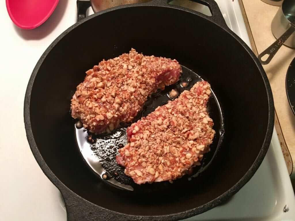
Then I beat an egg in a bowl and dipped each chop in the egg and then in the ground almonds. Here’s how the raw almond-coated chops looked (for all of these pics, you can click to enlarge):
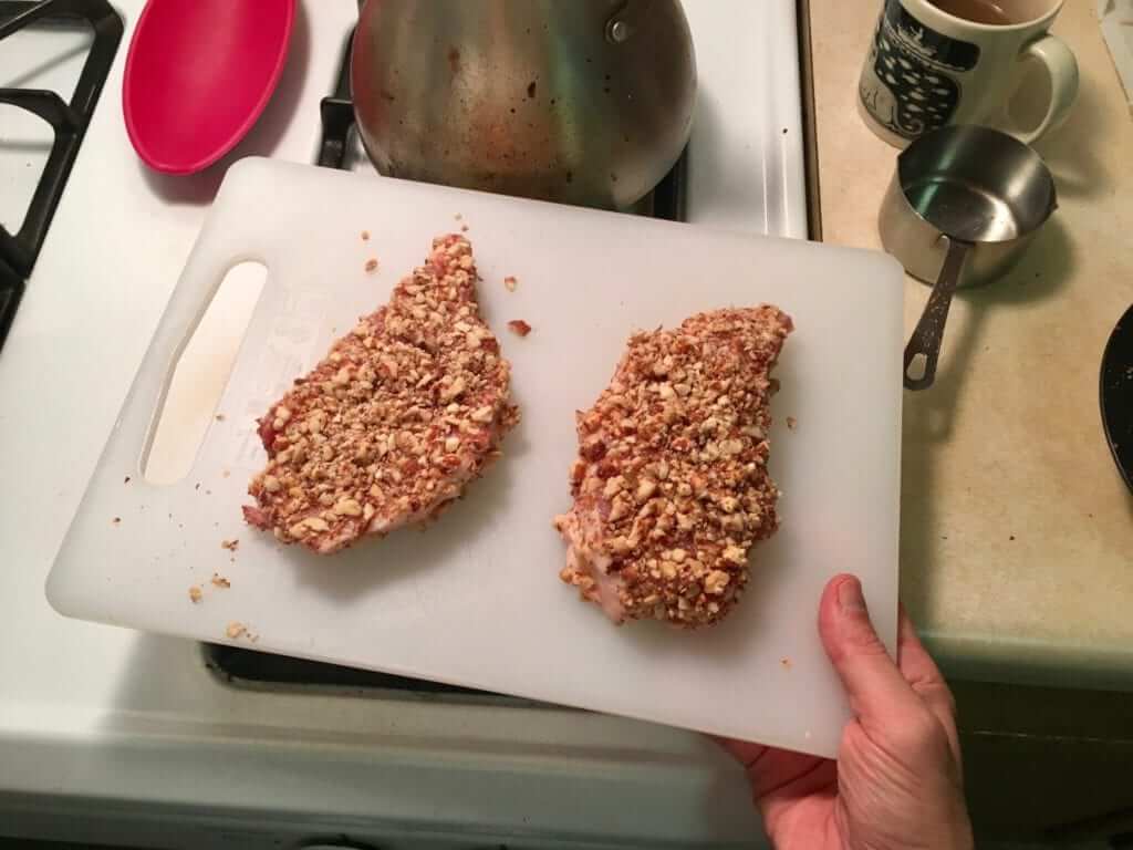
As you can see, some of those almond chunks are pretty chunky. I probably should have ground them a bit finer, but overall it worked out okay.
Next, I put some olive oil in a cast iron skillet over medium-high heat and cooked the chops for four minutes per side:
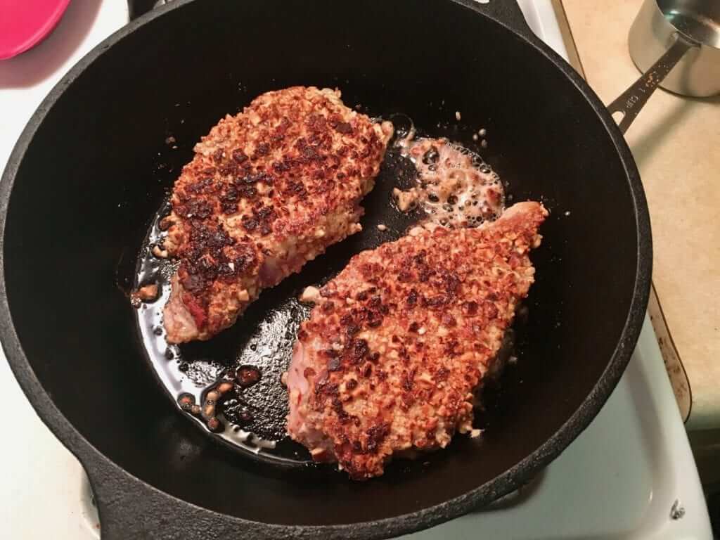
I removed the chops from the skillet and set them aside to rest for a few minutes. I used that time to make a pan sauce from the skillet drippings along with some butter, beer, duck stock, mustard, and corn starch (don’t ask me about quantities — I was winging it). Meanwhile, the Tugboat Captain made us a great celery greens salad. It all turned out beautifully:
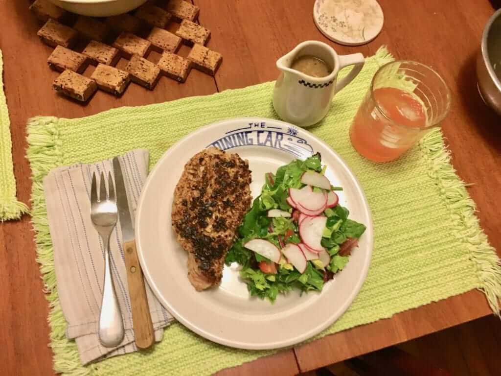
In short: a success! I’ll definitely be adding this one to my regular rotation.

KRC inspiration anniversary: I neglected to mention that yesterday was the 31st anniversary of when I attended the West Village Halloween Parade and received a quarter with a hole in it, which I put on my key ring and have kept there ever since. That quarter became the inspiration for the “Key Ring Chronicles” series that I curate and edit for McSweeney’s (with a little push from Uni Watch reader Jeff Barak, who provided some key impetus for this project).
Here’s my entry about the quarter, and here’s the full KRC archive.
Click to enlarge

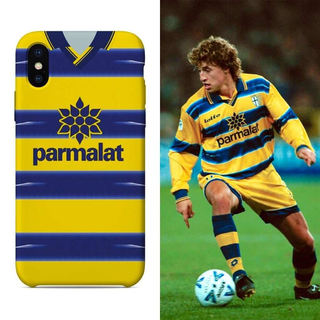
Assorted reminders: In case you missed it on Monday, our friends at Nostalgia Cases are raffling off one of their soccer jersey-based smartphone cases. To enter, send an email to the raffle address by this Friday, Nov. 2, 7pm Eastern. One entry per person. I’ll announce the winner next Monday.
In addition, if you don’t want to wait and see how the raffle plays out, Nostalgia Cases has also extended its 10% discount offer by another week. To get the discount, just go to the Nostalgia Cases site and use the checkout code UNIWATCH.
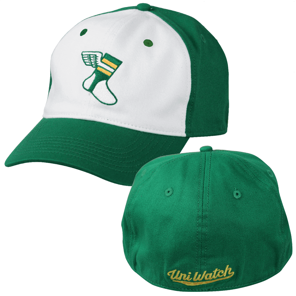
While we’re at it, please keep in mind that we’ve recently reduced the price of our flex-fit Uni Watch alternate cap (shown at right). It was originally $29.99 but is now $24.99, and you can order yours here.
And as long as we’re talking about caps, our Uni Watch classic cap, available exclusively from Ebbets Field Flannels, can still be ordered in all fitted sizes, we’ll have the adjustable version back in stock early next week. Get yours here.
The Ticker
By Yianni Varonis

Baseball News: Louisville Slugger is creating a range of commemorative bats celebrating the Red Sox World Series win. … The Kraft family, which owns the Patriots and New England Revolution, put out a Boston Globe ad congratulating the Red Sox for their title win, but used an outdated Bosox logo (from Skott Daltonic and Nicholas Neilling). … Staying with the Red Sox, here is a pretty cool photograph of the team touring Los Angeles in 1911. … A jersey worn by former Pirates OF Roberto Clemente recently sold for $66,000 at auction. … Reader Mike Barnes was watching highlights of a 1990 college baseball game and noticed two different-colored jerseys being worn in the Texas dugout. Anyone know why?

NFL News: The Panthers announced that they will go mono-black this week. … Also featuring black will be the Ravens, who will wear their black alternates (from Andrew Cosentino). … Also from Andrew, Ravens RB Ty Montgomery will retain his No. 88 following his trade from the Packers, even though it’s typically worn by receivers. … On the other hand, newly acquired Texans WR Demaryius Thomas will no longer be able to wear No. 88 because of this obscure NFL rule (from Mike Chamernik). … Also from Mike, the granddaughter of Browns OL coach Bob Wylie went as her grandfather for Halloween. … And another Halloween item from Mike: Steelers WR JuJu Smith-Schuester went trick-or-treating in full uniform! Here’s an additional photo.
College and High School Football News: Colorado will go mono-white this week (from Phil). … Washington State will go mono-crimson. … And apparently “50+” Minnesota fans hated the team’s GFGS uniforms enough to email HC P.J. Fleck directly to complain. … Bloomfield High School in Nebraska has some seriously vertically extended uni numbers (from Jeff Jensen).

Hockey News: This is pretty interesting: When filming a commercial, the Blackhawks had to replace the green from their shoulder patch with gold in order to avoid the green screen effect (from Ben Matukewicz). … The Blues’ ECHL affiliate, the Tulsa Oilers, will wear Blues-inspired uniforms this weekend (from Mike Lles and Steve Johnston).

NBA News: Here’s a pretty funny photograph of the Bulls’ mascot dressing up as Bulls C Robin Lopez for Halloween (from Mike Chamernik). … The Timberwolves broke out their black fauxbacks for Halloween (from @DeadstockDan). … From Phil, USA Today has published a gallery of what it considers to be the “ugliest uniforms in NBA history.” … According to Forbes, NBA2K19 is taking multiple steps to ensure opposing teams’ uniforms don’t clash in the video game. … The 76ers’ D League affiliate, the Delaware Blue Coats, have new uniforms.

College Hoops News: From Phil, nine men’s programs and six women’s programs will wear turquoise uniforms this year in honor of Native American Heritage Month, which is November. … Also from Phil, San Diego State is set to become the eighth college basketball program to wear the Jordan brand. … This article describes new tweaks to Xavier’s uniforms this season. … It appears that Arizona is now wearing captaincy patches for the first time (from Arizona Daily Star sports editor Ryan Finley).

Soccer News: This might be the most Halloween-appropriate sports costume ever. It was modeled after former England D Terry Butcher from a 1990 match in which he suffered a head wound that even stiches and head bandages couldn’t keep from massively bleeding (from our own James Rathjen). … Following the death of Leicester City (England) owner Vichai Srivaddhanaprabha, a local school is encouraging its students to wear the team’s blue or apparel for a day. … The death of Srivaddhanaprabha has prompted Leicester City fans to circulate an edited version of the team’s logo online featuring a crying fox. … Good read about the United Soccer League’s process of creating “a new identity” (from Josh Hinton). … Also from Josh, Nike has a new authenticity patch for its soccer kits. … Chilean club Colo-Colo will switch from Under Armor to Umbro (from Ed Żelaski). … Also posted above in the baseball and NFL sections: The Kraft family, which owns the Patriots and New England Revolution, put out a Boston Globe ad congratulating the Red Sox on their title win, but used an outdated team logo (from Skott Daltonic and Nicholas Neilling).

Grab Bag: From Phil, here are fun photographs of athletes wearing their Halloween costumes. … London’s famed Scotland Yard will now license its logo to be used on toys, clothing, and souvenirs to help raise money for the police force. … Here is a video of an historian describing an inmate’s uniform worn in a Nazi concentration camp. … A man recently released from jail was quickly arrested again because he stole his inmate’s uniform. Probably wasn’t worth it. … Motion-picture company Regal, based in Knoxville, Tenn., has a new logo that pays homage to the University of Tennessee. … Staying in cinema, the Avatar franchise has released a new logo, which is papyrus-free. … And on the small screen, the Satanic Temple has accused a Netflix show of copyright infringement for allegedly stealing the design of a monument for its set.
The Texans should just bench the rookie until his snap total is below 30% and then Thomas can have 88.
link for “JuJu Smith-Schuester went trick-or-treating” not working
Refresh the page and try it now.
Man, those pork chops look fantastic. I think I will try that recipe but I am going to stick them in the air fryer. I may also switch out the egg for a coating of EVOO. Maybe serve them as well with some mango salsa as I won’t have any pan drippings for a sauce. My stomach is rumbling just thinking about it. Thanks for the recipe!
It’s your money, but heating olive oil denatures it. Extra-virgin olive oil is meant to be served cold, with bread or in a salad dressing. Convincing people to cook with “EVOO” is one of many culinary frauds Rachael Ray has perpetrated.
Um, people were cooking with extra virgin olive oil for generations before Rachael Ray was born.
Paul is spot on once again.
link
This may be a case of scientific terminology vs. lay terminology, but I don’t think the word “denatures” is correct here, since olive oil has no protein in it.
How about a black stripe for the Steelers’ helmet, with white (or non-yellow) borders, just thin enough to establish that there is, indeed, a black mourning stripe on the helmet?
Cannot unsee the American flag decal covering most of the “RECONDITIONED” sticker on the Pitt helmet.
*smacks head* It says, “RECERTIFIED”.
The college hoops preview is up:
link
The guy from Pitt should’ve done some research into the 68 killings of black men. I took a quick look online and the Steelers wouldn’t put a decal on their helmet for murder victims due to a drug deal gone bad or shot during a robbery.
Key impetus? Nice one.
That pork chop recipe is definitely one I’m going to try. I have a question about the celery greens though. I’ve never seen them sold on their own. Are they available this way, or did you cut them off of stalks of celery? A couple weeks ago I was chopping celery to make stuffing, and after I removed the greens from the stalks I suggested to my kids that they give them to our pet rabbit. He loved them! If they are available commercially (ie, without having to trim them from the stalk yourself), I’ll have to find a place locally that sells them, and put them in Jack’s normal rotation of salad greens.
Removed from stalk.
“the response by the local sports teams would be similar to what we’ve seen in Pittsburgh. Ditto for Sikhs…”
I don’t believe there were any memorials of any kind by any of the Milwaukee teams or sports community for the Wisconsin Sikh Temple shooting.
Why does everything need a incident specific logo, whatever happened to just a black armband?
it happened in August of 2012 but Peter makes a great point. Since it was August it wasnt in middle of football or basketball season. A quick search on google and I dont find any evidence the Brewers did any logo/decal related honor.
6 were shot dead and 4 wounded. I don’t want to be insensitive but perhaps that wasn’t a “high enough” body count in the USA to be noticed? Sad stated of affairs if that’s were we are as a country.
Good point though, Peter.
Six years is a long time in the uni-verse. I think the default inclination toward more (and more visible) gestures has gotten much, much stronger in that time. Not saying that’s a good thing or a bad thing — just a thing.
The Aurora movie theater shooting occurred in late July of 2012, which may account for the perceived/real lack of news coverage or memorials by sports teams?
Also something I’d forgotten from that time…the Denver-based NASCAR team paid tribute to those who lost their lives in that massacre using a Colorado flag-inspired ribbon decal containing a cross (not that it mattered, but were all the victims Christian?):
link
No. I read an article (wish I could where) from a Denver-area rabbi where he compared the events in Pittsburgh to the Aurora shooting. He said that two members of his congregation were injured in that attack.
Paul, thanks for the college basketball preview. That looks like it took a ton of work.
In reaction to what I saw there, all the movement to logos on the jerseys somehow makes things look like practice jerseys to me.
As for today’s site entry, I love the JuJu trick or treating thing.
Also, yay, Nuggets. Now just make that the primary, come out with a road version, scrap all the others, we’re done.
I completely agree with you on the Nuggets. The skyline uniform is always their best look.
That Nuggets uniform is a perfect update from the Atari/Tetris uniforms.
I’ve been waiting for the Nuggets to make a proper update to that Skyline uniform and they finally did it and did it right. The 2nd edition of the Skyline template was my favorite when I was a kid.
Yup – this may not be popular.
There is a lot of love for the 1980s Denver Nuggets skyline uniform from the readers. It may be the signature Nuggets look, but it is not their best. I myself cannot call it a great uniform when you have a multi-coloured rainbow with Tetris buildings covering the torso.
I much prefer the first powder blue with yellow trim as the best Nuggets look, before the navy began to be more of a trim colour:
link
The rainbow on these new uniforms is more subdued. Not a bad thing. Kind of similar to how the Carolina Hurricanes brought the storm warning flags back in the striping of their present uniform in a more subdued fashion.
Paul, the Star of David in the first graf of the Pittsburgh section actually shows up correctly (i.e., like it does on the helmet) on my phone, but I can’t speak for everyone’s phones.
I haven’t heard of UVa doing anything but I don’t think the revealing of their uni combo (last night) means that they won’t do anything.
Re: the USL article, we haven’t mentioned this yet, but their “new identity” is three tiers called the Championship, League One, and League Two. At least they didn’t pay a design firm to come up with that…
Nike’s new NCAA jersey template is a vast improvement over last season and the obscenely thin shoulders, but that isn’t saying much. I really love the new LSU uniforms, too.
Maybe I missed it somewhere, but when and why did you decide to show the ads on the NBA jerseys?
The ads only get ad-blocked if they are *new* ads being announced for the first time — not for subsequent appearances.
RE: Pork Chops – couldn’t help but notice the “old school” placemat! All part of the presentation.
Also, the NCAA uni-hoops article has to be the most complicated thing you do all year. Congrats and Thanks.
If you’re going to announce your schedule in a longish video, you could do a lot worse than the Aussie Rules team Geelong Cats, who dressed up kittens in little team uniforms for each game on the schedule: link
Re: Purple Star of David: Try replacing what you have with the HTML code ✡ and see if that helps. That’s & # 10017 ; with no spaces in between.
There’s also a WordPress setting in Settings -> General that coverts glyphs to emoji, you could try turning that off too.
Don’t see that in Settings -> General.
In the Nuggets teaser video for the new uniform the jersey has an “18” on the front and “19” on the back: link
I assume this is for the “2018-2019 season,” but it looks really weird. I don’t recall seeing a team do that before.
I recall seeing that crop up occasionally here. It’s not common, since teams usually will just use current players’ jerseys for these types of unveilings.
The green screen edit link for the blackhawks is the wrong logo. The one they changed was this one with the green handles. link
They have different tomahawks on different color jerseys.
Nothing changed. The miscommunication here is that they “changed” shoulder logos when in actuality, the logos green parts turned gold because the green screen is showing gold. The GREEN SCREEN and green of the logo both turned gold.
That’s clearly what the tweet is saying.
still the wrong logo link. The logo with the “change” is the green handled one, not the linked red handleed one. The linked one would have had green screen issues only on the heads. Its also on a different “C”
The text of the tweet reads: The green in the Blackhawks shoulder logo was replaced with gold in this commercial due to the green screen effect.
The problem with the way that tweet is worded is that it doesn’t make it explicitly clear. It could be interpreted in one of two ways:
* The patch was physically altered to prevent an issue with the chroma key effect, or
* Because of the effect, the backdrop color bled through and showed up over the green portion of the patch.
The tweet only states that the color was changed, and it had to do with the effect. It doesn’t actually identify who or what made the change.
As for the logo link, yes, the wrong one was used. So both JD and PT have made valid points.
It’s pretty clearly the normal shoulder logo and the green handles and laces were turned gold with the green screen. It’s really easy to tell.
Almond-crusted is one of my favorite dishes to cook. My wife is hooked on it too. I typically do almond-crusted chicken. Make a cheater-aioli to go with it. Delicious.
Basically, mix a few other seasonings in with the almonds and it’s delicious.
Do you think Arizona has enough patches and markings on their jersey? If they get to the NCAA tournament [and choose to wear the patch], they will have 6.
Charlotte is “Buzz City”? More like “Buzz Kill”
Bob Wylie’s walrus-esque mustache is the most see-through giant mustache I’ve ever seen. Yet, the irony of a walrus “mustache” is that it has an incredibly low folicle-per-square-X ratio, making this the most correct walrus-ian mustache.
(I really just said this outloud, didn’t I…)
With regards to the Golden Tate Photoshop video posted yesterday, as of 12:30 EDT today, both ESPN and Pro-Football Reference have Tate listed as number 15 for the Eagles. The problem with that is that 15 has been retired for decades in honor of Steve Van Buren.
The Eagles, meanwhile, have updated their online roster to show Tate with #19, as shown in the video. However, link. ESPN has link, at least.
In the congratulations ad that the Kraft group bought. The middle logo one is for the Boston Uprising. The Kraft’s Overwatch League team.
So, 4 out of the 6 NBA alternate uniforms unveiled so far are black. Long live BFBS!
Now 5 out of 7 are black.
T-Wolves unis omitted because of purple? ;)
Or is it old news? Tried to look at past posts.
My bad. Forgot to add it (I’m scurrying to write an ESPN piece on all of these while also updating today’s blog entry). Now added!
Ugh… those Bulls unis ruin a tribute to one of the best city flags in the US.
In 2012 some idiot shot up a Sikh temple (called a “gurdwara” if I recall) in suburban Atlanta, killing six people. I don’t recall the Atlanta sports teams doing ANYTHING in commemoration. No “Atlanta strong,” nothing. So there is a valid observation where this sort of tribute was unevenly applied.
Sure. But already noted in another thread, that was six years ago, which is a long time in the uni-verse (and also a long time in the history of social media, which drives this type of thing much more now than it did then). The trend now is toward much more overt gestures.
When did “______ Strong” become the catch all for any type of tragedy? I appreciate the sentiment but it seems to almost become generic branding for tragedy, that when something bad happens you can anticipate a message of “____ Strong”. I feel like it reduces the effect when it’s rolled out as insert generic tragedy branding message here.
It worked for the Red Sox, because their “B” logo combined with the word “strong” functioned equally well as “Boston Strong” and “B(e) Strong.”
But yeah, it’s lame-o default in most other contexts.
I’m wondering of the use of Strong in this way came about as an offshoot of “LiveStrong”.
it did come from one nut armstrong.
The author Minnesota article in the ticker says the jerseys don’t matter… obviously he doesn’t Get It(tm)
I feel dumber now for having read that particular opinion piece.
I really like lots of the alternate NBA jerseys purely on an aesthetic level but I struggle to get past the merchandise angle.
One of the things that drew my interest in US sports uniforms was that they weren’t replaced yearly and that if I bought a replica I could expect to see it worn most of the time.
When there was one NFL sideline cap a year I used to buy it and wear it all season but now there are multiples I don’t bother and am actually fairly anti.
It might just be me getting older and more bitter but I feel that too much now is about the status of things as opposed to function and what it represents.
Paul,
Thanks for the props on my “Pittsburgh” comment. Always feels good to hear that I’ve contributed to the dialogue in a positive way.
On a totally different subject, as a Charlotte native I am a little perplexed as to why the Hornets use the phrase “Buzz City” on their “City” alternative jerseys.
Charlotte has long been nicknamed “The Queen City” after its namesake. Never has anybody referring to it as “Buzz City” – this is a nickname the Hornets totally made up as far as I can tell.
Almost makes me think that the team was uncomfortable using the term “Queen” on the jerseys, for reasons I will not speculate about.
Call me an old curmudgeon if you wish, but I’m not a big fan of memorial patches/stickers/armbands/whatever in general. From an aesthetic perspective, they just clutter up the uniform, and they don’t really serve any practical purpose beyond reminding the fans of something they probably already remembered anyway.
That Nuggets one is
The T-Wolves is also pretty awesome, the Bulls one is pretty good, as is the Thunders, Magic is mediocre, Detroit’s is , as was last years.
I guess fire and trash emojis don’t translate into the comments section!
Just can’t have porkchops without apple sauce . Seriously, just no ! Must have apple sauce . You’ve lost all credibility with me. Apple sauce … damn you
I’ve done a bit of a dive on the Texas baseball player in the orange “jersey.” I believe he is wearing an undershirt instead of the jersey. It’s pretty common to have their numbers on these shirts so scouts can identify players during pregame and at practice. However! I did a tiny bit of research and the Longhorns did not have a number 46 in 1990 at least according to this website. link
So the mystery continues