Click to enlarge
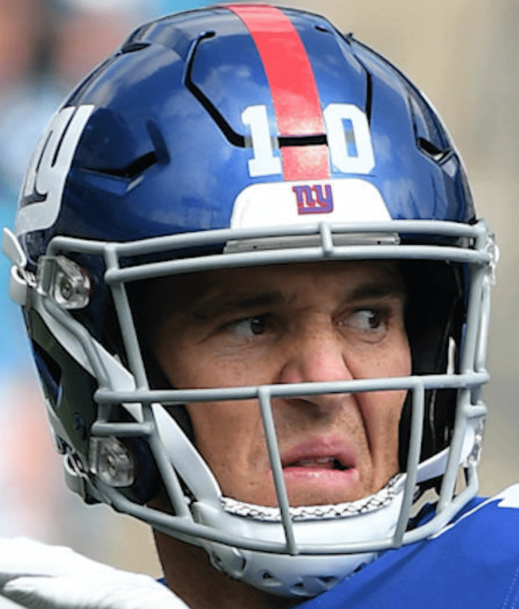
Last night’s loss to the Eagles was the latest evidence that the Giants really suck again this year. They’re not just bad — they’re boring (a pretty neat trick when you have playmakers like Beckham and Barkley), which is another way of saying they’ve become unwatchable. So this is a good time to mention something that’s been bugging me for a while now: As you can see above, the Jints’ chinstrap cups have these little liners with what appears to be a snakeskin pattern (that photo isn’t from last night, but it was the best close-up shot I could find). It doesn’t mesh well with the no-frills look of their uniform, and I find it really distracting. It would be nice if they’d change it, but I probably won’t be watching anymore to find out. Did I mention that they’ve become unwatchable?
As for last night, they wore their mono-white throwbacks — a good look, although it’d be better with the proper blue-topped socks instead of the solid-white Color Rash hose.

Click to enlarge
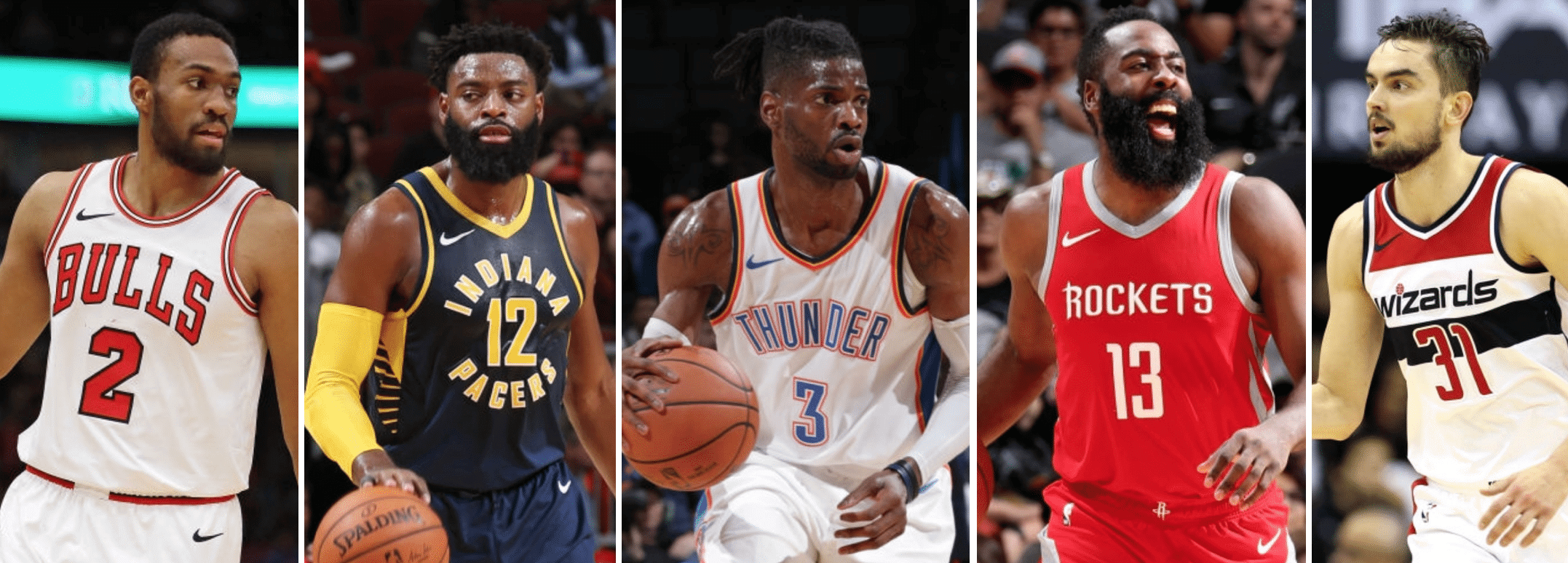
Almost time for tip-off:The NBA season begins on Tuesday, which means it’s time for my annual Uni Watch NBA Season Preview. Check it out here.
As for the images shown above, I thought it would be nice to announce the season preview by featuring the five remaining advertising-free teams. But as I was gathering the five photos, I received word that one of those teams — I can’t tell you which one — will likely be announcing a jersey advertising patch in time for Opening Night. Sigh.

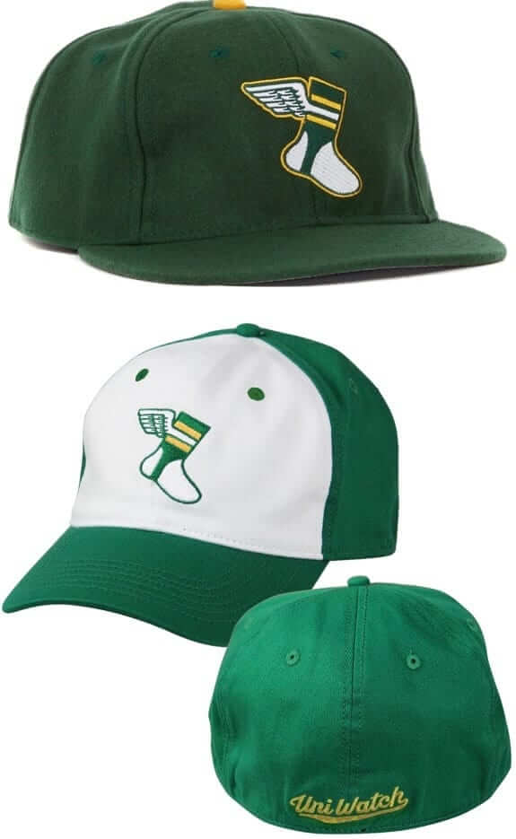
Headwear bargain bonanza reminder: In case you missed it earlier this week, big savings are on tap for both of our Uni watch caps.
First, our friends at Ebbets Field Flannels are offering a site-wide 20% discount with the checkout code PLAY18. That effectively reduces the price of our solid-green Uni Watch classic cap from $49 to $39. Order yours here.
In addition, we’ve reduced the price of our flex-fit Uni Watch alternate cap from $29.99 to $24.99. You can order that one here.
And while we’re at it, don’t forget that we have a great new T-shirt, designed by Andrew Harrington, that mimics the look of a vintage woven clothing tag. That one is available here.
My thanks, as always, for your consideration of our merchandise.
The Ticker
By Yianni Varonis

Baseball News: Here’s a fun video of Giants RF Hunter Pence and his wife cleaning out his locker and deciding what to keep and throw away now that the team’s season is over (from our own Brinke Guthrie). … Also from Brinke: Today’s Google Doodle is a salute to Roberto Clemente.

NFL News: Eagles K Jake Elliott wore a hunter-green suit before Thursday Night Football that featured photographs of his career on the blazer’s inside lining. … This article recounts the “ooh” and “aah” of the crowd the first time the Rams wore horned helmets. … The Chargers will go mono-navy this week (from Kristopher Sharpe). … A grocery store owner in Athens, Ala., will no longer sell products with the NFL logo, in response to players kneeling during the national anthem. … Paul Quirk was at Ford Field last week for the Lions game and took a picture of the stadium’s helmet display, which hasn’t updated the Titans or Jaguars helmets yet. … Giants OL Chad Wheeler had one of his jersey numerals peeling off last night (from @headshoes). … Mitchell & Ness has started selling a line of NFL jerseys that are split, Frankenjersey-style, between white and color (from Danny Quin).
College Football News: North Carolina will wear white on white on white against Virginia Tech, and Tech will give DB Chamarri Conner the honor of wearing No. 25 this week (from Andrew Cosentino). … Reader Kary Klismet has two items about Iowa: The school is honoring the 70th anniversary of its mascot, Herky the Hawk, with an exhibit at the university library, and these Iowa fans got to write messages on the inside panels of Iowa game balls after touring the factory that makes them. … West Virginia will wear mono-white this week. … Virginia’s equipment manager hinted that Cavaliers fans “might see something new for this weekend” and now we know that the team will wear an all-navy uniform (from our own Jamie Rathjen). … Potentially confusing uniform matchup as Duke will wear grey jerseys and navy pants versus Georgia Tech, which will wear white jerseys and navy pants. … From Phil: Northwestern will wear black helmets and pants with purple jerseys against Nebraska, and South Carolina will wear white helmets, black jerseys, and black pants against Texas A&M. … Houston will go red-white-red this week. … And Stony Brook will wear white-white-red. … This is unique: Players from St. John’s in Collegeville, Minn., wear their last names on the front of their helmets while also going NNOB (from Matt Lesser). … Riverhead High School on Long Island will retire the jersey number of former LB and Tech. Sgt. Dashan Briggs, who was killed in an airplane crash while serving in Iraq.

Hockey News: With the Penguins having unveiled their yellow alternate uni, here’s a look at the history of yellow uniforms in the NHL (from Phil). … The Canadiens honored the 25th-anniversary of their 1993 championship team while former players wore sweaters featuring a period-appropriate Stanley Cup patch (from Moe Khan). … Remarkable attention to detail as the Devils stamp their logo onto each of their arena’s toilets and urinals. … In Saskatchewan, Regina Pats G Max Paddock takes Pinktober really seriously.

NBA News: The Bulls announced that the logo of Calamos Investments, a Chicago-based global asset manager, will now appear on the United Center court apron. … Is this a new alternate logo for the Thunder? … Lonzo Ball agreed to the NBA’s request that he cover his tattoo depicting the logo of his family’s shoe company, Big Baller Brand. … Earlier this week we saw leaked images of the Lakers’ Magic Johnson-themed shorts. Now a photo of the jersey is circulating, although its legitimacy isn’t yet confirmed. … Kareem Abdul-Jabbar wrote a little essay explanining why he’s selling off his memorabilia (from David Firestone). … After the Kings got slaughtered by the Jazz in a preseason game last night, the Kings’ Twitter account posted game highlights but censored the score bug (from Mike Chamernik).

College Hoops News: Dayton teased new uniforms (from Eric Farrell). … New uniforms for Arizona State (from Chad Smith). … Boise State will also sport a new look this season. … And Purdue has a new uniform template (from @KyleYourFriend).

Soccer News: Pretty crazy new kits for Spanish squad CF Zamora that remind me a lot of this guy. … Here’s an interesting interview with the founder of the company that makes cell-phone cases based on retro-kit designs.

Grab Bag: Runner Justin Gallegos became the first athlete with cerebral palsy to sign an endorsement contract with Nike. A powerful video of Gallegos receiving the news can be viewed in this article. … Here’s a good look at how the Beatles got their famous logo. … There’s a new book featuring record label logos (from Jeff Ash). … airBaltic has introduced new cabin-crew uniforms. … A GQ writer offers “A Fat Dude’s Guide for Fat Dudes at the Gym”, including what to wear. … This article details the items that passengers often steal from airplanes, including life vests and — according to one flight attendant — the wings off her uniform (WaPo link). … Employees of the Callaway County Ambulance District in Missouri will wear pink work shirts this month for breast cancer awareness. … Fashion retailer Marks & Spencer has caused controversy over its decision to sell hijabs to children in England as a part of its school uniform collection. … The Dallas News investigates “Who is really behind the logos on the political flyers in your mailbox?” … Here’s a rugby union game in New Zealand where you couldn’t tell the two teams apart (from @SkullyEqual).
That alternate Thunder logo is still really sad. Honestly, I can’t think of a blander team identity than Oklahoma City’s.
last night’s Giants’ game: it’s a weird feeling to see a throwback to the “new” uniform after a team mostly reverted to its classic look.
Wonder if the Dolphins helmet has the updated stripes on the Lions display.
Also – I’m guessing it’s already been noted, but Eli’s stripes are cut for the gap in the helmet shell, but the numbers aren’t cut.
Covered in detail here:
link
In addition to the socks, those Giants unis last night would be better without the anachronistic “ny” logo below the collar. The jerseys are supposed to be 80s-90s throwbacks, so they shouldn’t have that logo on them! (And I know there are people around here who love that ny logo, but I hate it. It doesn’t look timeless to me, it just looks old. But, that’s just my opinion.)
The chinstrap padding pattern… doesn’t really bother me. In fact, the thing that bothers me about that particular picture is that Eli has a cut stripe, but uncut numbers. It’s also hard not to notice that they’re not simply white number decals, but clear decals with white numerals applied to them.
Also, Eli just looks disgusted in that photo.
I’m one of those that loves the NY logo. I find I always prefer logos that reference the location/city of the team rather than just the team nickname. For example, I have less of problem with the Texas Rangers’ jerseys both saying “Texas” than I do with the Angels’ jerseys saying “Angels” without reference to LA. I like it in basketball when the road jersey has the city name and the home the team name, but if it has to be one or the other, I prefer the Knicks “New York” only to the Lakers “Lakers” only habit.
It’s not the reference to the city that bothers me about the ny logo, it’s the design. To me, it just screams “I was made in the 1950s and I probably should’ve stayed there”.
But, I get that a lot of people do love that logo, and since I am not a fan of the Giants in particular, it’s not even remotely the worst thing in the world that the team has a preference for that logo.
“Cavaliers fans ‘might see something new for this weekend'”
I have no idea why the equipment manager said that. Mono-blue is not new; not even the helmet is.
Perhaps it’s technically new with this uniform set.
Giants classic throwbacks much better than the current uni.
I prefer the NY helmet, but the current white jersey is nonsense. Red numbers and stripes, and zero blue on the jersey makes no sense for the Giants.
The Giants color rush uniform is a fine set, however I still prefer their current away set.
It’s unique to the Giants. It’s a rare occasion where the road uniform doesn’t mirror the home uniform. The white jersey with red numerals and gray pants is a look the Giants have done well owning.
That said, I’m OK with the color rush uni being an alternate. If they ever introduce a new alt, I’d like to see a 1930’s inspired jersey. Red with a blue bar across the torso.
Mike D. agreed 100%. Giants’ current whites are awesome. Blue helmet is the perfect contrast to the red numerals. 2 titles in those whites too.
Whenever I see the Giants in their color rush, it takes me a second to realize they’re not the bills
Looking at the M&N site, they also have NBA throwback Frankenjerseys.
Caution: enter at your own risk
Those chinstraps are from a specialty chinstrap manufacturer called SportStar in Houston. They come with a few different types of foam and are actually pretty common in the NFL and NCAA D1. You’d be surprised how many guys wear SportStar.
And I don’t think it is snakeskin per se. I think it’s just the combo of material and cushy bumps.
In addition to the Stanley Cup Centennial Championship patches, those Canadiens jerseys had period-appropriate numbers – no white gap between the blue numerals and red outline – and even period-appropriate block lettering for the NOBs (rather than the rounded font they’ve used since 1997).
It’s just too bad they didn’t use period-appropriate jerseys with the blue-white-blue striped V-neck collar. The oversized mostly-white Adidas collar and the gratuitous laces throw the whole 1993-vintage feel off for me.
Whenever I see the Giants in their color rush, it takes me a second to realize they’re not the bills
The Thunder alt logo is essential the old OKC Redhawks logo, the AAA baseball team’s name before they became the OKC Dodgers
link
Well, if I had to guess, I’d say the Bulls are the one of the five that will be getting the new ad patch on their uniform…based on the ticker item stating that they are getting a new ad logo on the court apron.
Perhaps it was noted when the Magic’s patch honoring Rich DeVos was announced but isn’t it odd that it’s RDV instead of RMD (his middle name was Marvin)? His last name was by all indications DeVos, not De Vos. It would be like saying the initials of someone named John Patrick McDonald are JMD instead of JPM.
Kareem is a hero of mine for his strength and compassionate humanity. (I highly recommend the book he wrote about his relationship with Coach Wooden). But I think Uni Watch readers will see right through his “essay” about why he’s selling off his memorabilia. It’s actually marketing– not only for the auction company, but also for his financial manager. Et tu, Kareem?
My dad says he only tried in the playoffs
Here’s a crazy item. A Sherriff’s department in Arkansas is forcing all arrestees to wear Nike-branded apparel for mugshots! It seems to be some kind of anti-Nike move because of their association with Colin Kaepernick. link
BTW, response to the Frankenjerseys saying that the only person who would wear them is Two-Face (the Batman villain) is brilliant! Although Two-Face should really wear Frankenjerseys of arch-rivals: Red Sox/Yankees, Rangers/Islanders, UNC/Duke, that sort of thing.
“Pretty crazy new kits for Spanish squad CF Zamora that remind me a lot of this guy.”
Those kits remind me of link that was ubiquitous during my youth. I was a little too young for its heyday and I never had one myself, but they seemed to be in lots of classrooms and just about every garage sale I visited between the ages of 5 and 12.
Congrats to Herky! Still looking great at age 70.
I can tell the difference in the two rugby uniforms. One side is wearing Black/Yellow hooped shirts and Black/Yellow Hooped socks. The other is Black Shirts (with yellow collars) and Yellow topped black socks.
Really don’t like the mono-navy with the white helmet for the LA Chargers. Uni combo you would expect a college football team to wear.
If the Chargers insist on wearing another colour of pants with the navy jerseys (other than white), why not introduce some yellow pants? A nod to the 1967 Chargers:
link
The Bucks “City” jersey will be yellow. Wouldn’t surprise me if it’s themed for the People’s Flag of Milwaukee.
Complaining about the visual of the liner of a football chinstrap might just be the lamest thing I have ever heard on this site.
It’s not the Giants that have the weird looking chinstrap, it’s the brand. Just like helmets, all players can pick and choose what style/model/brand of chinstrap they want to use, the one today’s lede is about is from the brand SportStar, which is gaining a lot of traction in the NFL, not just with the Giants:
link
link
And while it appears a large number of Giants have chosen to wear SportStar, it’s certainly not required by the team, as there are a few exceptions:
link
And here’s a close-up of what the chinstrap looks like on the inside
link