Click to enlarge
[Editor’s Note: My recent piece about installing old gym lockers in my house inspired reader Keith Goggin to share his own locker-centric story. Enjoy. — PL]
By Keith Goggin
I’m the Athletic Director Holy Cross High School in Flushing, Queens. We had always been boys-only, but we recently went coed, so we had to renovate our locker rooms and divide everything up to allow for our new classes of girls.
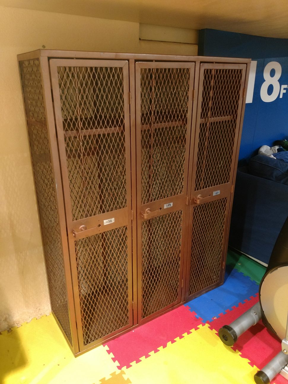
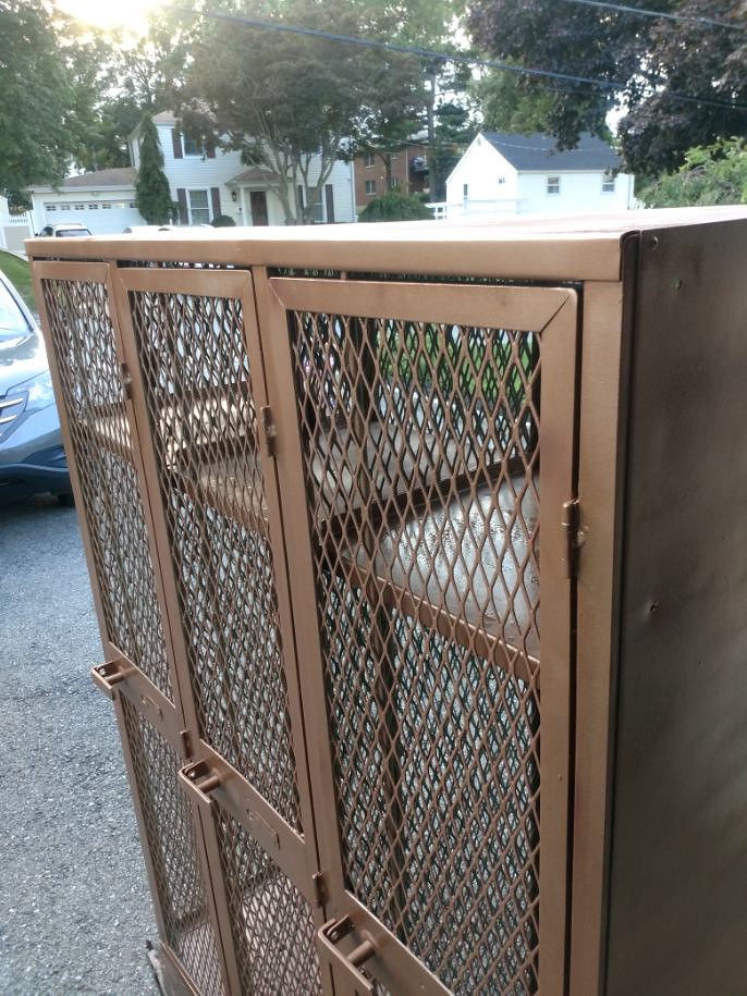
The old lockers were a sturdy cage style — about five feet tall and 15 inches wide. We had about 160 of them, mostly in banks of four — very big, bulky, and heavy.
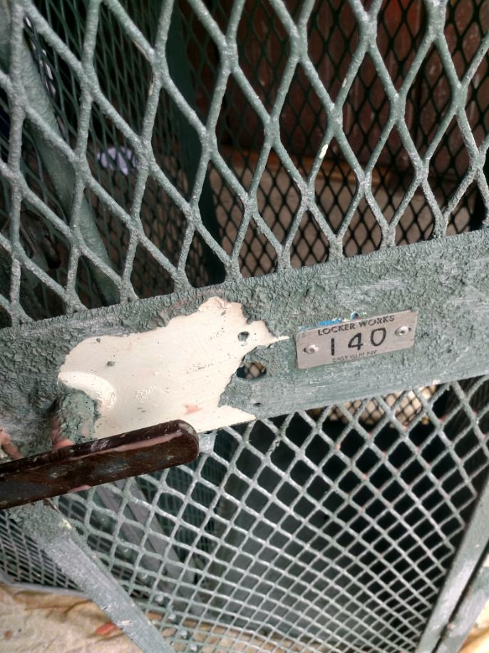
There was a bank of three that I had my eye on. It included the locker I used as a member of the varsity basketball team back in 1991-92, when I was a senior. It was an end locker — No. 140:
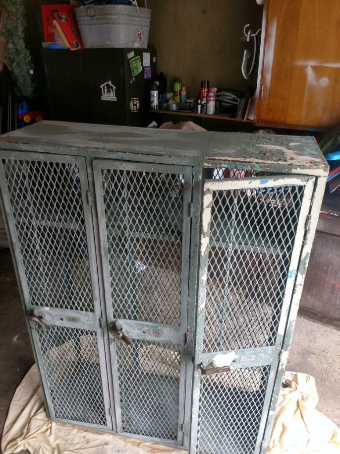
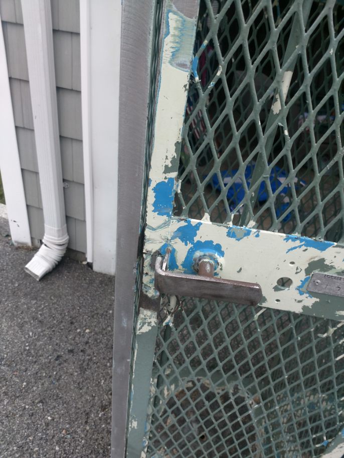
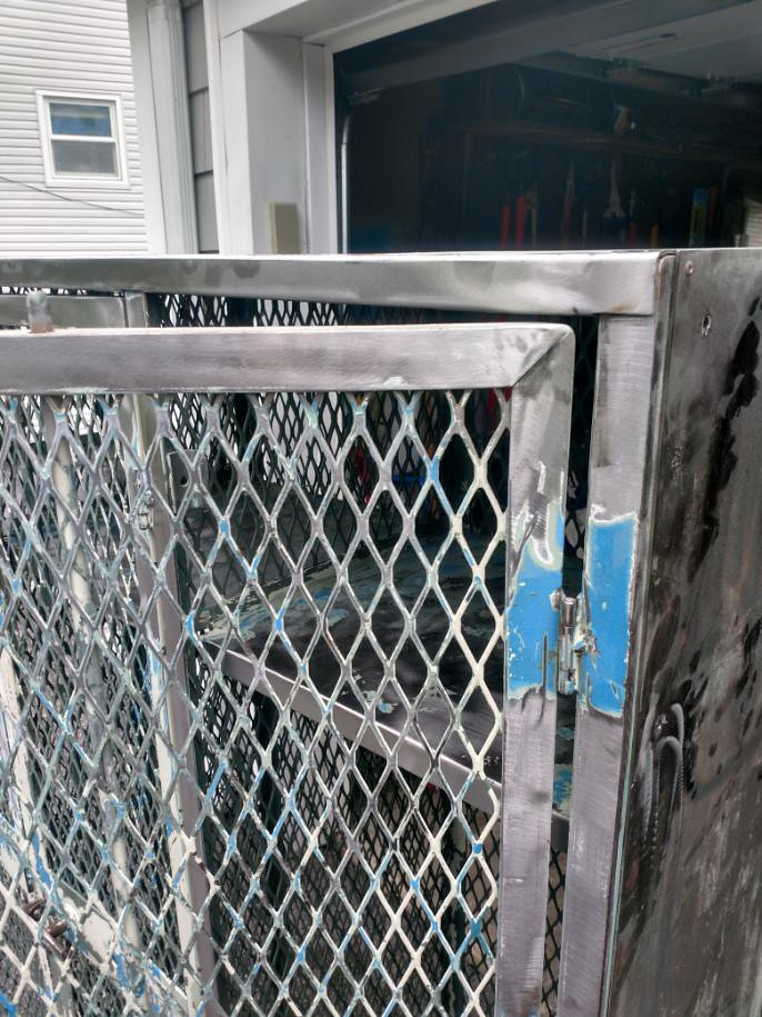
So when they dismantled the lockers, I took those three home (which was an escapade of its own, but never mind about that). They had about four layers of paint on them, with the top layer green. I decided to strip them down. Solvents were too weak, so I got an angle grinder and went to town, taking them down to bare metal:
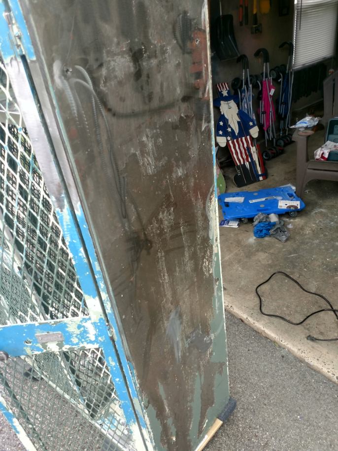
The next step was to prime them:
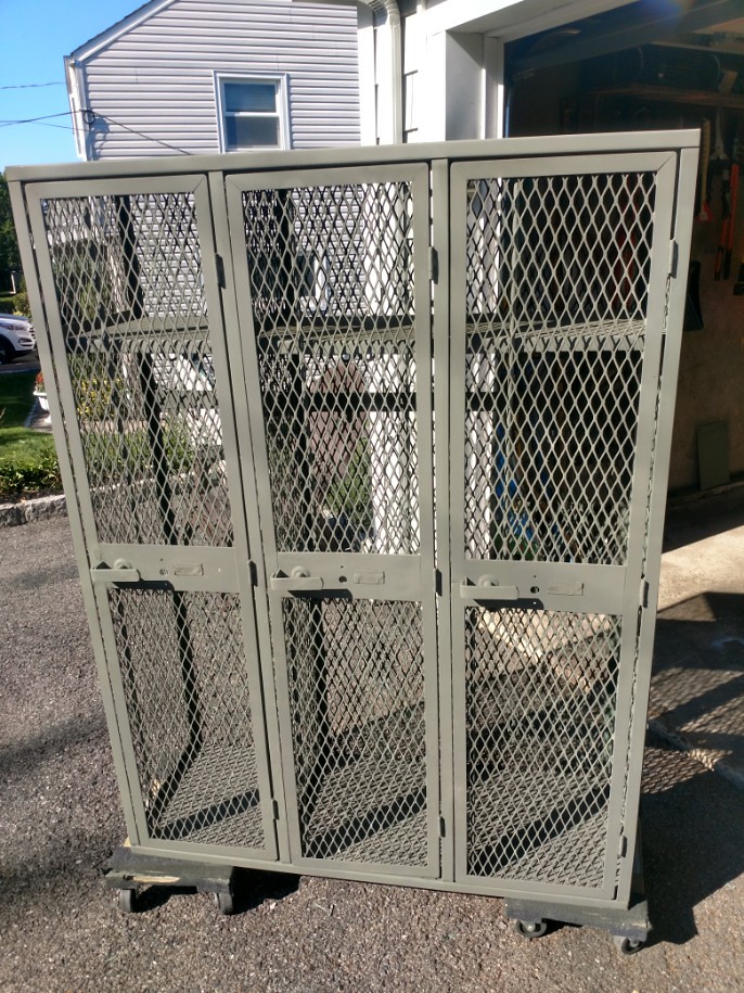
Then I had my son pick out a color to repaint them. He chose hammered copper, which was a pretty nice choice on his part:

About four rattle cans later, I had the lockers finished. I went over the numbers with a Sharpie and then somehow managed to lug the whole thing into my basement:
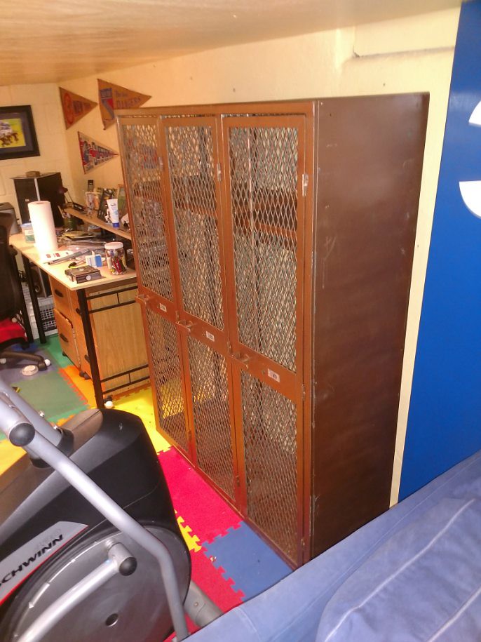
It’s perfect — one locker for my daughter, one for my son, and my old locker on the end. The kids put all their T-ball and soccer stuff in there (my wife is happy since it’s out of the way from our house’s main floor), and I have a few extra putters in mine for now.
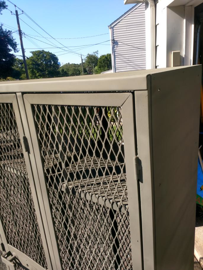
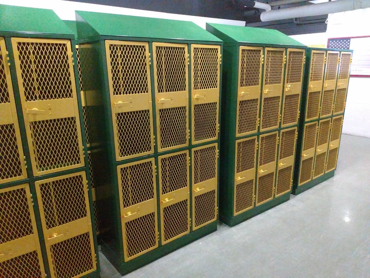
As for our school, I ordered new lockers in the same style, only double-stacked, to accommodate more athletes. I also had them made in our school colors, which Uni Watch readers will appreciate (click to enlarge):
I’m glad Paul shared the story of his lockers — it made me feel a little less crazy for taking these things home.
———
Great stuff from Keith! I should add that Keith and Joe Steele (the furniture maker guy who refurbished and reformatted the lockers I now own) are the real heroes of these stories. They put in the work and sweat to transform something old into something new.
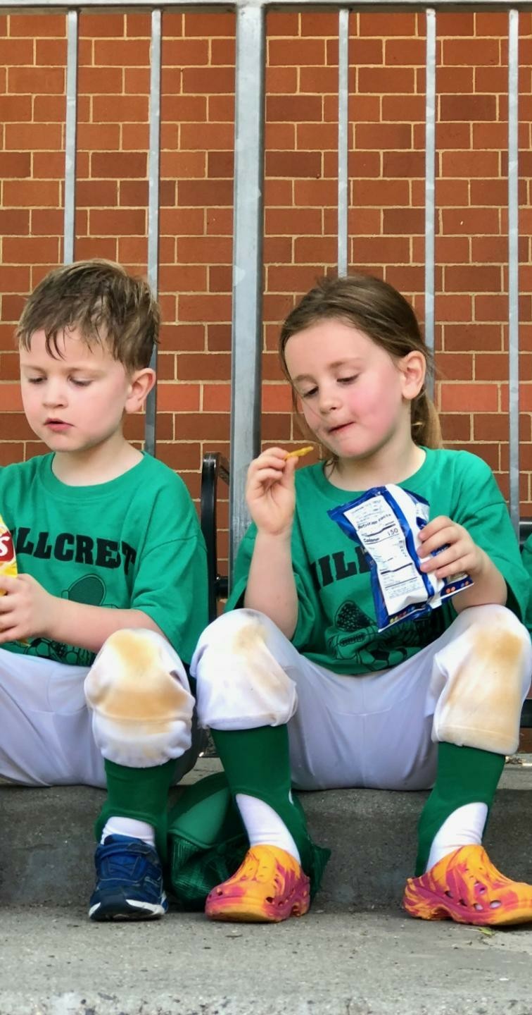
And speaking of heroism, Keith gets bonus points for teaching his kids the important things in life. Check this out (click to enlarge):
Click to enlarge
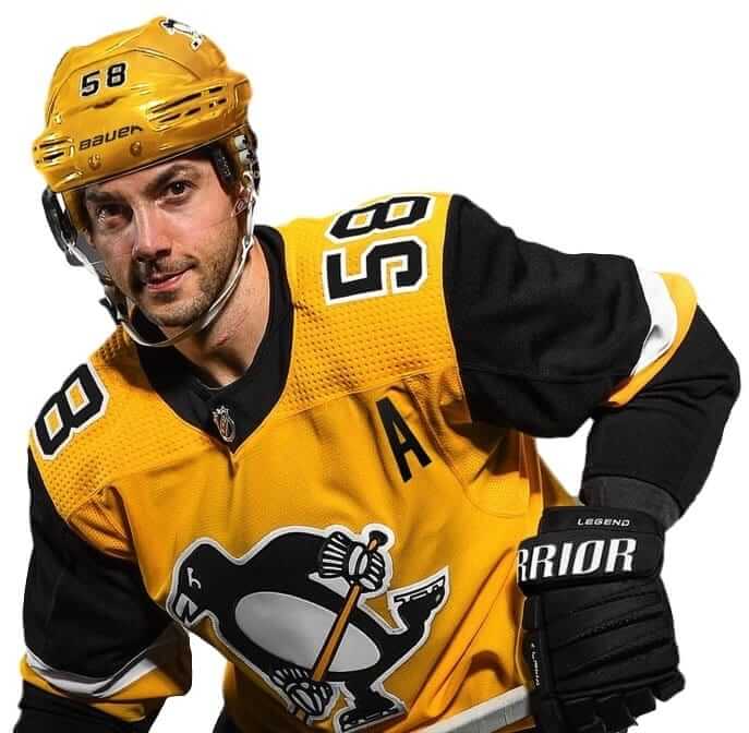
Another NHL alternate: The Penguins yesterday became the latest NHL team to release a third jersey alternate uniform. The design is similar to what the Pens wore in the 1980s and reprised for the 2017 Stadium Series.
The new alternate will be worn for 12 games this season, as spelled out here.
T-shirt/cap reminder: In case you missed it on Tuesday, we have a new T-shirt design, based on a classic woven apparel label (shown at right; click to enlarge). Thanks to some changes at Teespring, we’re offering this shirt in a much wider range of colors and styles than has been possible in the past. Full details here, or just go straight to the ordering page.
In addition, the price of our flex-fit alternate cap has been dropped from $29.99 to $24.99, and Ebbets Field Flannels is running a site-wide 20% sale on all their products, including our Uni Watch classic cap (use the checkout code PLAY18).
My thanks, as always, for your consideration of our merchandise.
By Lloyd Alaban

Baseball News: Reader Ryan Burns noticed Dodgers utility player Kiké Hernández sometimes wears clear glasses when batting, and sometimes he doesn’t. … This television ad featuring Rockies CF Charlie Blackmon cleverly incorporates one of the more conspicuous design features of Coors Field. As a bonus, Blackmon is wearing a hat with his nickname, “Nazty,” on it (from Kary Klismet). … Here’s a signed baseball card with former MLB P and current broadcaster Ron Darling in an Expos uniform. Darling pitched only three games for Montreal (from Andy Chalifour). … Billy Crystal was wearing the Yankees’ retro BP cap at last night’s Yankees/Red Sox ALDS game (from multiple readers). … Speaking of the Yankees: In a possible first, pinch-runner Adeiny Hechavarria wore a C-Flap in last night’s game. It’s probably the only helmet he has. … More Yankees: here’s how the Yankees’ famous interlocking “NY” came to be (from Phil). … New uniforms for the Jalisco Charros of the Mexico Pacific League (from Julio Marquez). … The Royals have filed suit against National Women’s Soccer League team Utah Royals (from @Royal_Champions). … Reds C Tucker Barnhart started a Twitter campaign to bring back Cincinnati’s pinstriped uniforms (from @JasonRL78).

NFL News: Leftover from Monday night: One of Drew Brees’s sons wore a Frankenjersey for his father’s record-breaking night (from Rose Culper). … The Giants are wearing their 1980s-era/Color Rash script helmets at this week’s practice (from Jon Star). … G.I Joe-vember came early for Eagles offensive coordinator Mike Groh, who was caught at a press conference wearing a Salute to Service jacket (from Blake Fox). … Here’s a video showing the evolution of NFL uniforms. Hard to believe lineman had shoulder pads that big! (From Jon Solomonson.) … Looks like someone has repurposed the 49ers’ old failed primary logo and slapped it onto a superhero mask (from our own Brinke Guthrie). … HB/QB George Taliaferro, the first African American to be drafted into the NFL, died Monday at the age of 91. Here’s a colorization of him in action for the Dallas Texans (from Pro Football Journal). … With the Jets hosting the Colts this Sunday, Gang Green will be going mono-white with grey facemasks to mark the 50th anniversary of the team’s Super Bowl III-winning season.
College and High School Football News: Notes from Phil: Pitt will wear their gorgeous throwbacks for this Saturday’s Notre Dame matchup. … Boston College will wear Doug Flutie-era throwbacks for this week’s game against Louisville. … Memphis wanted to go mono-white at home against UCF, but UCF said no, forcing Memphis to wear their usual home blues. … Colorado will wear gold-white-gold when they face off against USC this weekend. … Jorge Cruz spotted this logo for the Georgia Bulldog Club of Jacksonville in a local bar. As Jorge put it, this logo has no subtleties. … Ted Liu asks of Georgia Tech’s uniforms for this week: “Is this the first time Georgia Tech has worn non-white, non-gold pants? I can’t recall anything recent.” … As noted in the NFL section, George Taliafero died this week at the age of 91. His alma mater, Indiana, will replace their interlocking “IU” logo helmet decals with Taliafero’s No. 44 (from multiple readers).

Hockey News: New Hurricanes G Curtis McElhinney still hasn’t yet been issued ’Canes-colored pads, so he’s still wearing pads from his previous team, the Maple Leafs (from Andy Johnson). … The seats at the Red Wings’ arena will change from red to black, to better mask low attendance rates (from Mike Chamernik). … For the second straight season, the ECHL will feature Marvel Super Hero nights, which means Marvel-themed sweaters. … Penguins equipment manager Dana Heinze had his old number retired by his high school, where he played goalie (from Jerry Wolper).

NBA News: The most recent cover for Sports Illustrated Kids shows Lakers teammates F LeBron James and G Lonzo Ball in Adidas-era home unis, which they have never worn, and never will wear, in a game (from C. Duncan). … Looks like CBC Sports is still using the Clippers’ old logo, which has (sadly) been out of commission since 2015 (from Mike Enriquez). … No photos yet, but in honor of Deaf Awareness Night on Jan. 12, the Windy City Bulls, the Bulls’ D-League affiliate, will be wearing jerseys that will spell out “Bulls” in American Sign Language. After the game, the uniforms will be auctioned off with proceeds donated to Illinois Association of the Deaf (from Steve Johnston). … Cross-listed from the hockey section: Seats at the Pistons’ arena will change from red to black, to better mask low attendance rates (from Mike Chamernik). … Two jersey auction finds by David Firestone: Up for sale is a Bucks jersey worn for two seasons by C Kareem Abdul-Jabbar. Also up for auction: Kareem’s 1981 ASG jersey. … Drake performed in Phoenix on Monday and wore Suns SG Devin Booker’s high school jersey. … Phil found someone who is as fed up with all the Nike marketing BS as we are at Uni Watch HQ.

College Hoops News: Intentional or not, a great spot by Andrew Hoenig on this Temple men’s poster. Notice the “P” among the collection of school logos on the poster. That’s the official logo for Penn’s sports teams. The poster features a vertical line that bisects the Penn “P,” just like the actual, full logo. … Some Kentucky men’s items from Josh Hinton: Kentucky’s 2018-19 checkerboard-themed record book cover and their 2018-19 men’s program poster.

Soccer News: The Seattle Sounders of the MLS wore their away strip at home on Monday. They also went with Xbox Mixer for their shirt ad instead of their usual Xbox. … USL expansion side New Mexico United revealed their name and crest yesterday. They will begin play next spring. … USL side Louisville FC went Pinktober for last night’s game against North Carolina FC (from Josh Hinton). … Our own Alex Hider points us to the first renderings of FC Cincinnati’s proposed stadium. … Cross-listed from the baseball section: The Kansas City Royals of the MLB have filed suit against National Women’s Soccer League team Utah Royals (from @Royal_Champions). … Spanish Tercera Division side Zamora CF revealed their heart-themed third shirt.

Grab Bag: Check out this custom lid from Syracuse Lacrosse alum Nick Mariano. He will wear it for the Orange’s annual Orange Alumni Classic (from James Gardener).
Great work, Keith! Sanding to bare metal is hard work, or anyway much harder than I anticipated when I took on a project requiring it this summer. I nearly gave up in frustration with how slow it is, and I had only a fraction of the surface area of those lockers. And kudos on the copper – your son has excellent taste. Thanks for sharing the project and congrats on reclaiming locker 140!
Agreed. That was awesome. And a h/t to your craftsmanship too, very well done.
Thanks! You aren’t kidding about sanding to bare metal. It took a long time, and was way more tiring than I thought. I almost gave up a few times. But once I got started, I had to finish. Eventually.
Thanks again on the compliments!
Double agreed. About a million years ago I received two metal outdoor chairs as a gift, which had about 6 coats of paint on them, so I did the whole sand-them-down-to-bare-metal thing. I only realized about 3 coats deep that I should probably be wearing a dust mask, since I was doing the whole thing in my basement. Literally dozens of hours later, the chairs were ready for priming/painting. So I can totally empathize with the effort required for the lockers.
Great job Keith!
Thanks- I was a bit late with the mask too. Better late than never I guess.
Kind of late to this party, but one thing I see folks do when dealing with steel bike frames is taking them for powder coating, and those places also do the sand blasting to remove any old paint. Never tried doing this myself, but I’ve never seen anyone disappointed by going this route
I like when the Jets and Colts play.
Green and White vs. Blue and White.
Nothing extraneous.
It’s been about 40 years since they played a game in which they both wore gray facemasks for the occasion:
link^10
Curious that New Mexico United put “18” on its crest for the year of its founding, instead of “19” for its first season of play.
Also in the link: Penn FC announcing it will not play in USL Championship next season; returning in 2020 to USL League One: self-relegation!
Typo: “Reader Ryan Burns noticed Dodgers utility player Kiké Hernández sometimes wears clear glasses when battiong,”
batting
Got it.
The Giants’ 1970s-era helmets had two white stripes around the red center stripe. They switched to the single red stripe in the photo you posted in 1980. So it’s really a 1980s-era Giants helmet.
1979: link
1980: link
Fixed.
Re: the Royals’ lawsuit.
I think the NWSL has a point with the line “for the ulterior purpose of demoralizing Women’s Soccer and stifiling professional female sports leagues in general,” though it’s a bit overzealously phrased.
I don’t need to mention – and, indeed the NWSL does mention in its response – that the same team name can exist in multiple leagues with few, if any, problems.
Here’s two more examples involving women’s sports:
Las Vegas Aces (WNBA) – Reno Aces (PCL)
Seattle Reign (NWSL) – Ontario Reign (AHL); Seattle was founded first
I noticed in August during a Spirit/Royals game it seemed all NWSL people/on-air personalities/etc. were required to refer to Utah as “Utah Royals FC,” in full, every time. Hearing that for only one game drove me nuts.
However, I now can’t help but think that may have been done because in the back of the NWSL people’s minds they didn’t want to call Utah “the Royals.”
Considering Real Salt Lake (Real Sal Lago?) is translated to Royal Salt Lake. You can see why the name was chosen.
Yup, that was their thinking. Also includes Real Monarchs, the USL team.
Did they KC Royals ever send similar notice to the Reading Royals9ECHL)?
Nope.
Did they ever RECEIVE such a notice from the NBA’s Cincinnati Royals? Although that franchise is now the Sacramento Kings, they were the Royals when the KC team came into being. Surprised the Utah club didn’t include that in their legal filing–they really should.
Personally I’d rather not have two teams in the major leagues with the same nickname–instances such as “Giants” and “Cardinals” are so longstanding as to be permanent, but I wish, for example, that the NFL and NHL hadn’t both added “Panthers”. But when you go beyond the big 4, there are just too many sports and too many teams to not have duplication.
“The most recent cover for Sports Illustrated Kids shows Lakers teammates F LeBron James and G Lonzo Ball in Adidas-era home unis, which they have never worn, and never will wear, in a game.”
Maybe as a throwback. Give it a few years.
Apologies if discussed previously…but as the Giants have essentially gone to the white pants full time, they should consider using the white facemask from the throwbacks full time as well. It would help the helmet pop like the pants do.
I believe the only gray on the current set is between the blue and red pant stripes, so the gray facemask looks out of place.
I was gushing about the number font on Paul’s lockers, but this one on Keith’s is the one my junior high school actually used, and it’s totally bizarre — yet charming. What is it called? Where does it come from?
That flat-topped zero! (And 8 too, maybe?) The 4 with the curve in it isn’t something you see much (though I remember seeing it all the time in North Korea, for some reason).
I wouldn’t want to wear a sports uniform with this font, but it’s so quirky that there must be a story behind it.
Mark – here is a link to a locker equipment supply companiy’s website showing all of the numbers in that font: link
I sent an email to the company asking if there was a name for this particular font but have yet to receive a reply.
Thanks, Paul; that font is just so weird. Only 1, 2, and 7 look “normal”.
I’ve actually seen that “6” before; one of the Japanese train lines has a link font that they use with a 6 and a 9 that are completely different.
I prefer the less-weird locker fonts that we saw in host Paul’s previous post, but that one does hit some nostalgia buttons…
Great to see Dania Henize getting his number retired by my old high school in Johnstown. It can hang in the same arena with all the Slapshot memorabilia and Hockeyville awards for the rest of time!
Does College football not follow most other sports protocols in which the Home team gets first choice of jersey colors?
The Penguins jersey is a little more bland than I was hoping (needs some waist stripes), but at least it’s yellow. I’m so happy to see them wearing a primarily yellow uni once again. Can’t let Nashville have all the fun!
I don’t like the Yellow bucket. Methinks my boys should wear black helmets.
Every Pittsburgh team looks better in yellow buckets!
link
Would love to see the Pens sub in the yellow bucket with the white jersey once in a while, like the old days. Not likely to happen though.
The Jalisco Charros of the Mexico Pacific League are the latest team to have the laces on the baseball in their logo going in the wrong direction.
link
McElhinney is almost certainly wearing PadSkinz bc his blocker and the front of his leg pads are red. Carolina probably just didn’t have enough to cover the sides. Goalies use them a lot, even when they don’t change teams
Also up for auction: Kareem’s 1981 ASG jersey
I want the shorts!
Anyone else finding it disturbing that most of the arenas nowadays are changing to black seats?!? My flyers/sixers Wells Fargo center seats now going from classic champagne red, that made it feel like the Spectrum, and gave it a distinct look to very blah and bland black…I’m seeing this in most arenas nowadays including the ridiculous announcement that the RED wings arena is going with black seats just ONE year after opening ! Does anyone actually think these black seats are a good thing?!!! The arenas can be pretty generic already but now the executives all wanna have matching black seats ?!?! Why is this a good idea! It’s just a seat color but it has really been bothering me! Anyone else feel the same?!?
An empty seat will still look like an empty seat, regardless of the colour.
I remember when the Garden switched to teal and purple seats in the early 90s. Everyone continued to refer to the old colors (red, orange, yellow, green and blue) to describe their seat location. Red Seats Suck!!
RE: Georgia Tech’s Navy pants
Ken Sugiura (GT beat writer for the AJC) somewhat addresses this question.
link
Here’s the relevant paragraph:
“Navy pants are, at the least, a rarity for Tech and possibly a first, as the Jackets have traditionally worn either white or gold pants. Assorted black-and-white team pictures in the school’s digital archive from the first half of the 20th century show players in pants of light colors. While the school’s colors are white and gold, navy is considered an official secondary color. Tech has previously had navy pants in stock but never chose to wore them.”
Minute grammatical nitpicking:
“The Seattle Sounders of the MLS”
Technically, “the” should be omitted because it’s “Major League Soccer” and not “Major Soccer League” ;)
Also, it’s “Louisville City FC” not “Louisville FC” :)
the ubiquity of “United” as a name for North American soccer teams is so silly. if I ever get rich, I think I’ll start a pro soccer team and name it “Disjointed”.
I will also work to make Utah a Spanish-speaking monarchy so that “Real Salt Lake” is somewhat less absurd. But the capital will be in San Jorge rather than Ciudad Lago del Sal.
Where were those green and yellow lockers bought? Look great!