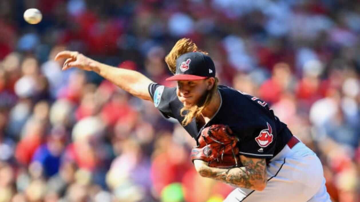
The Indians, facing elimination in yesterday’s ALDS game against the Astros, wore Chief Wahoo one last time before going down in defeat. With Wahoo being retired next season, yesterday’s season-ending loss means we have probably seen the last of Wahoo on an MLB diamond. (I say “probably” because there’s always the chance he could be revived as a throwback, although that seems iffy at best and unlikely anytime soon.)
By fairly amazing coincidence, yesterday was also Columbus Day and Indigenous Peoples’ Day. The symbolism of Wahoo’s final game taking place on those holidays is almost too perfect. You couldn’t script it any better. (And as reader Ryan Madden points out, the Braves were also eliminated yesterday, and the ’Skins got blown out by the Saints, which seems like an apt metaphor for colonialism. Freaky.)
To my fellow anti-Wahoo activists, I say this: Let’s not gloat. For one thing, there’s a lot more work to be done on this front, so this is no time to be spiking the football (sorry for the mixed-sport metaphor). Moreover, there’s a fan base out there that’s doubly sad today — in part because their favorite team’s season just ended, and in part because a logo they’ve been rooting for, in some cases for many decades, is being mothballed — and we shouldn’t be rubbing this in their faces on today of all days.
So to you Cleveland fans who grew up with Wahoo and will miss him, I say this: I feel for you, because I understand the close emotional connection we can have to our favorite teams’ symbols, even if those symbols are problematic. That connection is a big part of what Uni Watch is all about. So while I’m glad to see Wahoo’s demise and think it was long overdue, I understand why some of you may be mourning today. Hang in there.
For all photos in this section, click to enlarge
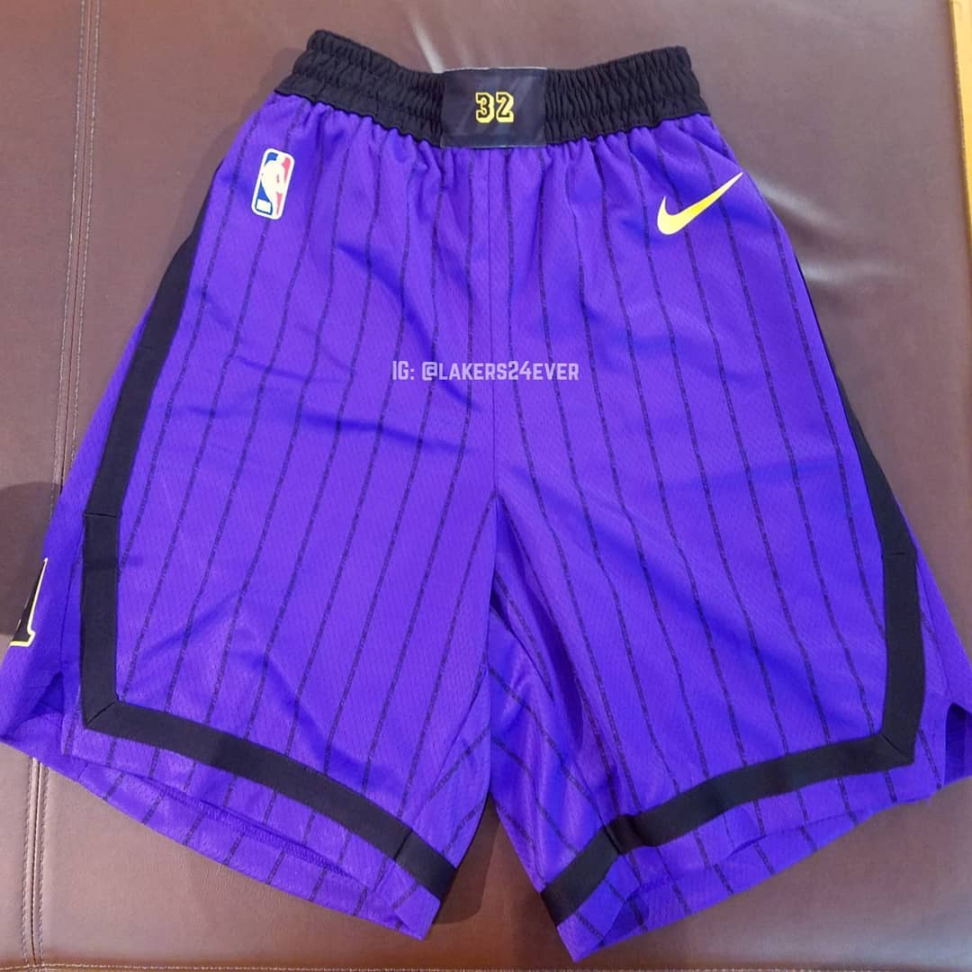
Lakers Lore leak: As you may recall, the Lakers used last year’s “City Edition” alternate uniform to introduce their own uni rubric, called the Lore Series, with a different Lakers legend being honored each season. Last year’s Lore uni was for Kobe Bryant. And based on retail leaks that have been circulating over the past few days, this season’s will be for Magic Johnson. After asking around a bit, I’m convinced that these leaks are legit.
At present, we’ve only seen the shorts, not the jersey. As you can see above, they have Johnson’s No. 32 on the waistband, along with Lakers-styled “M.” Here’s a closer look:

Here’s a side view, along with a closer look at the pinstripes, which spell out SHOWTIME3X5X:
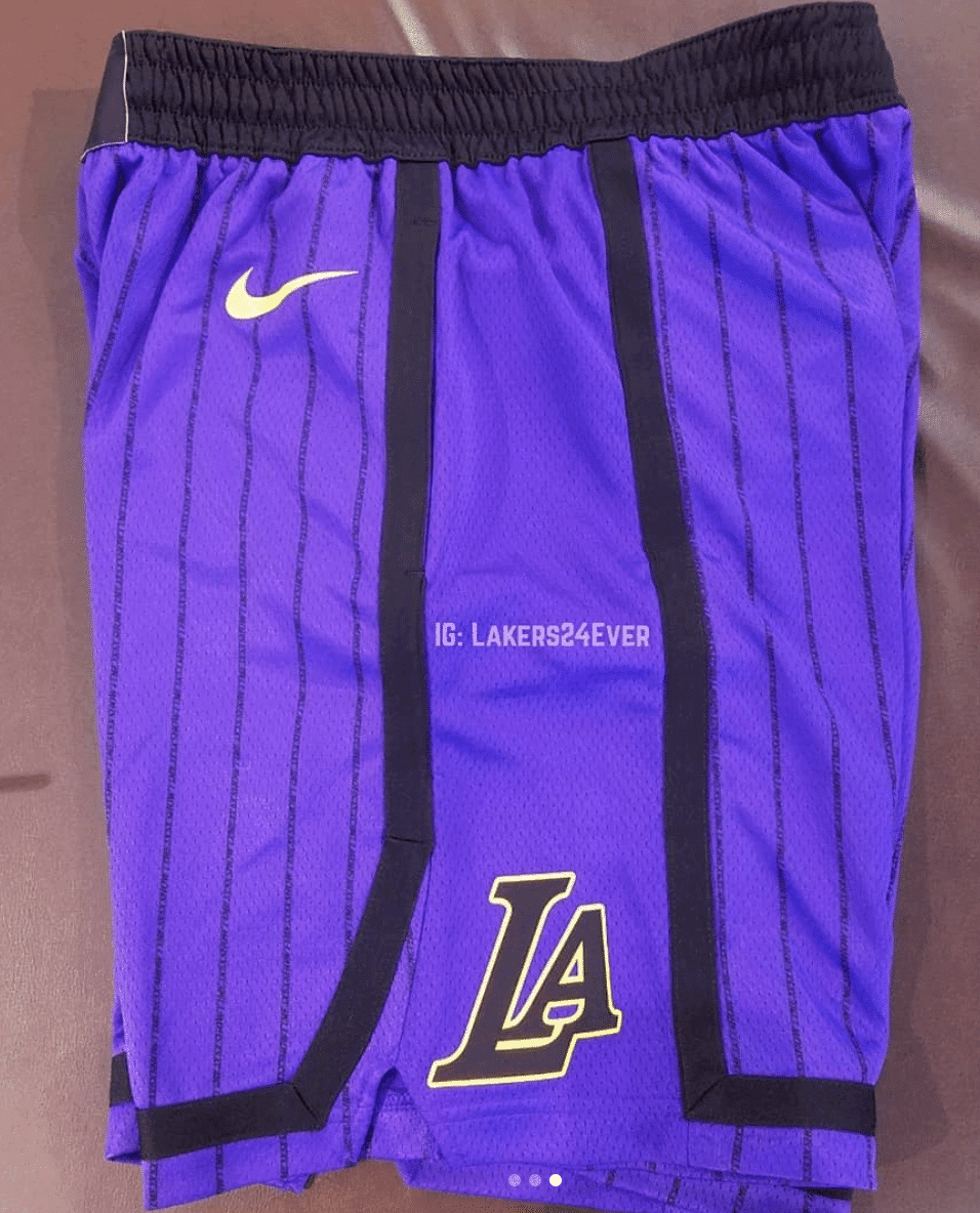

Personally, I’ve never liked pinstripes on basketball uniforms, and this design is unlikely to change my mind.
(My thanks to Rafal Niewiadomski and Instagrammers @lakers24ever and @shahinourian for this one.)
Click to enlarge
Collector’s Corner
By Brinke Guthrie
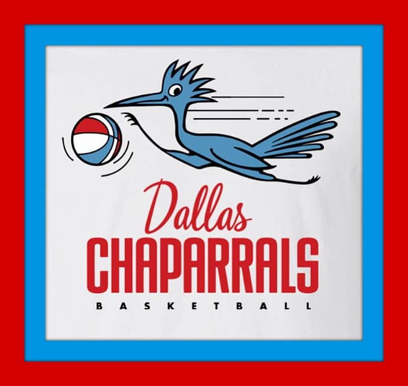
I grew up in Louisville back in the days of the ABA and was a huge Kentucky Colonels fan. Then we moved to Dallas, and I traded my allegiance to the Chaps. This Chaparrals T-shirt is current, not vintage, but it still has that retro feel with the old Chaps logo, and I love it all day long. A separate listing offers the same design in additional colors. Long live the ABA! [As an aside, the Chaps logo ranks very high among my all-time favorite team logos. So much better than today’s “intimidating” mascots. — PL]
Now for the rest of this week’s picks:
• The Rams are currently 5-0, and Rams fans won’t go wrong with this vintage bobblehead. (The seller has several additional teams, including the Chiefs who are also 5-0.)
• One more for the Rams: Nice, bold-looking set of 1970s stickers here.
• This Louisville Slugger bat bank includes signatures of stars like Mattingly, Puckett, Cal Ripken and others.
• This 1970s Boston Bruins puck (made in Czechoslovakia!) is still in the package.
• Here’s a 1970s Steelers helmet buggy — and nope, no helmet sticker on the other side!
• Teddy bears, baseballs, mugs, and more are in this lot of Minnesota Twins items.
• We’ve got an assortment of 1970s St. Louis Football Cardinals mugs/glasses here, including one that says “Big Red KMOX 1120.” Guess that could be the baseball Cards, too?
• Speaking of radio, WJR co-sponsored these 1970s Detroit Lions bumper stickers along with your friendly neighborhood Marathon dealer.
• This 1970s Detroit bumper sticker is for the Tigers. Notice the familiar Tiger logo has a bat in his teeth- never seen that before.
• This Cleveland Browns bumper sticker from WWWE in Cleveland was sponsored by Shell.
• No question, that’s Ray Guy of the Ray-duhz — the only player I recognize on this vintage Sears/NFL pillowcase.
Seen an item on eBay that would be good for Collector’s Corner? Send any submissions here.
ITEM! New T-shirt: It’s been a while since we’ve had a new Uni Watch T-shirt design, but we have a new one today. As most of you know, I love vintage clothing labels, so I worked with longtime reader/designer Andrew Harrington to create a design that mimics the look of a woven label (click to enlarge):
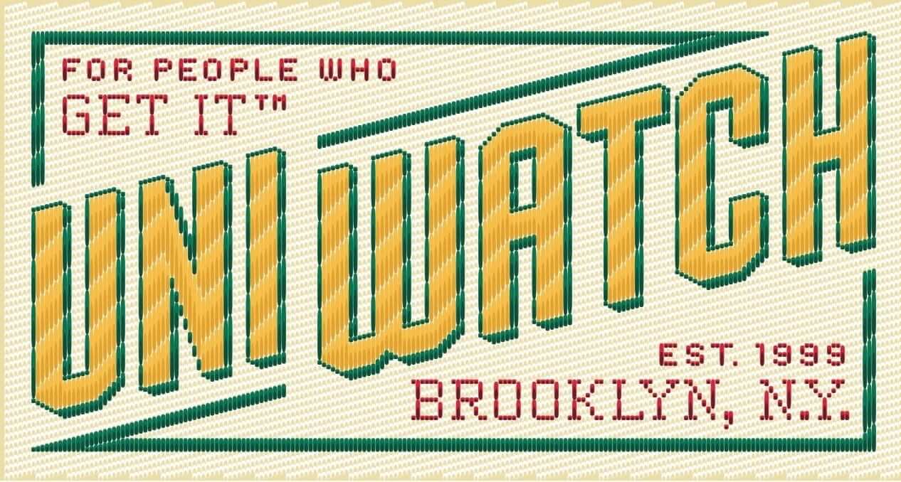
Nice, right? We’re calling it our “Designer Label” design. And thanks to some changes Teespring recently made to their interface, we’re able to offer it in a much wider range of colors, styles, and products. We have men’s tees, women’s tees, sweatshirts, long-sleeve tees, coffee mugs, and smart phone cases, all with lots of color options:
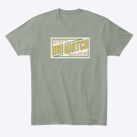
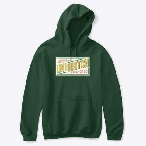
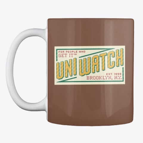
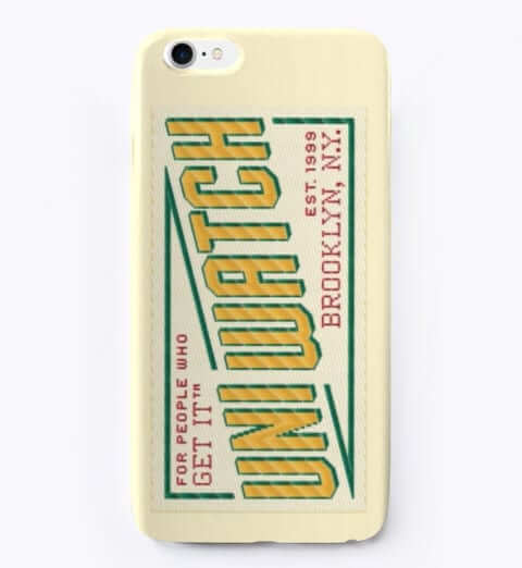
You can see the full range of available products here. My thanks, as always, for your consideration, and doubleplusthanks to Andrew for his great work on this design.
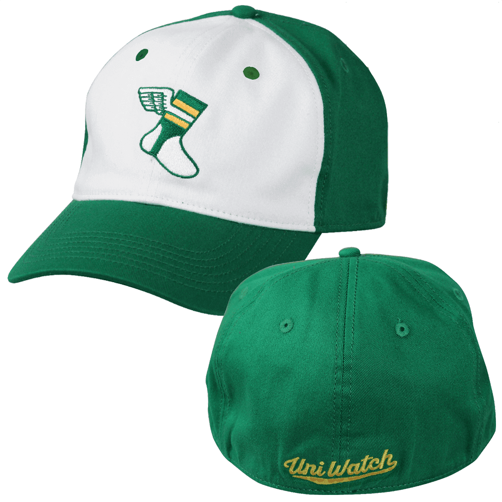
ITEM! Headwear price drop reminder: In case you missed it yesterday, we’ve decided to cut the price from $29.99 to $24.99. If you’ve been on the fence regarding this cap, hopefully this will push you over the fence, or something like that. You can order yours here.
In addition, our friends at Ebbets Field Flannels are currently offering a site-wide 20% discount (use the checkout code PLAY18), which effectively reduces the price of the Uni Watch classic cap from $49 to $39. All fitted sizes are in stock — get yours here.
The Ticker
By Alex Hider

Baseball News: These are the caps and T-shirts the Astros wore following their sweep of the Indians yesterday (from Ignacio Salazar and Guy Coolman). … Check out the duds worn by the 1873 Navy baseball team — those patterned socks, the bow ties, that giant chest logo. Good stuff (from Dan Cichalski).

NFL News: It appears that the Saints have now joined the ranks of the teams with blank nose bumpers, joining Washington and Kansas City (from @Michael Geddes). … Giants WR Odell Beckham Jr. has been wearing “OBJ” cleats inspired by the Nike’s “More Uptempo” sneakers — aka the shoes that have the giant AIR on the sides (from Charles Noerenberg). … A pair of New Orleans and Washington players had a bit of difficulty trading jerseys after last night’s game (from Eric Juergens). … President Trump is selling football jerseys with a “Stand Up for America” insignia, echoing his stance against demonstrations during the national anthem (from Phil).
College Football News: Louisville will wear uniforms inspired by Kentucky’s own Fort Knox on Oct. 27. More photos here. … Texas Tech will wear all-white 1974 throwbacks against TCU on Thursday. … Speaking of throwbacks, Oregon State will turn back the clock on Oct. 20.

Hockey News: Does anyone know what’s written on these strips of stick tape inside of the Islanders’ penalty box at Barclays Center? It looks like they may say “Sharks,” but why would they be there? (From John Muir.) … Speaking of the Isles, it appears they’ve dropped the orange outline from their helmet numbers. … The Ducks wore 1993 throwback jerseys during pregame warmups last night. As you can see, the jerseys had the Adidas logo on the front (from Nick Terranova). … Once the Ducks game started, the team wore their new retro-inspired alternates, and G John Gibson initially had a retro-colored catching glove but then switched gloves. … David Westfall was at a University of Nebraska-Omaha vs. Manitoba exhibition game on Sunday and noticed that all the UNO players had full face guards while Manitoba players had just eye guards, due to rule differences. … This would be correct if this shirt were referring to the Capitol Building. Unfortunately, it’s referring to the hockey team (from William F. Yurasko). … The Wall Street Journal editorial board is not happy that the Flyers’ new mascot, Gritty, is being adopted by left-wing workers’ groups.

Basketball News: Small change for Arizona’s navy uniform, as they’ve added blue piping to the shoulder and neck (from Josh Miller). … New uniforms for the U of Miami.

Soccer News: Arsenal has signed a kit deal with Adidas, which will take effect following the 2019 season (from Ted Arnold and Fred Vaughn). … The Pittsburgh Riverhounds played Pinktober and wore pink-trimmed uniforms against FC Cincinnati on Saturday, and the Florida State women wore pink last week (from Brian Henke). … More Pinktober: Louisville City FC midfielder Magnus Rasmussen has new pink boots for cancer awareness (from Josh Hinton). … Historical note from Denis Hurley: “In 1990, Sampdoria, normally blue and white, had to create a third kit for a European Cup Winners’ Cup game and chose red, with the kit designed by a star striker. However, as their rivals Genoa wear blue and red halves, Sampdoria couldn’t have the blue and red parts touching and so added a white trim.”

Grab Bag: Sports Studio, a Hollywood-based company, provides many of the athletic uniforms and costumes used in movies and TV (hard paywall) (from Dennis W. Alpert). … Pinktober socks two days ago for UVA field hockey (from our own Jamie Rathjen).
So in order to pay tribute to Magic Johnson, the LA Lakers are gonna look like the Orlando Magic. Genius!
nicely done
As a Lakers Fan, I am sad. I had some Showtime era mockups in place, but… I’m not feeling these. I’m not.
Man, I’d rather go with GFGS than these. Or a gradient. OR THROWBACKS.
Shame, Nike. First the black side panels, now this… hey, at least the NBA isn’t a template league, now that would be all nine layers of hell there.
I hear ya! I hate when teams bastardize classic uniforms.
As if Magic Johnson’s ego needed any more stroking.
No different than if the Bulls do it for Michael, Celtics do it for Larry, Jazz do it for Mailman, etc etc
Pacers do it for Flo-Jo…wait. Huh?
Can we ditch the whole “numbers as letters” trend? Is it over yet?
My guess on the hockey tape is that those strips are for the game pucks they take out of the game and sell? They say Sharks so they know which game they are from.
“Can we ditch the whole “numbers as letters” trend? Is it over yet?”
Not sure what you’re referring to regarding today’s post.
Houston Astros – The “IS” in Chasing History has been modified to look like an 18 (for the year). A common type treatment for some years now on Sports licensed apparel.
I think he is referring to “CHASING HI8TORY” on the Astros shirt. While we’re asking to stop things, let’s ask MLB to stop having champagne celebrations for each round of the playoffs and clinching postseason births.
While we’re at it… those “chasing history” caps are hidious.
Wahoo is gone. That’s great. Next steps in MLB:
– Cleveland changes its name (Spiders, Sentinels, Guardians).
– Atlanta changes meaning of Braves from Native American to patriotic (land of the free, home of the BRAVE) and goes all stars and stripes. It could actually work. And they dump the Chop ASAP. How is that still a thing?
Sadly, I knew Wahoo wouldn’t be enough. I knew the next target would be the name. I get Wahoo, but the name to me if anything is
“offensive” to people of India. I think people should be focusing more on the Redskins since that’s a literal slur. But once people get something they want more more more more more.
It’s not a matter of “We got this, now we want that.” Most people who’ve been opposed to Wahoo have also been opposed to the team name all along. (And yes, most of those people are also opposed to the ’Skins name.)
Indians ownership stated at the time of the Wahoo retirement announcement that the nickname was not changing. Any discussion of new nicknames is pure speculation.
My ask is that now Wahoo is gone, those of you who were so upset by his presence on jersey sleeves and caps, lobby your elected officials to do more for Native Americans who have been left behind in a thriving economy and are at greater risk for mental health issues. Those of you in Canada can always work to make things right with the First Nations of your country who were subjected to the vile and cruel Residential Schools into the 1990’s. It’s going to take generations to make that right.
Kudos Paul on the sensitive way you handled the issue today.
Can someone explain this me? I completely understand Wahoo, and despite the childhood nostalgia associated with the logo, I agree it was long overdue. I don’t understand Indians (but really like the idea of bringing the Spiders back), and I REALLY don’t understand Braves, which seems to fall into the “honoring Native Americans” category to me. I’m not trolling, or necessarily even disagreeing…just trying to educate myself.
The argument against the nickname Indians? It’s essentially that teams should not be named after groups of people. However, my understanding, and there are conflicts here, is that “Fighting Irish” is ok (because white people) and Chicago Blackhawks is ok because neither the name or logo is offensive (like Wahoo or Redskins). These nicknames and logos are also permitted if teams partner with local tribes on names and images.
The argument against the nickname Indians? It’s essentially that teams should not be named after groups of people.
No, that is not and has never been the argument.
The argument is that you shouldn’t be culturally appropriating the identity of a marginalized group (especially one that was almost exterminated in a continent-wide campaign of ethnic cleansing).
Terms like Fighting Irish, Celtics, Vikings, etc. are not OK “because white people.” They are OK because they are examples of a culture *celebrating itself* rather than misappropriating someone else’s culture.
We’ve been thru all this countless times. Let’s please move on. Thanks.
I can certainly get behind this argument, and the fact the the ‘Skins haven’t changed the name is baffling. However, doesn’t it make a difference that the Indians are actually named because of a Native American – Louis Sockalexis? I’ve long advocated to pro-Wahoo Clevelanders a middle ground where we drop the logo and embrace the name by actually partnering with NA groups/tribes and promoting the positive impact of Native American baseballers. To JUST drop names and logos seems to white wash both the bad and the good about Native Americans, which just seems wrong. Change the problems, but embrace history as history and address how we’ve grown.
However, doesn’t it make a difference that the Indians are actually named because of a Native American – Louis Sockalexis?
A long-debunked myth:
link
Fair enough, but the rest of the argument still stands. They could embrace that the name was from a more racist time in American history and continue to use the name as a vehicle for calling attention to and actually helping real Native Americans, including those who, for example, protest opening day every year. Isn’t that the logic behind, e.g., the Seminoles?
It doesn’t seem that just rebranding things because society has grown up is a panacea… if the ‘Skins ever change their name, it will be to make money and placate the growing majority of fans who recognize its offensiveness. Wouldn’t a better solution be rebrand if necessary but regardless leverage your position as a professional sports team to actually do something positive in Native American communities? Anything less seems a fairly hollow victory.
They could embrace that the name was from a more racist time in American history and continue to use the name as a vehicle for calling attention to and actually helping real Native Americans…
Right, because the best way to help an underprivileged group is to name a professional sports team after it. I look forward to more teams calling themselves the Battered Wives, the Opioid Addicts, and the Unemployed in the near future.
Paul, I appreciate the way you handled the Wahoo’s demise. (even as a Cleveland baseball fan I can’t help but think being felled on Columbus Day was apropos).
I am sad the Tribe lost, I am sad that a logo that I grew up on is being scrapped. I understand people get triggered at the cartoonish depiction of Native Americans and as bad as it may sound, I have never equated the logo with being racist against N.A. people.
I do think it was a classy way that you handled it in the lead today, and appreciate you understand the other side’s view on this.
Also, on the Designer Label front, are those hoodies cotton or a cotton/poly mix?
Blend.
Well said and exactly my thoughts. I will miss Wahoo because I grew up with it (even though I’m not a Cleveland fan) but fully understand why it needed to go. Sorry to Indians fans who are losing it and sorry you’re dealing today with the worst day of the year—the day your team’s baseball season is over.
My guess for the Islanders/Sharks stick tape is for game-used pucks! Oddly enough, I’m a Sharks fan and bought a game-used puck from a Sharks home game last year, vs the Islanders! They wrap the outside edge of the puck in that tape, and it has the opponent and date the game was played
Random question – why is it called a “nose bumper” when it sits on the forehead? Wouldn’t “brow bumper” be more appropriate?
Because it wraps under the front edge of the helmet and provides padding so the helmet doesn’t come down and hit the nose:
link
Doesn’t *always* work though.
link
Re: John Gibson not wearing retro-coloured catching glove. Goalies can be particular about their equipment and probably needs some time to work it in.
The post reminded me of watching Roberto Luongo in 2006-07. Back when the Canucks wore blue and green as a throwback alternate instead of the regular colours. Roberto initially stuck with his usual pads in games but did wear the retro-coloured gloves:
link
The blue and green pads then started to be worn regularly with the alternate uniforms later in the season, by the time the alternate became their home uniform during that playoff run:
link
also…the Redskins got destroyed by the Saints last night. That really is a pretty great coincidence!
Yes, that was noted in today’s text.
dang it, I missed it. I read the Braves part and glanced over the end of the sentence
The Saints are a much better team than the Redskins. No “Coincidence”.
Best game of the year coming up in a few weeks when the Saints meet the Rams.
Rams/Chefs will be a good game too
As someone who lived in St. Louis in the 1970s, I can assure you the “Big Red” referred only to the football Cardinals. Local media (although not so much fans) used that name all the time to refer to the football team, never the baseball team.
This. The Big Red was the football team. Sometimes the papers would reference “Gridbirds,” as well.
For baseball, it’s Cards or Redbirds.
Oooh, never heard of Gridbirds. Love that!
Ah, back to the great days of Jim Hart, Neil Lomax, E.J. Junior, Ottis, Theotis and Roy…
I like El Birdos for the baseball team, as well, though that technically was a nickname bestowed by Orlando “Cha-Cha” Cepeda on the ’67 team. Even though it’s not even remotely grammatically correct, somehow it seems to flow better than “Los Birdos,” and “El/Los Aves” would probably be too confusing to some.
link
Agreed! Big Red was the football team exclusively. I don’t remember Gridbirds, but I was born in 1971 and started listening to both football and baseball games with my grandfather on KMOX in 1978-ish. So I might have missed it or just don’t remember. I like it a lot too. I vaguely remember many televised games being blacked out locally because of poor ticket sales. Not sure that was as common as I remember it but interesting to think about when you can get all games on some platform/device now.
Because that Browns bumper sticker auction has ended, eBay is redirecting me to “something similar” with a set of link featuring a Marathon sponsorship and their radio flagship at the time, WJR.
What I find odd is that WJR is identified as 760 here, as opposed to the truncated “76” that I grew up with in the 80s. It seems strange to see the full frequency listed as part of the station brand from an era where it was common to truncate AM frequencies – other examples in the Detroit market were the old WKNR 1310 as “Keener 13”, WWJ 950 as “Newsradio 95” (which persisted into the early 1990s), and Windsor’s CKLW 800 as “The Big 8”.
Not so odd when you realize that all modern cars have digital displays (whether fixed numbers or full Quartz displays) indicating the radio frequency.
But we’re talking about branding from the late 60s-early 70s era, when it was still common for analog AM dials to only show one or two digits.
I grew up the DC area and the radio jingle i remember most was:
“WMAL–A.M. 63”
after returning to the area after college and hearing
“WMAL–A.M. Six Thirty” I almost fell out of chair.
Go ‘Skins!
link
1. A little navy trim on the Arizona uniforms does nothing to correct the awful gradient design and overly shiny numbers.
2. Why does everything Louisville tries make an already bad set look worse?
3. Oregon State’s throwbacks are nice but for a newer design, I think OSU has some of the nicer modern uniforms.
Absurd that MLB teams get t-shirts and hats and throw beer and champagne around just for moving on to the next round of the playoffs.
The Saints went black pants and socks last night. UGH. Those are awful. You want to wear white at home, fine. But please pair your jerseys with the gold pants (or even better, the throwback whites) – Remember how good Superbowl 44 looked? Yes, that’s the ticket!
And the Redskins again with the burgundy over white…ugh!
Ugh is right! Gold Pants! Gold Pants!
Second.
Not only do the Saints need to quit wearing the black pants, but really every team that does should stop.
Washington looks infinitely better in yellow pants than the stupid white ones. I’ve always hated the striping on the whites.
Which versions of the iPhone are the cases available for?
Lots of versions — when you checkout, there’s a menu where you can choose the version you want.
One of the Rams players on that Sears/NFL pillowcase has got to be WR Harold Jackson:
link
The Viking could be Ed Marinaro?
and I think the Steelers WR has to be Swann or Stallworth?
I’m going to miss Wahoo.
I think every puck I had when I was younger (early to mid 90’s) was made in Slovakia. I never really thought about this and now I want to dig out my old puck collection. Were some made in the Czech Republic? Were some of the older ones made in Czechoslovakia?
link
Boston College will wear 1984 throwbacks this Saturday versus Louisville.
Paul,
The large Designer Label on this site (green letters) doesn’t match the one on the shirts, etc. (gold letters)
Which one will it be?
Oops — put the wrong image file in there!
Now fixed. Gold.
NYI played the Sharks yesterday at Barclays…it was probably for the pucks they collect in game to sell…
Each goal that is scored that puck is pulled from play and labeled with the tape. Label has team, player name, period and time of goal.
Legit Q:
You’ve said in the past on selling cell phone cases with uniwatch designs “if there’s one project I feel a little iffy about in retrospect, it’s this one b/c I don’t give a rat’s keister about phone cases”.
Yet, here you are selling a uni-watch collectble item for a variety of cell-phone cases.
Have you changed since then or are you opening your definition what you find acceptable to your
Design was already done, and Teespring now offers cell cases. Took literally two seconds to add it as a product option. If nobody wants it, that’s fine. I don’t see the harm.
That’s very different than the other cell case, which was a distinct project that entailed daily reminders, blah-blah-blah.
Also:
Parkview Baptist School in Baton Rouge wore Pinktober Friday night.
Kudos, Paul, for the bit about the end of Wahoo. I like Wahoo but I don’t love him, and I’m not at all sad to see him go. Logos change, and as many of us have said all along, it’s just a cartoon.
Glad to see Wahoo go, though for me it is as much because I prefer letter based logos on baseball caps than stuff like Wahoo or the Blue Jays’ bird. That said, the block C is pretty generic and boring, I think for the cap logo they should go with the C they used from 1921-1936 and then come up with a new primary logo as well.
Another winning design on the shirt. It would be cool if they offered one the color of the label. And thanks again for including big and tall sizes for your heftier fans.
Also UCF’s annual Space Game will be November 1. They have a lot to live up to after last year’s awesome uniforms. Can’t wait.
Huge thanks to you Paul for how you handled the story. When I first started reading Uni-Watch and this argument came up, I was strictly opposed to losing Wahoo but I have seen the other side of the story because of this site. While I am sad to see him go I also see why he has to go. Thanks again for your graceful handling of the story.