By Phil Hecken
Follow @PhilHecken
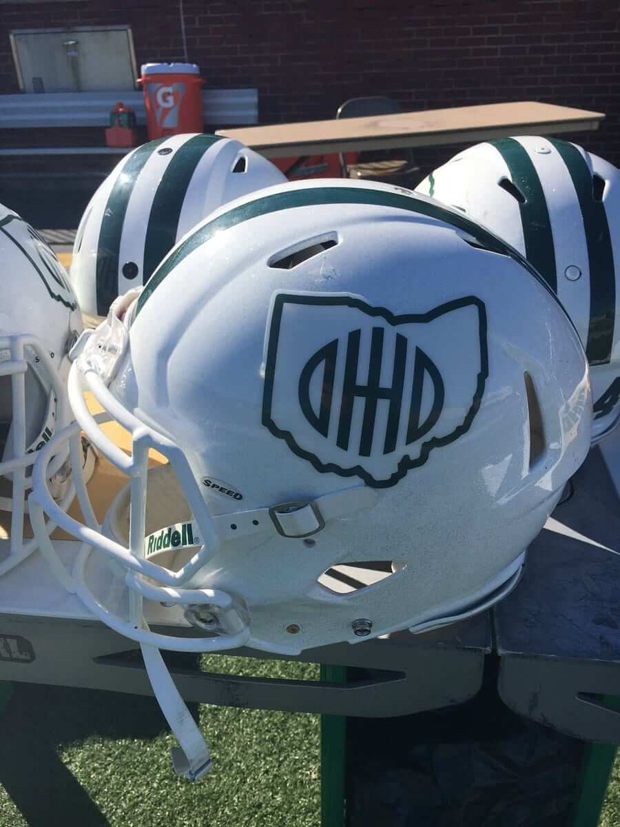
The Ohio Bobcats had a neat throwback uniform yesterday against U-Mass, in honor of the 50th anniversary of the 1968 MAC championship team. The funny thing is, while my OCD loves the symmetry of the helmet logo — the Uni Watcher in me hates that it’s annoyingly unreadable. Like, the image (aside from the outline of the state) is almost too cute by half. If you didn’t know the team (or what the outline of the state of Ohio looks like), you’d be hard pressed to figure out that the logo reads “OHIO”.
Up close, or even from a distance — it’s like a weird backwards “D”, then, I donno — a double “H” — then a frontwards D. But it doesn’t look like Ohio. Otherwise, it was a great looking uniform. It’s a shame Ohio still has the old “tire tread” jersey, and U-Mass’ truncated pants stripes are a bit annoying, but other than that…it was a stellar matchup.
The Marching Band still uses a version of the helmet logo. And it’s even more annoying from a readability standpoint. At least the helmet “O”s kinda, sorta look like “O”s (well, more like D’s. But the band’s logo just look like “triangle/double-h/triangle”. Yes, you know you’re watching (or listening to) Ohio…I just wish the logo were a bit more readable. And it turns out, it’s an easy fix.
Our own Rex Henry made just one small tweak…and voila!
Now it's perfect. The conjoined I & H was too busy. pic.twitter.com/usTGJElU1T
— ACC Tracker (@ACC_Tracker) September 29, 2018
Much better, no? Yes.
Terry will have more to say on this (and naturally, a different take) below.
OK, here’s TJ with your …
Sunday Morning Uni Watch
By Terry Duroncelet, Jr.
From Thursday:
• Miami wore BFBS against UNC. SO. MUCH. COLOR. OPPORTUNITY. WASTED.
From Friday:
• Tulane wore some of the wildest helmets that I’ve seen in ages, if not ever. Unfortunately, they also wore BFBS togs, so it ended up being the definition of a clown suit.
From Saturday:
• Garnet/white/garnet for Florida State is a LOOK. They need to wear this helmet more often (granted, with their conventional/preferred jerseys and pants, which is LITERALLY ANYTHING that isn’t BFBS).
• Ohio’s uniforms from a “class with pizzazz” standpoint have seen better days (this is the correct timeline), but their helmets from the weekend were a joy (context). I LOVE the logo, and bonus points to the Ohio Marching 110 for continuously using this logo (or at least a variant of it) for many years (and for using Remo drumheads). It should also be noted that they wore these against UMass, who have worn their own retro decals against the Bobcats in the recent past. More photos can be found here.
• Michigan State usually looks pretty decent in all-green, because they typically wore matching green helmets with said unis. But in their game against Central Michigan, they wore white helmets with the mono-green, resulting in what I personally find to be the Spartans’ least-appealing look that they’ve worn in recent years. Try again, State.
• Ball State and Kent State partook in a color-vs-color matchup.
• Oklahoma wore their Rough Rider uniforms against Baylor. This tends to be a rather polarizing uniform, but I like it, personally. It’s a nice alternate look for them (“alternate” being the operative word), and I don’t mind change as long as it looks good and makes sense.
• I don’t have any real way to confirm this, but I caught some of the Notre Dame/Stanford game, and it looks like the multi-gold issue with Notre Dame’s helmets from last week has been remedied. Most (if not all) of the helmets now feature the deeper gold, regardless of helmet manufacturer.
• Y’know, for how much Penn State loves and breathes by “whiteout” right down to getting off the bus in white warmups (h/t to Ben Jones), you would think that they would take this one home game to wear their usual road uniforms at home. It just seems inconsistent. Plus, I feel this game would yield significantly better contrast (all-white vs grey/scarlet/grey), given how Ohio State’s “grey” is so light and silvery, that when they wear the white tops, the lids and trousers get swallowed up, and sometimes appear white from a distance.
• LSU wore some rad throwback helmets against Ole Miss (context). The 1958 team was the first National Champion football team in LSU history. Good look.
• And lastly, North Texas wore beautiful 1967 throwback uniforms, and there’s a great breakdown of the uniform, which can be viewed here.


Joe Ringham’s 5 & 1
Following in the footsteps of the original “5 & 1,” Jim Vilk, and Catherine Ryan after him, Joe Ringham returns for 2018 to make his “5 & 1” (five good looking and one stinker) uni-vs-uni matchups. Sometimes he’ll have some “honorable mentions” and sometimes there will be more than one “bad” game. You may agree and you may disagree — these are, after all, just opinions and everyone has one. Feel free to let him know what you think in the comments section.
Here’s Joe:
A good Sunday, everyone. Time to close out the month of September with some good-looking games. To the list we go…
5) Louisiana-Monroe at Georgia State — There’s something about the way some colors just look good when matched against one another. Here’s an example, with GSU’s mono-blue looking quite nice against ULM’s white/white/gold. I like it, and that’s all that matters in this space.
4) Arkansas State at Georgia Southern — Put this into the same column as the game above of “colors that just look good when matched up against one another”. The red/white/red of ASU matched up fabulously against the blue/blue/white of the Eagles.
3) Boise State at Wyoming — This one was one that just popped out at me, color-wise, when I saw it. The white/white/orange BSU went with seemed to just match up quite nicely against the white/brown/gold of the Cowboys.
2) BYU at Washington — Had a very good feeling about this one this week. I’ve already said how much I like this road look for BYU, and it paired up excellently against the Huskies gold/purple/gold home unis. One very visually-appealing game in Seattle.
1) Florida at Mississippi State — Had my eye on this one before the day even started, and wasn’t disappointed. The Gators should always go orange/white/orange on the road, as I think it’s their best look. MSU looked excellent in maroon/maroon/grey at home, making for one awesome-looking game and the best-looking one of the day.
And, finally…
+1) North Carolina at Miami (FL) — On a weekend where pickings for the bad slide of the list were slim, this goes here because the U’s mono-black really is a look that just doesn’t look right to me.
Enjoy the rest of your football Sunday, and I will see you again when the calendar turns to October.
Thanks Joe! You can follow Joe on the Twitter and let him know what you think of his choices or make a 5 & 1 suggestion of your own!
NCAA Uni Tracking
Uni Watch will again track the uniform combinations worn by the “Power 5” conferences. All of the 2017 trackers are back!
We’ve got Rex Henry (tracking the ACC), Dennis Bolt (tracking the PAC-12), Kyle Acker (tracking the Big XII), and Ethan Dimitroff (tracking the B1G AND the SEC). Rex, Dennis, and Kyle and are all returning from 2015, and Ethan is back after joining the NCAA Uni Tracking a couple seasons ago. Ethan continues his dual role of tracking both the B1G and the SEC.
Here are the Uni Trackers for the Power 5 Conferences:
Rex is up first today (ACC):

ACC
More Here.
Follow Rex on Twitter here.
And now, here’s Dennis with the PAC-12:

PAC-12
More here.
Follow Dennis on Twitter here.
And here is Ethan, with the SEC:

SEC
And be sure to check out Ethan’s WVU Mountaineer Tracker.
Follow Ethan on Twitter here.
And here is Kyle with the Big XII:

Big XII
Follow Kyle on Twitter here.
And here’s Ethan with the B1G:

B1G

Welcome to the 2018 Oregon Ducks Uni Tracker. This little project was originally begun way back in 2008-09 by Michael Princip, who retired after several seasons, whereupon the project was continued by Tim E. O’Brien. He, too, retired from the tracking, but the project has been ably kept up by the man who also tracks the Pac12, Dennis Bolt.
Here’s this week’s Uniform Combo for the Ducks (you can click to enlarge):

You can read about this uniform, and MUCH MORE, by checking out the Duck Tracker here!
Thanks Dennis!

Too Good…
for the Ticker
Paul received an e-mail from reader Eric Stang, who recently paid a visit to the Vikings Museum and took some pics. It’s a bit too long, and too good for the ticker.
Here’s Eric…
Hello Paul,
I enjoyed your articles about the Vikings uniforms and the history surrounding its origins on ESPN.com
I wanted to let you know that I visited the Vikings new museum last Monday, and as a lifelong fan and die-hard Vikings historian/collector – I have some insight for you that may help. Attached are some pictures from the museum on how this is displayed.
First, Karl Hubenthal designed the uniforms, Norseman logo and the Vikings horns. Everything was accepted by the team, except the yellow “V” stripes on the arms. It was stated that Norm Van Brocklin and the Vikings management approved all but the “V” striping on the arms (BTW, I think that was pretty innovative and cool). The Vikings archivist stated Mr. Hubenthal’s artwork is on loan with the Vikings; not donated.

Second, the Aldritt family was chosen to supply the uniforms and paint the helmets. However, they weren’t given exact guidance on the size of the horns. At the Vikings museum they have a helmet from 1961 worn by Don Joyce. As you can see from the picture the Vikings horns are very large and not very precise.

When I saw the Don Joyce helmet and read about the Aldritt family, a couple key things dawned on me. One, the Vikings helmets are a darker, plum color. A color that does not match the rest of the uniform, nor is “royal purple” as noted on Mr. Hubenthal’s artwork designs. I’ve always enjoyed the darker purple, and for a period of time the Vikings purple started having blue tones. The other item is how large the Vikings horns are on the helmet, and how they lack precision.

The person at the museum said that the Aldritt family were given templates of the horns (which are on display) and to start using that size on the helmets, as opposed to what they had been doing. He mentioned that coach Van Brocklin instructed them to do this.
In summary, I believe that Karl Hubenthal designed the insignia, horns and uniforms and was given instruction to use the purple and gold colors. The Aldritt family supplied the uniforms, but I do not believe that Mr. Aldritt designed the horns. He may have interpreted how big to make them and then was told to re-size and make them smaller based upon the templates on display and the letters that accompany them.
Here’s the story on the side in the display that explains it.
It doesn’t make sense that Aldritt sporting goods designed the horns on the helmet, as they were instructed to do based upon the approved drawings of Hubenthal.
What makes sense is that Aldritt was involved in applying the horns to the helmet, as well as either painting the helmet or instructing Ridell to paint the helmet a certain color.
I hope this helps, and if you want to find out more you can contact the Vikings directly at the museum. I have a contact there if you need it.

Best,
Eric
OK. Now, on to the ticker…
Uni Watch News Ticker
By Phil

Baseball News: Neither Paul nor I (nor many of you) care about the retail side of sports, but some of you do. And for those of you, here’s the top jersey sellers for 2018. … Dear God, what’s worse than a grown male wearing a full uni to a ballgame? Well, it’s pretty bad when that full uni includes a knock-off jersey (from adrian). … What’s worse than players wearing undershirts with visible swooshes? Well, how about TWO swooshes? (from Neymar Garciaparra). … Jimmer Vilk is easily annoyed — but what annoys him as much as the White Socks wearing black socks is this crime. … Christian Yelich’s brother, who saw Christian play for the first time in 4 years after being deployed, threw out the first pitch in what appeared to be a knock-off jersey (from Kleiny_02). … Reader Zach Carlstrom Spotted this Milwaukee Brewers logo progression tee at a shopko in sun prarie, WI and thought some people might enjoy it. …In yesterday’s Reds-Pirates game, Reds pitcher Michael Lorenzen wore catcher Tucker Barnhart’s batting helmet while hitting an RBI single (from Joanna Zwiep). … As you’re all no doubt aware, the Mets David Wright is retiring at the end of this season (in fact, he likely played his last game last night). He had some special cleats this weekend (from Chris F.).

NFL News: Recently we had a discussion about automobiles on athletic fields (specifically football). Well, here’s a video of Lynn Swann leaping one of those cars on the sideline (from reader Kevin). He also asks, “When was the last time fans rushed the field after a baseball game? (and maybe the same question in other sports as well). When did players saying “hi mom” when the camera was focused on them stop being a thing?” Good questions!
College Football News: Did you ever wonder why USC (among several schools) doesn’t put a player’s last name on his jersey? Of course you do. Here’s why.

Hockey News: Hmmm. The NHL continues to reduce the size of goalie equipment, following recent reductions for pads and pants. The overall aim is to boost scoring while at the same time rewarding athletic ability in the crease by eliminating unnecessary padding that wasn’t protecting goalies, but instead simply helping them block pucks (from Paul Dalton).

NBA News: OK, this is kind of an odd one from Mike Chamernik: NBA informed Cleveland’s J.R. Smith he would be fined per game during the season for “Supreme” tattoo on his leg, unless it is covered, and Smith plans to have conversations with league about situation.

Soccer News: “FIFA19 is here, but that doesn’t mean it’s time to throw away FIFA18” notes Josh Hinton. He adds, “About midway through the video, there’s a really cool piece of art put together showing all of the old FIFA video game discs.” … There’s not much context behind this jersey photo, but I am guessing it is referring to DC, since it’s in Audi Stadium (from Gregory Koch).

Grab Bag: Nike has released a new, Kei Nishikori tennis shoe (from Blake Fox). I wouldn’t think this a big deal, but Brinke adds, “a first for Nike — they don’t normally sponsor players for shoes unless they wear the clothes, too. Cibulkova the other notable.”
I was at Audi Field yesterday as well and also saw the guy wearing the “Statehood” DCU shirt. So, yes, you’re correct that it refers to D.C.
Yes! Time for some college football uni tracking Canadian rules style! For the football where your team can have 12 players on the field and it is not too many men.
From Canada West conference this weekend:
-Fresh uni combo for the Alberta Golden Bears. They went white/yellow/white. Visiting UBC Thunderbirds went white over blue.
link
-Calgary Dinos went mono-red at home. Saskatchewan Huskies went white over green. The green helmets with vintage style S logo.
link
-Manitoba Bisons wore their brown jerseys for the first time at home this year. Better than the mono-black unis. Going brown over brown. Regina Rams went white over white.
link
Mississippi State; have you lost your mind? Auto primer/auto primer/dull white is never going to be a good look unless you’re in an auto body repair shop.
-Tulane’s helmet would have been more palatable with just the large wave. Just by leaving the scowling face off the helmet, this would have been an improvement.
-Washington Huskies uniform could look much better without the random black sleeves and black in the TV numbers.
That Ohio logo looks like 2 things to me:
1) a football with some artistic liberties… the O’s are the ends, and the HI comprise the laces, while the negative space between each O and the HI makes up the stripes
2) the wide torso of a referee with his hands on his hips
I like that Ohio logo as is. I would not change a thing about it. I think the negative space invokes an abstract look at a football, which is all I really see. That’s very cool! I would buy a T-shirt with that logo on it.
“Did you ever wonder why USC (among several schools) doesn’t put a player’s last name on his jersey? Of course you do. Here’s why.”
So why? This says nothing but maybe the SC players are more recognizable.
FSU should get rid of those helmets. The gold helmet is one of the best in college football. If they want to do a garnet helmet at least make it GARNET, not purple and black.
Garnet pants are a great look though.
Am I the only one who wonders where the hell all these college teams store their plethora of different helmets, jerseys, pants, etc? Oregon for instance must have had to add another wing to their athletic department just for storage space!
I think the last time fans rushed the field is in 1995 when the Mariners won the AL West tiebreaker…
link
I love the OHIO logo from a design standpoint, and never had a problem reading it…. UNTIL the line between the H & I was taken out on you guys’ modified one…. then all I could read was OHID. Trying to make it “more legible” actually takes away from the look, because once you introduce something to make the H & I more like an H & I, your brain can’t help try to reconcile the O as a D at the end.
I understand the deal about people not knowing it’s Ohio maybe not getting what it says, but, to me, the abstractness
Is what make the O at the end work. When I scrolled down to the modified one, at the very first glance it said OHID.
Did Florida change the stripe on their orange pants? It used to be the same as the helmet stripe. In the Mississippi state game the stripe is the same as the sleeve stripe they wear on their orange jersey.
Yes. I think they changed it last year. Bothers me because I like the old design much better.
Thanks! I went back & looked at the 2016 & 2017 game photos & looks like 2016 was the last time they had the old pant stripe. I missed it in the 2017 Uni Watch preview apparently. Old stripe was superior & made more sense aesthetically speaking.
Regarding the Lynn Swann leaping the car video.
Aren’t those Cleveland Browns’ uniforms just great? Classic.
YES! How anyone cannot want them to go back to those is beyond me.
And it turns out, it’s an easy fix.
Our own Rex Henry made just one small tweak…and voila!
Much better, no? Yes.
Better, yes. Much? No.
Not to blame Rex…he made the best of a bad situation. Morphing letters to fit into a certain shape is almost universally a bad idea.
Remember when Jim Vilk had fire and brimstone rained down upon him just because he didn’t make Boise/WYO the &1? Now it’s in the Top Five (and deservedly so this week) and not a discouraging word was heard. Anyway, good job today, Joe.
Oh man… take a peek at Lions vs Cowboys… Lions wearing their grey alts as a “dark” uniform…. vs cowboys in white. What a mess. Those greys should only be worn as a “light” uniform vs a dark jersey. Yikes.
That article that “explains” why USC goes NNOB? Their explanation is pretty much “Gee, I don’t know.”
The Ohio State Marching Band uses the same Ohio treatment on their off-Field berets and in a marching formation during pregame. Midway through, they collapse the intersection to create the tunnel the team runs through.
I thought the Virginia Tech/Duke game should have gotten a nod with the maroon-white-maroon vs. white-blue-white. Both teams had matching helmet/pants combinations, the teams’ colors stand out against each other, and white wasn’t worn in the same place by either team.
How do you not give a nod to Texas vs. Kansas State??