We’ve come a long way from the days when Topps would clumsily airbrush a new uniform onto an old photo of a player who’d joined a new team. Nowadays, a player who’s changed teams — or who’s even the subject of trade rumors — gets Photoshopped into a new uni lickety-split.
But what does that digital uni-swap process actually entail? I’m not a Photoshop guy myself, so I couldn’t tell you. But Bryndon Minter, who does creative work for the NFL’s social media channels, gave us a fascinating insight into that process the other day by tweeting a time-lapse video showing how he took a photo of Browns wide receiver Josh Gordon, who’d just been traded to the Patriots, and gave him a Pats uni. Check this out:
Time Lapse of the @JOSH_GORDONXII jersey swap.
Got word he'll be wearing 10 around 1:10 in the time lapse pic.twitter.com/UxszK1LOF9
— Bryndon Minter (@BryndonMinter) September 18, 2018
Pretty cool, right? I wanted to know more, so I got in touch with Minter and asked if he could tell us a bit more about how he approaches this type of task. Here’s his response:
To start, I look first for images from formal photo shoots. Those are a lot easier to use, because it’s usually a higher-quality photo and the players aren’t wearing a helmet. If those aren’t available, I try to find a badass photo of a celebration or anything showing emotion.
Honestly, I don’t have a ton of Photoshop experience — I’ve primarily focused on shooting/editing video. My first jersey swaps were for Colin Kaepernick, who was rumored to be potentially going to the Ravens, Seahawks, or Dolphins in May 2017. Didn’t really try again until the Richard Sherman 49ers signing, which happened at 6pm PST on a Saturday night. The first draft was awful. I scrapped it, completely restarted. Not sure how the quality is so drastically different, but from the second Sherman version on, I definitely started getting better at it.
I don’t really have a set way that I carry these out. Sometimes it’s colorizing the jersey hue, other times it’s “Frankensteining” and taking similar elements from other photo assets, like I did in the Josh Gordon time-lapse (pulled from a photo of Stephon Gilmore in same helmet and similar stance). The whole thing took three hours.
I’ve gotten a lot of requests from designers, so at some point I’ll most likely do a few tutorials on how I do these.
Fascinating! Big thanks to Minter for sharing these insights with us.
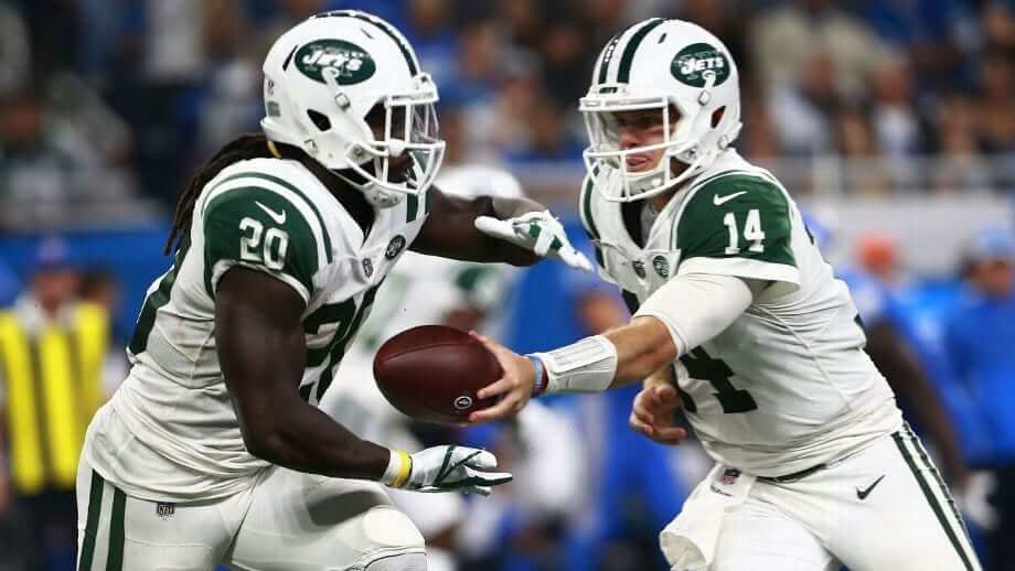
Meanwhile, speaking of Gordon, he appeared at his first Patriots practice yesterday and was wearing a wristwatch, which seems odd, no? (Nice spot by Joey Ellis.)
And speaking of Photoshop: The Trail Blazers yesterday became the latest NBA team to sell out to a corporate uniform advertiser. As per our well-established protocol, we will neither name the advertiser nor show its ad. But we will show that an ad-clad Trail Blazers jersey looks like shit, which is all you need to know (click to enlarge):
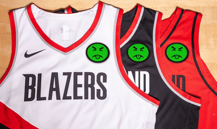
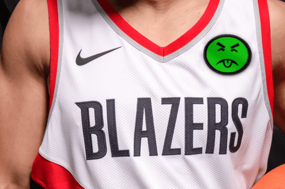
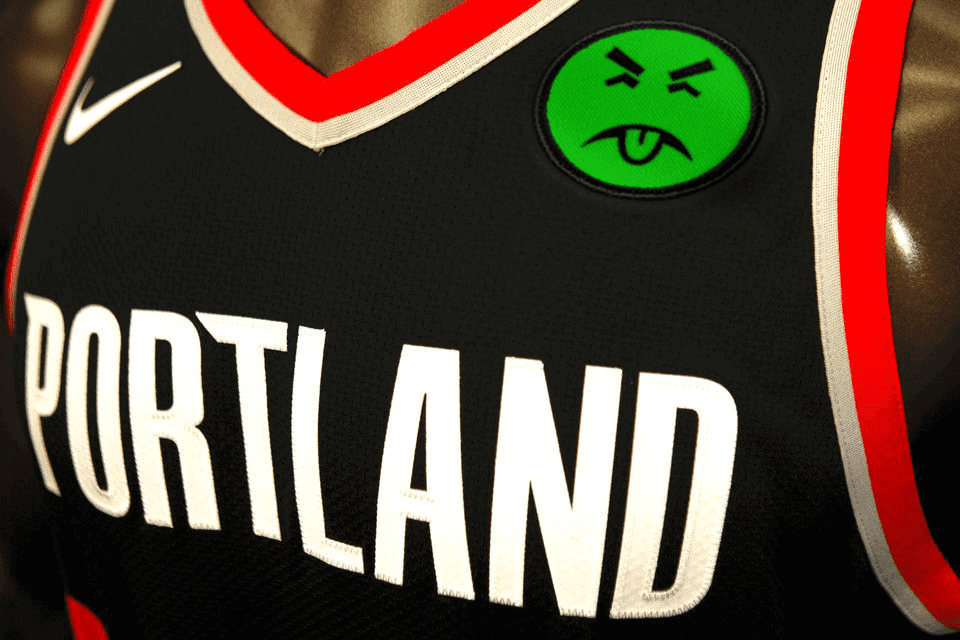
There are now 24 ad-clad teams, including three that have joined the ranks in the past six weeks. There are six remaining ad-free teams.
(My continued thanks to Nic Schultz for his Photoshoppery.)
Click to enlarge
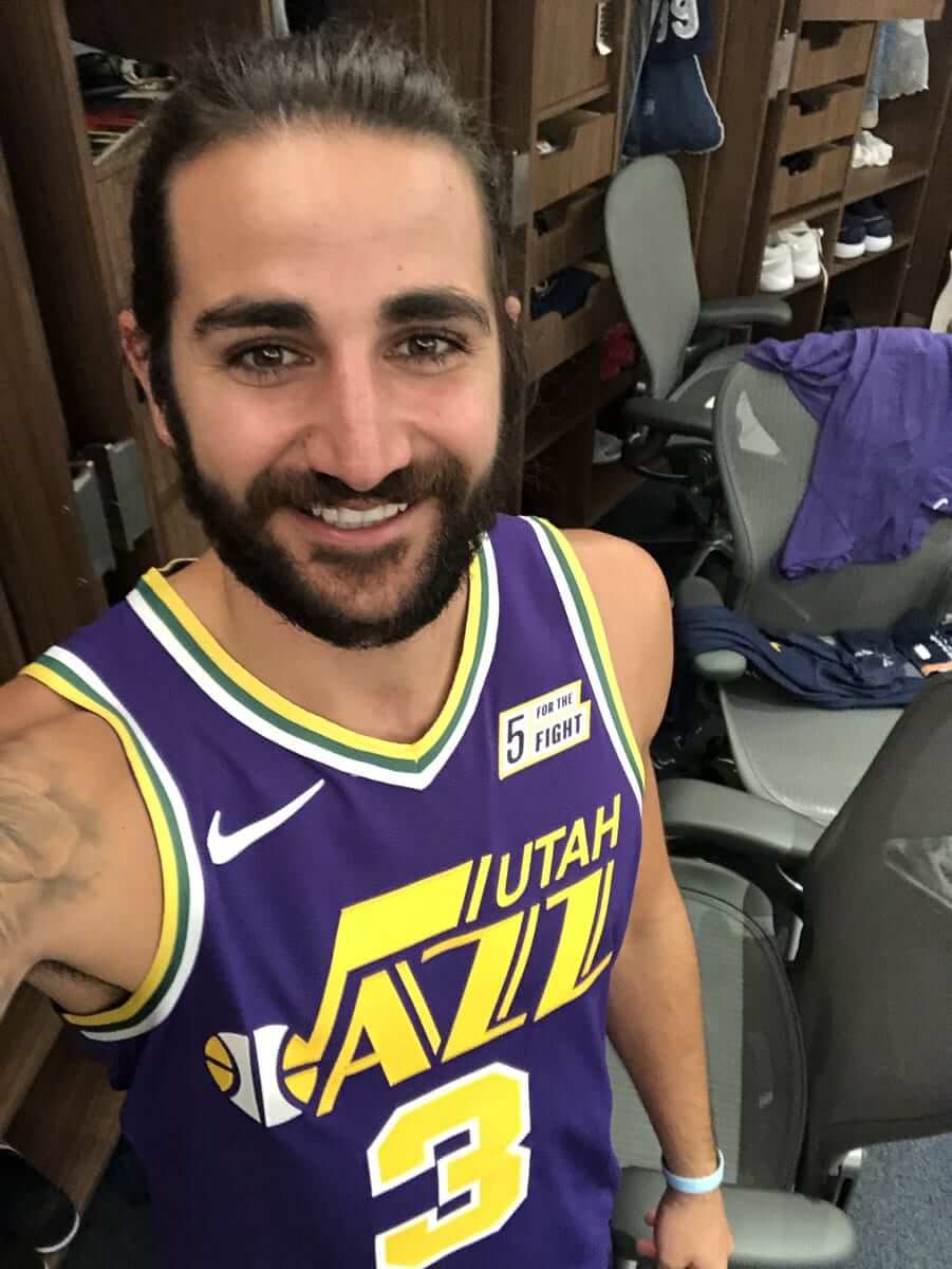
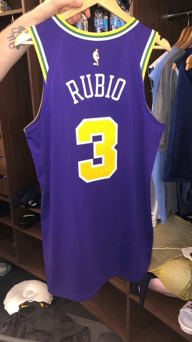
And speaking of the NBA: Utah Jazz point guard Ricky Rubio has been hinting for about a week that the team has a new uniform in the works, and yesterday he got to show it off — a purple throwback that matches what the Jazz wore from 1986 through 1996. Here’s how it looks from the back:
Click to enlarge
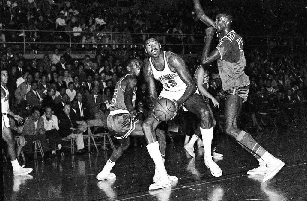
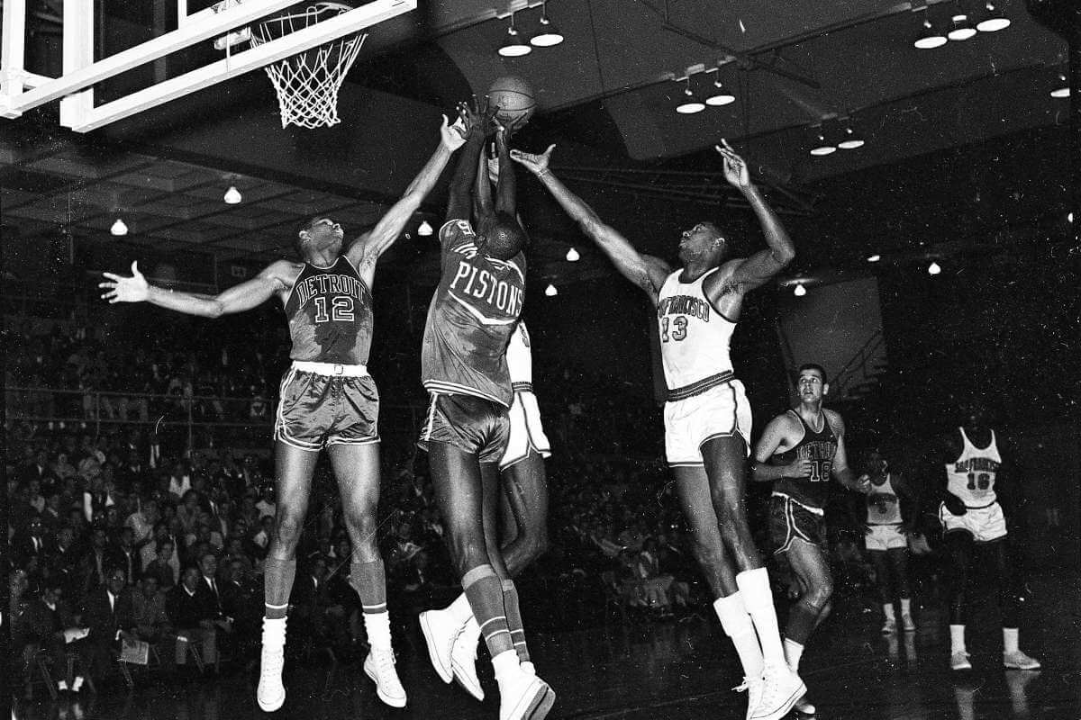
Too good for the Ticker: Check out these two NBA photos from a 1962 Warriors/Pistons game. There’s a lot to admire here, but the most uni-notable thing, obviously, is that one of the Detroit players — apparently Walter Dukes, at least according to the Twitter hive mind — is wearing his warm-up top on the court! I can definitively say that I’ve never seen that before. Anyone else..?
(My thanks to John Cannon and @ursus_arctos59 for their contributions to this section.)
Contest reminder: Today’s the next-to-last day to get your entries in for my Jets-redesign contest. As usual, the best entries will be featured in one of my upcoming ESPN columns. Full details here.
Cap reminder: In case you missed it on Wednesday, I’m happy to report that all fitted sizes of the Uni Watch classic cap, available exclusively from Ebbets Field Flannels, are now back in stock. Grab your preferred size before they sell out again!
Meanwhile, two weeks ago I asked for feedback on our flex-fit alternate cap, and a bunch of you said, “Actually, I’ve been meaning to buy that one, but I keep forgetting or putting it off.” If that’s you, go ahead and order one already. Thanks.
The Ticker
By Paul

Baseball News: The Red Sox had a division title banner made, but it fell off the truck that was transporting it. A few Sox fans found it and will return it — for the right price (from Mike Chamernik). … The Marlins’ teal throwbacks were such a big hit this season that they’re bringing them back for 2019 (thanks, Phil).

Pro Football News: The Browns’ mono-brown Color Rash uniforms will finally make their on-field debut tonight. … Meanwhile, check out the Browns’ striped end zones! They represent the team’s 16 Hall of Famers (from @Cdud1970 and Jerry Wolper). … WR Jordan Matthews, who returned yesterday for a second stint with the Eagles, will wear No. 80, not his old No. 81. … The AAF — the new pro league debuting in February — released four of its eight team names and logos (from Tod Meisner).
College Football News: Colorado A&M-era throwbacks on tap this weekend for Colorado State. Love that green/orange color combo. … Sportswriter Steve Rushin found his dad’s 1952 Purdue Big Ten championship belt buckle while poking around in the basement (from Jen Hayden). … Yesterday we reported that Iowa State would wear a “CBA” memorial decal for slain ISU golfer Celia Barquín Arozamena. Now comes news that ISU’s opponent this weekend, Akron, will also wear the decal (from Kary Klismet). … Here are this week’s uni combos for Washington State and Arkansas (thanks, Phil). … Throwback uniforms this Saturday for Montana (from @clarkbarniner).

Hockey News: Here’s how the Panthers’ jerseys look with the 25th-anniversary patch and the “A” and “C” designations (from @34inXXIII). … G.I. Joke pregame jerseys on tap for six games this season for the Charlotte Checkers (thanks, Phil). … Here’s the logo for the 2019 NHL All-Star Game, which will be hosted by the Sharks (thanks, Brinke). … Fun fact: Urinals at the Devils’ arena feature the team’s logo (from Dan Klein). … Bruins and Flames wore this patch for yesterday’s exhibition game in China (thanks, Brinke). … The Flames have an alternate uni unveiling coming up on Friday (thanks, Phil).

NBA News: Here’s an old Bucks team photo that appears to show Kareem Abdul-Jabbar wearing stirrups over his tube socks! Not sure what that was about (from many readers).

College Hoops News: Texas Tech is teasing new red jerseys (thanks, Phil). … Illinois’s uniforms will get “tweaks” this year and a full redesign next year (from @mrmichael21). … New uniforms for Arkansas State (thanks, Phil).

Soccer News: Manchester United has new pink uniforms, and some fans are not pleased (thanks, Phil). … New uniforms for CSKA Moscow, which has switched from Adidas to Umbro (from Ed Zelaski). … Also from Ed: New alternate kit for Red Bull Salzburg. … “Outside the Stade de Suisse in Bern is an old scoreboard from the first stadium on the site, the Wankdorfstadion, and a picture of it in action in the 1954 World Cup final,” says our own Jamie Rathjen. “In advance of the first Champions League group stage game for the local team, BSC Young Boys, against Manchester United, the ads in the picture have been covered up because UEFA only allows ads for Champions League advertisers to appear in and around the stadium.” Douchebags. … Nike has produced a new mashup kit for FC Barcelona, featuring elements from all of the team’s kits over the past 20 years. More info here. … New third kit for Scottish club Hibernian (Jamie again). … Good story from Denis Hurley: “In 1990, Cork City wore a new away shirt against Dundalk, but it proved to be the only time they wore it. However, when the clubs played again the following week, Dundalk forgot their away shirts, so they ended up borrowing the City jerseys.” … For last night’s Portland Timbers game, the jersey numbers used elements from all of the players’ home country flags (from @bryant_rf).

Grab Bag: Check out this super-cool book that presented a design proposal for an identity system for the 1976 USA bicentennial (from James Gilbert). … “Pizza” chain Papa John’s, looking to turn the page on the era of disgraced founder John Schnatter, may have a new logo in the works. … The airline Cathay Pacific misspelled its own name on a jet livery (from @deadendnights and David Cline). … More memorials for slain Iowa State golfer Celia Barquín Arozamena: Michigan’s women’s golf team wore red ribbons for her, and Ladies European Tour players will wear black ribbons and observe a moment of silence for her during the first round of the Mediterranean Open (from Kary Klismet). … Oktoberfest uniforms for the German volleyball team United Volleys (from Jeremy Brahm). … Speaking of volleyball, the U. of Florida is doing a jersey giveaway (from Evan Murray).
I’m visiting my mom today, so I won’t be keeping as close an eye on the site as I usually do. Play nice while I’m away, okay? Thanks. — Paul
“Some fans are not pleased” is one way to describe hostility to Man U’s pinK shirts. “Some male fans are not confident in their own masculinity” would be more accurate, though. Pink is just a color; there’s nothing inherently girly or feminine or gay about it. It’s not one of my favorite colors, but it’s vastly underused in sports because of the idiotic perception of it as a non-manly color, as if that’s even a quality a color can have.
Agreed.
Totally agree. Italians don’t see to have that problem with pink, with teams like Juventus having used it, as well as the iconic Giro leader’s jersey. I have lots of feelings about the whole concept of masculinity, esp now as a parent whose own son doesn’t totally conform to a lot of boyish things (frankly neither do I, I’m definitely not into cars and tools, for example).
French rugby team Stade Francais started wearing pink several years ago. No one really complained other than the pink they chose was awfully bright. As was said, it’s just a color and one under utilized. The club owner did this, however, to popularize rugby with women. Here’s a link to Stade Francais’ kit for this season. link
I’m not sure the kit color is pink. I don’t know how to describe it. “Light salmon” maybe? I think if you are going to go pink, pepto bismol pink is the only way to go.
link
I know it is actually fuchsia, but it looks better.
I see it as the color looks like complete crap on the jersey, but if you want that angle it seems to be popular nowadays..
I don’t like the United Jersey. It’s too light and subtle. In my opinion for a team that wears red it looks like they mixed their red and white kits in the wash. If it was bolder like the Giro leaders jersey it would be fine.
All political and social connotations aside, that kit is just plain ugly.
If the kit wasn’t absolute crap, I think a lot more united fans would be open to wearing it :) !
Real men wear pink, and wear it confidently. But the Man U kits look like white shirts that got mixed in with a red shirt in the wash by accident.
It’s funny, you’ll freeze out the ad logo’s, but not Chief Wahoo imagery.
Apples and oranges. Whether you support his use or are glad to see him leaving the uniforms, Wahoo is part of the Indians’ identity, not an outside company’s corporate advertising patch. Also, see Paul’s reply to Richard below regarding the use of Mr. Yuk.
That is some good uni news from the Utah Jazz. I would be all for those throwbacks becoming the primary uniform again. Looks great.
The Jazz belong in purple and not navy blue.
You should put the green stinkface patch over the Jazz corporate patch as well!
Good to see the Marlins bring back the teal. Was I dreaming or did I read somewhere that the Marlins would be changing their uniforms for 2019? I figured a return to teal would be in the works, but the teal throwbacks for 2019 makes me think a uniform change won’t take place for the 2019 season.
1) As I’ve explained many times, I only use Mr. Yuk when a new ad patch is introduced, not for existing ad patches.
2) As I’ve also explained, I will not Mr. Yuk-ify patches for charity initiatives. The Jazz and Qualtrics deserve praise, not ridicule, for taking the high road with their patch. Too bad no other team has followed their example.
Last night in MLS, Portland and San Jose wore white at home (instead of green and blue, respectively).
Them basterds teasing us by keeping a jersey in an ice block just for it to be the addition of a biofreeze ad patch. Ugh…
Just like the Bears “Monsters of the Midway” set, I love the Browns’ orange numbers on brown jerseys.
In both cases, my first instinct is to prefer white numbers or white outlines/shadows, but when I see the color on color I can’t help but like it.
I’ll be curious to see how readable orange-on-brown is on the field, though. Didn’t the Browns run into trouble with that very problem a few years ago?
Don’t worry – this new orange is oranger, so it’ll be just fine!
I don’t know about unreadable, but they often have the problem of being unwatchable.
In your comment on Papa John’s, you put “pizza” in quotes, implying that you don’t consider their product real pizza. I remember similar dismissive remarks about Papa John’s in the past. I’m just curious what your thoughts are on the other large pizza chains like Domino’s and Pizza Hut. What about frozen pizza available in grocery stores (like Tombstone or DiGiorno’s)? I realize Papa John’s may not compare with smaller, local, more authentic places, but it doesn’t seem to me to be any worse than these other mass products that are also marketed as pizza. I would think that the vast majority of Americans would consider the Papa John’s product as falling firmly within the food category known as pizza, not some fringe element that is so different/bad/ whatever that it doesn’t deserve the title.
I would also refer to Domino’s, Pizza Hut, and Little C’s as “pizza” (and believe I actually have referred to them as such in the past).
These are not pizzerias; they are fast-food chains that happen to offer a pizza-ish foodstuff. From their business models to their production methods to their marketing campaigns to their employment practices to their product, they have more in common with McDonald’s or Taco Bell than with my local slice joint.
You can call them whatever you like. I will call them what I like, which is “pizza.” Let’s please move on. Thanks.
Thank you for answering my question. I’m sorry that I didn’t remember you referring to the other chains as “pizza” in the past.
So by that logic, do you refer to McDonald’s’s and Wendy’s’s primary offering as “burgers” or do you just call them burgers? I’m just wondering how far this goes. Because those are vastly different than the burgers offered by local shops as well.
(I’d like to say that I don’t mean this as an insult or to be demaning; I think you do a great job and everyone is entitled to their own opinions. I just think it’s a fun, goofy topic.)
Is Budweiser a “beer”?
Other than the rather obvious corporate pandering of the Memphis Express, the four AAF logos and team names are pretty good. I especially dig the unique (without being goofy) name of the Orlando Apollos.
Of course, reading the comments below, nobody else liked them, but that seems to be par for the course whenever anybody releases new logo designs.
I thought it was interesting that the Atlanta Legends’ crown logo and color scheme of purple and gold clearly are referencing royalty, but instead of choosing a name like “Kings” or “Royals” they picked something more unique among American sports team names, which also has a broader meaning beyond simply royalty.
Also interesting how the Apollos’ logo references archery, which was only one of many things associated with the Greek deity. But they didn’t just name the team the “Archers”. Many in this country would also think of the Apollo space program before they associated Apollo with the Greek god.
In both cases, the team name has a broader range of meanings, while the logo references a more specific aspect of the name.
I agree they are not bad. Will be interesting to see how the football landscape will all go down in 2020. AAF and new XFL will likely be playing seasons at the same time and competing then.
So tell me, how is the Nike swoosh which you DO show on the Trailblazers jerseys NOT a “corporate uniform advertiser?” The hypocrisy and double standard by you is laughable. And you cover up the corporate uniform advertiser with ANOTHER corporate advertiser as anyone who was a kid back in the 1970’s and 1980’s will recall the “Mr. Yuck!” PSA’s.
Bra-fucking-vo.
I’m on record for about 20 years now as strongly opposing maker’s marks on uniforms.
Contrary to your assertion, Mr. Yuk is actually not a corporate mark.
Thanks for the feedback.
Do you have permission to use Mr. Yuk?
I love Mr. Yuk
Josh Gordon has an Apple watch in that photo. I have one of my own, and it’s quite versatile.
Yeah, I had just typed basically the same thing but longer, and it didn’t post for some reason. Since its just as much a fitness tracker as it is a watch, it makes sense. I wear mine when playing, but usually put a wristband over it to avoid damage.
Endzone stripes for the Browns… More lipstick on a pig. I’m thankful I’m not a Browns fan. They have the absolute worst team branding in sports, sacrificing good aesthetics for the sake of “tradition” – ugly tradition. They have no primary logo. Sorry, but Riddell helmets from 1985 don’t count. Horrible colors and a ridiculous name even Paul Brown didn’t like. Coming next year is yet another uniform redesign from Nike that is sure to give their masochistic fans more of the same garbage. If a team ever needed a complete re-do it’s the “Browns” Unfortunately I think they missed their golden opportunity to do this when they reentered the league.
Up until this latest uniform set, they had great aesthetics. Obviously, your mileage may vary, but I’d take the Browns old set over the current Broncos, Falcons, Panthers, Lions, Ravens,Bucs (especially the Bucs) sets and a host of other teams.
I personally don’t need a logo, but if the helmet logo bothers people so much, I’m all for the Brownie or the dog.
That dude in Boston who was trying to get something for that banner he “found” is a garbage human, just for the record.
And the end-zone stripes in Cleveland should look really slick tonight. Better than the product playing on the field, at least.
“The Marlins’ teal throwbacks were such a big hit this season that they’re bringing them back for 2019”.
…Hopefully to be designated as their primary home uniform along with teal helmets.
Yeah, the introduction and now expansion of teal throwbacks by the Marlins has been the one praiseworthy aspect of Jeter’s management of the team. I still assume from the dismal quality of his decisionmaking that the team’s new uniforms will be just as bad as their current dreary set. But despite Jeter’s jihad against whimsy and fun, just maybe the success of the teal throwbacks indicates that he might at least consider accepting a good redesign for the Fish.
In reference to the ticker AAF logos, the Memphis express specifically. …
On the right side of the helmet this would be fine… going forwsrd, progress, etc…. on the left side it’s shooting backwards…. definitely should have built this on an M instead of an E, so it could be mirrored on the other side and shooting forward on both sides. Designer error.
if that pic is Walter Dukes, he’s wearing not just a warmup jacket, but someone else’s warmup jacket. He didn’t wear a number ending in 5.
I got curious about that Warriors-Pistons photo and found it as part of a (slightly) larger photoset on the Warriors first-ever homestand in 1962
link
The first games were played at USF War Memorial Gym, which is still standing doesn’t seem to look look a lot different than 1962.
link
It always amazes me to think about how these modern teams, billion dollar operations, were playing in basically gymnasiums in our lifetimes.
Was the driver of that Boston banner-bearing truck Bill Buckner?
Bill Buckner “jokes” are beyond lame.
The Boston banner story, and the guy who found its increasingly expletive-laden quotes, almost reads like an Onion article
Come on Flames don’t screw this up, ditch the BFBS.
Yep – please be the red and yellow vintage. The last couple of Flames thirds were screw ups. Including this one:
link
I’m a Flames fan, and I much prefer the current red jerseys to the red throwbacks. I would love if they brought back the white throwback though.
Look for a memorial sticker on Minnesota’s helmets in memory of would-be senior Nick Connelly. Nick died on Wednesday from Burkitt’s Lymphoma.
Jets/Browns should of worn 1970 throwbacks tonight as they did in first MNF telecast.
Paul, regarding the Miami MLS logo piece on ESPN: are the wings on the herons meant to signify the three stripes in the Adidas logo (MLS outfitter, as well as a brand that Beckham endorses)? I’m not one to typically read into things like that, but nowadays I wouldn’t be surprised if that was the case.
Either way, thanks for that article. It was very enjoyable to read about the process and see the process sketches.
Nobody mentioned that. And there were several other crest options that had different wing formations.
I get airbrushing (loved the old Topps Traded sets because of the airbrushed unis) and I get photoshopping, but seeing the artist add Tom Brady to the newly Patriotized Josh Gordon photo was… a little weird.
Cool… but weird.
I noticed it during the 30 for 30 installment of the Boston/L.A. rivalry when they showed footage of the Celtics against the Pistons.
Browns’ unis tonight are DOPE! Well, at least say better than their normal ines.