By Phil Hecken and the SMUW Crew
Follow @PhilHecken
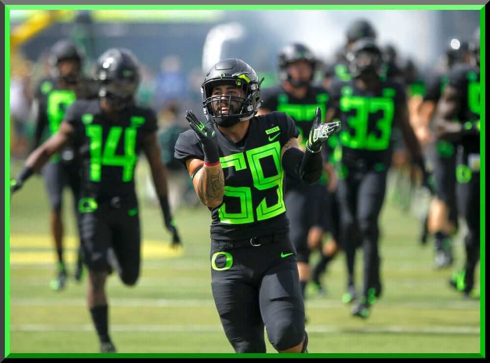
What’s new is old again — the Ducks breaking out another new uniform in non school colors — and since they kinda wrote the book on BFBS and neon, well, they just added another new chapter.
The Ducks wore their new black unis with neon green affects yesterday against San Jose State University, who went almost mono-white. At least it was easy to tell the teams apart.
Have I mentioned yet that Oregon has really, really HUGE numbers?
I’m just surprised they busted this uni out this weekend, during a day game that probably few saw on television, rather than saving them for a nationally televised game, like they have against Stanford next weekend (ESPN Game Day will be covering that from Autzen).
Now, for the rest of your Saturday rundown, here’s Terry “TJ” Duroncelet, Jr., with your…
Sunday Morning Uni Watch
By Terry Duroncelet
From Friday:
• Memphis took greyscale a little too seriously on Friday night and wore grey… at home… against an all-white-clad Georgia State team. *sigh* The helmets were apparently heavily inspired by their old helmets from the 1970s (back when they were known as Memphis State University), but with some added tweaks, such as asymmetrical helmet decals, a matte shell, and a (textured?) blue facemask, tweaks that I would have not been aware of had it not been for Blaise D’Sylva.
From Saturday:
• Toledo wore navy/yellow/navy against the Miami Hurricanes (who wore white/white/orange), which made for a vibrant and attractive game.
• Wish I could say the same for Mizzou and Purdue. BTW, for the context of the flag on Purdue’s helmets, they wore said flag decals on the left side of the helmets, with a U.S. Armed Forces decal of the player’s choosing on the back.
• Murray State not only has fantastic taste in helmet stripes (also, what mouthguard does Kentucky RB Benny Snell Jr. use?), but they also do player names in a manner that I personally haven’t come across before: they put their athlete’s last names on the back of the NECK BUMPERS on the helmets (photo cred to Flacat22). I’ve seen my fair share of atypical approaches to the college football helmet, including accidental goatse (please love yourself and DO NOT Google that), but this is something that I actually like. Let’s hope the Racers keep this (provided they haven’t been doing this for a while).
• During Temple’s game against Maryland, the Owls wore a heart decal that read “JM 79”, in honor of Jordan McNair, the Terrapins offensive lineman who died this past June.
• Blaise D’Sylva reports that Houston has jettisoned the beveling/shadowing in their ‘UH’ logo. Shots from last week’s game seem to verify what the original tweet says.
• Oregon’s… “ensemble”, might be the definition of LOUD, but regardless, the numbers are at least visible and (mostly) legible. You can even see them from the far away shots!
• Mississippi State wore helmet decals that had an integrated teal ribbon with the number 8 in honor of Alex Wilcox, the MSU softball pitcher who passed away from ovarian cancer this past June (her uniform number was #8). If you zoom in on the provided helmet picture, the bottom of the decal reads ‘AW’ (her initials). Here’s the video of the staff applying the decals.
• Nevada becomes the latest team to implement a Turnover Trinket of some sort. More specifically, a “Turnover Towel” (photo cred to bsuorangecrush).
• Huey Freeman from The Boondocks is a member of the Western Kentucky Band these days, apparently.
• More teams should take notes from the UCLA/Fresno State game on how important contrast is.
• Or better yet: Michigan and SMU! Now THAT game was a real looker!
• It’s nice to see Oklahoma State and Boise State looking normal for a change, although this is also a good opportunity to point out the apparent Battle of the Pant Names.
• Eastern Washington wore Suicide Awareness ribbon decals on the back of their helmets yesterday against WASU (photo cred to David/509fitted).
Thanks, TJ! OK, now on to the rest of your SMUW…


Joe Ringham’s 5 & 1
Following in the footsteps of the original “5 & 1,” Jim Vilk, and Catherine Ryan after him, Joe Ringham returns for 2018 to make his “5 & 1” (five good looking and one stinker) uni-vs-uni matchups. Sometimes he’ll have some “honorable mentions” and sometimes there will be more than one “bad” game. You may agree and you may disagree — these are, after all, just opinions and everyone has one. Feel free to let him know what you think in the comments section.
Here’s Joe:
Good Sunday, everyone! To the list we go…
5) Miami (OH) at Minnesota — I had another game lined up for this spot, and then this one snuck in and stole the spot. Loved the Gophers usual maroon/maroon/gold home look, and it matched up really well against the red/white/red of the Redhawks. Looked absolutely fantastic
4) BYU at Wisconsin — This game was the perfect example of how a team wearing blue matches up perfectly against a team wearing red. Just a beautiful looking game under a sunny sky in Madison.
3) Miami (FL) at Toledo — This was one of the first games I saw on television in the early window of games, and immediately knew it would be on the list. The white/white/orange of the U on the road is what they should always go with, and it looked great against the blue/gold/blue of the Rockets. Bold, bright, and eye-appealing.
2) Boise State at Oklahoma State — Any other week, this would be at the top of the list. The Broncos looked great in blue/white/blue on the road. Pair that up against the white/orange/white that OSU went with, and you have one damn-near perfect looking game in Stillwater.
1) LSU at Auburn — I’ll let you guys in on one of my unwritten rules, when it comes to this space. I avoid, or try to avoid, putting teams in in back to back weeks. I make a rare exception here, in the case of LSU, for this games‘ annual appearance on the top of the list. We’ll let the pictures do the rest of the talking…
And, finally
+1) Central Michigan at Northern Illinois — Just a week after I put CMU on the good side of the list, the bring out the hideous mono-golds that automatically put them on this side of the list every year. Even NIU making this a color vs color match-up can’t save this one.
Enjoy the rest of your football Sunday, everyone!
Thanks Joe! You can follow Joe on the Twitter and let him know what you think of his choices or make a 5 & 1 suggestion of your own!
NCAA Uni Tracking
Uni Watch will again track the uniform combinations worn by the “Power 5” conferences. All of the 2017 trackers are back!
We’ve got Rex Henry (tracking the ACC), Dennis Bolt (tracking the PAC-12), Kyle Acker (tracking the Big XII), and Ethan Dimitroff (tracking the B1G AND the SEC). Rex, Dennis, and Kyle and are all returning from 2015, and Ethan is back after joining the NCAA Uni Tracking a couple seasons ago. Ethan continues his dual role of tracking both the B1G and the SEC.
Here are the Uni Trackers for the Power 5 Conferences:
Rex is up first today (ACC):

ACC
More Here.
Follow Rex on Twitter here.
And now, here’s Dennis with the PAC-12:

PAC-12
More here.
Follow Dennis on Twitter here.
And here is Ethan, with the SEC:

SEC
And be sure to check out Ethan’s WVU Mountaineer Tracker.
Follow Ethan on Twitter here.
And here is Kyle with the Big XII:

Big XII
Follow Kyle on Twitter here.
And here’s Ethan with the B1G:

B1G

Welcome to the 2018 Oregon Ducks Uni Tracker. This little project was originally begun way back in 2008-09 by Michael Princip, who retired after several seasons, whereupon the project was continued by Tim E. O’Brien. He, too, retired from the tracking, but the project has been ably kept up by the man who also tracks the Pac12, Dennis Bolt.
Here’s this week’s Uniform Combo for the Ducks (you can click to enlarge):

You can read about this uniform, and MUCH MORE, by checking out the Duck Tracker here!
Thanks Dennis!
NEW Uniform Design “Contest”

Got a note from an old friend, Catherine Ryan, who readers may remember for her stint as the “5 & 1” college football uni matchup lady a few years back. She’s a Villanova grad, and wanted to invite readers to submit designs for a Villanova “third” jersey. I’ll let Catherine explain:
Hello, Uni Watch readers! Some of you may remember me from my stint as the resident 5-and-1 columnist a few years back. Well, I’m here again to propose a fun opportunity to create some unique uniform concepts!
I am a graduate of Villanova University and one of the editors of www.VUhoops.com the leading Villanova basketball blog on the interwebs. As you may have heard, we have won two of the last three National Championships and, as a result, are enjoying a great deal of attention concerning, among other things, our uniforms!
Recently, we’ve been wearing our 1985 white throwbacks as our home uniforms, with the modern blue unis on the road. Villanova rarely takes risks beyond it’s navy/white palette but has occasionally dabbled in sweat backs, bizarrely tiny wordmarks, and this. Also, whatever these are. As you can see, many of these “risks” have completely missed the mark. However, rumors are abound about Nike creating a third alternate jersey for the program this year.
So, I thought I would offer the Uni Watch readers a chance to submit their own ideas for a third alternate uniform for the Villanova Wildcats men’s basketball team. I will post all the submissions on VUhoops.com. We have an engaging and active community over there that would love to discuss all of your ideas!
If you’re interested, just send me your ideas at Catherine.M.Ryan10@gmail.com by September 28, 2018. Feel free to submit as many proposals as you’d like. Be creative! Or be traditional! Or be completely reckless! Take a shot at redesigning the logo if you want!
College basketball is right around and the corner and we’d love to have you all help us kick off our 2018 coverage!
Thanks, Catherine!
OK, readers — you know what do to. Just make sure to send all your submissions to Catherine (address listed above) and not me or Uni Watching. Good luck to everyone who submits!
Contest reminder: Paul here, reminding you that I’m currently running a Jets-redesign contest. As usual, the best entries will be featured in one of my upcoming ESPN columns. Full details here.
Uni Watch News Ticker
By Phil

Baseball News: OK — this one is really good — should these two guys really be sitting together (let alone on the same side)? From Venomous Snake. … Mimicking his teammate, Anthony Rizzo, Javier Baez stayed in full uniform for the ride back from D.C. (from Josh Hinton). … Check out the Baltimore Orioles batting helmet being worn in the film Teachers (1984). From Pierre Escargot. … Oops! Craig Bates asks, “Another weekend and another weird printing snafu find at a store in #Knoxville. Are the @Pirates moving to #CharmCity?” … Last night, the Giants became Los Gigantes (from Brinke).

NFL/CFL News: James Connor, Steelers Running Back, will honor the late Mac Miller with special cleats today (from Mike Slavonic). … As planned, the Montreal Alouettes have returned to wearing their primary logo on the helmet for the remainder of the season. Made the appearance Friday night. Submitter Wade Heidt adds, “However, they did not return to their usual primary helmet as I expected. The logo is only in red. Almost looks like the paint job is not complete when compared with how the logo usually looks. Have kept the striping off the helmet and stayed with grey facemask, which differs from the usual primary helmet.” … Tweeter Russell Goutierez writes, “Week 2 of 2018 and still the 2016 jersey design graphic. SMH or is it maybe just that the large majority of those in #WhodatNation don’t notice and/or don’t care?” … The Tennessee Titans now have 20th Anniversary logos in their end zones (from Lee Wilds). … The concept of casual Friday has been a staple of American workplaces for years. In Washington, a trio of offensive linemen have turned the topic on its head.
College/High School Football News: We’ve seen the retro-Longhorns logo before, but where did that Trojans head come from (from Griffin Smith)? … Check out this helmet logo for Cashion, a High School in Oklahoma (from Coach Sawyer).

Hockey News: The New York Islanders, who currently play in Brooklyn, will be playing about half their games this season at the “new” Nassau Coliseum. In a beautiful sight, the center ice logo has returned (from @cannolifactory). … Yesterday’s sub-lede featured a look at the new Winnipeg Jets third sweaters (but not much on the breezers). Here are some photos of the full uniform, including the pants. … Introducing the jersey for The State of Hockey’s professional women’s team in the NWHL (from Goat Jerseys).

NBA News: If Jimmer Vilk didn’t ghostwrite this article, then he probably would agree with (at least half of) it: “The Rockets need a ‘ketchup and mustard’ or pinstripe jersey.” Ketchup/mustard, yes. Pins? Never. … Stephen Curry was given his own Spurs kit, but without the Premier League sleeve badges (also posted in the soccer section). From Josh Hinton.

Soccer News: Crystal Palace has a new yellow “fade” kit (from Paul). … Yesterday, Toby Alderwereild was wearing a jersey with no club crest (from James Clancy) Here’s another view (from Mickey McGuire). … Borussia Dortmund have taken a stand against racism amid a dire political climate in Germany by displaying a special message on their shirts (from Tim Walsh). … In yesterday’s action, Toby Alderweireld wore a badge less kit vs Liverpool (from Josh Hinton). … Also from Josh, Stephen Curry was given his own Spurs kit, but without the Premier League sleeve badges (also posted in the hoops section).

Grab Bag: Here’s a look at what the United States will wear when they golf in this year’s Ryder Cup. … Our old friend Jerry Reuss writes, “When I saw (yesterday) morning’s entry, I had to send you this. Attached is an image of The Demon, actually Dale Torborg, who is currently the Minor League Conditioning Coordinator for the White Sox.” Wow, thanks Jerry! … “What a jersey!” exclaims Jon Horton. “I turned on ESPN+ and saw these amazing jerseys. In a night game, they are iridescent. Guinness Pro14 rugby. The back has a rainbow confetti design as well.”
Ah Yeah! Time for some college football uni tracking Canadian rules style! For the football where you can find two 50 yard lines on the field.
From Canada West conference this weekend:
-Regina Rams went usual mono-green at home. UBC Thunderbirds went white over blue:
link
-Calgary Dinos wore their alternate white helmets with the dinosaur paw print on the road in Saskatoon. Went mono-white. Saskatchewan Huskies wore their green helmets with the “US” logo featuring the straight on view of the husky face. Went mono-green:
link
link
-Alberta Golden Bears wore their alternate white helmets featuring the smirking bear on the road in Winnipeg. Went white over green. Manitoba Bisons went mono-black:
link
I love Alberta’s uni.
Two Pitt-related errors:
(1) ACC Tracker – Pitt wore white pants yesterday
(2) James Conner (not Connor)
Damn. I go by the uniform reveals and Pitt uses a sepia tone that makes them look like the gold pants.
Thanks for the correction
Should be fixed now.
Can someone explain the inconsistencies with Murray State’s helmet stripes? #30 has a checkerboard pattern, but the other pictures show a diamond pattern.
The Pirates can move to Montreal for all I care. Nobody cares about them now. The fans see Bob Nutting for who he is. And how about the painful irony that Andrew McCutchen being a Yankee? Good for him and Neil Walker, they deserve to be on a contender. #BoycottThePirates2018
As for yesterday’s wrestling piece? Surprised it got a positive response. Maybe Paul should do more wrestling pieces.
Call me Nobody, then. The Bucs are the only Pittsburgh pro team I follow these days. Gonna take more than Mr. Nutting to change that.
Anyway…
You can even see them from the far away shots!
Note to ALL teams in ANY sport: that is the whole point of having jersey numbers! If they’re not big and/or not legible they’re a failure.
So you would rather root for a team that is more concerned about its fiscal bottom line than teams that go all-out to win?
OK then.
Steelers do need to move on from Le’Veon Bell, but the Pens? Must be an old-school “I don’t care about hockey” fan.
Don’t care about football *or* hockey.
I’m not saying I’m happy with everything Nutting has/hasn’t done but he’s far from the worst owner in sports (as others have suggested). The Pirates are the only team I’ve supported from the cradle. Hopefully to the grave, but we’ll see. Now when Nike takes over MLB’s uniforms…that could be a potential test to my fandom…
Joseph, appreciate your work on the wrestling article yesterday. It was just too sweet!
Glad there were some good looking games that I missed. At night there were a bunch of black mono abominations, and a colorless Mizzou/Purdue which was a good game for either a B&W TV or even better for the radio. Can we stop with the gray?
Mizzou/Purdue was a little odd too in that Purdue wore dark/medium gray unis with the Mizzou coaches sporting dark/medium gray polos (which matched their trousers horribly), with Mizzou players in all white and Purdue coaches in white/VERY light gray polos. Nike essentially cross-matched the two squads.
Hi Uni-verse!
link
Please keep this tragedy in your thoughts and prayers. Difficult situation for all of us here in Lexington.
Big XII Tracker: Baylor didn’t wear mono-green; they had gray jerseys. Texas wore orange jerseys, as they were at home.
The Demon was an interesting development in wrestling. He was actually the result of a deal with the band Kiss to be effectively a branded wrestler. The deal required that The Demon wrestle in at least one main event of a pay-per-view event; when he flopped, WCW put him in an early match but made the announcers CALL it a “special main event” to satisfy the contract! A bit of a scam!
Before he was The Demon, Torborg–who is the son of longtime player and manager Jeff Torborg–had wrestled in a baseball uniform, but with facepaint, as “The MVP”. link (Not to be confused with a later WWE wrestler called “MVP”.) Torborg had played baseball at Northwestern and in the minor leagues.
BTW, the ticker has two items about the same Toby Alderweireld story.
Dennis Bolt does a fine job covering the PAC-12. USC, Stanford and WSU normally wear the same shade of red. I note that Dennis has shown them as being different this year. To my eye, having watched all of their games, nothing has changed.
Thanks Jon (I swear you are not related to me)
I’ll be honest that I have not touched the color mix for those three red schools. They have been the correct shade all 4 years I’ve done it.
Us uni trackers do try our best to get fonts, shades etc right for each team. I typically use the same general uniform template and do not spend the hours getting panels/stitching right for each team.
When we do our preseason work we are scouring press releases for links to their official colors and then either are lucky or have to guess at shades and fonts. Some school publicize their school color mixes and other don’t. And those “traditional” school that use a collegiate block are all similar but have different tweaks that I have to find a current photo with the number I use and nip/tuck the corners etc.
And each week most of us rely on the twitter uniforms reveals so that we are not scrambling at 8pm pst to make the graphic from scratch. But last year Washington State was notorious for revealing one helmet decal but using a different one. And WSU also has about three shades of gray they use, and many uniform reveals are moody and blurry and hard to see it all, so its easy to think you are getting it right and then Saturday at midnight you realize differently.
Hi Jon. Having re-reed you note, I initially thought you were complimenting me on noticing three shades of red, but now read it to mean that you think they wear the same red? Since I do not see these uniforms in person in perfect lighting I am going off photos and also the official color mixes that the university provides. In my eye these ARE different shades of read, as they should be. If you have knowledge about them being the same red, please let me know.
Each school’s official red is Pantone 201, but sometimes look a bit different on the field. I go by these Pantone numbers most of the time, but have to make judgement calls on teams like Virginia Tech whose uniforms are more vibrant than these numbers. Gold colors don’t translate very well, either.
That SMU-Michigan game really was beautiful.
Two teams looking exactly how they are supposed to look which is a rarity these days unfortunately.
Watching the TCU-OSU game last night I noticed the purple chrome helmets. I am sure it was not the first time TCU has worn them, but was the first time I had ever seen them. With apologies to Paul, I have to say that those are really nice.
Also, the 3 best unis in college football (IMO), are USC, Penn State and Alabama.
“Huey Freeman from The Boondocks is a member of the Western Kentucky Band these days, apparently.”
Was that supposed to be funny? Sorry, but it’s 2018, and the ‘black people have funny hair’ bit became poor taste decades ago. I expect better from this site. Especially in the wake of the racist cartoons of Serena Williams making news this week.
… link
This site and sports in general getting a little to pc/political for my taste. Maybe I’m just to White.
Oregon may have big numbers but as a sportscaster, I appreciate numbers you can read. Now, if only the sports would institute the rule that the number has to contrast with the jersey. I can’t tell you how many times I have seen gold numbers on white jerseys and my favorite of all time… the Rockwall Yellow Jackets back in the 80’s (when my eyes were good) who wore light orange and white with no stroke on the numbers… It looked like mixed up orange cream soda.
LSU – Auburn looked great, but both teams have the pant stripes “wrong”. LSU should have them together (purple white purple, no yellow in between) and Auburn should have theirs apart (blue white orange white blue) matching both teams’ helmet/jersey stripes. it would then be perfect.
I was thinking the same thing
link
Loved the Michigan/SMU matchup. No bells and whistles; just classic, clean Unis. Same for LSU/Auburn.
This is Superb. I want to tell you how much I appreciated your clearly written and thought-provoking article.
Even though Memphis went overboard with the gray at least it is an official school color.
I was at the NIU/CMU game. I didn’t notice at the game but the pic looks like NIU has 2 different matte finishes on their helmets.