Click to enlarge
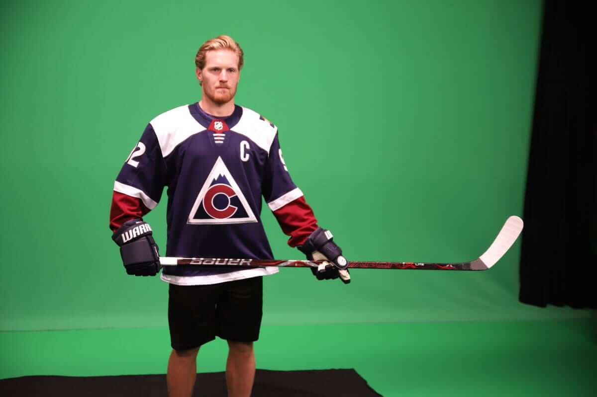
As we approach the start of NHL preseason games, more and more alternate jerseys are starting to appear. The latest unveiling comes from the Avalanche, who announced yesterday that they’re reviving their Avs/Rockies hybrid jersey.
The Avs originally wore this design in 2015-16 and 2016-17. Now, after the league’s one-year hiatus on alternate unis, it’s back. It will reportedly be worn for a dozen home games against division rivals.
The new Adidas version appears to be essentially the same as the original Reebok version, except the red sleeves look brighter (which could just be the lighting) and, of course, the collar is worse.
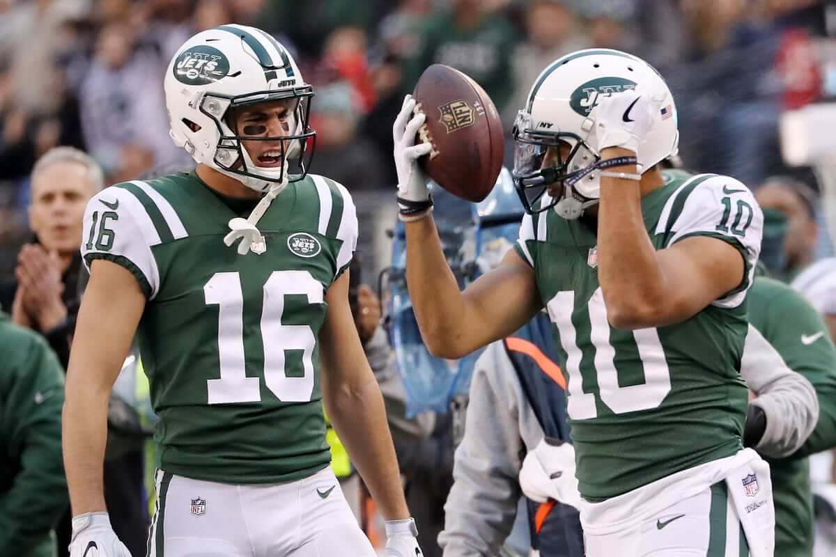
Meanwhile, the Jets are slated to unveil their third jersey tonight, but it appears to have leaked to a message board yesterday:

Although the image has been taken down from its original posting, SportsLogos.net says the image was hosted by the server that the NHL uses for merchandise pics, which suggests that it’s legitimate. We’ll find out for sure tonight.
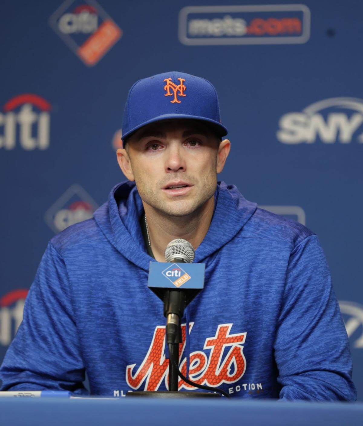
The Wright stuff: The Mets announced yesterday that David Wright, whose health has been derailed by serious back, neck, and shoulder problems, will suit up for one last start at third base on Sept. 29 — the next-to-last day of the season — and then call it quits.
This upcoming one-game appearance (which likely won’t even be a full game for Wright, because they’ll no doubt pull him from the field midgame so the fans can salute his exit) has a surprisingly wide range of uni-related implications:
1. Some people are already asking if the Mets will wear a patch for Wright’s final game. Personally, I hope not — I really dislike patches for active players, in part because it’s so unseemly for a player to be wearing his own patch.
2. Mets Police editor Shannon Shark has a much better idea: For most of his career, Wright has worn an orange undershirt, instead of the Mets’ usual blue base layer. So Shannon suggests that the whole Mets team should wear orange undershirts on Sept. 29. I like this idea, but I’m also nervous about, for this reason: Wright would only wear a short-sleeve orange undershirt. The only way you knew it was orange was from the collar (and, occasionally, a glimpse of sleeve poking out from under his jersey sleeve). If the whole team goes orange-base-layered on Sept. 29, I bet a bunch of them will mess it up by wearing orange long-sleeve undershirts — something that Wright himself never did.
3. Another one of Wright’s uni quirks is that he goes high-cuffed for day games but low-cuffed for night games. Unfortunately, his Sept. 29 send-off game is a night game, so our final impression of him will be as a pajamist. Dang.
4. Wright is the Mets’ captain (in fact, I think he’s the only current MLB captain — am I forgetting anyone?), but he has never worn the designatory “C” because, to his credit, he thinks that would be too showy. But for his final game, equipment manager Kevin Kierst should get a “C”-clad jersey made, stick it in Wright’s locker, tell him he has to wear it, and not take no for an answer. It would be a nice way to acknowledge his importance to the team.
One additional uni-related issue, although it won’t play out on Sept. 29, is that the Mets will almost certainly retire Wright’s No. 5. That ceremony will presumably take place next year.
Jets-redesign reminder: Remember, I’m currently running a Jets-redesign contest. Full details here.
The Ticker
By Kris Gross

Baseball News: Red Sox 2B Brock Holt wore shoes he designed with cancer patients last night (from Sara). … Cubs 1B Anthony Rizzo protested the Cubs’ recent travel schedule by going in full uniform on the team plane Wednesday night (thanks Brinke).

NFL News: The Ravens wore purple pants with their white jerseys for the first time ever in last night’s game against the Bengals. Note that these purple pants were different from the Color Rash purple pants (from Billy King). … The Titans will wear white at home against the Texans.
College Football News: Here are this weekend’s uniform combos for Oregon, TCU, Arizona State, Northwestern, Illinois, Syracuse, Georgia Tech, and Stony Brook (from @mrmichael21). … Oklahoma’s football truck was updated with Jordan logos (from Sam McKinley). … Coastal Carolina has been displaced due to Hurricane Florence, and the team brought their pets with them (from Tris Wykes).

Hockey News: Bruins C Jakob Forsbacka Karlsson has a doozy of an NOB (from RM Cooper). … The Saskatoon Blades will wear Humboldt-inspired jerseys on Sept 22. … The Lehigh Valley Phantoms of the AHL will wear fifth-anniversary jerseys this season. The design will debut at the team’s season opener on Oct. 6 (from @SlideshowRobbie).

Basketball News: A new Clippers alternate jersey may have leaked. … LeBron James is not a fan of using a square basketball for training (from Mike Chamernik). … Ricky Rubio appears to like the new Jazz alternates. … Southern Illinois named their first game of the season after an alum who donated the fourth largest amount in school history (from @mrmichael21). … Sports Illustrated ranked their top 10 college uniforms. … Check out the original design for Kentucky’s Rupp Arena (from Josh Hinton).

Soccer News: Legia Warszawa celebrates 100 years of Polish Independence with these jerseys (from Ed Żelaski). … Now some notes from Josh Hinton: India’s 2018 kits were unveiled. … Here’s the explanation for Greenville Triumph SC’s new crest. … Nashville SC is offering free tickets to Hurricane Florence evacuees.

Grab Bag: Here’s what the US Ryder Cup team will wear in Paris (from Benji B). … National Lacrosse League team Rochester Knighthawks are moving for the 2019-20 season, but Rochester will get an expansion team that season, also called the Knighthawks (from Griffin Smith). … Long Beach State University and Long Beach Community College have both had recent identity redesigns (from Seth Moorman).
When Forsbacka Karlsson was called up to the Bruins in 2016-17, they had his last name hyphenated on his jersey.
Which doesn’t actually seem to be the case with his name, and hoo boy did that look weird with the three layered letters the B’s used pre-Adidas.
link
This is a case where using a nickname would make a lot of sense. The Boston University radio guys always just called him JFK and that would fit a whole lot better. If the point of names is for spectactors to identify the players, it’s hard to argue that the full last name is readable even from row 1.
I like the orange undershirt idea as a shout out to David Wright. And also sticking a C to his jersey.
I didn’t realize how much I missed the NHL’s third jerseys until they’ve started coming out! My first impression of the Jet’s third jersey was that it was close to the Penguin’s baby blue throwback, but with the new word mark and extra large stripes I think it’ll stand out on it’s own.
Yeah, the orange undershirt idea is PERFECT. I will be upset if they don’t do this.
Here’s the thing, though: Wright would only wear a *short-sleeve* orange undershirt. The only way you knew it was orange was from the collar (and, occasionally, a glimpse of sleeve poking out from under his jersey sleeve).
If the whole team goes orange on Sept. 29, I bet a bunch of them will mess it up by wearing orange *long-sleeve* undershirts — something that Wright himself never did.
I’ll add this proviso to the text.
Great write-up on David Wright, Paul. I love the idea of the orange undershirts as a tribute. Also, if he wears the “C” I’ll probably lose it. Aw heck, I’m going to lose it anyway. There has always been something special about David, both on and off the field, and I’m happy we’ll get to see him on the field one more time. Of course, I feel for him because the injuries shut down such a great player, but more than anything, I’m sorry for the pain he had to endure. My prayers are with him in that I hope that after baseball, his injuries won’t cause him to live a life in constant pain.
And you’re right about the jersey retirement. If they don’t do it, the fanbase will never let the team forget it. 5 belongs to David, and it needs to be up on the wall when he can no longer wear it.
Ravens: I think the Color Rash pants would have looked better. Less black, more gold.
Then again, I’m probably the only one who liked the gold pants when they broke those out a few years back.
Completely agree. Would like to see the white/gold/white stripe and purple socks with the white jerseys. The gold pants however can stay in the catacombs….nevermore.
I think this was fantastic. Big fan of the Ravens in the purple pants on the road with white jerseys.
Problem with the Ravens going purple and gold is that it looks too much like the Vikings. Ravens are purple and black.
The Vikings wear yellow, the Ravens wear gold. And the Vikings only use their yellow as a trim.
Helmets are different colors too (hell, even the shade of purple isn’t identical).
All those factors make it easy to differentiate Baltimore & Minnesota from one another.
Lee
Minor correction: The Ravens wore purple pants with their white jerseys for the FIRST time ever in last night’s game against the Bengals.
Yup. Just fixed that.
Sorry that you had to re-read a sentence with the dreaded word purple in it.
When I see the crest on the Winnipeg Jets alleged leaked third, it subtly reminds me of the crest for the major junior hockey team that plays about a six-hour drive west from Winnipeg:
link
Though these teams have looked similar. The 1980s Regina Pats wore basically the same uniforms as the Winnipeg Jets in their final WHA season:
link
link
Not quite the same but reminds me a bit of the Johnstown Jets of the EHL. Winnipeg’s 3rd jersey isn’t up to what you’d wish for the standards of a team of the NHL.
link
The jersey looks like something a beer league team would wear. Very generic looking.
I am not sure it is even nice enough for a beer league. It’s absolutely horrific.
Re: Ravens pants
NFL is reaching college level uniform absurdity if a team has 2 different pants that are the same color (throwback uniforms excluded).
And by my count that gives the Ravens 4 different pants, and 3 different color pants? And that is not even counting the gold ones, which I assume are retired. Brutal. In football I think a team should have, at most 2 different color pants to wear, and if they have, 2, one should be white (see Chicago, KC, etc).
If you want to develop a classic look you have to be consistent, constantly changing up your pants combos does the opposite of that.
That said, these purple ones with black stripes look pretty nice (for purple). I’d prefer they add stripes to black pants and wearing them home or away (with contrasting socks), but if they simply went white pants with the purple jersey and these purple pants with the white jersey that would be a good look.
If you want to develop a classic look you have to be consistent….
Right — but for better or worse, developing a classic look is not always a team’s goal.
The Ravens did indeed look pretty good last night. The bar isn’t set very high, though.
I’ll be at the Jets jersey unveiling tonight. Most everybody in town is reacting negatively to the leaked photo. We can only hope that it looks better with numbers and a nameplate.
As a Mets fan, I am ALL in favor of David Wright’s #5 being retired. Having said that, Keith Hernandez’s #17 and MOST DEFINITELY Gary Carter’s #8 should have already been retired.
Wow is that Jets jersey underwhelming.
I understand and agree mostly with the changes with Native American mascots and names for teams. However “Prospector Pete” and “49ers” being offensive is taking political correctness too far at Long Beach State. The Cal State University system wanting schools to move away from individuals as mascots is strange. So if USC was a Cal State school Tommy Trojan would be out. I guess the Dallas Cowboys should be changed since the history of Cowboys wasn’t good with regard to Native Americans.
To be fair, It wasn’t really Cowboys that played the part of exterminating the natives. It was the Army more than anything. The cowboys drove cattle from ranches in Texas to stockyards in Abilene, Kansas City and other points north. They had a job to do and weren’t typically paid until the job was completed. They didn’t want trouble,and looking for a fight with the natives, especially Comanche, would not be in line with their goal of getting paid.
Haha…drove cattle right through land that was once indigenous peoples. “they had a job to do”…the great quote used throughout history. I’m sure most if not all groups can find something negative where they wronged another group. Vikings, Pirates, Buccaneers….Heck one man’s “Patriot” is another mans Rebel. It’s ridiculous.
Well, who gets credit for ownership of the land first? The Comanche ran the Kiowa and Caddo off their land before the European settlers. You can keep going. The simple fact is the people labeled as cowboys didn’t do what movies and uninformed society suggest.
At some point I suspect that all sports teams will just be named the Pangeans.
Ravens needed to invert the stripes from last night – white/black/white instead of black/white/black. Couldn’t hardly see the black up against the purple, even in the linked photo. I’m guessing these purple pants will become this year’s color rush pants for them and they’ll just wear their normal purple jerseys with them, but I don’t really see what was wrong with their original striping, it would’ve looked fine with their white tops.
Kudos for going black socks, at least. Looking forward to the eventual black jerseys/purple pants/black socks combo that they’re inevitably going to wear later this season.
The Ravens have one of the worst uniforms in the history of sports. Insipid font, colors that don’t blend well etc. But adding stripes on the pants really went a long way. Hopefully they can get a proper block font for their numbers soon.
I get all the negative comments on the Jets uni, but need to see it live in game action. That shade of blue with black might really pop.
Or admittedly it could join the long list of 3rd jerseys that seemed a waste of time and quickly forgotten
Nothing wrong with the Jets 3rd jersey. The Jest wordmark is short enough and bold enough to work on a Hockey sweater. It’s when you have lengthy text, like Minnesota that the jersey looks semi-pro-ish.
Ravens purple pants only work in this regard because they paired them with the black topped socks. Had they went color rush purple it would have been too much. White pants are still cleaner looking and always will be.
The Jets’ third unis look quite good. A colour of the existing palette, the short JETS script, as previously mentioned, looks sharp, classic numbers and lettering, and the striping looks very traditional.
Less is more. I like it.