If you don’t build it…they can’t come
[Editor’s Note: Paul is on his annual August break from site. Deputy editor Phil Hecken is in charge from now through the end of the month, although Paul is still on the clock over at ESPN and may be popping up here occasionally.]
By Phil Hecken, with Ron Bolton
Follow @PhilHecken
If you are here for the GRIFFINS ALTERNATE DESIGN Contest for GROUP 4, scroll down or CLICK HERE — it follow’s today’s lede!
Weekend readers (and hopefully those of you who read weekdays as well) know that I do a good number of sub-ledes with Ronnie Bolton, who I have featured in a few ledes as well, and he’s joining me again today for a very special post. If you don’t already, you should follow Ronnie on the Twitter @OTBaseballPhoto.
If you’ve been reading any of my postings over the past (almost) 10 years, you know that I love stadia almost as much as I love uniforms, and I’ll occasionally do postings on what are for the most part, architectural marvels. But one of the things I haven’t really touched upon are stadia that were proposed but never built. Before I began my August run subbing for Paul, I spoke to Ron — knowing the breadth and depth of his knowledge in this area is, well, broad and deep — and asked him if he could come up with a few proposed stadiums from the past that were, for whatever reason, never constructed. That’s the focus of today’s post. (Tomorrow, barring breaking uni news today, I will feature Mark Anderson, who I’ve featured years ago, with a another fantastic post that kinda riffs off of today’s — so you’ll definitely want to stick around for that!)
Anyway, if you don’t want to go straight into the final round of voting for the Griffins Alternate Jersey Design Contest (which immediately follows this), please sit back and enjoy Ron’s look at some future stadiums that were never constructed.
With apologies to the Moody Blues, here are…
Days of Future (Stadia) Passed
By Ronnie Bolton
Sportsman Park 1949

Here is something different and unique for today – the initial plans for a new St Louis Cardinals ballpark drawn up in 1949!
At the time, the Cardinals had been renting the use of Sportsman Park as the ballpark was not owned by the Cardinals, but instead to their crosstown rivals the St Louis Browns. The Cardinals moved in as tenants in 1920 after their own ballpark, Robison Field and one of the last of the wooden ballparks, was considered obsolete.
After beating the Browns in the 1944 World Series and clearly becoming St Louis’ team, the Cardinals started exploring building their own ballpark. In 1949, Cardinals new owner Fred Saigh put forth the sketch you see here, a three-deck horse shape ballpark in the Streamline Moderne style, a design popular since the 1930s.
But Saigh was also quite evasive when pushed on where this new modern ballpark would be built, only assuring the press it would be on 18 acres of land that he personally owned and set aside $5 million to finance it.
But before Saigh could break ground he was indicted on tax evasion charges and in January 1953 was sentenced to 15 months in prison. Commissioner Ford Frick pressured Saigh to sell the team and he finally relented in February 1953 when Anheuser-Busch purchased the team for $3.75 million.
At about the same time the struggled cash-strapped Browns, now owned by the colorful Bill Veeck, were struggling badly at the gate. But Veeck, always an opportunist, saw the light at the tunnel with Saigh being sent to prison and had high hopes of driving the Cardinals out of town. But when Anheuser-Busch took ownership of the Cardinals, Veeck saw the writing on the wall knowing he couldn’t compete with the beer company’s resources, so he sold Sportsman Park to them for $800,000 and bolted to Baltimore and changing the name of the Browns to the Orioles.
In turn Anheuser-Busch, now owners of Sportsman’s Park started to put money into the ballpark and renovating it, thus killing and prospects of a new ballpark in St Louis and making this drawing a cool afterthought.
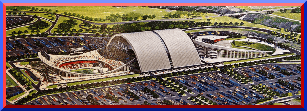
Pittsburgh Stadium 1958

Pittsburgh, PA, 1958 – A proposed 70,000-seat multi-purpose stadium built over the Monongahela River!
If this had actually come to fruition it would have included a 600-room luxury hotel with multiple high-class restaurants, world’s largest covered boat dock underneath and even a bowling alley with 100 lanes! But due to obvious logistical issues, the idea originated with Pittsburgh resident Eric M. Sirko never really had a chance to be taken into serious consideration, and that’s probably a good thing.
Kansas City Rolling Roof 1968

Kansas City, MO, 1968 – Before ground broke on the Truman Sports Complex (Arrowhead and Royals Stadium), a revolutionary plan was in place for a rolling roof that was capable of protecting either stadium from the elements.
The half-moon structure would be placed on rail-road like tracks and roll back and forth to either ballpark and placed in the middle of both went not needed. But costs and infighting sank the idea and it was scraped from the plans.
Brooklyn Domed Stadium 1952

Colliers Magazine, Sept. 27, 1952 issue – Say one thing about Dodgers owner Walter O’Malley, he was a man who was years ahead of his time. At the very least he was an astute businessman who knew the importance of a good ballpark and what a team needed out of that ballpark to flourish.
Here was a plan for a 52,000-seat multi-purpose domed stadium in Brooklyn O’Malley was pushing, it was a $6 million project that included a movie theater, a shopping mall and the possibility of a retractable roof. One of the interesting details of this project that never happened was the universal dimensions of the outfield, according to this drawing it was set at 380 feet all around. O’Malley had a couple sites on the radar for his futuristic ballpark, but it was believed he had an eye on the intersection of Atlantic and Flatbush Avenue.
[Interestingly, there was another dome in the works for the Dodgers, which was (obviously) never built. It would have kept the Dodgers in Brooklyn. There were some crazy models developed for this not-so-crazy proposal. — PH]
San Francisco 1983

Bay Area sports fans should be glad this unimaginative idea put forth in 1983 as the new home to the Giants and 49ers never materialized. At the time, baseball ballparks were still just considered places where style and class died in slabs of concrete, as evidenced by this atrocity. The one thing that San Francisco did get right with this idea is the location, as this is where Giants’ AT&T Park sits today.
Thanks Ron! Great job (as always). Hope you’re enjoying your vacation!
And now, on to the Fourth Group of submissions for the Griffins Alternate Jersey Design Contest!

Griffins Alternate Design Contest – Fourth Group of Submissions
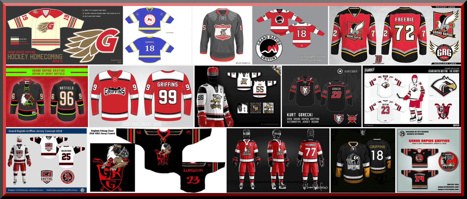
Today we begin voting on the fourth (and final) group of contestants for the third annual Grand Rapids Griffins design contest. In case you missed it, the contest parameters and rules were laid out here.
We’re using a new polling system, which we hope will eliminate (or at least drastically reduce) any fraud or shenanigans. You will be permitted to vote for as many designs as you would like, but you may only vote ONCE. The poll(s) will close approximately twenty-four (24) hours after being posted — the TOP THREE vote recipients will move into the final group (the winner of which will be chosen by the Griffins).
Today the lede will focus on the final 15 submissions. I expect to announce the winner chosen by the Griffins (from the 12 finalists voted by you, the readers) this Friday.
You will also notice the polling system looks different — I want to give my great thanks to Larry Torrez, who worked with me to come up with the poll you’ll see below in an aesthetically pleasing format as well! Great work ElTee (of DC)!
REMINDER: The Griffins set out the following parameters for designing an alternate jersey. Please use them to guide you as you make your decision(s) below:
• Create a brand new design for a Griffins alternate jersey (remember: you are ONLY designing a jersey, not a full uniform).
• While your design work must be original, you MAY use current or previous Grand Rapids Griffins logos.
Therefore, while some of the submissions you see below may include gloves, helmet, pants, etc., you are ONLY voting on the jersey design. Please keep that in mind when casting your vote(s).
OK? That’s about it. First I’ll display all the submissions for today, which will be followed by the new (sharp-looking and hopefully cheat-proof) poll. Click to enlarge any image below.
A: George Miller

B: Tyler Behmlander

C: Ryan Haruta

D: Adam Foxman

E: Brooks Freeman

F: Brent Hatfield

G: Josh Maczinski

H: Zach Grantham

I: Kurt Gorecki

J: Fabio B.

K: Clark Rasmussen

L: Stephanie Schaap-Jones

M: Vincent PettoFrezzo

N: Samuel Whitehead Agee

O: Kenneth Dittenber

And there you have it. Your final 15 submissions. And now, to vote, here’s the poll — to start, click “ENTER” or hit “SUBMIT”; once you start the poll, the reader design will appear next to the name and you may select as many designs as you like. Once you have finished voting, be sure to scroll to the bottom and hit “ENTER” or click “SUBMIT” to make sure your vote(s) are counted! That’s it!):

Collectors Corner
By Brinke Guthrie
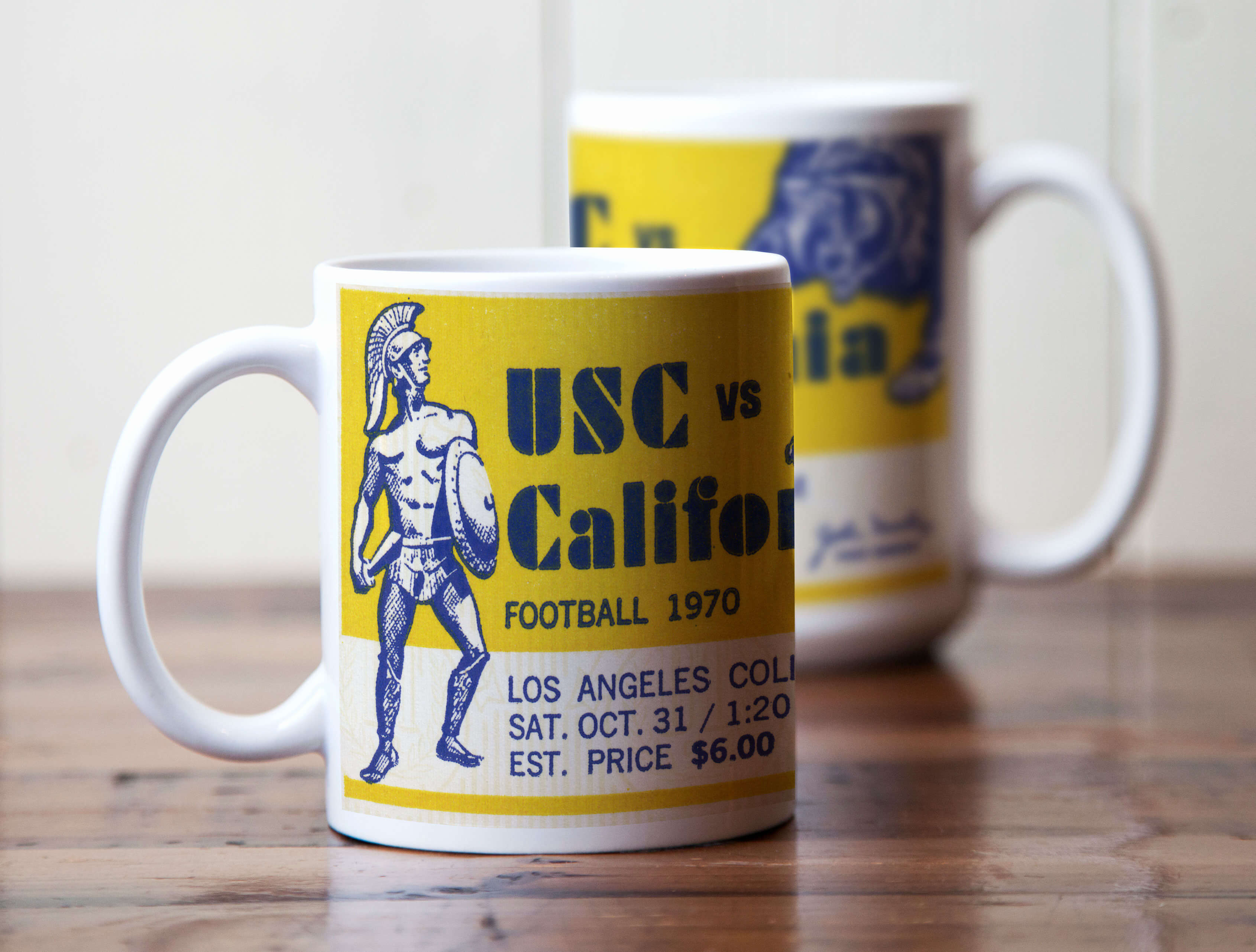
It was great to find this since I was an ABA Kentucky Colonels fan way back when. Somebody hand painted this terrific little figure of Louie Dampier (one of my favorite guys along with Cincy Powell, Jim (Goose) Ligon, Darel Carrier and Dan Issel). Looks a bit angry, doesn’t he? This is the team’s 1974 look with red/blue, which I never thought looked right. You can also get Louie (with mustache) in the classic white/blue. Figures are 3″ tall. OK, on with the rest of the week:
• These are absolutely cool. This is a California Angels “Teammate” clock– around 1972 here- from Westclox. You never see these on eBay! I had a Reds version and it worked like a charm. Wind it up with a big ‘ol key on the back. A great item.
• Holy cats! Get the entire set of 1968 Fleer NFL Big Signs here!
• How about this ceramic figure of Boston Bruins hockey legend Bobby Orr. He’s wearing the famous #4, and the listing says it’s 5 1/2″ X 4″ X 12″, so this is one big guy. Just right for any Bruin fan.
• This 1970s New York Rangers hockey jersey was made by Maska Sport Knit for Doug Laurie Sports, which at the time was located inside Maple Leaf Gardens in Toronto.
• St. Louis (baseball) Cardinals fans always knew when it was time for first pitch with this stainless steel digital watch. Mid 1970s for this one, maybe?
• Bucs fans, serve your NFL game day snacks on this 1970s Tampa Bay Bucs serving tray, starring Bucco Bruce. If you’re not a Bucs fan and want the whole league, sure, why not?
• Back in the early 1970s, you could get this packet of 20 autographed Dodgers photos for just 50 cents.
• These AFC and NFC magnetic standings boards (Orange Products in New Jersey, of course) look to be in perfect shape.
• Terrific example of early 1970s NFL poster art here- looks like Otis Taylor on this KC Chiefs poster. My room in our Dallas house had a pretty large closet, and I clearly recall putting this one up in there.
Here’s another nice poster- I think late 1970s or early 1980s for this Detroit Lions poster from Damac.
• IMO, the 1970s “sailboat logo” on this NBA San Diego Clippers key ring is much better than what they use now in Los Angeles. Totally underrated logo.

New raffle: Paul here. Our friends at Vintage Brand are generously offering to let two lucky Uni Watch readers each choose any item they want from the Vintage Brand website. In case you haven’t gotten acquainted with their products, they offer stuff like this (click to enlarge):
To enter, send an email to the raffle address by this Friday, Aug. 31, 7pm Eastern. One email per person. We’ll announce the two winners next week. Good luck!
The Ticker
By Alex Hider

Baseball News: Last night, the Los Angeles of Anaheim threw back to their California Angels days. Only, looks like the coaches didn’t get the throwback helmets! (from Chris Creamer and Funhouse, respectively). And Mike Trout had a pretty cool C-Flap added to his helmet (from Steve). Here’s one more look (from Whip #27). … Diamondbacks players wore their favorite team’s jerseys (other than the D-Backs) for their road trip (from Adam Vitcavage). … Phillies P Austin Davis says his “Big Fudge” NOB on Players’ Weekend was given to him in college because he gained some weight (from Phil). … The Washington Post has a feature story on baseball players on their barbers (WaPo link) (from Tom Turner). … Syracuse University wasn’t founded until 1873, but they fielded a baseball team in 1888. Check out those pillbox caps (from Max Weintraub). … The Las Vegas 51s of the Pacific Coast League will give away Vegas Golden Knights baseball jerseys on Sept. 1 (from Phil).

NFL News: The Giants are now selling advertising on their roster moves. Seems kind of callous to turn someone’s job status into an ad (from Jerry). … Reader Brian Spiess notes that while Browns QB Baker Mayfield has been wearing a Riddell “808” mask during preseason — as he did in college — he wore a different mask in mini-camp. … Listicle: All of the alternate uniforms NFL teams will be wearing this year (from Phil). … Flying Dog Brewery in the Frederick, Maryland is releasing a Ravens-themed beer in a purple camo can (sorry Paul) for football season (from Andrew Cosentino). … Robert Brashear took a ton of photos at the Steelers’ Hall of Honor at Heinz Field. … This story was published in 2017, but it’s a good one. The Great Lakes Freighter Trophy (The Athletic link) used to be awarded to the annual “Great Lakes Classic” preseason game between the Browns and Lions — until it went missing (from Jerry and Cleo Macin). … The Chargers have been out of San Diego for over a year, but Yahoo still uses what is now called SDCCU Stadium as the backdrop for fantasy football drafts (from Griffin Smith).
College Football News: Colorado will wear gold helmets, white jerseys and white pants against Colorado State on Friday (from Phil). … Texas Tech will honor former nose tackle Gabe Rivera, who died this summer, with a memorial decal (from Sean). … According to Josh Hinton, this podcast contains some Kentucky uni talk. … The University of Central Oklahoma is designing its game notes in the style of a Netflix show (from Ryan Atkinson). … Paul reported in his college football preview that Rutgers is putting the name of its stadium, HighPoint.com, on the field. Now, we have photos (from Griffin Whitmer). … Designer Conrad Burry updated Jordan’s Jumpan logo to make it football-appropriate for college football teams. … Nebraska has added a video board to the Cornhuskers’ tunnel entrance at Memorial Stadium (from @HardyWallbanger). … Lots of inconsistencies with Tulane’s uniforms from 1900 — some with sleeve stripes, some with chest logos others without (from @TulaneSportsGuy). … Listicle: The most un-ignorable unis of 2018 (from Phil). … Per Wade Heidt, two Canadian college football teams — Carleton Ravens and Queen’s Gaels — have new uniforms. …

Hockey News: It looks like on-ice advertising us expanding in the NHL. The Bruins and Flyers have added ads in the corners of the rink. Here’s more info on the decision (thanks to all who shared). … New mask for Jets G Eric Comrie (from Griffin Smith). … The Las Vegas 51s, a minor league baseball team, will give away Golden Knights baseball jerseys on Sept. 1 (from Phil).

NBA News: Designer Joey Artigue took Major League Baseball’s Player’s Weekend concept and applied it to the NBA (from Phil). … Bulls G Zach LaVine was wearing a 1996 Scottie Pippen All-Star jersey on the beach recently (from @Throwback_Sport). … Creighton unveiled its new white jerseys yesterday (from Chris R. and Nick Moyer). …

Soccer News: Manchester United and Tottenham wore similar jersey templates when they played each other this weekend yesterday, even though their kits were made by different manufacturers (from Anthony Gonsalves). … Austin Foust needs help identifying a jersey, which he assumes is an old Pitt soccer jersey. … The MLS tracker has been updated to include another week (from 3rd Degree).

Grab Bag: Rafael Nadal was wearing custom Nike Zoom Cage 3 shoes during the US Open yesterday (from Brinke). … NASCAR Hall-of-Famer Bill Elliott came back for a race last Saturday. Because he had not raced at Road America racetrack, his car was given yellow rookie bumper stripes (from Chris H.). … The Ohio History Center in Columbus is asking for Ohioans to donate sports-related memorabilia for a new collection (from Eric Furniss). … Cool story via reader Anthony Nuccio: When Local Roller Rinks Had Their Own Collectible Stickers. … Georgia Tech’s mascot, Buzz, has always worn classic black Converse as part of his uniform. But now, he has to wear Adidas due to the school’s new apparel contract, and of course there had to be a dumb hype video involved (from Bobby).
Thanks for sharing the stadium designs. One correction to note: the rolling roof design in KC was for the Truman (as in President Harry S.) Sports Complex, not Turner.
Thanks, fixed.
Here’s a great article on a neighborhood style ballpark proposal that was rejected in favor of New Comiskey:
link
And if you scroll down and click one of the gallery links in this article, you’ll see some previous proposals for Baltimore stadiums:
link
Bad enough when watching Flyers games on Comcast we are bombarded with adverts projected onto the glass behind the nets, and along the boards. Very distracting. But hey it’s all about the $$$$$$$. (Like Comcast needs more.)
So true. We’re a couple steps away from European hockey, where literally every square inch (centimeter? centimetre?) of ice, boards and uniform are sold.
Link to the Mike Trout pic isn’t working.
Should work now
Love the rolling roof idea! BTW – Typo in the NFL Ticker section. Should be Chargers not Charges.
The raffle link, leads to an address with a typo. link
Thanks, fixed!
The raffle link, leads to an address with a typo. link
Further info about the Canadian university teams in College Football News. The uniform changes coincide with change in manufacturer.
Carleton Ravens have switch from Nike to Under Armour. The uniform is a new design.
Queen’s Gaels switched from adidas to Nike. In fact, all Queen’s sports teams have switched to Nike, announced earlier this year. Queen’s uniforms not much different. Now some striping on the pants and navy around the neckline for the Tricolour. The old adidas unis:
link
Veeck saw the writing on the wall knowing he couldn’t compete with the beer company’s resources, so he sold Sportsman Park to them for $800,000 and bolted to Baltimore and changing the name of the Browns to the Orioles.
Although Veeck did see the writing on the wall, and did intend to move to Baltimore, the American League owners saw the opportunity to squeeze him out of the game and did just that. Veeck sold the Browns and the new owners moved them to Baltimore.
Veeck was stymied in his attempts to get back into baseball until 1958, when he purchased an option to buy the White Sox from the Comiskeys and made it abundantly clear he would sue anyone who attempted to prevent him from excercising his option.
The Mike Trout C-flap link goes to a tweet that doesn’t exist.
Fortunately, I found the right post: link
The rolling roof in Kansas City appears to be more for baseball than for football. What where they planning to put between the two parks, a grass practice facility for either team to use, or a public park? Maybe a farmer’s market or shopping mall that would benefit from the roof placement between sporting events.
The captains’ “C” patches on the Central Oklahoma football uniforms (now permitted by the NCAA) are too small.
That alternate uniforms “listicle” is so breathtakingly stupid I didn’t even get past the second entry. The Internet needs to stop letting high-school kids write about uniforms.
Ditto. The article said alternates but there are also a lot of throwbacks on this list. If this is the case, then where’s the Dolphins’ throwbacks? Where are the newly announced Steelers and 49ers’ throwbacks? I don’t think the Bears are wearing those this year but what about the orange alternate jerseys that they will be wearing this season?
Not to mention the Lions’ throwbacks being absent from that listicle.
Plus it said the Bengals uniforms we’re flawless…..
I see at least three finalists from previous editions of the contest in today’s group. Should make things interesting. Good luck everyone (but vote for me! :P ).
Tell me about it! Haha
RE: ceramic Bobby Orr…..
Back in the 70s/80s there was a whole line of “Smiley” ceramics out there. Mostly already painted. My Mom had a Christmas one.
Below is an unpainted hockey boy ready to be Gretzky, Hull, or whomever.
Others shown in the second link.
link
link
link
Portland almost had the Delta Dome
link
link
There never were any drawings for it, but in August 1966, Vince Lombardi floated the idea of putting a dome over Lambeau Field. It would have been more of a retractable roof than a dome, open on both ends. Lombardi came up with the idea in the wake of the 1965 NFL championship game, which was played in the mud after a snowstorm dropped 5 inches of snow.
That sure punctures the myth of Lombardi as the uber manly man. Five inches and some mud is a minor winter storm in Wisconsin, but Lombardi didn’t want to play football in those conditions any more? What a wuss!
Kidding aside, I sort of see how an open-on-the-ends roof over Lambeau’s field could be not terrible. It’d be interesting to see it rendered.
In 1982, the Packers commissioned a study to see whether Lambeau Field could be renovated to have an air-supported fabric roof like that on the Metrodome, which then was new. It was feasible, the study found, but nothing ever came of it.
link
20 Stadiums that were never built… (some repeats)
link
Can’t think of anything else the assumed-to-be-Pitt shirt (in soccer) would be.
The Pittsburgh Cannons. The little cannon on the shoulders leads me to believe that.link
After looking at the small logo on the right shoulder, could this jersey be from the old ASL’s 1972 Pittsburgh Cannons?
link
What Jim V. said.
San Fran escaped the Hoosier Dome/Metro Dome/Carrier Dome/Silver Dome marshmallow roof craze of the early 1980’s – CONGRATULATIONS
we’re quite happy with PacBell Park. Er, SBC Park. Er, AT&T Park.
I believe KC floated the idea of putting the moving roof in again when they renovated the two stadiums several years back.
That Pittsburgh stadium looks like a perfect example of the futuristic designs everyone drew up back in the 1950s. Would have been pretty fascinating, if not an engineering headache.
That’s correct, it was up for a vote (I was living out there at the time), but I think people just voted for other renovations and stopped short of doing the roof. There was a whole push to do that to try and get the super bowl
Phil, do you still run the reader concepts on the weekends? Haven’t seen them in a while, wasn’t sure if you just put the kibosh on them or the submissions dried up.
I haven’t run any in a while. I also (probably due to that first fact) don’t really receive any unsolicited submissions any more either. Maybe, if a few come in, I’ll run some when I get back to weekends. If you have any, feel free to send them in with a note you mentioned it in the ticker!
Thanks Phil!
Horseshoe shaped, not horse shaped. Haha
Remarks like this are why this is my last piece for Uni-Watch. No need for the mocking
Seems like a bit of an overreaction but ok.
I hope you don’t mean this, I hate that half the comments end up being corrections too. But Paul somehow is ok with it and actually prefers it. The “haha” wasn’t necessary, I agree, but your piece was good and I really enjoyed it. Please keep it up.
Thanks for today’s article! I hope you will write more in the future. Although I’d seen many of these proposals before, seeing them together and with your descriptions was really valuable!
As for copyediting comments and complaints: I’ve worked as a writer and an editor for more than two decades now. Copy corrections sting, but it’s important always to remember that your words are not your ideas. Your words are just tools you use to communicate your ideas. Any feedback on your words, even petty mocking over spelling or punctuation, is feedback you can use to make your ideas shine more clearly next time. Heck, most of the time, even petty ridicule is a sign that the person making fun actually cared about your ideas. Your first response to the mocking will naturally be to feel insulted, but your first response is wrong. Take it as encouragement, no matter what the other person intended.
Get over yourself…take your “horse” shoes and go home.
Imagine if you were a real writer and had to depend on this for a living…with skin that thin…no, wait…everyone is special…there, there…
I hope this lead item brings out more and more of these stadium proposals that never happened. Good stuff.
Agreed. I love stuff like this. Thanks, Ronnie!
There’s almost nothing online as far as drawings or models but there was a proposal for a multipurpose retractable stadium in Cleveland called the Hexatron. link
I always thought the original design proposal for Veterans Stadium was far better than what Philly ended up with:
link
The magnetic standings board is missing the Vikings. Sellers says it’s 28 teams, full set. Um, no, no it’s not.
Can anyone answer what in the holy hell the alternate circular Griffins logo is? I have wondered every time I have seen it. I assume once someone points it out I feel like a complete dingus, but I am ok with this.
Do you mean this?
link
Yes, what in the holy hell is it!?!? Someone WAS paid to create it proving anyone with some colored pencils, a soup can (to trace a circle) and a piece of paper can make a logo.
Still stumped about the blue portion, but the red represents “La Grande Vitesse”, a sculpture by Alexander Calder that was installed in 1969 and has come to symbolize the city since then.
link
The blue is likely the Grand River (thus the rapids).
Not wowed by the sculpture.
“Joe Kinnebrew designed the Grand Rapids City logo which the City adopted in March of 1982. He was a Grand Rapids native. The three-color logo incorporates the sun in yellow, the Calder stabile in red, and the Grand River in blue. The logo provides a uniform symbol of the City of Grand Rapids. It enables the public to recognize City services and programs.”
link
*shrug*
Thanks. I guess you have to be from Grand Rapids to know about the sculpture.
I always thought it was some weird abstracted illustration of the Griffin’s beak. I’m sure I’ll still think that, but oh well…
I’m not sure if there were any real plans to make the entire outfield fence 380 feet from home plate at the proposed Brooklyn dome. How would home run statistics compare to Ebbets Field?
The fences at the Little League World Series are said to be 225 feet from home plate, which has led to many home runs over the years. What would happen if such a convention was adopted in the Major Leagues (not the 225 feet, see above)?
Not new stadia but never built renovations at UNC.
link
and
link
The college football “listicle” makes the mistake of referring to Minnesota’s “H.Y.P.R.R. Elite” uniforms as a Nike thing, when the name is actually a P.J. Fleck thing. Though it’s easy to make that mistake, since when the unis were announced back in February, I certainly thought it sounded like something Nike would use.
Disappointed to see that not one Arizona Diamondback wore a hockey jersey of the Coyotes as their favorite team…
-Jet
My favorite planned stadium was for Italian professional side Siena.
link
“The project turns the idea of a stadium inside out, changing it from an inward-looking container into an open arena to be used every day of the week. The pitch’s centre of gravity has been shifted so as to allow an open view over the surrounding areas.”
Me thinks the Vintage Brand you’re hosting a raffle for has a very loose understanding of how copyright/public domain rights work. . .
The majority of the images they are offering require license to reproduce for sale.
*shrug*
“I found this image on Google…must be ok to use and sell.” — Everyone ever.
Slow-clap to the Carleton Ravens for their #FearTheConspiracy hashtag. Best use of a collective noun for a group of birds since Counting Crows called a song “Murder of One.”
I’m shocked, SHOCKED!! that the NHL owners are allowing on-ice ads in the corners. A unanimous decision, you say? Never would have dreamed that the owners would accept money for ads like that.
The Angels are no longer “Los Angeles of Anaheim”. That went away with anew stadium agreement. Originally “Los Angeles” when they played in Dodger Stadium, or as they called it Chavez Ravine. Then when they moved to Anaheim they changed to ”California”, since they were the only American League team in the state. They became Anaheim when Disney purchased them to promote the city where Disneyland is located. The current owner Arte Moreno wanted to capitalize on the entire Los Angeles region, even though they are in another county. Similar to the Giants and Jets calling themselves New York when they are in a different state. Many teams aren’t in the city they are named after including the Dallas Cowboys. They had to compromise with the stupid “Los Angeles Angels of Anaheim” because of their stadium contract. Now they have a new agreement and are just Los Angeles. They still have no mention of Los Angeles on their uniforms. I thought a better name would have been the “Southern California Angels”, named after the region like the Patriots are with New England or the Buccaneers after Tampa Bay.
Golden State Angels?
The Angels’ original identity of Los Angeles had nothing to do with Chavez Ravine; they were named after the PCL team that folded when the Dodgers moved west, and even played their inaugural season at the PCL Angels’ old home of Wrigley Field before taking up tenancy at Dodger Stadium.
Just saw this Tulane team pic today…appears top row, 2nd from left (in stripes) might have some sort of nose protection hanging from his neck. Or, what the heck is it?