By John Ekdahl
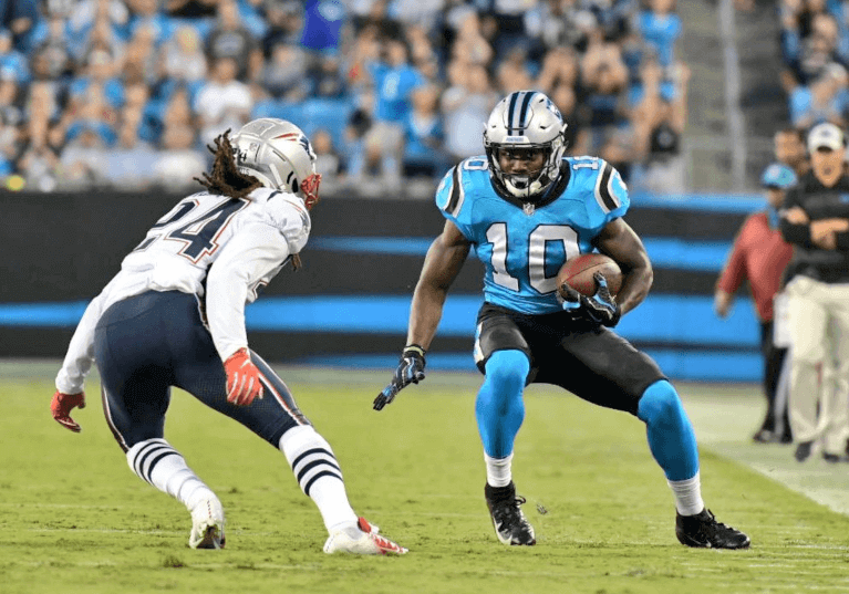
As highlighted by the Panthers on Thursday night (and Kris Gross in the Ticker yesterday), the Carolina Panthers planned to wear the black pant and blue jersey combo for the first time in their history, which we got to see in action last night.
Why now? Well, I wouldn’t discount the influence that Madden may have had on some of the players.
“It’s really coming from the players,” equipment manager Don Toner said. “They’re the ones who wanted to try something different.”
We’ve never seen the blue and black look in real life, but fans who play Madden have had the option to choose that combo for several years now. The reaction on social media indicates it’s a rather popular look.
“I don’t know anything about Madden, but evidently you could use this combo in the game,” Toner said. “Somebody brought that up.”
As Twitterer @NFL_Journal pointed out, this look was supposed to debut with the team itself:
It was shown that they would wear black pants, both at home and on the road. And the home jersey would be Carolina blue. While not as odd as the original Jaguars uniforms, these just didn’t sit well. Again, the powers that be seemed to come to their senses and in 1995 the Panthers had an excellent set of home and away uniforms. They did add the Carolina blue jersey as an alternate later, but never with the black pants. The black pants did show up a few years ago with a black on block design that looked pretty good in our view.
So what other Madden sets can we get pushed onto the field now?

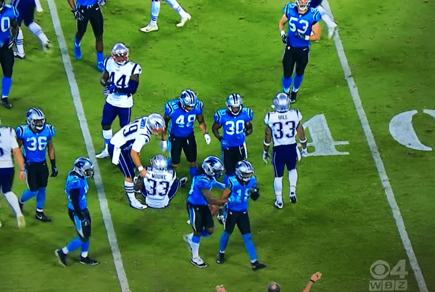
From the same Panthers/Pats game, here’s a great shot of two #33s on the field at the same time. Thanks to Justin Hicks.
And yet another uni-highlight from the Panthers/Pats game:
Bubble gum shirt. pic.twitter.com/wx1pXZHqYX
— Michael Hurley (@michaelFhurley) August 25, 2018

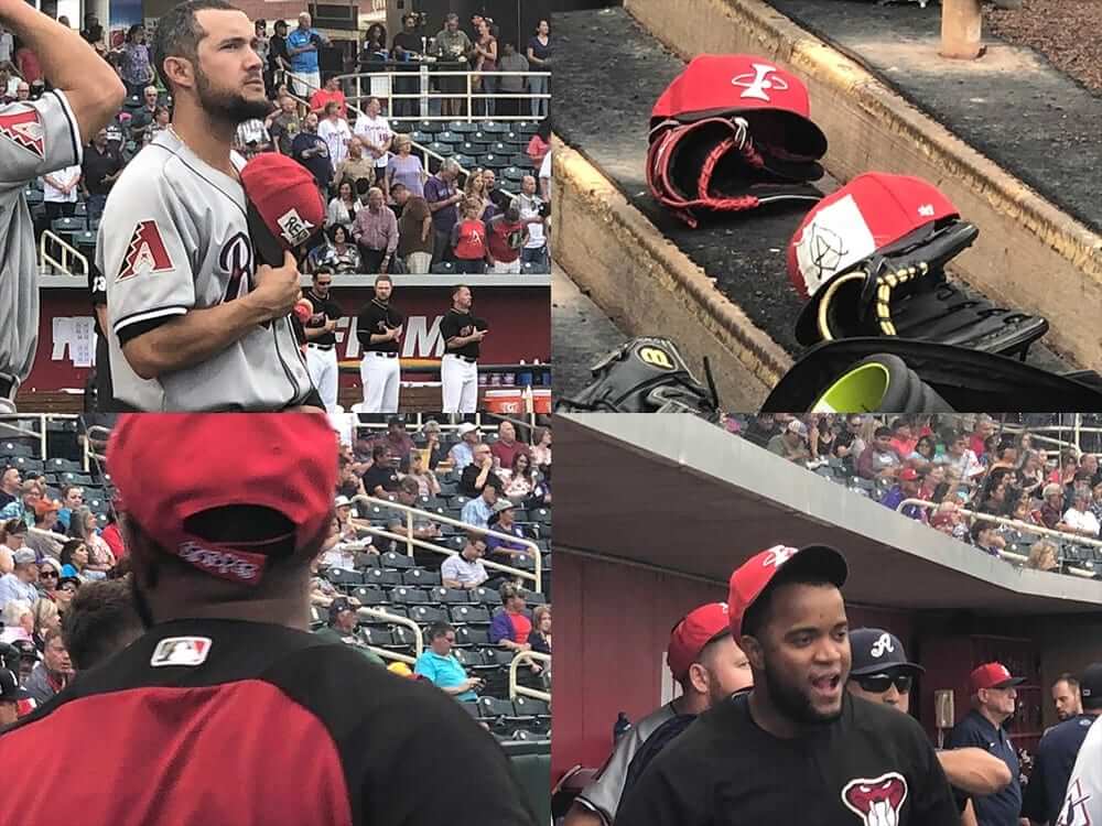
From Frank Mercogliano: “The Reno Aces made it to Albuquerque but their hats didn’t so they are wearing snapbacks from the team store, and some players have modified them.” I love the white fabric with the hand-drawn logo in the top right.
Their hats ended up arriving in the seventh inning.
We’re happy to make this change, Mike. pic.twitter.com/tRymuo5zBP
— Angels (@Angels) August 25, 2018
Mike Trout made a last-minute change to his Players Weekend uni last night, opting to swap out “KIIIIID” for “A. Cox” to honor his brother-in-law Aaron Cox, who died last week.
Asked if this was the toughest game of his career, Trout said: “It was. My brother came out here, but the family is back home. Every so often, you can’t help but think about it. He was a friend of mine and obviously my brother-in-law, but we were really close.”
Cox was the brother of Trout’s wife, Jessica. No cause of death has been given for Cox, who retired from baseball this month after pitching three seasons in the Angels’ organization.
ESPN has a good collection of the best shoes and nicknames from Players Weekend here.
But here it is, what we’ve all been waiting for:
It's really happening. 📦🍔 #PlayersWeekend pic.twitter.com/sj2kEFCsDK
— Arizona Diamondbacks (@Dbacks) August 24, 2018
It even made it to the locker room.
Here’s the throwback Bruins logo they’ll be using for this year’s Winter Classic.
A first look at the 1930’s throwback logo we’ll be wearing when we go #BackOutdoors on Jan. 1, 2019. #WinterClassic pic.twitter.com/q8xqfXHUkL
— Boston Bruins (@NHLBruins) August 24, 2018
Justin Verlander appears to have been, ahem, a tad overcharged on his current trip out west.
The Beverly Hills Hotel serves @JustinVerlander with the bill for his meal 😂 pic.twitter.com/3CRZopAlo2
— Darren Rovell (@darrenrovell) August 24, 2018

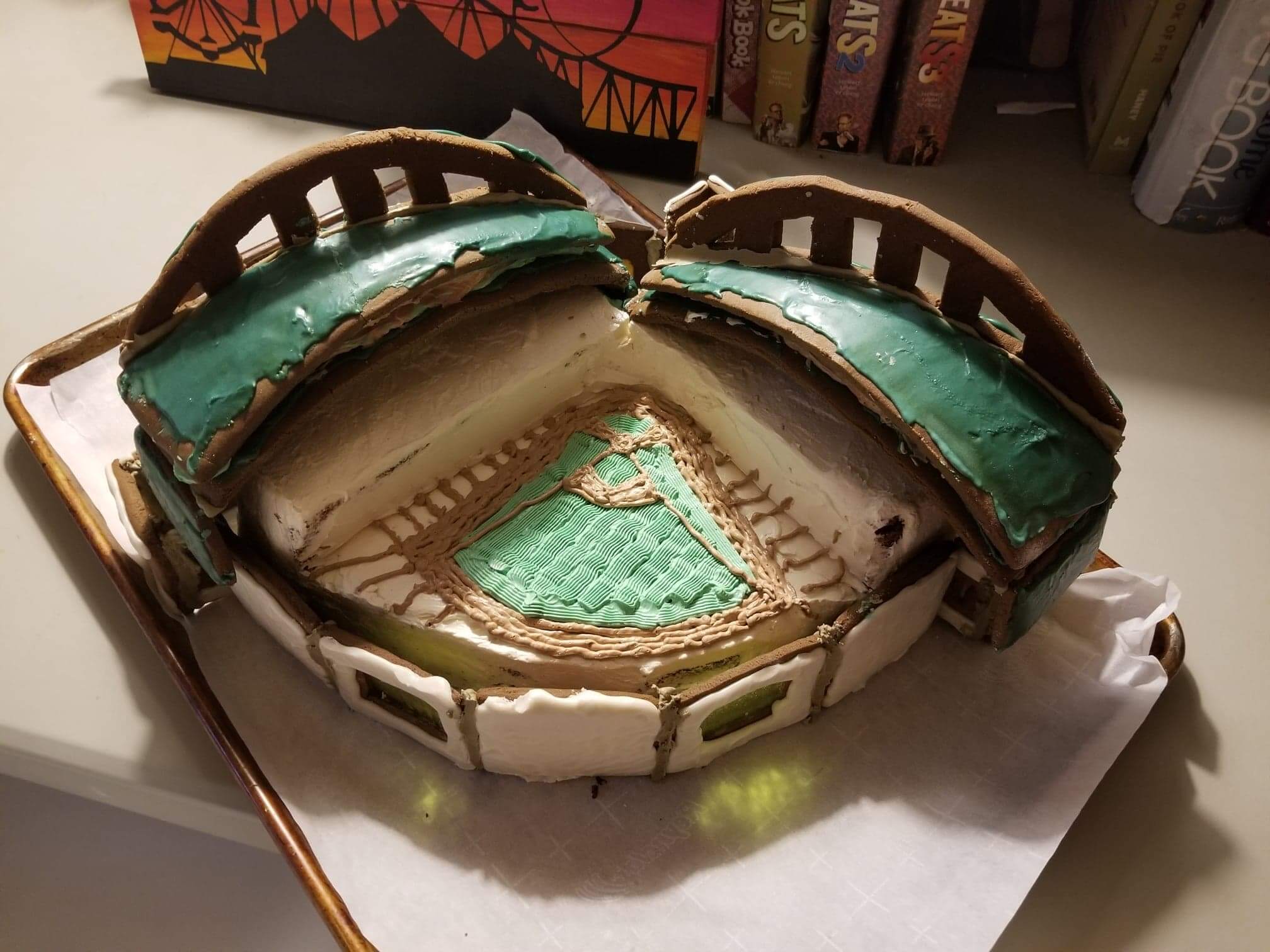
Reddit user Onion920 posted a photo of a gingerbread Miller Park, created by his wife:
Classic gingerbread wall and roof panels, and a spiced gingerbread cake infield and seating area, made with freshly grated ginger, and topped with buttercream frosting.
Thanks to Mike Chamernik for the find. Pretty good effort!
That being said, I kinda liked the silver/blue/black, if only because they didn’t muck it up with leotard-looking black socks.
I’ll be fine if this is a one and done, but it was fun once.
I wish they’d wear this look more often. The black pants made the blue pop, IMO.
If the Panthers switched to a black helmet this would be a slick look.
Their color combo is underrated and they’ve always been able to avoid the leotard look.
If they had worn a black helmet they would have looked like the Jacksonville jaguars
Exactly what I was thinking. Matching helmets and pants is always a good look. Not a fan of these shorts a lot of the players are wearing now.
Where are the days griffin designs?
they will be back Monday and Tuesday
Those Panthers uniforms are UGLY. NEVER, EVER should your pants color be darker than your top with the exception of colors silver, gray, gold or yellow paired with a white top.
Good grief, hope they ditch that look.
It’s not a great combination, but I’m not a huge fan of their regular uniforms. Oh well.
“NEVER, EVER should your pants color be darker than your top with the exception of colors silver, gray, gold or yellow paired with a white top” is a ridiculously specific, arbitrary “rule”, but OK.
If that combo doesn’t work, it’s not because the pants are darker than the jersey. It’s because they’re combining uniform elements that were designed decades apart and not originally intended to be worn with each other. It makes the distribution of the different colors throughout the uniform look sloppy, almost random. theIt would certainly be possible to design such a combo for the Panthers that would be more cohesive-looking, though I’m not sure at this point I’d trust Nike to pull it off.
From a design standpoint, he’s right about the pants shouldn’t be darker than the jersey. it’s literally what makes a uniform fall into a classic category. Example: I know people don’t seem to like the all white look, but the Jets look terrible with green pants… which leads to green sock tops, and the unitard look.
Of the Madden combos, I wouldn’t mind seeing the Eagles black pants paired with their White jerseys.
One thing I noticed about the Panthers’ blue over black look last night is that when the players wore their pants over the knee (which I kind of thought was required by the rules now?) they looked 100% better than the players who wore their pants above the knee, exposing way too much blue sock. Anybody else agree?
One thing some people here might not be aware of is that this is the first season where David Tepper is the owner of the Panthers instead of Jerry Richardson. Richardson was something of a traditionalist and it seems that Tepper is going to change some things up, for example letting the team experiment with different uniform combos. This is the second straight week that the Panthers have used a totally new combo, as last week they wore white pants with the blue jerseys. I wouldn’t be surprised if we saw the silver pants or even the black pants with the white jerseys at some point this year…
Also, it seems to be believed that the team will finally put the Panthers logo at midfield when the regular season begins instead of the NFL shield.
How someone could say this panther combo was ok, and also say “While not as odd as the original Jaguars uniforms” shows me what’s wrong with uniforms these days. The original jag unis were still in the “classic” mold. It was basically a Bronco look with different colors… black helmet (dark color), teal jersey (mid range color), and white pants (light color)… royal blue helmet (dark), orange jersey (mid range), white pants (light). Nothing wrong with that at all.
The problem I have now is exactly what’s highlighted in this article… for years I’ve said it’s starting to look like someone closed their eyes and winged through the color combinations.
I’m just going to have to get used to uniforms not looking beautiful to me anymore… now they are supposed to look “sick”… and they do :)
The problem I have now is exactly what’s highlighted in this article… for years I’ve said it’s starting to look like someone closed their eyes and winged through the color combinations.
*on Madden I mean
I thought that the Jaguars original uniforms that never made the field were being referenced. The helmet was silver and the jersey had a shoulder tone that looked like a leaping jaguar. There was nothing wrong with the original Jags set that made the field. Wish they would go back to it.
Mark Malone was a QB…
Oh, that could be…. I didn’t realize they might be talking about that one… that color scheme could’ve looked good, but the jag across the shoulders was definitely odd, so you’re probably right
There is simply no reason for the Panthers to even HAVE black pants. It’s an unbalanced look.It doesn’t go with any combination. Unfortunately, a silver helmet limits you to silver or white pants. Just because people on Madden like to use an asinine uniform combination doesn’t mean it should ever see the field. It’s a pro league. Dress like it.
You can also combine elements of the Eagles light blue and yellow uniforms in with their green ones on Madden. Are we going to see that too?
You could almost take your point a step further and say that if you have silver helmets, silver pants are really the only option that looks right and they should get rid of the white ones.
I will admit that the silver helmet/white jersey/white pants look has grown on me over the years just from having gotten used to it, but it’s always looked a little unbalanced.
I guess one other combo we could see this year is black jersey with white pants, which I don’t think would look right either.
A black helmet would really make the Panthers’ uniforms pop. The black pants just don’t fit any scheme except for a BFBS look, but the blue top pairing was actually an improvement. The Madden combo machine does make it fun to mash up a look, although some can come out looking down right ugly. The Cardinals look good when you go with the red top/black pants. The Texans and Bills both look good with a red top and blue pants. A bizarre combo that looks decent was the Dolphins color rush top with teal pants. You can mess with the socks and shoes too which makes for a solid pairing. Another one that is a bit of a throwback is the Patriots road uniform with silver pants. That was the look the team sported I think from 1992-2000. There is a Bears orange jersey that looks great with the navy pants although that jersey is no longer used. One of the more interesting combos is the Lions silver/gray color rush jersey with the blue pants.
The modding community, which I was a part of for several years, is pretty creative. They were creating color rush and alternate looks long before they became a thing. All-yellow Packers, black alternates for the Cowboys, Vikings, Redskins, an all-silver Raiders look, red alternates for the Patriots and Titans, if you could think of it there was someone who could create it.
Speaking of new football uniform combinations (CFL), Toronto Argonauts went white over white with the blue lid for the first time this year at Montreal last night.
link
A black helmet or even a white helmet would really make that Panthers’ combo sizzle. The black pants don’t really fit other than a BFBS look. The combination last night was not bad and actually better than the color rush look we have seen. As for other “Madden” combos we could pull off, there aren’t a whole bunch. The Cardinals look very good when you put their red top with the black pants. The Bills and Texans are both sharp with a red top and blue pants. An interesting combination that we probably would never see is the Dolphins orange top with teal pants. It is surprisingly sharp in the game. Unfortunately the Bears no longer use their orange top but it looks very good when paired with the navy pants. The Lions might actually want to try this one, the silver color rush with the blue pants, it works really well.
As someone who was once part of the modding community, I can say a lot of gamers were well ahead of the curve when it comes to color rush and alternate looks. We could change just about anything in the Madden PC game: helmet, jersey color, numbers, pants, socks, shoes. Some of the creations were only dreams-black alternates for the Cowboys, Dolphins, Patriots, Redskins, Packers or whatever team you could think of. An all-yellow or all-green Packers look. Vikings with a yellow jersey and purple pants. Red alternate for the Patriots or Titans. The Raiders in all-silver or all-black. Teal pants for the Jaguars. A black helmet for the Panthers. A throwback 1971 helmet for the Eagles. All-kelly green for the Jets “sack exchange” uniform.
I like the Panthers look from the neck down but in my opinion the helmet colour should be in the main uniform somewhere as well even if it just the numbers on the jersey.
This is why I dislike the Cowboys colour rush more than the Saints and Raiders.
Ten dollars for a glass of juice? FORTY-TWO bucks for a salad? Boy I’m glad I live in the Midwest . . .
Never been to a hotel huh? They have those in the Midwest too, and eatting there is just as unreasonably expensive.
link
Matt Holliday got called back up to the Rockies on Friday so his nickname didn’t earn a ton of hype or previews, but it’s definitely worth noting here. Well done sir.
It’s photoshopped.